
This post may contain affiliate links. If you click one, we may earn a commission at no cost to you. Here's more details on how we make money.
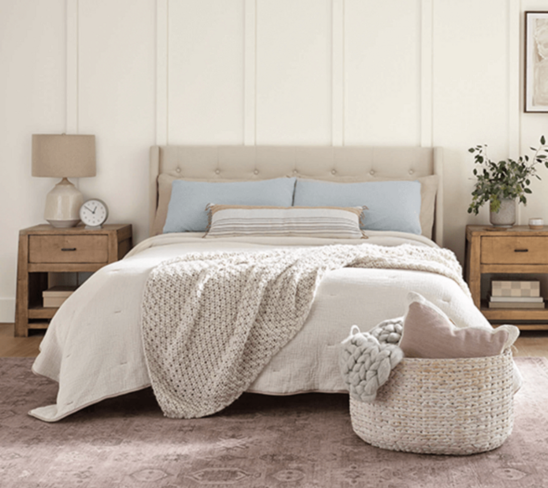
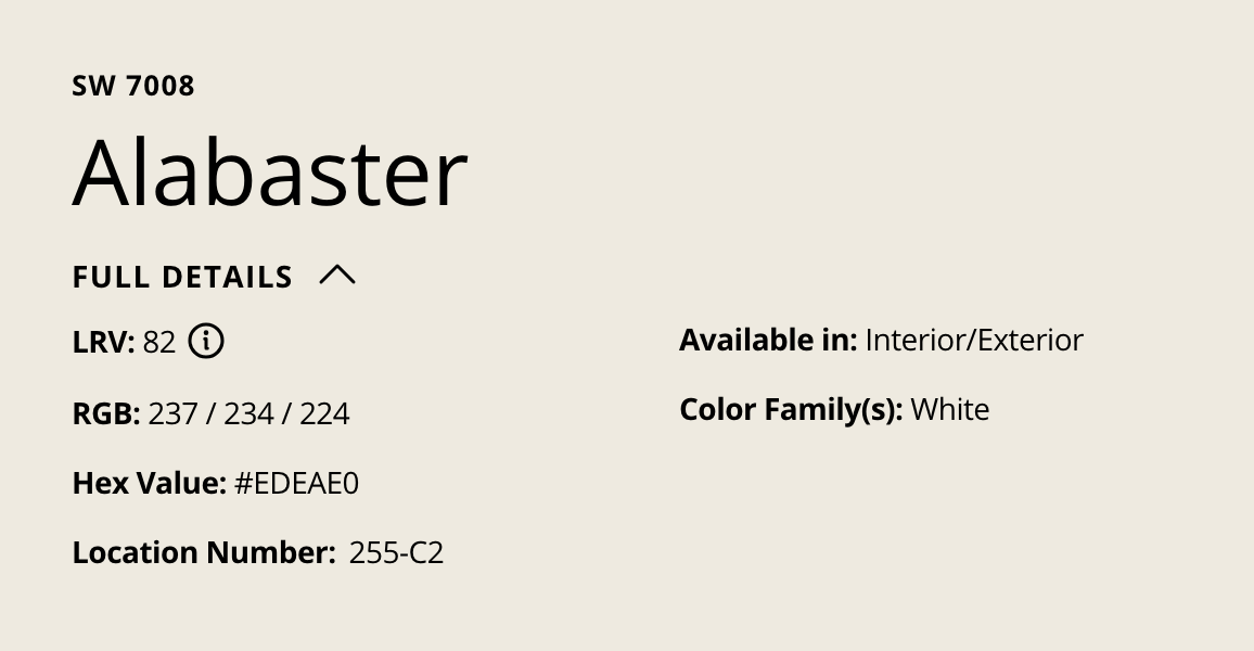
In the space of paints and colors, Sherwin Williams Alabaster (SW 7008) is a renowned shade. Acclaimed for its subtle and soft characteristics, it is predominantly a white hue, encapsulating a hint of gray.
It is often a go-to choice for homeowners who seek a neutral tone to complement various styles and themes. However, a commonly pondered question is, does Sherwin Williams Alabaster look yellow?
An Exploration of Color Undertones
To understand whether Alabaster appears yellow, we need to delve into the concept of undertones. Every color on the spectrum possesses an undertone, a subtle hue lying beneath the surface color, which can influence the overall appearance of the color in different lighting conditions and surroundings.
The Undertone of Alabaster
Sherwin Williams Alabaster has a subtle, warm undertone, which can be interpreted as a beige or a hint of gray, making it lean towards the creamy side of the white spectrum. This warm undertone may lead some to perceive it as having a yellowish tinge, particularly when juxtaposed with cooler or pure white shades. However, labeling Alabaster as a yellowish white would be an overstatement.
Lighting’s Impact on Color Perception
Lighting plays a pivotal role in the perceived color of a paint shade. Natural daylight accentuates the true color of Alabaster, allowing its warm, creamy nature to shine subtly without veering into yellow territory. However, artificial lighting, especially warmer lights, may exaggerate the warmth in Alabaster, giving it a slight yellowish appearance.
Alabaster in Different Spaces
When painted in spaces with ample natural light, Alabaster tends to reflect light beautifully, maintaining its creamy white appearance. In contrast, in areas with limited natural light and warmer artificial lights, it may seem a bit creamier.
Additionally, the surrounding colors in a room can also affect how one perceives the color of Alabaster. When paired with cooler tones, Alabaster may appear more warm and creamy. Conversely, alongside warmer tones, it is likely to appear more true to its white base.
Finding Complementary Colors
When using Alabaster, choosing the right complementary colors is crucial. Cooler shades of gray, blues, or greens can balance the warm undertones of Alabaster, preventing it from appearing yellow. Furthermore, incorporating decorative elements in cooler tones can also help maintain the balance between warm and cool tones in a space.
Choosing the Right Sheen
The finish or sheen of the paint can also influence the color's appearance. Higher gloss levels tend to reflect more light, potentially emphasizing the warm undertones of Alabaster. Opting for a matte or flat finish can help in maintaining the neutrality of this shade.
Conclusion
Sherwin Williams Alabaster is a versatile, neutral, creamy white shade with a subtle, warm undertone, making it a splendid choice for varied aesthetic preferences. While this undertone may sometimes lend a slight yellowish appearance to the color, especially under specific lighting conditions or when paired with certain surrounding colors, labeling Alabaster as a yellow shade would be a misinterpretation.
