This post may contain affiliate links. If you click one, we may earn a commission at no cost to you. Here's more details on how we make money.
If you're anything like us, you find joy in discovering the perfect color combinations that bring a space or project to life. This time, we're shining the spotlight on the warm and inviting world of coral color palettes.
Coral is more than just a color; it's a statement of joy, warmth, and creativity, blending beautifully in a variety of settings. From the soft whispers of pastel corals to the dynamic splash of bright coral contrasts, these palettes are sure to spark your imagination and ignite your next design project.
So grab your favorite cup of coffee, get cozy, and let's explore some of the most delightful coral color palettes that can transform the ordinary into something truly extraordinary.
Learn more about color coral: 100+ Shades of Coral Color
1. Coral Reef Color Palette
Spanish Orange + Atomic Tangerine + Melon + Aero + Celestial Blue
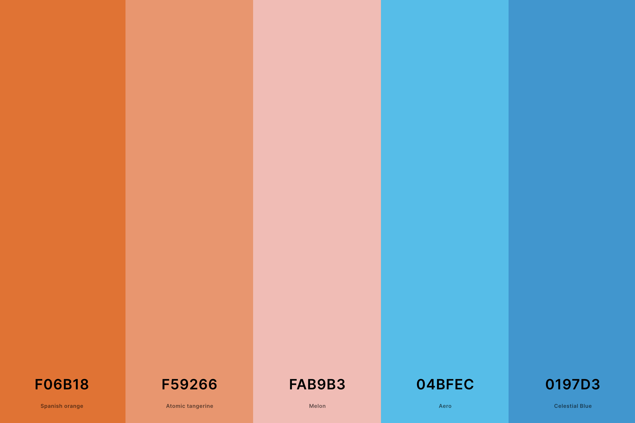
Hex Codes: #F06B18, #F59266, #FAB9B3, #04BFEC, #0197D3
This palette is like a tropical vacation in colors! With the zesty Spanish Orange and the soft Atomic Tangerine, it brings energy and softness together.
Melon adds a touch of sweetness, while Aero and Celestial Blue inject a refreshing contrast that mimics the ocean's embrace around a coral reef.
It's a harmonious blend that's lively and soothing all at once.
2. Bright Coral Color Palette
Fawn + Atomic Tangerine + Coral + Tomato + Candy Apple Red
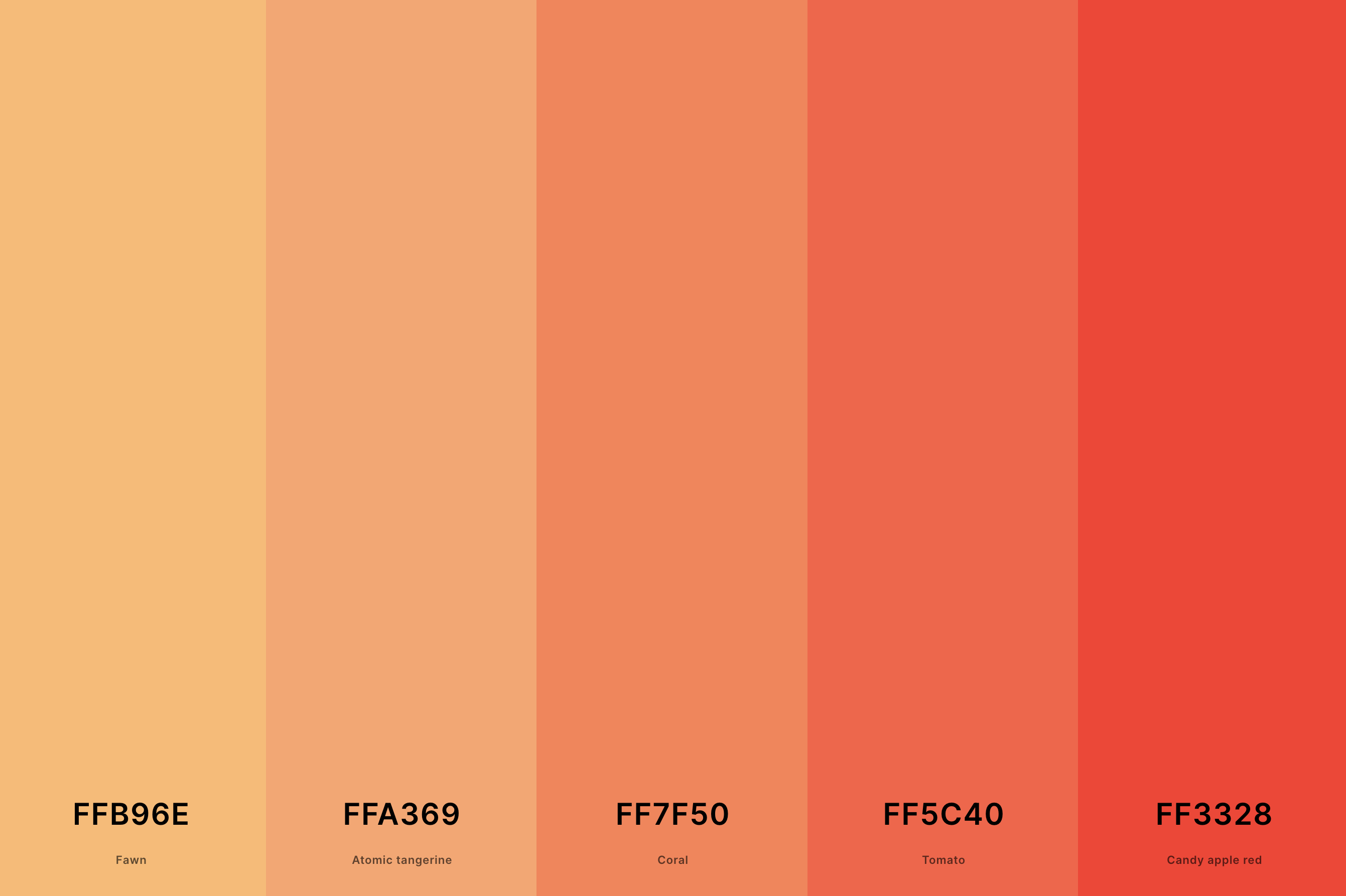
Hex Codes: #FFB96E, #FFA369, #FF7F50, #FF5C40, #FF3328
This one's a showstopper! It starts with the sunny warmth of Fawn and builds up the heat with layers of Atomic Tangerine and Coral.
The Tomato and Candy Apple Red add a fiery depth, creating a dynamic and invigorating palette. It's perfect for designs that aim to stand out and energize.
3. Coral And Teal Color Palette
Tomato + Coral + Antique White + Verdigris + Caribbean Current
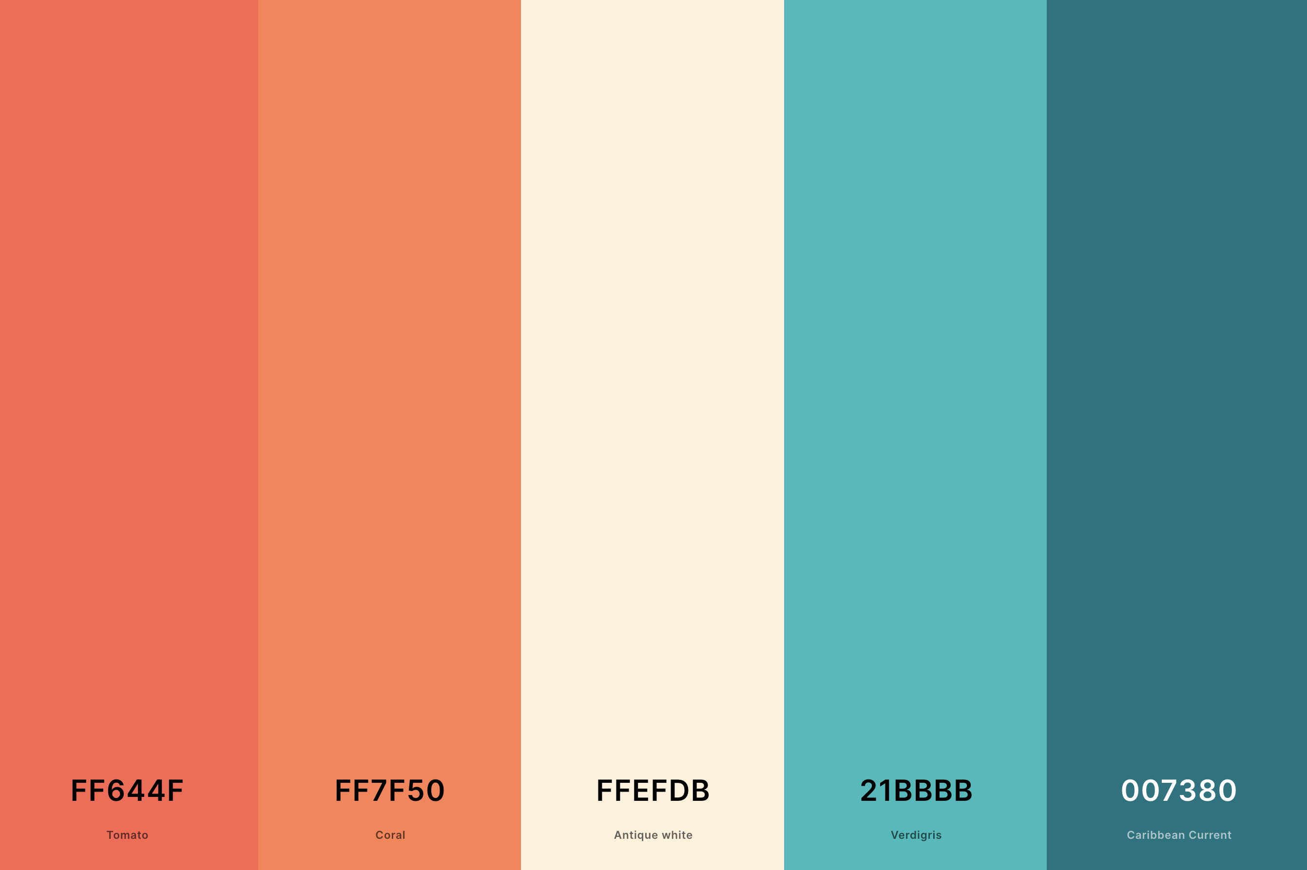
Hex Codes: #FF644F, #FF7F50, #FFEFDB, #21BBBB, #007380
Oh, how I adore this pairing! The Tomato and Coral shades offer a juicy, vibrant base, while Antique White softens the overall look.
The real stars are Verdigris and Caribbean Current, providing a cool, refreshing contrast that's as invigorating as a splash in a clear, teal ocean.
This palette is all about balance and unexpected harmony.
4. Aqua And Coral Color Palette
Salmon + Peach + Mint Cream + Celeste + Light Sea Green
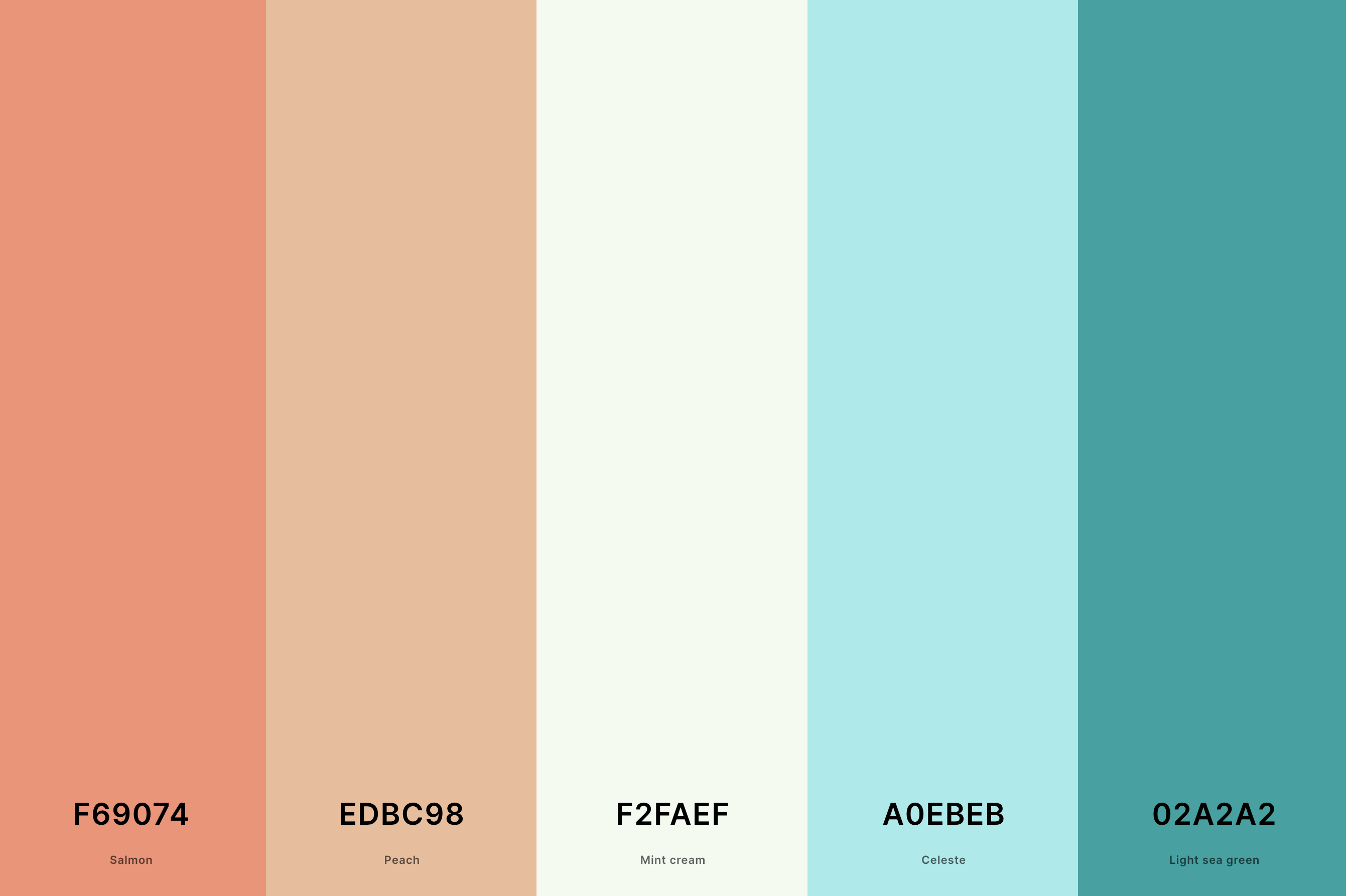
Hex Codes: #F69074, #EDBC98, #F2FAEF, #A0EBEB, #02A2A2
Soft, dreamy, and utterly delightful! Salmon and Peach bring a cozy warmth, while Mint Cream offers a hint of crisp freshness.
The Celeste and Light Sea Green are like a gentle wave, making the whole palette feel like a serene, sunlit lagoon. It's perfect for creating spaces that feel airy and light-hearted.
5. Coral And Blue Color Palette
Scarlet + Coral + Sky Magenta + Majorelle Blue + Palatinate Blue
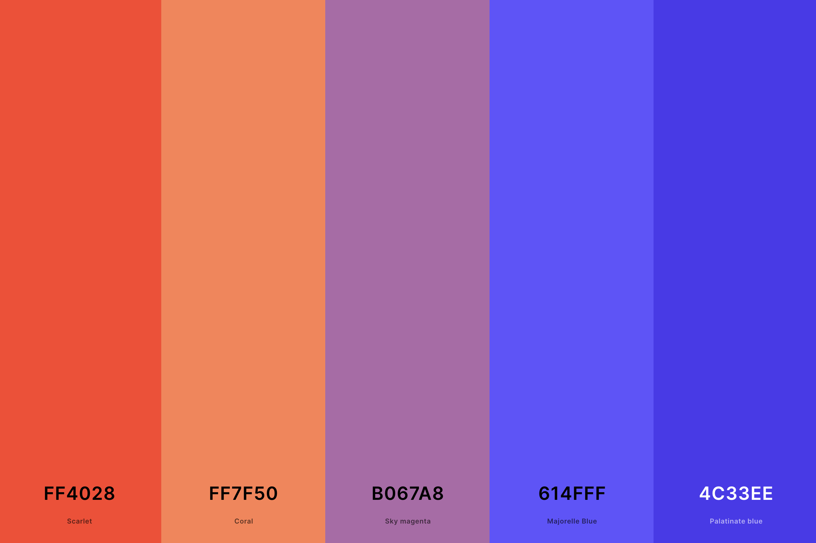
Hex Codes: #FF4028, #FF7F50, #B067A8, #614FFF, #4C33EE
This palette takes boldness to new heights! Scarlet and Coral provide a fiery foundation, while Sky Magenta adds a whimsical twist.
Majorelle Blue and Palatinate Blue bring in a regal, yet vibrant contrast, crafting a palette that's both daring and sophisticated.
Ideal for designs that crave a dynamic punch with a touch of elegance.
6. Pastel Coral Color Palette
Platinum + Champagne Pink + Pale Dogwood + Cherry Blossom Pink + Cinereous
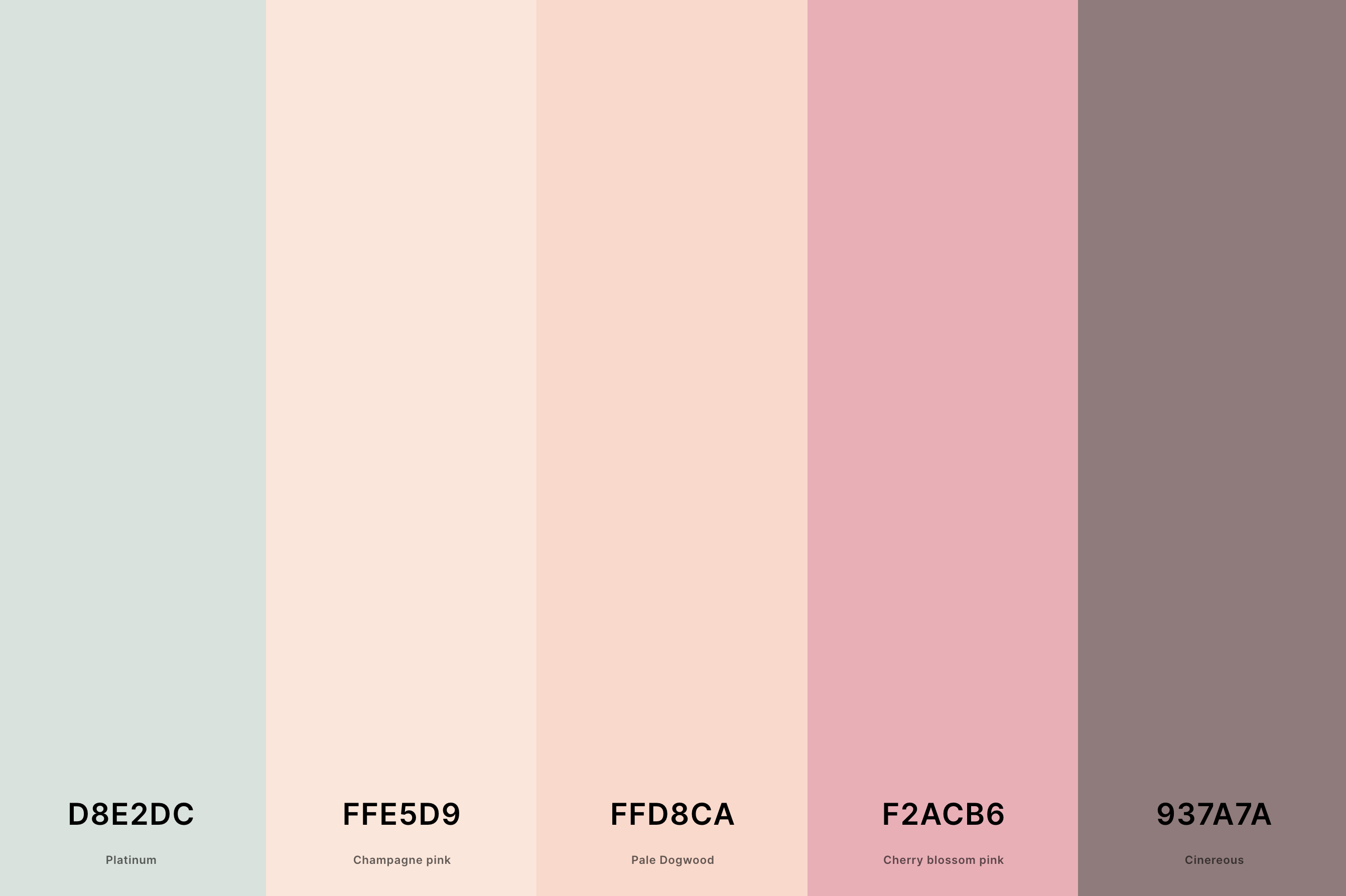
Hex Codes: #D8E2DC, #FFE5D9, #FFD8CA, #F2ACB6, #937A7A
This palette whispers elegance and softness, making it perfect for a gentle, understated look.
Platinum and Champagne Pink set a luxurious, muted backdrop, while Pale Dogwood and Cherry Blossom Pink add a delicate floral touch.
Cinereous anchors the palette with its earthy depth, creating a sophisticated harmony that's soothing and chic.
7. Coral And Gold Color Palette
Satin Sheen Gold + Goldenrod + Naples Yellow + Coral + Atomic Tangerine
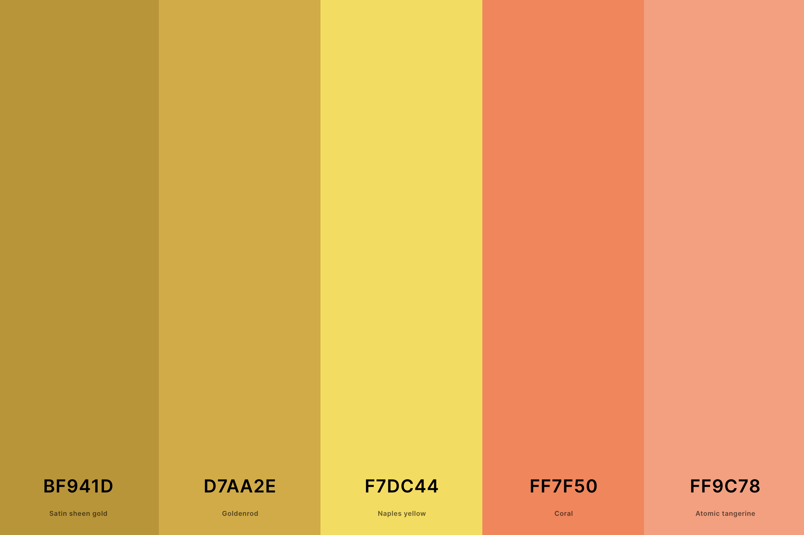
Hex Codes: #BF941D, #D7AA2E, #F7DC44, #FF7F50, #FF9C78
Luxurious and warm, this palette is like a sunset wrapped in gold. Satin Sheen Gold and Goldenrod bring a rich, opulent vibe, while Naples Yellow lightens the mood with its sunny disposition.
Coral and Atomic Tangerine add a vibrant, energetic heart to the palette, making it ideal for designs that aim to dazzle and uplift.
8. Coral And Green Color Palette
Dark Slate Gray + Zomp + Cambridge Blue + Bittersweet + Jasper
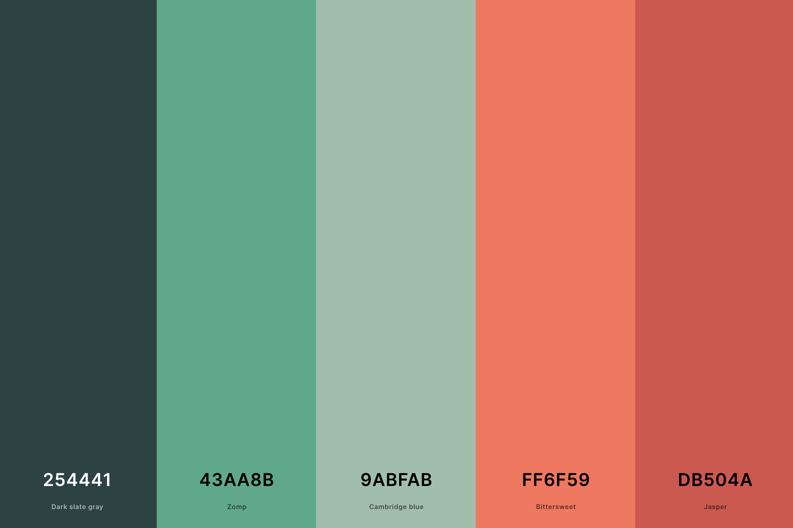
Hex Codes: #254441, #43AA8B, #9ABFAB, #FF6F59, #DB504A
Nature-inspired and utterly refreshing, this combination is a breath of fresh air. Dark Slate Gray and Zomp offer a deep, verdant contrast to the lively Coral and Bittersweet, while Cambridge Blue adds a tranquil, watery element.
This palette is perfect for spaces that aim to be rejuvenating and harmonious with a touch of vibrancy.
9. Coral And Grey Color Palette
Platinum + Silver + Cinereous + Atomic Tangerine + Coral
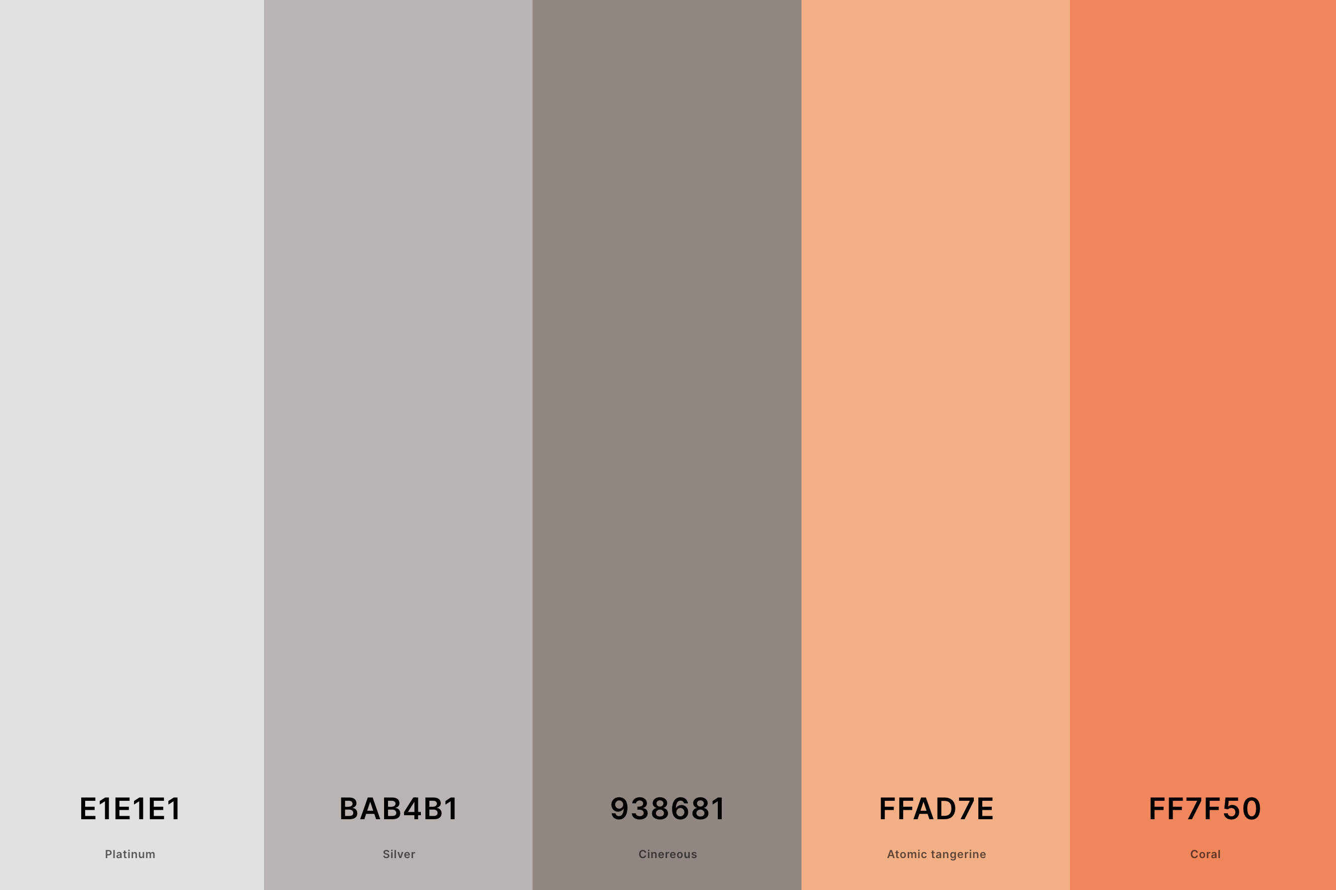
Hex Codes: #E1E1E1, #BAB4B1, #938681, #FFAD7E, #FF7F50
Sophisticated and modern, this palette merges the warmth of coral with the coolness of grey tones. Platinum and Silver provide a sleek, contemporary foundation, while Cinereous adds a touch of warmth.
The Coral and Atomic Tangerine bring a pop of cheerful color, making this palette versatile for both sleek, modern designs and cozy, inviting spaces.
10. Coral And Mint Color Palette
Verdigris + Tiffany Blue + Aquamarine + Melon + Bittersweet
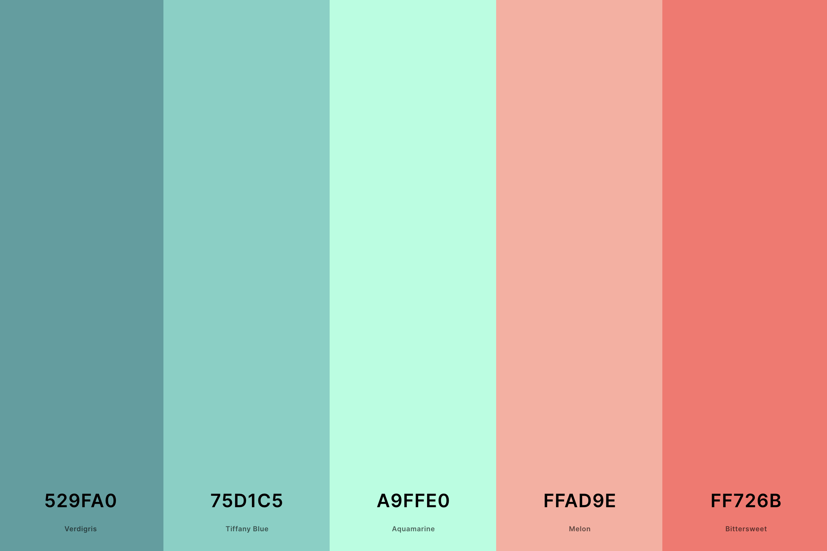
Hex Codes: #529FA0, #75D1C5, #A9FFE0, #FFAD9E, #FF726B
Fresh, playful, and invigorating, this palette is a joy to behold. Verdigris and Tiffany Blue offer a cool, minty freshness, while Aquamarine lightens the mood with its ethereal quality.
Melon and Bittersweet add a warm, welcoming contrast, creating a palette that's both energizing and comforting. It's perfect for designs that aim to be vibrant yet soothing.
11. Coral And Pink Color Palette
Light Coral + Salmon + Bittersweet + Vermilion + Chili Red
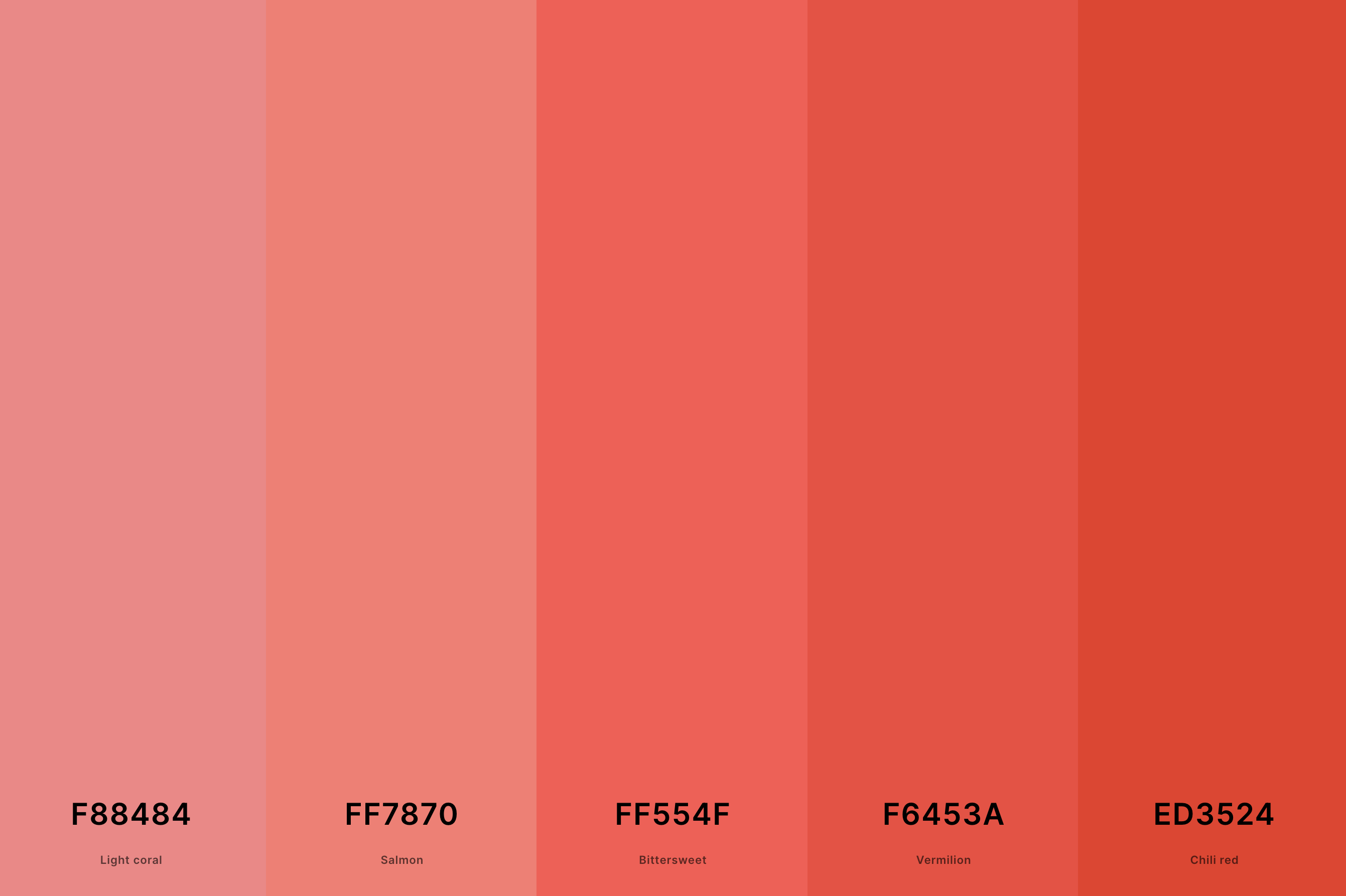
Hex Codes: #F88484, #FF7870, #FF554F, #F6453A, #ED3524
This palette is a celebration of all things feminine and playful. Light Coral and Salmon infuse a soft, romantic vibe, while Bittersweet adds a touch of vibrancy.
Vermilion brings a dash of boldness, and Chili Red spices things up with its fiery spirit. This blend is perfect for designs that embrace femininity and warmth, creating spaces that are inviting and full of life.
12. Coral And Turquoise Color Palette
Coral + Peach + Champagne + Tiffany Blue + Turquoise
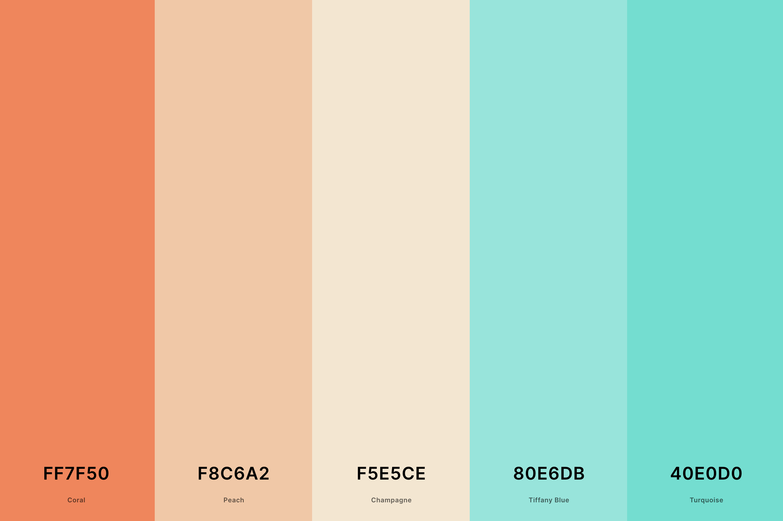
Hex Codes: #FF7F50, #F8C6A2, #F5E5CE, #80E6DB, #40E0D0
A palette that feels like a tropical escape, combining the warmth of coral with the refreshing coolness of turquoise. Coral and Peach lay down a warm, sunny foundation, while Champagne softens the overall look with its subtle elegance.
Tiffany Blue and Turquoise bring in the refreshing feel of clear, tropical waters, making this palette ideal for creating an oasis of calm and vibrancy.
13. Coral And Orange Color Palette
Atomic Tangerine + Coral + Ut Orange + Orange Peel + Safety Orange
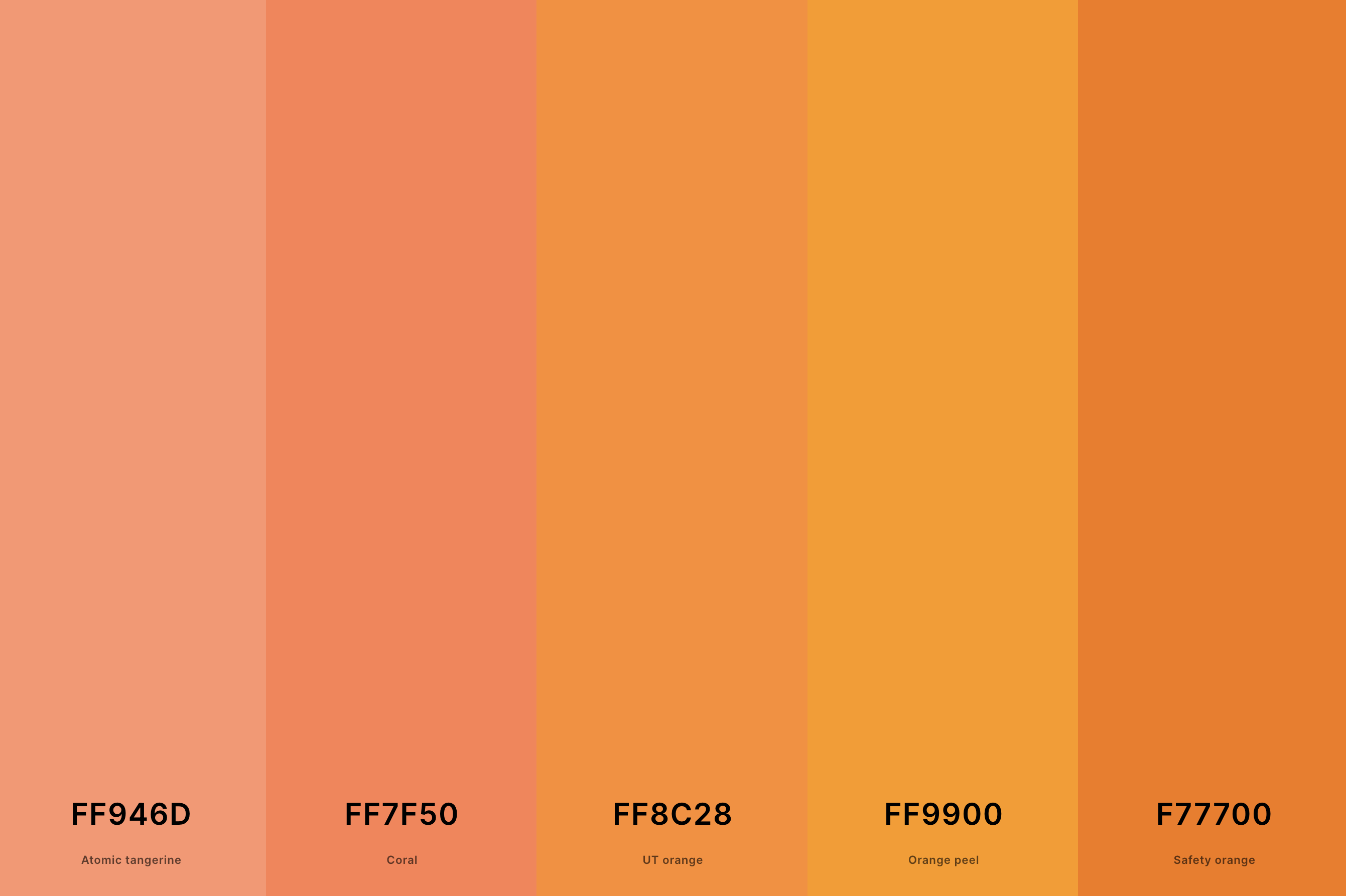
Hex Codes: #FF946D, #FF7F50, #FF8C28, #FF9900, #F77700
This palette radiates energy and warmth, capturing the essence of a glowing sunset. Atomic Tangerine and Coral provide a juicy, vibrant base, complemented by the deeper shades of Ut Orange and Orange Peel.
Safety Orange adds an extra punch, making this palette perfect for designs that aim to be bold, energetic, and full of life.
14. Coral And Peach Color Palette
Folly + Bittersweet + Coral + Peach + Sunglow
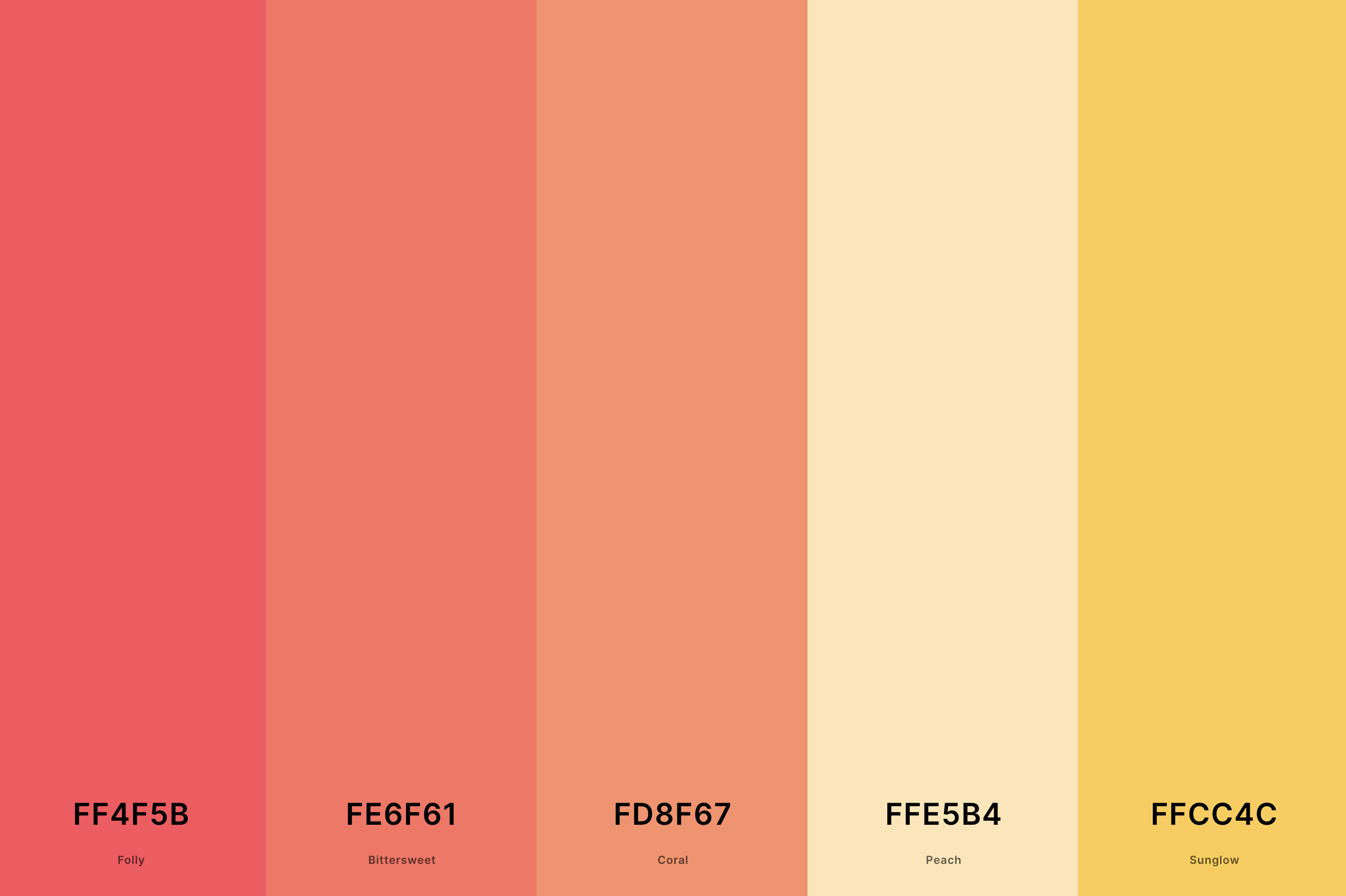
Hex Codes: #FF4F5B, #FE6F61, #FD8F67, #FFE5B4, #FFCC4C
Soft, sweet, and utterly delightful, this palette combines the gentle charm of coral with the tender allure of peach. Folly and Bittersweet bring a lively zest, while Coral adds a soft, heartwarming touch.
Peach and Sunglow soften the overall look with their light, airy feel, creating a palette that's perfect for serene, inviting spaces that feel like a warm embrace.
15. Coral And Red Color Palette
Fire Brick + Fire Engine Red + Poppy + Vermilion + Tomato
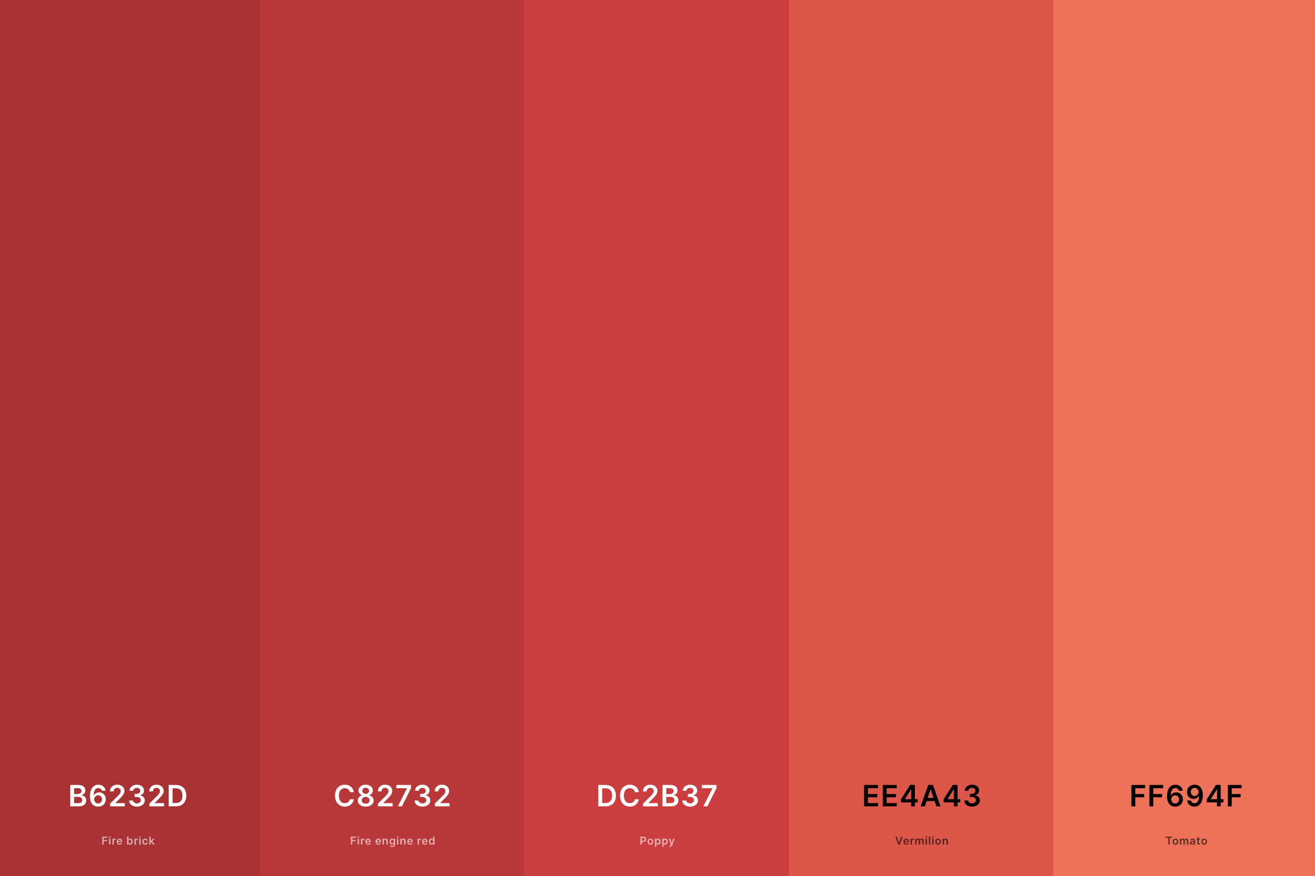
Hex Codes: #B6232D, #C82732, #DC2B37, #EE4A43, #FF694F
Bold and passionate, this palette combines the fiery spirit of red with the cheerful warmth of coral. Fire Brick and Fire Engine Red lay a robust, passionate foundation, while Poppy adds a touch of playful brightness.
Vermilion and Tomato introduce a lively, dynamic contrast, making this palette perfect for designs that aim to make a statement and captivate attention.
16. Coral Wedding Color Palette
Beaver + Payne'S Gray + Hunyadi Yellow + Coral + Bright Pink (Crayola)
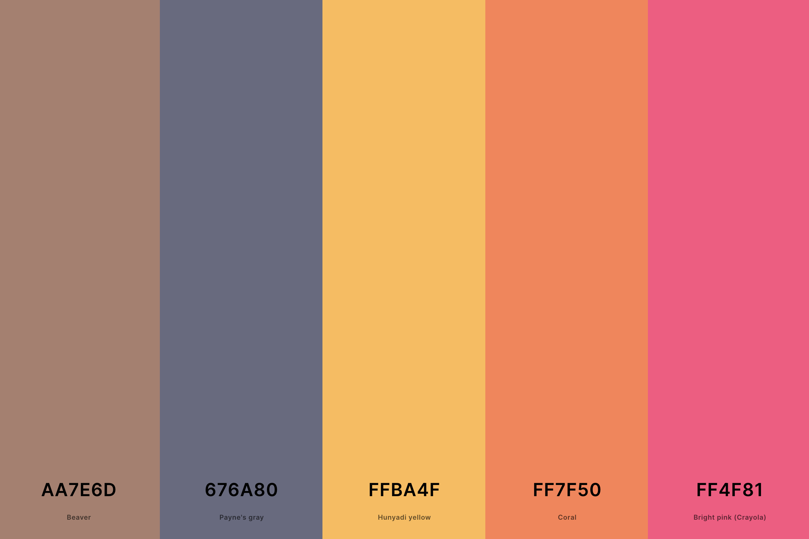
Hex Codes: #AA7E6D, #676A80, #FFBA4F, #FF7F50, #FF4F81
This palette is the epitome of romantic elegance, perfect for that special day. Beaver and Payne's Gray provide a sophisticated, neutral backdrop, allowing the vibrant Coral and Hunyadi Yellow to pop with joyful warmth.
Bright Pink (Crayola) adds a playful, loving touch, making this palette ideal for a wedding that's both classic and full of personality.
17. Light Coral Color Palette
Papaya Whip + Apricot + Peach + Coral Pink + Light Red
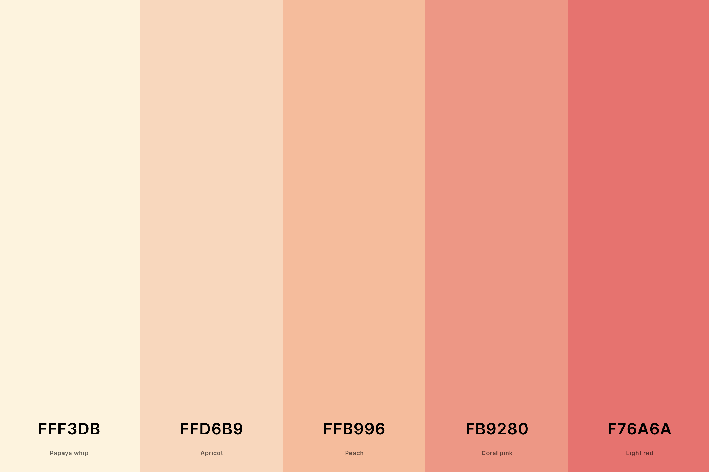
Hex Codes: #FFF3DB, #FFD6B9, #FFB996, #FB9280, #F76A6A
Airy and delicate, this palette is like a gentle sunrise. Papaya Whip and Apricot offer a soft, dreamy base, while Peach adds a whisper of sweet warmth.
Coral Pink and Light Red introduce a tender vibrance, creating a palette that's perfect for spaces that seek to be soothing, inviting, and filled with light.
18. Navy Blue And Coral Color Palette
Jordy Blue + Navy Blue + Coral + Salmon + Peach
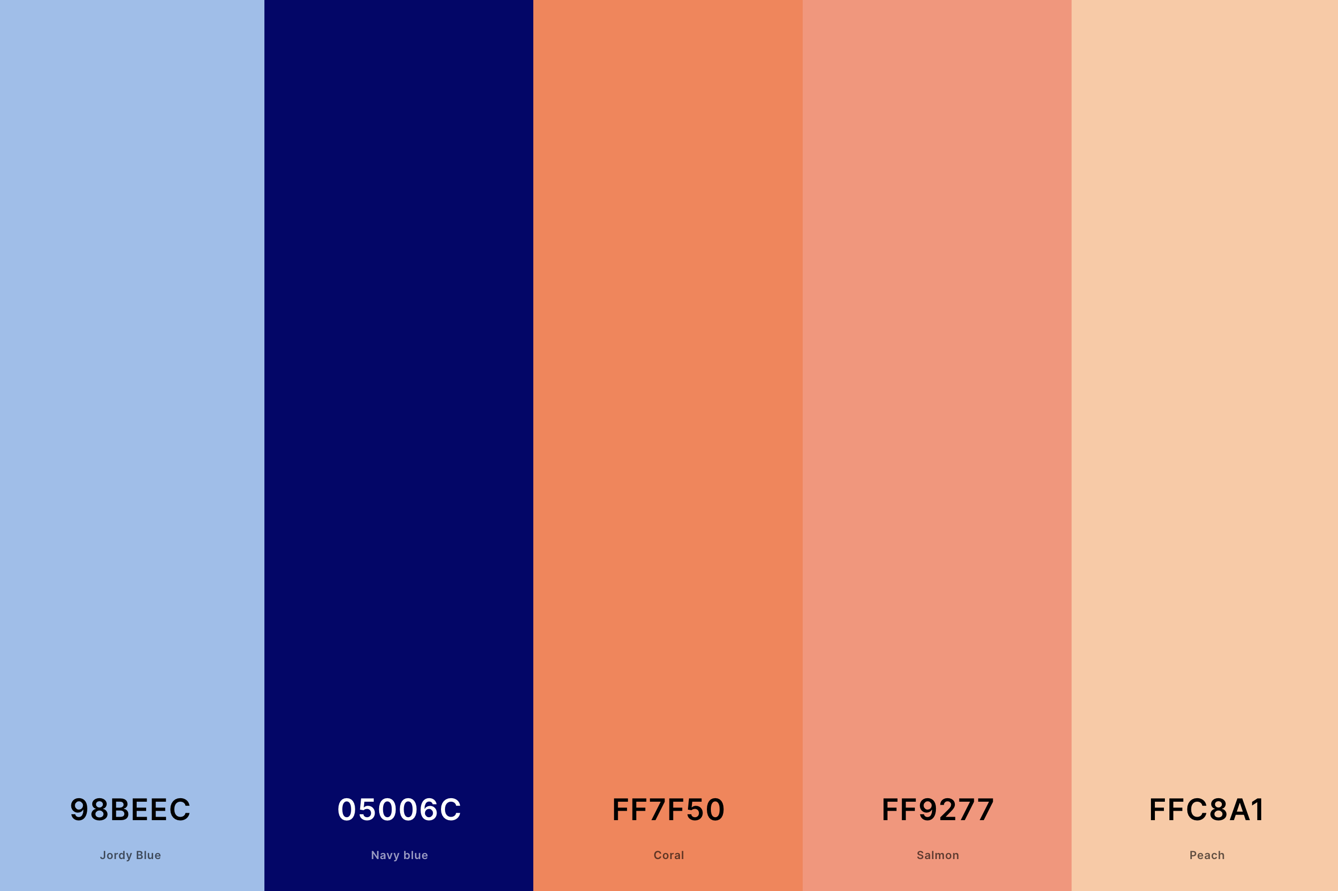
Hex Codes: #98BEEC, #05006C, #FF7F50, #FF9277, #FFC8A1
This palette brings a classic, nautical elegance with a twist. Jordy Blue and Navy Blue provide a deep, serene foundation, reminiscent of the open sea.
Coral and Salmon add a splash of lively warmth, while Peach softens the overall look with its gentle glow.
It's ideal for designs that aim to be timeless, with a hint of vibrant energy.
19. Yellow And Coral Color Palette
Tomato + Coral + Peach Yellow + Mikado Yellow + Xanthous
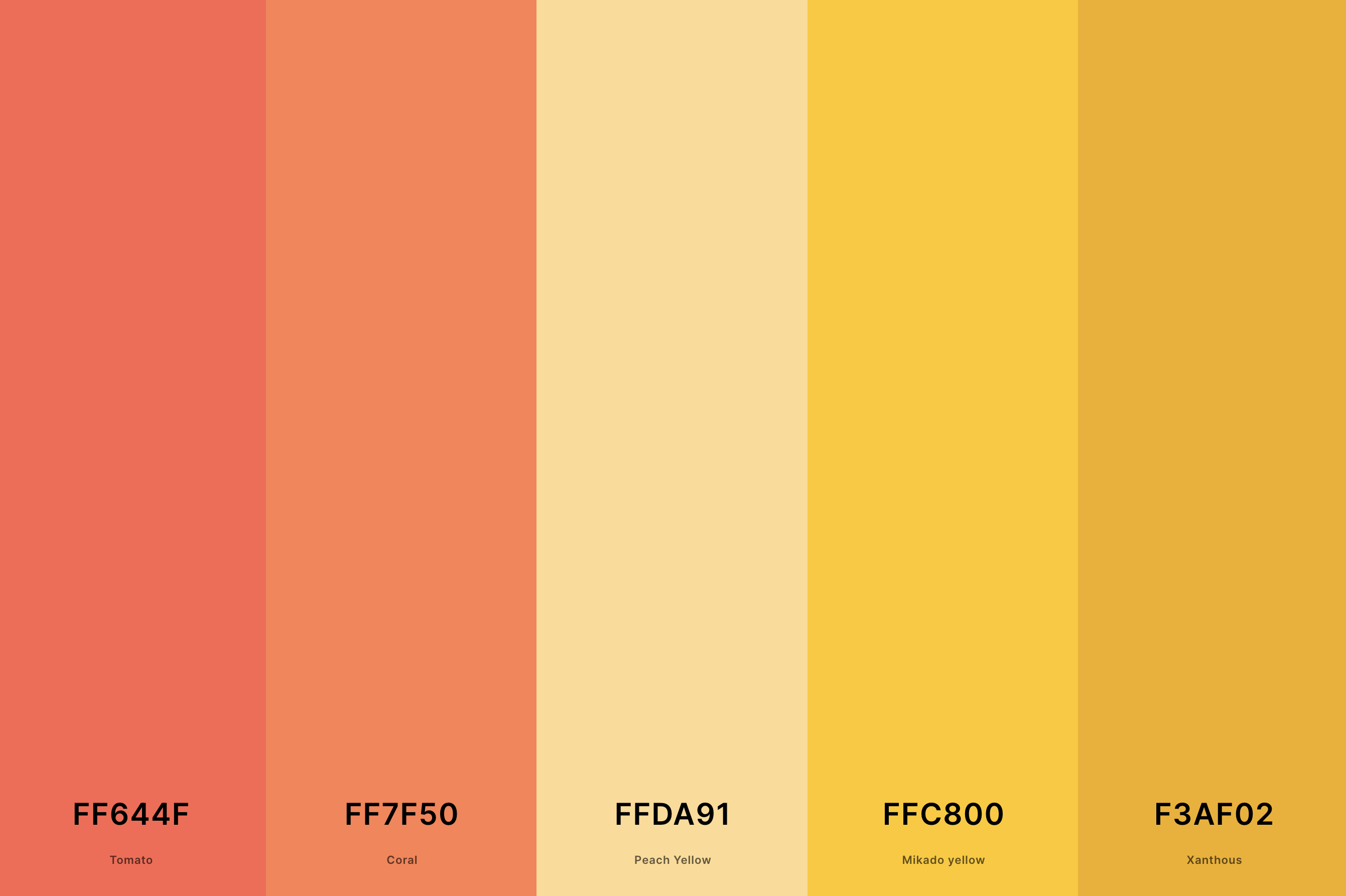
Hex Codes: #FF644F, #FF7F50, #FFDA91, #FFC800, #F3AF02
Bright and sunny, this palette exudes happiness and vitality. Tomato and Coral infuse a vibrant, warm heart, while Peach Yellow and Mikado Yellow brighten the mood with their luminous glow.
Xanthous adds a unique, golden touch, making this palette perfect for designs that aim to be cheerful, radiant, and full of life.
20. Black And Coral Color Palette
Black + Van Dyke + Cinereous + Coral + Burgundy
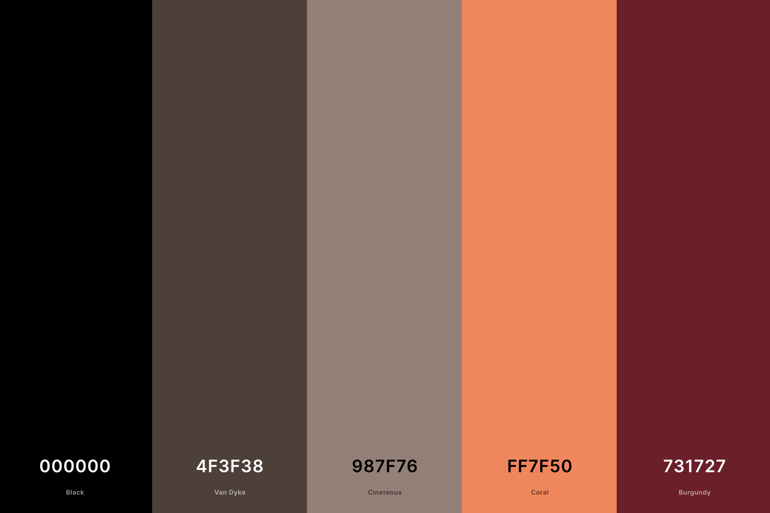
Hex Codes: #000000, #4F3F38, #987F76, #FF7F50, #731727
Bold and dramatic, this palette combines the depth of black with the vivacity of coral. Black sets a powerful, sophisticated tone, while Van Dyke and Cinereous add a softer, nuanced contrast.
Coral brings a burst of energy and warmth, with Burgundy deepening the palette's intensity. This combination is ideal for designs that aim to be striking, elegant, and unforgettable.
21. Blue, Gray And Coral Color Palette
Timberwolf + Melon + Coral + Payne'S Gray + Zaffre
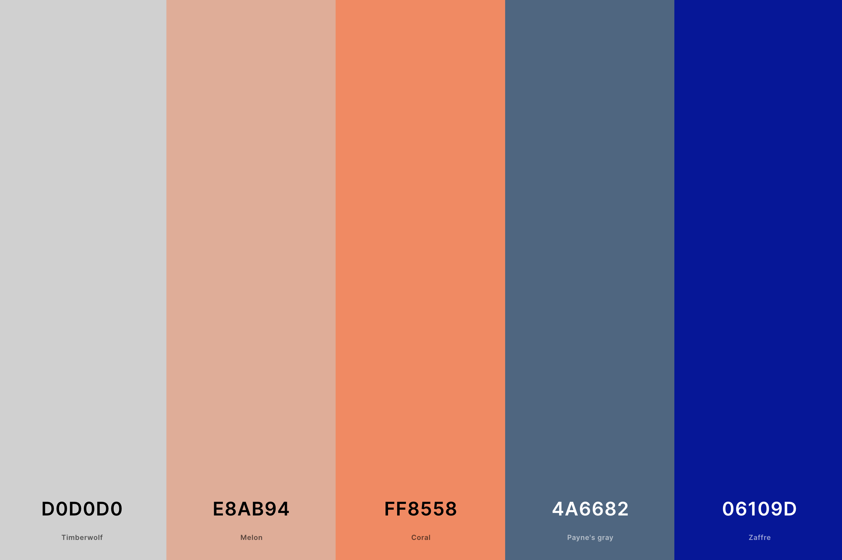
Hex Codes: #D0D0D0, #E8AB94, #FF8558, #4A6682, #06109D
This palette is the epitome of cool sophistication with a warm twist. Timberwolf and Melon offer a muted, elegant base, while the vibrant Coral adds a splash of lively warmth.
Payne's Gray and Zaffre introduce a deep, thoughtful contrast, creating a palette that's perfect for modern, chic designs that want to balance warmth with cool, refined tones.
22. Chartreuse And Coral Color Palettes
Yellow Green + Chartreuse + Gold + Orange Peel + Tomato
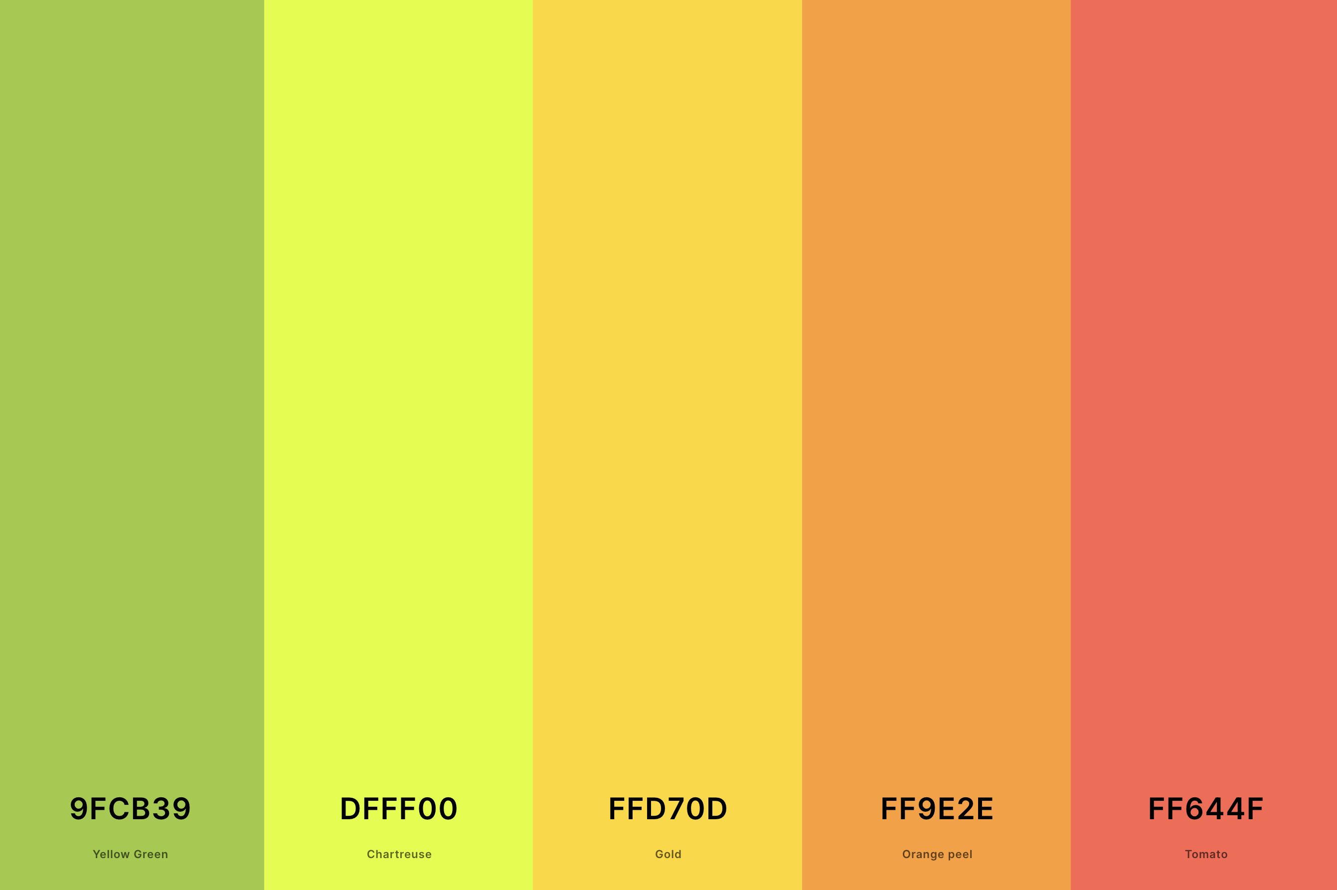
Hex Codes: #9FCB39, #DFFF00, #FFD70D, #FF9E2E, #FF644F
Vibrant and full of life, this palette is a celebration of color. Yellow Green and Chartreuse bring a zesty, energetic vibe, while Gold adds a touch of luxury and richness.
Orange Peel provides a tangy twist, and Tomato rounds out the palette with its warm, inviting presence. This combination is ideal for spaces and designs that aim to be bold, cheerful, and full of vitality.
23. Dark Green And Coral Color Palette
Dark Green + Cal Poly Green + Forest Green + Coral + Atomic Tangerine
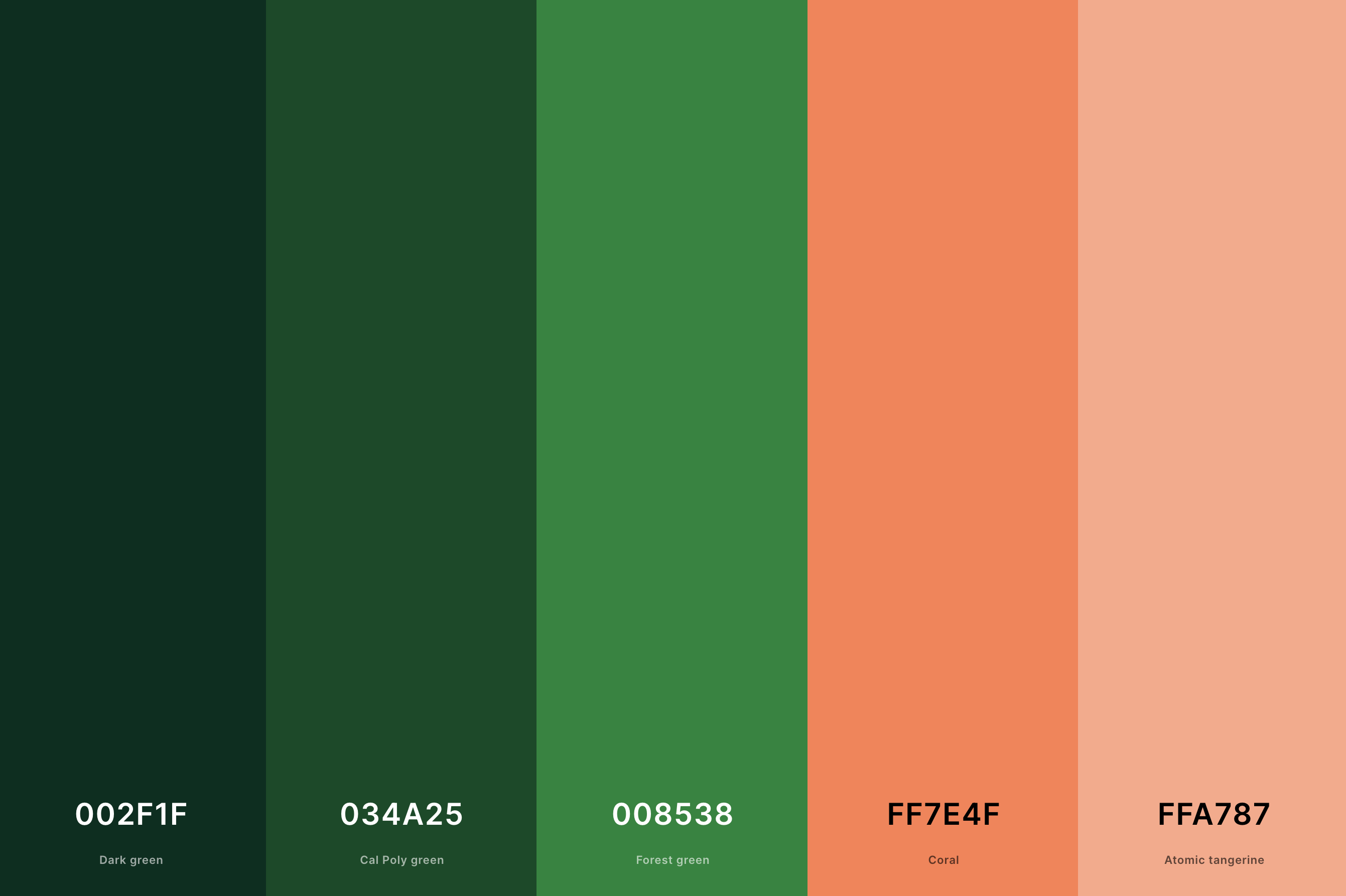
Hex Codes: #002F1F, #034A25, #008538, #FF7E4F, #FFA787
Deep, lush, and inviting, this palette draws inspiration from the natural world. Dark Green and Cal Poly Green offer a rich, verdant backdrop, evoking a feeling of a dense, enchanted forest.
Forest Green deepens the connection to nature, while Coral and Atomic Tangerine inject a burst of warmth and light, creating a palette that feels both grounded and invigorating.
24. Turquoise, Coral And Black Color Palette
Black + Caribbean Current + Turquoise + Peach + Pumpkin
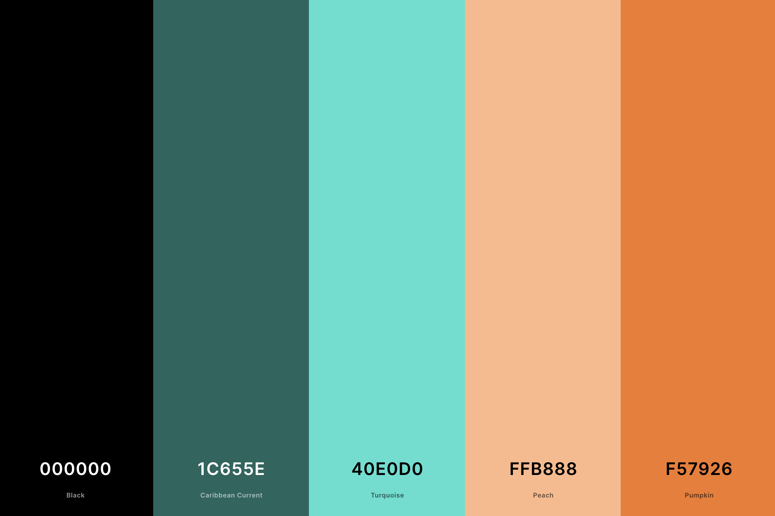
Hex Codes: #000000, #1C655E, #40E0D0, #FFB888, #F57926
This palette is striking and contemporary, with a hint of mystery. Black sets a bold, dramatic tone, while Caribbean Current and Turquoise add a refreshing, vibrant contrast.
Peach softens the look with its gentle warmth, and Pumpkin adds an earthy, grounding touch. Perfect for designs that aim to make a statement with a modern, edgy flair.
25. Coral And White Color Palette
Coquelicot + Coral + Melon + Seashell + Aquamarine
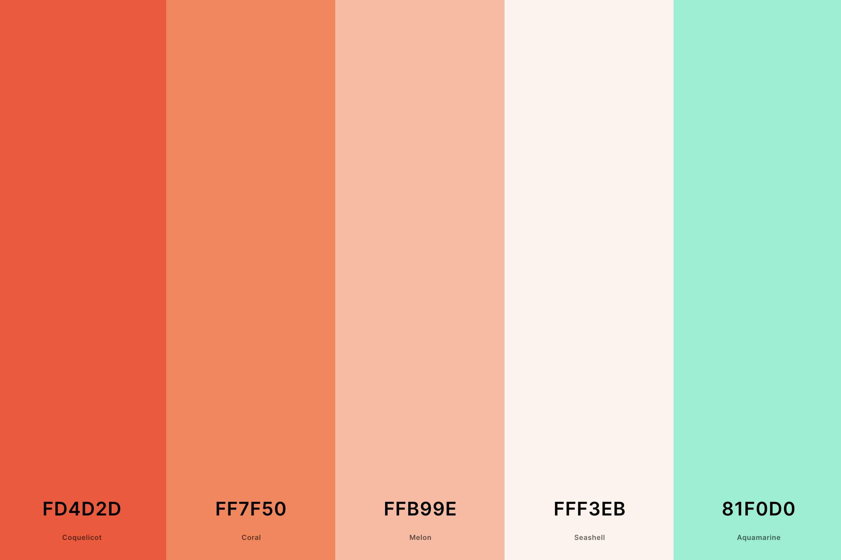
Hex Codes: #FD4D2D, #FF7F50, #FFB99E, #FFF3EB, #81F0D0
Pure, simple, and radiantly beautiful, this palette is a testament to elegance. Coquelicot and Coral provide a vibrant, heartwarming base, while Melon adds a softer, more delicate touch.
Seashell and Aquamarine lighten the overall feel, creating a palette that's airy, fresh, and perfect for designs seeking a blend of warmth and tranquility.
26. Coral Beach Color Palette
Tiffany Blue + Bone + Melon + Melon + Salmon
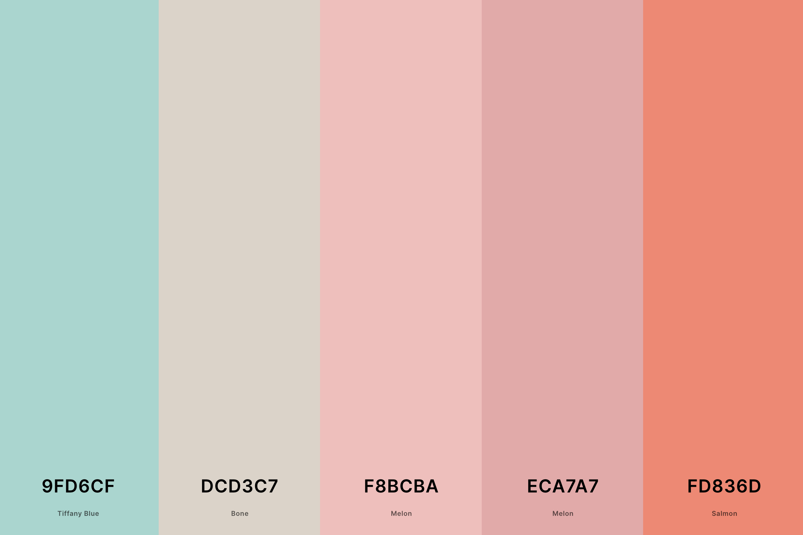
Hex Codes: #9FD6CF, #DCD3C7, #F8BCBA, #ECA7A7, #FD836D
Evoking the soft, sun-kissed sands and the gentle wash of waves, this palette is effortlessly serene. Tiffany Blue and Bone set a tranquil, breezy backdrop, while Melon adds a touch of sweet warmth.
The second shade of Melon deepens this warmth slightly, and Salmon brings it all together with its inviting glow, perfect for spaces that aim to capture the essence of a beachside retreat.
27. Coral Copper Color Palette
Chocolate Cosmos + Burnt Umber + Copper + Cocoa Brown + Coral
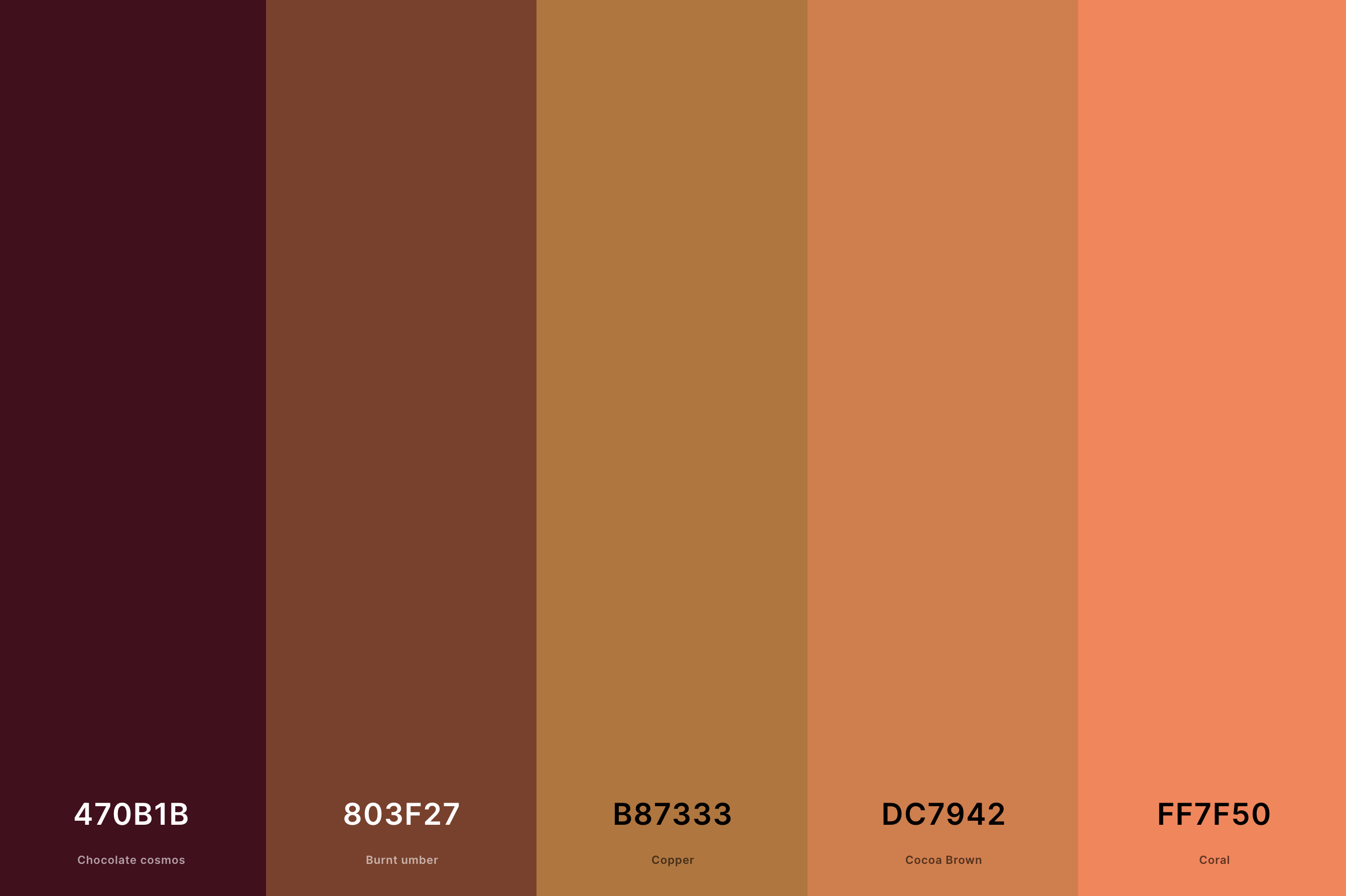
Hex Codes: #470B1B, #803F27, #B87333, #DC7942, #FF7F50
Rich, earthy, and wonderfully warm, this palette combines the rustic allure of copper with the vibrant energy of coral.
Chocolate Cosmos and Burnt Umber provide a deep, intense foundation, reminiscent of the earth's natural beauty.
Copper adds a metallic gleam, Cocoa Brown softens the mix, and Coral brightens the palette with its lively spirit, ideal for designs that celebrate the organic and the vibrant.
What is the Complimentary Color of Coral?
Ever find yourself wondering about the perfect match for the lively and cheerful coral in your color schemes? Well, let's chat about the magic of complementary colors. When it comes to coral, a shade that dances between pink and orange, its complementary buddy on the color wheel is none other than teal.
Picture this: the warm, sun-kissed vibes of coral paired with the cool, refreshing essence of teal. It's like a visual symphony, a blend of warmth and coolness that just sings together.
This duo is more than just a pretty pair; it's a dynamic contrast that can elevate any design, space, or wardrobe. Imagine a coral dress with teal accessories, or a living room with coral walls accented by teal decor. The combination is not only eye-catching but also creates a balance that's both inviting and stylish.
So next time you're playing with colors, remember the charming dance between coral and teal. It's a match made in color heaven, ready to spruce up your creative projects with a splash of harmony and style!
What Colors Go With Coral?
Coral is that playful, spirited shade that sits somewhere between the warmth of pink and the zest of orange, bringing a pop of joy wherever it goes. Now, when it comes to pairing colors with coral, think of a palette that's as versatile as your favorite pair of jeans.
First up, we have the classic whites and creams, offering a clean, crisp backdrop that lets coral take center stage. Then, there's the cool and calming navy blue or deep indigo, providing a sophisticated contrast that's as chic as it is timeless.
For a more earthy, grounded vibe, shades of grey or soft taupe can add a touch of elegance and subtlety to the mix.
But wait, there's more! For those who love a bit of adventure in their color stories, mint green or turquoise can join the party, creating a fresh, invigorating look that's reminiscent of tropical waters. And let's not forget about metallics – gold and copper accents with coral? Absolutely divine.
So, whether you're jazzing up your wardrobe, giving your living space a makeover, or designing your next big project, remember that coral plays well with a wide spectrum of colors, offering endless possibilities to express your creative flair. Let's get playful with coral and its fabulous friends!
