This post may contain affiliate links. If you click one, we may earn a commission at no cost to you. Here's more details on how we make money.
Hey color lovers! If you're anything like us, you know that finding the perfect color palette can be both an adventure and a challenge. Today, we're super excited to share with you our latest obsession: the best neutral color palettes.
Now, don't let the word "neutral" fool you – these aren't your average, run-of-the-mill shades. We're talking about a collection of colors that bring a room to life in the most understated yet impactful way.
From the warm embrace of earthy tones to the refined elegance of soft pastels, these palettes are all about creating a sense of balance and harmony in your space. Think of them as the foundation of your design, the canvas upon which you can paint your personal style.
Whether you're looking to spruce up your living room, give your wardrobe a chic update, or find that perfect shade for a peaceful bedroom retreat, these neutral palettes are here to inspire.
So, grab your favorite cup of coffee, get cozy, and let's explore these amazing neutral color combinations that are sure to transform any space into a stylish haven! 🎨✨
1. Neutral Color Palette
Khaki + Almond + Isabelline + Charcoal + Desert Sand
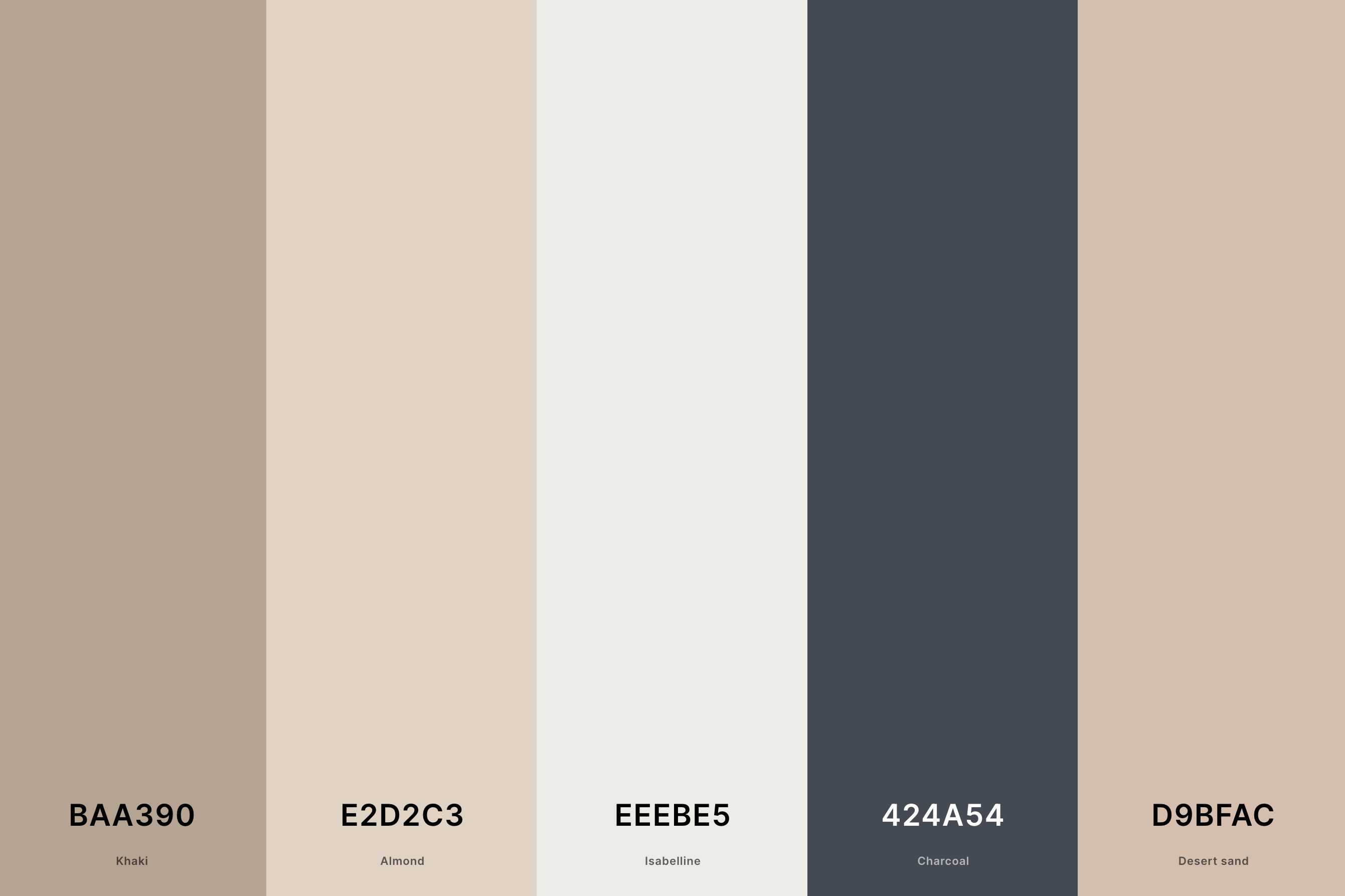
Hex Codes: #BAA390, #E2D2C3, #EEEBE5, #424A54, #D9BFAC
This palette skillfully combines earthy tones with a sophisticated charcoal accent. Khaki and Almond provide a warm, comforting base, while Isabelline lightens the mood, offering a soft contrast.
The inclusion of Charcoal adds a touch of elegance, perfect for creating a balanced, inviting atmosphere. Desert Sand ties it all together, bridging the gap between the lighter and darker shades, making it ideal for a variety of design applications.
2. Warm Neutral Color Palette
Light Orange + Apricot + Coral Pink + Old Rose + Rose Taupe
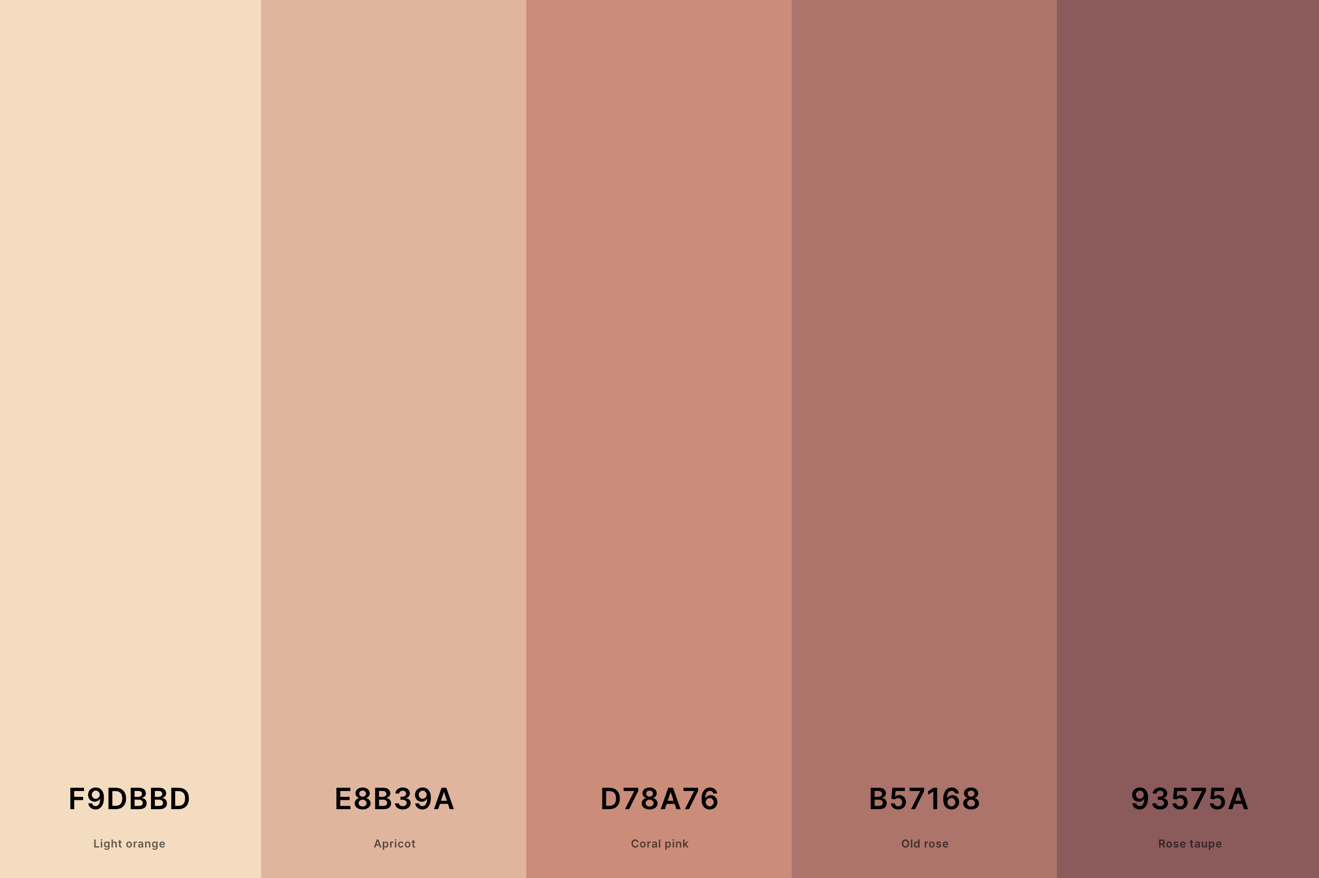
Hex Codes: #F9DBBD, #E8B39A, #D78A76, #B57168, #93575A
This palette exudes warmth and comfort, making it perfect for creating inviting spaces. Light Orange and Apricot bring a gentle, soothing warmth, while Coral Pink adds a subtle vibrancy.
Old Rose provides a deeper, more grounded feel, and Rose Taupe rounds out the palette with its earthy depth, creating a harmonious blend of warm tones. This palette is particularly suited for cozy, intimate environments.
3. Neutral Brown Color Palette
Café Noir + Coffee + Beaver + Khaki + Champagne Pink
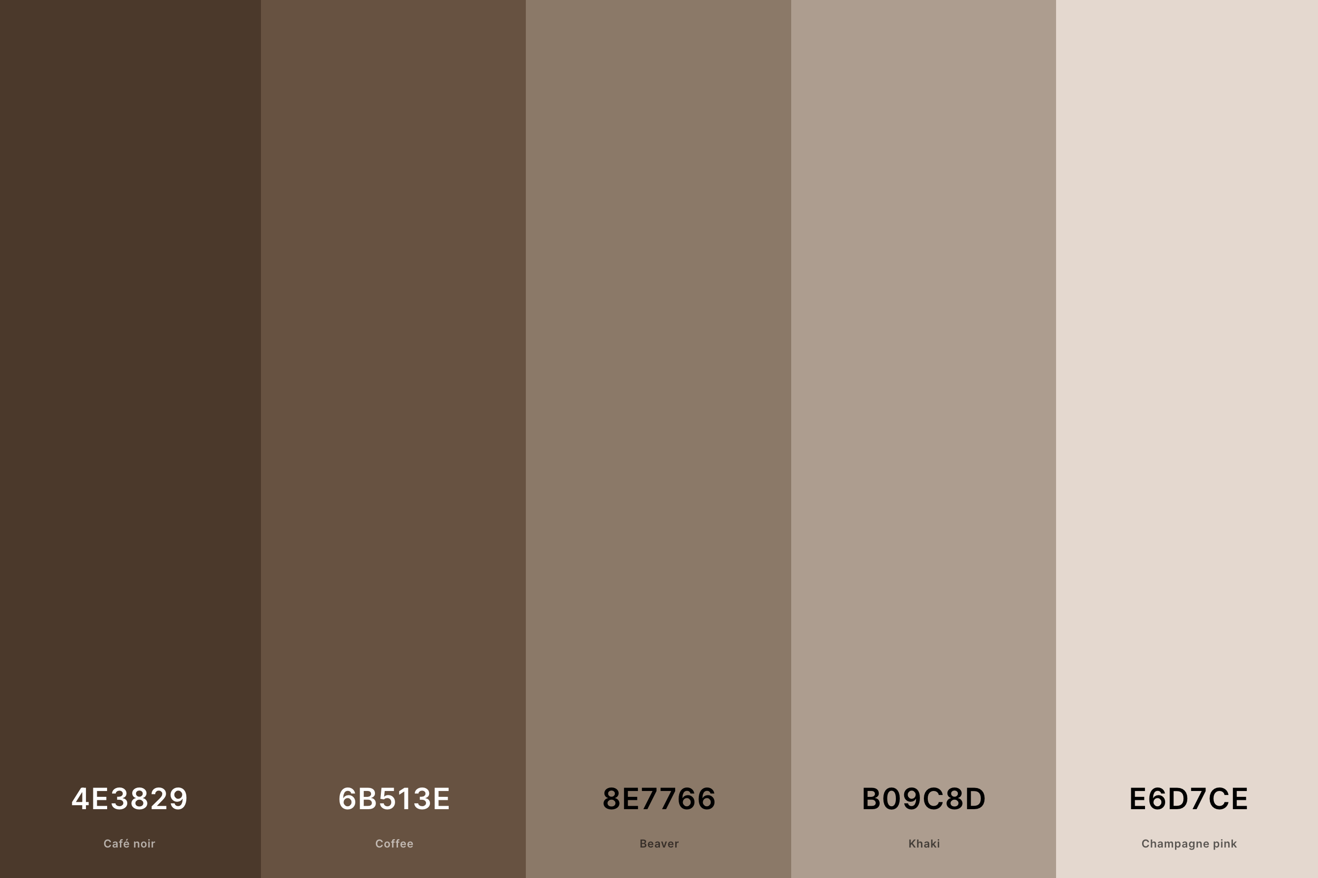
Hex Codes: #4E3829, #6B513E, #8E7766, #B09C8D, #E6D7CE
This palette offers a rich range of brown tones, from the deep, dark Café Noir to the light and delicate Champagne Pink. Coffee and Beaver sit comfortably in the middle, providing a solid, earthy foundation.
Khaki lightens the mood slightly, offering versatility. The overall effect is one of stability and warmth, with a touch of elegance from the lighter Champagne Pink, making it suitable for both sophisticated and casual settings.
4. Modern Neutral Color Palette
Dim Gray + French Gray + Cambridge Blue + Desert Sand + Pale Dogwood
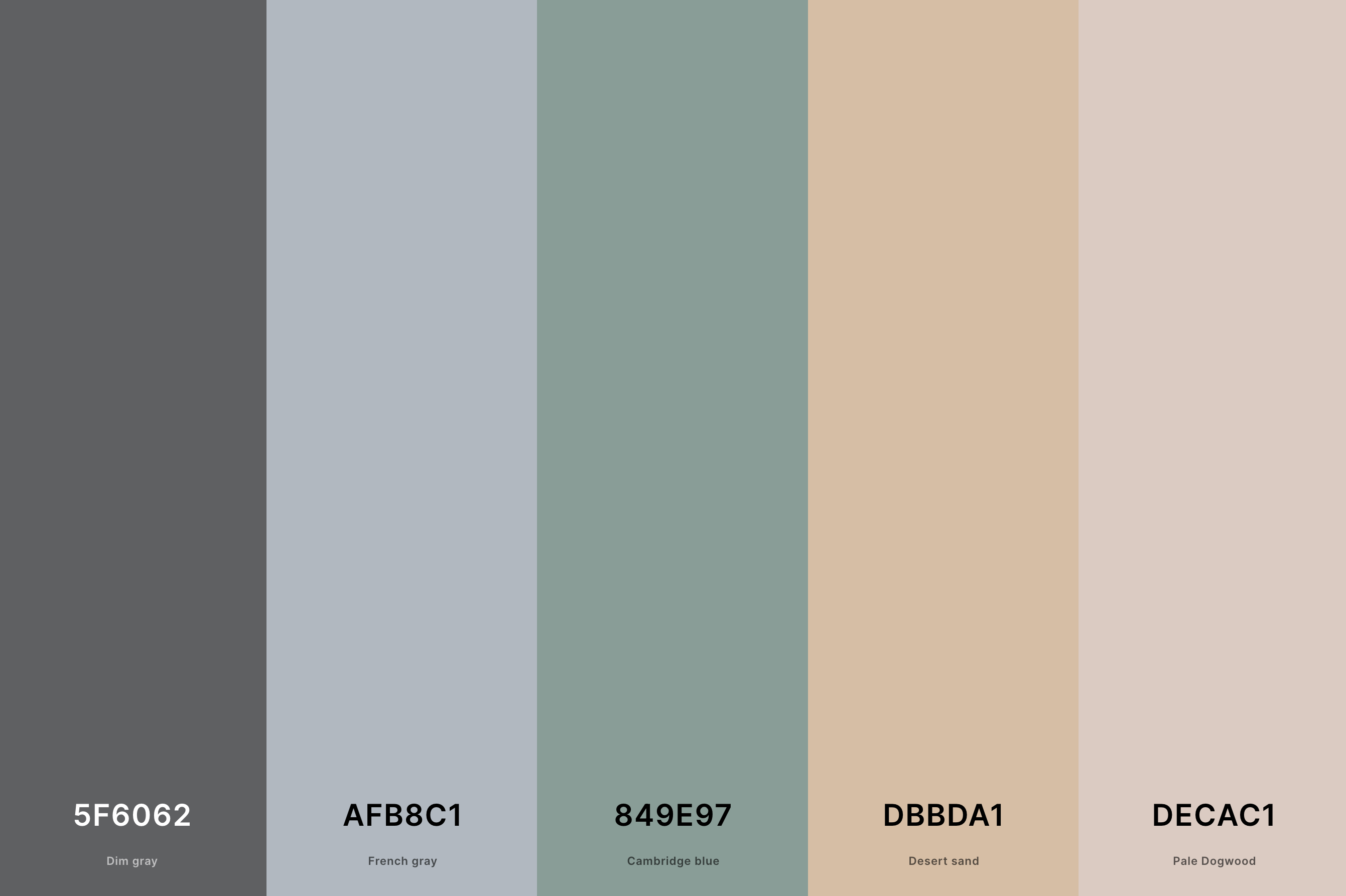
Hex Codes: #5F6062, #AFB8C1, #849E97, #DBBDA1, #DECAC1
This palette is the epitome of modern sophistication. Dim Gray and French Gray provide a sleek, contemporary base, while Cambridge Blue adds a unique, subtle pop of color.
Desert Sand and Pale Dogwood soften the overall look, ensuring the palette remains approachable and versatile. It's an ideal choice for modern interiors, providing a chic yet warm atmosphere.
5. Neutral Pastel Color Palette
Cadet Gray + Thistle + Platinum + Ash Gray + Slate Gray
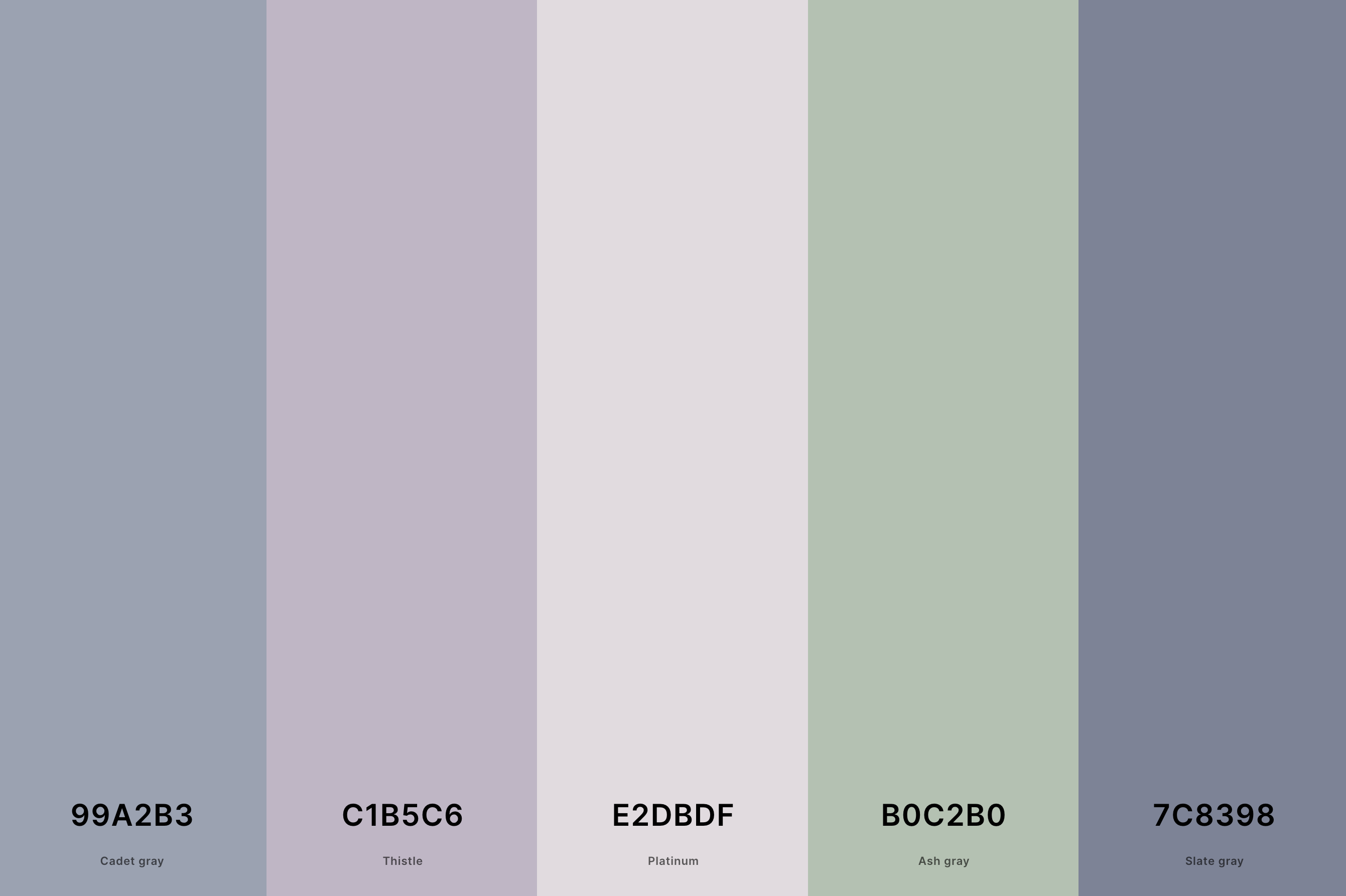
Hex Codes: #99A2B3, #C1B5C6, #E2DBDF, #B0C2B0, #7C8398
This palette is a beautiful blend of muted pastels, creating a tranquil and elegant atmosphere. Cadet Gray and Ash Gray offer a solid, neutral base, while Thistle and Platinum introduce a delicate, subtle color.
Slate Gray anchors the palette, adding depth and sophistication. It's perfect for spaces where a peaceful, refined aesthetic is desired.
6. Neutral Skin Tone Color Palette
Brown Sugar + Persian Orange + Desert Sand + Pale Dogwood + Pale Dogwood
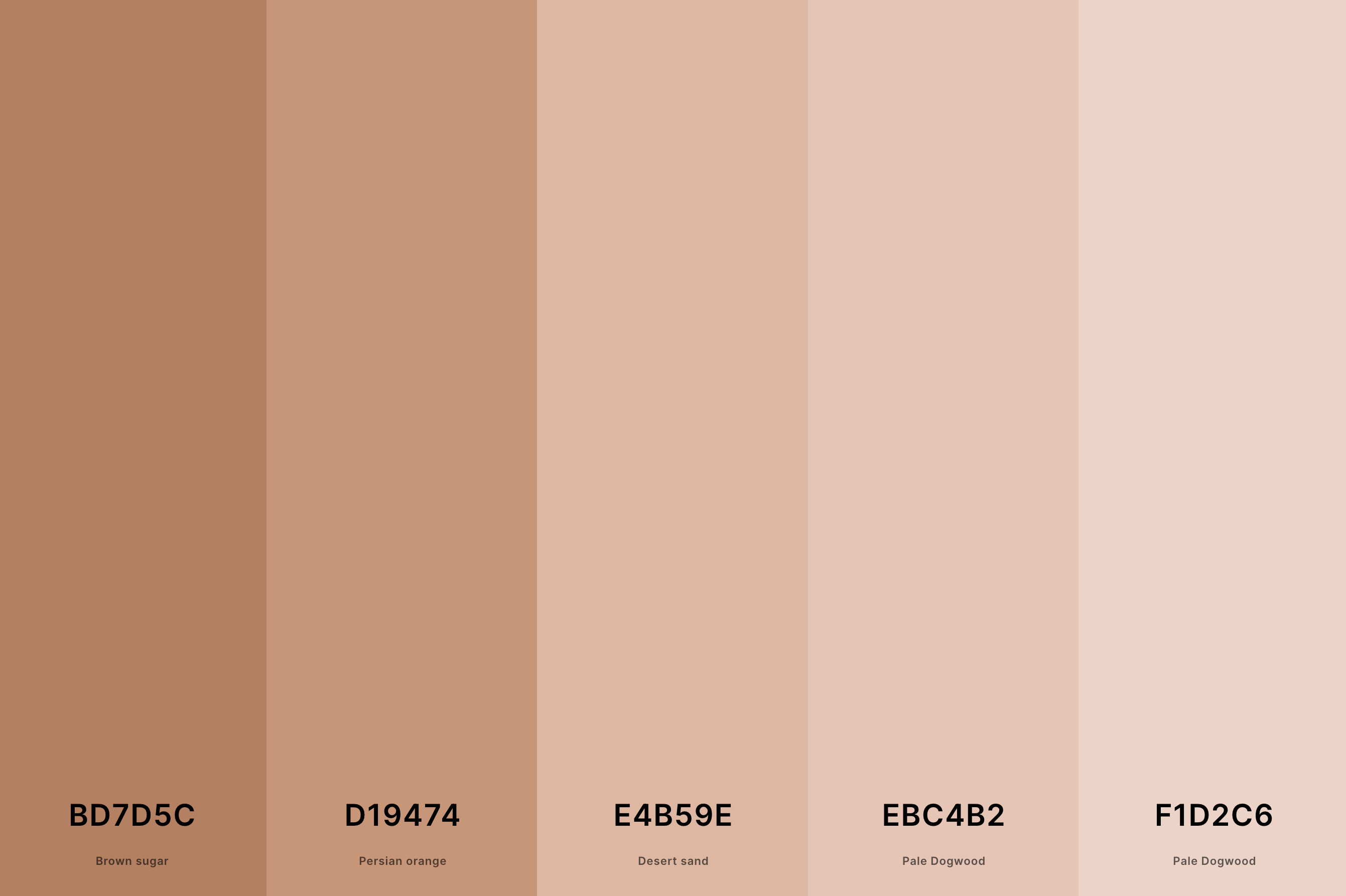
Hex Codes: #BD7D5C, #D19474, #E4B59E, #EBC4B2, #F1D2C6
This palette mirrors the diverse and natural beauty of skin tones, blending warmth and subtlety. Brown Sugar and Persian Orange offer rich, warm shades reminiscent of a sun-kissed glow.
Desert Sand provides a soft, neutral base, while the repeated Pale Dogwood adds a delicate, creamy touch. This combination creates a harmonious, organic feel, ideal for fashion, cosmetics, and inclusive design projects.
7. Beige Neutral Color Palette
Eggshell + Almond + Desert Sand + Buff + Chamoisee
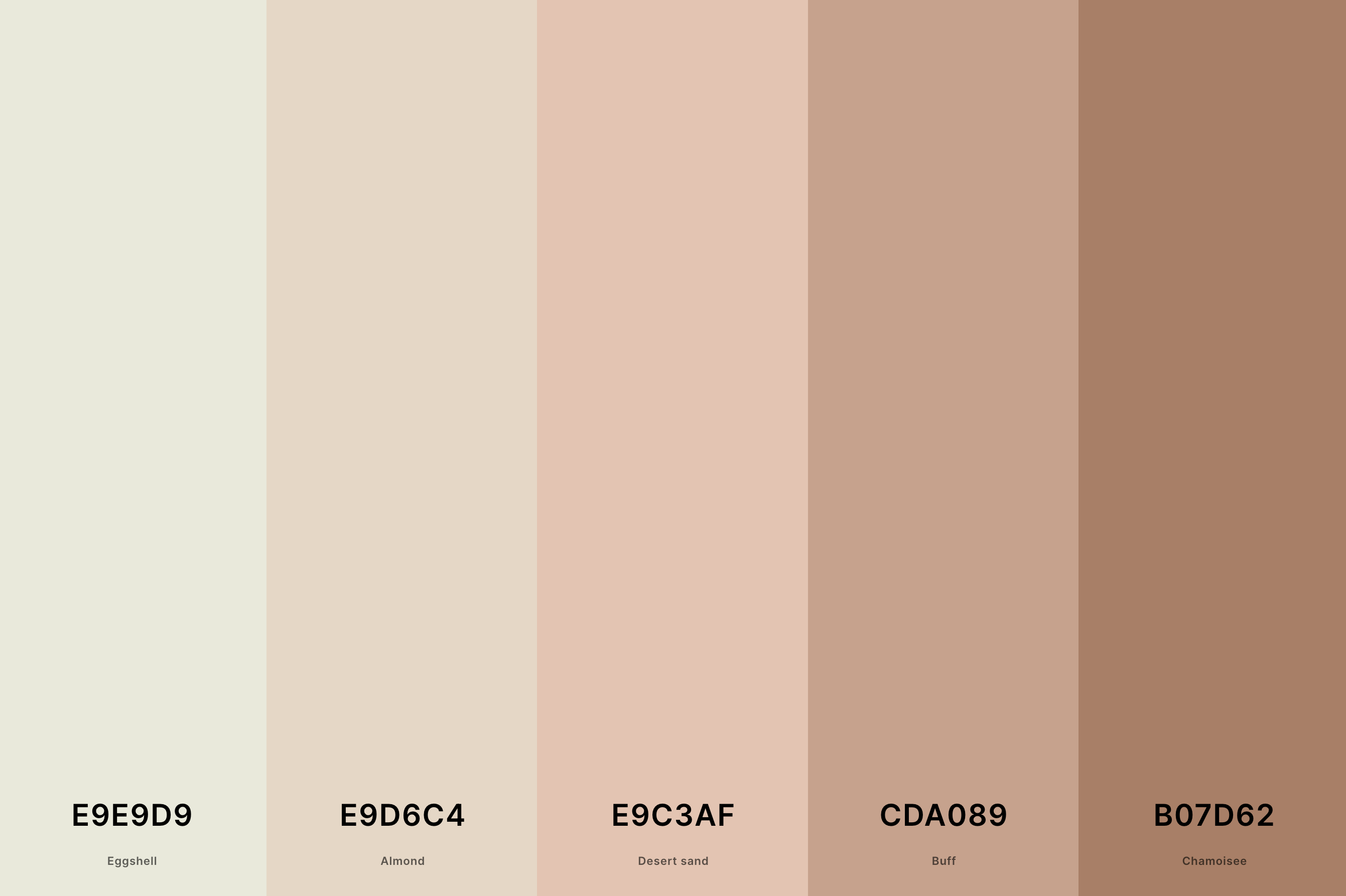
Hex Codes: #E9E9D9, #E9D6C4, #E9C3AF, #CDA089, #B07D62
This palette brings together various beige shades, evoking a sense of calm and elegance. Eggshell's lightness pairs well with the deeper, earthy tones of Almond and Buff.
Desert Sand bridges these shades with its gentle warmth, while Chamoisee adds depth and richness. This palette is a classic choice for interior designs that aim for a timeless, sophisticated, yet comforting atmosphere.
8. Neutral Winter Color Palette
Russian Violet + Charcoal + Taupe Gray + Silver + Platinum
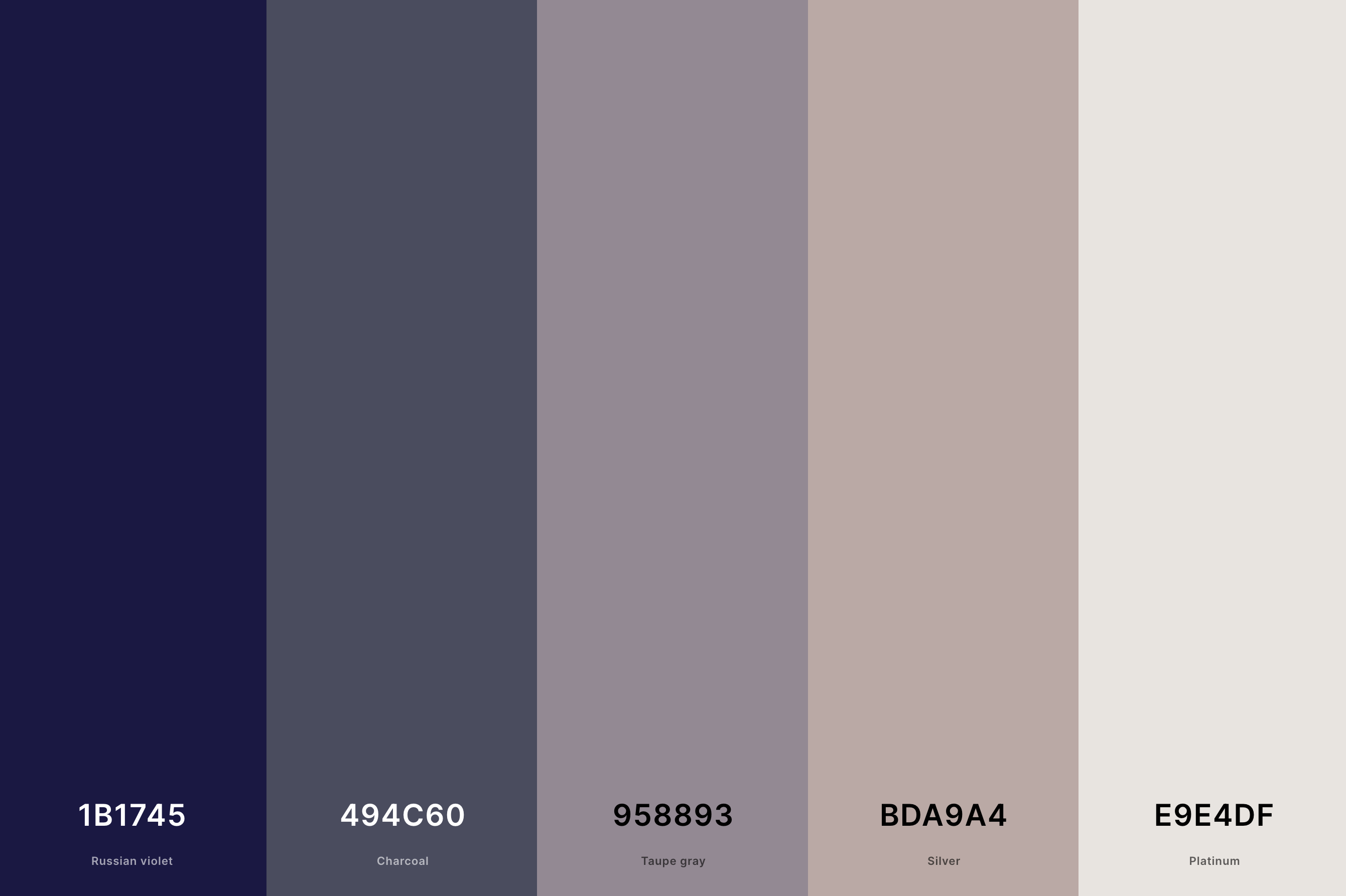
Hex Codes: #1B1745, #494C60, #958893, #BDA9A4, #E9E4DF
This palette captures the essence of winter with its cool, muted tones. Russian Violet and Charcoal provide depth and mystery, reminiscent of a winter night. Taupe Gray and Silver add a touch of softness and light, like freshly fallen snow under moonlight.
Platinum offers a subtle shimmer, bringing a hint of winter's magic. It's an ideal palette for creating a cozy yet elegant winter-themed space or design.
9. Neutral Green Color Palette
Bone + Dun + Sage + Reseda Green + Ebony
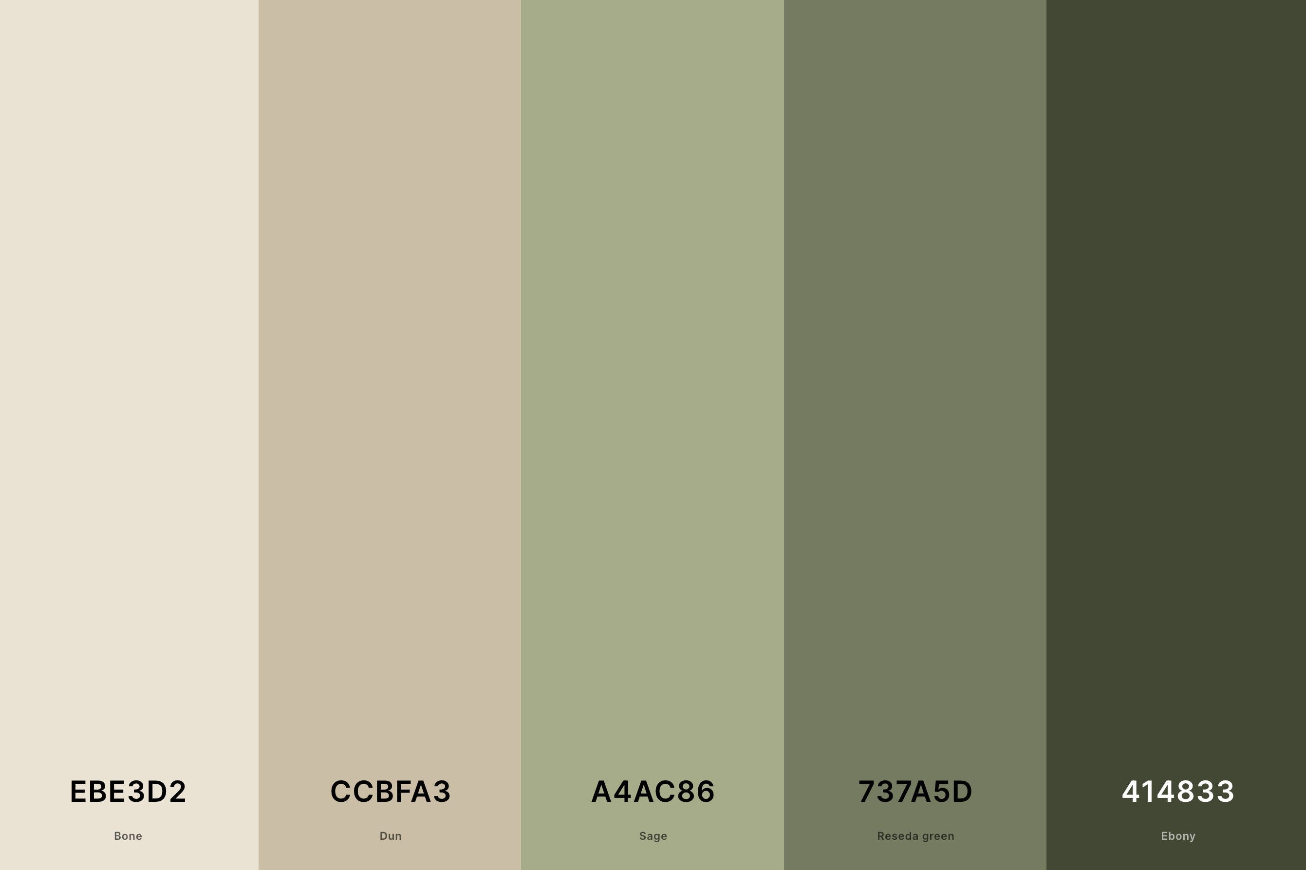
Hex Codes: #EBE3D2, #CCBFA3, #A4AC86, #737A5D, #414833
This palette is a tribute to nature's understated beauty, featuring earthy greens and neutrals. Bone and Dun offer a soft, neutral canvas, while Sage and Reseda Green bring in the calming, grounding elements of the forest.
Ebony adds a necessary contrast, reminiscent of the deep, rich soil. It's perfect for spaces and designs that aim to bring a touch of the outdoors inside, fostering a sense of tranquility and connection to nature.
10. Neutral Wedding Color Palette
Space Cadet + Cadet Gray + Isabelline + Pale Dogwood + Fairy Tale
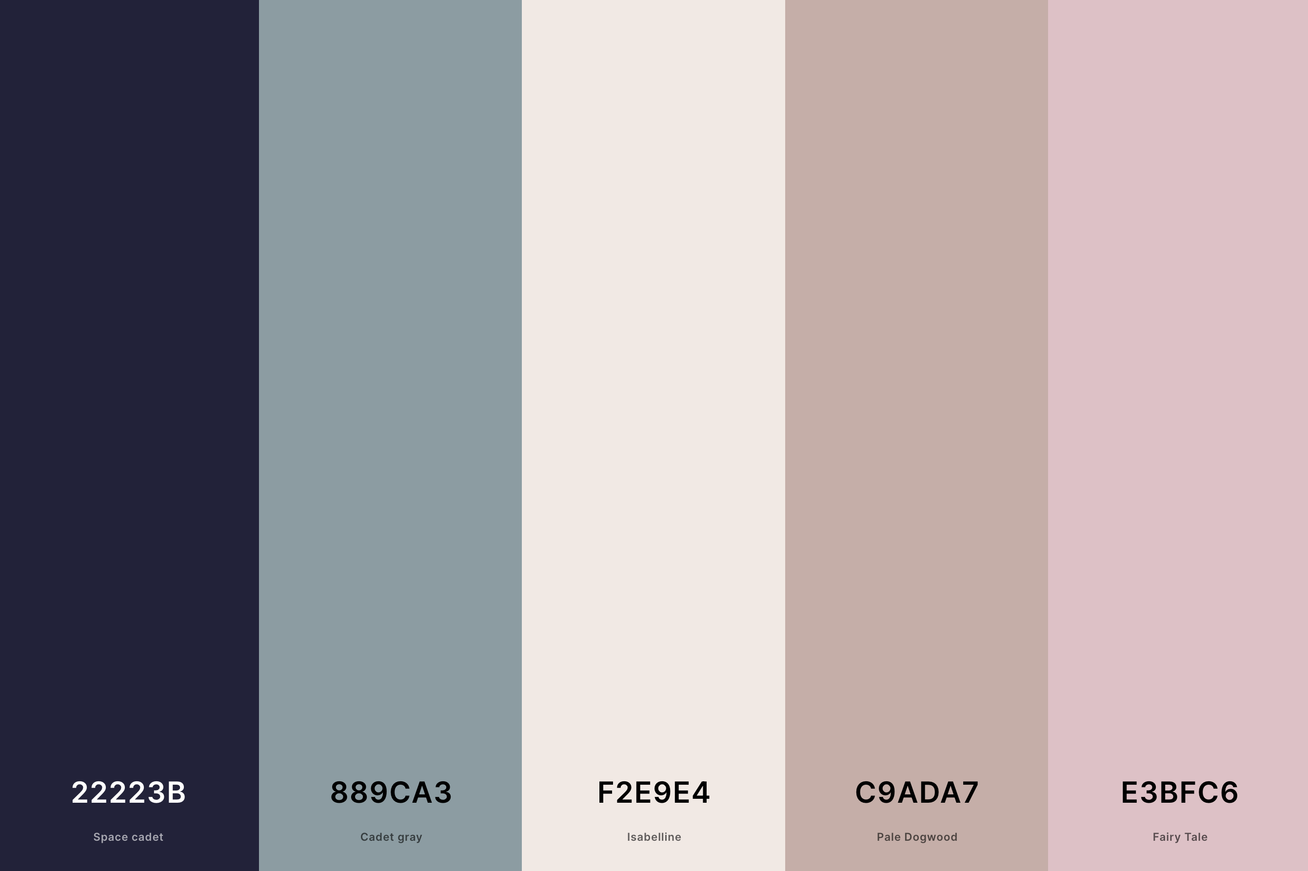
Hex Codes: #22223B, #889CA3, #F2E9E4, #C9ADA7, #E3BFC6
Elegant and timeless, this palette is ideal for a romantic, sophisticated wedding theme. Space Cadet provides a deep, luxurious foundation, contrasted beautifully by the softness of Cadet Gray and Isabelline.
Pale Dogwood adds a touch of gentle warmth, while Fairy Tale introduces a dreamy, whimsical quality. Together, these colors create a balanced, enchanting atmosphere, perfect for a memorable, stylish wedding.
11. Cool Neutral Color Palette
Federal Blue + Cadet Gray + Seasalt + Gray + Jet
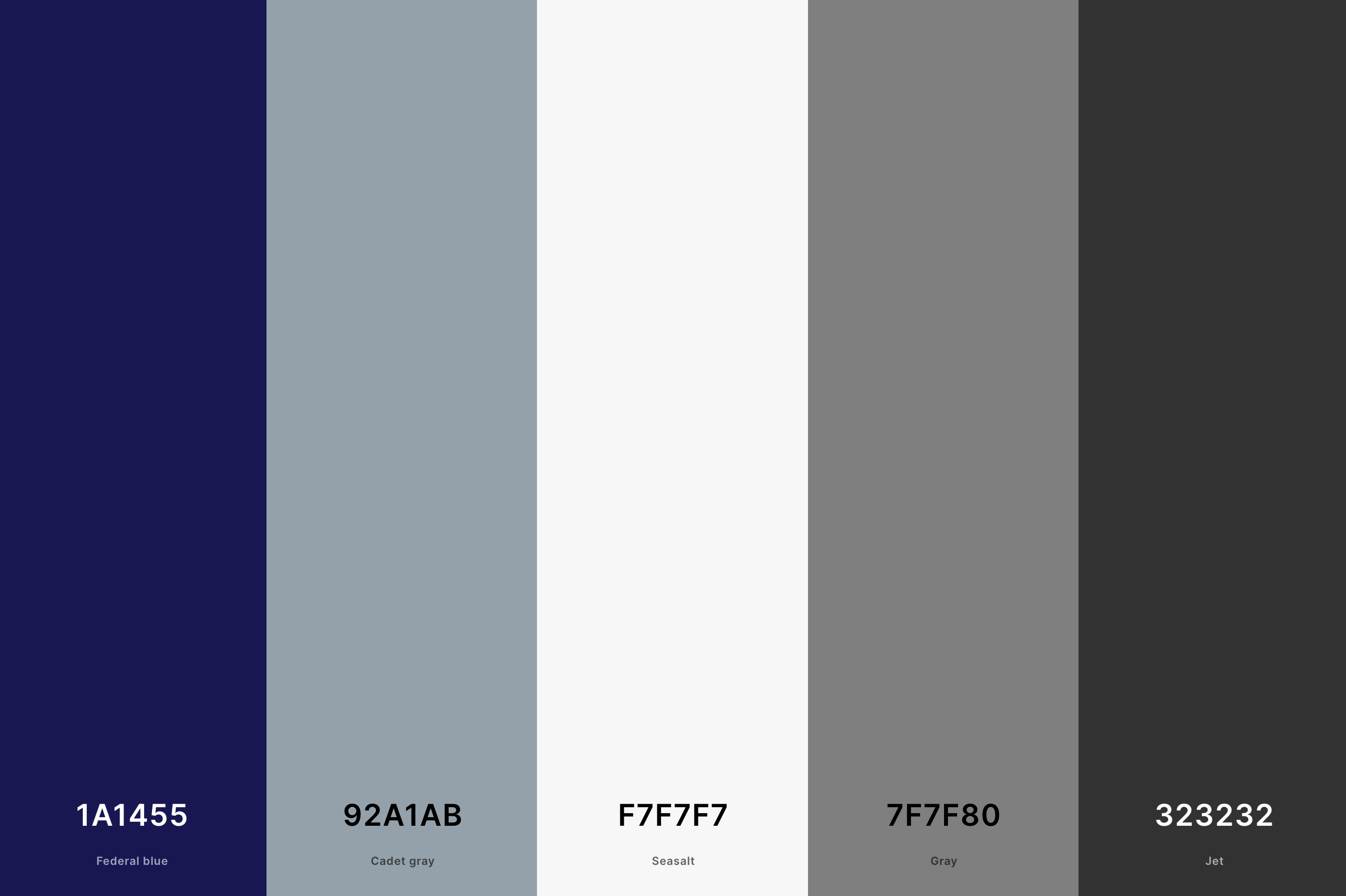
Hex Codes: #1A1455, #92A1AB, #F7F7F7, #7F7F80, #323232
This palette embodies a cool, sophisticated air, perfect for modern designs. Federal Blue stands out as a deep, engaging color, complemented by the lighter, softer Cadet Gray.
Seasalt adds a crisp, clean element, while Gray provides a versatile, balanced medium shade. Jet anchors the palette with its strong, definitive presence. Ideal for sleek, contemporary spaces, this palette creates a fresh, dynamic atmosphere.
12. Dark Neutral Color Palette
Silver + Dark Purple + Dark Green + Black Olive + Night
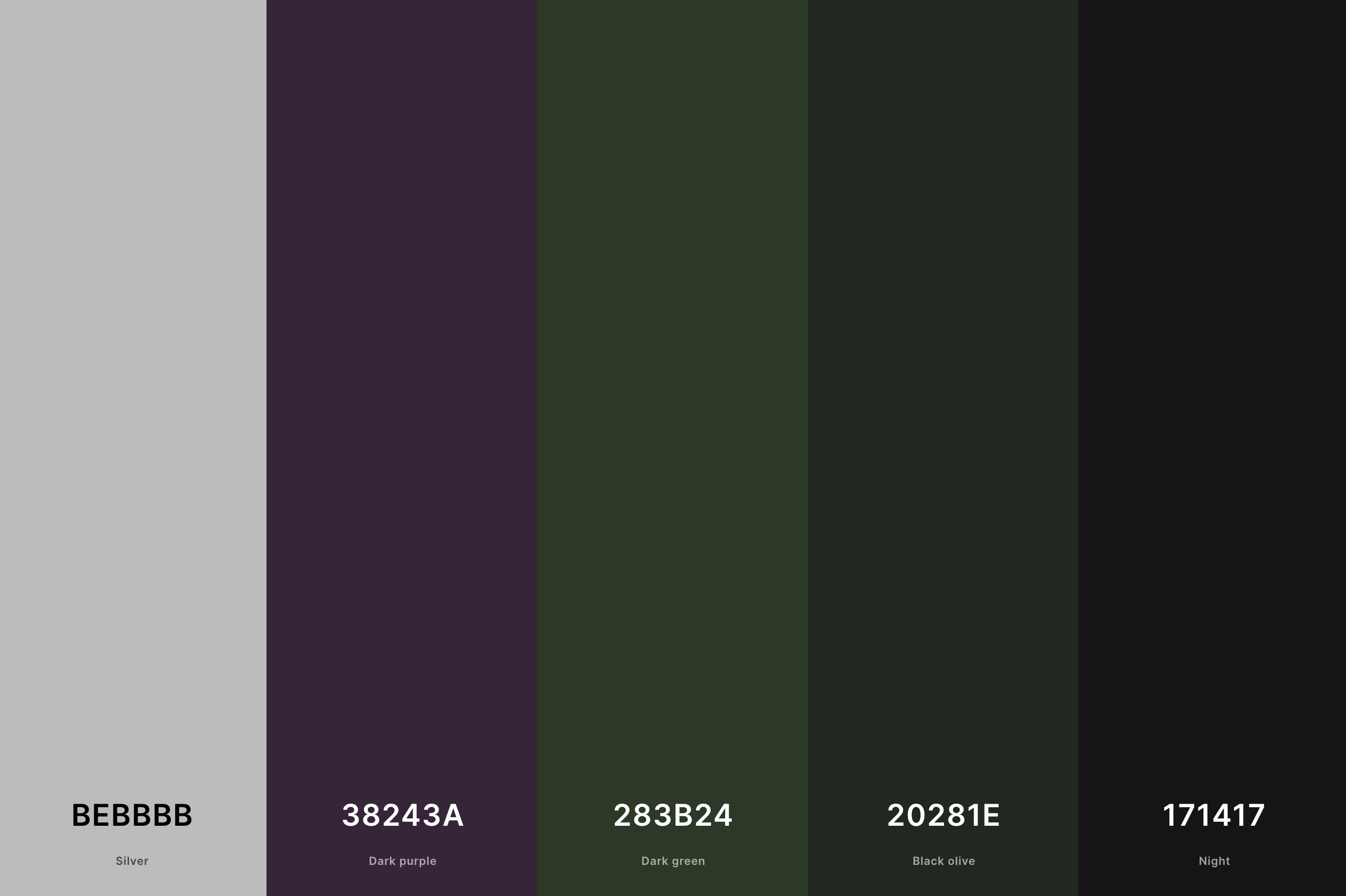
Hex Codes: #BEBBBB, #38243A, #283B24, #20281E, #171417
Embodying depth and intensity, this palette is rich with powerful tones. Silver offers a contrasting lightness, bringing balance to the darker shades.
Dark Purple and Dark Green add a mysterious, organic depth, reminiscent of a dense forest at twilight.
Black Olive and Night deepen the overall feel, perfect for creating a dramatic, yet sophisticated ambiance. Ideal for bold, statement interiors or designs where a strong impact is desired.
13. Muted Neutral Color Palette
Space Cadet + Davy'S Gray + Taupe Gray + Silver + Isabelline
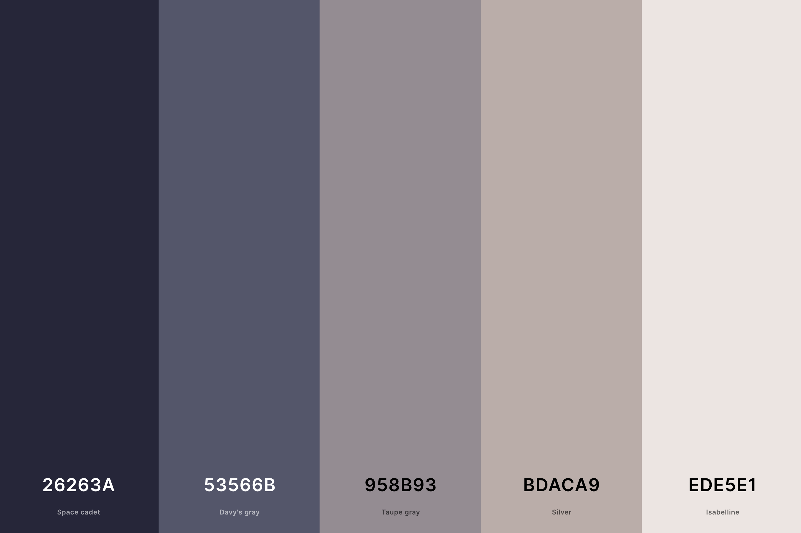
Hex Codes: #26263A, #53566B, #958B93, #BDACA9, #EDE5E1
This palette is a study in subtlety and sophistication. Space Cadet and Davy's Gray provide a muted, understated base, while Taupe Gray bridges these darker tones with its softer presence.
Silver and Isabelline lighten the overall mood, adding a gentle luminosity. The resulting combination is both elegant and approachable, ideal for creating a refined, tranquil environment.
14. Neutral Boho Color Palette
Battleship Gray + Chamoisee + Melon + Rosy Brown + Payne'S Gray
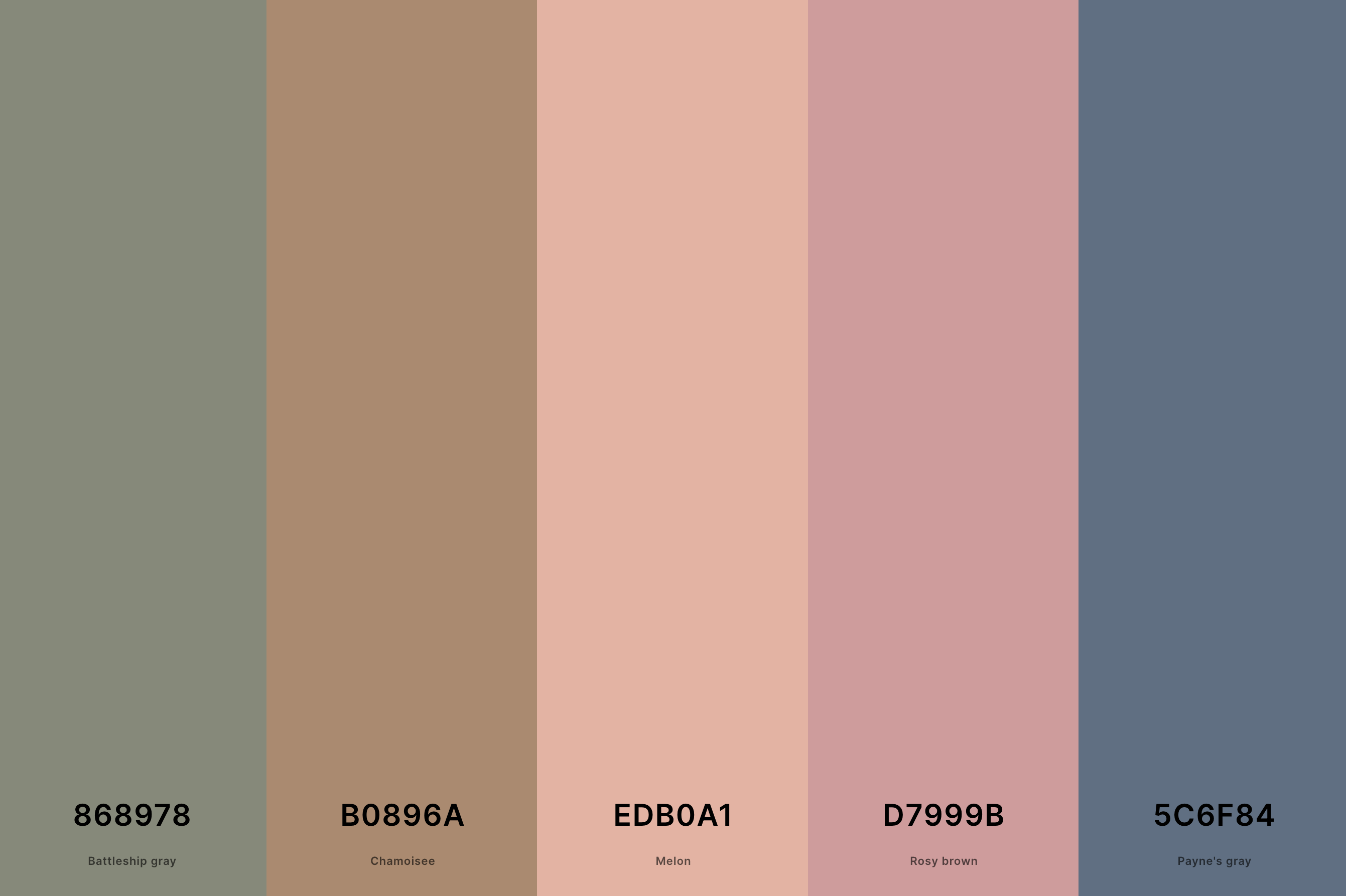
Hex Codes: #868978, #B0896A, #EDB0A1, #D7999B, #5C6F84
This palette offers a bohemian twist on neutral tones. Battleship Gray and Payne's Gray provide a cool, grounded base, contrasted by the warm, earthy Chamoisee and Rosy Brown.
Melon adds a subtle, playful pop of color, infusing the palette with a touch of whimsy. This eclectic mix is perfect for spaces that embrace a bohemian, free-spirited aesthetic, offering both warmth and coolness.
15. Neutral Clothing Color Palette
Russian Violet + Pale Dogwood + Tan + Khaki + Café Noir
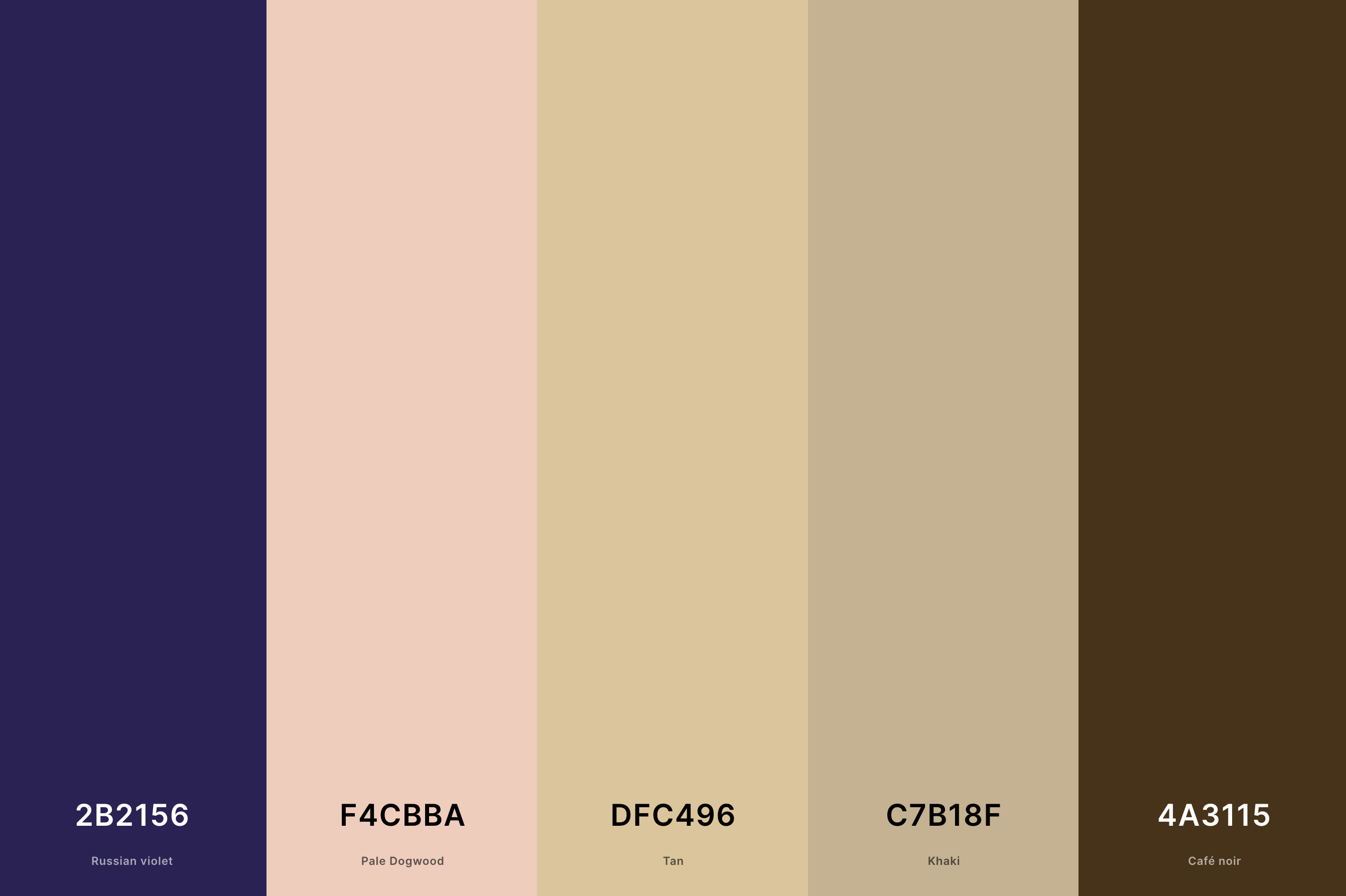
Hex Codes: #2B2156, #F4CBBA, #DFC496, #C7B18F, #4A3115
Fashion-forward and versatile, this palette combines deep Russian Violet with the softness of Pale Dogwood. Tan and Khaki offer neutral, wearable tones, suitable for a variety of clothing styles.
Café Noir adds a touch of classic elegance. This palette is ideal for a wardrobe that balances bold statements with timeless sophistication, suitable for every occasion.
16. Neutral Interior Design Color Palette
Ecru + Wenge + Jet + Khaki + Platinum
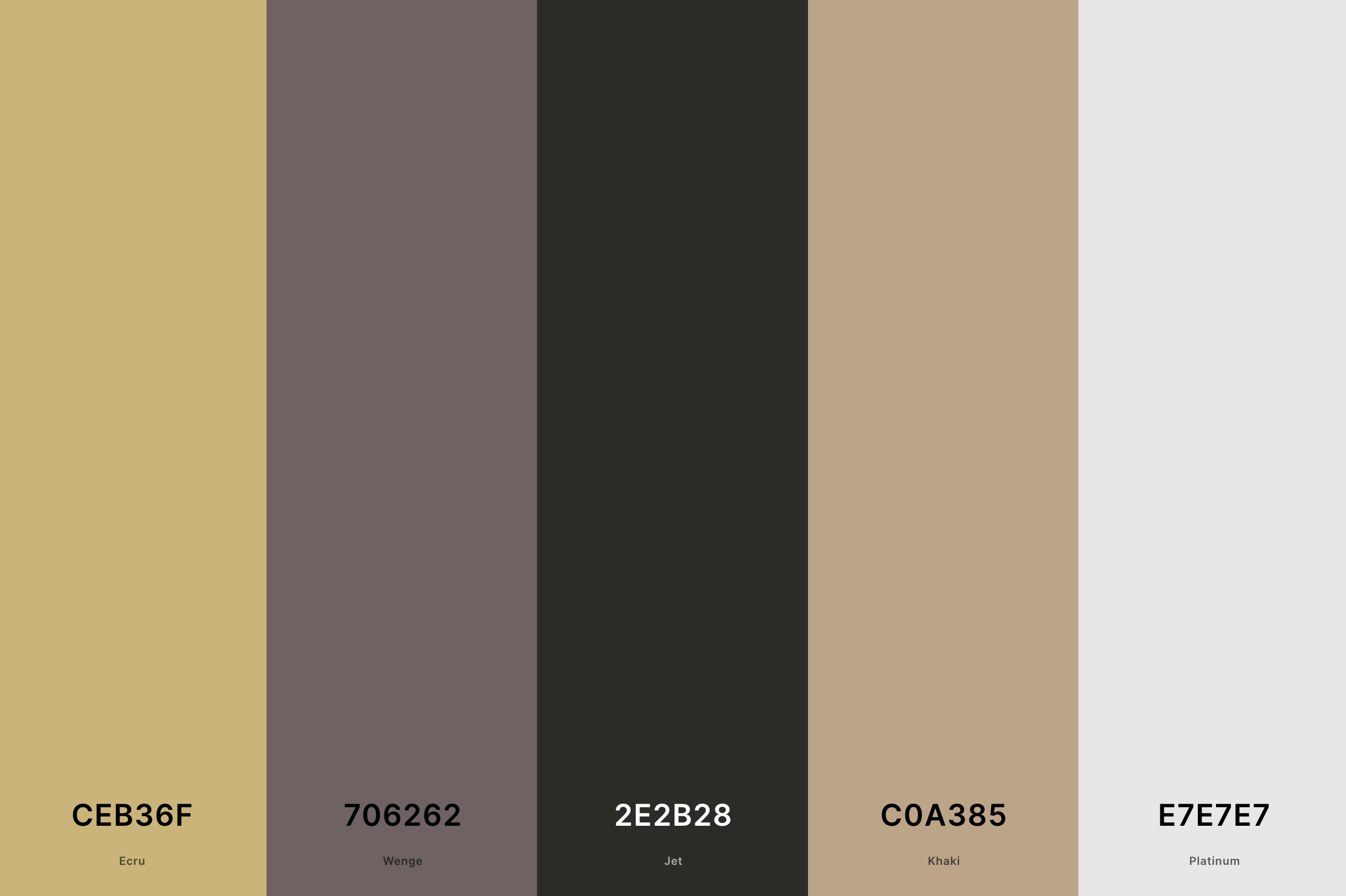
Hex Codes: #CEB36F, #706262, #2E2B28, #C0A385, #E7E7E7
This palette is an excellent choice for contemporary interior design. Ecru offers a warm, inviting base, complemented by the deeper, earthier Wenge. Jet adds a bold, striking contrast, making the space more dynamic.
Khaki provides a balance between the light and dark shades, while Platinum introduces a touch of sophistication and shine. This palette is versatile, suitable for a range of interior styles from minimalist to eclectic.
17. Neutral Pink Color Palette
Brown Sugar + Coral Pink + Melon + Pale Dogwood + Seashell
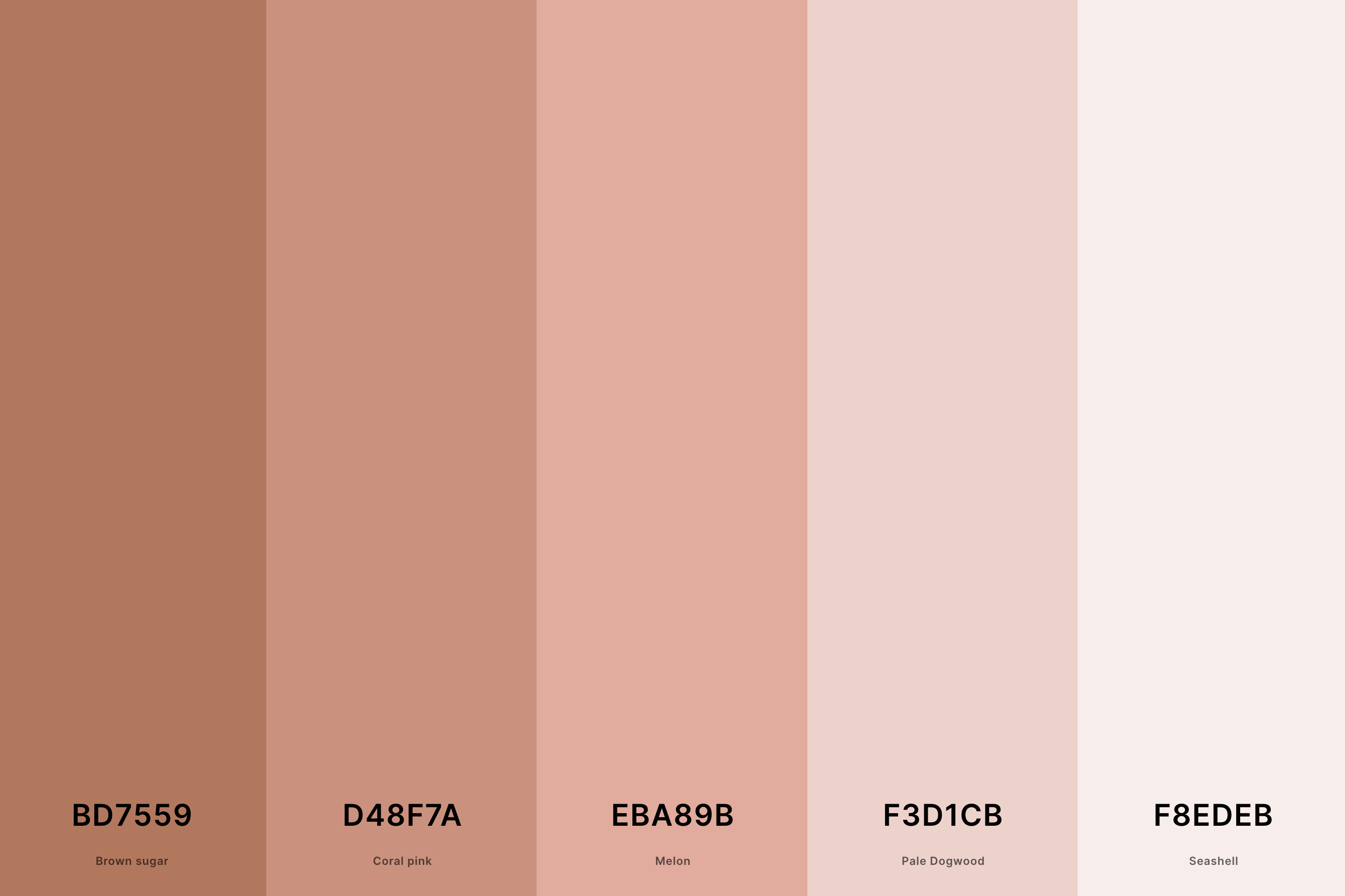
Hex Codes: #BD7559, #D48F7A, #EBA89B, #F3D1CB, #F8EDEB
This palette is soft and romantic, ideal for creating a gentle, inviting atmosphere. Brown Sugar and Coral Pink bring warmth and a hint of playfulness, while Melon adds a slightly bolder touch.
Pale Dogwood and Seashell soften the overall look, making the palette light and airy. This combination is perfect for spaces that aim to be soothing and nurturing, such as bedrooms or wellness spaces.
18. Neutral Spring Color Palette
Hunyadi Yellow + Linen + Tea Rose (Red) + Cambridge Blue + Slate Gray
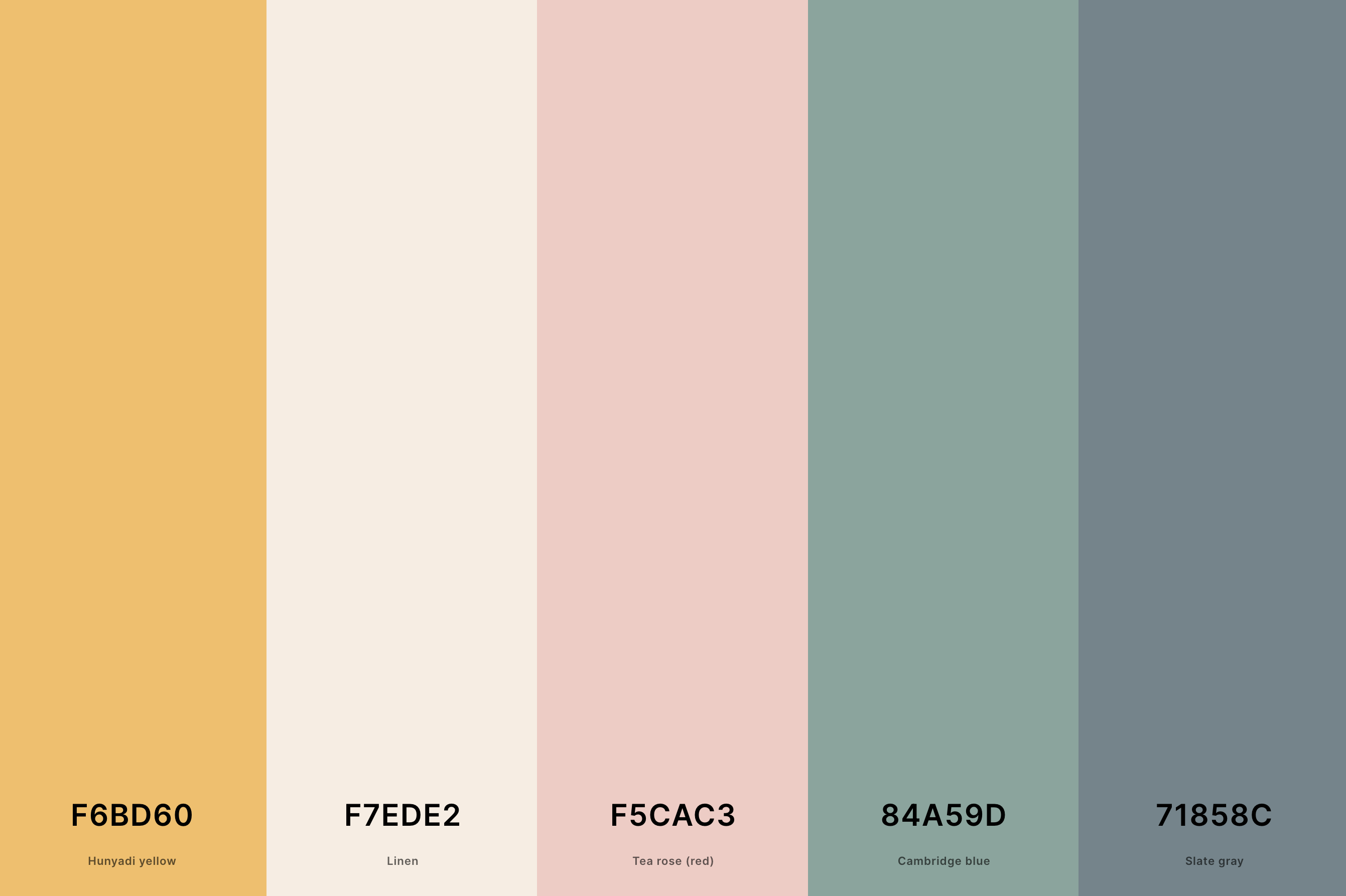
Hex Codes: #F6BD60, #F7EDE2, #F5CAC3, #84A59D, #71858C
Reflecting the freshness of spring, this palette combines the vibrant Hunyadi Yellow with the calmness of Linen. Tea Rose (Red) adds a soft, floral touch, reminiscent of spring blooms, while Cambridge Blue brings a cool, serene element.
Slate Gray provides a grounding contrast, ensuring the palette remains balanced. Ideal for seasonal designs and spaces that wish to capture the essence of spring.
19. Neutral Summer Color Palette
Federal Blue + Charcoal + Rose Quartz + Silver + Alabaster
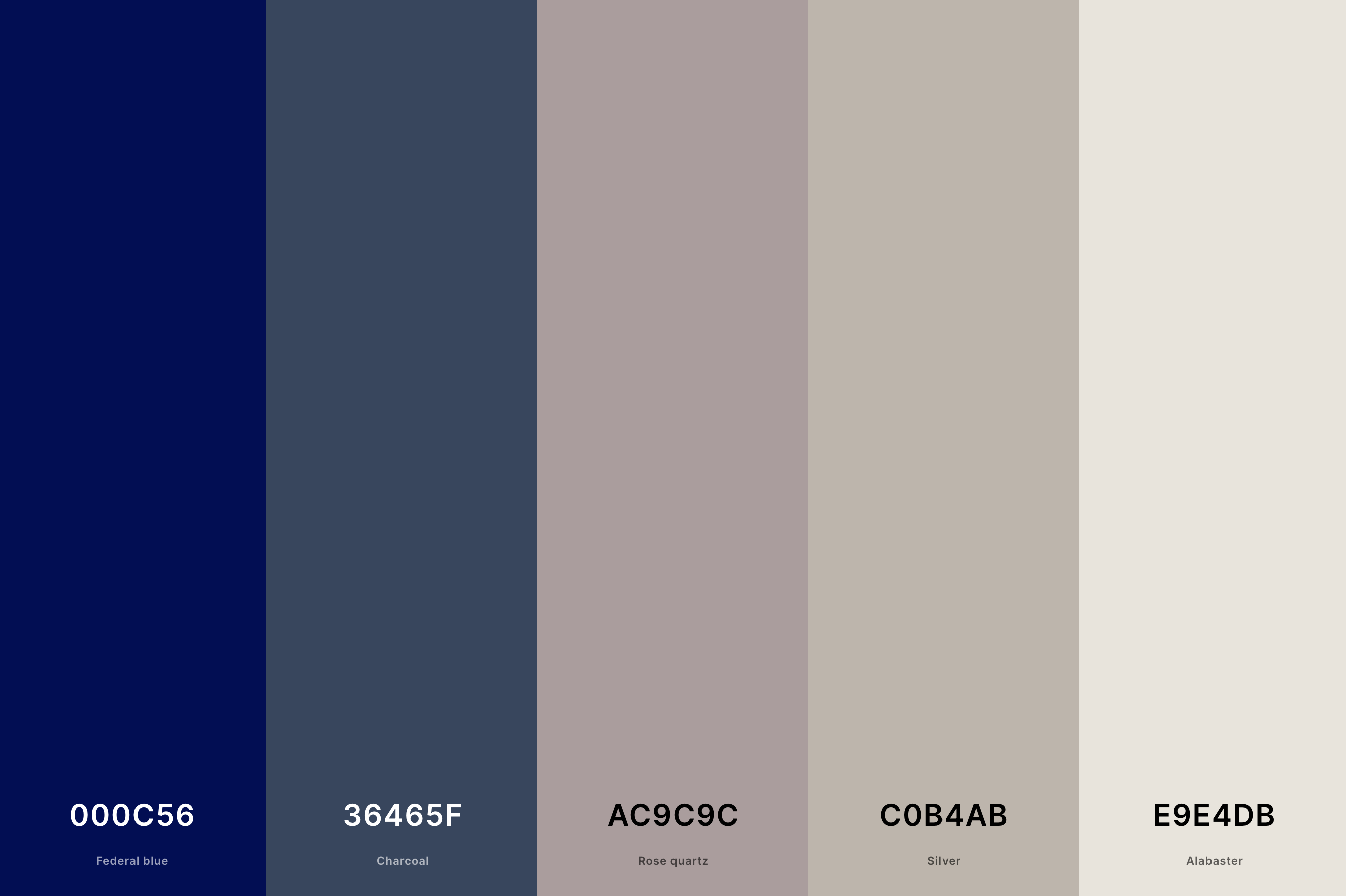
Hex Codes: #000C56, #36465F, #AC9C9C, #C0B4AB, #E9E4DB
This palette evokes the relaxed yet sophisticated vibe of summer. Federal Blue and Charcoal offer depth and a hint of mystery, akin to a summer evening sky.
Rose Quartz brings a warm, soft glow, complemented by the cool shimmer of Silver. Alabaster ties everything together with its subtle, soothing presence.
Perfect for summer fashion, interiors, or events that aim for an elegant, laid-back feel.
20. Soft Neutral Color Palette
Gray + Cinereous + Pale Dogwood + Champagne Pink + Linen
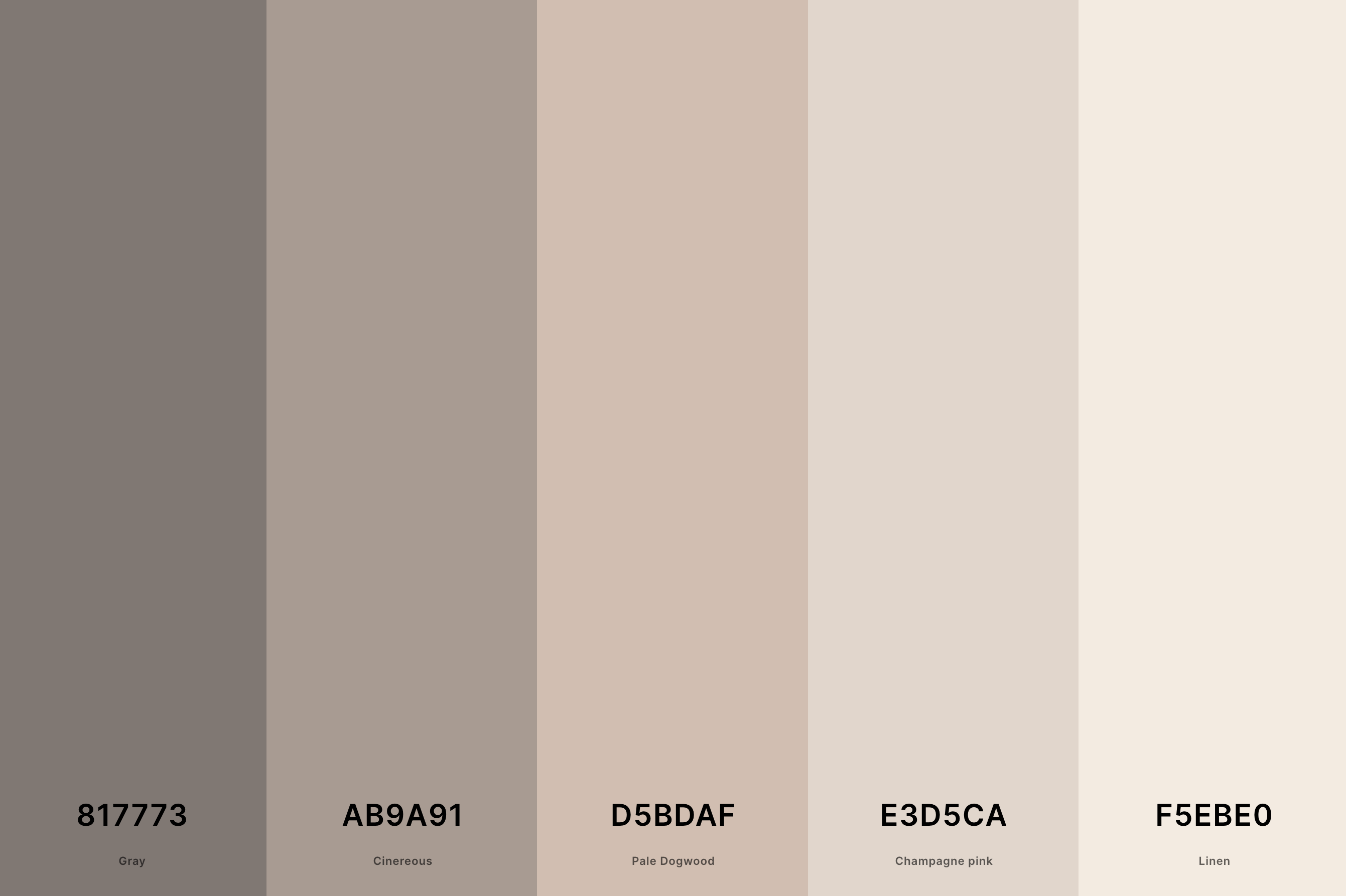
Hex Codes: #817773, #AB9A91, #D5BDAF, #E3D5CA, #F5EBE0
Embodying a gentle, calming energy, this palette is soothing and understated. Gray and Cinereous provide a neutral, versatile base, perfect for a variety of applications.
Pale Dogwood and Champagne Pink add a touch of soft warmth, creating an inviting feel. Linen lightens the overall mood, bringing in a sense of freshness and simplicity. This palette is ideal for creating a peaceful, relaxing environment.
21. Neutral Earth Tones Color Palette
Buff + Desert Sand + Champagne Pink + Ash Gray + Sage
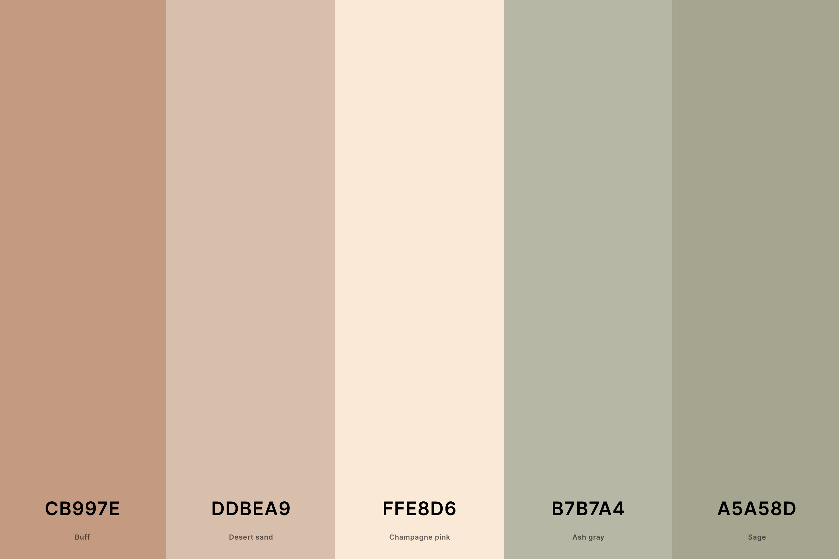
Hex Codes: #CB997E, #DDBEA9, #FFE8D6, #B7B7A4, #A5A58D
This palette brings together earthy and natural shades, perfect for creating a grounded and organic feel. Buff and Desert Sand provide warm, sandy tones, evoking a sense of calm and stability.
Champagne Pink adds a subtle, refined touch of color, while Ash Gray offers a neutral, balancing element. Sage introduces a hint of natural greenery, completing the palette with a connection to the natural world.
Ideal for spaces that aim to be soothing, natural, and harmonious.
22. Neutral Blue Color Palette
Jet + Payne'S Gray + Cool Gray + French Gray + Isabelline
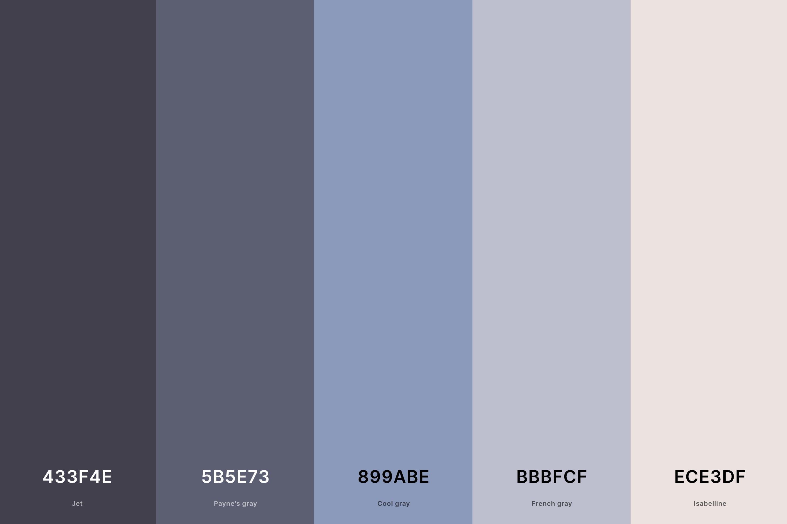
Hex Codes: #433F4E, #5B5E73, #899ABE, #BBBFCF, #ECE3DF
This palette is a sophisticated blend of blue and gray shades, offering a modern and chic aesthetic. Jet and Payne's Gray add depth and intensity, reminiscent of the ocean's depths.
Cool Gray and French Gray provide softer, more muted tones, bringing balance and versatility. Isabelline serves as a light, neutral backdrop, allowing the blues to shine.
This palette is perfect for contemporary designs that seek a balance of elegance and tranquility.
23. Neutral Fall Color Palette
Rosewood + Hooker'S Green + Bistre + Raw Umber + Dutch White
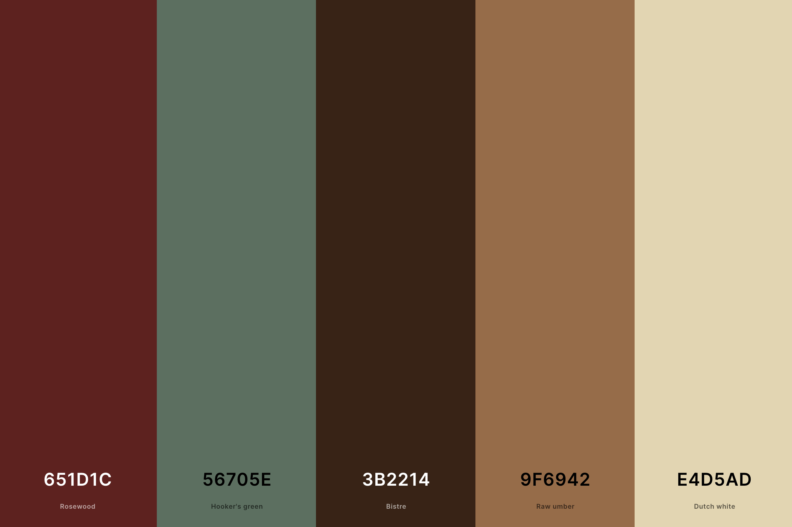
Hex Codes: #651D1C, #56705E, #3B2214, #9F6942, #E4D5AD
Capturing the essence of autumn, this palette combines warm, earthy tones with deep, rich colors. Rosewood and Bistre bring in the warm hues of fallen leaves, while Hooker's Green adds a touch of late-season foliage.
Raw Umber grounds the palette with its earthy, robust tone. Dutch White provides a soft, light contrast, reminiscent of the hazy autumn sky. Ideal for designs that aim to evoke the cozy, nostalgic feel of fall.
24. Neutral Ground Color Palette
Raw Umber + Davy'S Gray + Dun + Alabaster + Silver
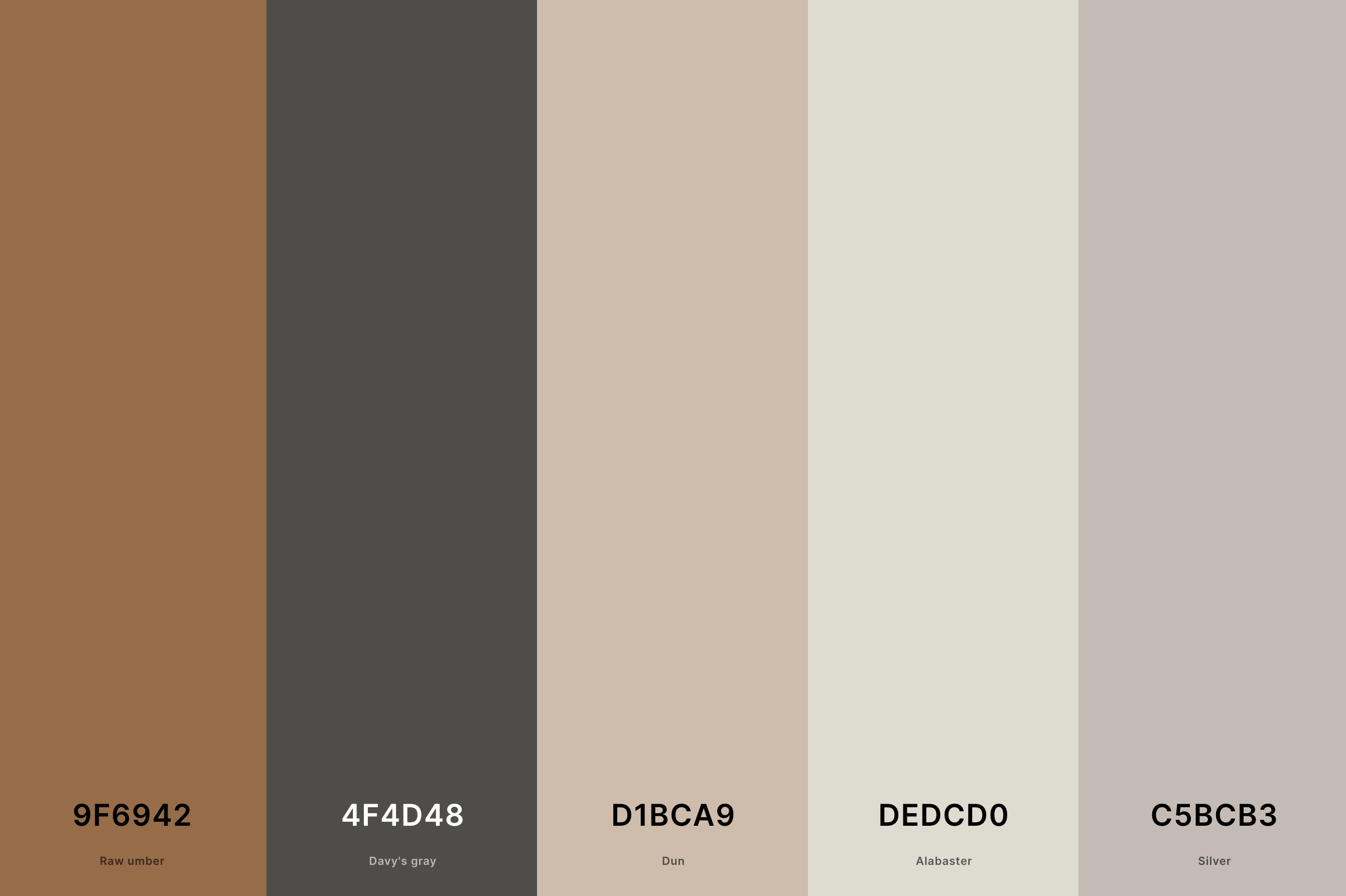
Hex Codes: #9F6942, #4F4D48, #D1BCA9, #DEDCD0, #C5BCB3
This palette is a harmonious blend of natural, earth-inspired tones. Raw Umber and Davy's Gray offer a strong, grounded feel, perfect for creating a sense of stability.
Dun adds a lighter, more muted earth tone, while Alabaster brings a subtle brightness.
Silver provides a modern twist, adding a sleek, contemporary edge. This palette is well-suited for spaces that seek to blend natural elements with modern design.
25. Deep Neutral Color Palette
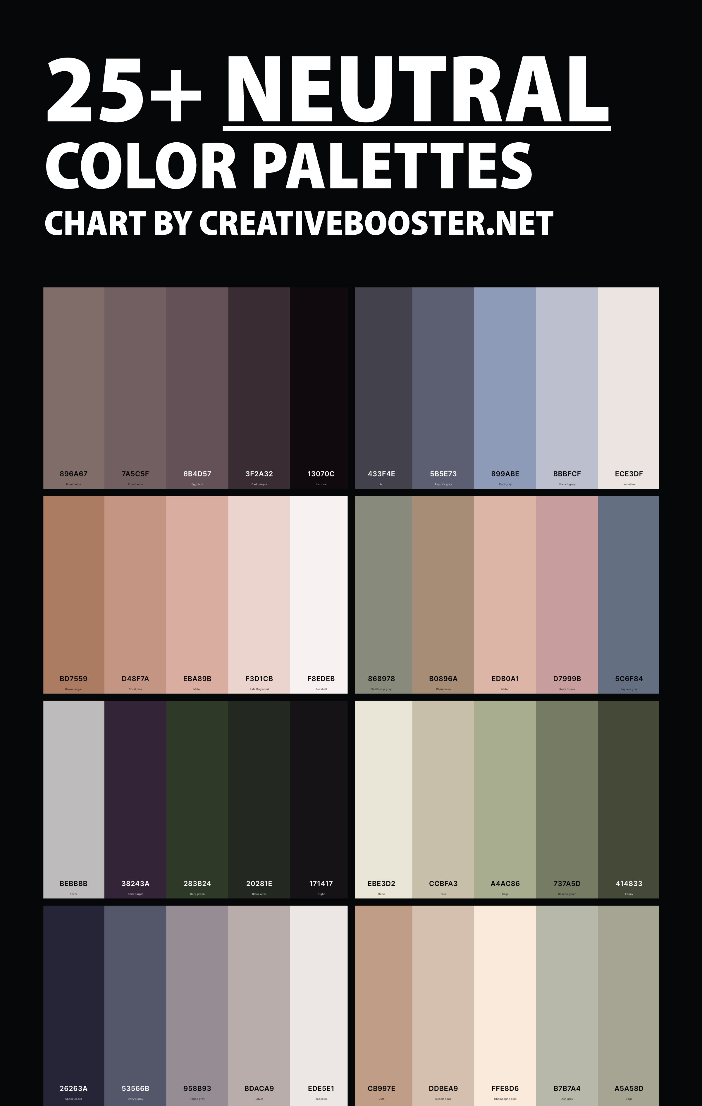
Rose Taupe + Rose Taupe + Eggplant + Dark Purple + Licorice
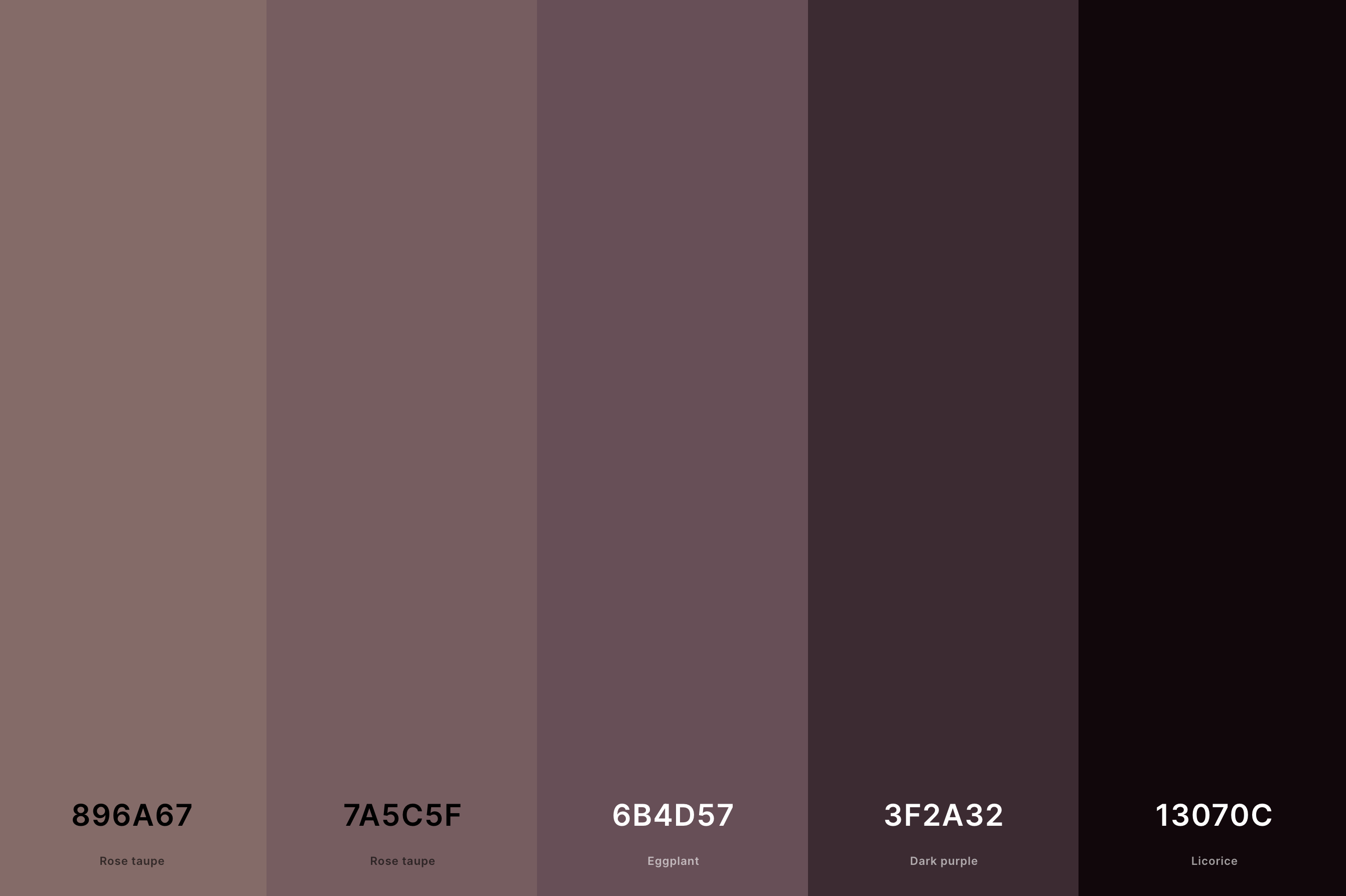
Hex Codes: #896A67, #7A5C5F, #6B4D57, #3F2A32, #13070C
This palette is rich and intense, featuring deep and moody tones. The double inclusion of Rose Taupe offers a warm, dusky base, complemented by the darker, more dramatic Eggplant and Dark Purple.
Licorice adds the deepest shade, providing a strong, bold contrast. This palette is ideal for creating an atmosphere of sophistication and mystery, perfect for luxurious and dramatic spaces.
26. Light Neutral Color Palette
Rose Taupe + Cinereous + Silver + Timberwolf + Isabelline
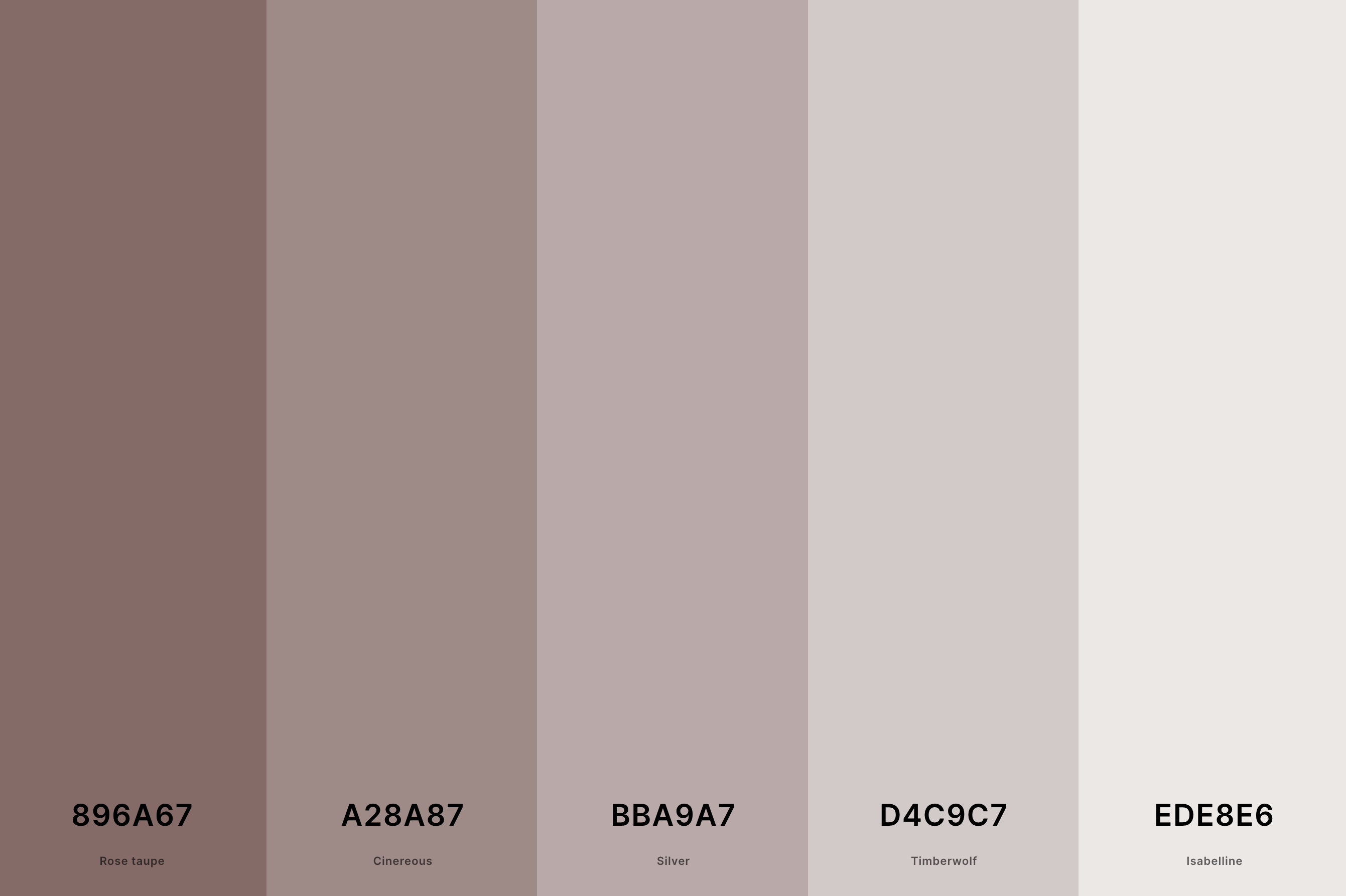
Hex Codes: #896A67, #A28A87, #BBA9A7, #D4C9C7, #EDE8E6
This palette is a delicate and light composition, ideal for creating a serene and airy atmosphere. Rose Taupe offers a touch of warmth, while Cinereous provides a gentle, muted tone.
Silver introduces a subtle shimmer, adding a hint of sophistication. Timberwolf and Isabelline, with their light and almost ethereal qualities, elevate the palette, making it perfect for spaces that aim for a soft, tranquil, and elegant ambiance.
27. Aesthetic Neutral Color Palette
Black + Gunmetal + Almond + Khaki + Walnut Brown
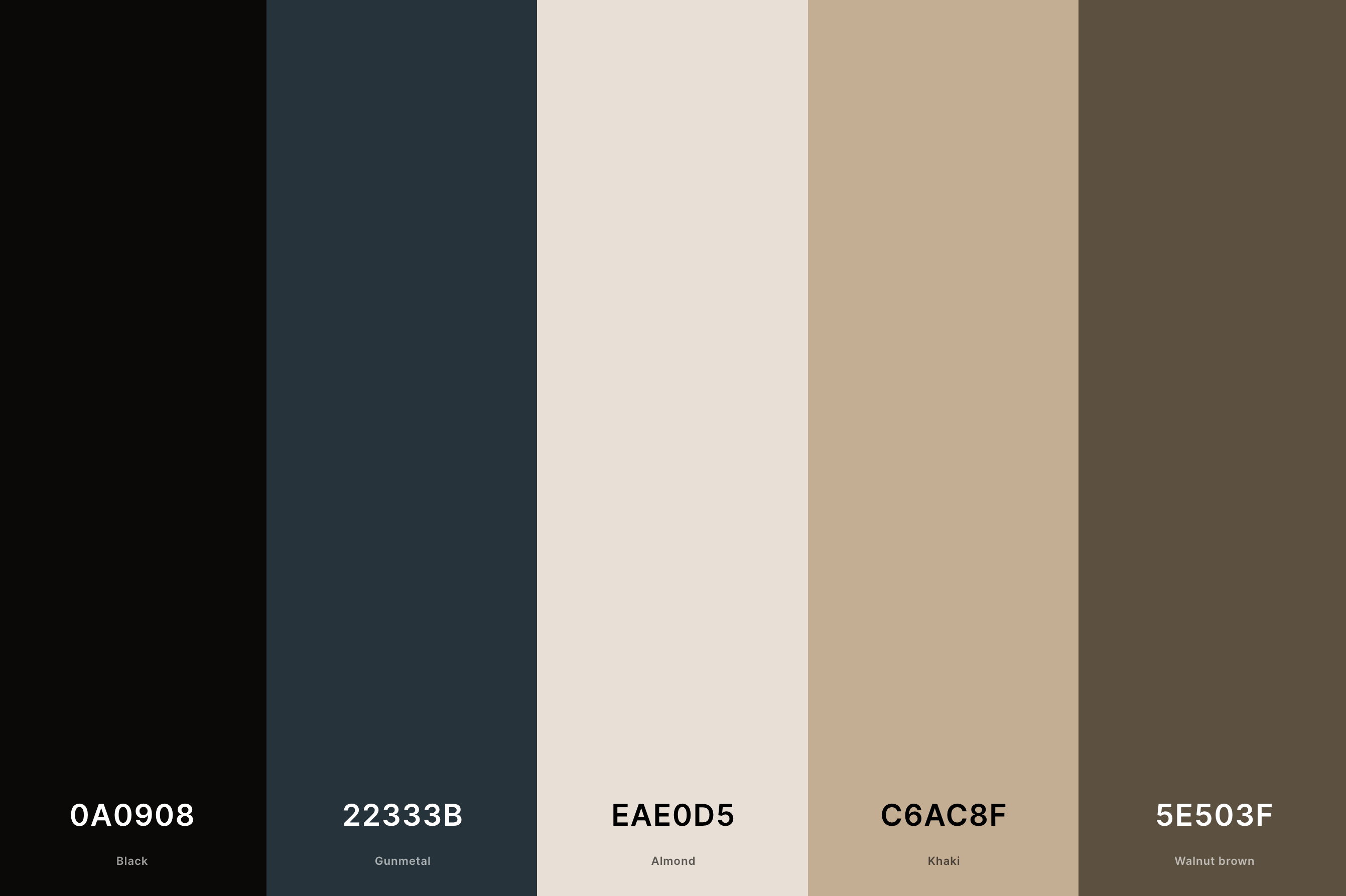
Hex Codes: #0A0908, #22333B, #EAE0D5, #C6AC8F, #5E503F
This palette combines deep, striking shades with softer, earthy tones for a balanced and stylish look. Black and Gunmetal provide a bold and dramatic foundation, perfect for making a statement.
Almond and Khaki introduce warmth and naturalness, softening the overall feel. Walnut Brown ties these elements together with its rich, grounding presence.
Ideal for designs that seek a contemporary yet timeless aesthetic, this palette effortlessly blends sophistication with natural appeal.
What Are Neutral Color Palettes?
Alright, let's break it down: what exactly are neutral color palettes? When we talk about neutrals, we're diving into the world of colors that don't scream for attention but have an incredible power to balance and elevate a space or outfit.
Imagine walking into a room that feels just right - it's calming, it's chic, and it's incredibly welcoming. That's the magic of neutrals! These are shades like beige, taupe, gray, and yes, even the often overlooked but oh-so-essential whites and blacks. They're like the best kind of friends: supportive, versatile, and always making you look good.
Neutral palettes are the secret sauce to a cohesive look. They're the backbone of a design, offering a canvas that lets your statement pieces shine. And the best part? They're timeless. While hot pinks and electric blues might be the flavor of the month, neutrals are the forever stylish, go-to choice for elegance that never fades.
So, whether you're revamping your living room, planning an outfit, or designing a website, think of neutral palettes as your trusty sidekick. They create a space that's both comforting and sophisticated, proving that sometimes, the most impactful statements are made softly and subtly.
How to Make a Perfect Neutral Color Palette?
Crafting a neutral palette that sings harmony and sophistication is like baking the perfect cake - it's all about the right ingredients and proportions.
First things first, let's pick our base. Start with a grounding color - think a rich charcoal, a creamy beige, or a sleek ash gray. This is your foundation, the color that sets the tone. Next, sprinkle in some lighter shades like soft ivory or a gentle taupe. These are your highlighters; they'll bring in light and dimension.
Now, for the secret ingredient: texture and contrast. Yes, even in a neutral palette! Add a deeper shade, like a warm walnut brown or a muted slate, to give your palette depth and a touch of drama. This isn't about creating stark contrasts but rather about adding layers that speak to each other in whispers.
Remember, the beauty of neutrals lies in their ability to play well with others. So, mix and match, experiment with shades, and see how they interact. The goal is to create a palette that feels cohesive, calming, and absolutely chic. It's about finding that sweet spot where simplicity meets elegance.
