This post may contain affiliate links. If you click one, we may earn a commission at no cost to you. Here's more details on how we make money.
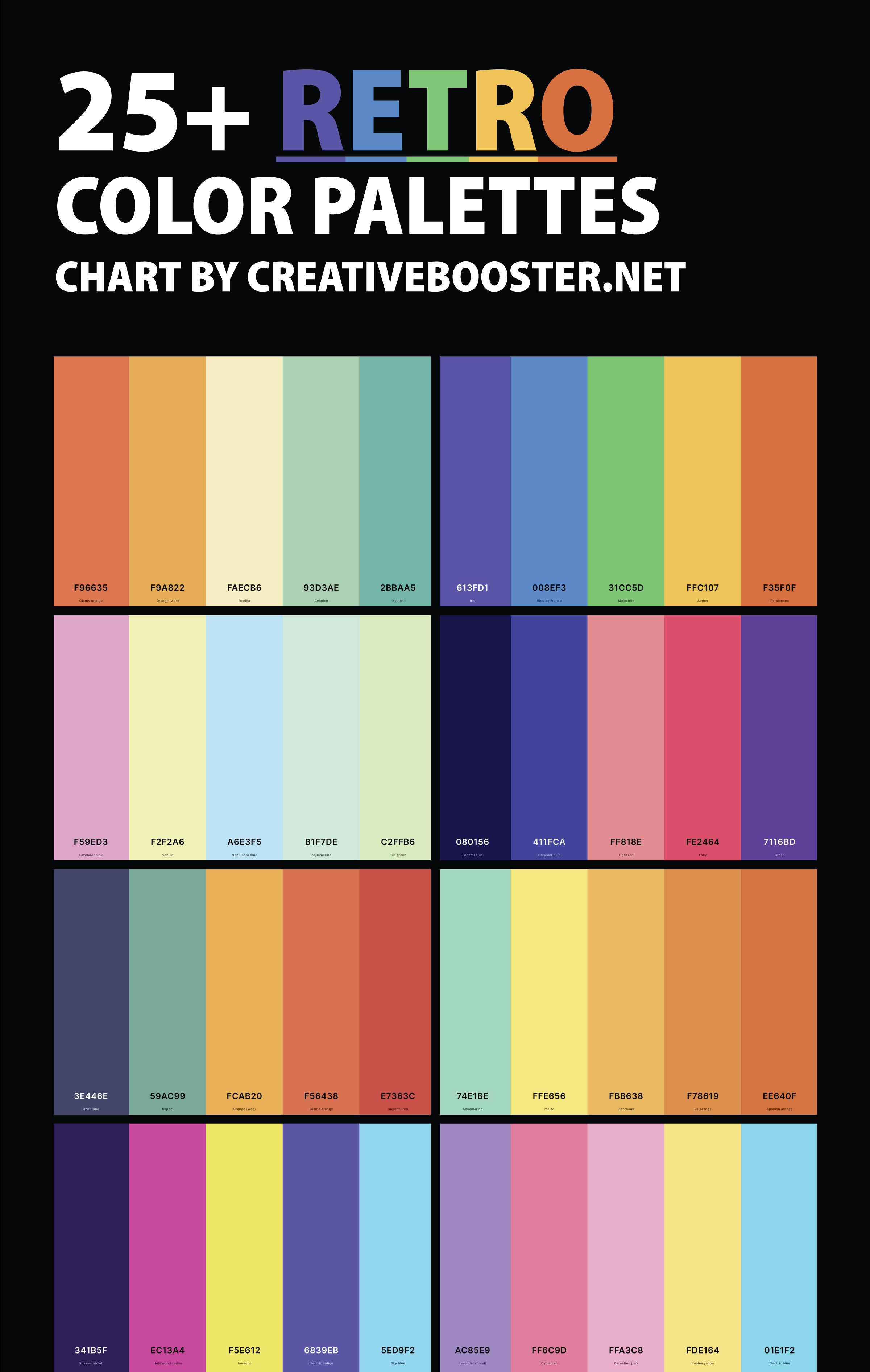
Welcome to our colorful journey through time with more than 25 retro color palettes! We're excited to guide you through a vibrant array of palettes that not only capture the essence of various retro eras but also bring a touch of timeless charm to any design project.
From the neon-lit streets of the 80s to the soft pastels of the 50s, each palette in this collection tells a unique story, evoking memories and emotions tied to those iconic decades.
Color has the power to transport us back in time, creating a vivid connection to past styles and trends. Whether you're a designer seeking inspiration, a history buff, or simply a lover of all things retro, these palettes offer a fascinating glimpse into the world of color and its enduring impact on our visual culture.
1. 70's Retro Color Palette
Eminence + Amaranth + Persimmon + Tangerine + Gold (Metallic)
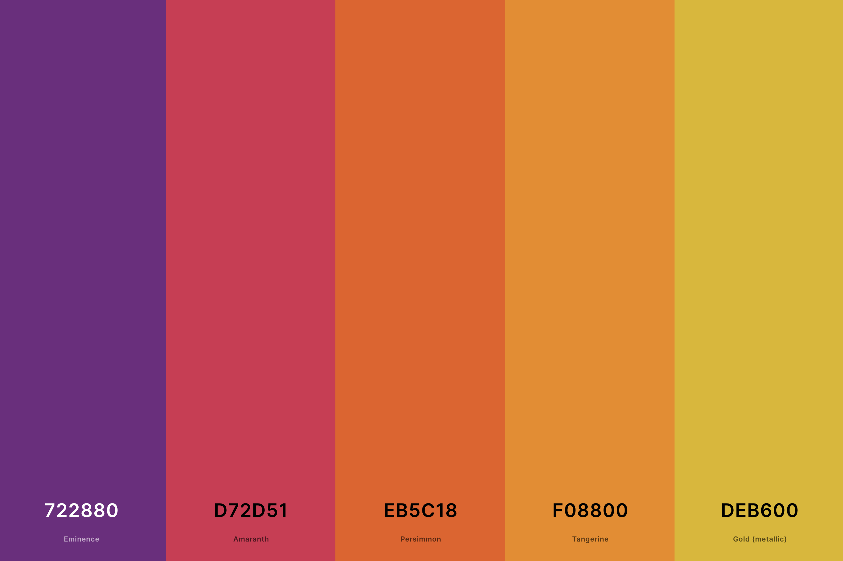
Hex Codes: #722880, #D72D51, #EB5C18, #F08800, #DEB600
This palette radiates a lively spirit typical of the 1970s, combining deep oranges, rich browns, and warm yellows. These shades reflect the era's love for earthy and vibrant tones, reminiscent of popular interior designs and fashion trends.
This selection is a harmonious blend that echoes the energetic yet earth-connected vibe of the 70s, making it a perfect representation of this iconic decade.
2. Bright Retro Color Palette
Vivid Sky Blue + Hot Magenta + Lawn Green + Aureolin + Candy Apple Red
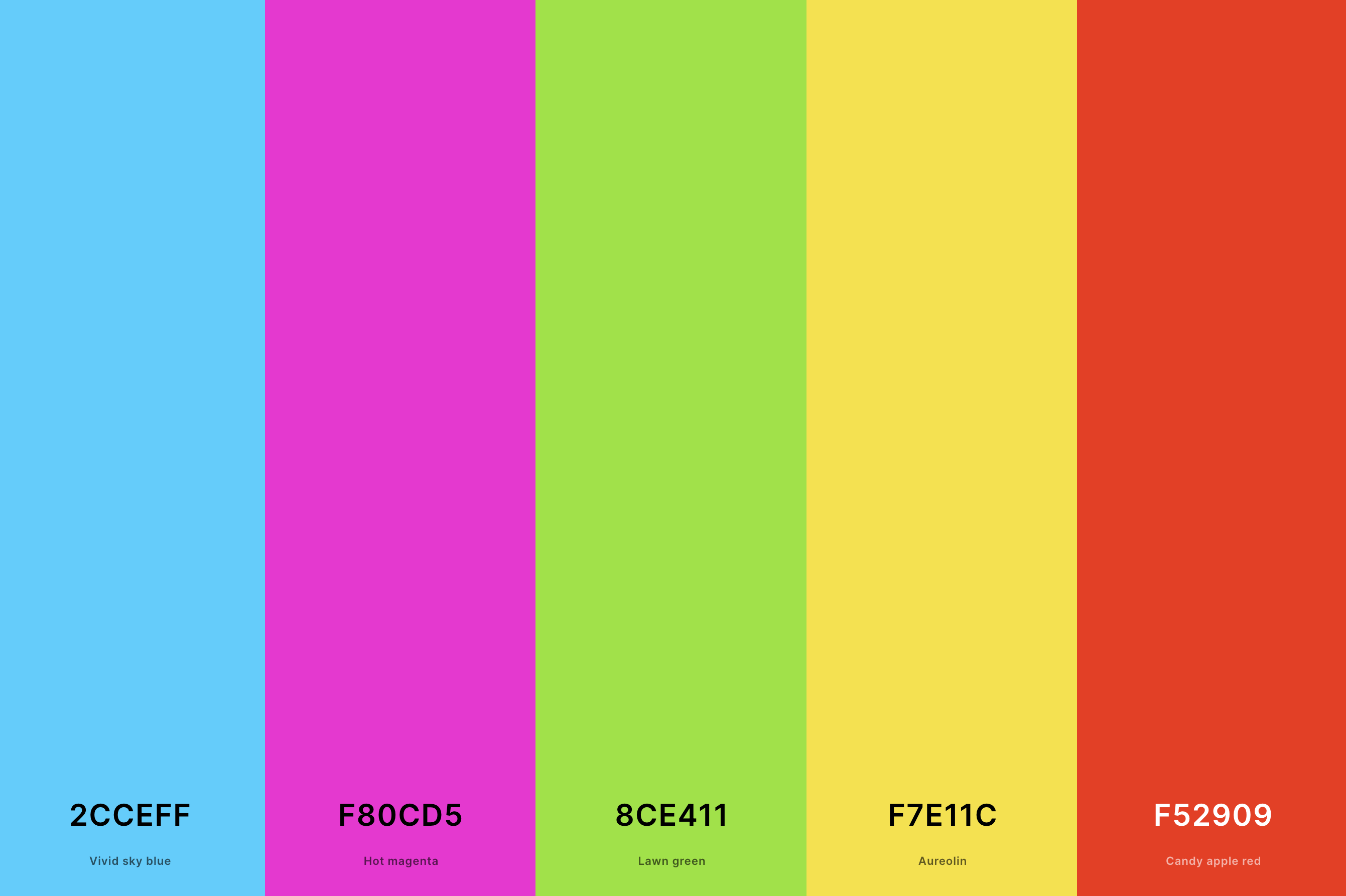
Hex Codes: #2CCEFF, #F80CD5, #8CE411, #F7E11C, #F52909
A vivid mix of electric blues, hot pinks, and neon greens, this palette transports you back to times of bold expression and fun. The high-contrast, saturated colors are a nod to pop culture's influence during the late 20th century.
It's an ideal choice for designs seeking to evoke a sense of nostalgia while retaining a lively and youthful exuberance.
3. 80's Retro Color Palette
Purple Pizzazz + Aureolin + Folly + Bleu De France + Electric Blue
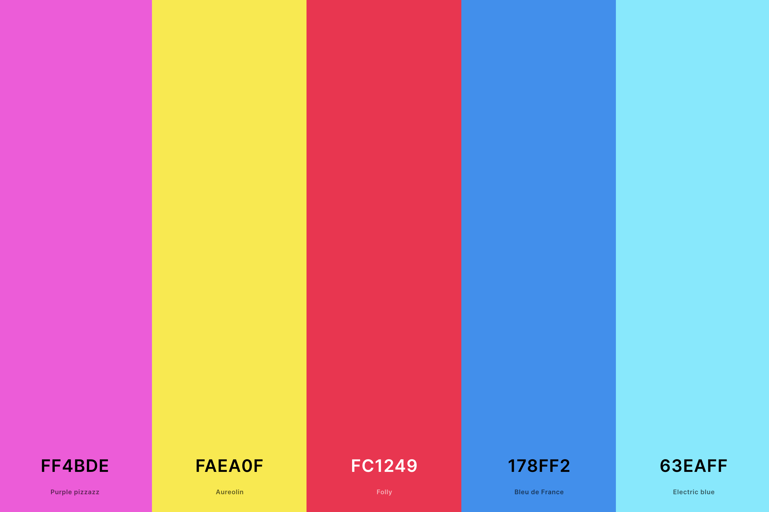
Hex Codes: #FF4BDE, #FAEA0F, #FC1249, #178FF2, #63EAFF
This palette is a dynamic combination of neon shades, pastels, and primary colors, reflecting the 1980s' unique blend of opulence and innovation.
The use of bright pinks, blues, and purples alongside more subdued tones captures the decade's penchant for bold fashion and groundbreaking technology. It's a perfect pick for evoking the vibrant, transformative energy of the 80s.
4. Retro 1950s Color Palette
Poppy + Orange (Crayola) + Vanilla + Pistachio + Columbia Blue
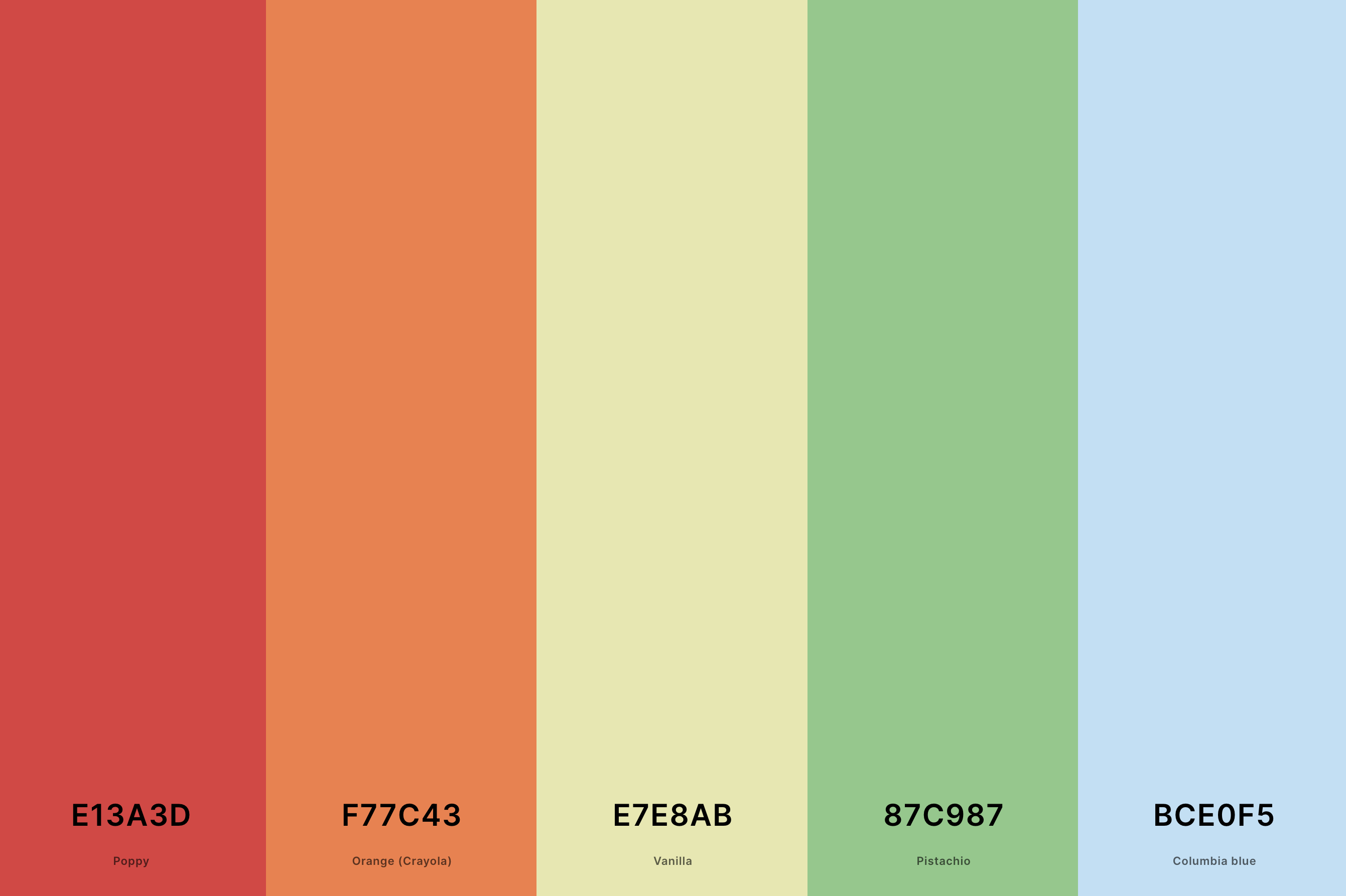
Hex Codes: #E13A3D, #F77C43, #E7E8AB, #87C987, #BCE0F5
Characterized by soft pastels and creamy neutrals, this palette offers a comforting, cozy feel reminiscent of the post-war era's domestic bliss.
Mint greens, soft pinks, buttery yellows, and sky blues create a gentle, optimistic ambiance, ideal for capturing the decade's sense of renewed hope and the birth of the modern American dream.
5. Retro Rainbow Color Palette
Vermilion + Spanish Orange + Hunyadi Yellow + Dark Cyan + Cerulean
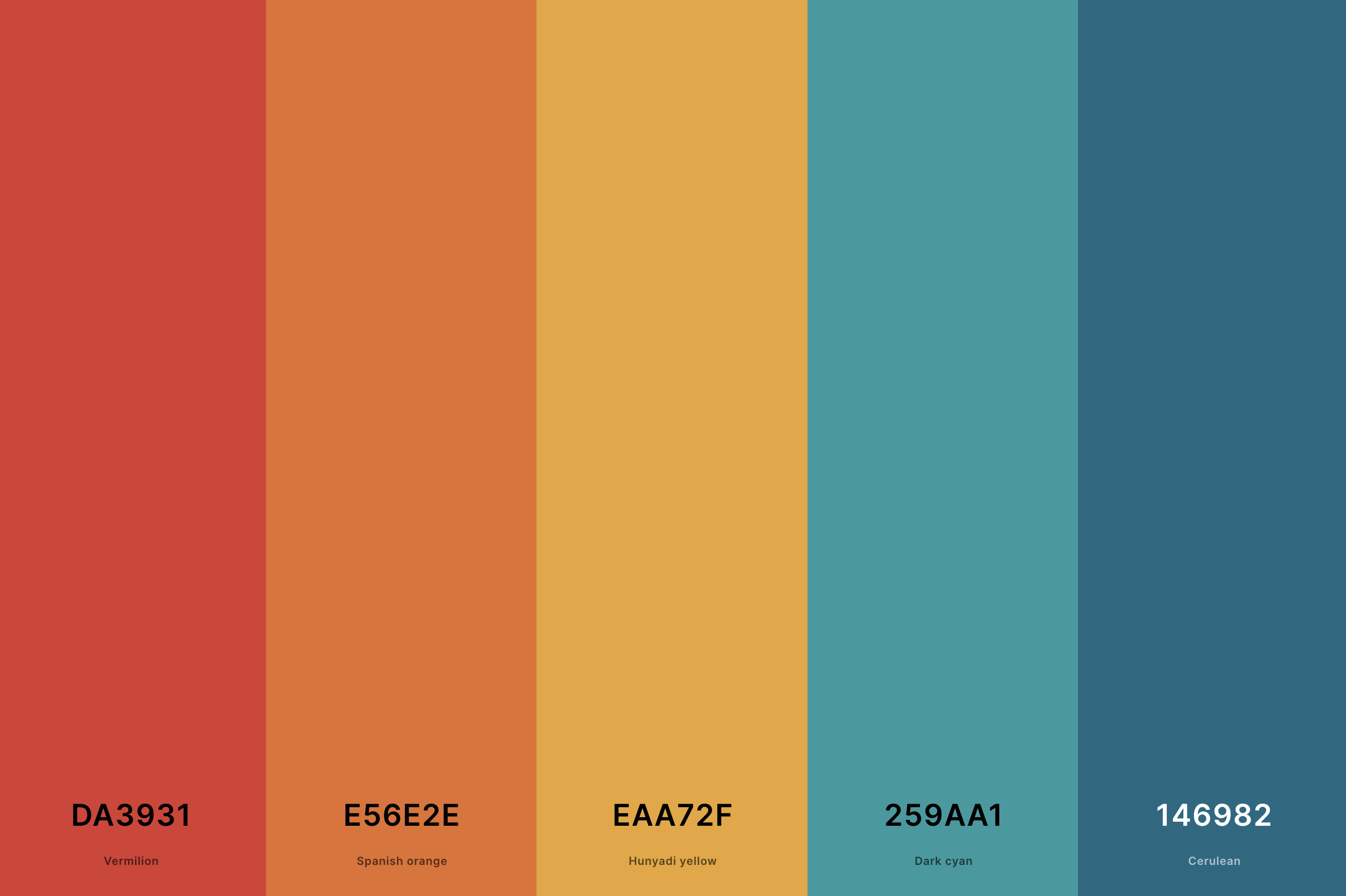
Hex Codes: #DA3931, #E56E2E, #EAA72F, #259AA1, #146982
This palette is a joyous celebration of color, featuring a spectrum that spans from deep reds to vibrant violets. It captures the spirit of inclusivity and freedom that has been associated with the rainbow symbol since the 1970s.
The use of the full color range in a slightly muted tone gives it a nostalgic feel, making it ideal for projects that aim to evoke a sense of universal unity and timeless joy.
6. Summer Retro Color Palette
Celadon + Cosmic Latte + Vivid Sky Blue + School Bus Yellow + Folly
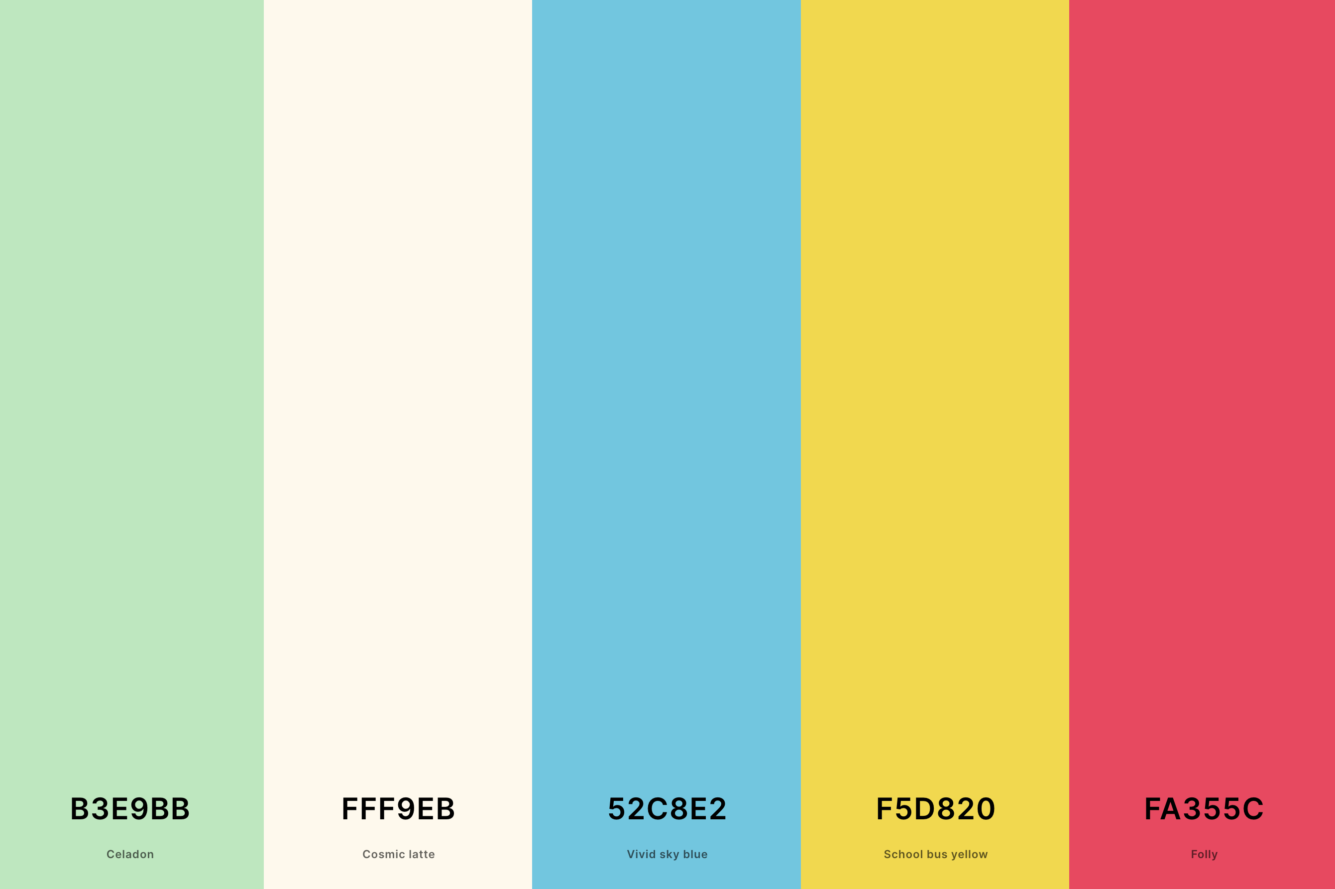
Hex Codes: #B3E9BB, #FFF9EB, #52C8E2, #F5D820, #FA355C
Evoking the relaxed vibe of vintage summer holidays, this palette combines sandy beiges, ocean blues, and sunset oranges. It's reminiscent of old Polaroid pictures, with their sun-bleached, slightly faded quality.
These colors bring to mind the leisurely summers of past decades, ideal for designs that aim to capture the timeless, laid-back essence of a summer retreat.
7. Neon Retro Color Palette
Russian Violet + Hollywood Cerise + Aureolin + Electric Indigo + Sky Blue
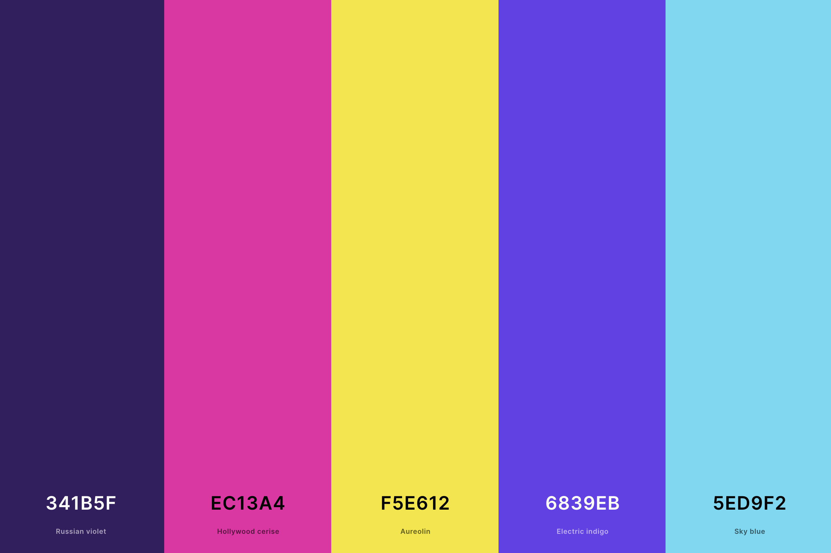
Hex Codes: #341B5F, #EC13A4, #F5E612, #6839EB, #5ED9F2
This electric assortment features glowing neon greens, pinks, blues, and yellows, reflecting the iconic neon signage and bold fashion of the late 20th century.
It's a nod to the era's fascination with futuristic ideas and the rise of electronic culture.
Perfect for projects that want to channel the high-energy, adventurous spirit of retro night life and technological advancements.
8. Retro Christmas Color Palette
Cal Poly Green + Forest Green + Dutch White + Chili Red + Barn Red
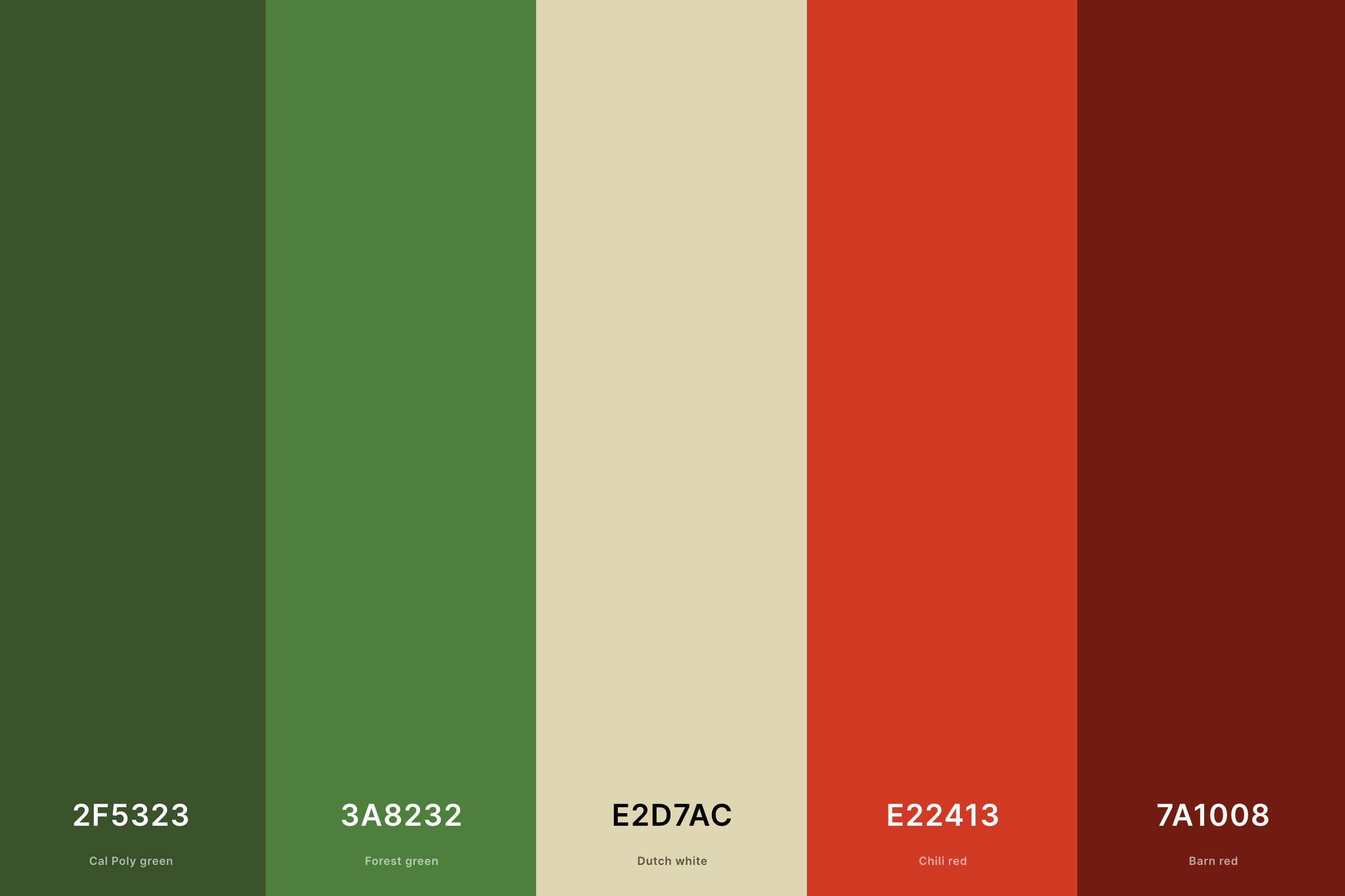
Hex Codes: #2F5323, #3A8232, #E2D7AC, #E22413, #7A1008
Combining traditional holiday reds and greens with softer, vintage tones like cream and muted gold, this palette offers a nostalgic twist on the classic Christmas colors.
It brings to mind old-fashioned Christmas decorations and cozy, family gatherings. This palette is ideal for creating a warm, nostalgic atmosphere that recalls the simpler, heartfelt celebrations of yesteryear.
9. Retro Pastel Color Palette
Lavender Pink + Vanilla + Non Photo Blue + Aquamarine + Tea Green
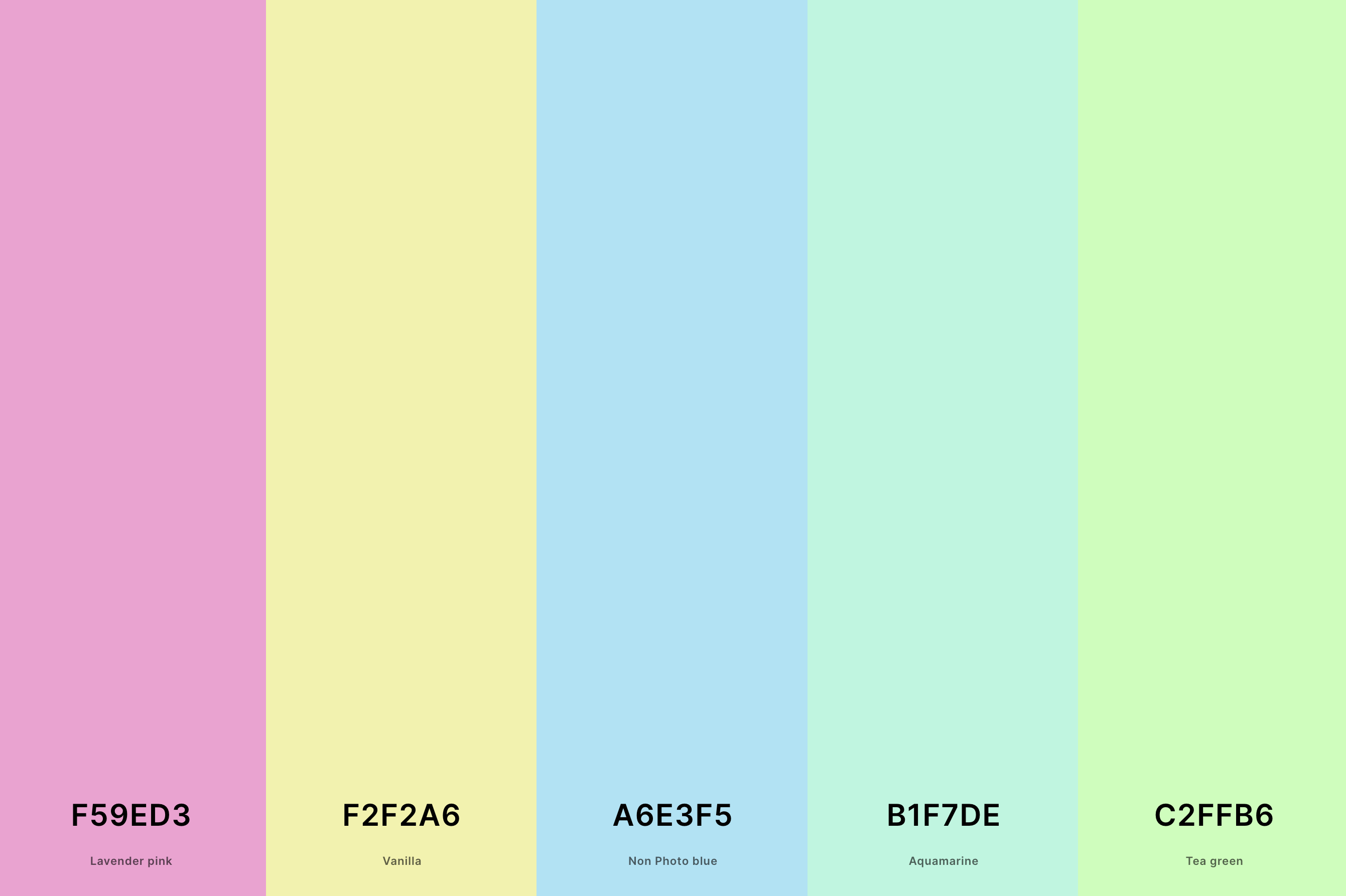
Hex Codes: #F59ED3, #F2F2A6, #A6E3F5, #B1F7DE, #C2FFB6
Featuring soft pinks, baby blues, pale yellows, and mint greens, this palette is reminiscent of mid-20th century interior design and fashion trends. It evokes a sense of gentle optimism and understated elegance.
These subdued shades are perfect for designs that aim to reflect the innocence and simplicity of earlier times, while still maintaining a chic, modern appeal.
10. Retro Vintage Color Palette
Coffee + Robin Egg Blue + Floral White + Saffron + Tomato
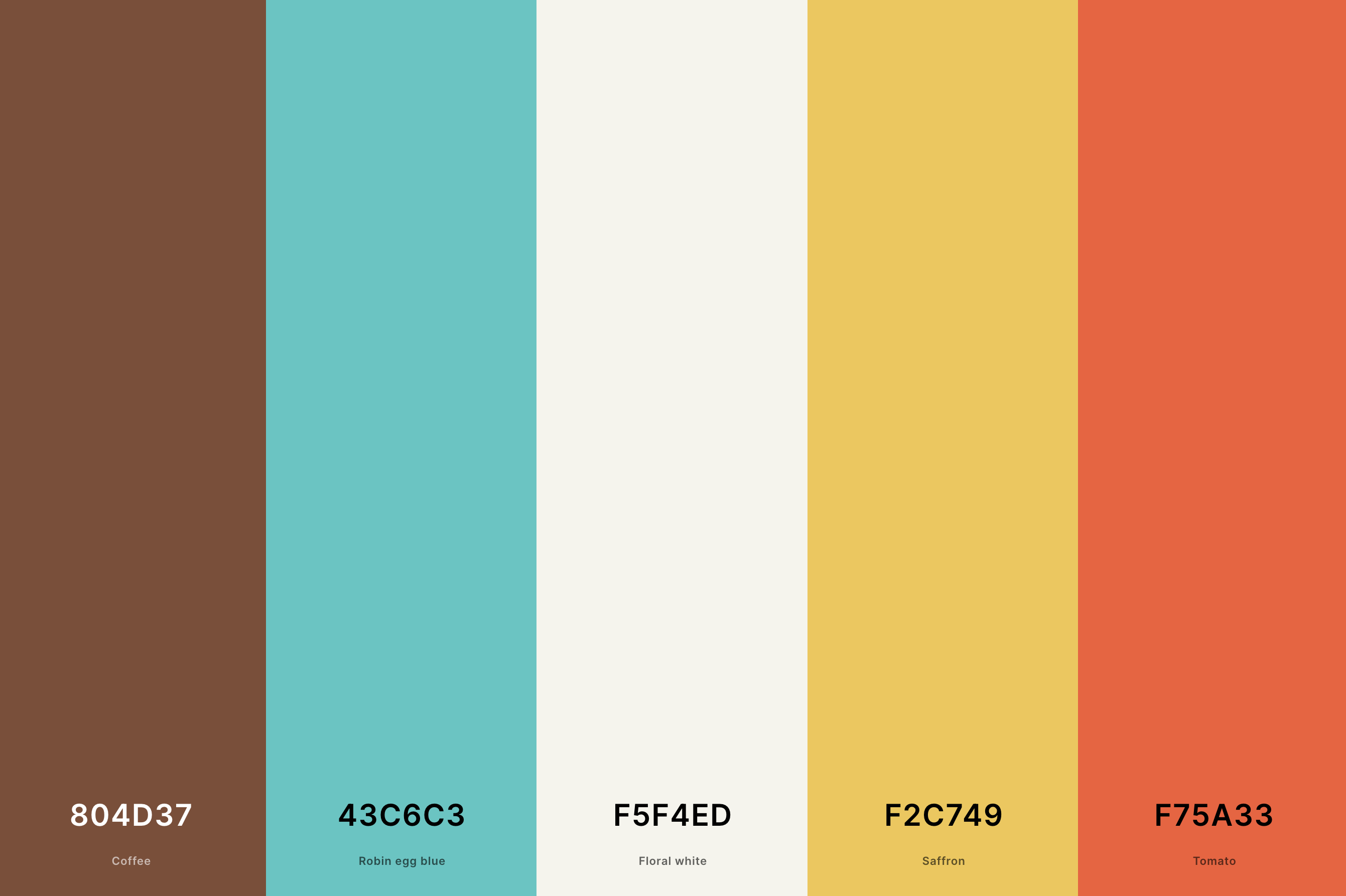
Hex Codes: #804D37, #43C6C3, #F5F4ED, #F2C749, #F75A33
This palette is a sophisticated mix of muted greens, browns, and reds, often found in mid-century furniture and fashion. It reflects a time of classic elegance and enduring quality.
These colors are ideal for evoking the vintage charm of the 40s and 50s, capturing the essence of an era that appreciated craftsmanship and timeless design.
11. Retro Cyberpunk Color Palette
Phlox + Fluorescent Cyan + Robin Egg Blue + Grape + Russian Violet
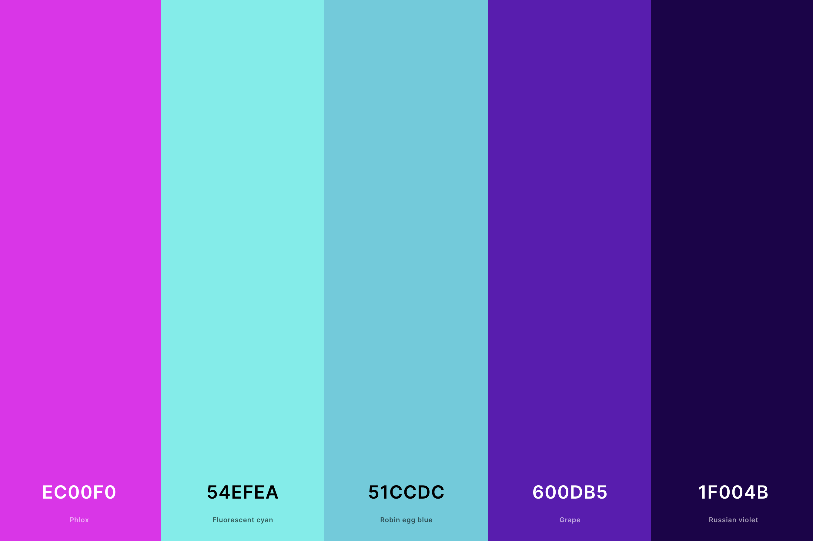
Hex Codes: #EC00F0, #54EFEA, #51CCDC, #600DB5, #1F004B
This palette is a futuristic blend of neon pinks, electric blues, and deep purples, interspersed with contrasting dark shades. It reflects the cyberpunk genre's vision of high-tech, neon-lit urban landscapes, often portrayed in late 20th-century media.
These colors capture the genre's essence of rebellious, cutting-edge subcultures, making it perfect for designs that aim to evoke a sense of gritty, neon-soaked futurism.
12. Retro Mid Century Modern Color Palette
Chestnut + Old Rose + Champagne + Keppel + Brunswick Green
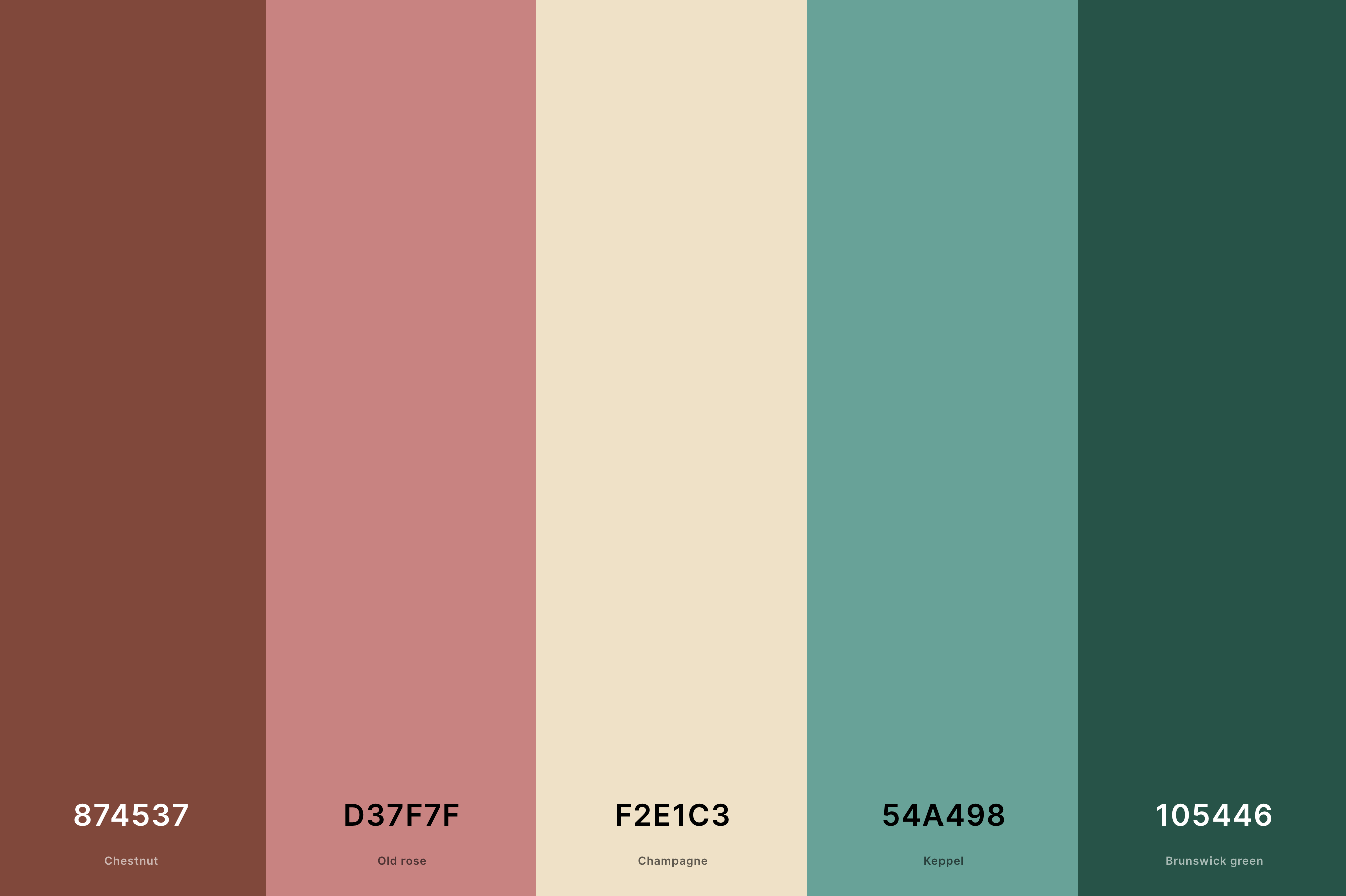
Hex Codes: #874537, #D37F7F, #F2E1C3, #54A498, #105446
Characterized by olive greens, mustard yellows, and burnt oranges, this palette embodies the quintessential mid-20th-century modern aesthetic.
These colors are often associated with the era's iconic furniture and architecture, reflecting a unique blend of sophistication and organic warmth.
Ideal for designs aiming to capture the essence of post-war optimism and the golden age of American design.
13. Retro Orange Color Palette
Aquamarine + Maize + Xanthous + Ut Orange + Spanish Orange
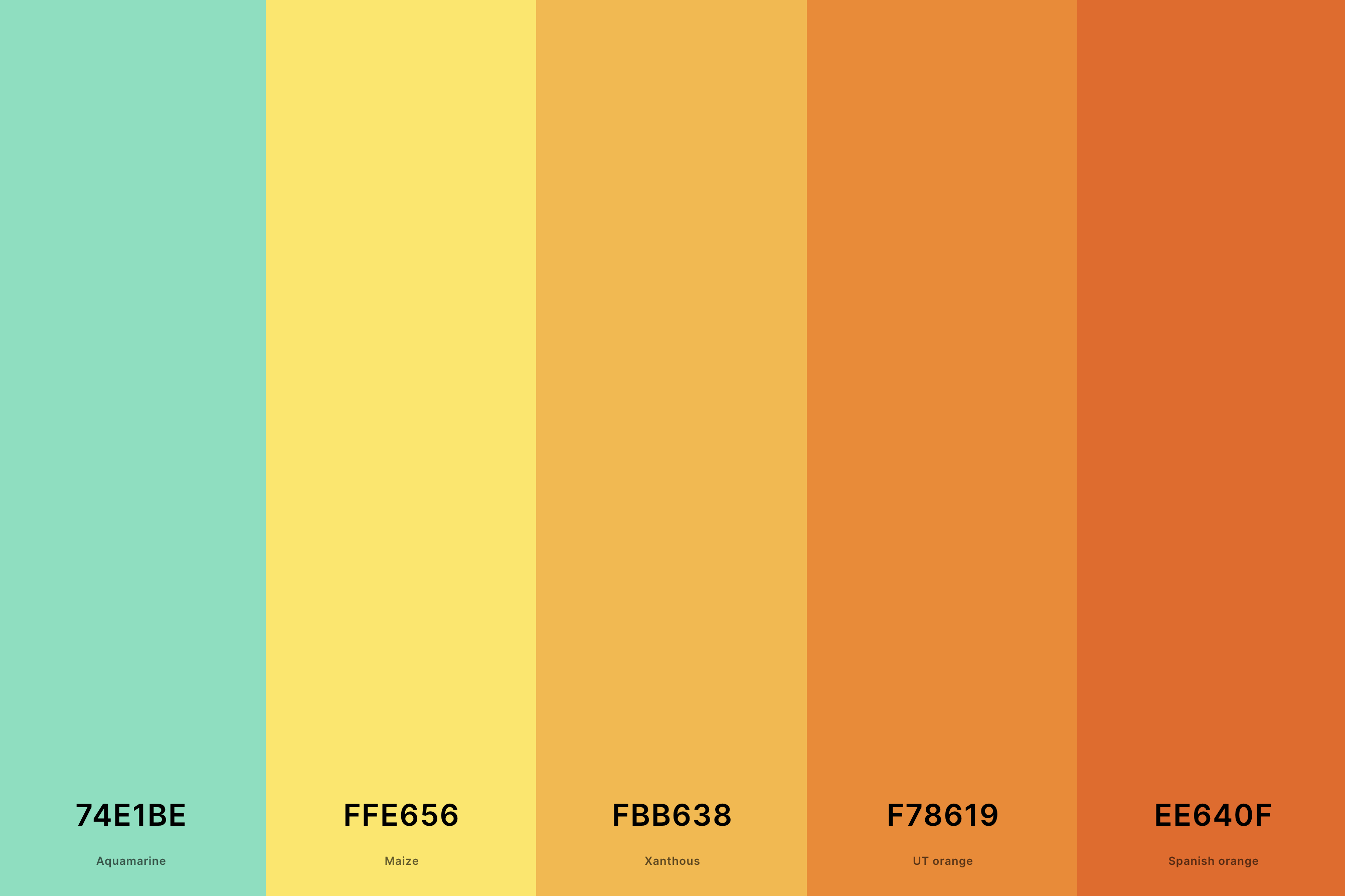
Hex Codes: #74E1BE, #FFE656, #FBB638, #F78619, #EE640F
This palette is a celebration of various shades of orange, ranging from bright tangerine to rich, earthy terra cotta. Orange was a dominant color in several decades of the 20th century, often used in both pop culture and interior design.
This range of oranges evokes a sense of playful energy and warmth, perfect for designs that seek to capture the essence of retro joy and vibrancy.
14. 60's Retro Color Palette
French Mauve + Cocoa Brown + Old Gold + Yellow Green + Celestial Blue
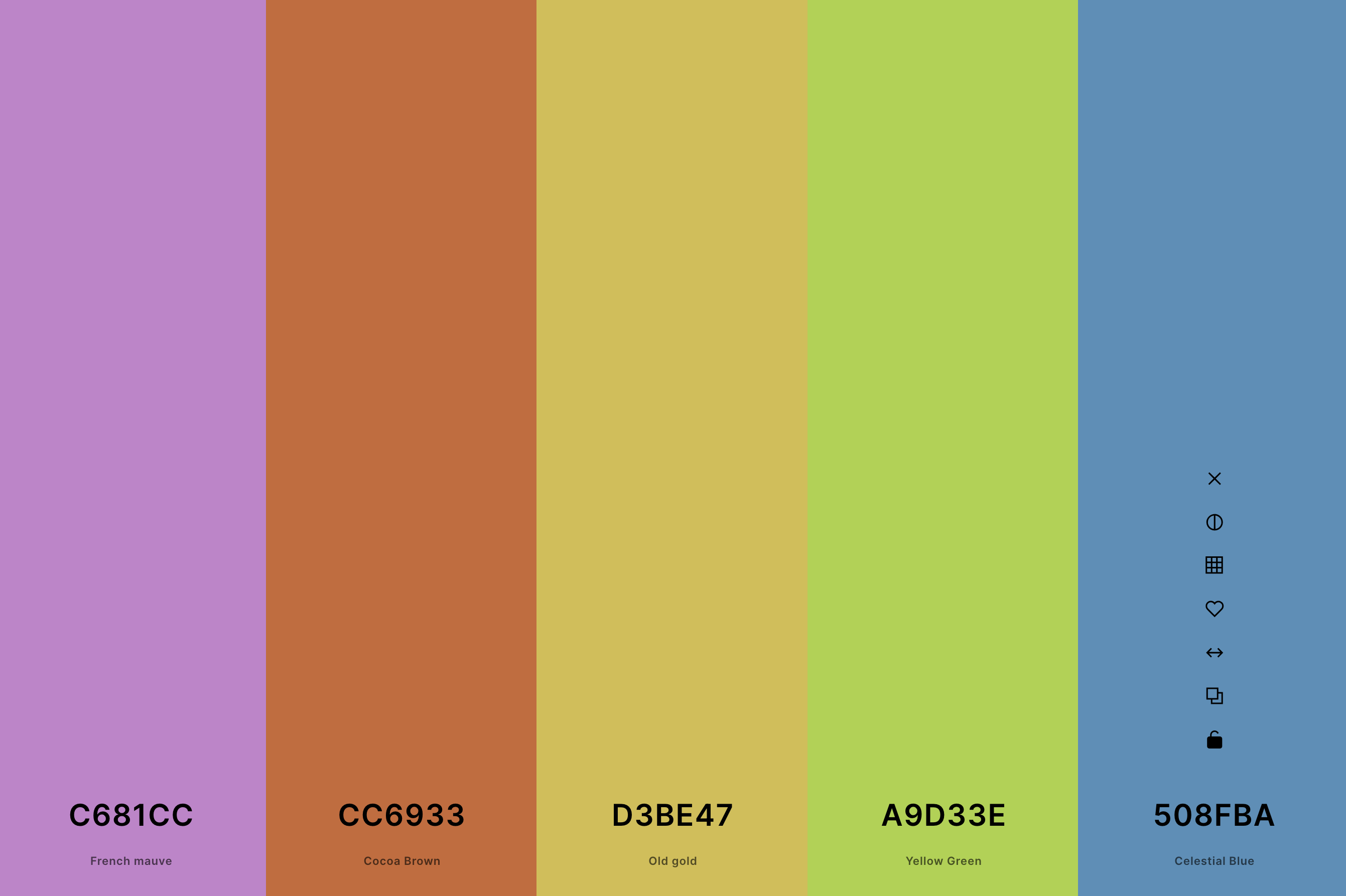
Hex Codes: #C681CC, #CC6933, #D3BE47, #A9D33E, #508FBA
The 1960s palette is an eclectic mix of psychedelic brights like hot pinks, lime greens, and sunny yellows, juxtaposed with earthy tones like olive green and brown.
This combination reflects the decade's cultural revolution, from the peace movement to the explosion of pop art. It's an ideal choice for conveying the era's dynamic and transformative spirit.
15. Retro Futuristic Color Palette
Federal Blue + Chrysler Blue + Light Red + Folly + Grape
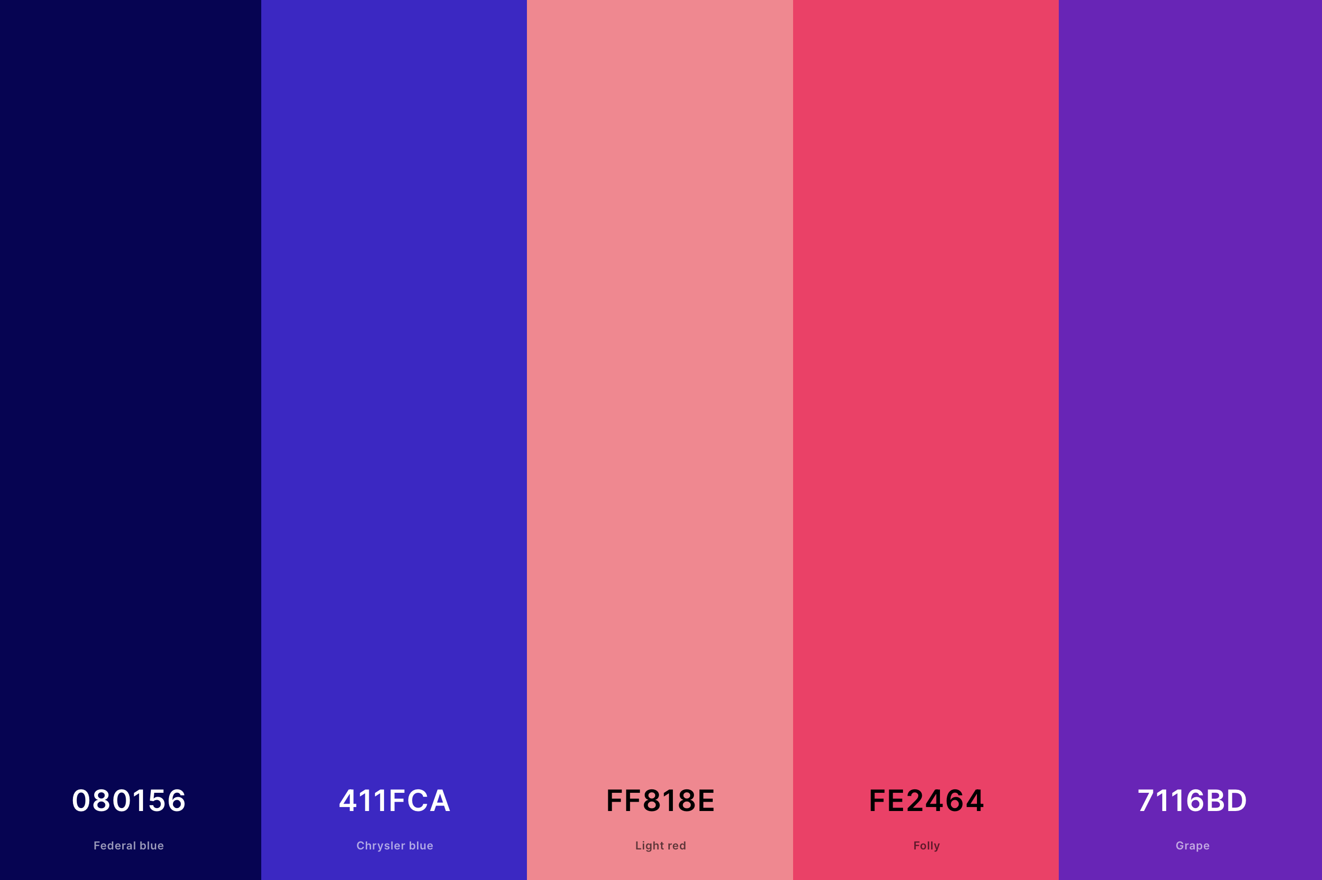
Hex Codes: #080156, #411FCA, #FF818E, #FE2464, #7116BD
This palette combines metallic silvers and blues with neon pinks and greens, creating a vision of the future as imagined in the past. It reflects the optimistic, science-fiction-inspired outlook prevalent in the mid-20th century.
These colors are perfect for designs that aim to evoke the excitement and curiosity about the future that was a hallmark of retro futurism.
16. Green Retro Color Palette
Onyx + Reseda Green + Sage + Mint + Shamrock Green
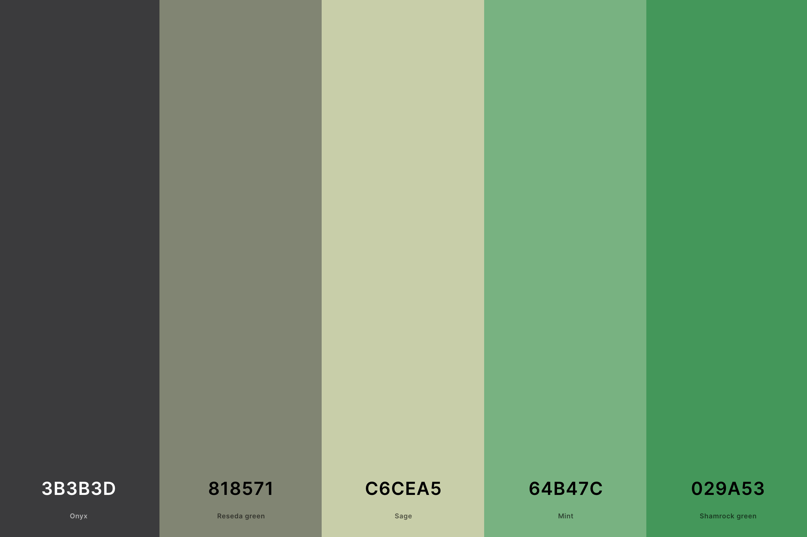
Hex Codes: #3B3B3D, #818571, #C6CEA5, #64B47C, #029A53
This palette showcases various shades of green, from deep forest greens to light, almost pastel hues. Green was a popular color in different eras, often used in everything from kitchen appliances to fashion.
This range of greens echoes the love for nature and organic forms prevalent in retro design, ideal for creating a sense of freshness and natural elegance in your projects.
17. Modern Retro Color Palette
Field Drab + Ecru + Light Orange + Burnt Sienna + Hunyadi Yellow
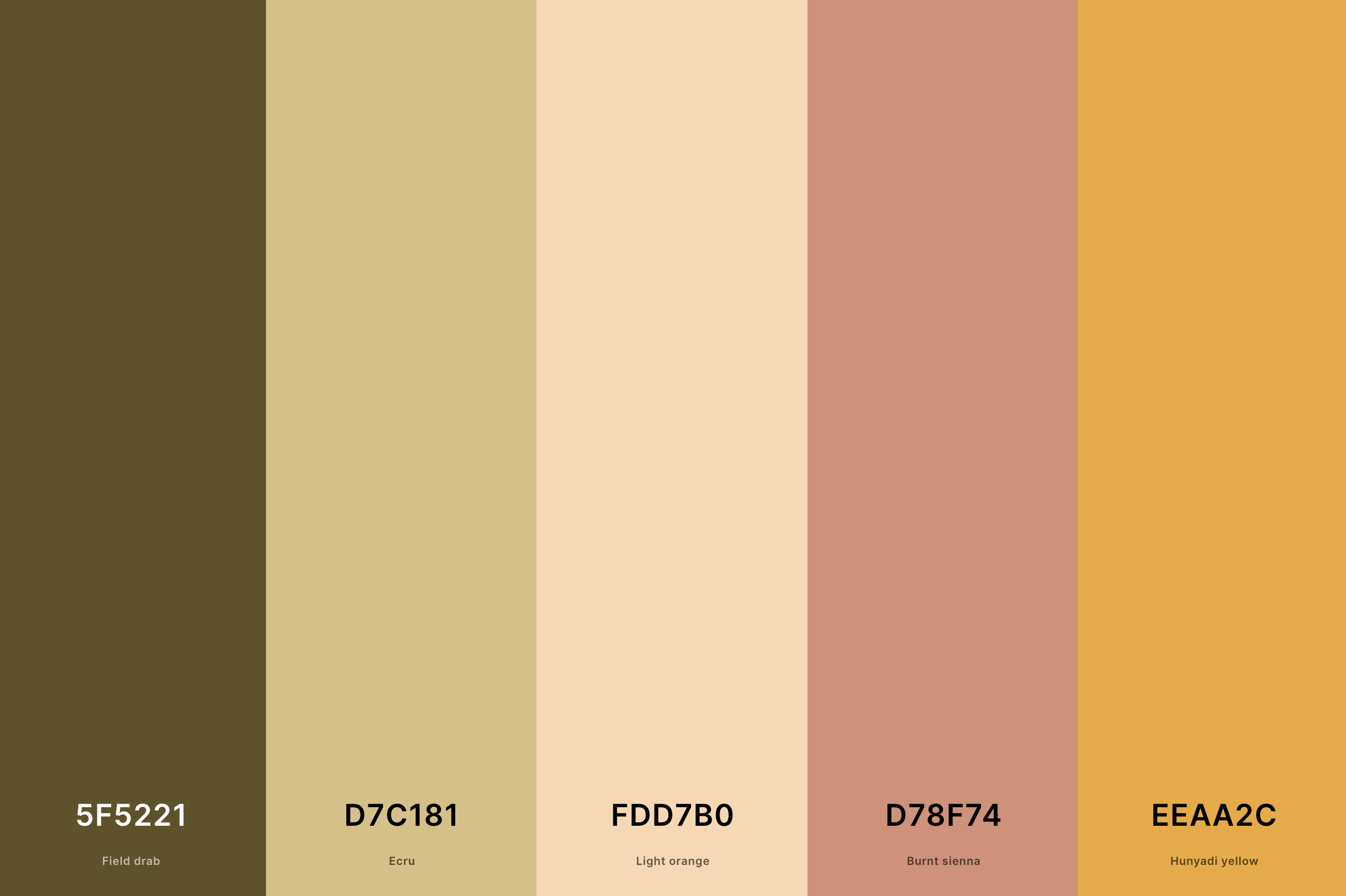
Hex Codes: #5F5221, #D7C181, #FDD7B0, #D78F74, #EEAA2C
Merging contemporary trends with a nostalgic touch, this palette features a balanced mix of bold and subtle shades. Think of sleek grays and whites complemented by pops of bright reds or blues.
It's a nod to the retro era's enduring influence on modern design, making it perfect for projects that blend the old with the new, creating a timeless yet current aesthetic.
18. Retro 1940s Color Palette
Wheat + Auburn + Sunglow + Myrtle Green + Indigo Dye
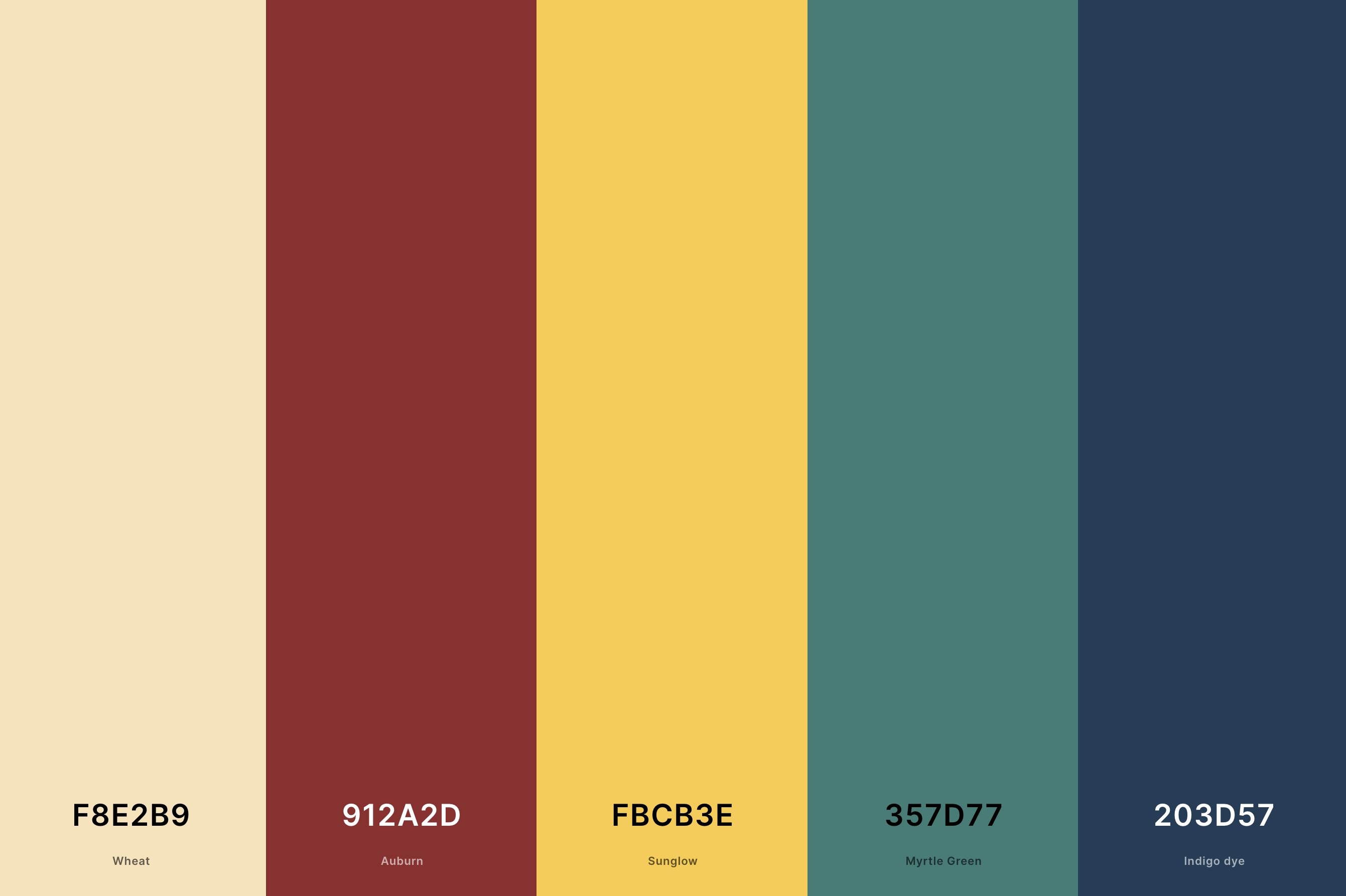
Hex Codes: #F8E2B9, #912A2D, #FBCB3E, #357D77, #203D57
Dominated by subdued, desaturated colors like navy blues, deep reds, and earthy browns, this palette reflects the 1940s' practical yet stylish sensibility.
These colors were prevalent in everything from fashion to propaganda posters, embodying the era's blend of austerity and elegance.
It's an ideal choice for projects aiming to capture the resilient and refined spirit of the 1940s.
19. Retro 90s Color Palette
Lavender (Floral) + Cyclamen + Carnation Pink + Naples Yellow + Electric Blue
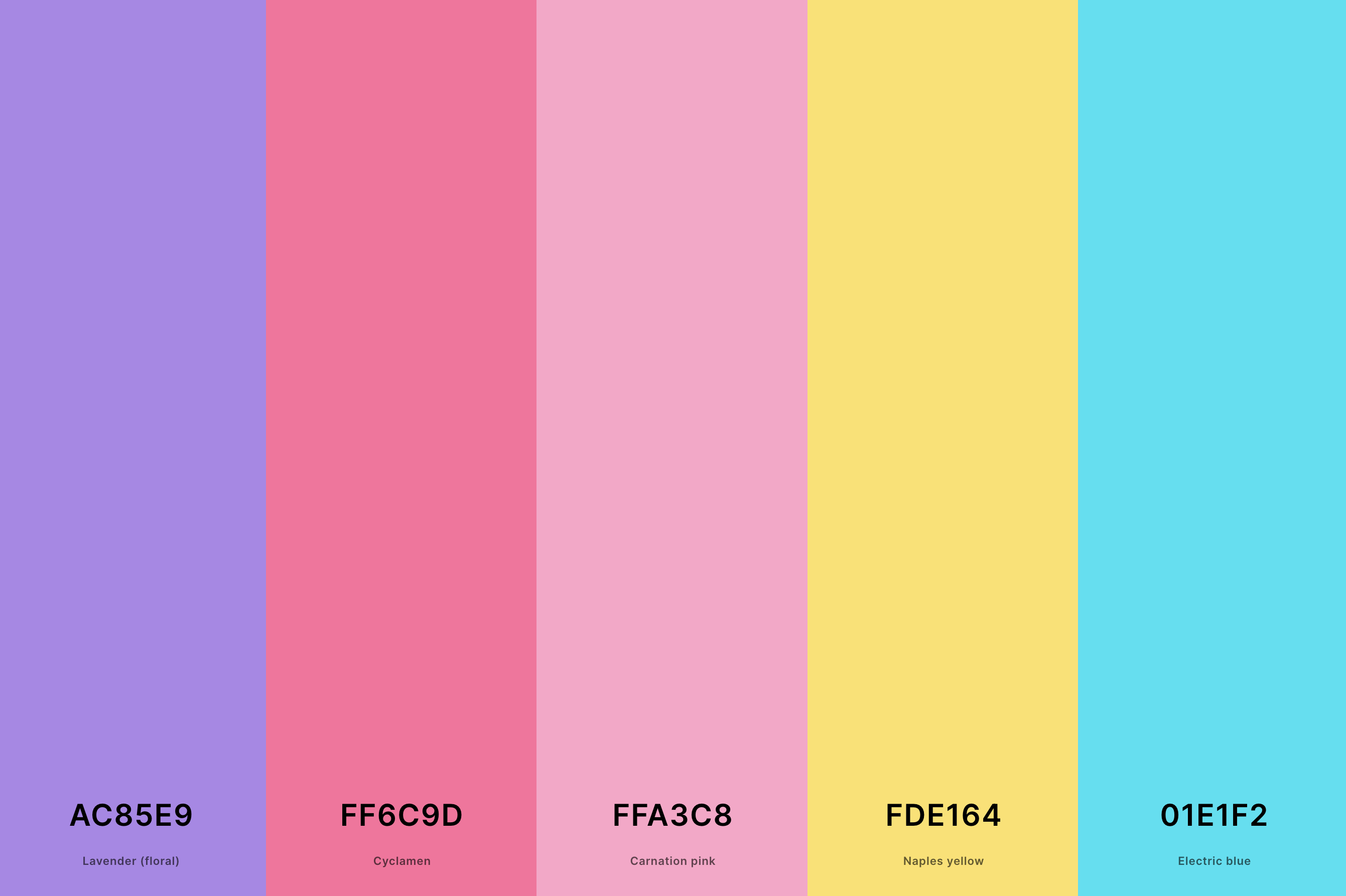
Hex Codes: #AC85E9, #FF6C9D, #FFA3C8, #FDE164, #01E1F2
This palette is a playful mix of bright, bold colors and softer, grungy tones. Neon pinks, electric blues, and vibrant yellows meet washed-out denims and earthy greens.
This combination captures the 90s' eclectic and experimental style, reflecting the decade's unique blend of optimism and edginess. Perfect for designs that aim to evoke the 90s' diverse cultural landscape.
20. Retro Aesthetic Color Palette
Delft Blue + Keppel + Orange (Web) + Giants Orange + Imperial Red
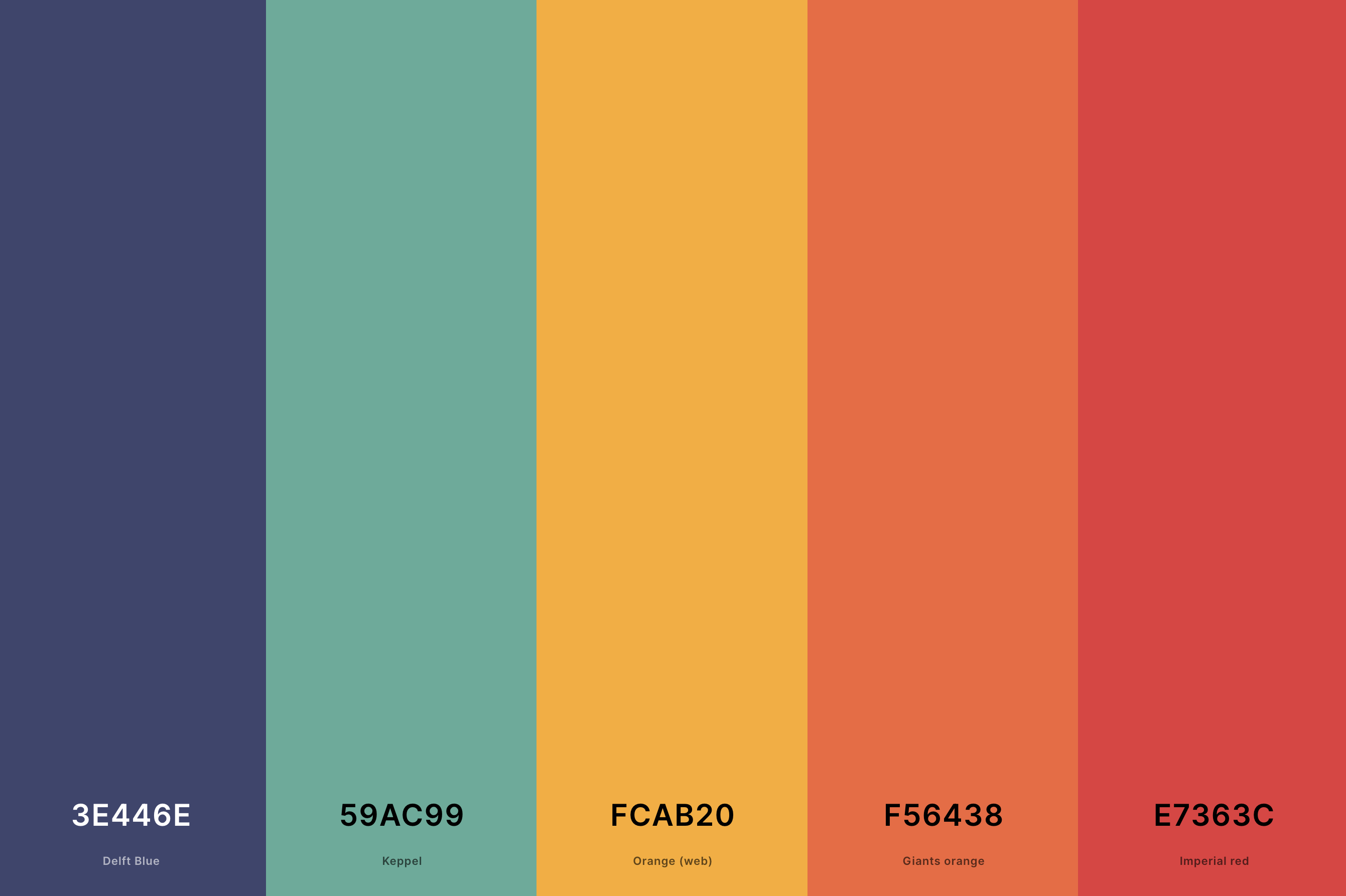
Hex Codes: #3E446E, #59AC99, #FCAB20, #F56438, #E7363C
This palette embraces a variety of shades, from pastel pinks and blues to deeper, more saturated colors like burgundy and navy. It's a versatile mix that captures the essence of different retro eras, from the optimistic 50s to the vibrant 80s.
This palette is ideal for designs that aim to channel a sense of nostalgia while maintaining a broad appeal across various retro styles.
21. Retro Anime Color Palette
Auburn + Scarlet + Champagne + Myrtle Green + Rich Black
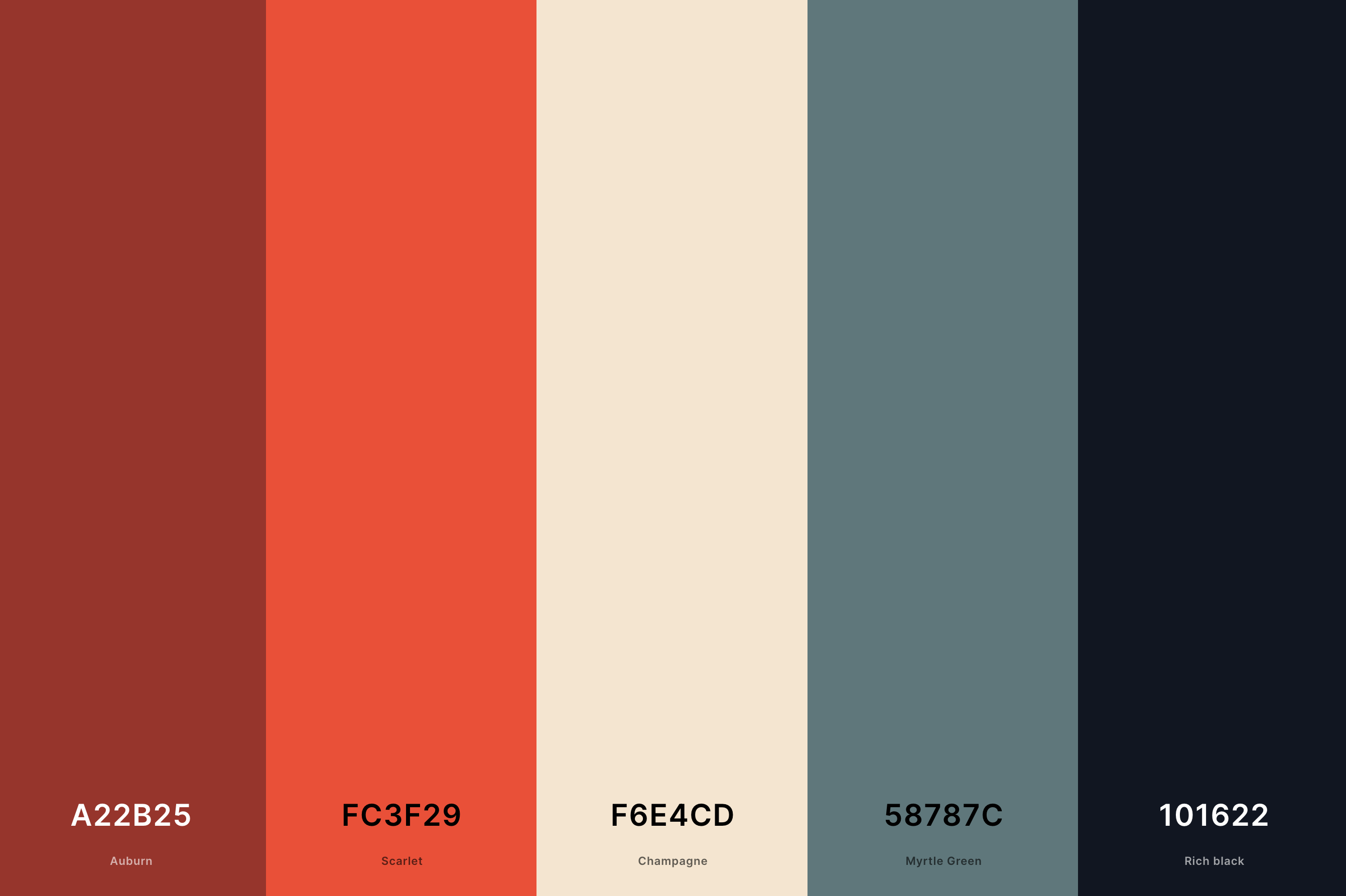
Hex Codes: #A22B25, #FC3F29, #F6E4CD, #58787C, #101622
Featuring a mix of bold primary colors and pastel tones, this palette captures the essence of classic anime aesthetics from the 80s and 90s.
Vivid reds, blues, and yellows are softened by gentle pinks and light blues, reflecting the dynamic and expressive nature of retro anime art.
This palette is perfect for projects aiming to evoke the nostalgic charm and adventurous spirit of early anime.
22. Retro Arcade Color Palette
Iris + Bleu De France + Malachite + Amber + Persimmon
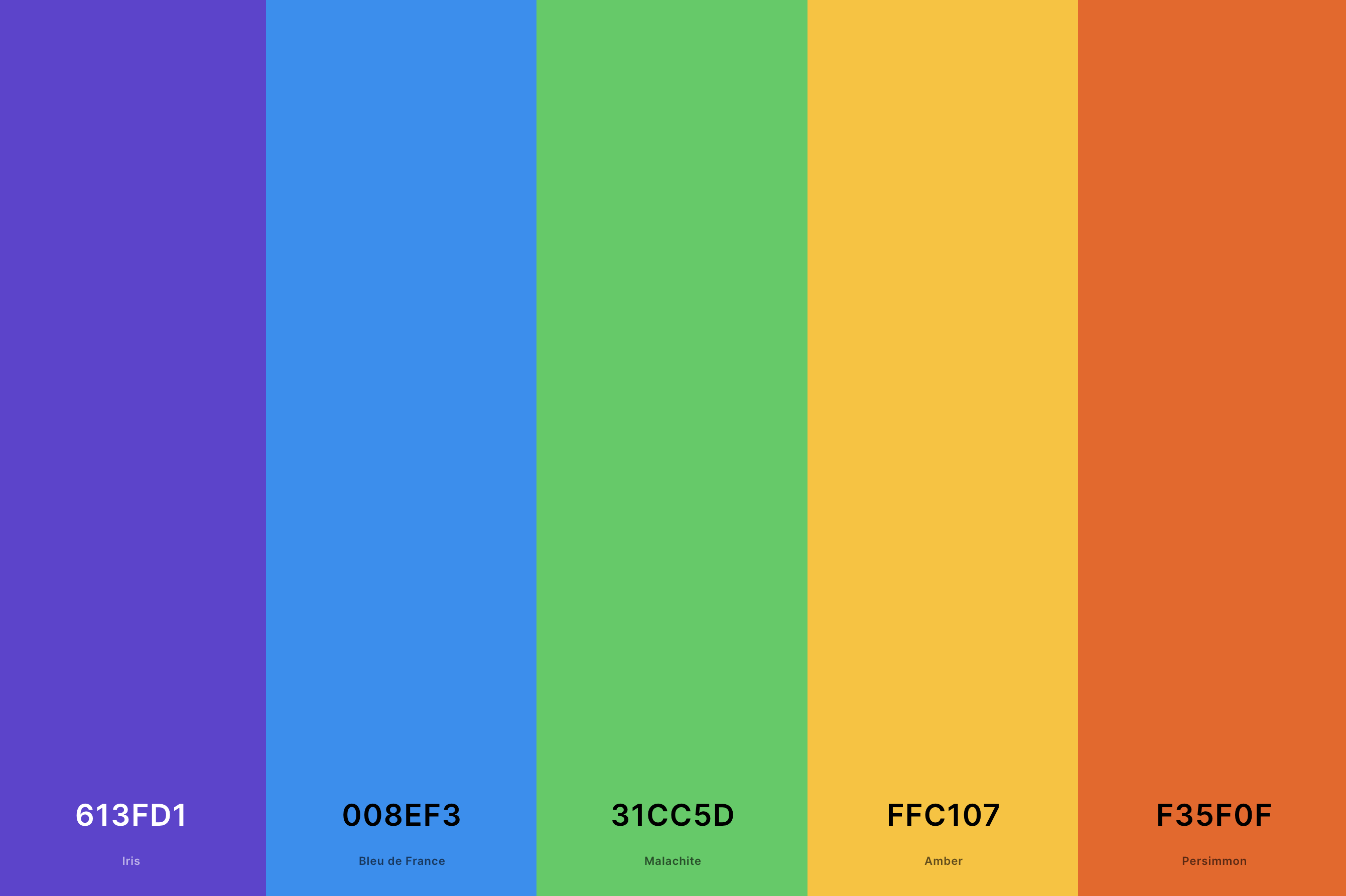
Hex Codes: #613FD1, #008EF3, #31CC5D, #FFC107, #F35F0F
This palette is a vibrant homage to the golden age of arcade games, featuring neon greens, bright pinks, electric blues, and glowing yellows. These colors reflect the luminous screens and flashy graphics that defined arcade culture.
Ideal for designs that seek to capture the excitement and energy of vintage gaming, this palette brings a playful, high-spirited vibe.
23. Retro Beach Color Palette
Giants Orange + Orange (Web) + Vanilla + Celadon + Keppel
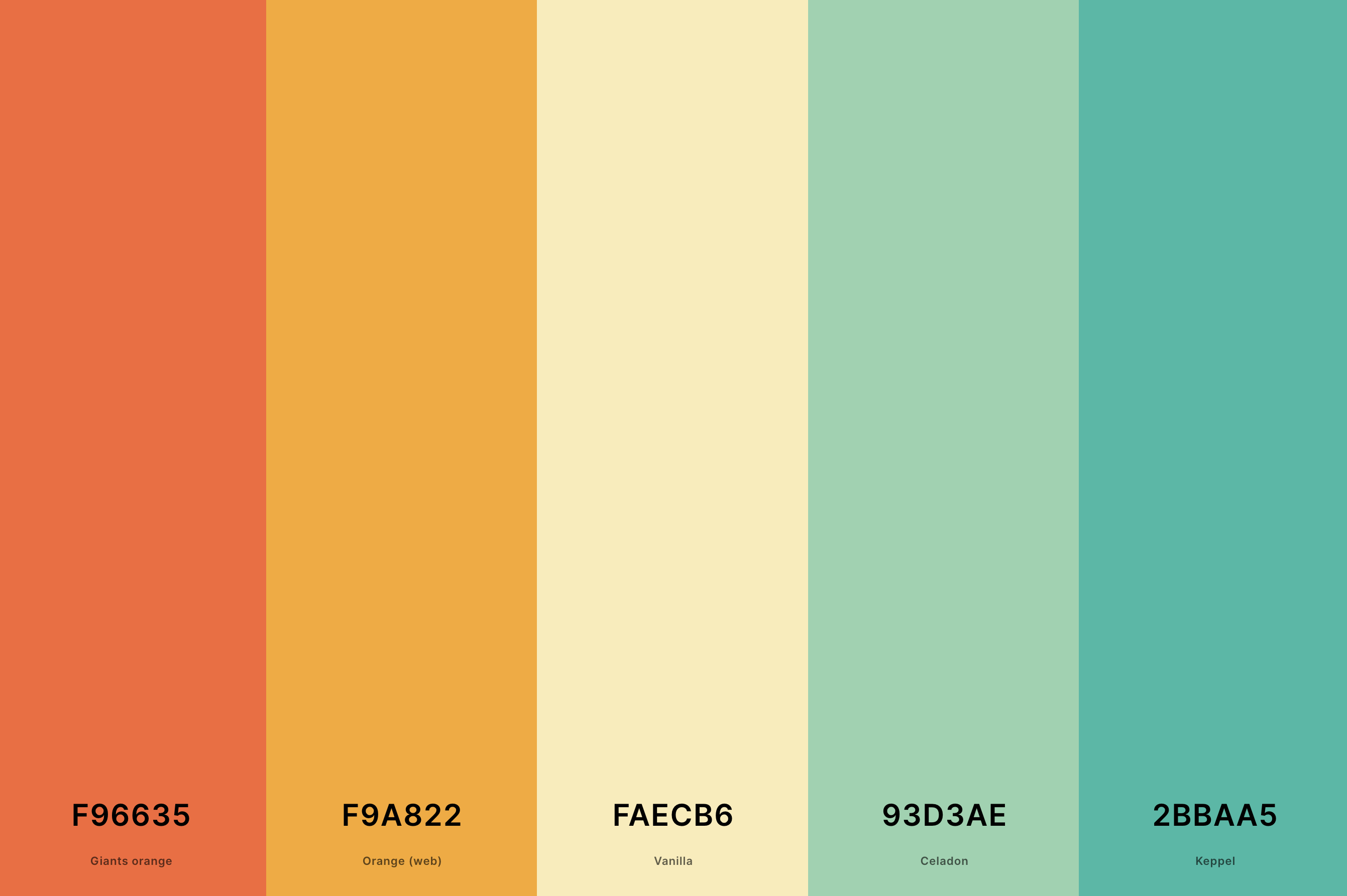
Hex Codes: #F96635, #F9A822, #FAECB6, #93D3AE, #2BBAA5
Evoking the laid-back and sunny beach scenes of the past, this palette combines sandy beiges, oceanic blues, and sunny yellows.
It's reminiscent of vintage beach postcards and old surf movies, capturing the effortless cool and relaxed ambiance of retro coastal life.
Perfect for designs that aim to bring a sense of timeless summer fun and seaside nostalgia.
24. Retro Blue Color Palette
Polynesian Blue + Yale Blue + Raisin Black + Payne'S Gray + Blue Gray
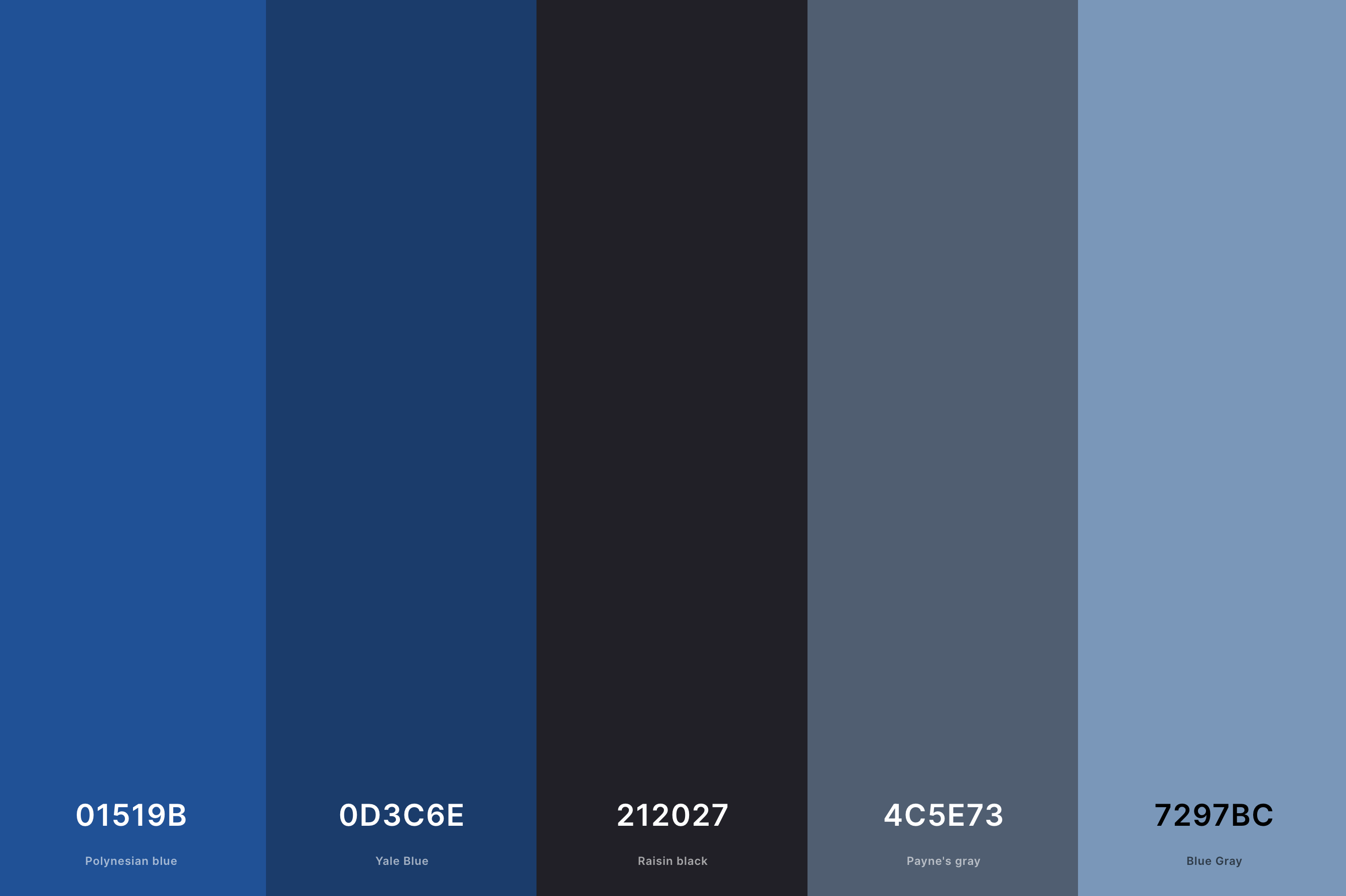
Hex Codes: #01519B, #0D3C6E, #212027, #4C5E73, #7297BC
This palette explores the depth of blue, from deep navy to bright sky blue, reflecting its popularity in various retro eras.
Blues were often used in everything from mid-century furniture to 80s fashion.
This range of blues is ideal for creating a sense of calm and elegance, echoing the enduring appeal of blue in retro design and style.
25. Retro Fall Color Palette
Dark Green + Dark Moss Green + Orange (Web) + Orange (Pantone) + Rufous
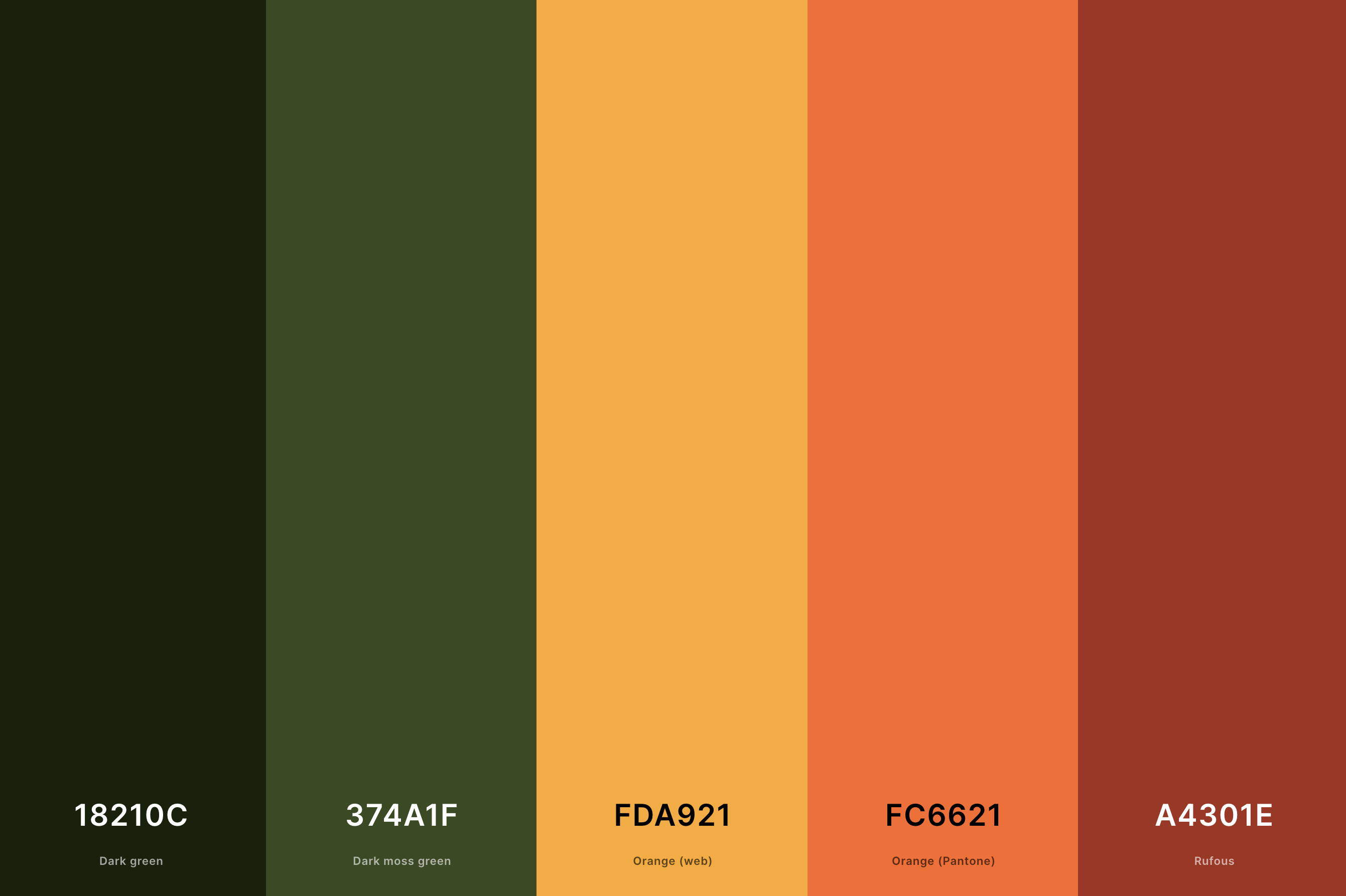
Hex Codes: #18210C, #374A1F, #FDA921, #FC6621, #A4301E
Inspired by the warm and earthy tones of autumn, this palette features rich oranges, deep reds, and golden yellows, complemented by softer browns and greens.
It captures the cozy and comforting atmosphere of fall, reminiscent of vintage Thanksgiving decorations and the natural changes of the season.
This palette is perfect for designs that aim to evoke the nostalgic warmth and rustic charm of retro autumn scenes.
26. Retro Game Color Palette
Midnight Blue + Grape + Aquamarine + Folly + Fandango
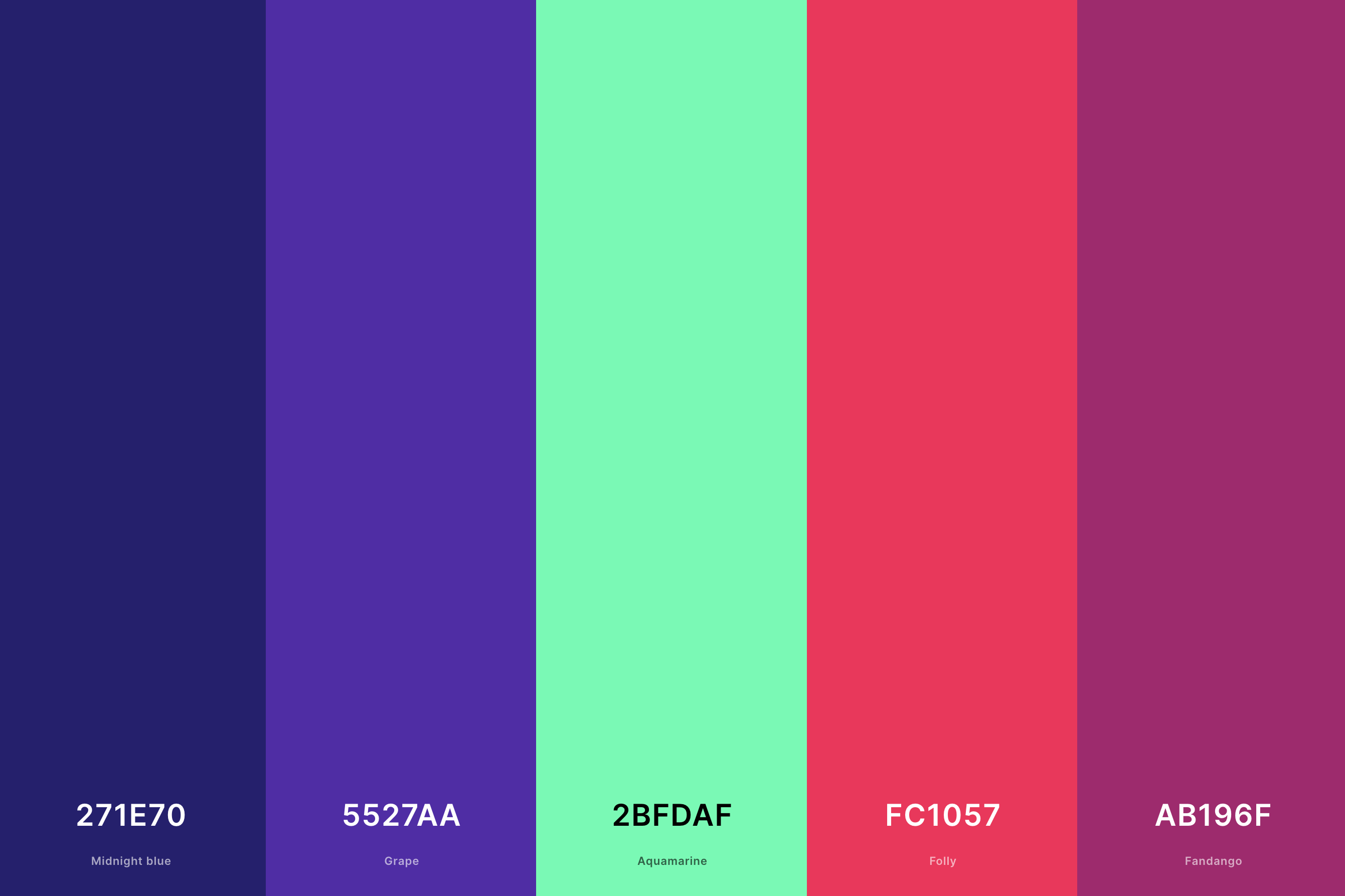
Hex Codes: #271E70, #5527AA, #2BFDAF, #FC1057, #AB196F
This palette is a lively mix of primary and secondary colors – think bold reds, blues, greens, and yellows.
These shades are reminiscent of the early days of video gaming, where bright, distinct colors were used to create memorable characters and worlds within the limited graphics of the time.
Ideal for designs aiming to capture the simplicity and iconic charm of retro video games, this palette brings a playful and nostalgic energy.
27. Retro Pink Color Palette
Dark Purple + Coral Pink + Tea Rose (Red) + Anti-Flash White + Tan
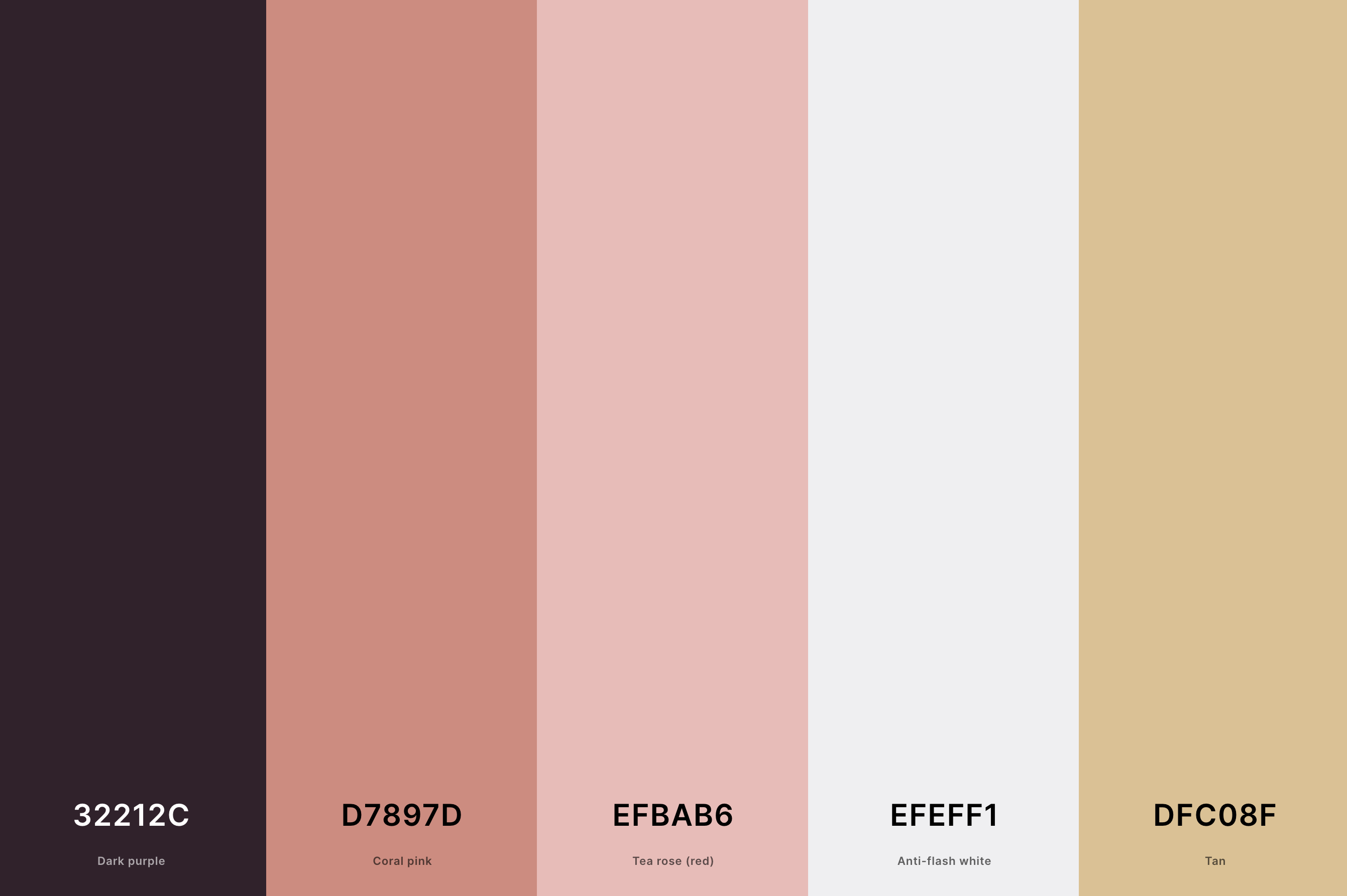
Hex Codes: #32212C, #D7897D, #EFBAB6, #EFEFF1, #DFC08F
Dominated by various shades of pink, from soft pastels to vibrant fuchsias, this palette encapsulates the playful and sometimes whimsical use of pink in different retro eras.
It reflects the color's popularity in mid-century interior design, 80s fashion, and pop culture.
This range of pinks is perfect for creating a sense of fun and femininity, capturing the heart of retro styles that embraced boldness and softness in equal measure.
What Are Retro Colors?
Retro colors are a fascinating subject in the world of design, often defined by their ability to evoke nostalgia and bring to life the spirit of past decades. These colors are typically associated with the color schemes popular in the 50s, 60s, 70s, 80s, and 90s, each era having its distinctive palette that reflects the cultural and social trends of the time.
In the 1950s, for instance, we see a lot of soft pastels and creamy neutrals, indicative of the era's optimism and the emerging American dream. Moving into the 60s, the color palette shifts to include psychedelic brights, signaling the cultural revolution and the rise of pop art. The 70s brought earthy tones and warm colors, mirroring the decade's love for nature and organic forms.
The 1980s are known for their bold neon and pastel colors, a reflection of the era's technological advancements and pop culture influence. Finally, the 90s saw a mix of grungy and bright, bold colors, embodying the decade's diverse cultural landscape.
Understanding retro colors is not just about recognizing these palettes but also appreciating their emotional and cultural significance. They provide a window into the past, allowing designers and color enthusiasts to create works that resonate with a sense of history and familiarity, while also offering a timeless appeal. By integrating retro colors into modern designs, one can create a unique blend of nostalgia and contemporary style, making these colors endlessly appealing and versatile.
How to Make a Great Retro Color Palette?
Creating a great retro color palette is an art that combines a deep understanding of color theory with a keen sense of historical aesthetics. The key is to evoke the spirit of a specific era while ensuring the palette is versatile and appealing to contemporary tastes. Here's a step-by-step guide to crafting an excellent retro color palette:
-
Choose Your Era: Start by selecting the time period you want to emulate. Each decade has its unique color story – from the pastels of the 50s to the neons of the 80s. This choice sets the foundation for your palette.
-
Research and Inspiration: Delve into the era's culture. Look at fashion, interior design, advertisements, and even popular movies of the time. This research will give you a genuine feel for the color trends of the period.
-
Select Core Colors: Based on your research, pick a few core colors that are representative of the era. For instance, avocado green and harvest gold for the 70s, or hot pink and electric blue for the 80s.
-
Add Complementary Shades: Once you have your core colors, add complementary shades to create balance and versatility. If your main colors are bold, consider including some neutral or muted tones.
-
Consider Modern Adaptation: Think about how these colors would fit into contemporary design. You might need to adjust the saturation or brightness to make them more suitable for current trends.
-
Test Your Palette: Apply your palette to various designs to see how well the colors work together. This step can help you fine-tune the shades for better harmony and appeal.
-
Feedback and Adjust: Finally, get feedback from others, especially those familiar with color theory and design. Use their input to make necessary adjustments.
Remember, a great retro color palette is not just about replicating the colors from a bygone era; it’s about reinterpreting them in a way that resonates with today’s audience while maintaining a nostalgic charm.
