This post may contain affiliate links. If you click one, we may earn a commission at no cost to you. Here's more details on how we make money.
Dive into the magical world of colors with us, where two vibrant characters - Blue and Green - are about to unite in an extraordinary dance. Have you ever wondered what happens when these two dynamic forces merge together?
Then join us in this vibrant journey, discovering what blue and green, when mixed together, create. Let's unlock the secret language of colors, spark our creativity, and experience the emotional resonance of this intriguing fusion.
What Color Does Blue and Green Make With Paints?
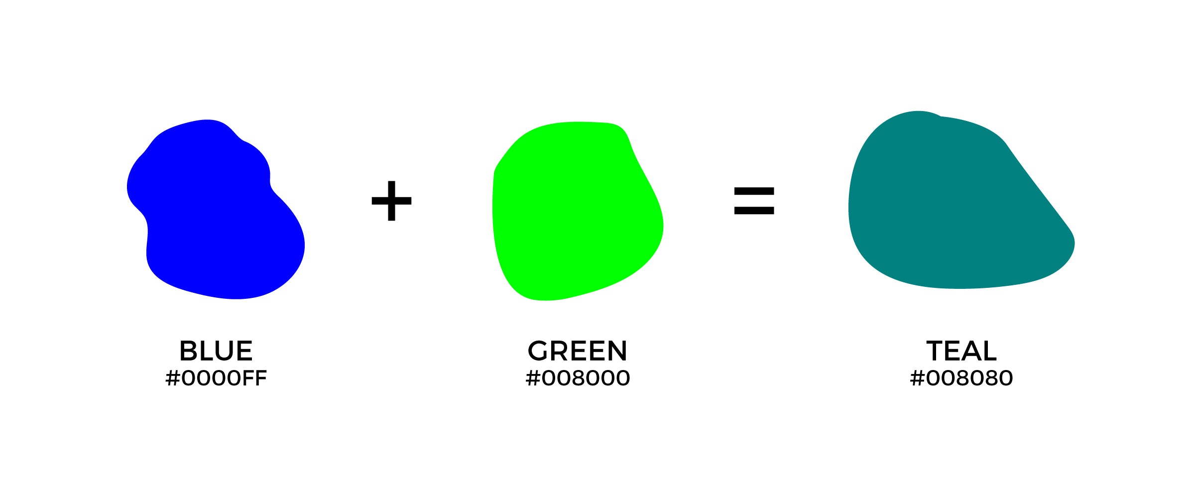
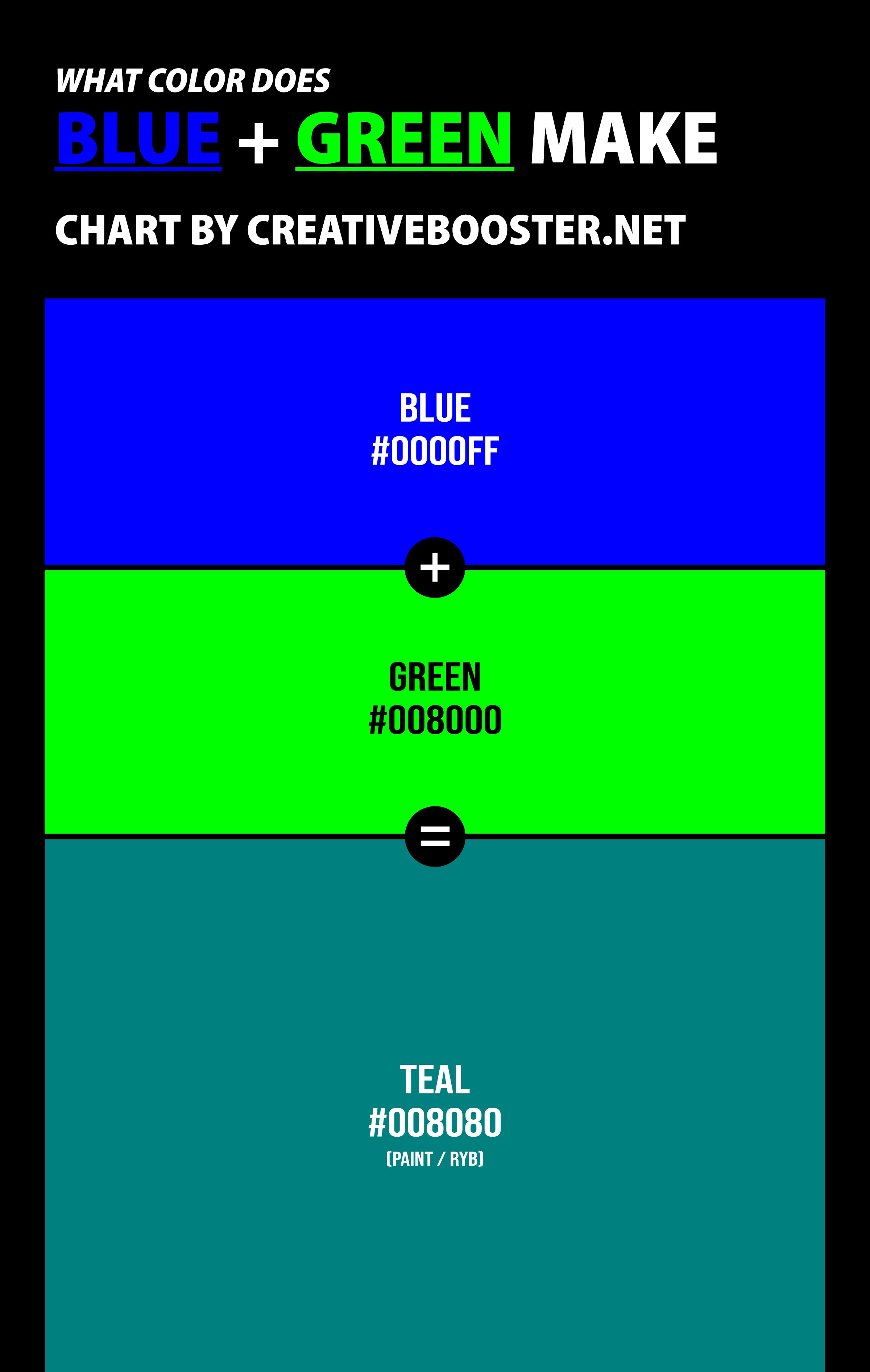
When mixing paints, green and blue makes teal. This occurs due to the intricacies of subtractive color mixing, a fascinating process that reveals the depth and richness of color in the physical world.
Now, imagine yourself as an artist, your brush ready to blend green and blue on your palette. As the paints mingle, they give birth to teal, a color that radiates tranquility and sophistication. This isn't just an act of creating new hues, but an emotional journey that connects us to the vibrant world of color.
Teal isn't just a color; it's a feeling. It's the comfort of balance and stability, the excitement of tropical adventures, the depth of the ocean, and the regality of the peacock. Teal exudes a sense of calm and relaxation, encouraging a feeling of openness and communication.
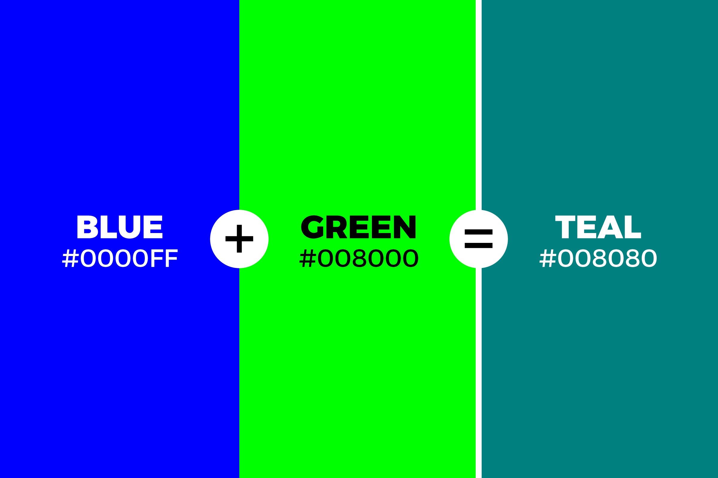
Moreover, the very process of watching blue and green blend into teal can be meditative, a moment of connection with the simple yet profound beauty of color.
So, the next time you see teal, remember the powerful dance of blue and green paints, the creative joy they bring, and the emotional depth they stir. After all, color isn't just something we see, it's something we feel.
What Color Does Blue and Green Make With Lights?
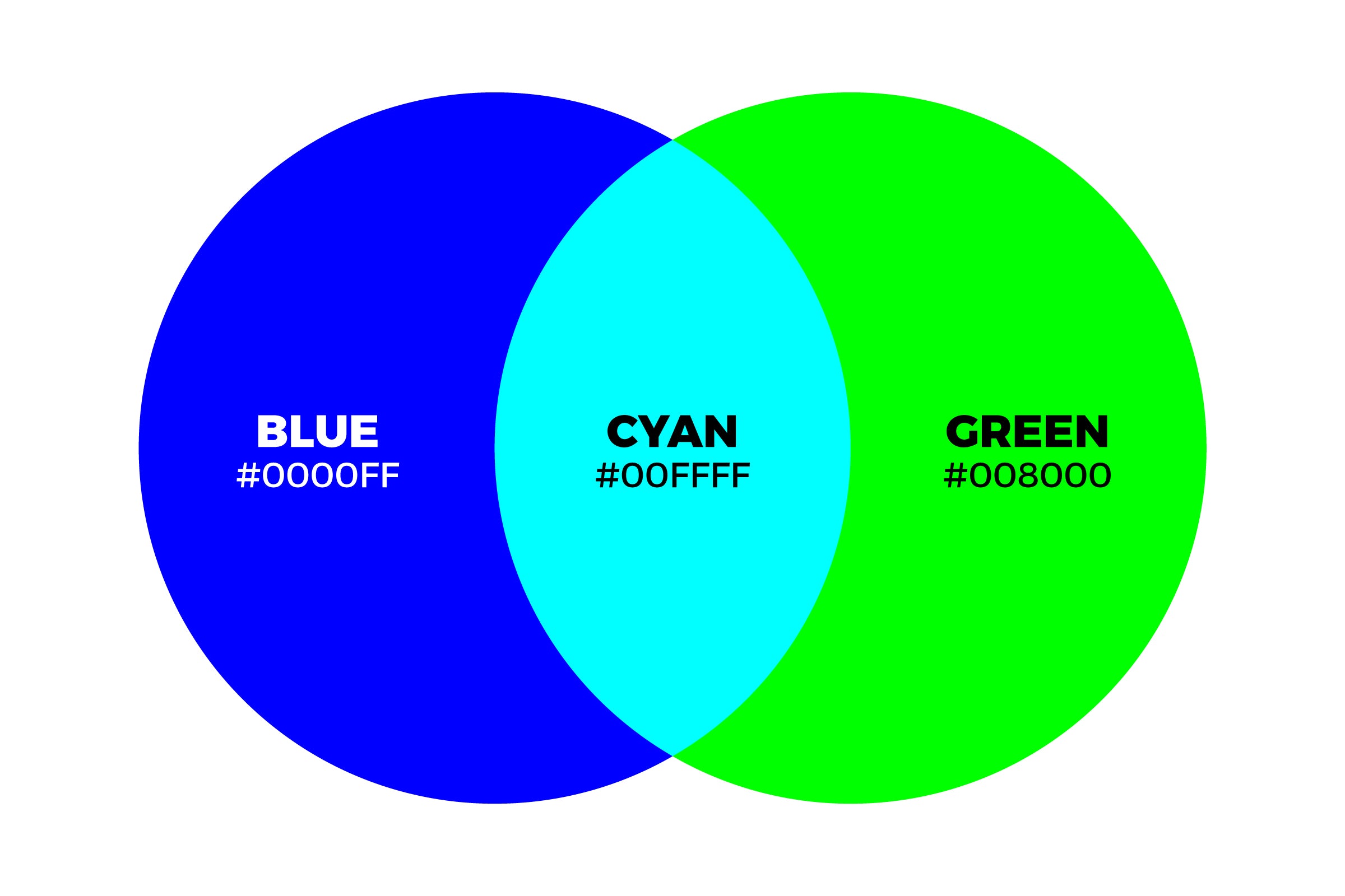
When green and blue mix in lights, the result is cyan. Cyan is a color that sings of the sea and the sky - a strikingly beautiful hue. But why does this fascinating fusion happen? It's all due to the magic of additive color mixing, a principle at play in the world of light.
To understand this, imagine yourself standing on a stage with two spotlights, one green and one blue. As they shine together, their lights intersect and blend, forming cyan, an intense color that feels refreshing and soothing to the eye. This isn't a mere physical phenomenon, but a psychological journey too, one that you experience every day.
Think about the glowing screens around you - your TV, your smartphone, your computer. Each pixel on these screens is a dance floor where red, green, and blue lights waltz together, creating millions of colors, including cyan.
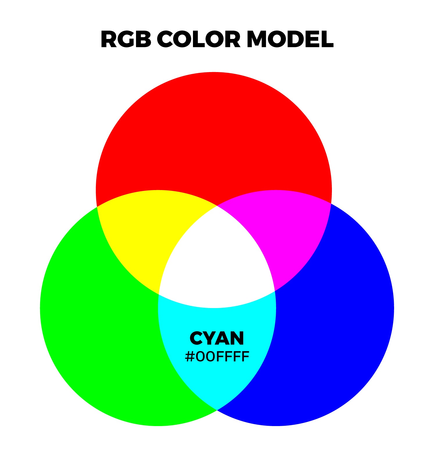
Cyan also has a significant psychological impact. It's a color that evokes feelings of calmness, clarity, and emotional balance. It's the color of peace, linking us with the soothing rhythm of water and the wide expanse of the sky, helping to reduce stress and anxiety.
In the realm of colors, cyan, the child of blue and green light, is a testament to unity, harmony, and the extraordinary world of additive color mixing. So next time you see a cyan hue, remember the wonderful dance of blue and green lights that makes it all possible.
Names of Blue and Green Colors Mixed Together
Teal
Teal is a dark yet vivid shade of azure, making it the perfect choice for anyone who wants to add depth and elegance to their living space. Teal can be used as an accent color or even as the main hue in your room – either way, you will observe that its subtlety brings forth an aura of gracefulness.
Teal
HEX #008080
RGB 0, 128, 128
CMYK 100, 0, 0, 50
Cyan
Cyan creates vibrancy by blending together mixtures of green, blue, and white pigments into a delightful hue that exudes warmth yet remains quietly intense at the same time. As such, cyan can be used either as accentuating feature or as main stage design element depending on how you want to affect your moods.
Cyan
HEX #00FFFF
RGB 0, 255, 255
RGB percentage 0%, 100%, 100%
CMYK 100, 0, 0, 0
HSL 180°, 100%, 50%
Azure
Azure is a brilliant blue-green color. It has been associated with clarity and freshness, perfect for instilling feelings of relaxation and serenity. Its boldness makes it an ideal choice for energizing your living space or adding drama to a dull room.
Azure
HEX #007FFF
RGB 0, 127, 255
RGB percentage 0%, 49.8%, 100%
CMYK 100, 50.2, 0, 0
HSL 210°, 100%, 50%
Baby Blue
Baby Blue is one the softest shades available in green-blue palette. This pastel shade evokes both peace and joy - its tranquil hues make baby blue an excellent background color while its subtle liveliness will bring brightness to any surrounding.
Baby Blue
HEX #89CFF0
RGB 137, 207, 240
RGB percentage 53.7%, 81.2%, 94.1%
CMYK 43.1, 14.1, 0, 5.9
HSL 200°, 73.3%, 76.5%
Robin Egg Blue
Robin Egg Blue has long been a beloved tint around the world because of its calming vibes. It is usually described with adjectives such as airy and lighthearted due to how effortlessly it blends both coolness from blue along with freshness from green hues.
Robin Egg Blue
HEX #96DED1
RGB 150, 222, 209
CMYK 32, 0, 6, 13
Aqua
Aqua may not quite have all shades of turquoise but still manages to sparkle when placed against any backdrop - especially if earthy tones are chosen wisely! Its cheerful, almost bubbly composition stands out without being too ostentatious which makes Aqua great for those looking for something unique yet non-intrusive.
Aqua
HEX #00FFFF
RGB 0, 255, 255
CMYK 100, 0, 0, 0
Aquamarine
Aquamarine stays true to its namesake by displaying glimmering hints within each brush stroke. The bright aqua tints capture attention while retaining peaceful undertones at the same time; ideal if one wishes relaxation amidst immense charm when executing design ideas into reality.
Aquamarine
HEX #7FFFD4
RGB 127, 255, 212
CMYK 50, 0, 17, 0
Turquoise
Turquoise is a popular shade that pairs nicely with any style. Its charming blend of green and blue pigments offers unrivalled elegance which can be juxtaposed against whites, grays or even black for an eye-catching display.
Turquoise
HEX #40E0D0
RGB 64, 224, 208
CMYK 71, 0, 7, 12
Are Blue and Green Complementary Colors?
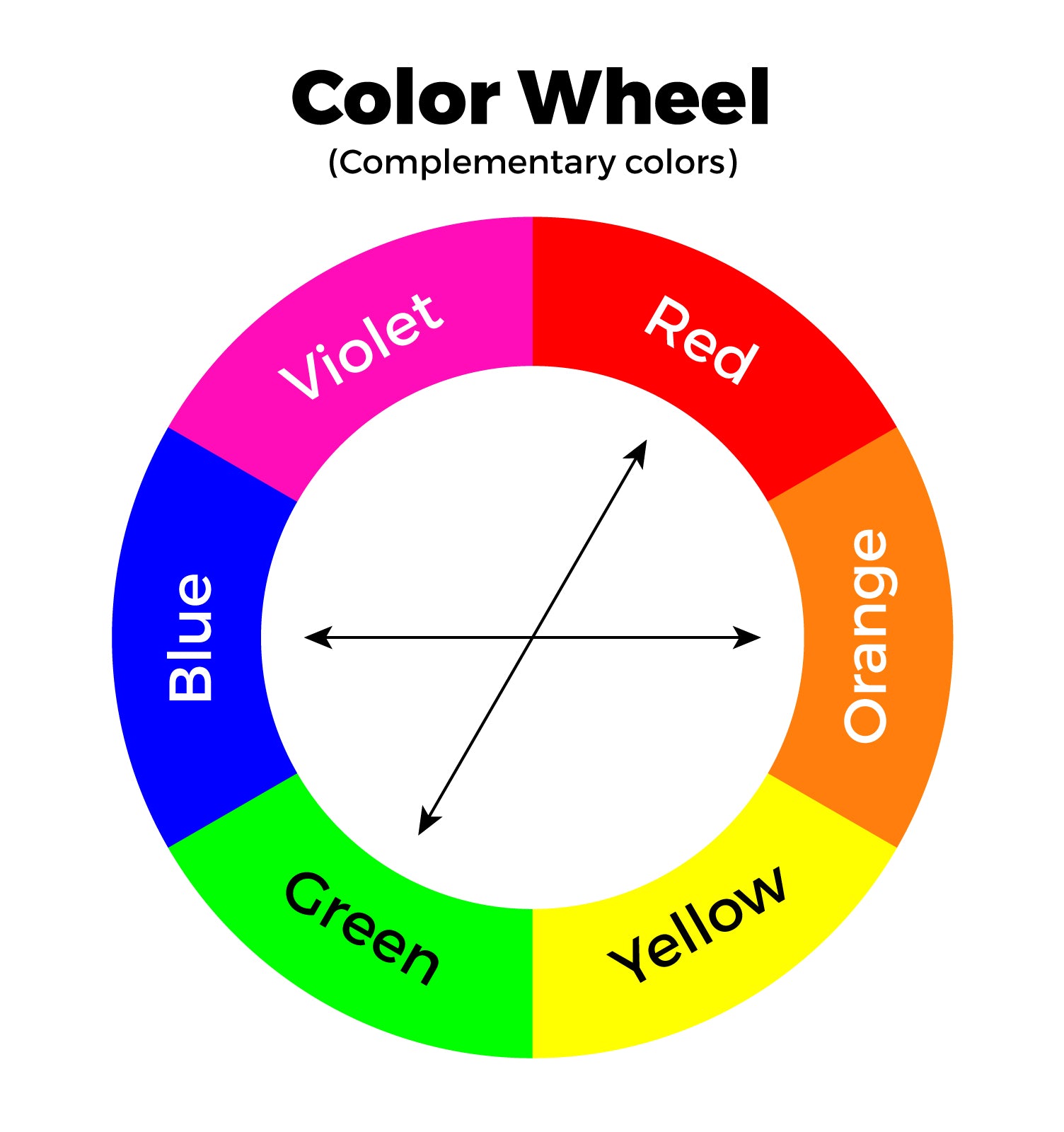
A symphony in the color world, complementary colors are a wondrous pairing that brings vibrancy, balance, and contrast to our visual experience. But are blue and green complementary colors? In the traditional sense, they are not. However, there's a deeper story that weaves through the heart of color theory.
In the color wheel, complementary colors sit directly opposite each other. For blue, its complement is a warm, fiery orange; for green, it's the passionate, vibrant red. When placed side by side, complementary colors make each other pop, bringing a dynamic energy to any visual composition.
But what about blue and green? Their closeness on the color wheel brings harmony rather than contrast. Together, they create a cool, calming effect, a soothing visual echo of nature's own palette in the skies and forests.
However, in the realm of color psychology, blue and green share a complementary bond. Both evoke feelings of tranquility, calmness, and rejuvenation. Blue, the color of the sea and sky, brings a sense of peace and stability. Green, the color of nature, instills a feeling of growth and renewal.
So, while blue and green may not be complementary in the traditional color theory sense, they certainly complement each other in evoking similar emotional responses. This intertwining dance of harmony and psychology is one of the many reasons why the world of color is endlessly fascinating.
