This post may contain affiliate links. If you click one, we may earn a commission at no cost to you. Here's more details on how we make money.
In this guide, we'll dive deep into the chromatic waters of color theory, unraveling the mystery of color mixing. Blue, the color of calm skies and deep seas, meets purple, the royal emblem of luxury and creativity.
What captivating shade emerges from their union? Buckle up for a fascinating journey, as we learn not just about the product of this chromatic blend, but also a lot more about these beautiful colors.
What Color Does Blue and Purple Make With Paints?

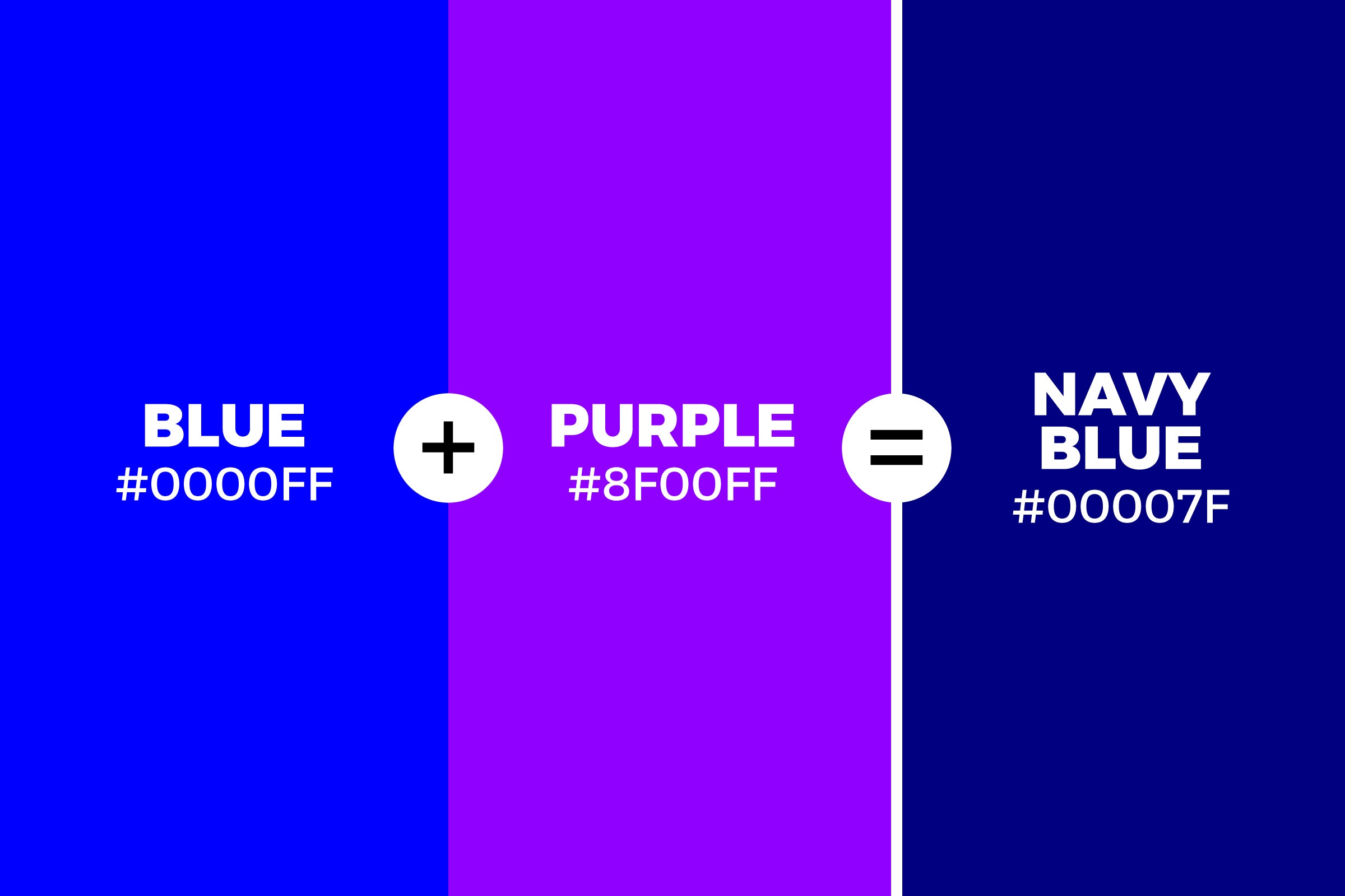
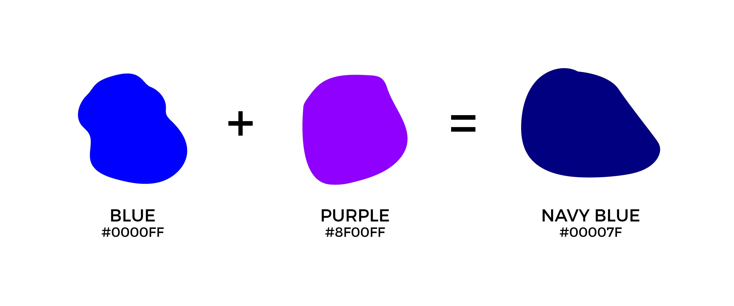
Blue and purple make a deep, rich, and enigmatic navy blue - a color that carries the tranquil depth of the night sky and the mystique of twilight. As fascinating as this may sound, this color blending is a riveting journey worth exploring.
Blue, the epitome of calm and stability, meets Purple, the emblem of creativity and luxury. Their merger in the world of paint brings forth the profound and sophisticated navy blue, a shade that whispers tales of the deep sea and starry skies.

But here's the twist in the tale! The resulting hue can subtly change with the variation of blue and purple ratios. More blue gives it a cooler feel, while an extra dash of purple warms it up, showcasing the dynamic spectrum of navy blue.
What Color Does Blue and Purple Make With Lights?
When the soothing waves of blue light merge with the vibrant rays of purple, an extraordinary spectacle of color takes center stage. But what hue do these two colors create when they dance together under the spotlight? Let's illuminate the answer: it's a striking and radiant shade of magenta!
Unlike mixing paints, mixing lights involves additive color theory, where colors blend by adding wavelengths of light together. Blue, a primary color in the light spectrum, when combined with purple, essentially a mix of red and blue, amplifies its red component. This leads to the creation of brilliant magenta, an electric pink-purple hue that truly dazzles the eye.
Intriguing, isn't it? The world of colored lights is a fascinating arena where the usual rules of color mixing don't always apply. And that's just the tip of the iceberg. Ready to light up your understanding of colors? Join us as we delve deeper into the luminescent mysteries of color theory, one light wave at a time!
Names of Blue and Purple Colors Mixed Together
When blue, the color of tranquility, and purple, the symbol of luxury, join forces, they give birth to a stunning spectrum of hues. Let's dive into the canvas of color and explore the beautiful names of these mixed shades.
Navy Blue
With a generous addition of purple to blue, we get a dark, almost black, navy blue. It's the color of deep waters, symbolizing both power and depth.
Periwinkle
A delightful pastel shade where blue meets lavender. This hue is as dreamy and delicate as the flower it's named after.
Lavender Blue
This hue sits a bit closer to blue on the color spectrum, but with a charming hint of purple. It's a calming color, like a peaceful summer sky just before dusk.
Indigo
Darker than periwinkle and lavender blue, indigo is a deep, rich blend of blue and purple. It's as mysterious as the night sky and just as captivating.
Violet
Violet is a vibrant shade that leans more towards purple, but with a noticeable presence of blue. This dynamic color seems to pulse with creative energy.
Are Blue and Purple Complementary Colors?
No, contrary to popular belief, blue and purple are not complementary colors. It's a common misconception, but let's set the record straight, shall we?
In the world of color theory, complementary colors sit directly opposite each other on the color wheel. This arrangement creates a high contrast, making each color seem more vibrant when paired. So, what is the complementary color to blue? It's orange! For purple, it’s yellow. Now, that’s a vibrant visual, isn't it?
But why are blue and purple often mistaken as complements? It's because they are analogous colors, meaning they sit next to each other on the color wheel, leading to a harmonious blend rather than a stark contrast. They create serene and comforting color palettes, often seen in nature during twilight hours.


