This post may contain affiliate links. If you click one, we may earn a commission at no cost to you. Here's more details on how we make money.
Welcome to our latest blog post about the best orange color palettes! Orange, a color that radiates warmth and vitality, is a versatile shade that can transform any space or design. It's the color of sunsets, autumn leaves, and juicy citrus fruits, bringing a sense of energy and positivity.
In this post, we'll explore over 25 stunning orange color palettes, each offering its unique charm and personality. From the deep, rustic tones of burnt orange to the bright and lively shades of neon orange, we'll showcase a diverse range of combinations that demonstrate just how well orange goes with other colors.
Get ready to be inspired as we delve into the world of orange color palettes, where each palette tells its own vibrant story. Let's discover the perfect orange palette that resonates with your style and vision!
Related reading: 100+ Shades of Orange Color
1. Burnt Orange Color Palette
Tawny + Persimmon + Orange (Wheel) + Gamboge + Xanthous
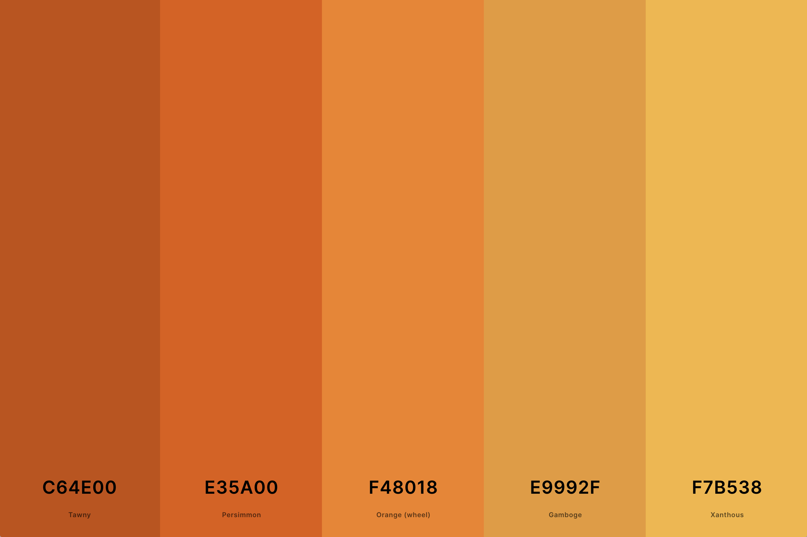
Hex Codes: #C64E00, #E35A00, #F48018, #E9992F, #F7B538
This palette features deep, warm tones that resemble the colors of autumn leaves or a sunset. The rich shades of burnt orange are complemented by soft browns and tans, creating a cozy and inviting atmosphere.
This combination is ideal for spaces seeking a touch of warmth and earthiness, making it a surprising yet harmonious choice for a purple color palette. The inclusion of these warmer tones can add depth and contrast to cooler purple shades.
2. Orange And Blue Color Palette
Pumpkin + Orange Peel + Pacific Cyan + Honolulu Blue + Marian Blue
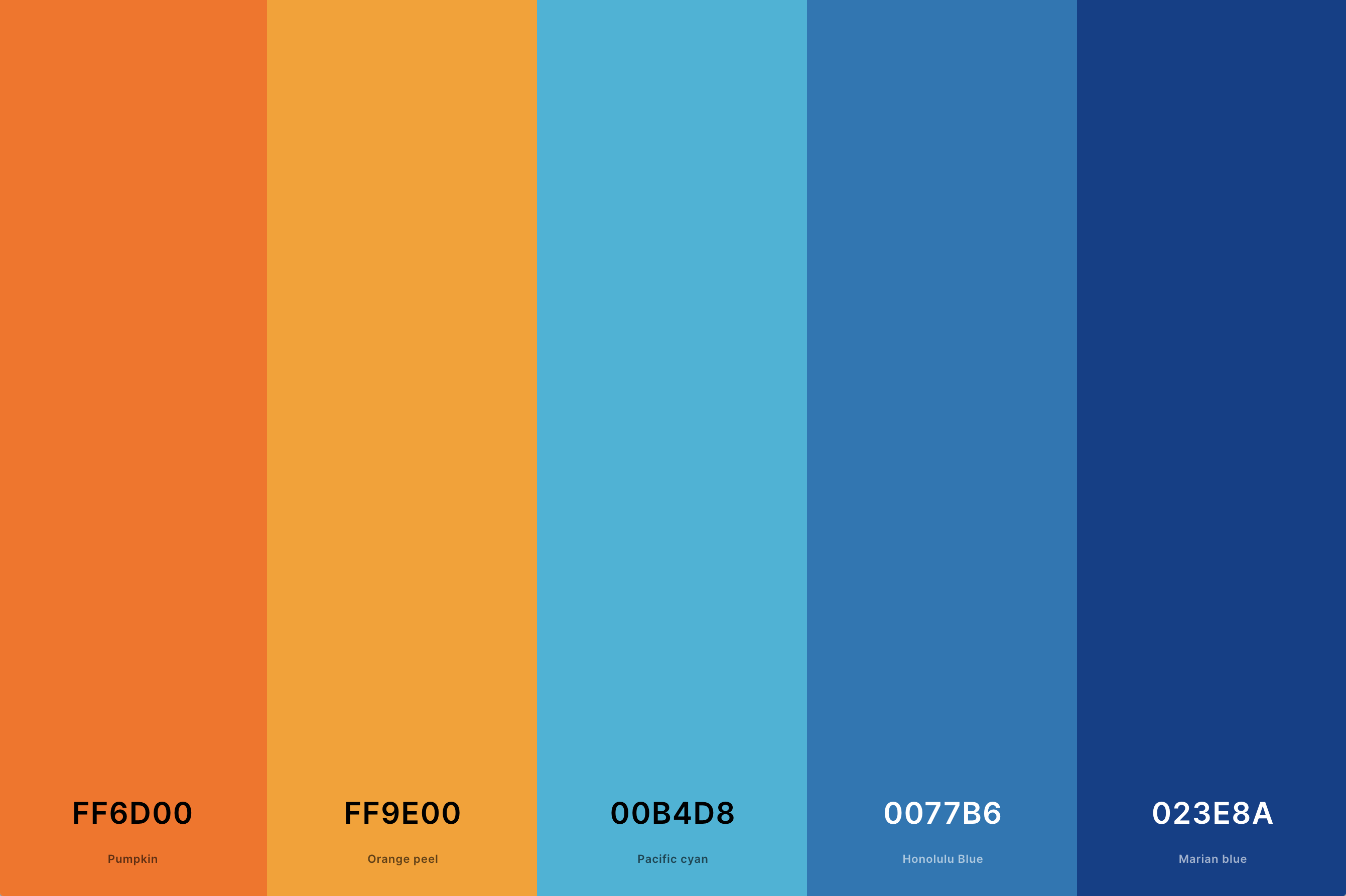
Hex Codes: #FF6D00, #FF9E00, #00B4D8, #0077B6, #023E8A
A classic complementary color scheme, the vibrant interaction between orange and blue creates a dynamic and lively palette. This combination is perfect for designs seeking high contrast and visual interest.
In a purple color palette, the addition of orange brings energy and brightness, while the blue provides a calming balance. This trio can be used effectively in both modern and traditional settings.
3. Orange And Green Color Palette
Orange (Pantone) + Ut Orange + Gold + Lime Green + Forest Green
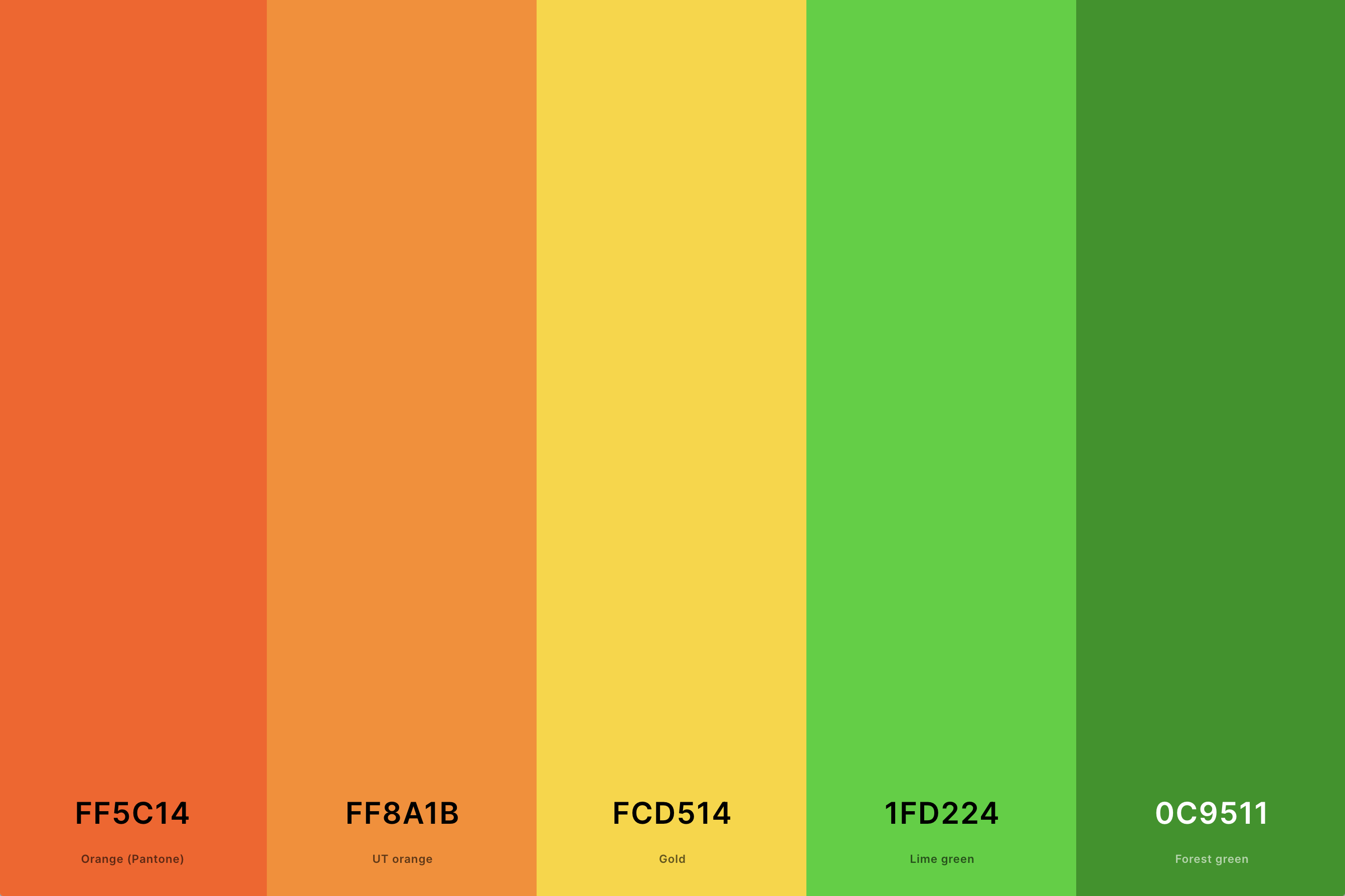
Hex Codes: #FF5C14, #FF8A1B, #FCD514, #1FD224, #0C9511
This palette combines the freshness of green with the zest of orange, creating a lively and organic feel. It's reminiscent of nature, evoking images of spring blooms and citrus orchards.
When integrated into a purple color palette, these colors offer a spectrum that spans from natural and earthy to bold and vibrant. This range allows for versatile design applications, from playful and energetic to more subdued and naturalistic.
4. Purple And Orange Color Palette
Russian Violet + Purple + Veronica + Sandy Brown + Dark Orange (Web)
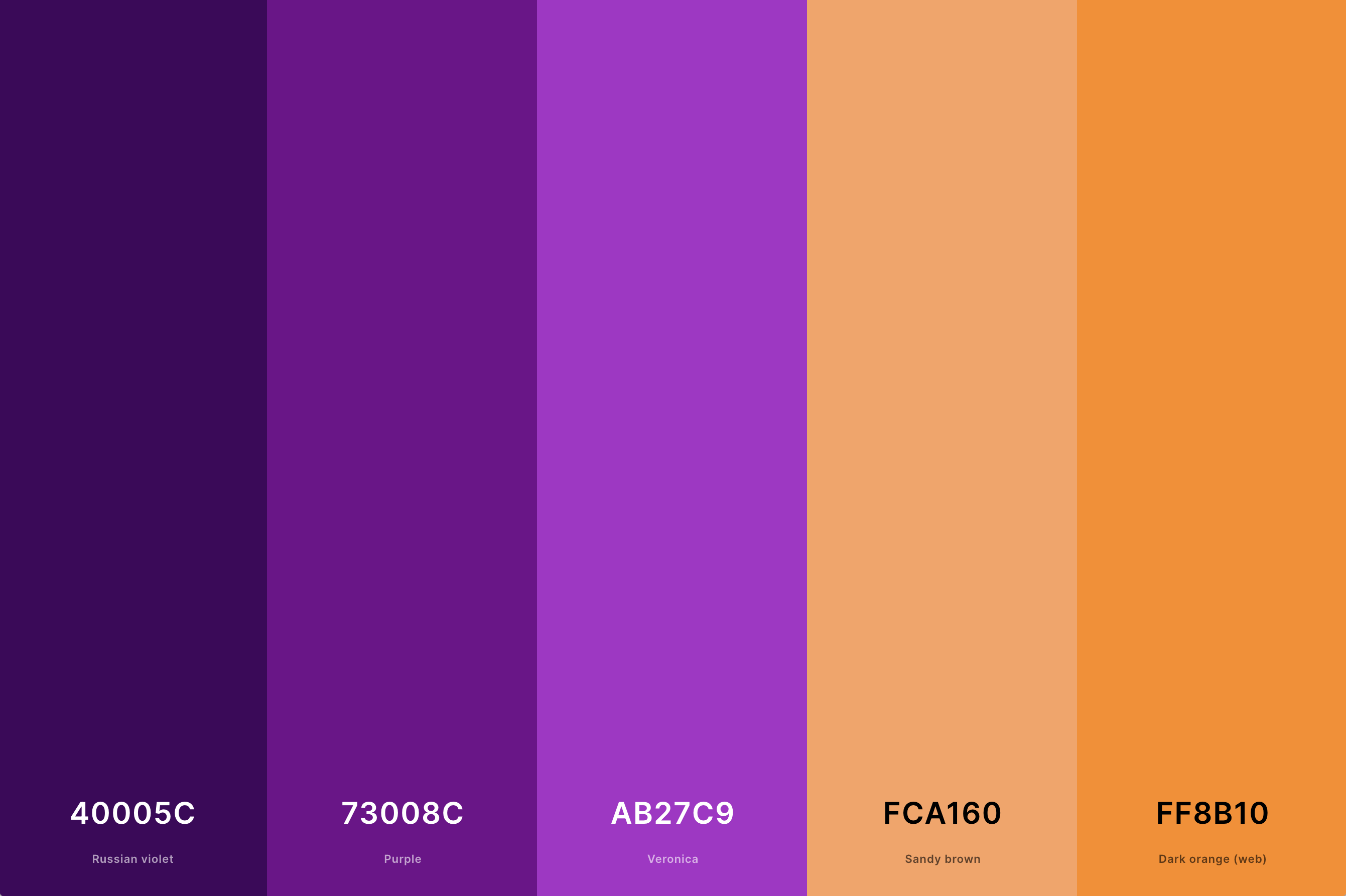
Hex Codes: #40005C, #73008C, #AB27C9, #FCA160, #FF8B10
This palette is an adventurous choice, blending the regal and mysterious qualities of purple with the playful and energetic vibes of orange. This combination is ideal for innovative and creative spaces, offering a balance between sophistication and fun.
The presence of purple tones down the brightness of orange, while the orange adds a splash of excitement to the otherwise serene purple.
5. Light Orange Color Palette
Orange (Pantone) + Pumpkin + Sandy Brown + Light Orange + Light Yellow
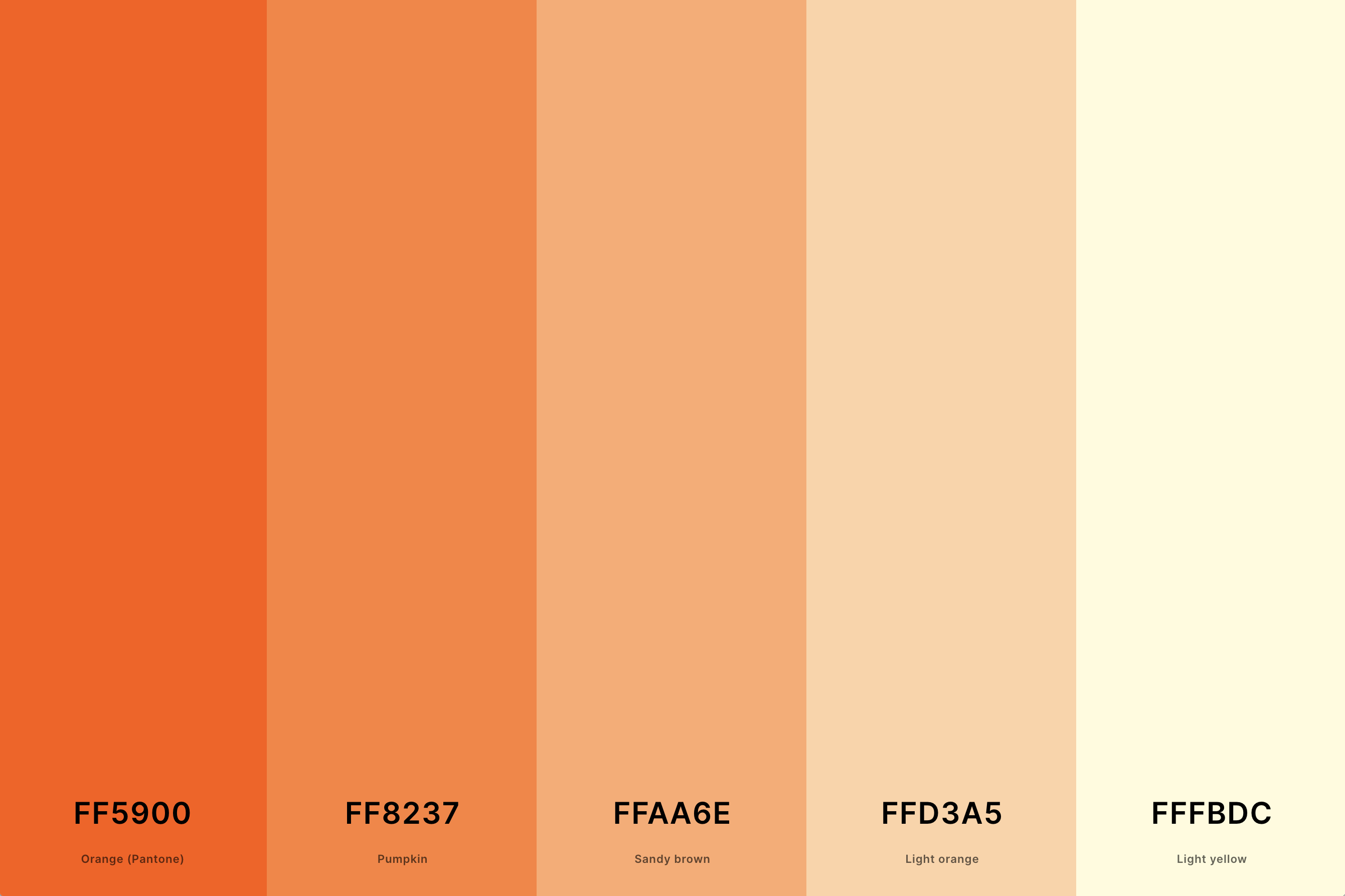
Hex Codes: #FF5900, #FF8237, #FFAA6E, #FFD3A5, #FFFBDC
This palette consists of soft, muted orange tones that evoke a sense of calm and simplicity. It's reminiscent of a gentle sunrise or the soft petals of a light-colored marigold.
When paired with purple, this palette creates a delicate and harmonious look. The light orange shades add a subtle warmth to the cool purples, making it an excellent choice for designs that aim to be soothing and understated.
6. Orange And Pink Color Palette
Ut Orange + Sandy Brown + Fairy Tale + Cherry Blossom Pink + Bright Pink (Crayola)
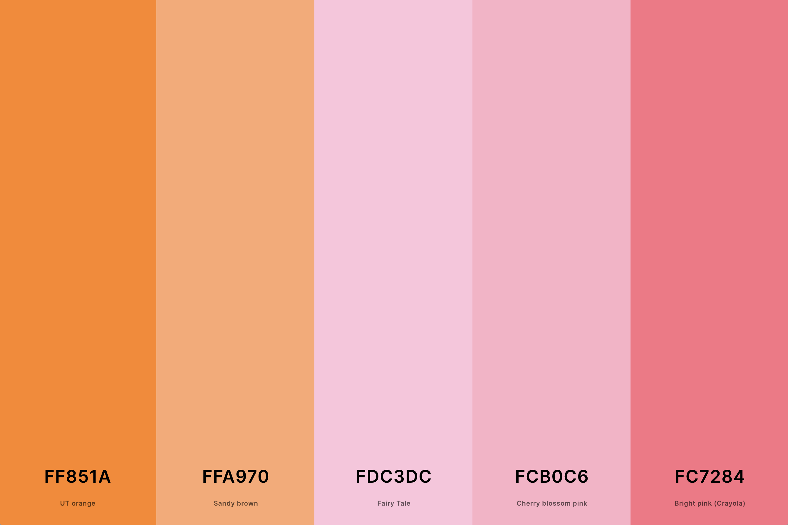
Hex Codes: #FF851A, #FFA970, #FDC3DC, #FCB0C6, #FC7284
This palette combines the warmth of orange with the playful charm of pink. The result is a youthful and vibrant blend, perfect for energizing and uplifting spaces.
When used in a purple color palette, these colors add a touch of whimsy and romance. The pink softens the orange, while the purple adds a sophisticated backdrop, making it a fantastic choice for designs that aim to be both fun and elegant.
7. Orange And Red Color Palette
Red + Orange (Pantone) + Pumpkin + Princeton Orange + Mikado Yellow
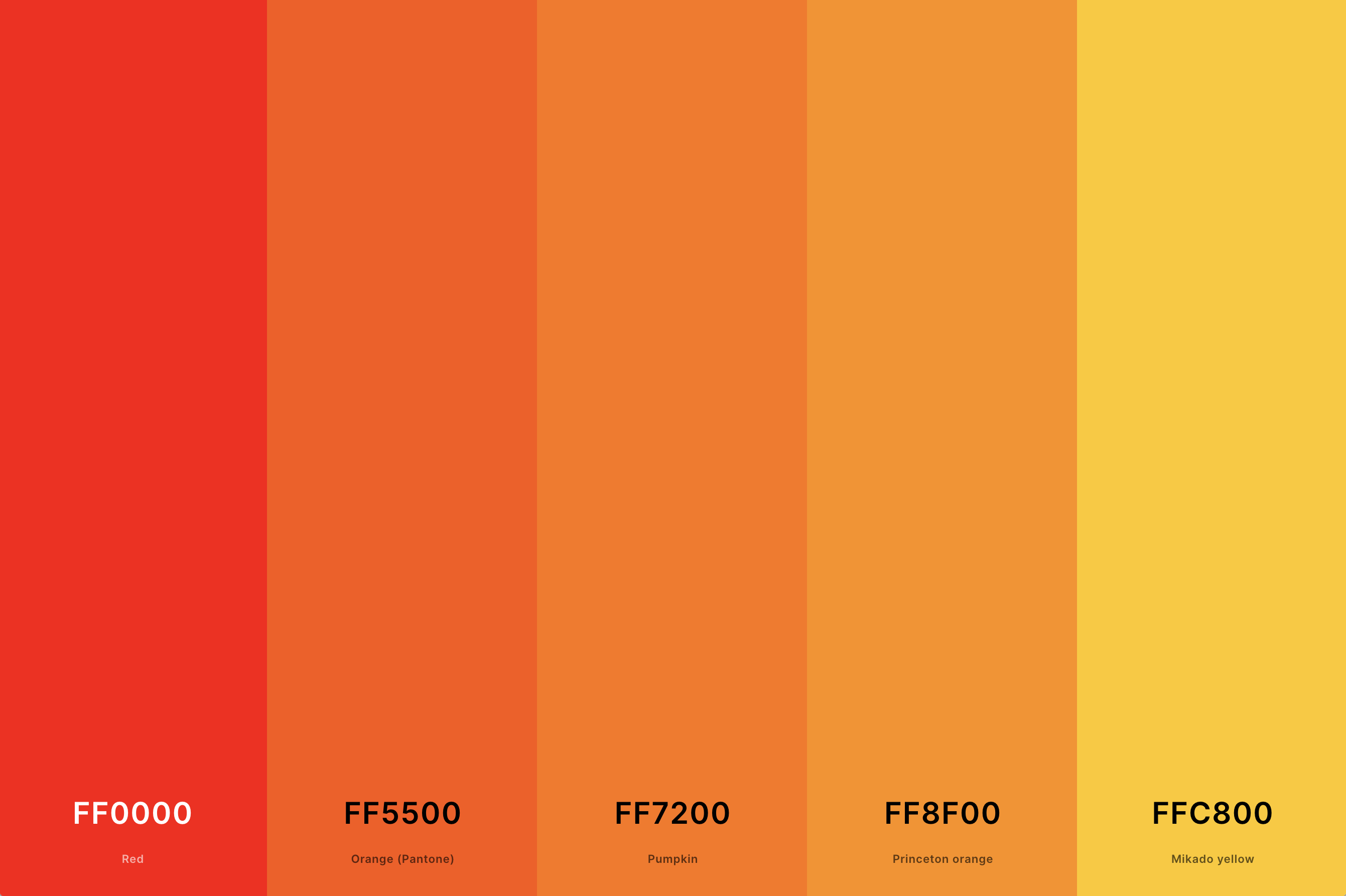
Hex Codes: #FF0000, #FF5500, #FF7200, #FF8F00, #FFC800
This palette is all about intensity and passion, combining the heat of red with the brightness of orange. It's reminiscent of a blazing fire or a spectacular sunset. In a purple color palette, these warm tones bring a sense of drama and vitality.
The red deepens the impact of the orange, while the purple adds a regal touch, creating a palette suitable for bold and expressive designs.
8. Orange And Teal Color Palette
Midnight Green + Light Sea Green + Non Photo Blue + Atomic Tangerine + Spanish Orange
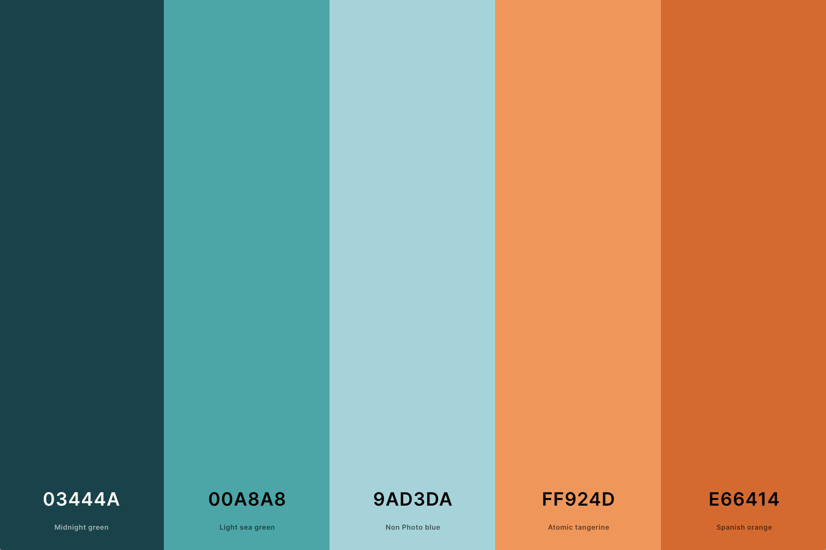
Hex Codes: #03444A, #00A8A8, #9AD3DA, #FF924D, #E66414
A refreshing and modern combination, this palette pairs the warmth of orange with the coolness of teal. The contrast is striking and visually appealing, reminiscent of tropical waters meeting a sunset beach.
When incorporated into a purple color palette, it provides a balance of warm and cool tones. The teal offers a tranquil contrast to the energetic orange and purple, ideal for contemporary and stylish designs.
9. Orange Sunset Color Palette
Golden Gate Bridge + Tangelo + Orange (Pantone) + Safety Orange + Princeton Orange
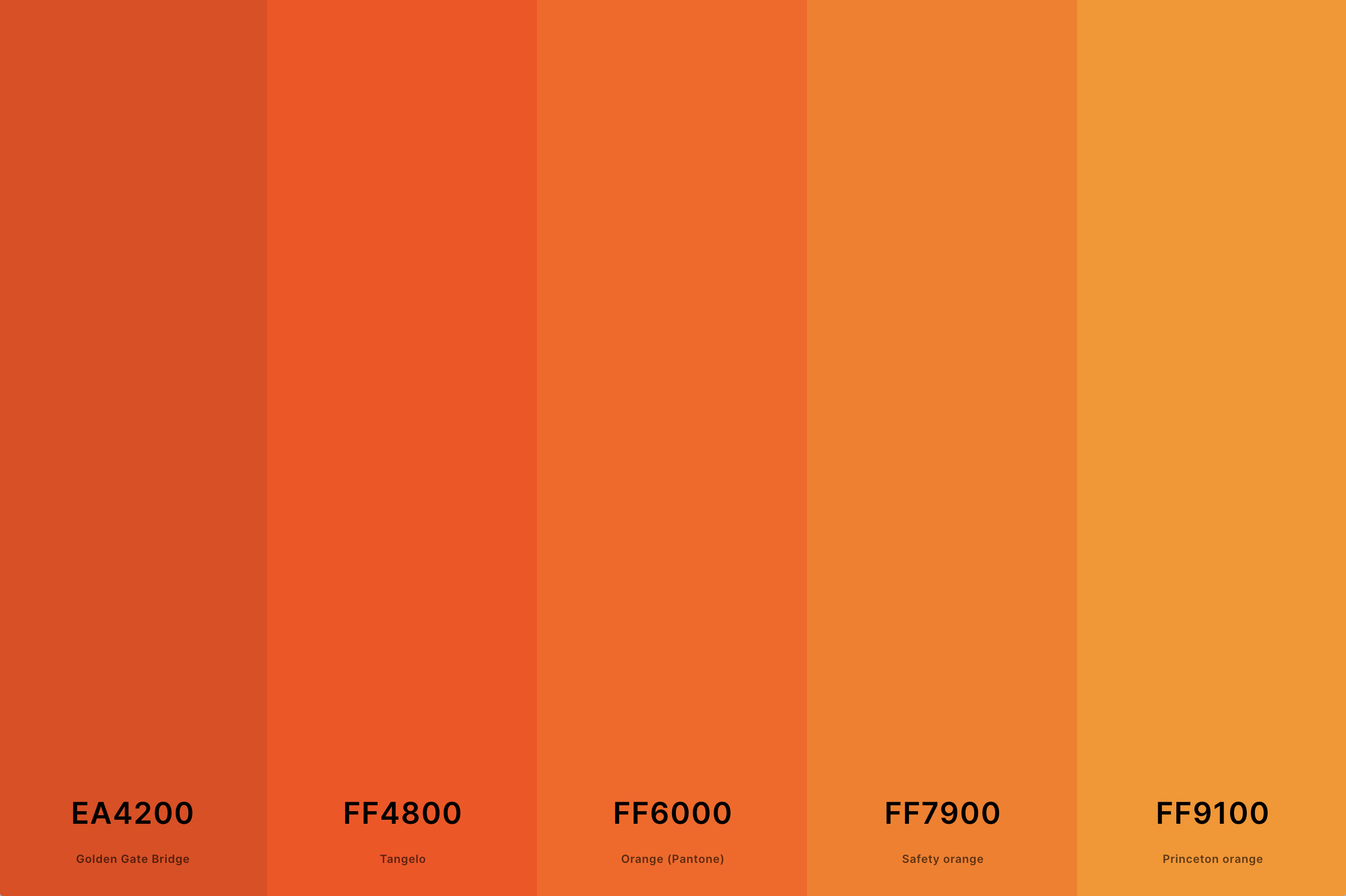
Hex Codes: #EA4200, #FF4800, #FF6000, #FF7900, #FF9100
This palette captures the mesmerizing colors of a sunset, blending various shades of orange with hints of pink and yellow. It creates a feeling of warmth and serenity, like watching the day come to a gentle close.
Within a purple color palette, these sunset tones add a soothing yet dynamic quality. The gradient from yellow to deep orange mirrors the transition from day to night, making it perfect for designs that aim to evoke feelings of calm and reflection.
10. Pastel Orange Color Palette
Ut Orange + Sandy Brown + Peach + Peach Yellow + Flax
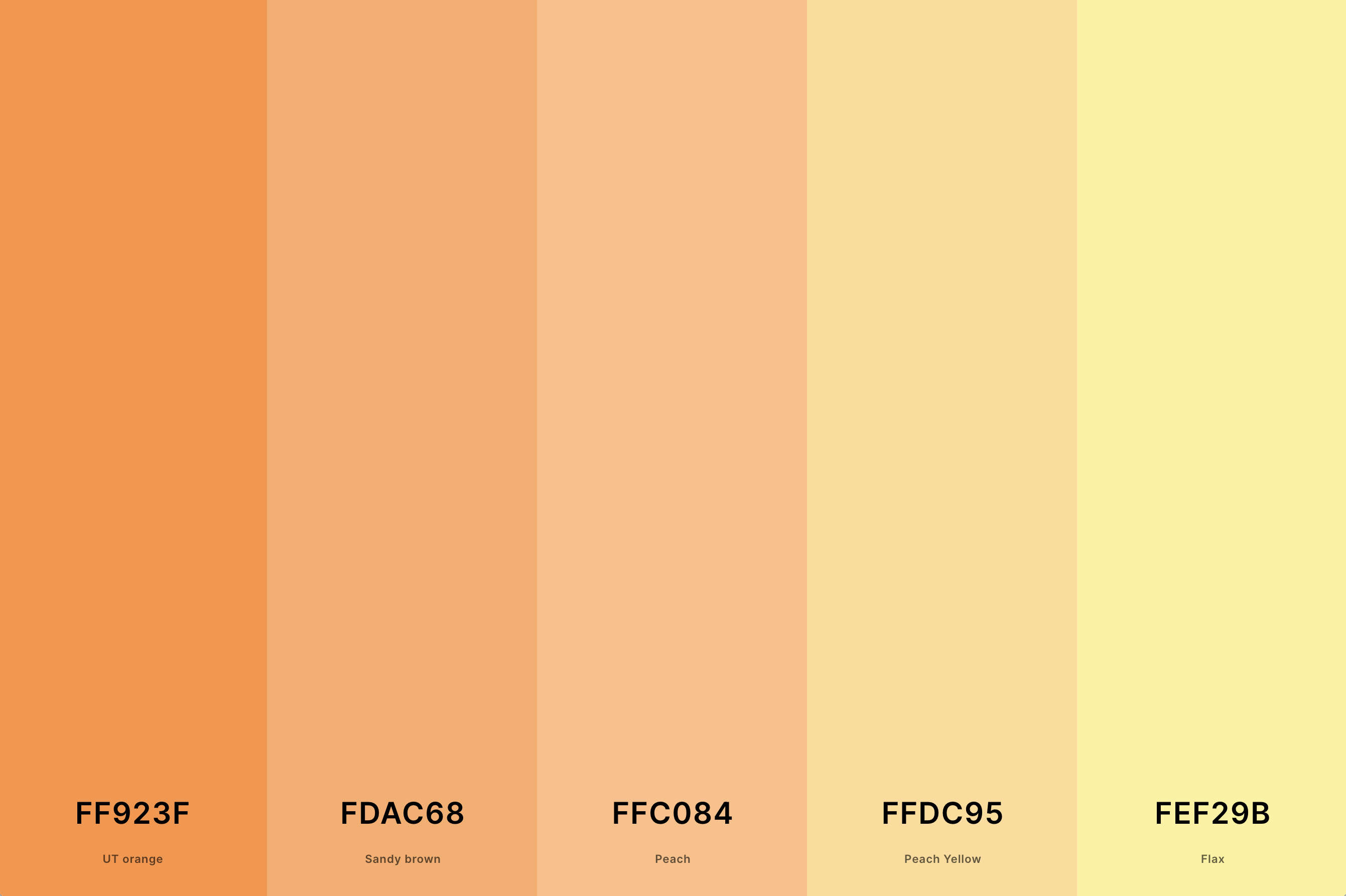
Hex Codes: #FF923F, #FDAC68, #FFC084, #FFDC95, #FEF29B
Soft, muted, and delicate, this palette features pastel oranges that are subtle and soothing. The colors are reminiscent of a peaceful dawn or the tender petals of a light apricot blossom.
When merged with purple hues, the palette becomes dreamy and romantic. The pastel oranges provide a gentle warmth that complements the cooler purples, creating an ideal palette for spaces and designs that aspire to be tranquil and airy.
11. Blue, Green And Orange Color Palette
Spring Green + Green Blue + Electric Blue + Lawn Green + Pumpkin
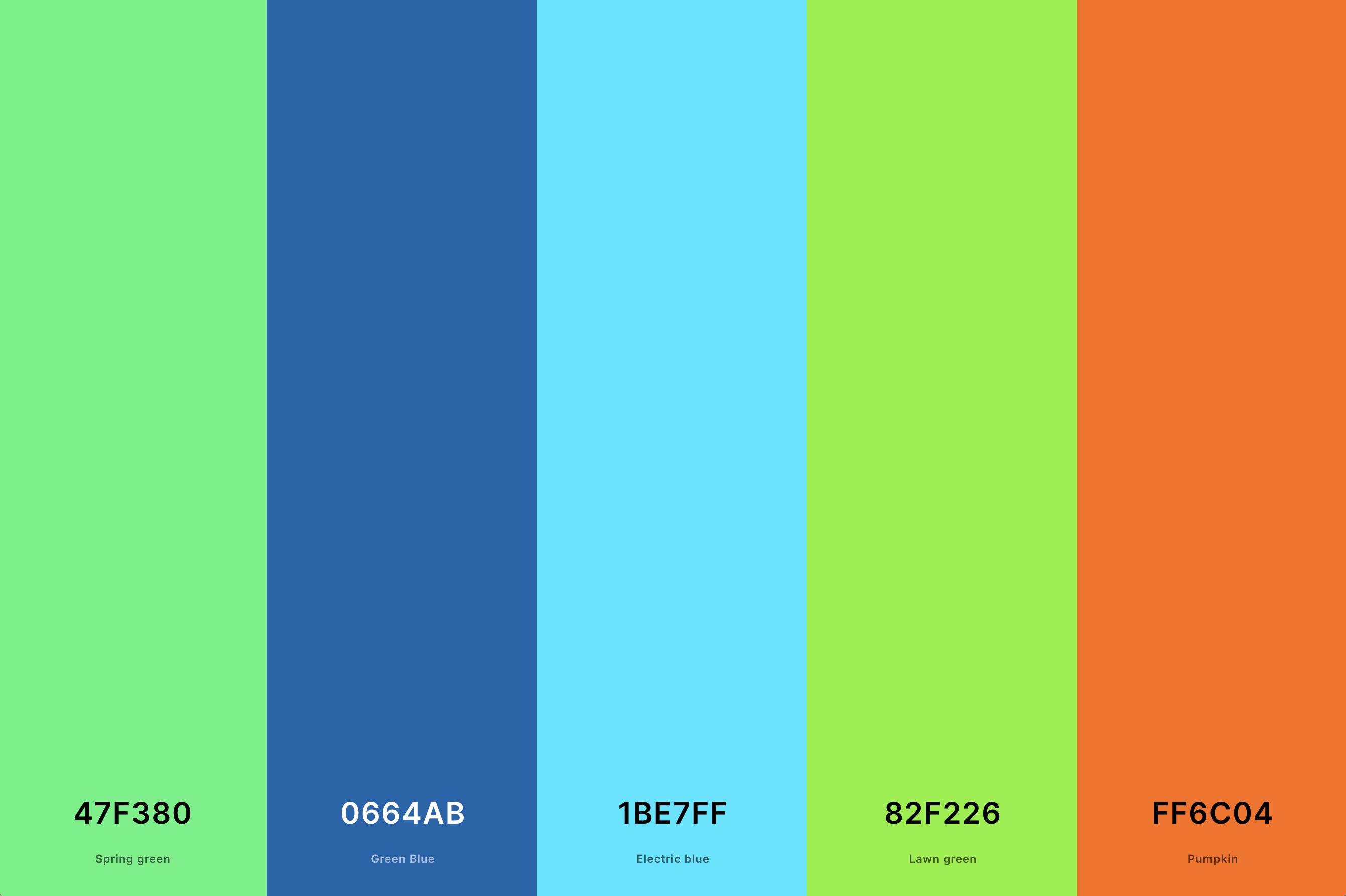
Hex Codes: #47F380, #0664AB, #1BE7FF, #82F226, #FF6C04
This vibrant and refreshing palette combines the coolness of blue, the naturalness of green, and the energy of orange. It's like capturing the essence of a lush, sunny landscape under a clear sky.
Integrating this palette with purple adds an extra layer of depth, creating a rich and diverse spectrum.
The blue and green tones offer a soothing backdrop, while the orange injects life and vibrancy, making it a versatile choice for dynamic and lively designs.
12. Dark Orange Color Palette
Chocolate Cosmos + Barn Red + Rufous + Sinopia + Aerospace Orange
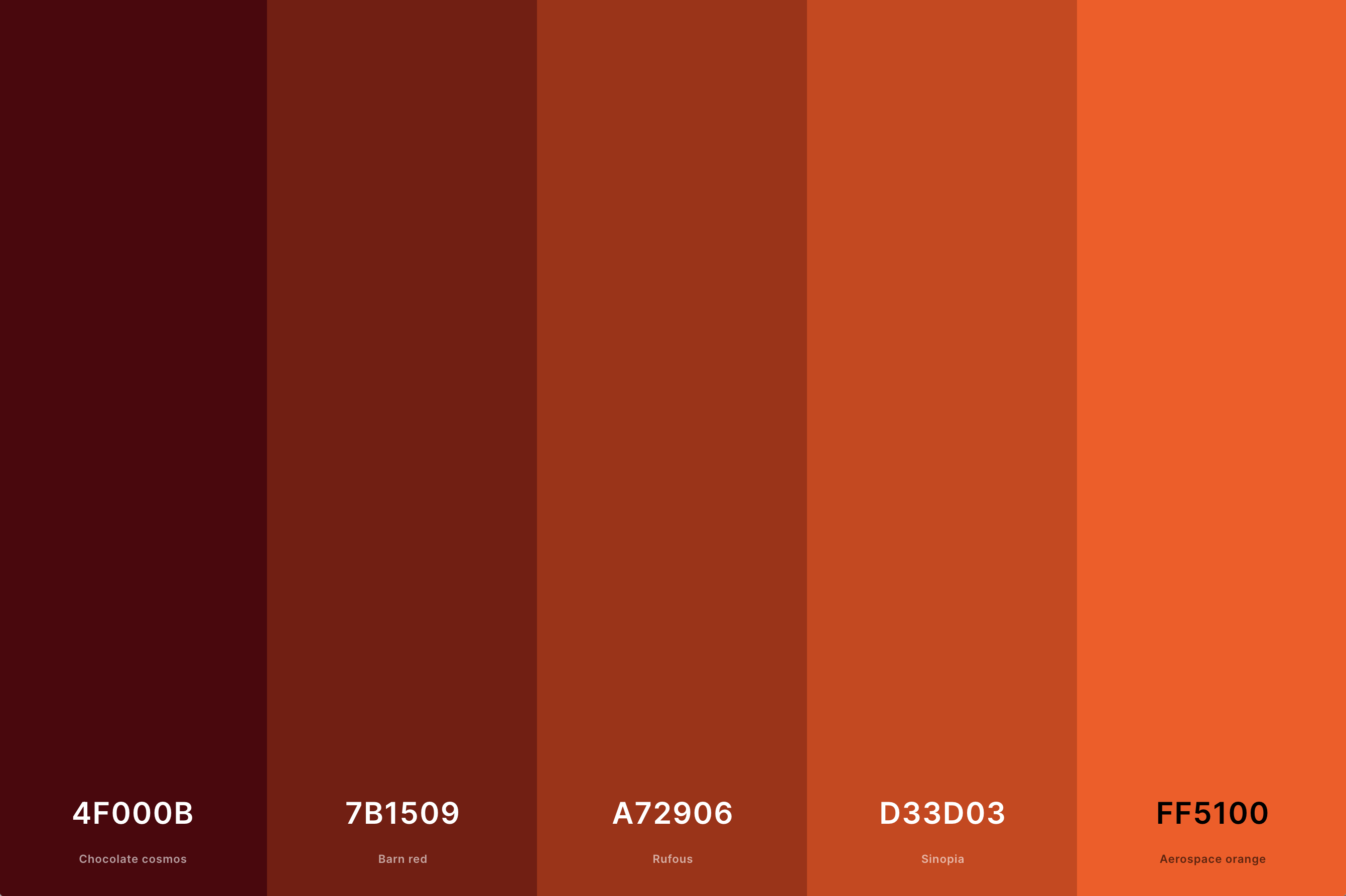
Hex Codes: #4F000B, #7B1509, #A72906, #D33D03, #FF5100
This palette is characterized by deep, intense shades of orange, evoking feelings of warmth and richness. It's reminiscent of autumnal evenings or the glowing embers of a cozy fire.
When combined with purple, this palette takes on a luxurious and sophisticated character.
The dark orange shades add a robust and earthy element, contrasting beautifully with the more mysterious and elegant purple, ideal for creating an ambiance of comfort and opulence.
13. Modern Orange Color Palette
Smoky Black + Aerospace Orange + Ut Orange + Sunglow + Cornsilk
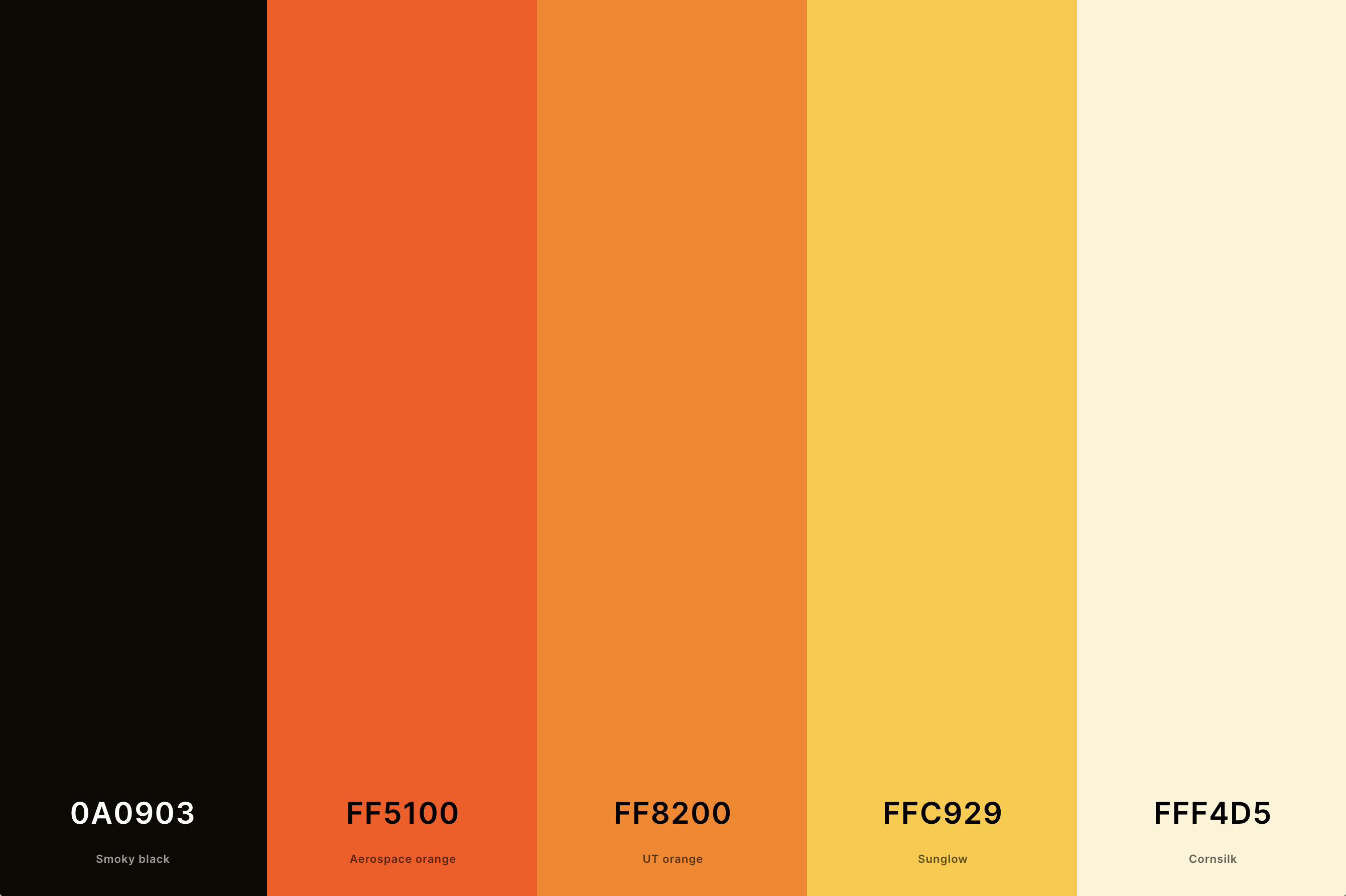
Hex Codes: #0A0903, #FF5100, #FF8200, #FFC929, #FFF4D5
This palette features a mix of contemporary orange shades, blending both bright and muted tones for a fresh, trendy look. It's perfect for spaces that aim to be stylish and forward-thinking.
When used alongside purple, it creates a striking and modern contrast. The blend of new-age orange shades with classic purple results in a palette that is both energetic and refined, suitable for designs that aim to be chic and eye-catching.
14. Orange And Brown Color Palette
Seal Brown + Chocolate + Burnt Orange + Safety Orange + Sandy Brown
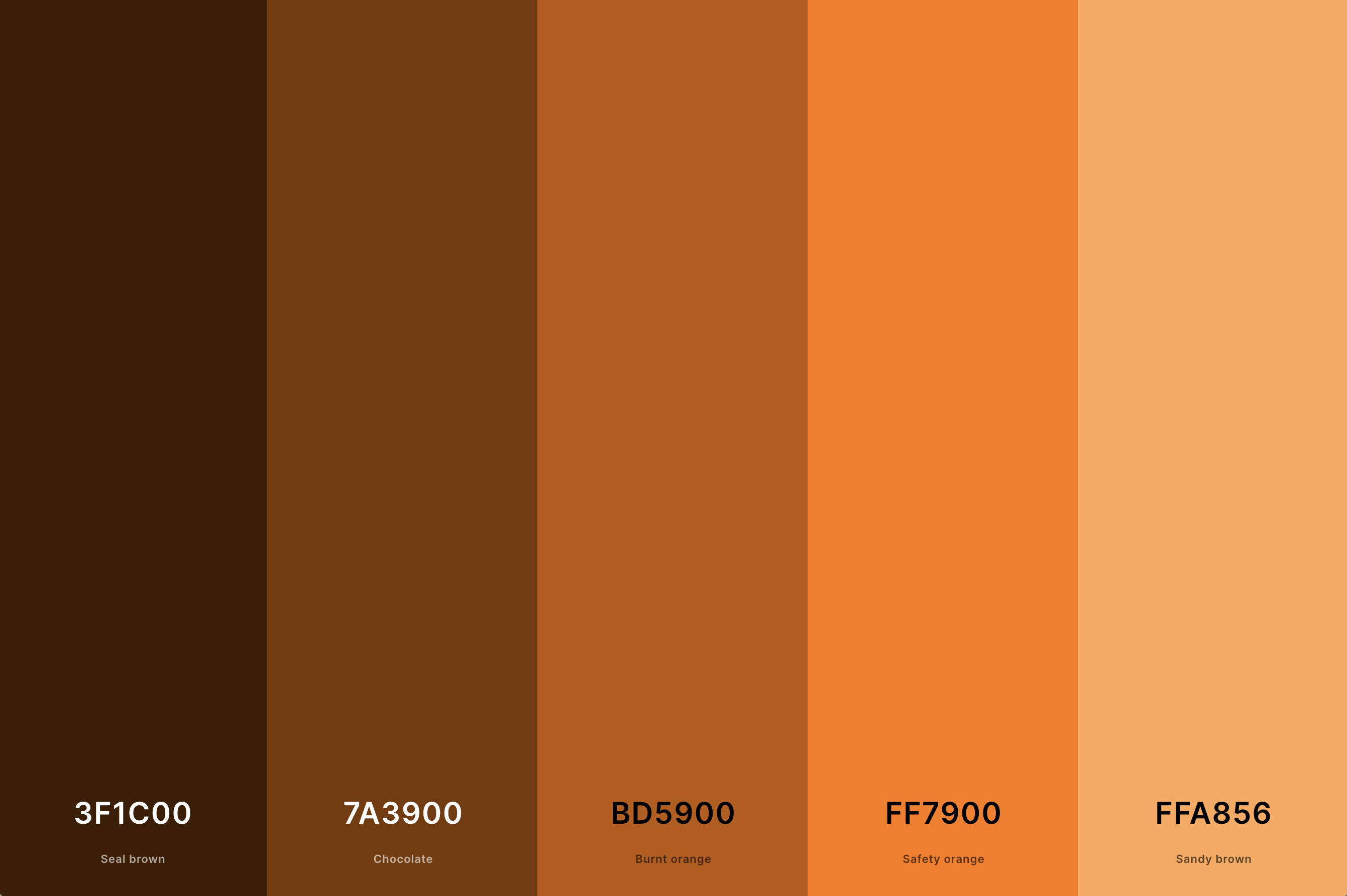
Hex Codes: #3F1C00, #7A3900, #BD5900, #FF7900, #FFA856
A natural and grounded palette, combining the earthiness of brown with the vibrancy of orange. This pairing is reminiscent of woodland scenes in autumn, offering a sense of stability and warmth.
In a purple color palette, these tones contribute to an atmosphere of rustic elegance.
The brown tones anchor the brightness of the orange, while the purple adds a touch of luxury, making it a great choice for designs that celebrate the beauty of the natural world.
15. Orange And Yellow Color Palette
Scarlet + Orange (Pantone) + Dark Orange (Web) + Jonquil + Yellow
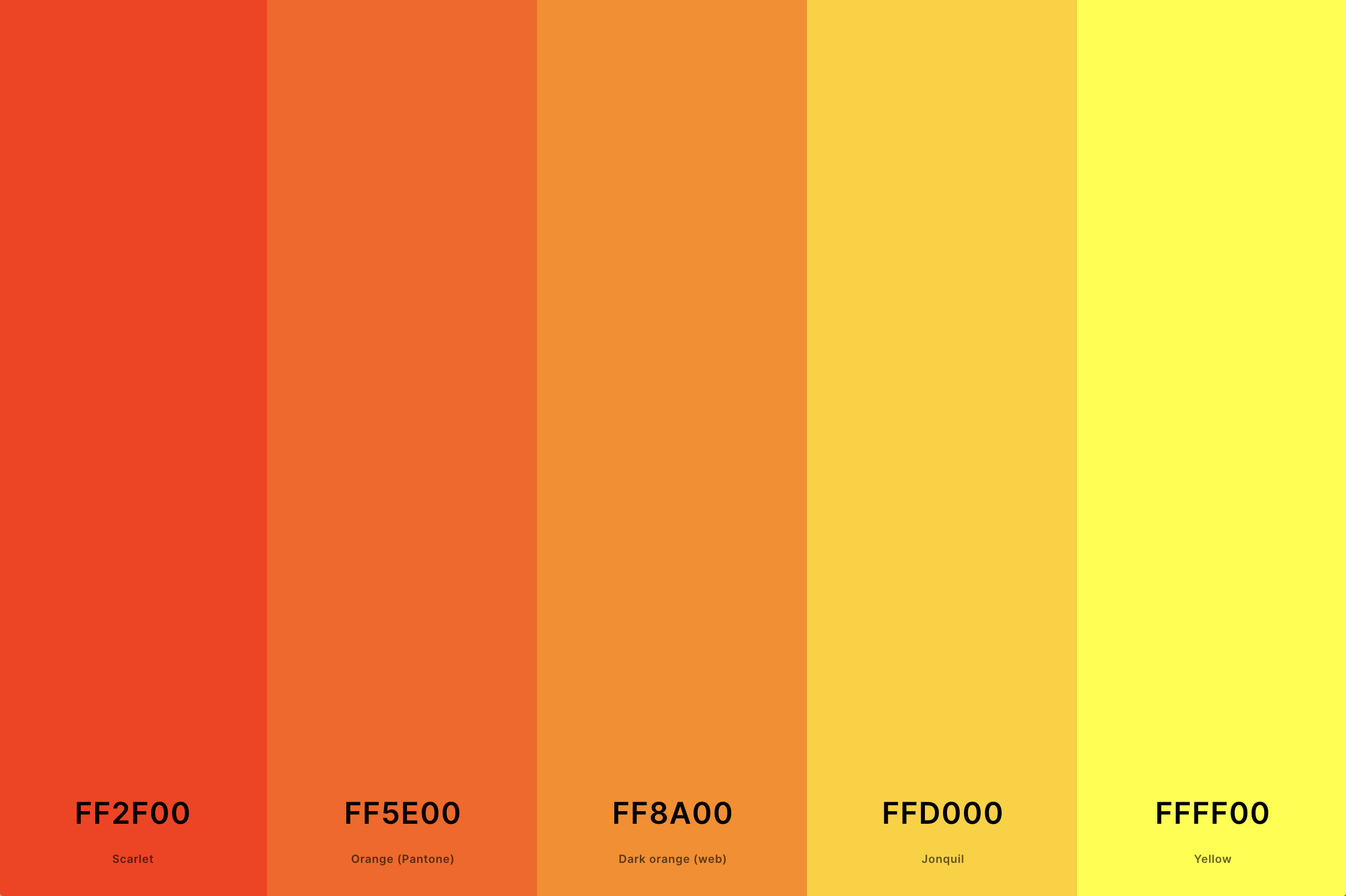
Hex Codes: #FF2F00, #FF5E00, #FF8A00, #FFD000, #FFFF00
Bright, sunny, and cheerful, this palette merges the zest of orange with the joy of yellow. It's like capturing the essence of a sunny day, full of optimism and energy.
When these colors are incorporated into a purple color palette, they bring a lively and playful dynamic.
The yellow brightens the orange, creating a vivid contrast against the more subdued purple, perfect for designs that aim to be vibrant and inviting.
16. Rust Orange Color Palette
Penn Red + Syracuse Red Orange + Tangelo + Safety Orange + Xanthous
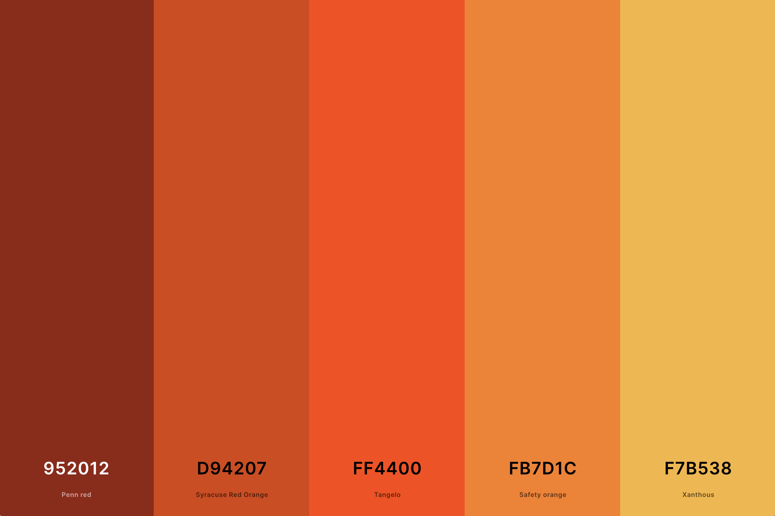
Hex Codes: #952012, #D94207, #FF4400, #FB7D1C, #F7B538
This palette evokes a sense of time-worn elegance, with deep, muted shades of orange that resemble rusted metal or autumn foliage. It brings an air of vintage charm and robust warmth.
When combined with purple, the palette gains a sophisticated and somewhat nostalgic feel.
The rustic orange tones provide a grounded, earthy contrast to the regal and mysterious purples, making it ideal for spaces that blend antique allure with contemporary sophistication.
17. Aesthetic Orange Color Palette
Orange (Pantone) + Amber + Atomic Tangerine + Azure + Bistre
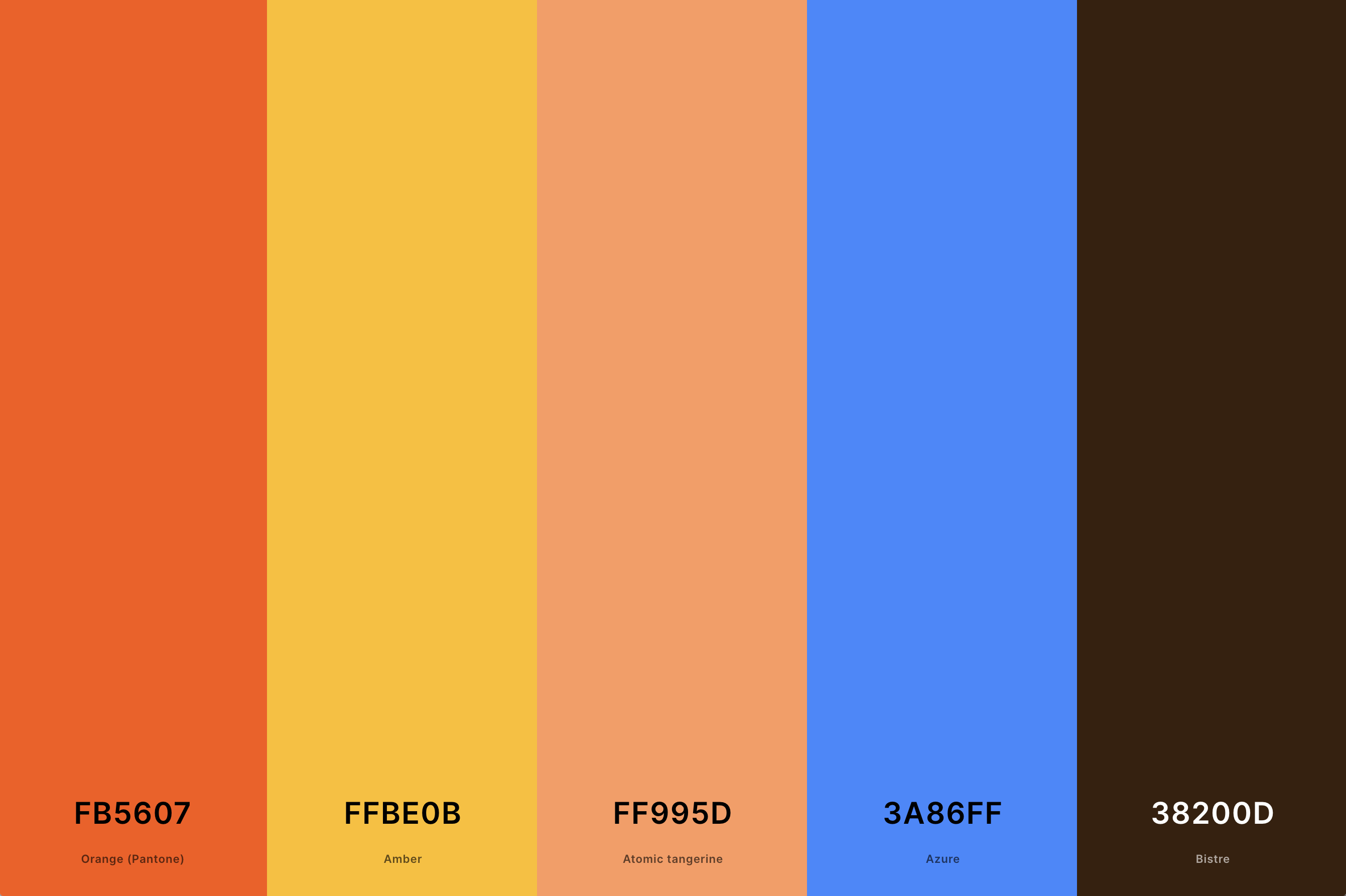
Hex Codes: #FB5607, #FFBE0B, #FF995D, #3A86FF, #38200D
Characterized by a blend of stylish and appealing orange shades, this palette is both modern and artistic. It ranges from soft, pastel-like oranges to brighter, more saturated tones, offering a versatile and trendy appeal.
When merged with purple, the palette becomes eclectic and visually engaging. The aesthetic orange hues add a touch of contemporary flair to the classic elegance of purple, creating a unique and captivating design choice.
18. Orange And Black Color Palette
Eerie Black + Jet + Sandy Brown + Dark Orange (Web) + Burnt Orange
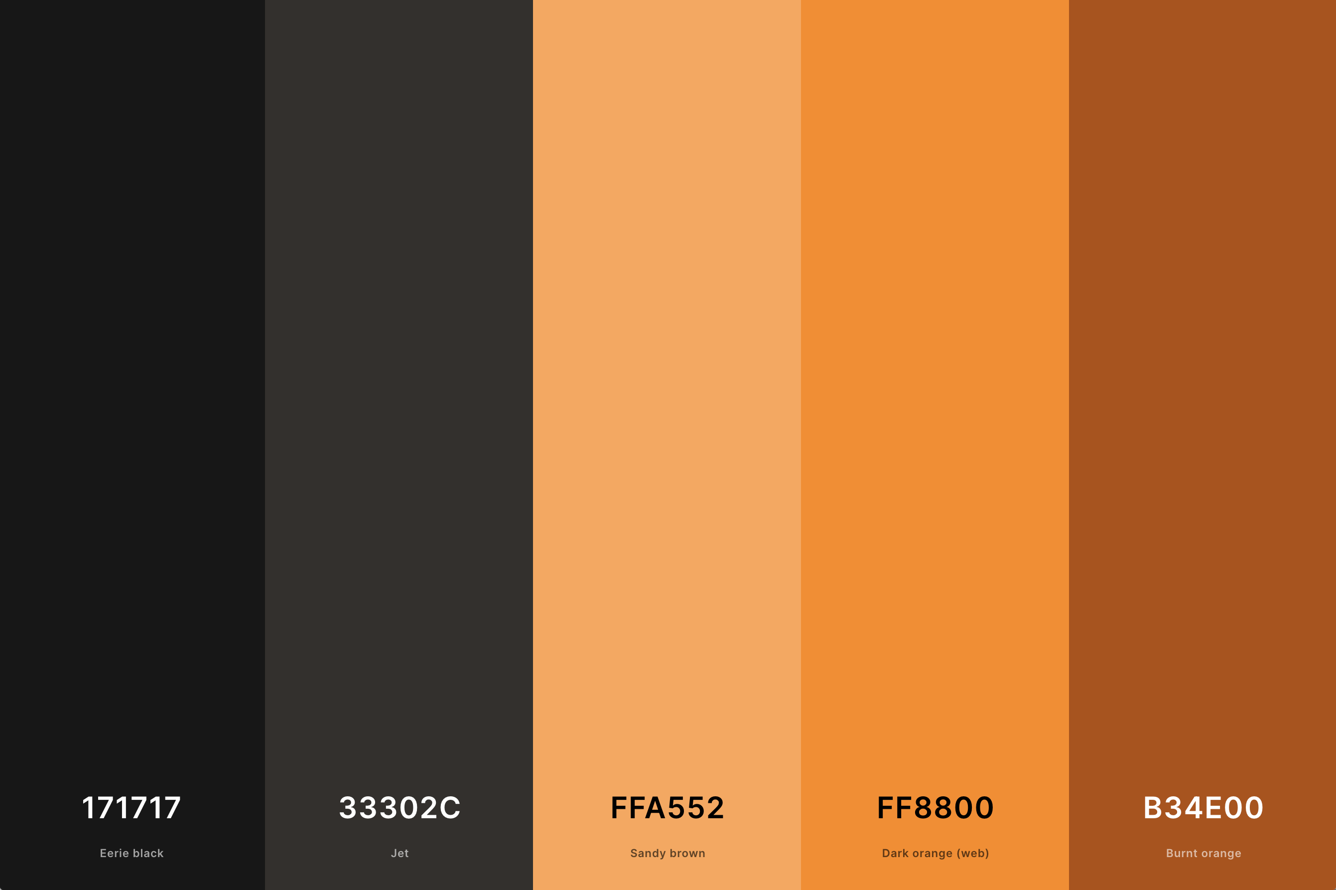
Hex Codes: #171717, #33302C, #FFA552, #FF8800, #B34E00
This bold and striking combination pairs the brightness of orange with the starkness of black. The contrast is dramatic and impactful, reminiscent of modern graphic designs or Halloween motifs.
In a purple color palette, these colors introduce an element of dramatic flair. The black adds depth and intensity to the palette, while the orange offers a vibrant burst of energy, perfect for designs that aim to be both edgy and vibrant.
19. Bright Orange Color Palette
Scarlet + Orange (Pantone) + Orange (Wheel) + Saffron + Dutch White
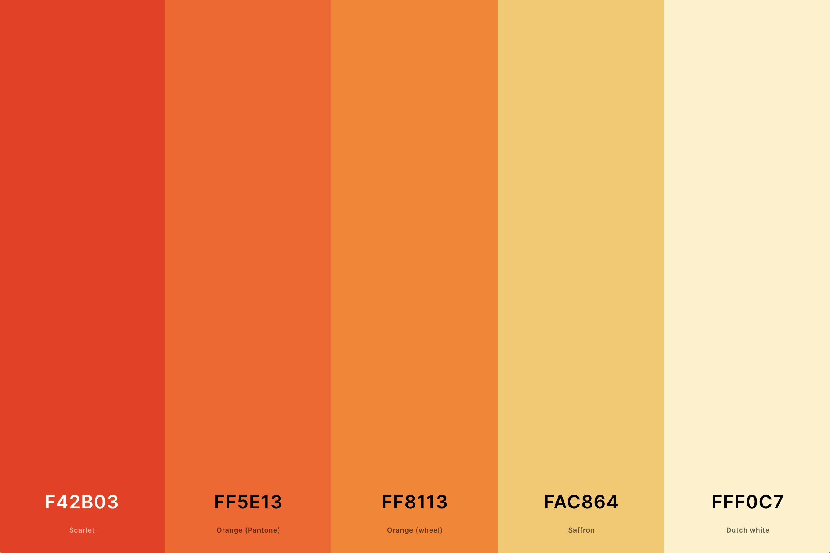
Hex Codes: #F42B03, #FF5E13, #FF8113, #FAC864, #FFF0C7
Full of life and energy, this palette features vivid and intense orange shades. It's like capturing the exuberance of a summer day or the brilliance of a tropical flower.
When incorporated into a purple color palette, the bright orange adds a dynamic and joyful element.
It creates a lively contrast with the cooler purple tones, making it an excellent choice for designs that seek to be bold, cheerful, and attention-grabbing.
20. Gray And Orange Color Palette
Orange (Pantone) + Ut Orange + Timberwolf + Khaki + Dim Gray
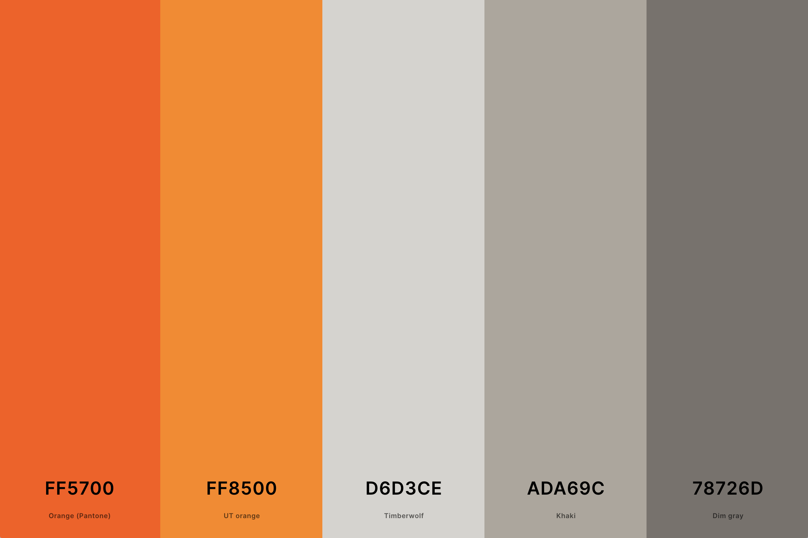
Hex Codes: #FF5700, #FF8500, #D6D3CE, #ADA69C, #78726D
A sophisticated and modern combination, this palette blends the neutrality of gray with the warmth of orange. The gray tones provide a sleek and understated backdrop, allowing the orange to pop and bring vibrancy to the design.
When combined with purple, the palette becomes elegantly balanced.
The gray adds a contemporary and refined touch, while the orange injects life and warmth, creating a harmonious blend ideal for spaces that aim for a chic and balanced aesthetic.
21. Neon Orange Color Palette
Rose + Orange (Pantone) + Amber + Electric Blue + Imperial Red
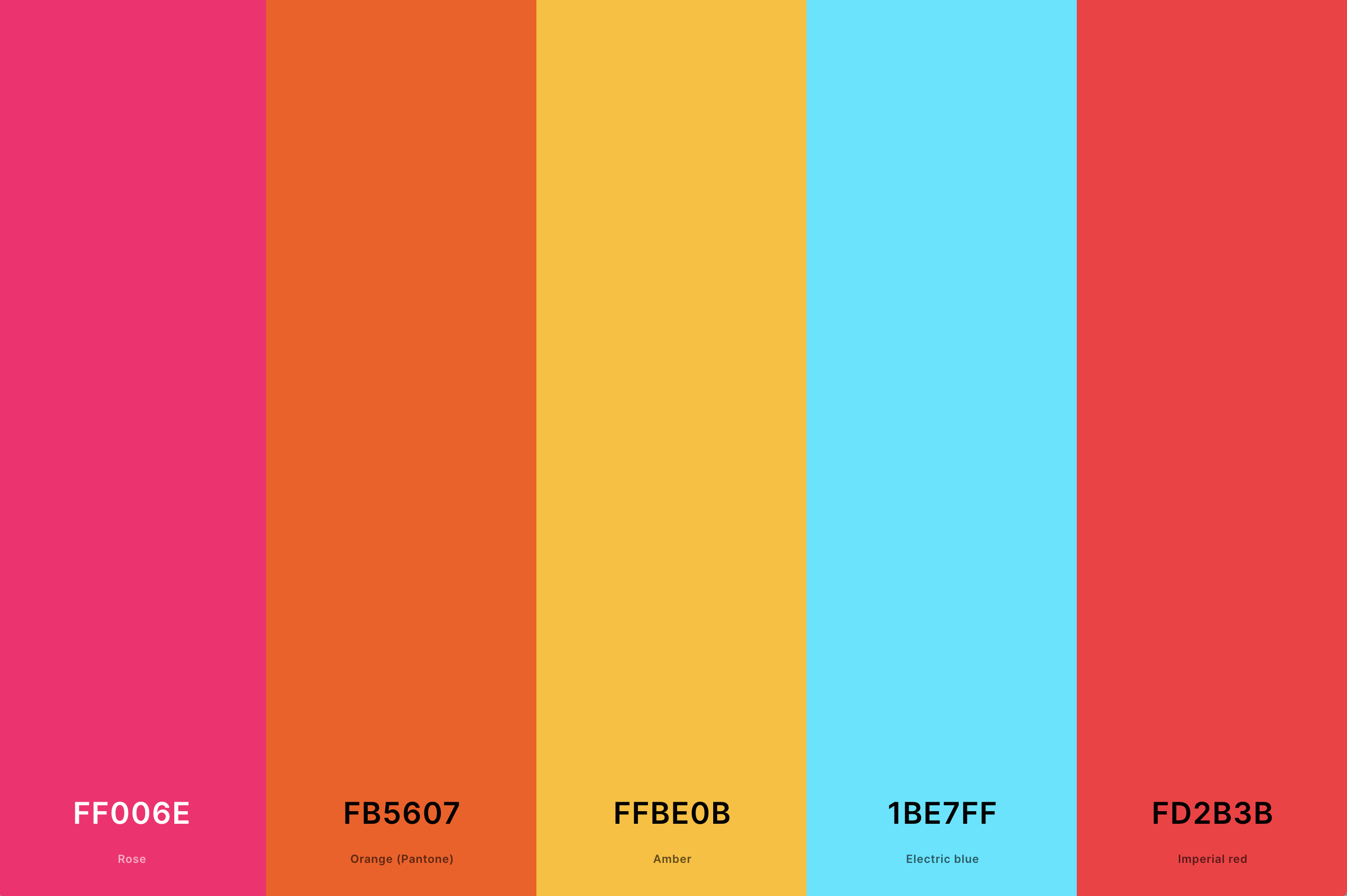
Hex Codes: #FF006E, #FB5607, #FFBE0B, #1BE7FF, #FD2B3B
This palette is electrifying and bold, featuring intense neon orange shades that command attention. It's reminiscent of vibrant city lights or the vivid glow of a sunset.
When integrated into a purple color palette, these neon orange shades add an ultra-modern and energetic touch. The combination with purple creates a striking contrast, ideal for designs that aim to be cutting-edge and visually stunning.
22. Orange, Yellow And Pink Color Palette
Dogwood Rose + Rose + Bittersweet + Carrot Orange + Xanthous
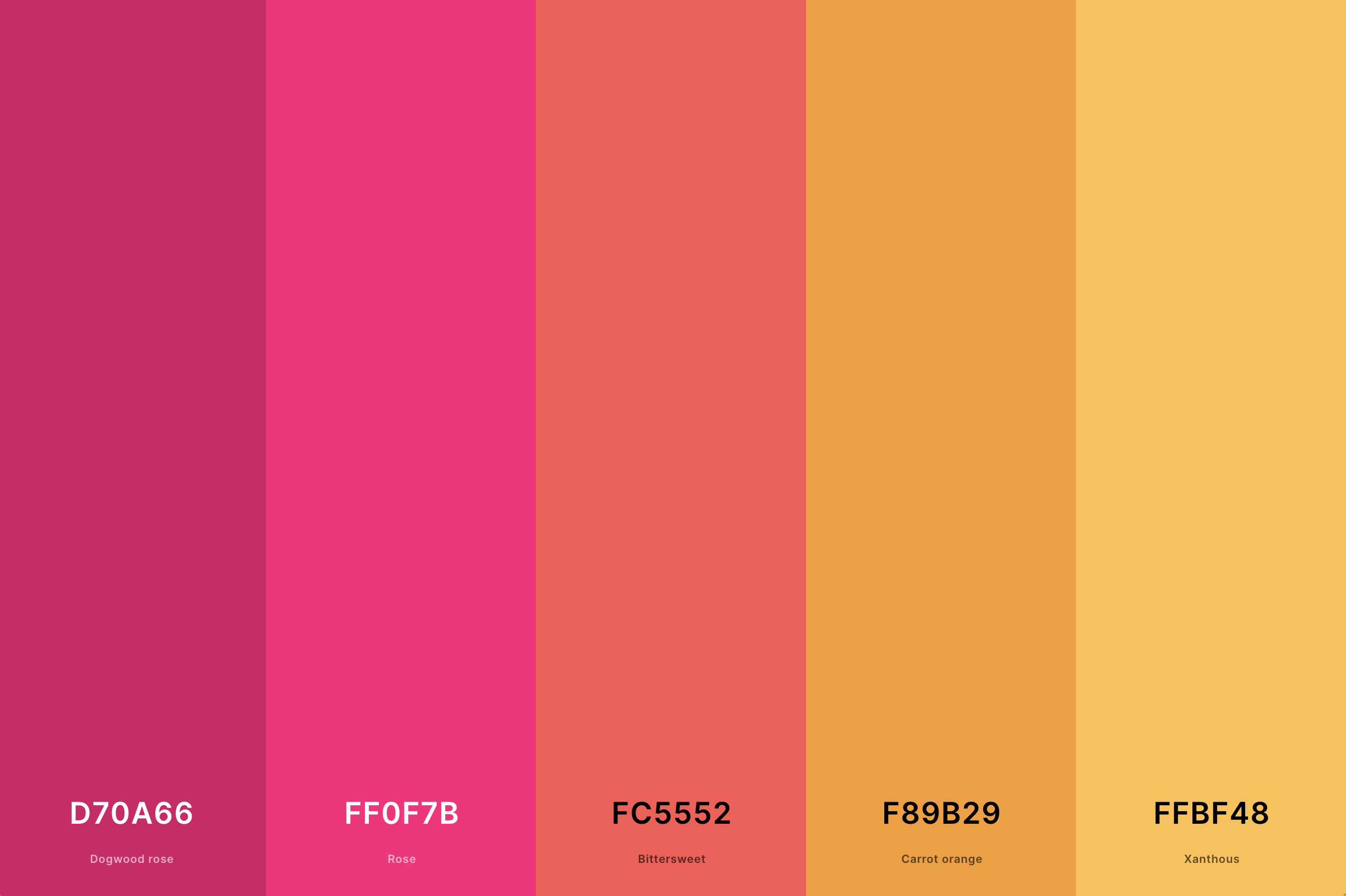
Hex Codes: #D70A66, #FF0F7B, #FC5552, #F89B29, #FFBF48
A cheerful and playful combination, this palette merges the warmth of orange with the brightness of yellow and the sweetness of pink. It evokes the joy of a sunny day filled with blooming flowers.
Adding these colors to a purple palette introduces a lively and youthful vibe. The mix of warm and cool tones creates a vibrant and harmonious blend, perfect for spaces that want to exude positivity and charm.
23. Yellow, Orange And Green Color Palette
Citrine + Orange (Web) + Orange (Pantone) + Apple Green + Avocado
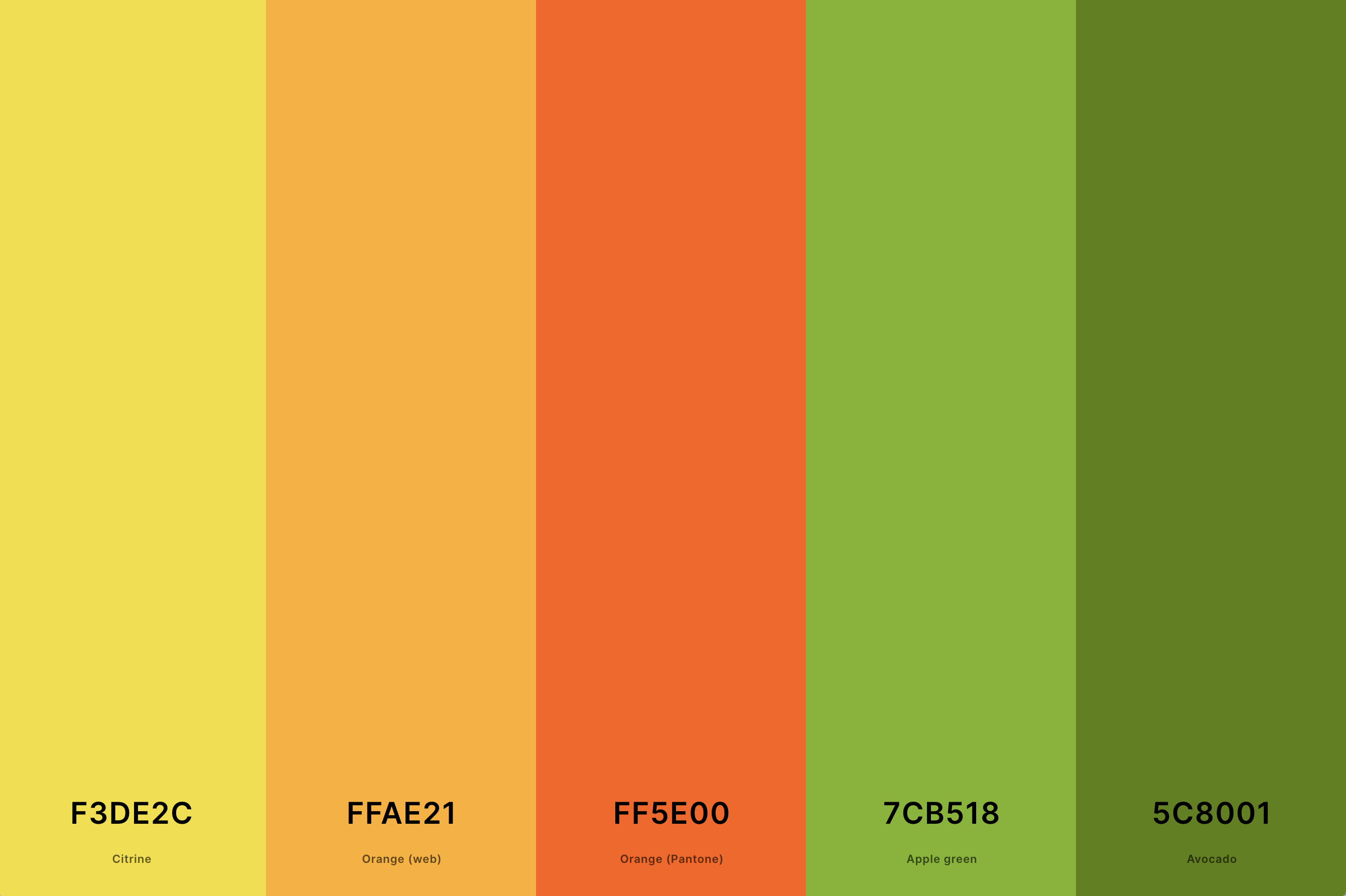
Hex Codes: #F3DE2C, #FFAE21, #FF5E00, #7CB518, #5C8001
This palette is like a burst of nature, combining the sunniness of yellow, the energy of orange, and the freshness of green. It's reminiscent of a sunny meadow or a vibrant garden.
When these colors are woven into a purple color palette, they create a lively and organic feel.
The green and yellow bring a natural brightness, while the orange adds a pop of vibrancy, making it an excellent choice for designs that aim to be refreshing and invigorating.
24. Blue, Orange And Purple Color Palette
Electric Purple + Eminence + Orange (Pantone) + Blue (Munsell) + Marian Blue
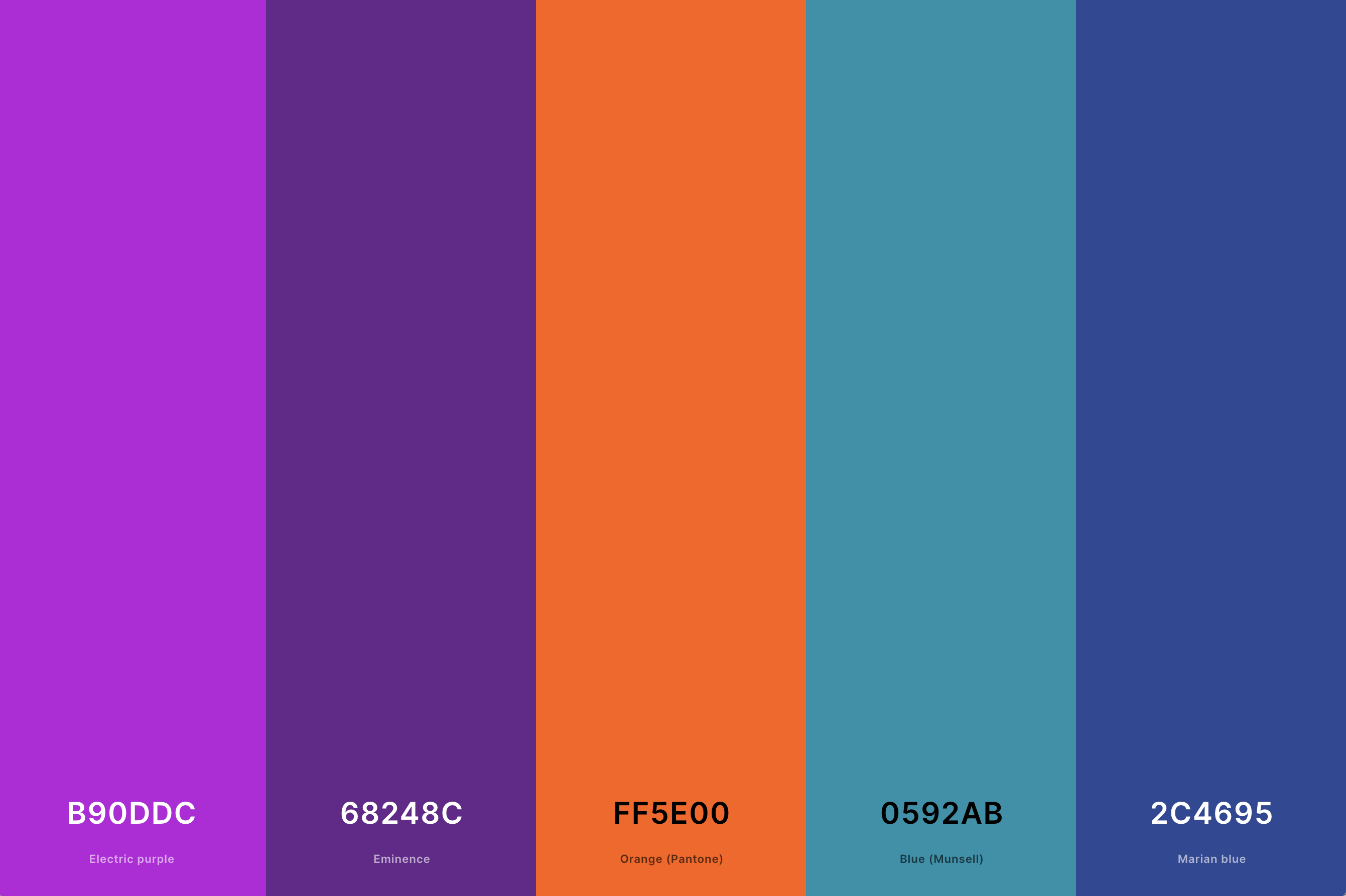
Hex Codes: #B90DDC, #68248C, #FF5E00, #0592AB, #2C4695
A harmonious blend of cool and warm tones, this palette combines the tranquility of blue with the vibrancy of orange and the depth of purple. It's like capturing the essence of a majestic sunset over the ocean.
The inclusion of blue and orange with purple creates a balanced and dynamic spectrum, ideal for designs that seek to be both serene and energetic. This palette is perfect for spaces that aim to inspire creativity and calmness.
25. Burnt Orange And Green Color Palette
Rufous + Sinopia + Carrot Orange + Hunter Green + Dark Green
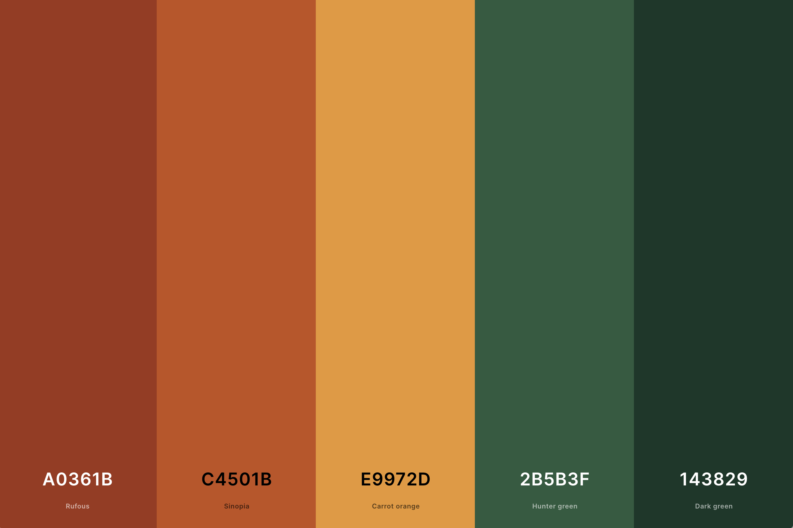
Hex Codes: #A0361B, #C4501B, #E9972D, #2B5B3F, #143829
This palette combines the rustic warmth of burnt orange with the natural tranquility of green. It evokes a sense of earthy elegance, reminiscent of a forest in autumn.
When these colors are paired with purple, the palette takes on a rich and sophisticated look.
The green tones bring a sense of balance and harmony, while the burnt orange adds depth and warmth, creating a luxurious and inviting atmosphere.
26. Orange And Burgundy Color Palette
Chocolate Cosmos + Claret + Rust + Pumpkin + Coral
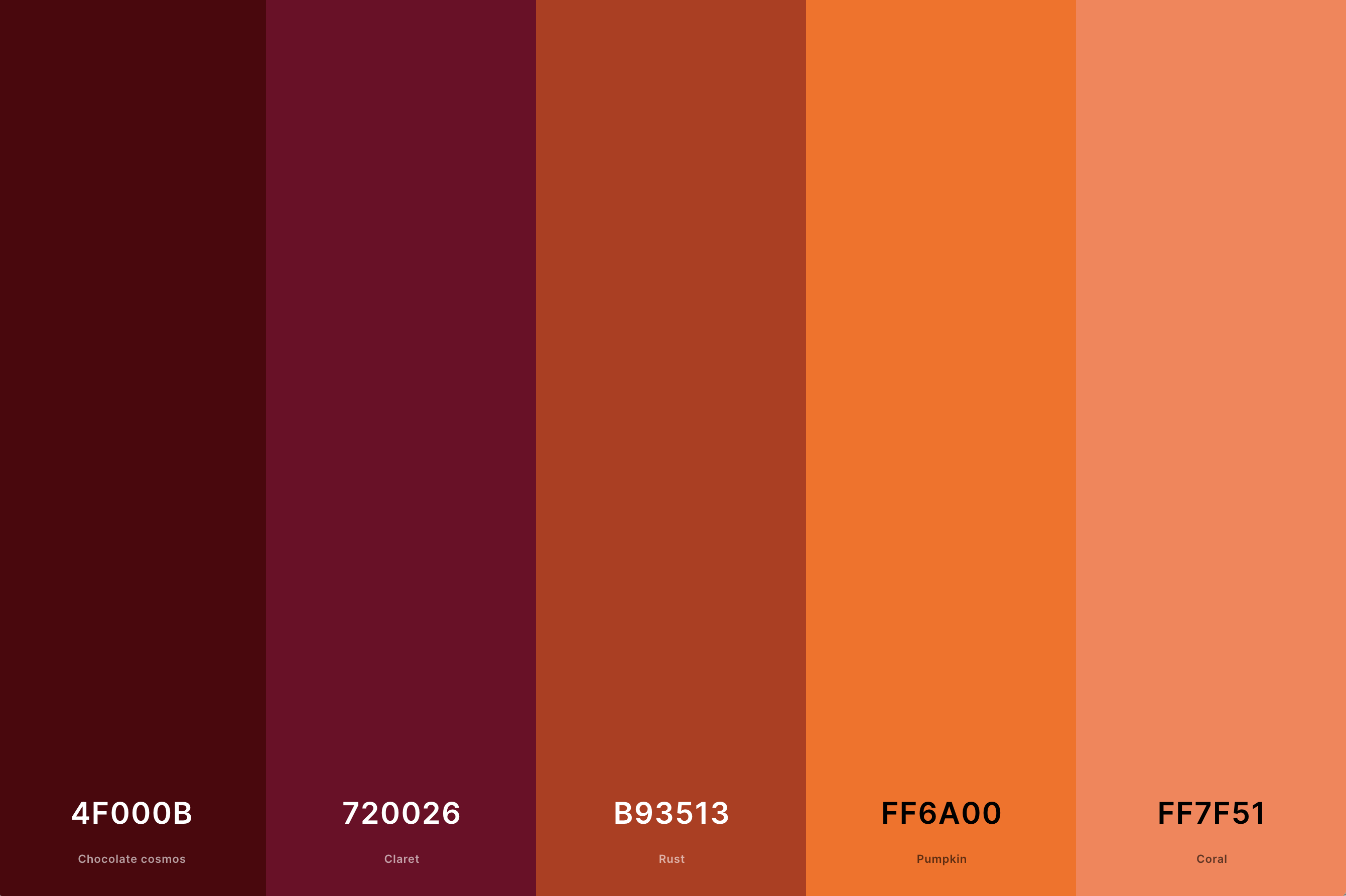
Hex Codes: #4F000B, #720026, #B93513, #FF6A00, #FF7F51
This palette is a fusion of the vibrant energy of orange and the deep sophistication of burgundy. It's a combination that speaks of richness and depth, reminiscent of a luxurious tapestry or a fine wine.
When these hues are added to a purple color palette, they create an ambiance of opulent elegance.
The burgundy deepens the impact of the orange, and the purple adds a regal touch, resulting in a palette that is perfect for spaces and designs that aim for a luxurious and refined aesthetic.
27. Pink, Orange And Yellow Color Palette
Rose + Bittersweet + Carrot Orange + Xanthous + Sunglow
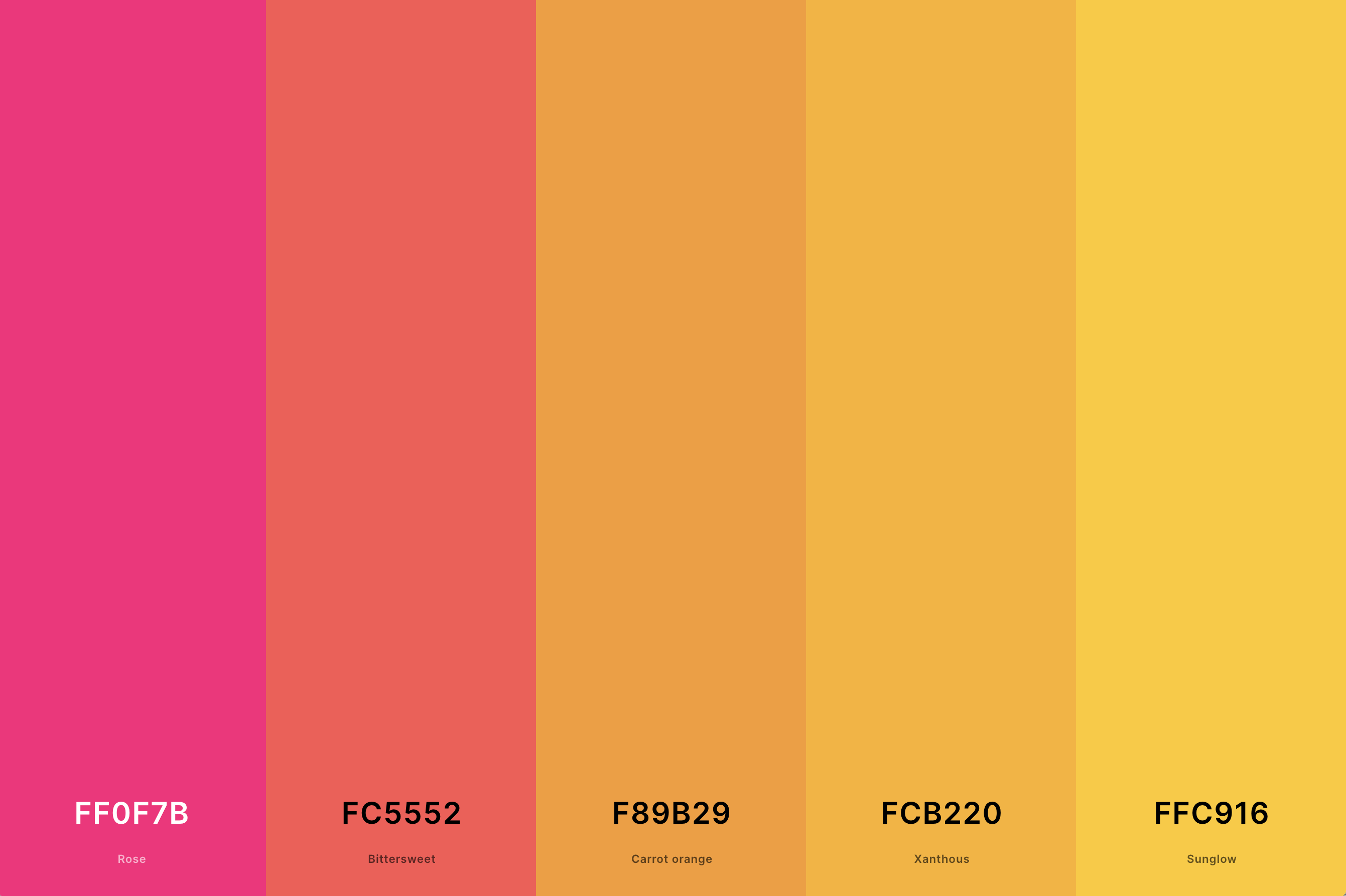
Hex Codes: #FF0F7B, #FC5552, #F89B29, #FCB220, #FFC916
A lively and uplifting blend, this palette merges the softness of pink with the cheerfulness of orange and the radiance of yellow. It captures the essence of a joyful summer day, full of light and happiness.
In a purple color palette, these warm tones introduce a sense of playfulness and brightness.
The pink softens the vibrancy of the orange and yellow, while the purple adds a sophisticated backdrop. This combination is ideal for designs seeking to be vibrant, warm, and inviting.
What is the Complimentary Color to Orange?
The complementary color to orange is blue. This relationship is grounded in color theory, where colors directly opposite each other on the color wheel create the most vivid and dynamic contrasts.
Orange, a blend of red and yellow, is inherently warm and energetic, often associated with joy, sunshine, and creativity. Blue, on the other hand, is a cool color, evoking calmness, stability, and depth, reminiscent of the ocean and the sky.
When orange and blue are paired, they enhance each other's intensity, making each color appear more vibrant. This contrast is not just visually striking but also creates a balanced and harmonious visual experience. The warmth of orange is tempered by the coolness of blue, resulting in a palette that is both lively and soothing.
This complementary pairing is widely used in various fields, from art and design to fashion and home decor, due to its ability to capture attention and create a dynamic aesthetic.
For designers and artists, understanding and utilizing this complementary relationship allows for the creation of designs that are both balanced and full of life, making a statement without overwhelming the senses.
What Colors Go With Orange?
Orange is a versatile and vibrant color that can harmonize with a wide range of colors, creating diverse and appealing palettes. When thinking about what colors go well with orange, consider both complementary and analogous colors, as well as neutral tones.
Blue, being the complementary color to orange on the color wheel, creates a striking and dynamic contrast. This combination is lively and can bring energy to any space or design.
For a more subdued yet still vibrant palette, consider pairing orange with its analogous colors, like red and yellow. These combinations evoke the warmth of a sunset or the richness of autumn, perfect for creating a cozy and inviting atmosphere.
Neutral colors like white, gray, and black also pair wonderfully with orange. They allow the brightness of orange to shine while providing a grounding effect, making the palette more balanced and accessible.
These pairings are excellent for contemporary designs where you want a pop of color without overwhelming the senses.
For a more unexpected and sophisticated palette, pair orange with purple or green. These combinations are less common but can produce stunning results, especially when the right shades are chosen.
In essence, orange's ability to pair with a variety of colors makes it a fantastic choice for those looking to add a touch of warmth and energy to their designs.
