This post may contain affiliate links. If you click one, we may earn a commission at no cost to you. Here's more details on how we make money.
Hey there, color lovers! Today, we're going to explore the world of yellow – a color that can brighten up even the gloomiest day.
Yellow, in its many shades, is more than just the color of sunshine. It's the color of happiness, creativity, and warmth. From the soft whispers of pastel yellows to the bold statements of neon, this versatile color has something for everyone.
In this post, we're diving into the best yellow color palettes, each one carefully crafted to bring a unique vibe to your space, wardrobe, or design project.
Whether you're looking to create a cozy, welcoming atmosphere, a vibrant, energetic space, or something that balances sophistication with playfulness, yellow has got you covered. It goes well with many colors.
We'll be looking at combinations that include other colors too, because let's face it, yellow loves company! So, grab your favorite cup of coffee, get comfy, and let's explore how these yellow palettes can transform your world, one shade at a time! 🌼💛✨
1. Blue And Yellow Color Palette
Oxford Blue + Prussian Blue + Indigo Dye + Mustard + Selective Yellow
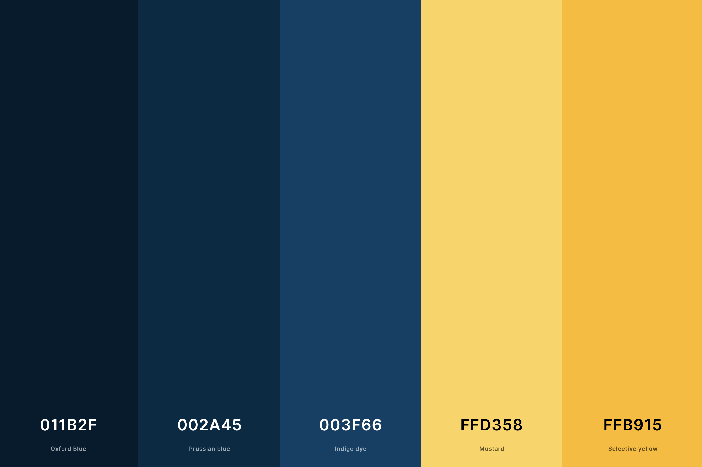
Hex Codes: #011B2F, #002A45, #003F66, #FFD358, #FFB915
This palette is a striking blend of deep blues and vibrant yellows. Oxford Blue and Prussian Blue provide a deep, sophisticated base, while Indigo Dye adds a hint of brightness.
The real stars here are Mustard and Selective Yellow - these warm, inviting yellows pop against the cooler blues, creating a dynamic and cheerful contrast.
This palette is perfect for designs where you want to mix a sense of tradition with a burst of energy and optimism.
2. Green And Yellow Color Palette
British Racing Green + Dark Spring Green + Dark Pastel Green + Canary + Gold
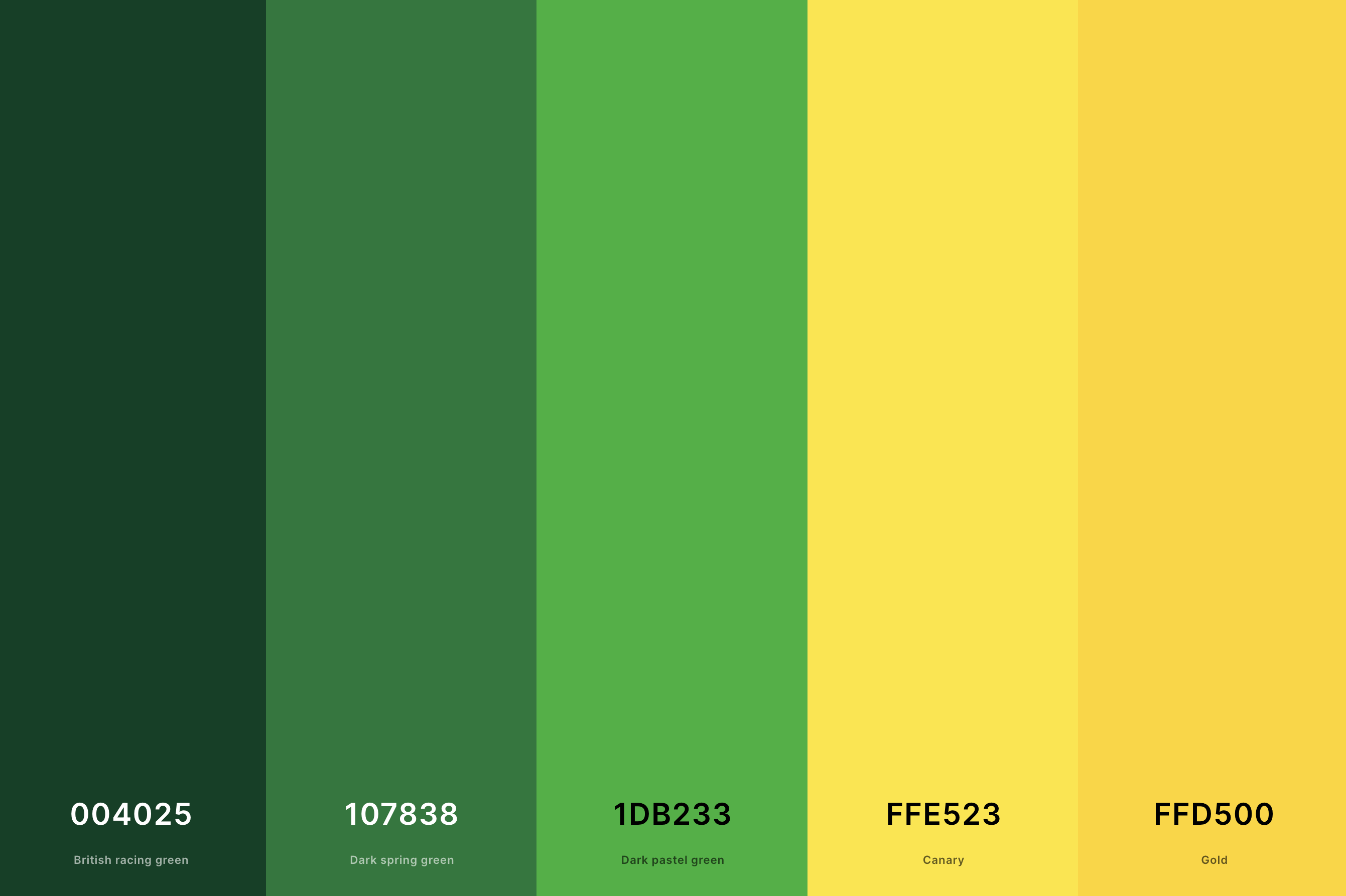
Hex Codes: #004025, #107838, #1DB233, #FFE523, #FFD500
Here, we have a lush, nature-inspired palette. British Racing Green and Dark Spring Green offer a rich, verdant backdrop, reminiscent of a forest's depth. Dark Pastel Green adds a fresher, more vibrant touch.
The addition of Canary and Gold infuses this palette with a splash of sunshine, bringing a sense of joy and liveliness. It's ideal for spaces or designs aiming to reflect growth, vitality, and a connection to nature.
3. Mustard Yellow Color Palette
Dark Goldenrod + Goldenrod + Saffron + Mustard + Vanilla
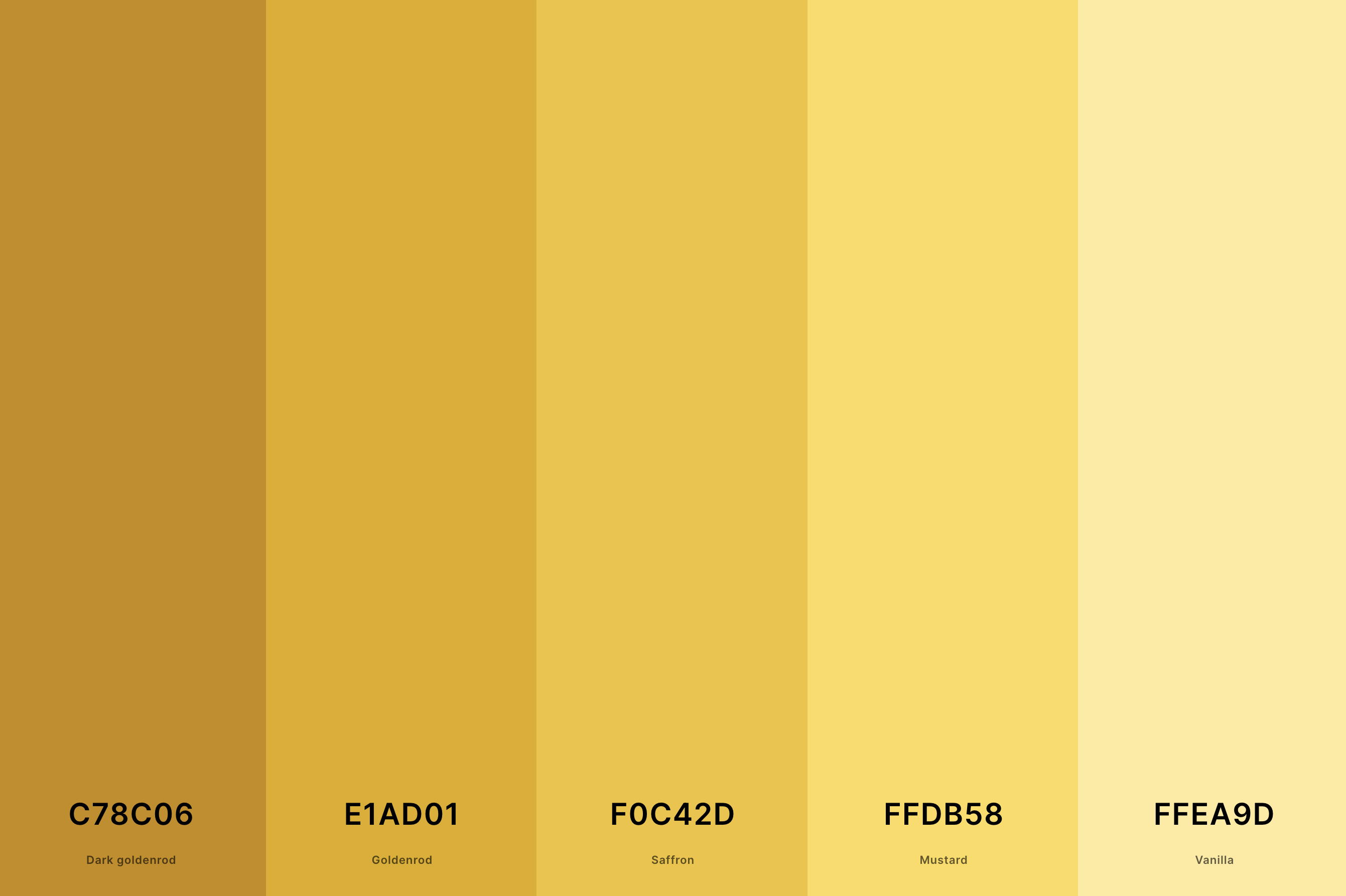
Hex Codes: #C78C06, #E1AD01, #F0C42D, #FFDB58, #FFEA9D
This palette is all about the warmth and richness of yellow. Dark Goldenrod and Goldenrod set a cozy, autumnal mood, while Saffron adds a bit of spice. Mustard and Vanilla, lighter and more subdued, balance the intensity, making the palette versatile.
It's perfect for creating a welcoming, comforting atmosphere with a hint of rustic charm.
4. Pastel Yellow Color Palette
Naples Yellow + Jasmine + Vanilla + Lemon Chiffon + Cornsilk
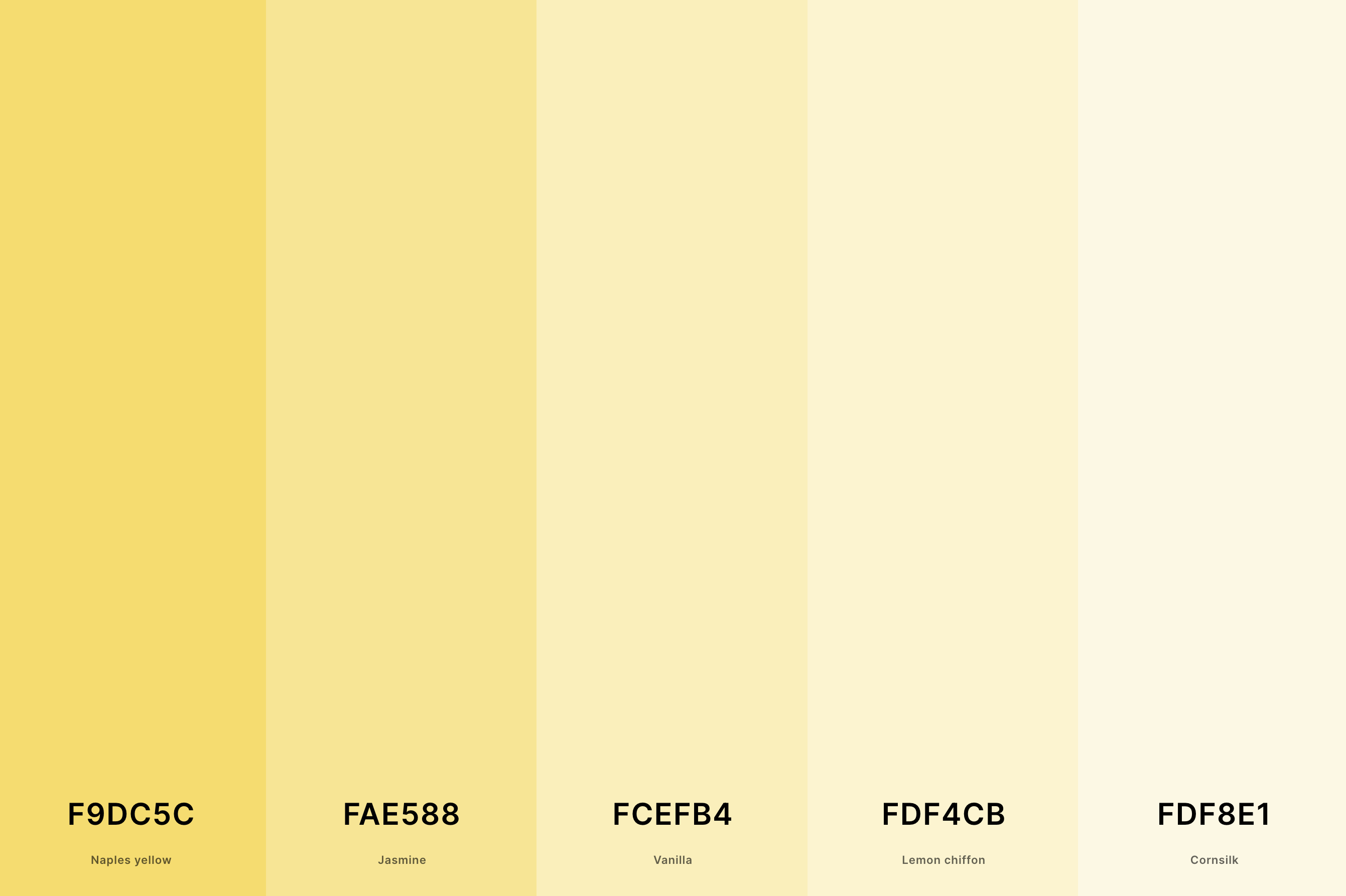
Hex Codes: #F9DC5C, #FAE588, #FCEFB4, #FDF4CB, #FDF8E1
Soft, soothing, and incredibly sweet, this palette is like a gentle sunrise. Naples Yellow and Jasmine bring a bit of cheer, while Vanilla adds a creamy, soft touch. Lemon Chiffon and Cornsilk, almost ethereal, lighten the overall feel.
It's a dreamy choice for spaces or designs that aim to be calming, gentle, and subtly uplifting.
5. Purple And Yellow Color Palette
Indigo + Mauveine + Phlox + Yellow + School Bus Yellow
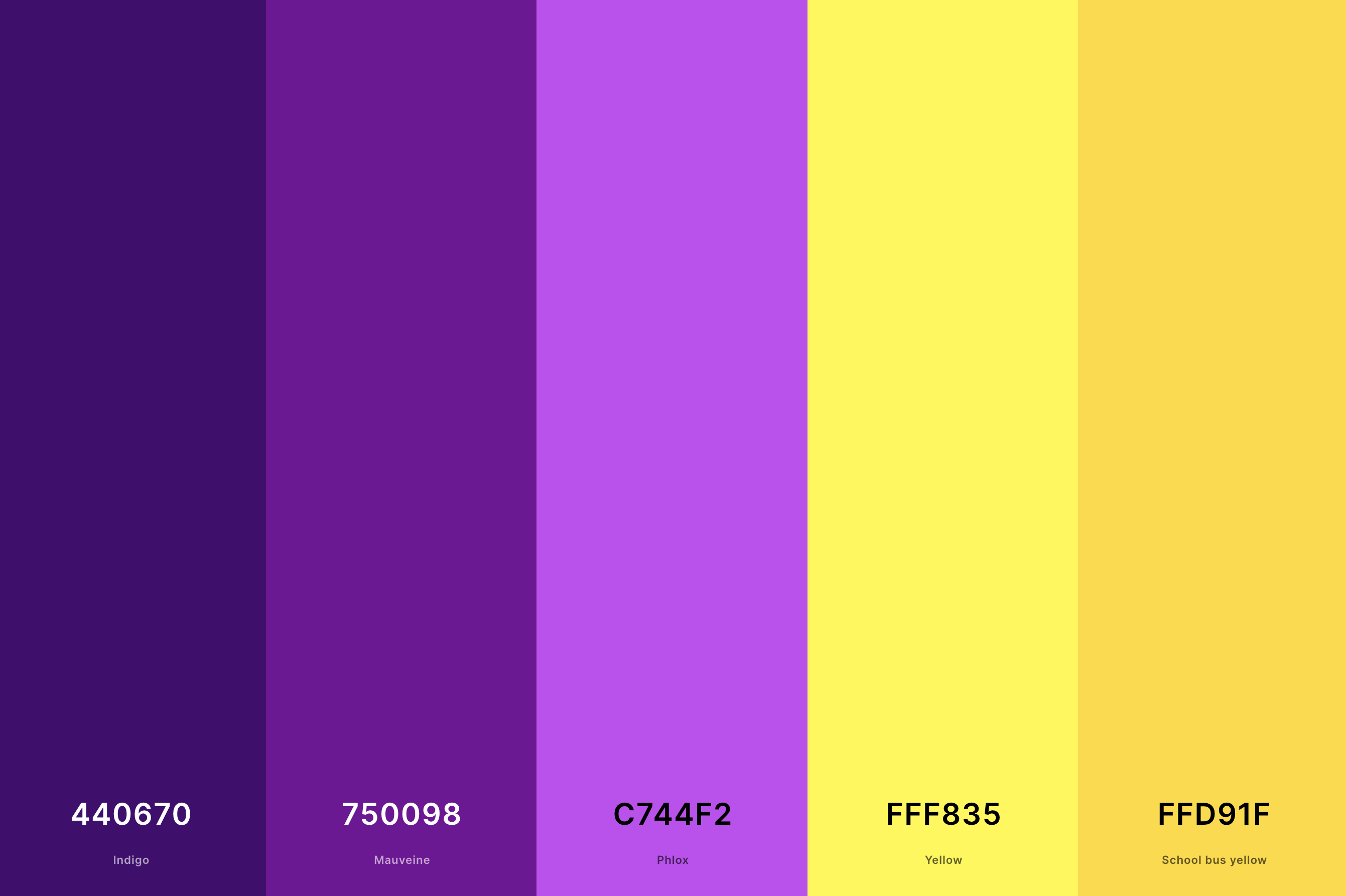
Hex Codes: #440670, #750098, #C744F2, #FFF835, #FFD91F
Bold and unexpected, this palette combines the regal mystery of purple with the bright cheerfulness of yellow. Indigo, Mauveine, and Phlox provide a range of purples from deep to vibrant.
Yellow and School Bus Yellow, bright and eye-catching, create a striking contrast. This palette is fabulous for designs that want to be playful, bold, and a bit dramatic.
6. Black And Yellow Color Palette
Night + Eerie Black + Jet + Jonquil + Aureolin
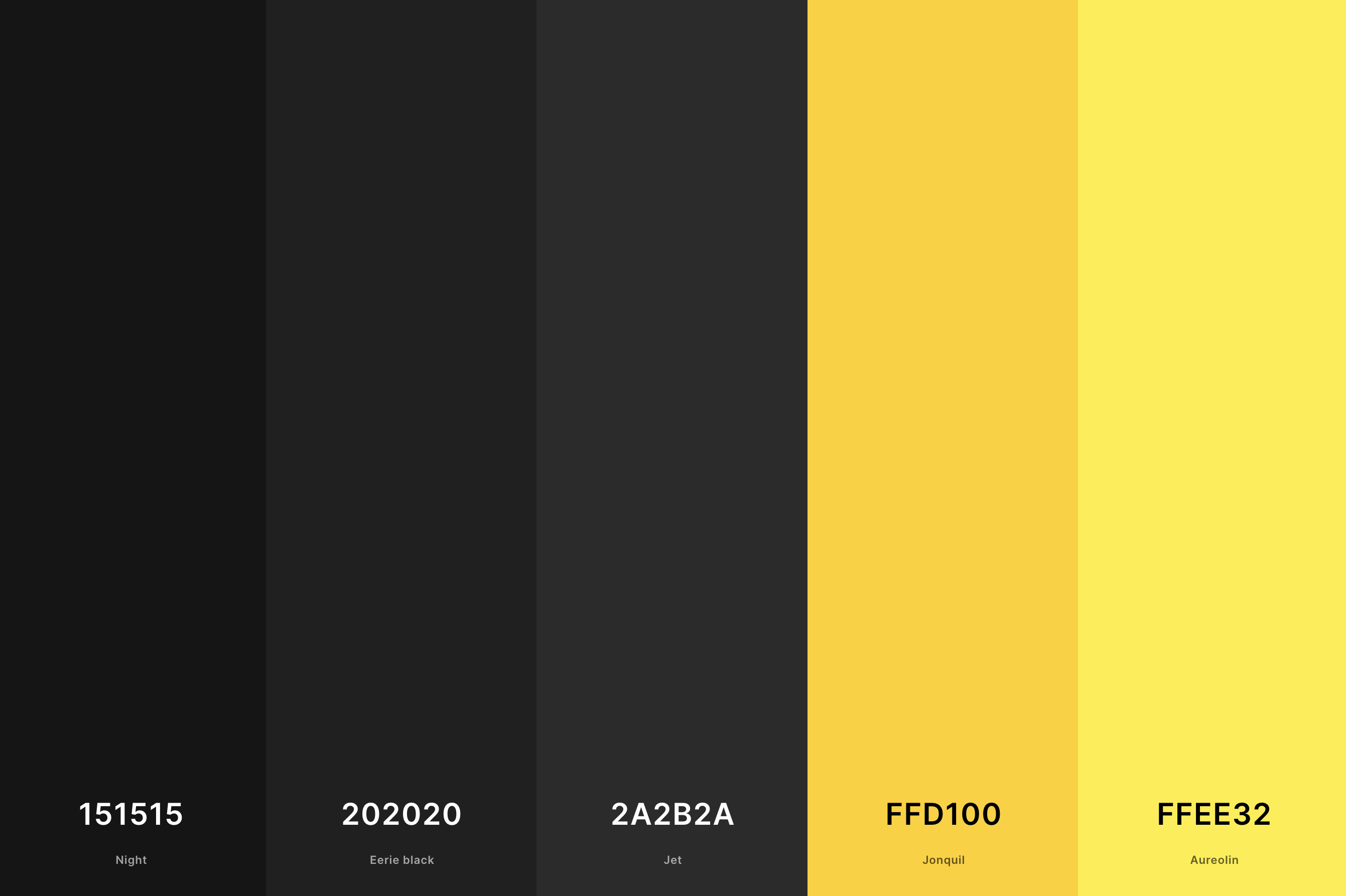
Hex Codes: #151515, #202020, #2A2B2A, #FFD100, #FFEE32
This palette is all about bold statements and high contrast. Night and Eerie Black are as deep as it gets, offering a powerful, sophisticated base. Jet adds a slightly lighter touch to this dark foundation.
Jonquil and Aureolin break through the darkness with their luminous yellows, creating a dynamic, attention-grabbing contrast. This palette is perfect for designs that aim to be edgy, modern, and unmissable.
7. Pink And Yellow Color Palette
French Rose + Persian Pink + Apricot + Maize + Gold
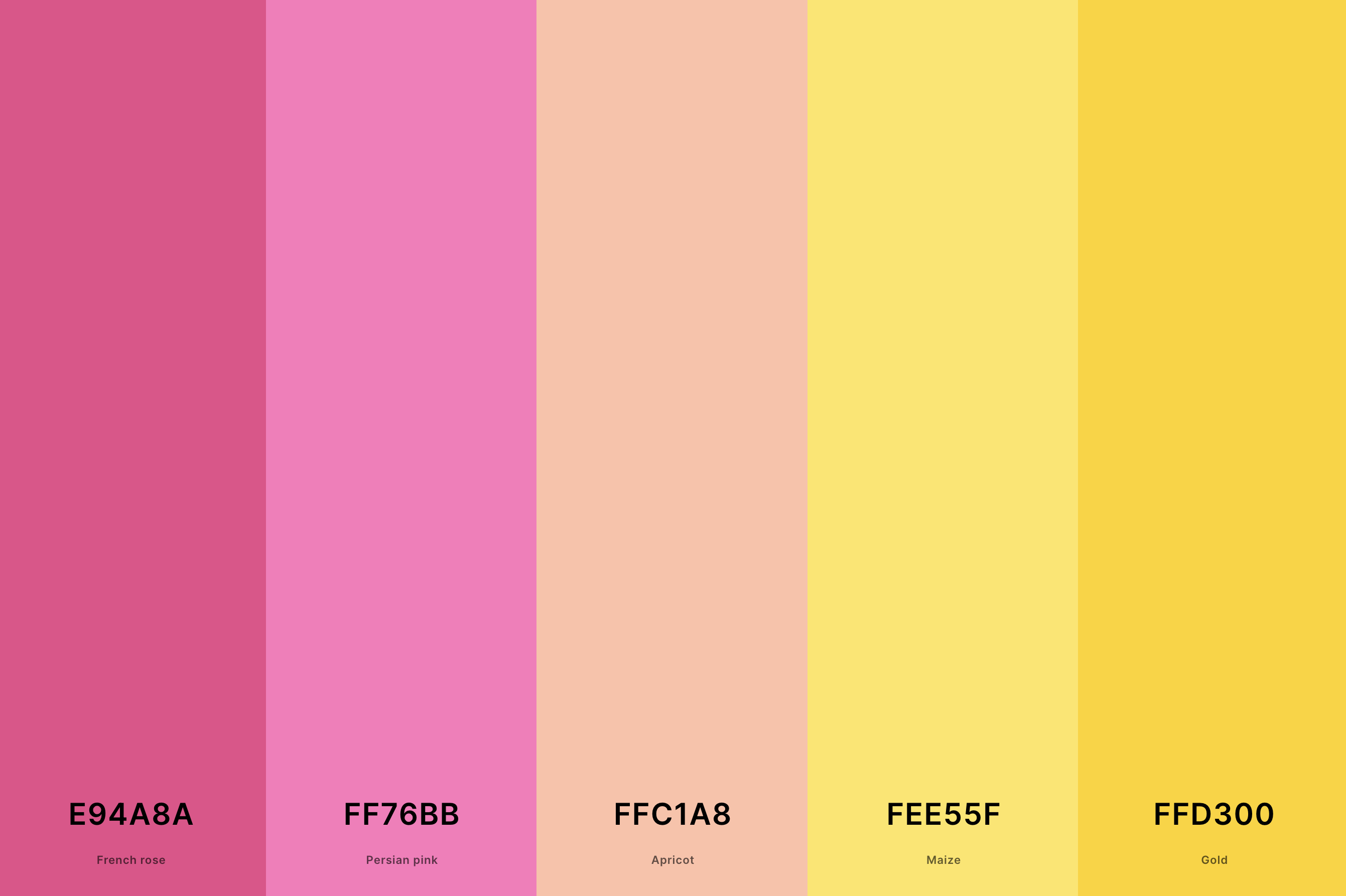
Hex Codes: #E94A8A, #FF76BB, #FFC1A8, #FEE55F, #FFD300
A playful and charming mix, this palette combines the softness of pink with the brightness of yellow. French Rose and Persian Pink add a romantic, feminine touch, while Apricot softens the transition to the more vibrant yellows.
Maize and Gold, both lively and cheerful, inject a dose of sunshine. This palette is a wonderful choice for designs that aim to be fun, whimsical, and full of life.
8. Red And Yellow Color Palette
Dark Red + Off Red (Rgb) + Orange (Pantone) + Sunglow + School Bus Yellow
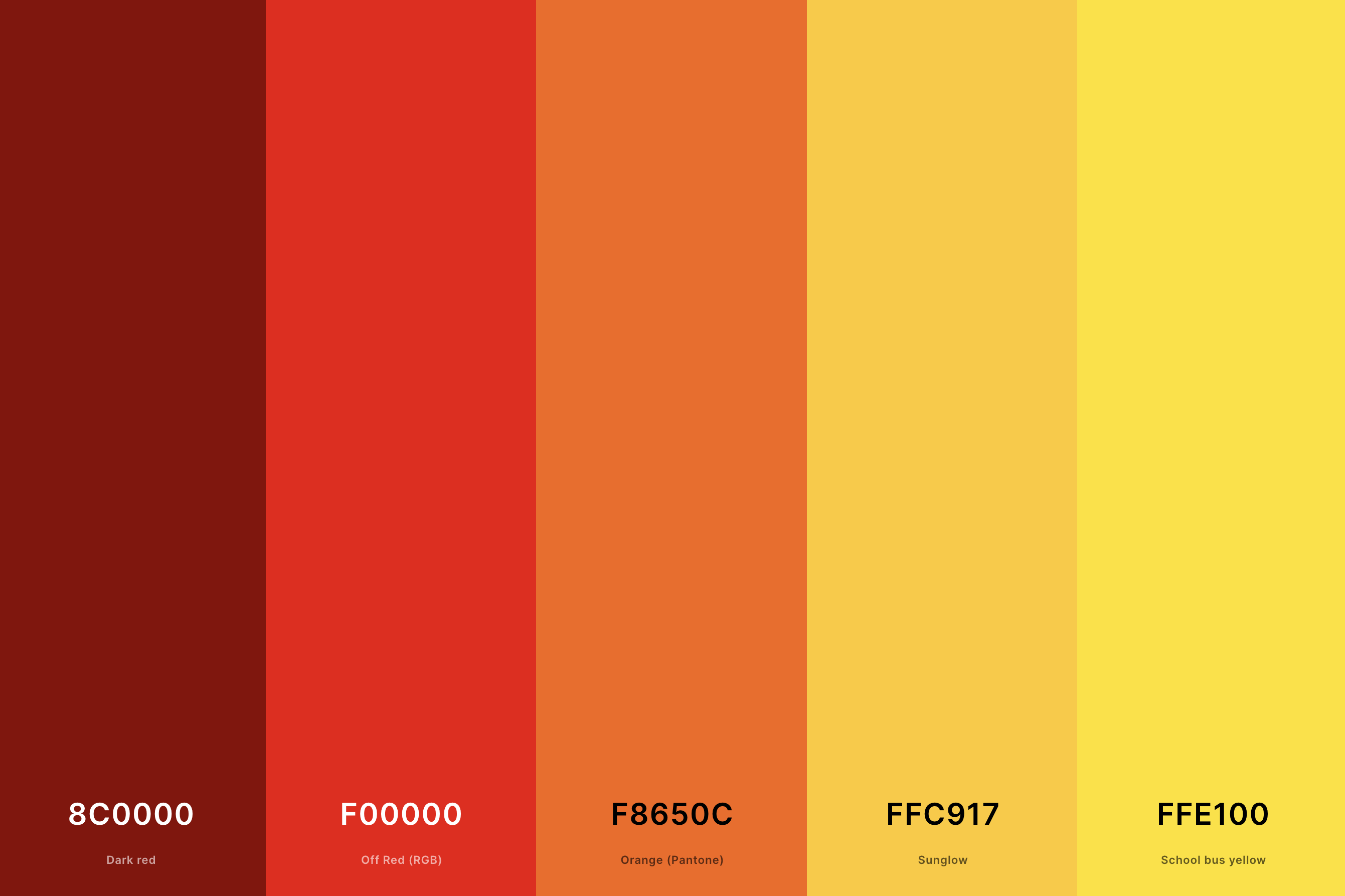
Hex Codes: #8C0000, #F00000, #F8650C, #FFC917, #FFE100
Here's a palette that's fiery and full of energy. Dark Red and Off Red provide a passionate, intense foundation, with Orange (Pantone) adding a zesty twist.
Sunglow and School Bus Yellow, bright and bold, add a punchy, vibrant contrast. This palette is great for designs that want to evoke excitement, passion, and a sense of adventure.
9. Yellow And Orange Color Palette
Safety Orange + Princeton Orange + Orange (Web) + Mikado Yellow + School Bus Yellow
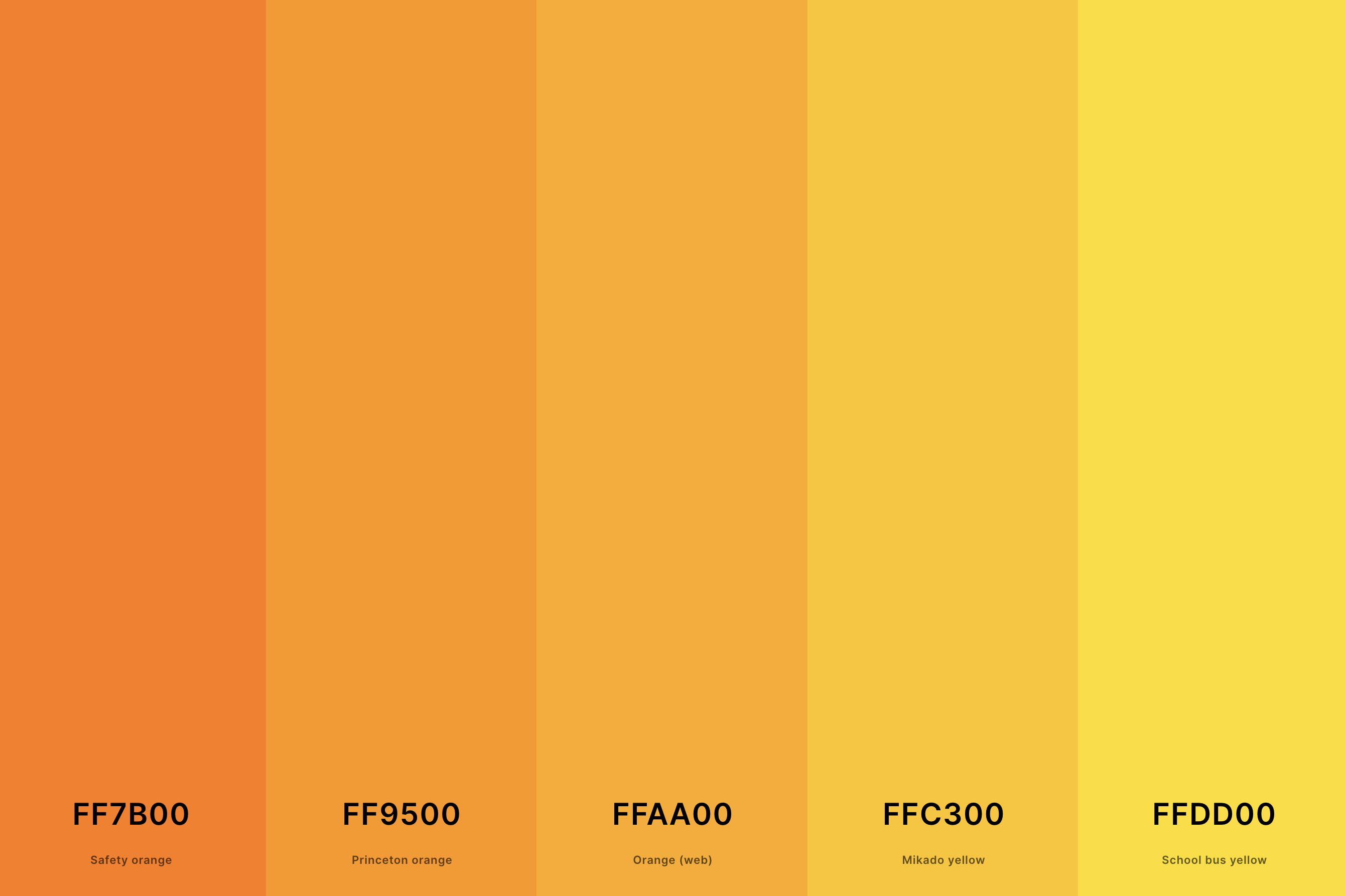
Hex Codes: #FF7B00, #FF9500, #FFAA00, #FFC300, #FFDD00
Warm, radiant, and invigorating, this palette is a celebration of sunny colors. Safety Orange and Princeton Orange offer a juicy, vibrant base, while Orange (Web) deepens the mix.
Mikado Yellow and School Bus Yellow lighten the mood, bringing a cheerful, optimistic vibe. This palette is ideal for designs that want to feel energetic, warm, and inviting.
10. Blue, Green And Yellow Color Palette
Violet Blue + Pigment Green + Mantis + Gold + Selective Yellow
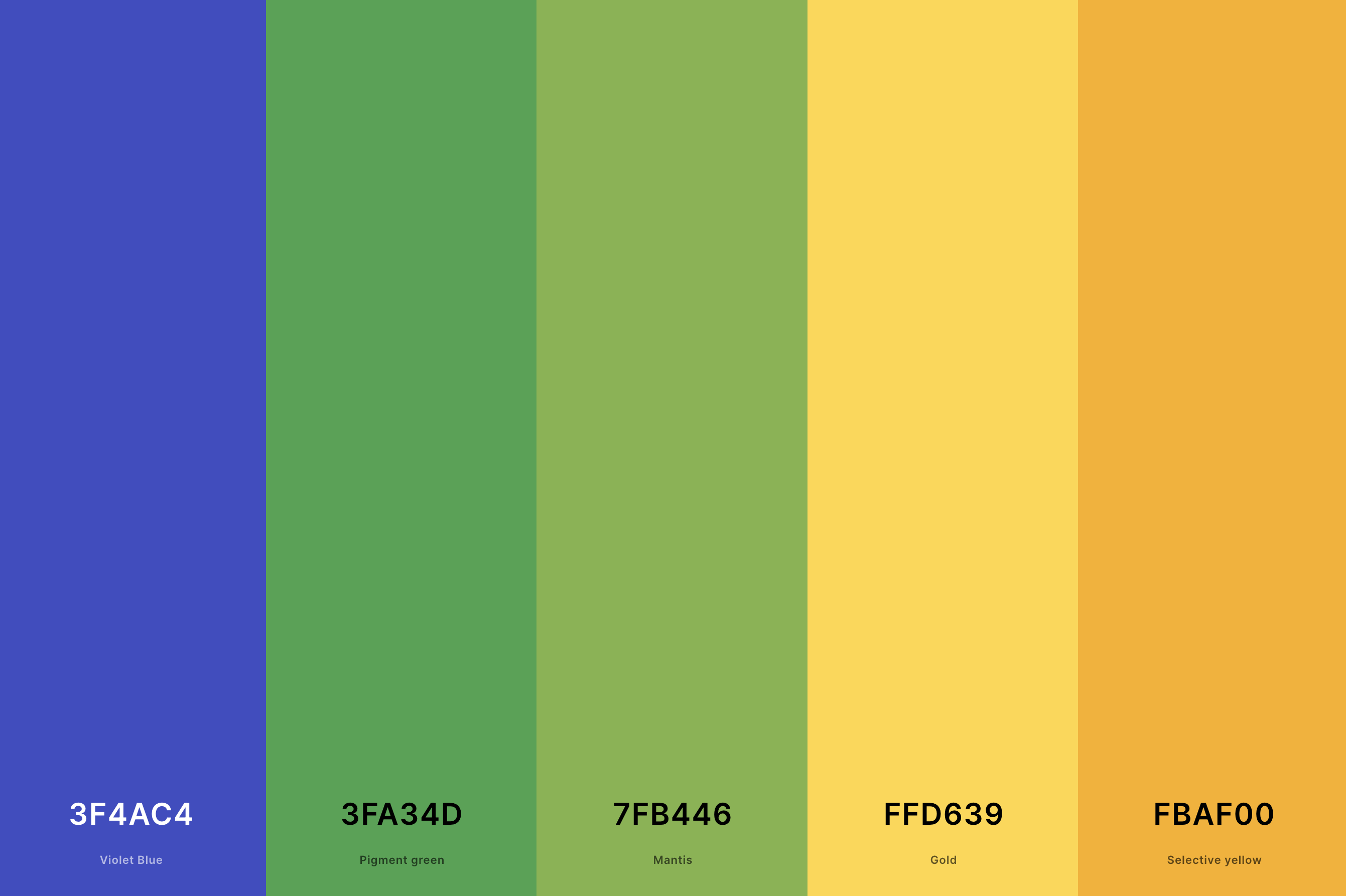
Hex Codes: #3F4AC4, #3FA34D, #7FB446, #FFD639, #FBAF00
A refreshing and harmonious blend, this palette combines the coolness of blue and green with the warmth of yellow. Violet Blue and Pigment Green offer a cool, serene background, while Mantis adds a touch of lively green.
Gold and Selective Yellow, bright and cheerful, provide a lovely contrast and bring a sense of joy and energy. This palette is perfect for designs that aim to be balanced, refreshing, and uplifting.
11. Light Yellow Color Palette
Light Yellow + Cream + Mindaro + Icterine + Yellow
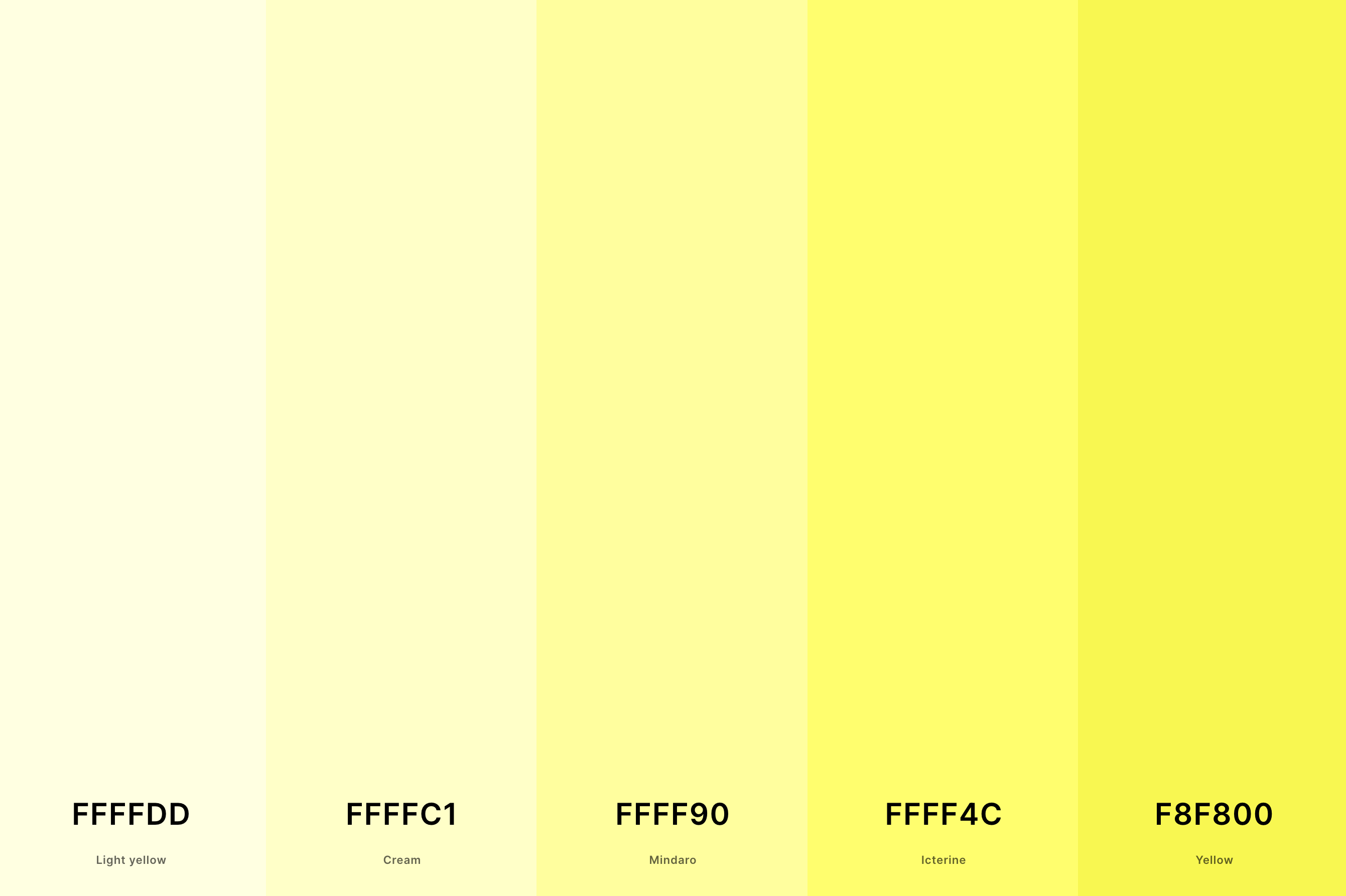
Hex Codes: #FFFFDD, #FFFFC1, #FFFF90, #FFFF4C, #F8F800
This palette is like a gentle whisper of sunlight. Light Yellow and Cream offer a soft, almost ethereal glow, creating a delicate and soothing atmosphere.
Mindaro and Icterine bring in a touch of fresh, spring-like energy, while Yellow adds a cheerful, sunny vibe.
This palette is perfect for designs that seek to be soft, airy, and subtly joyful, creating a space that feels like a peaceful morning.
12. Red, Blue And Yellow Color Palette
Fire Engine Red + Red (Cmyk) + Delft Blue + Jonquil + Selective Yellow
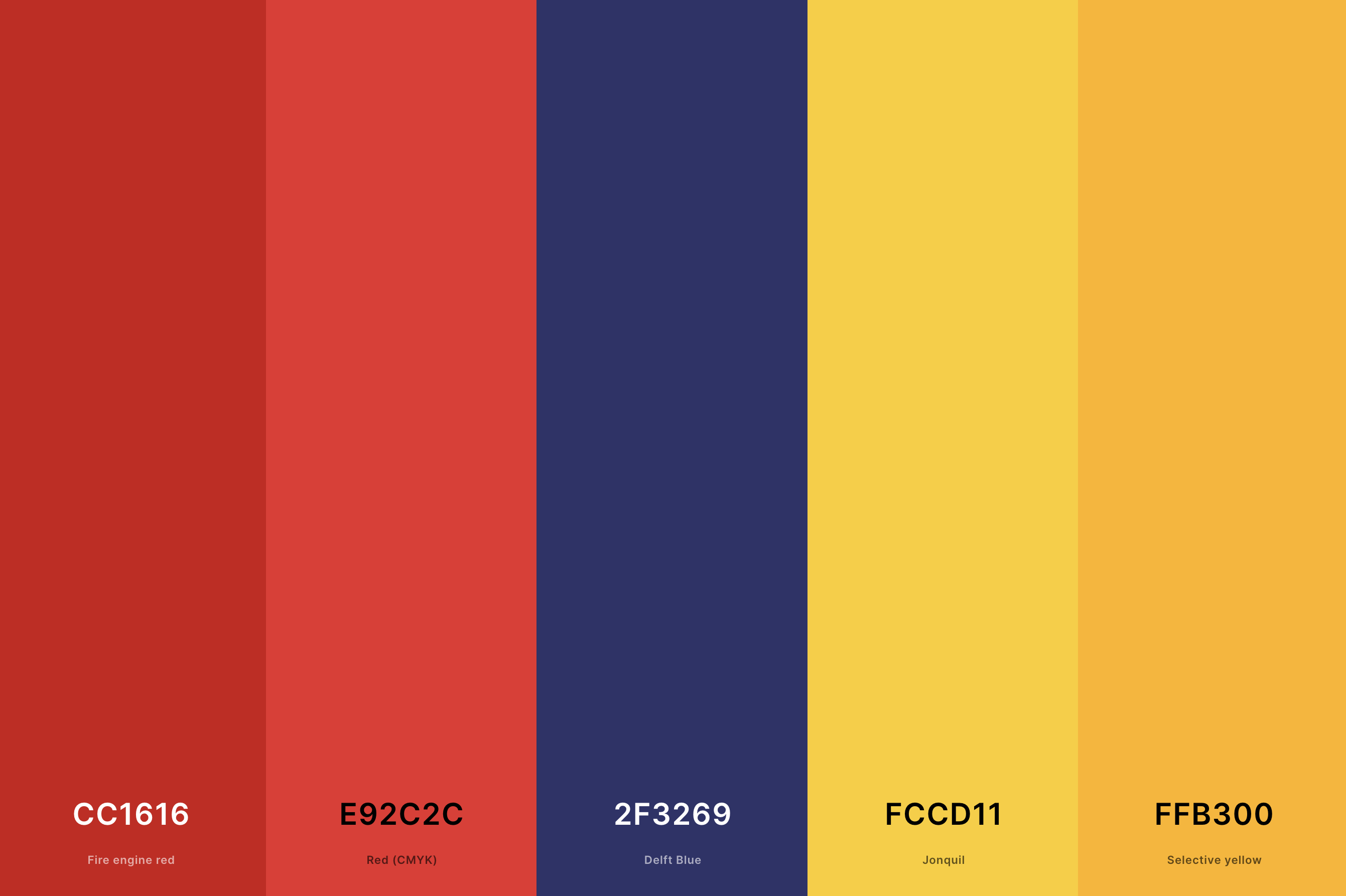
Hex Codes: #CC1616, #E92C2C, #2F3269, #FCCD11, #FFB300
This palette is a classic primary color mix with a twist. Fire Engine Red and Red (Cmyk) provide a robust, energetic base, full of passion and vibrancy. Delft Blue adds a touch of sophistication and depth, balancing the warmth of the reds.
Jonquil and Selective Yellow brighten the palette with their luminous, lively presence. It's an ideal choice for designs that aim to be bold, playful, and full of life.
13. Red, Yellow And Green Color Palette
Engineering Orange + Red (Cmyk) + Orange (Web) + Gold + Forest Green
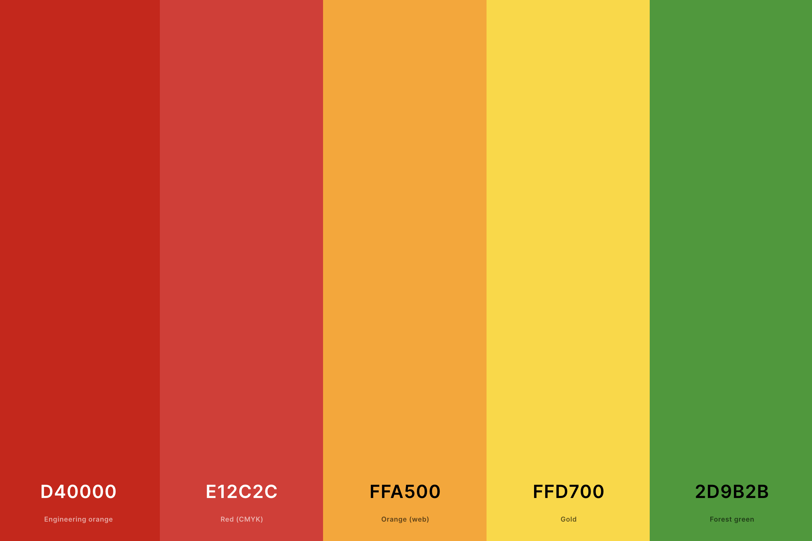
Hex Codes: #D40000, #E12C2C, #FFA500, #FFD700, #2D9B2B
Here, we have a palette that’s both earthy and vibrant. Engineering Orange and Red (Cmyk) offer a warm, fiery foundation, full of life and energy. Orange (Web) adds a tangy twist, while Gold brings a luxurious, rich quality.
Forest Green grounds the palette with its natural, calming presence. This combination is perfect for designs aiming to be dynamic, organic, and invigorating.
14. Golden Yellow Color Palette
Naples Yellow + Mustard + Xanthous + Dark Goldenrod + Golden Brown
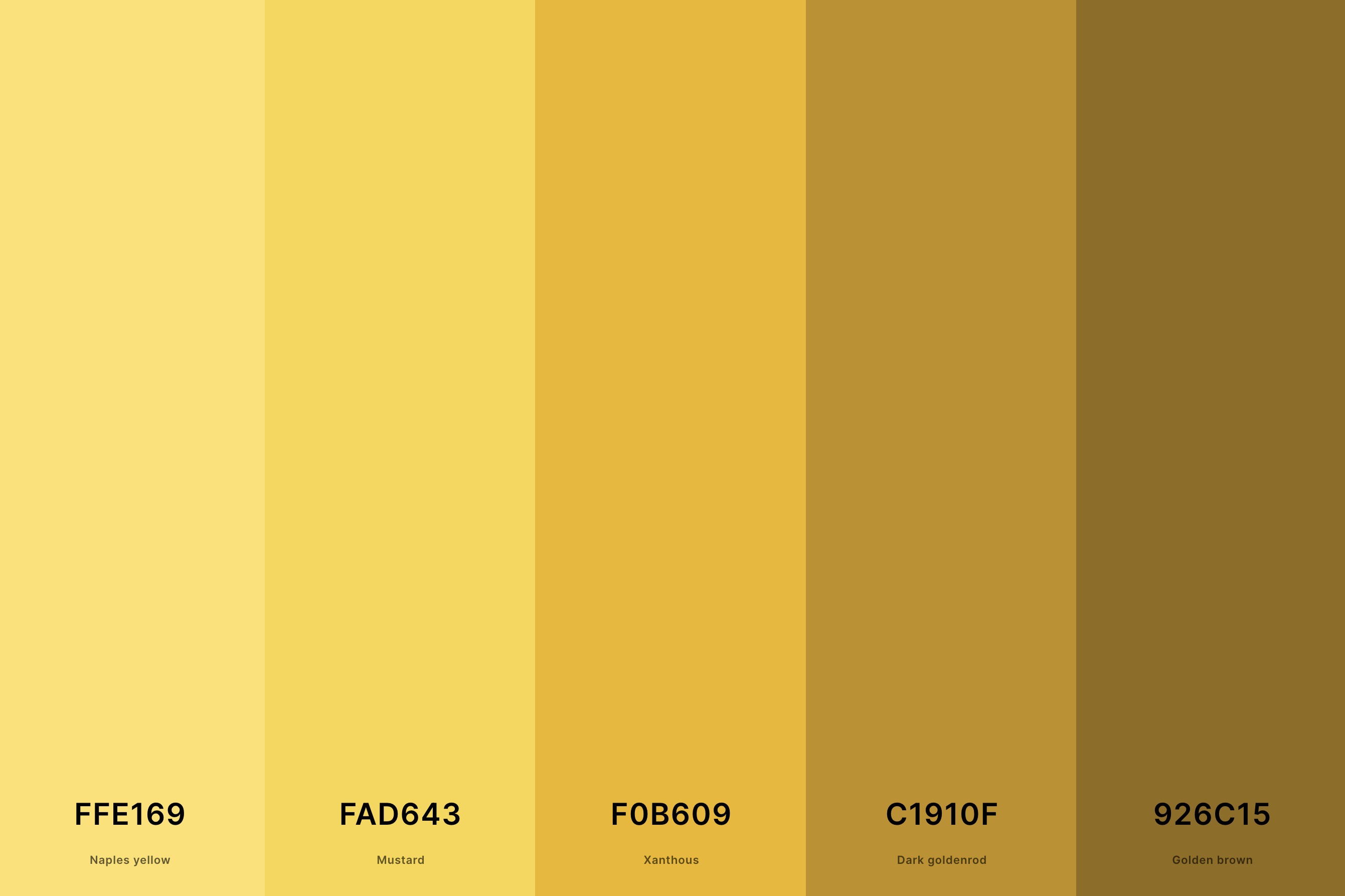
Hex Codes: #FFE169, #FAD643, #F0B609, #C1910F, #926C15
This palette is like a treasure trove of golden shades. Naples Yellow and Mustard are soft and inviting, creating a warm, welcoming feel.
Xanthous adds a bit more intensity, while Dark Goldenrod and Golden Brown deepen the palette, adding richness and a hint of mystery.
This palette is great for creating a sense of luxury, warmth, and opulence.
15. Navy Blue And Yellow Color Palette
Federal Blue + Navy Blue + Dutch White + Gold + Mikado Yellow
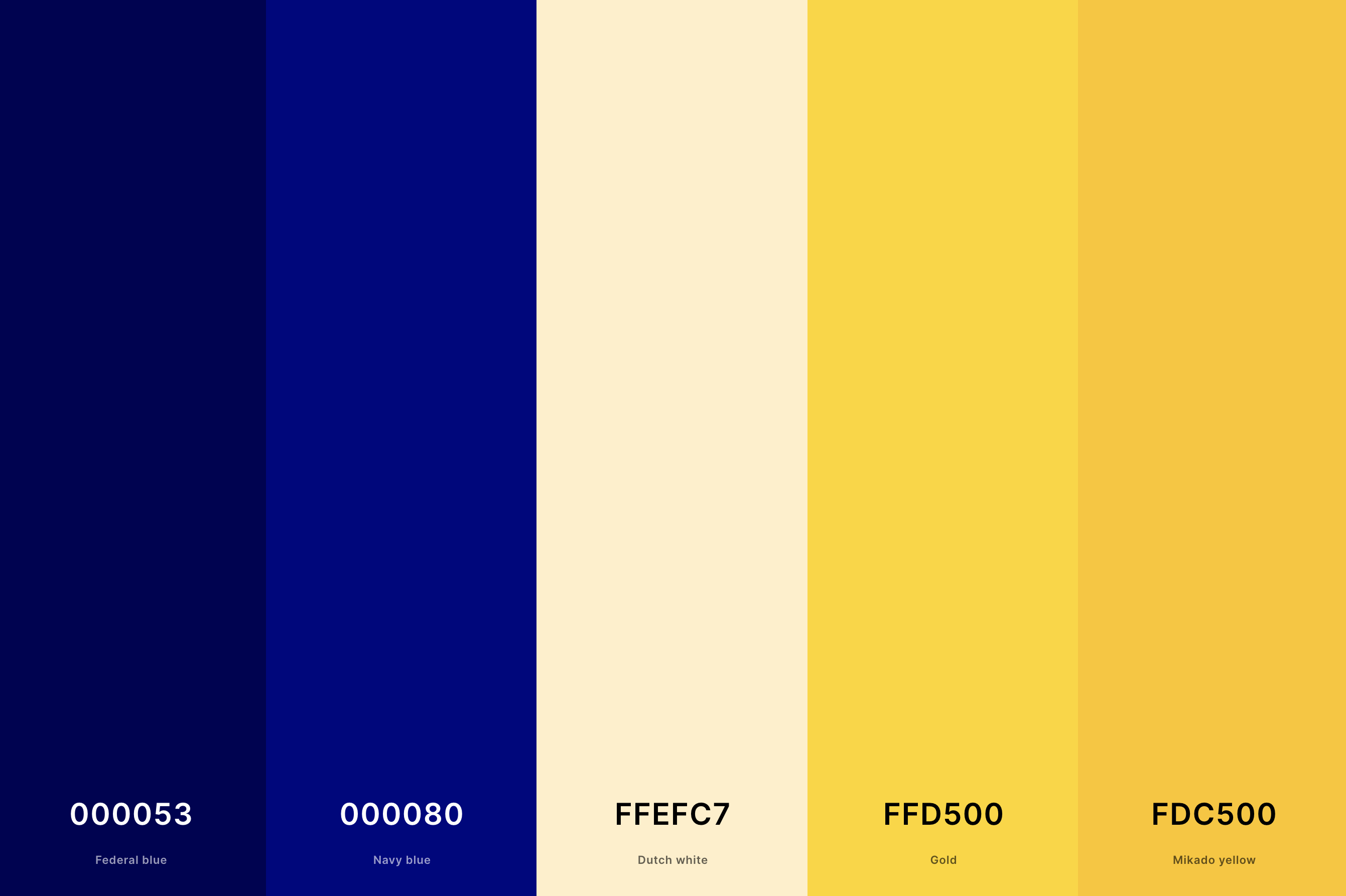
Hex Codes: #000053, #000080, #FFEFC7, #FFD500, #FDC500
A classic and sophisticated mix, this palette combines the depth of navy with the brightness of yellow. Federal Blue and Navy Blue provide a strong, dignified base, while Dutch White softens the mix.
Gold and Mikado Yellow add a splash of radiance, creating a striking contrast. This palette is perfect for designs that want to convey a sense of elegance, confidence, and cheerfulness.
16. Pale Yellow Color Palette
Mindaro + Mindaro + Cream + Cream + Ivory
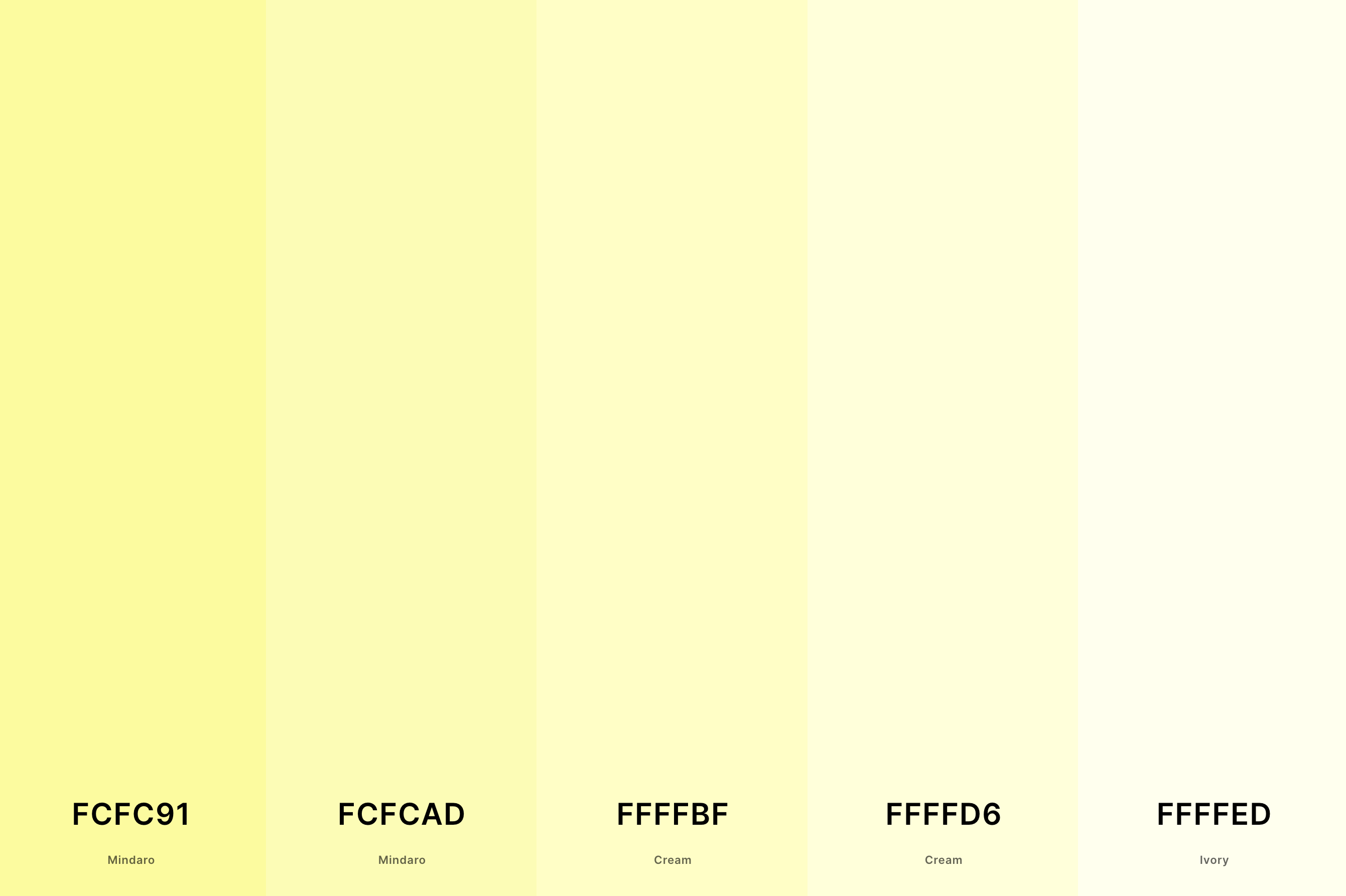
Hex Codes: #FCFC91, #FCFCAD, #FFFFBF, #FFFFD6, #FFFFED
This palette is a breath of fresh, soft air. Featuring Mindaro in two shades, along with Cream and Ivory, it's like a gentle embrace of subtle yellows.
The colors flow seamlessly into each other, creating a tranquil, soothing ambiance.
It's a perfect choice for spaces that aim for a delicate, refined, and peaceful mood, reminiscent of a quiet, sunlit afternoon.
17. Warm Yellow Color Palette
Aureolin + Saffron + Ochre + Brown + Seal Brown
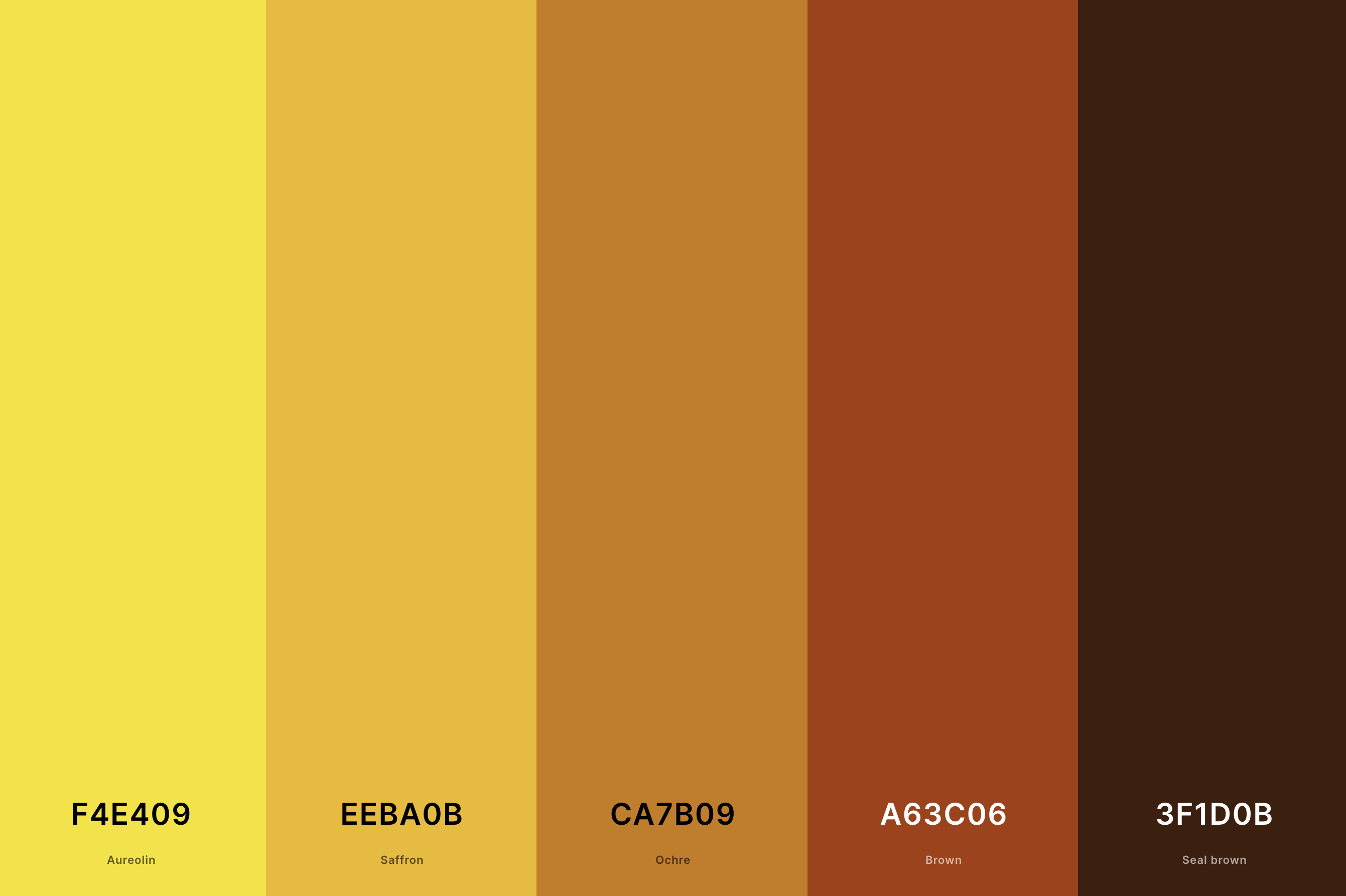
Hex Codes: #F4E409, #EEBA0B, #CA7B09, #A63C06, #3F1D0B
Embracing the heartier side of yellow, this palette exudes warmth and earthiness.
Aureolin and Saffron bring bright, sun-kissed tones, while Ochre and Brown deepen the warmth with a rich, grounded feel.
Seal Brown adds a robust, intense anchor, making this palette ideal for creating cozy, inviting spaces that feel like a warm embrace.
18. Brown And Yellow Color Palette
Seal Brown + Russet + Vanilla + Canary + Mikado Yellow
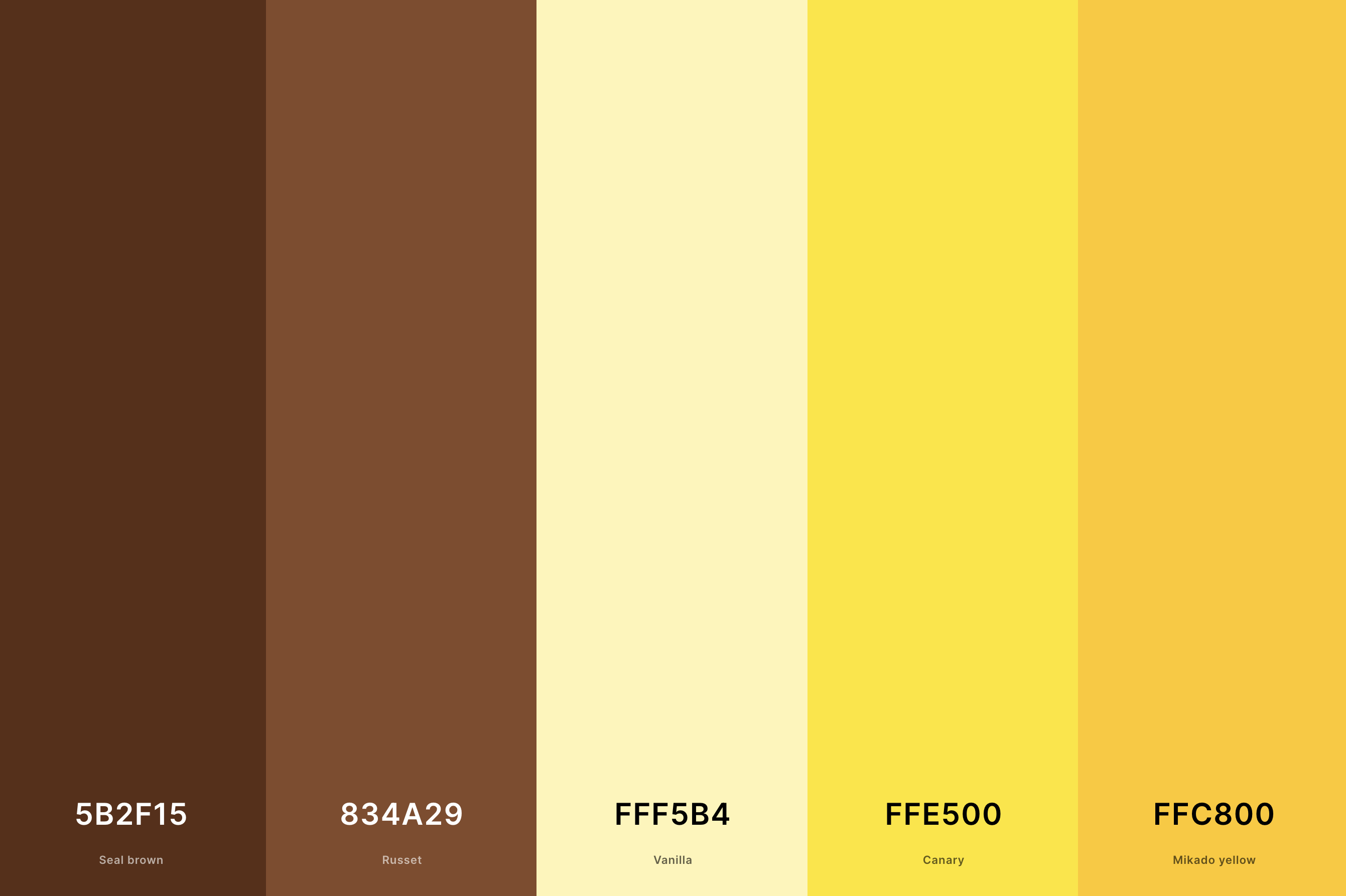
Hex Codes: #5B2F15, #834A29, #FFF5B4, #FFE500, #FFC800
This palette combines the comforting depth of brown with the cheerfulness of yellow. Seal Brown and Russet create a rich, earthy foundation, while Vanilla lightens the mood with its soft, creamy presence.
Canary and Mikado Yellow add pops of vibrant, energetic color, perfect for designs that aim to be both comforting and lively.
19. Neon Yellow Color Palette
Lime + Chartreuse + Lemon Lime + Yellow + Yellow
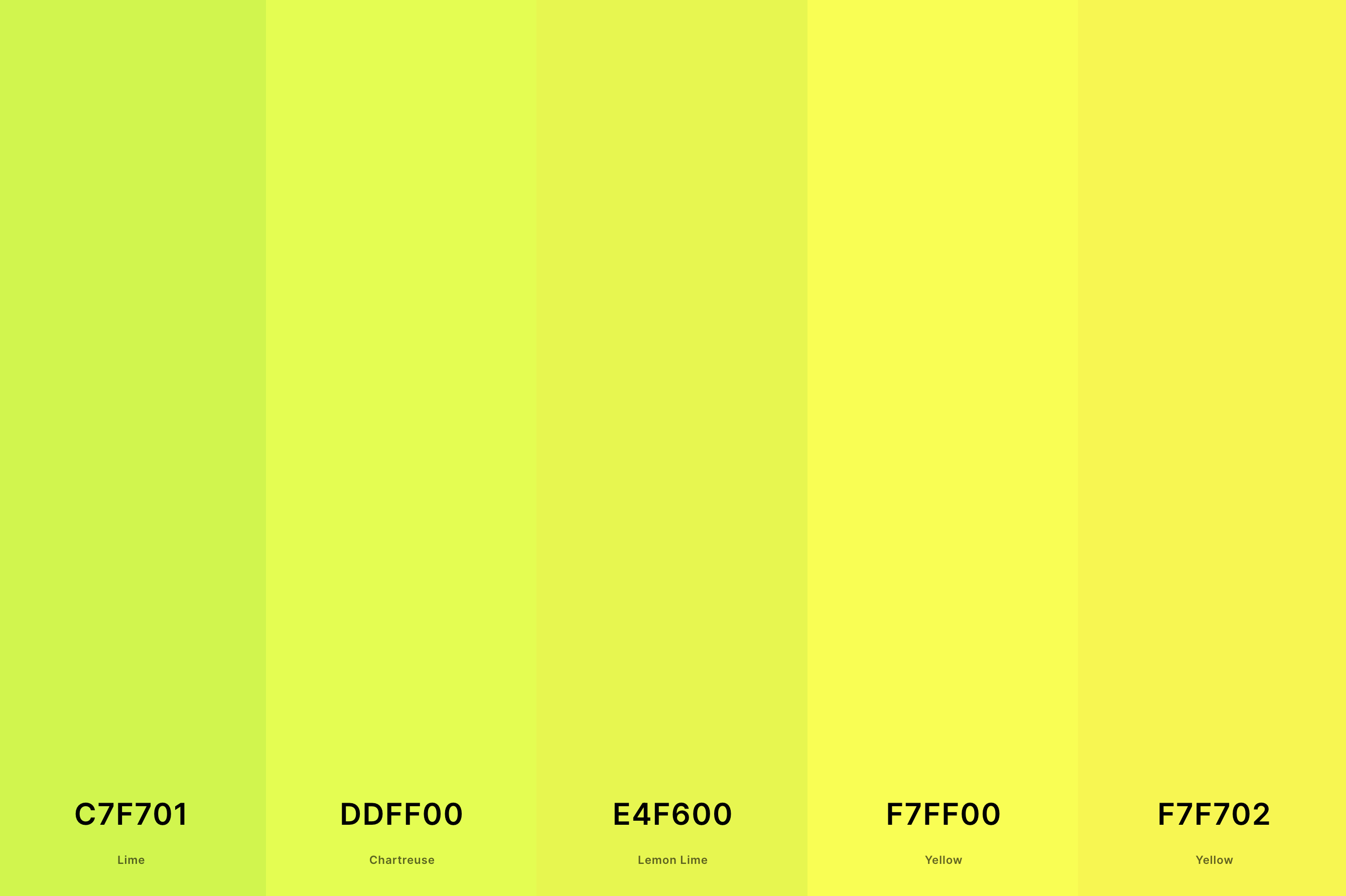
Hex Codes: #C7F701, #DDFF00, #E4F600, #F7FF00, #F7F702
This palette is a vibrant burst of energy. Lime, Chartreuse, and Lemon Lime bring electric, zesty tones that are impossible to ignore.
Two shades of Yellow intensify the neon effect, making this palette perfect for designs that aim to be bold, modern, and full of vitality.
20. Yellow And Grey Color Palette
Davy'S Gray + Cadet Gray + Platinum + Jonquil + Gold
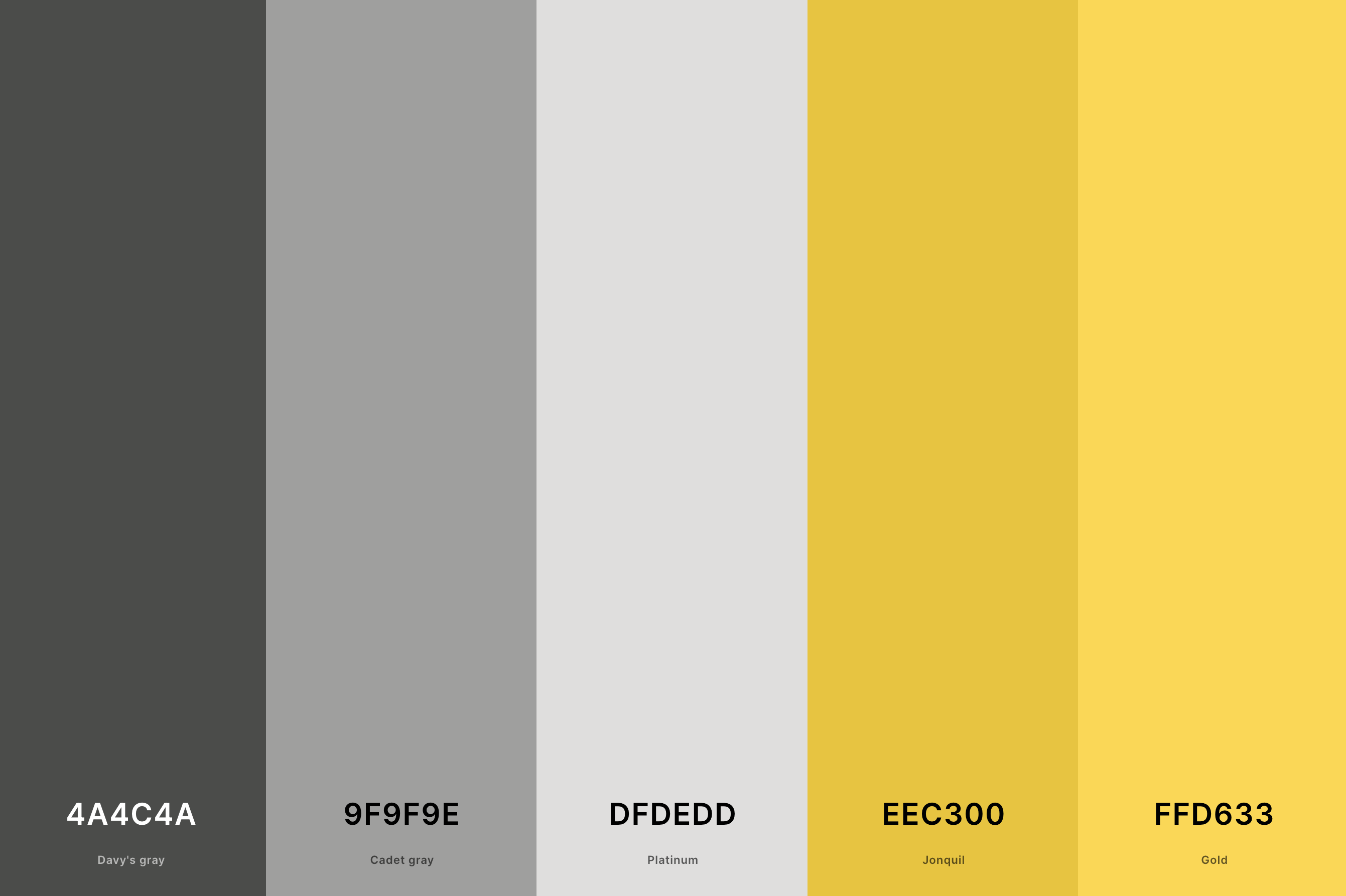
Hex Codes: #4A4C4A, #9F9F9E, #DFDEDD, #EEC300, #FFD633
A sophisticated and modern blend, this palette pairs the brightness of yellow with the neutrality of grey. Davy's Gray and Cadet Gray provide a sleek, contemporary backdrop, while Platinum adds a touch of refined elegance.
Jonquil and Gold break through with their luminous, vibrant energy, creating a palette that's both balanced and striking. It's ideal for designs looking to blend cheerfulness with chic, understated elegance.
21. Pink, Green And Yellow Color Palette
Hot Pink + Plum (Web) + Light Green + Naples Yellow + Gold
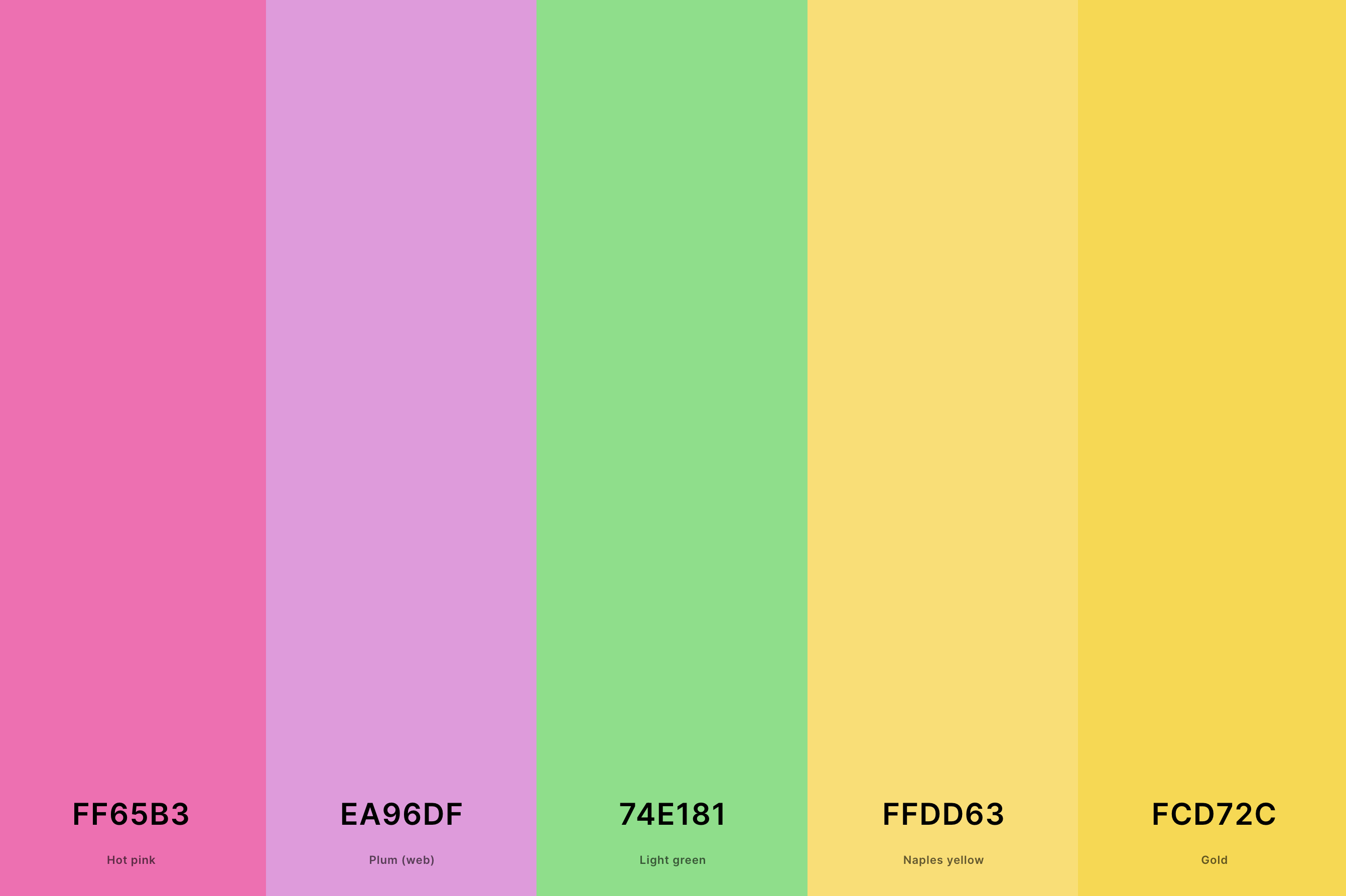
Hex Codes: #FF65B3, #EA96DF, #74E181, #FFDD63, #FCD72C
This palette is a delightful mix of playful and soothing tones. Hot Pink and Plum (Web) add a pop of lively, spirited pink, while Light Green brings a refreshing, calming presence.
Naples Yellow and Gold, both warm and cheerful, infuse the palette with a sunny, optimistic vibe. It's perfect for designs that aim to be fun, youthful, and full of energy.
22. Yellow, Orange And Green Color Palette
Apple Green + Citrine + Jonquil + Gamboge + Cocoa Brown
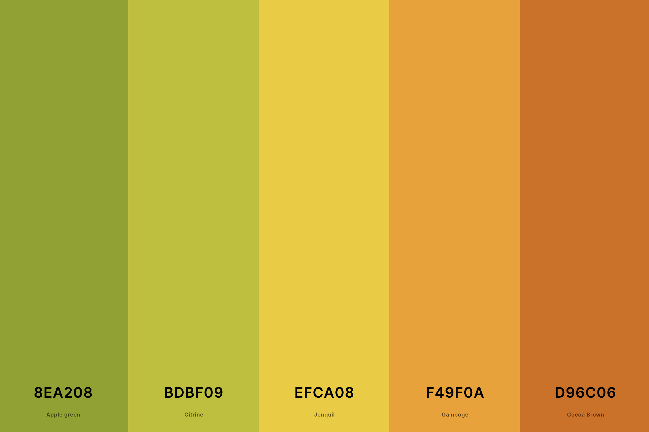
Hex Codes: #8EA208, #BDBF09, #EFCA08, #F49F0A, #D96C06
This palette is like a burst of autumnal joy. Apple Green and Citrine bring in fresh, natural green hues, reminiscent of a forest in fall. Jonquil and Gamboge add a touch of golden yellow, evoking the warmth of autumn leaves.
Cocoa Brown grounds the palette with its deep, earthy tone. This combination is ideal for designs that seek to capture the essence of autumn's richness and vibrancy.
23. Pink, Orange And Yellow Color Palette
Hot Pink + Melon + Lemon Chiffon + Mustard + Orange Peel
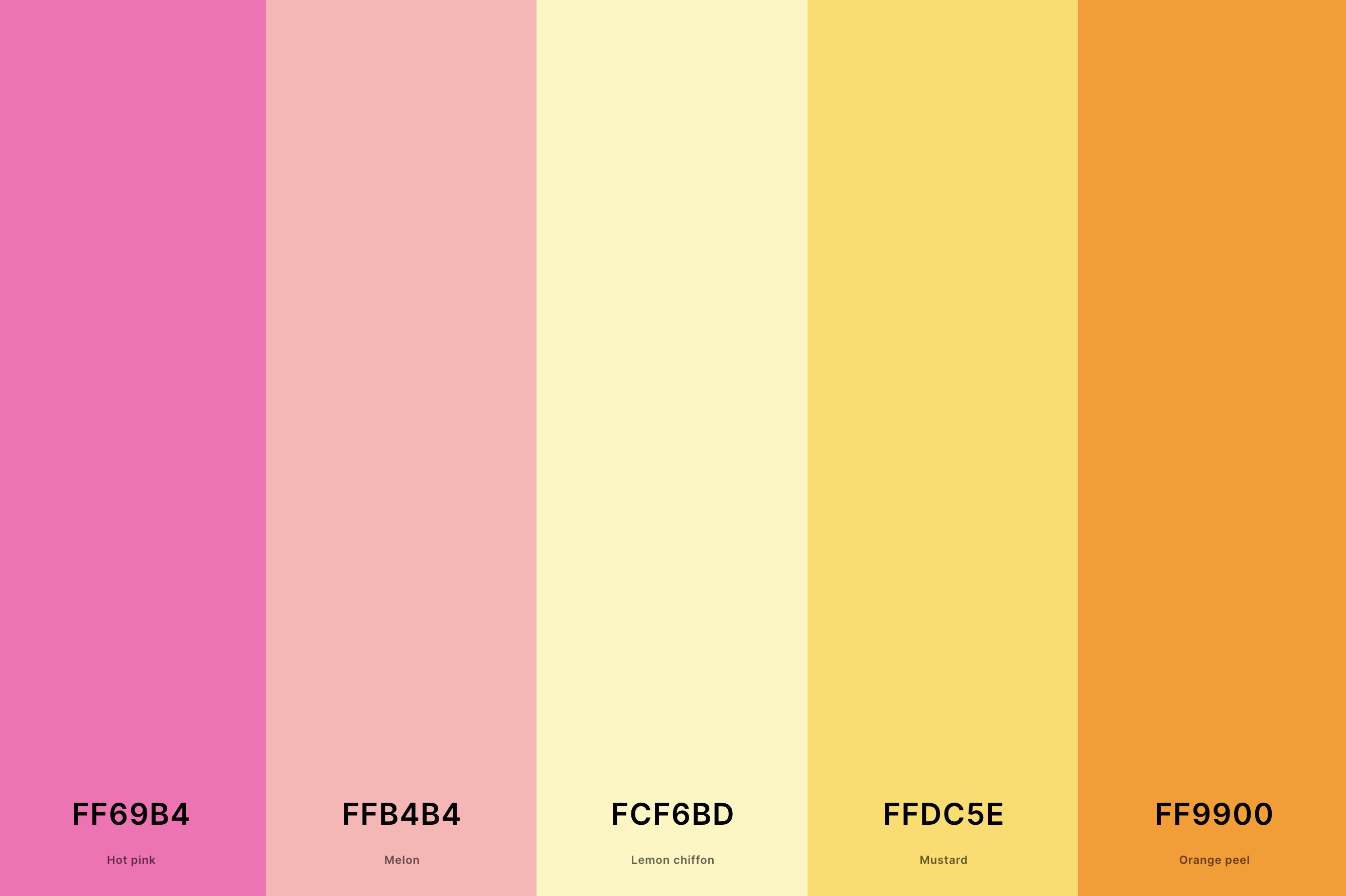
Hex Codes: #FF69B4, #FFB4B4, #FCF6BD, #FFDC5E, #FF9900
A cheerful and warm blend, this palette combines the softness of pink with the brightness of yellow and orange. Hot Pink and Melon provide a romantic, playful base, while Lemon Chiffon adds a gentle, subtle touch.
Mustard and Orange Peel, both bright and lively, create a sunny, inviting feel. This palette is great for designs that want to be welcoming, cheerful, and full of life.
24. Sage Green And Yellow Color Palette
Asparagus + Sage + Dutch White + Old Gold + Saffron
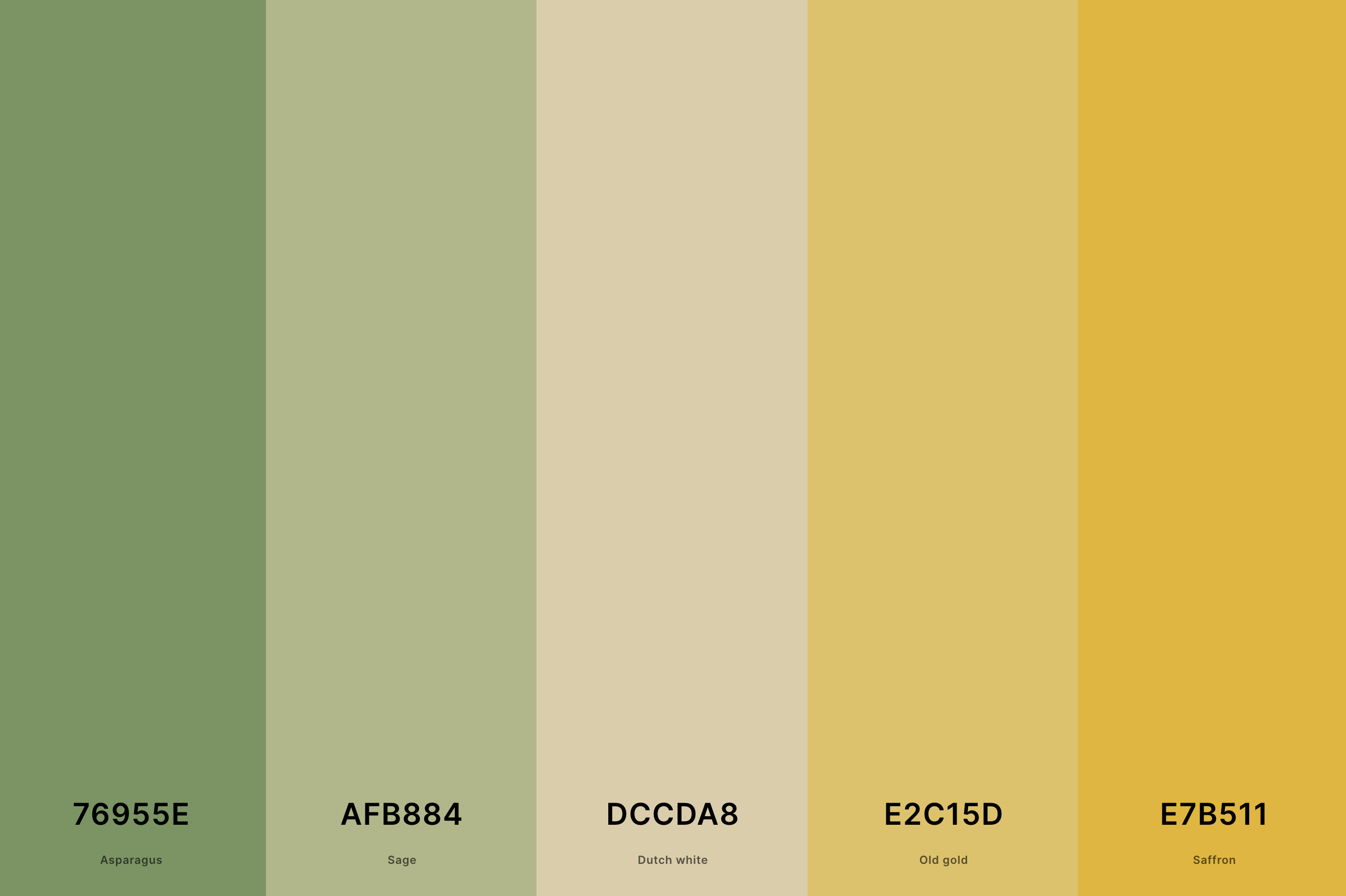
Hex Codes: #76955E, #AFB884, #DCCDA8, #E2C15D, #E7B511
Earthy and tranquil, this palette is like a walk through a serene garden. Asparagus and Sage offer muted, soothing green tones, creating a calm, restful backdrop.
Dutch White softens the overall feel, while Old Gold and Saffron bring in warm, golden hues, adding a touch of gentle sunlight. This palette is perfect for spaces or designs aiming to be calming, natural, and subtly elegant.
25. Teal And Yellow Color Palette
Sunset + Jasmine + Mint Green + Turquoise + Teal
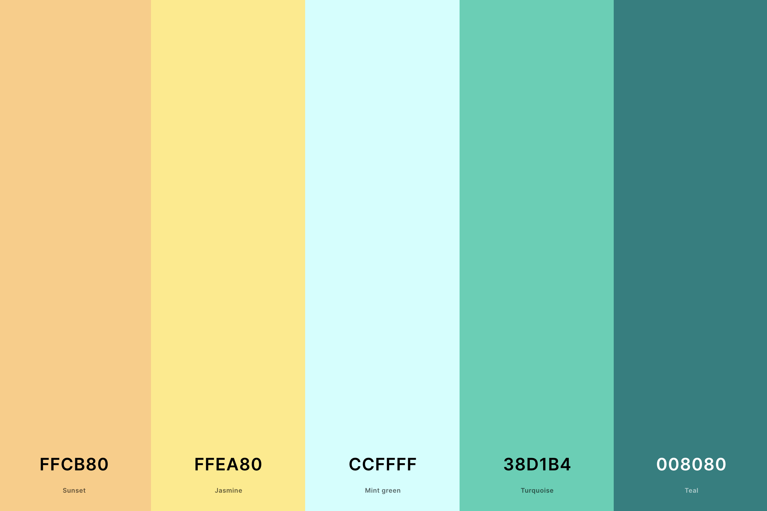
Hex Codes: #FFCB80, #FFEA80, #CCFFFF, #38D1B4, #008080
This palette is a refreshing combination of cool and warm tones. Sunset and Jasmine provide a soft, warm yellow, evoking the gentle glow of a setting sun.
Mint Green and Turquoise add cool, tranquil blue-green hues, reminiscent of a serene seascape.Teal anchors the palette with its deep, oceanic tone.
It's an ideal choice for designs that aim to balance warmth with a sense of calm and tranquility.
26. Yellow Gold Color Palette
Naples Yellow + Old Gold + Gold (Metallic) + Satin Sheen Gold + Dark Goldenrod
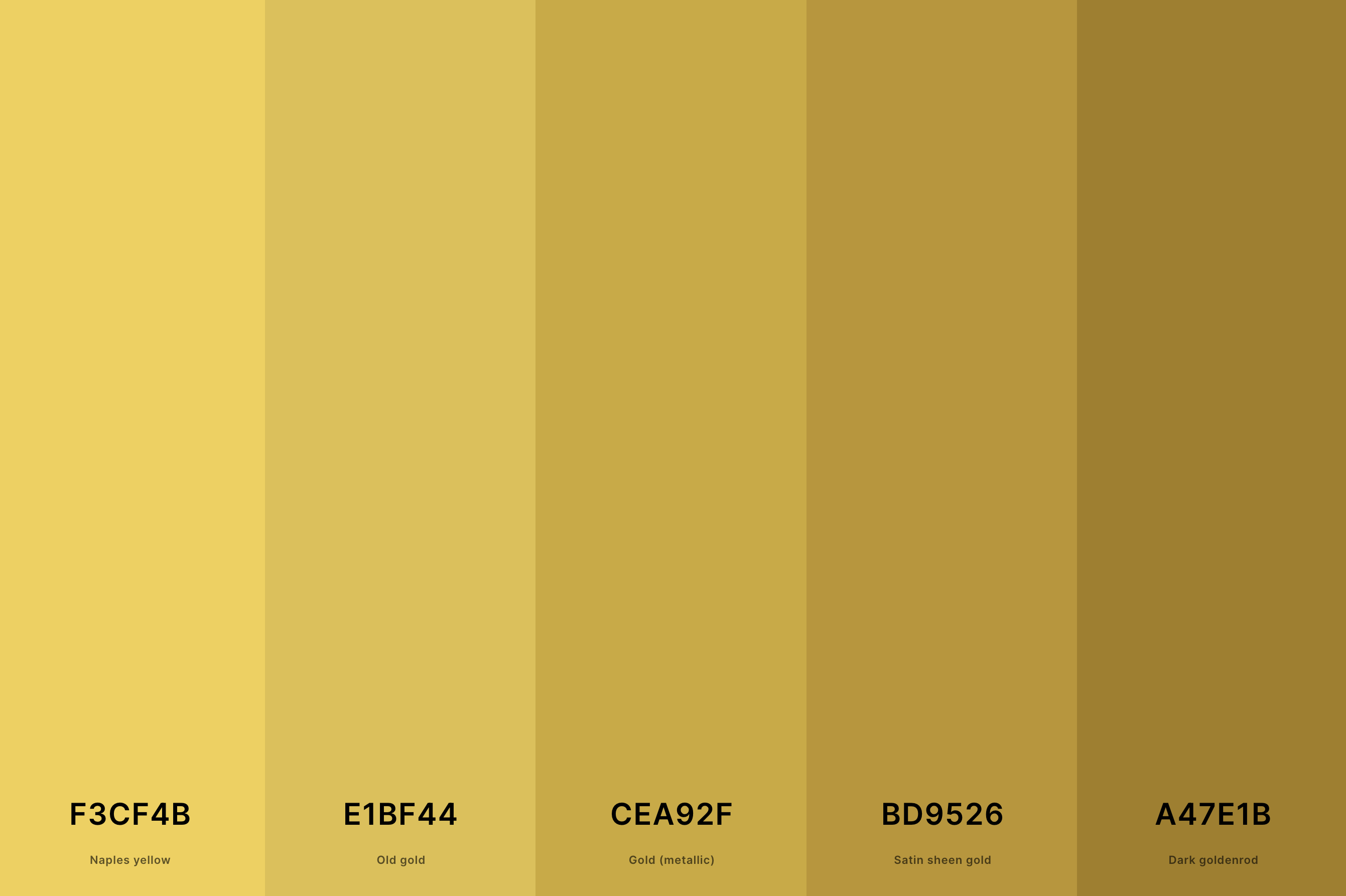
Hex Codes: #F3CF4B, #E1BF44, #CEA92F, #BD9526, #A47E1B
This palette is a luxurious celebration of gold in all its glory. Naples Yellow starts us off with a soft, buttery tone, setting a rich, opulent stage. Old Gold deepens the luxury, adding a vintage charm.
Gold (Metallic) and Satin Sheen Gold bring in the sparkle and shine, reminiscent of precious metals. Dark Goldenrod anchors the palette with its deeper, more intense shade, adding depth and a touch of mystery.
This palette is perfect for designs aiming to evoke elegance, wealth, and a timeless allure.
27. Dark Yellow Color Palette
Eerie Black + Field Drab + Satin Sheen Gold + Citrine + Canary
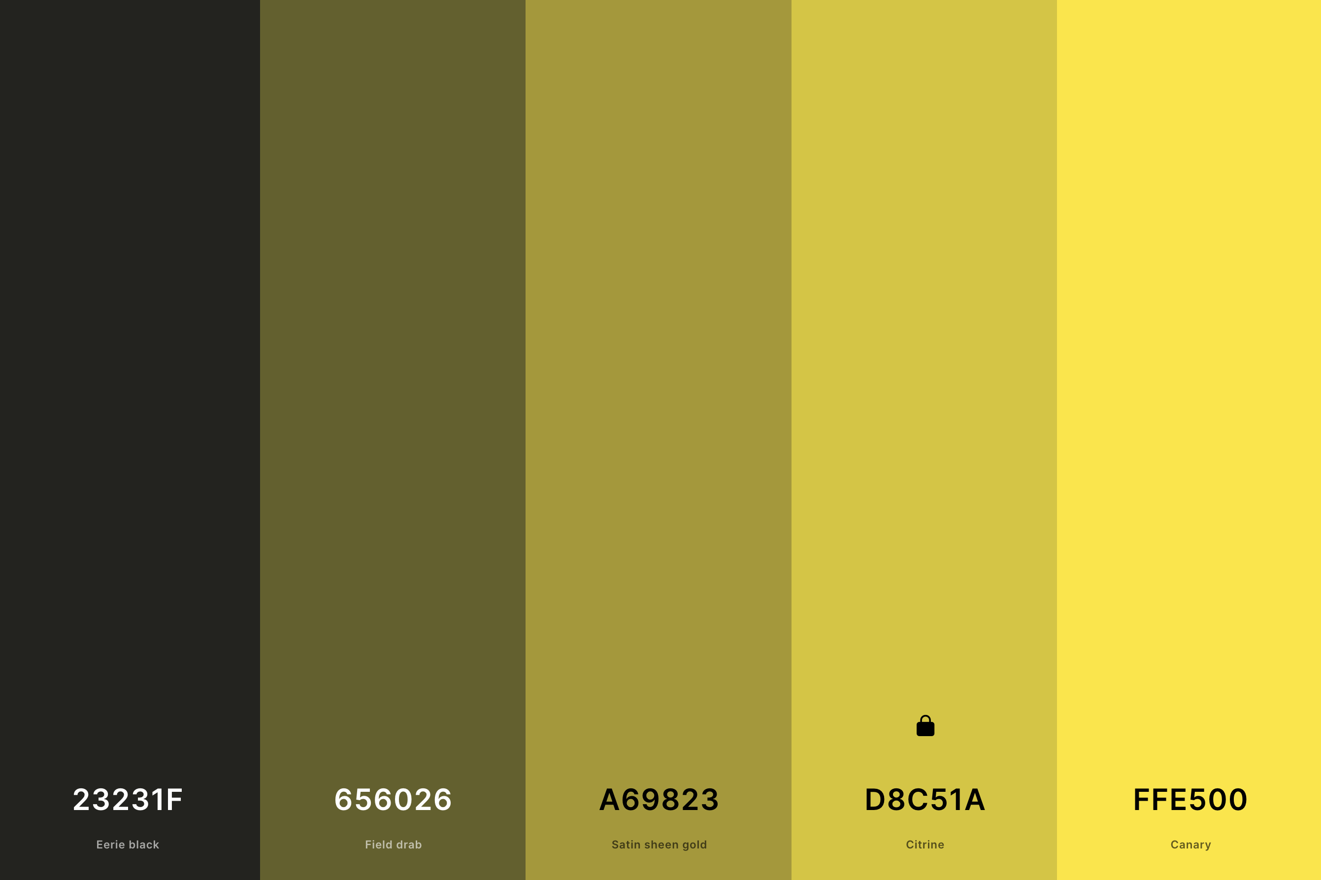
Hex Codes: #23231F, #656026, #A69823, #D8C51A, #FFE500
This palette explores the deeper, more intense side of yellow. Eerie Black and Field Drab provide a strong, muted background, against which the yellows can shine.
Satin Sheen Gold and Citrine stand out with their rich, golden tones, offering a warm, inviting glow. Canary, as the lightest shade, adds a bright, energizing touch.
This combination is ideal for designs that want to be bold, sophisticated, and full of character, with a hint of mystery and depth.
What is the Complimentary Color to Yellow?
Let's talk about the magic of complementary colors, specifically what beautifully pairs with our sunny friend, yellow. Imagine a color wheel, where each color has a perfect opposite that makes it pop – that's the essence of complementary colors. For yellow, that special counterpart is none other than the cool and confident purple.
Why do these two make such a fabulous duo, you ask? It's all about balance. Yellow, with its warm and lively personality, finds its perfect match in purple’s cool and regal vibe. When these two come together, it’s like a dance of opposites, each enhancing the other’s best qualities.
In design, this pairing is a go-to for creating a vibe that’s both vibrant and harmonious. Think of a room with soft yellow walls and plush purple accents – it feels energetic yet cozy. Or a yellow dress with purple accessories for a look that’s playful and chic. This color combo isn’t just visually appealing; it’s also emotionally balanced, bringing together joy and sophistication.
So there you have it, folks – yellow and purple, a match made in color heaven. Whether in fashion, interior design, or art, this pairing is sure to bring a dynamic and balanced touch to your creations. 🌼💜✨
What Colors Go With Yellow?
So what colors really jive with yellow to create that perfect harmony?
First up, we've got the classic, the timeless – gray. Yellow and gray are like a sunny day peeking through a soft, cloudy sky. They balance each other beautifully, with yellow adding a pop of joy to the sophisticated calm of gray. Perfect for a modern, chic look in your home or wardrobe.
Next, let's talk about navy blue. Yellow with navy is like a burst of sunlight over a deep ocean. This combo is all about striking contrast, perfect for creating a bold, eye-catching vibe. It's a go-to for anyone looking to make a statement.
And how about its complementary color, purple? This duo is the epitome of playful elegance. The cool tones of purple perfectly offset the warmth of yellow, creating a balanced and visually appealing look.
Finally, for a more earthy, natural vibe, pair yellow with green. It's like a field of wildflowers - vibrant, lively, and full of life. Yellow's versatility is its superpower, making it a fantastic color to play with. 🌻💛🎨
