This post may contain affiliate links. If you click one, we may earn a commission at no cost to you. Here's more details on how we make money.
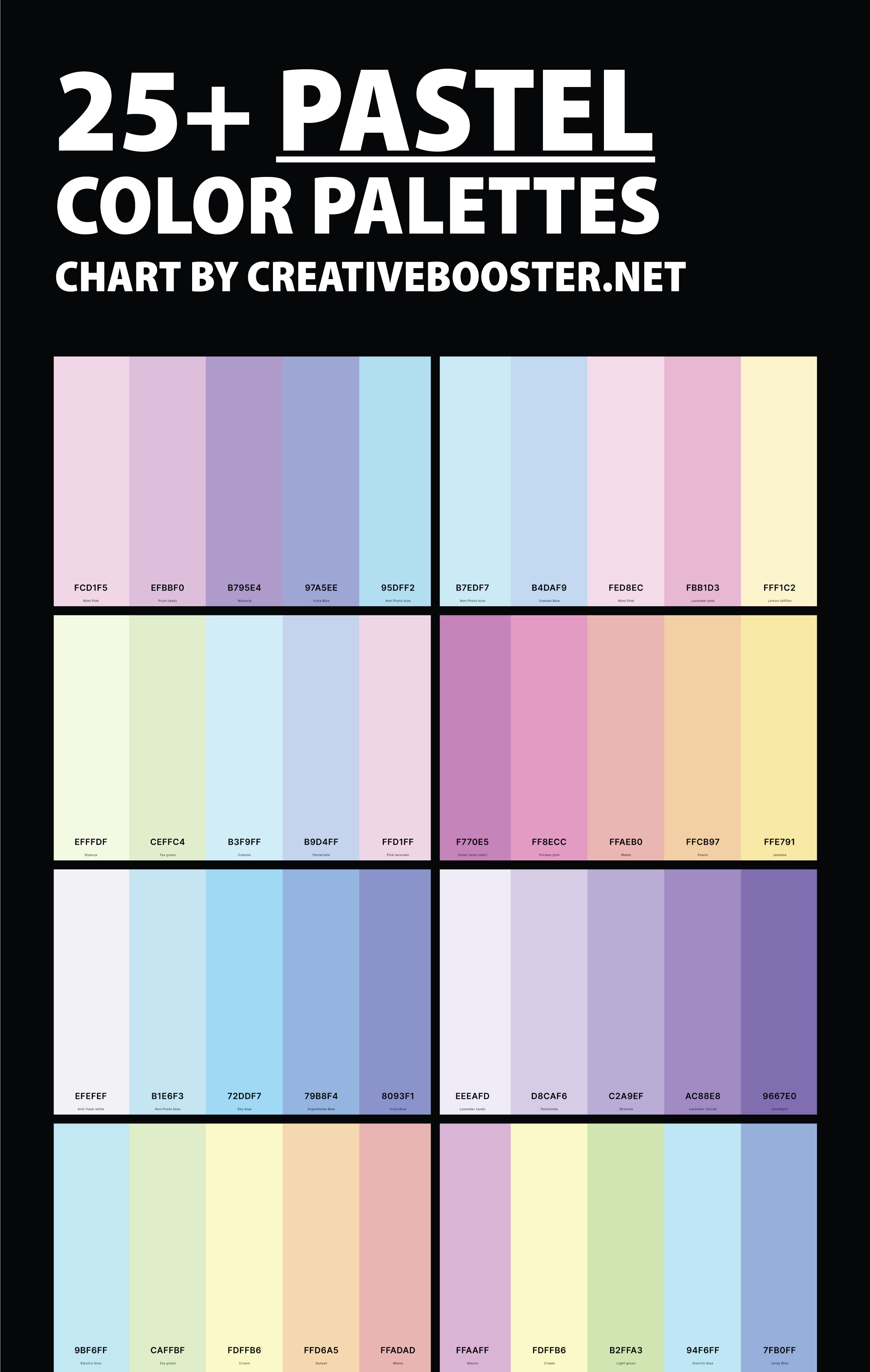
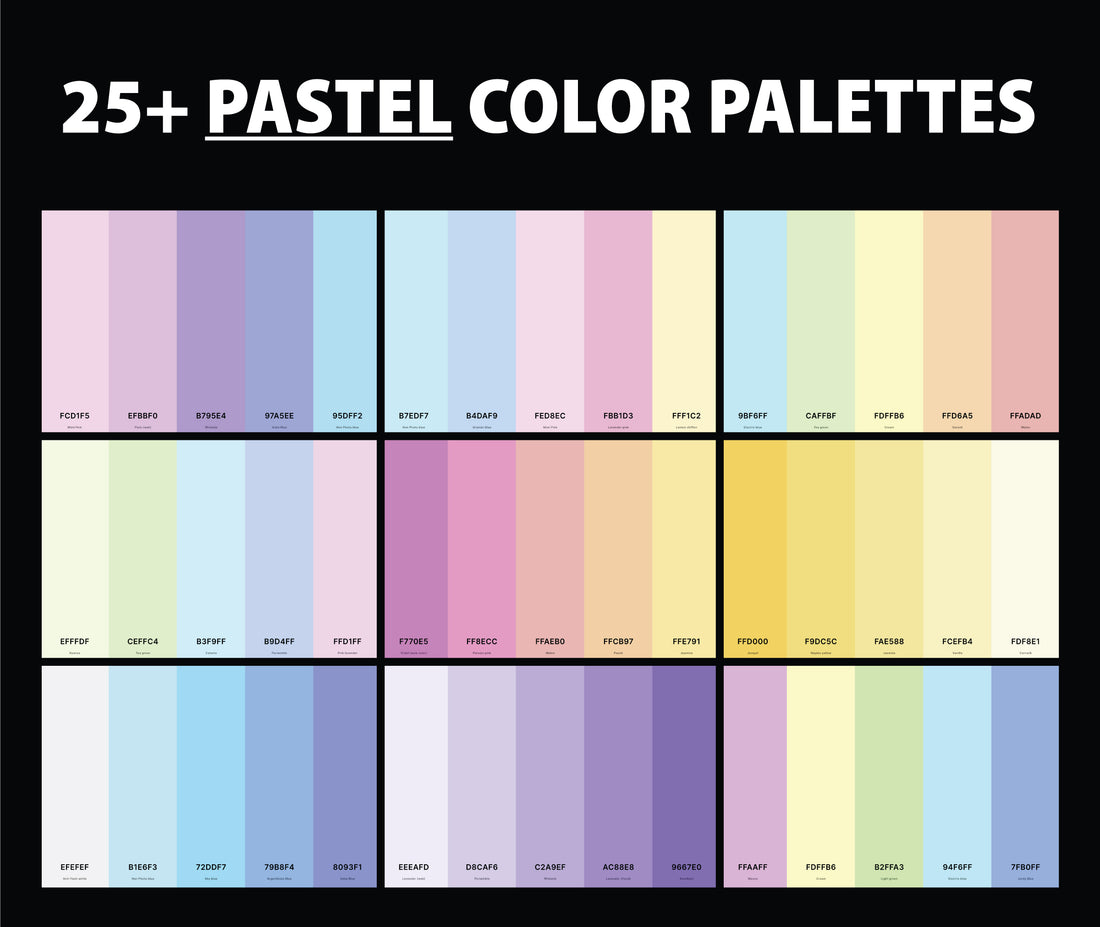
Welcome to the exploration of the world of pastel color palettes! We're thrilled to guide you through a kaleidoscope of soft, soothing shades that can transform any space into a haven of calm and creativity.
Pastel colors, known for their light, airy qualities, hold a unique power to infuse serenity and warmth into various designs and environments.
From the subtle, romantic whispers of pinks and blues to the refreshing splash of greens and yellows, these palettes are not just a trend; they're a timeless expression of elegance and finesse.
Ideal for interior design, fashion, and art, pastels offer a versatile canvas for creative expression. Let's delve into the world of pastel colors and discover how they can elevate your projects and spaces to new heights of aesthetic beauty!
1. Pastel Color Palette
Electric Blue + Tea Green + Cream + Sunset + Melon
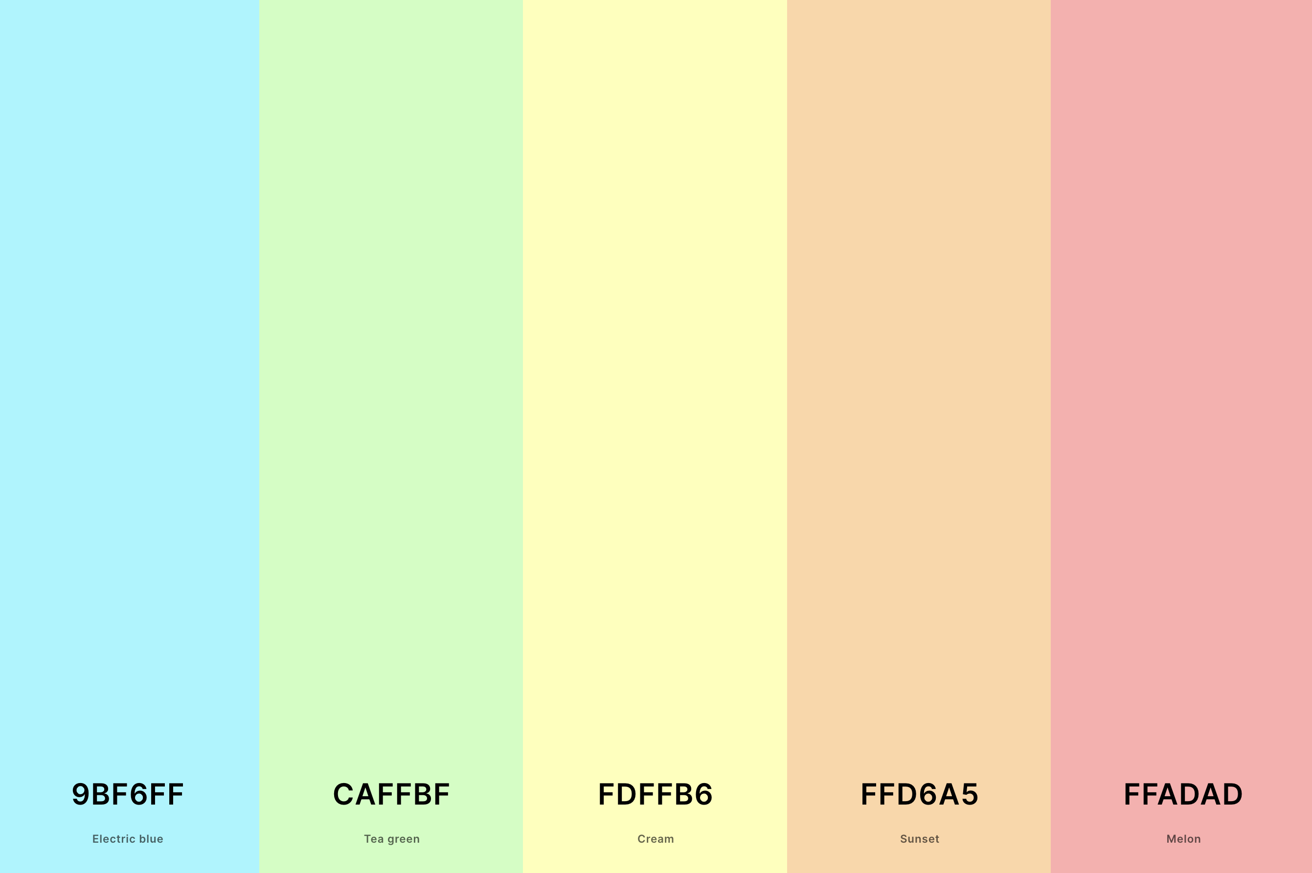
Hex Codes: #9BF6FF, #CAFFBF, #FDFFB6, #FFD6A5, #FFADAD
A classic choice, this palette blends fiery oranges and reds with mellow purples and pinks. It's like watching the sun dip below the horizon, casting a magnificent array of colors across the sky.
This combination is ideal for a sunset palette because it captures the vibrant yet harmonious transition of colors seen during the evening twilight.
2. Pastel Blue Color Palette
Anti-Flash White + Non Photo Blue + Sky Blue + Argentinian Blue + Vista Blue
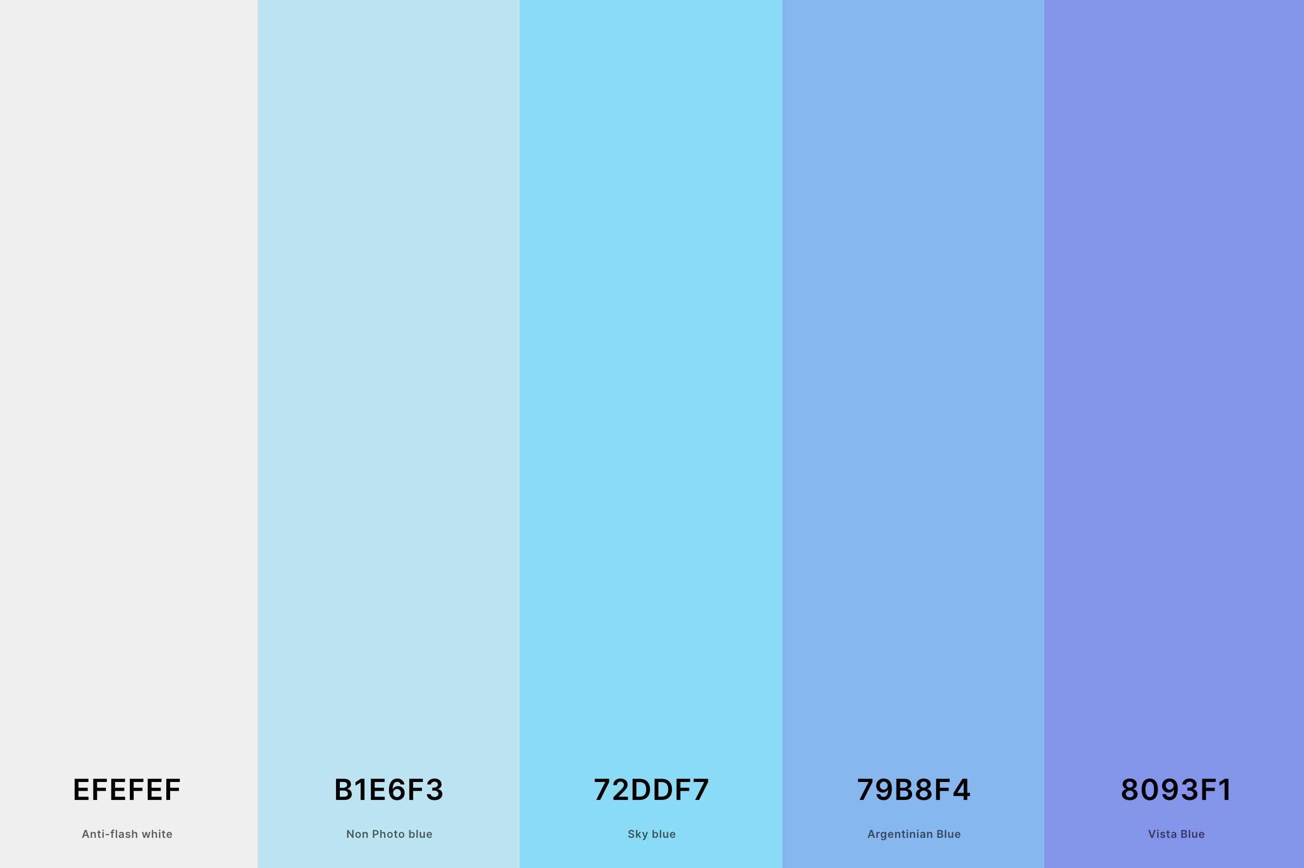
Hex Codes: #EFEFEF, #B1E6F3, #72DDF7, #79B8F4, #8093F1
This palette echoes the warmth and tranquility of a desert at dusk. It combines deep oranges, rich reds, and gentle yellows, mirroring the way the sun softly illuminates the sandy landscape.
These colors are perfect for a sunset theme as they reflect the natural light play you see in arid regions, bringing a sense of calmness and warmth.
3. Pastel Green Color Palette
Beige + Tea Green + Light Green + Light Green + Aquamarine
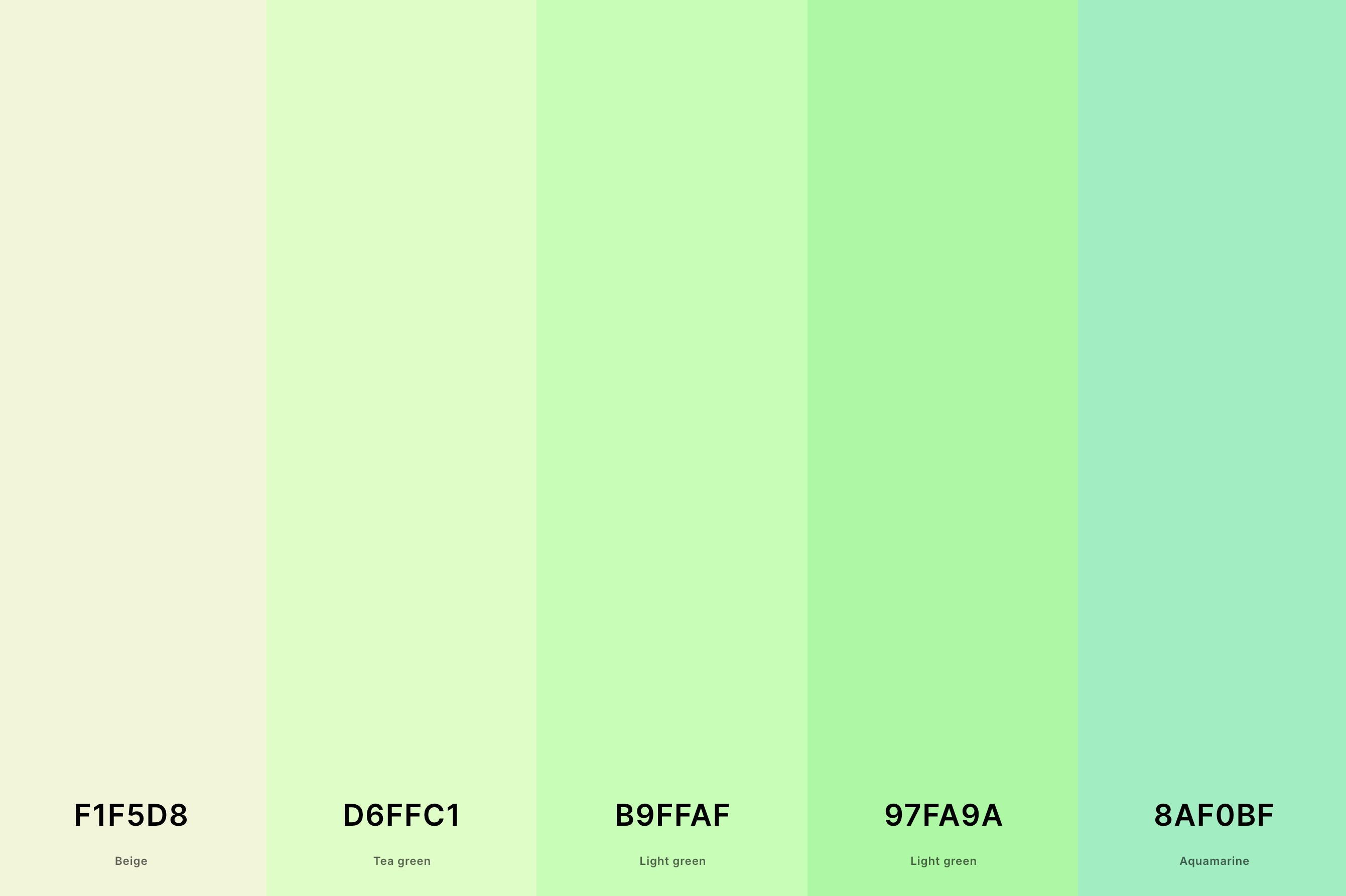
Hex Codes: #F1F5D8, #D6FFC1, #B9FFAF, #97FA9A, #8AF0BF
Inspired by the sea, this palette features a blend of cool blues and warm oranges.
The contrast between the calm, deep ocean blues and the lively, dynamic oranges creates a captivating visual experience, reminiscent of the sun setting over the ocean.
These colors work well together for a sunset theme, offering a balance between tranquility and energy.
4. Pastel Pink Color Palette
Cherry Blossom Pink + Fairy Tale + Mimi Pink + Floral White + Sky Blue
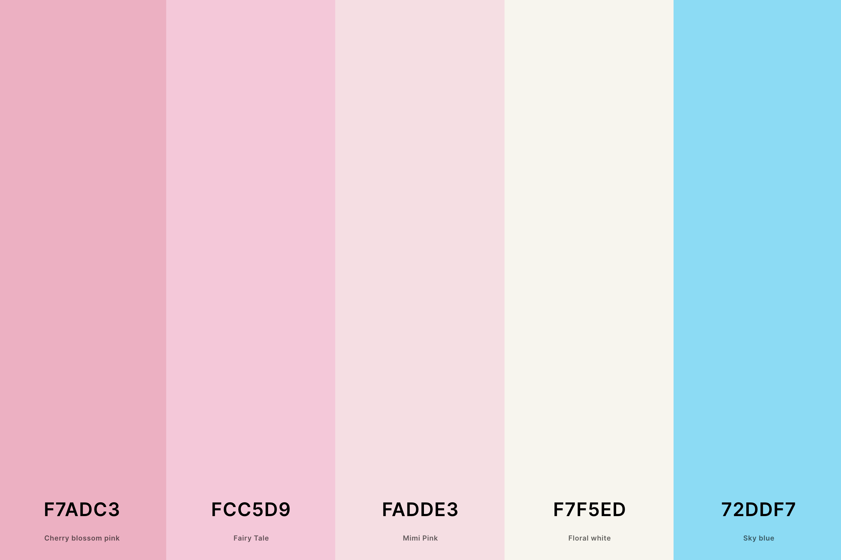
Hex Codes: #F7ADC3, #FCC5D9, #FADDE3, #F7F5ED, #72DDF7
Unusual yet striking, this palette centers around various shades of blue, complemented by soft pinks and purples.
It mimics the rare moments when the sunset sky is filled more with cool tones than warm, creating a unique, dreamy atmosphere.
This palette is great for a sunset theme as it represents the cooler, softer side of dusk.
5. Aesthetic Pastel Color Palette
Mimi Pink + Pink Lavender + Mauve + Jordy Blue + Non Photo Blue
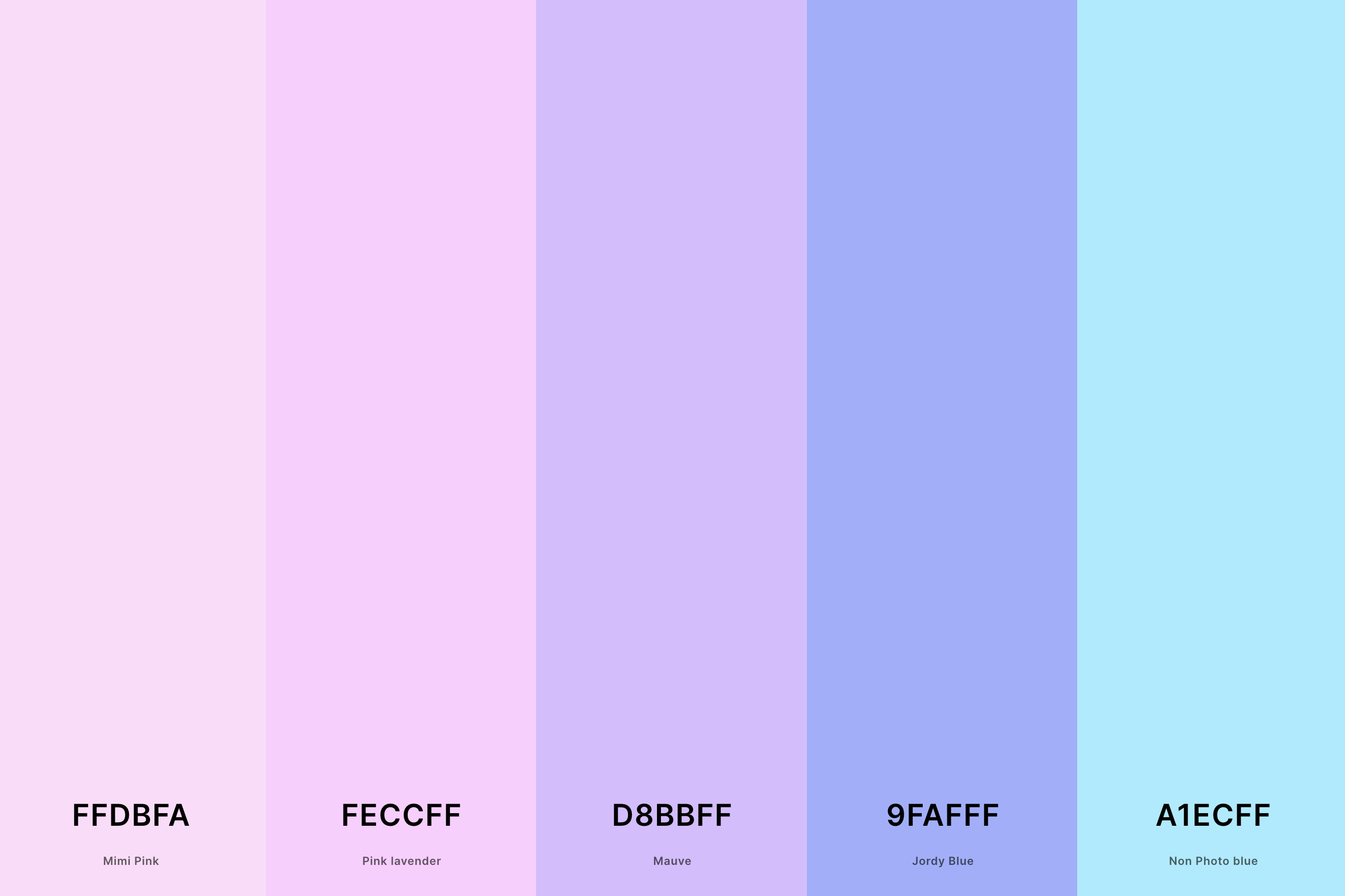
Hex Codes: #FFDBFA, #FECCFF, #D8BBFF, #9FAFFF, #A1ECFF
Dominated by shades of orange, from bright tangerine to soft peach, this palette is warm and inviting. It's reminiscent of the intense, glowing heart of a sunset, where the sky seems to be on fire.
The varying shades of orange in this palette capture the essence of a classic sunset, making it an excellent choice for a theme that seeks to evoke warmth and vibrancy.
6. Pastel Rainbow Color Palette
Melon + Sunset + Cream + Tea Green + Electric Blue
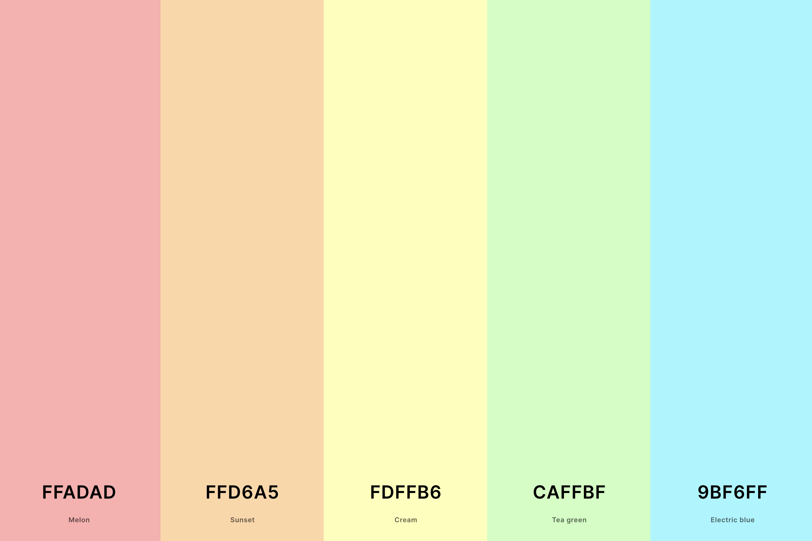
Hex Codes: #FFADAD, #FFD6A5, #FDFFB6, #CAFFBF, #9BF6FF
This palette is a gentle array of soft pinks, lavenders, and baby blues, reminiscent of the delicate colors of the sky when the sun is just below the horizon.
These subtle tones are ideal for a sunset theme as they reflect the peaceful and dreamy quality of early evening skies.
This palette appeals to those who appreciate a softer, more understated beauty in sunsets.
7. Neutral Pastel Color Palette
Ash Gray + Platinum + Desert Sand + Desert Sand + Wheat
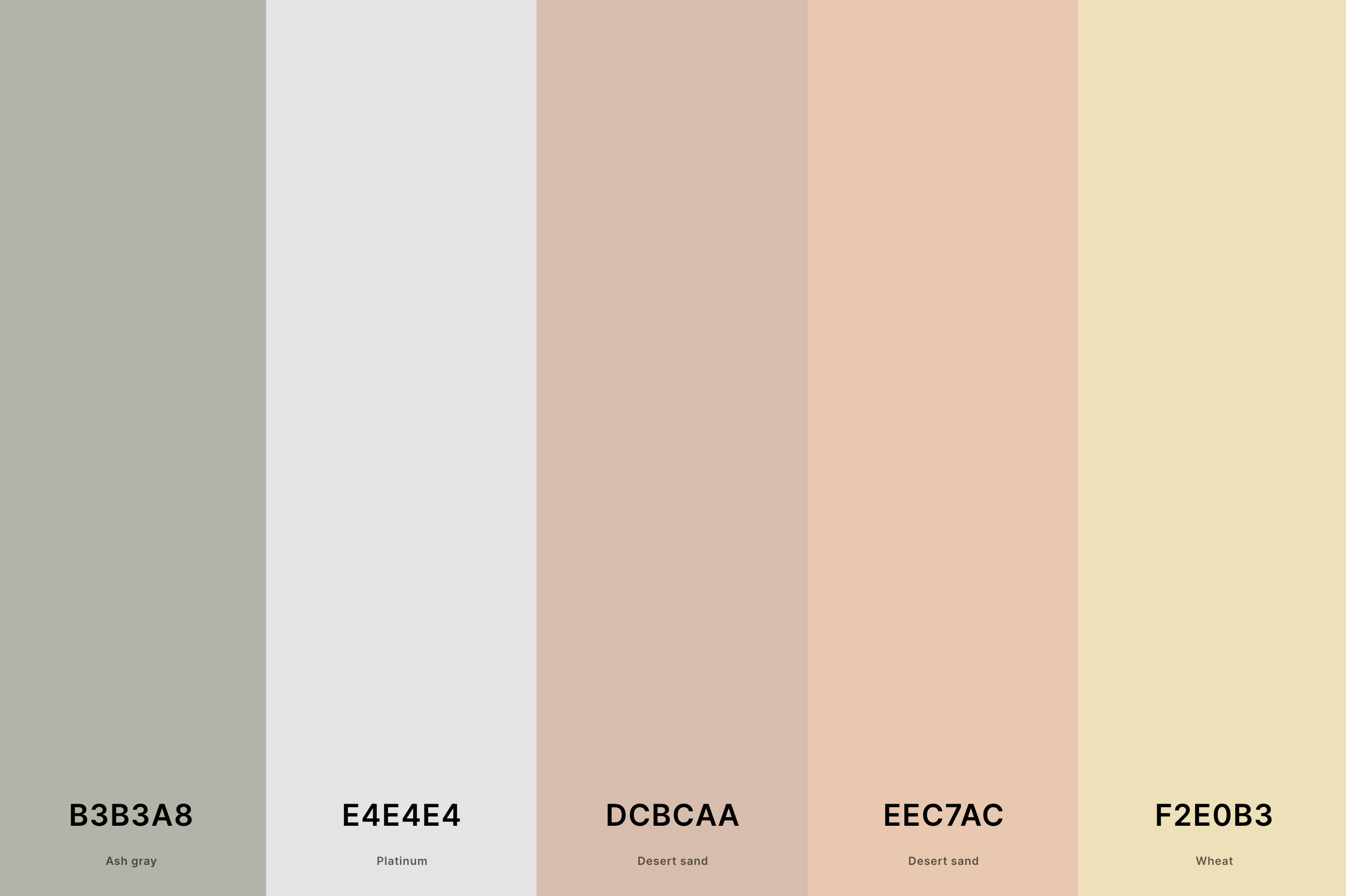
Hex Codes: #B3B3A8, #E4E4E4, #D1B2A1, #EEC7AC, #F2E0B3
Centered around shades of purple, from lilac to deep violet, this palette is both majestic and soothing. It captures the moment when the sunset sky turns into a canvas of purple, often seen in cooler climates.
This range of purples, complemented by hints of pink and orange, is perfect for a sunset theme that aims to portray the sky's mysterious and enchanting transformation at dusk.
8. Pastel Yellow Color Palette
Jonquil + Naples Yellow + Jasmine + Vanilla + Cornsilk
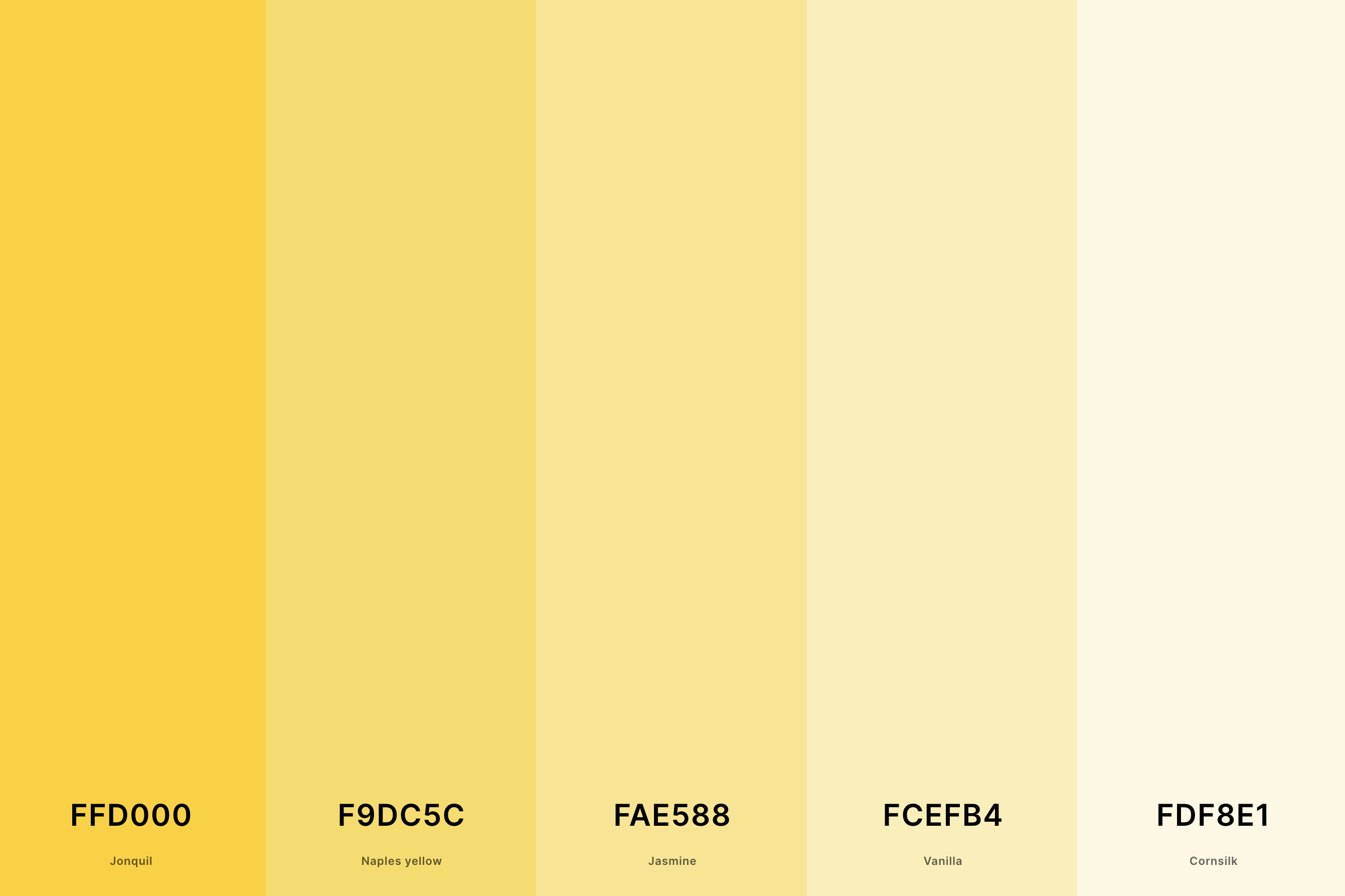
Hex Codes: #FFD000, #F9DC5C, #FAE588, #FCEFB4, #FDF8E1
Inspired by the seaside, this palette combines sandy beiges and sky blues with vibrant oranges and pinks.
It's like the scene of a sun setting over a beach, where the water reflects the sky's fiery colors and the sand glows under the fading light.
This palette is ideal for a sunset theme that seeks to capture the dynamic yet serene essence of beach sunsets.
9. Pastel Purple Color Palette
Lavender (Web) + Periwinkle + Wisteria + Lavender (Floral) + Amethyst
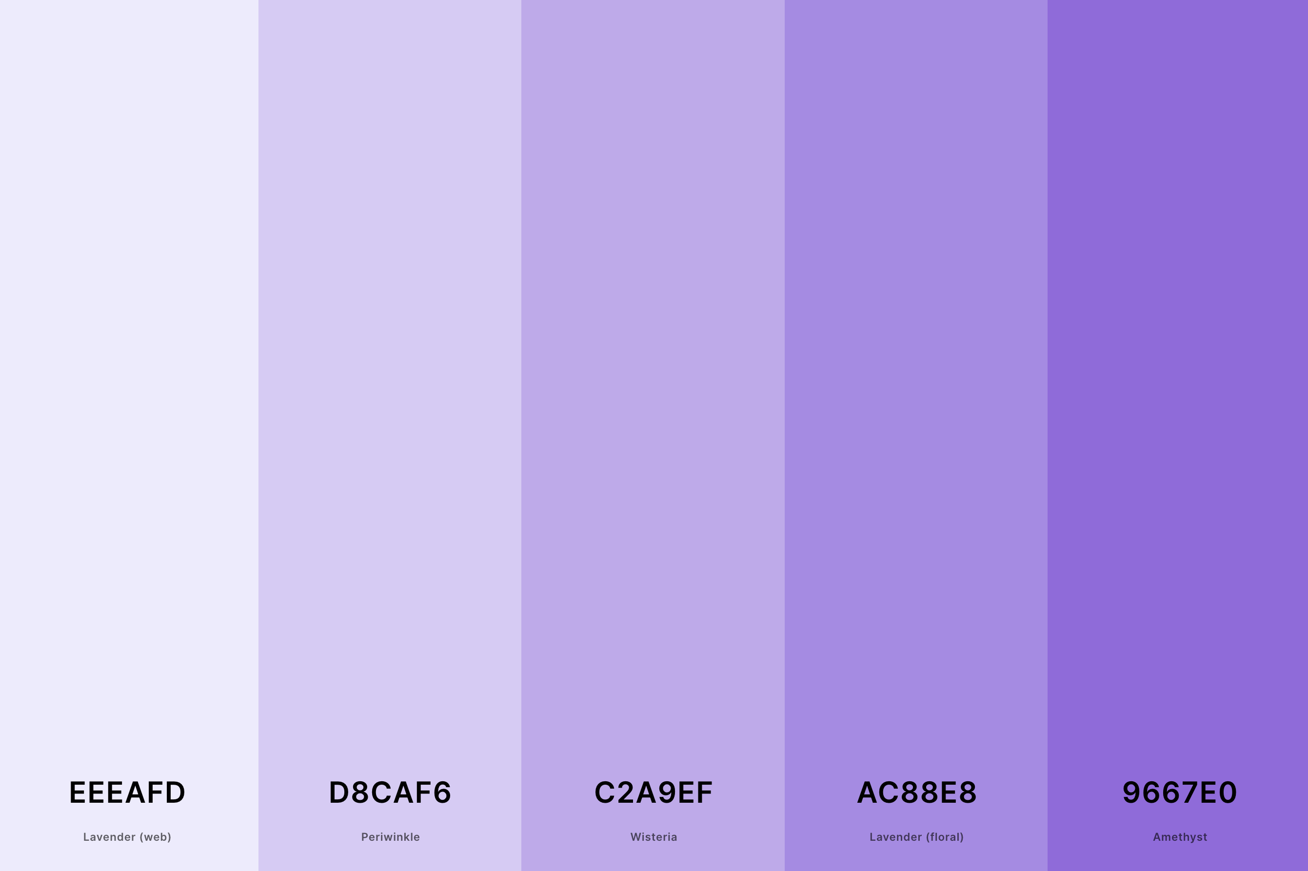
Hex Codes: #EEEAFD, #D8CAF6, #C2A9EF, #AC88E8, #9667E0
Elegant and romantic, this palette blends together soft pinks, warm oranges, and creamy whites. It mirrors the magical ambiance of a sunset during a wedding, creating a romantic and intimate setting.
These colors are perfect for a sunset-themed wedding as they evoke the tender and joyous emotions associated with both sunsets and nuptials.
10. Muted Pastel Color Palette
Cherry Blossom Pink + Desert Sand + Papaya Whip + Tea Green + Ash Gray
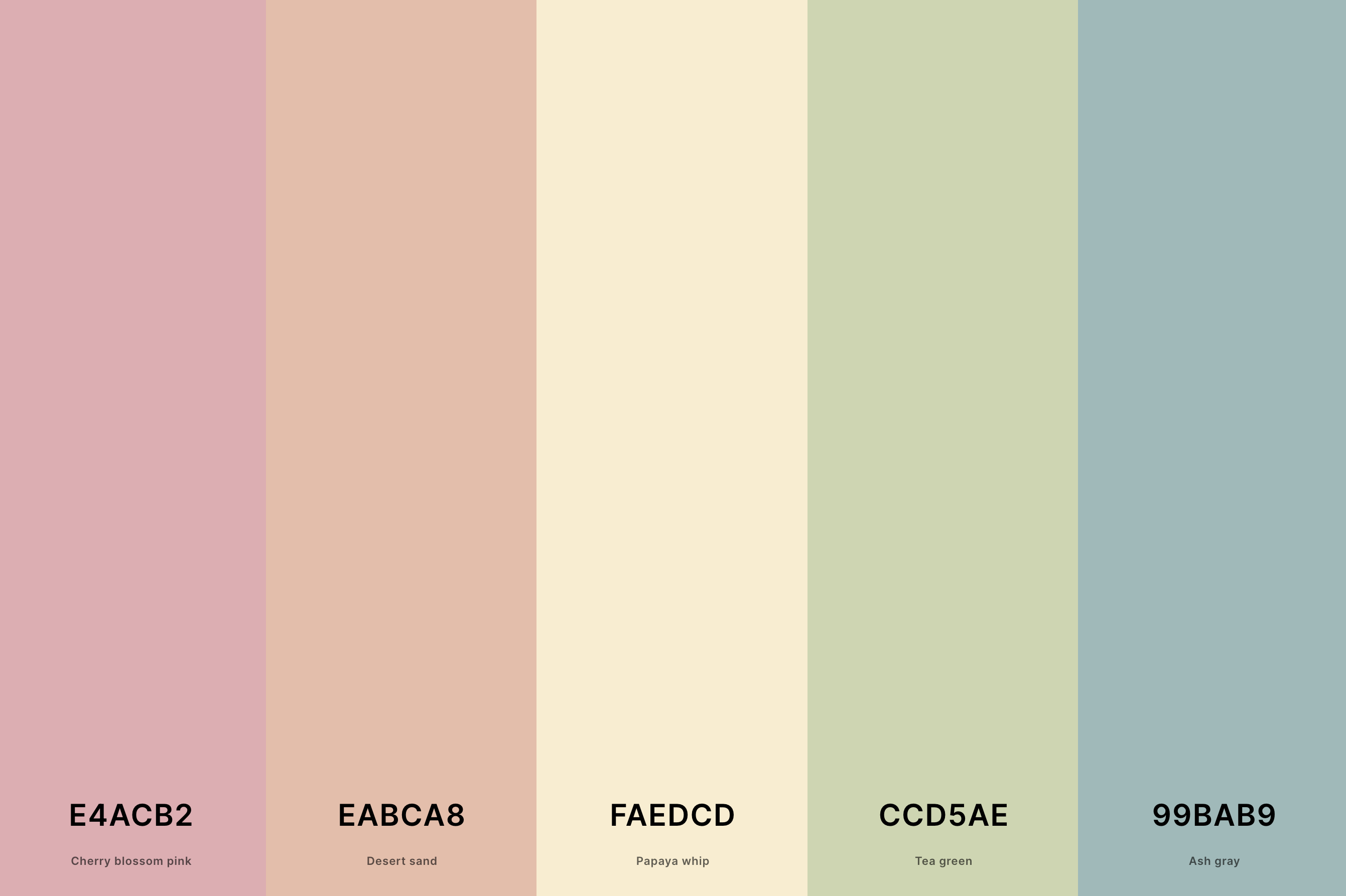
Hex Codes: #E4ACB2, #EABCA8, #FAEDCD, #CCD5AE, #99BAB9
This palette is a harmonious blend of trendy and appealing colors like coral, blush, and teal. It's designed to be visually pleasing, capturing the modern interpretation of sunsets in art and design.
This palette works well for a sunset theme that focuses on contemporary, Instagram-worthy aesthetics, combining both classic sunset colors with modern, stylish hues.
11. Pastel Autumn Color Palette
Moss Green + Sunset + Desert Sand + Rosy Brown + Old Rose
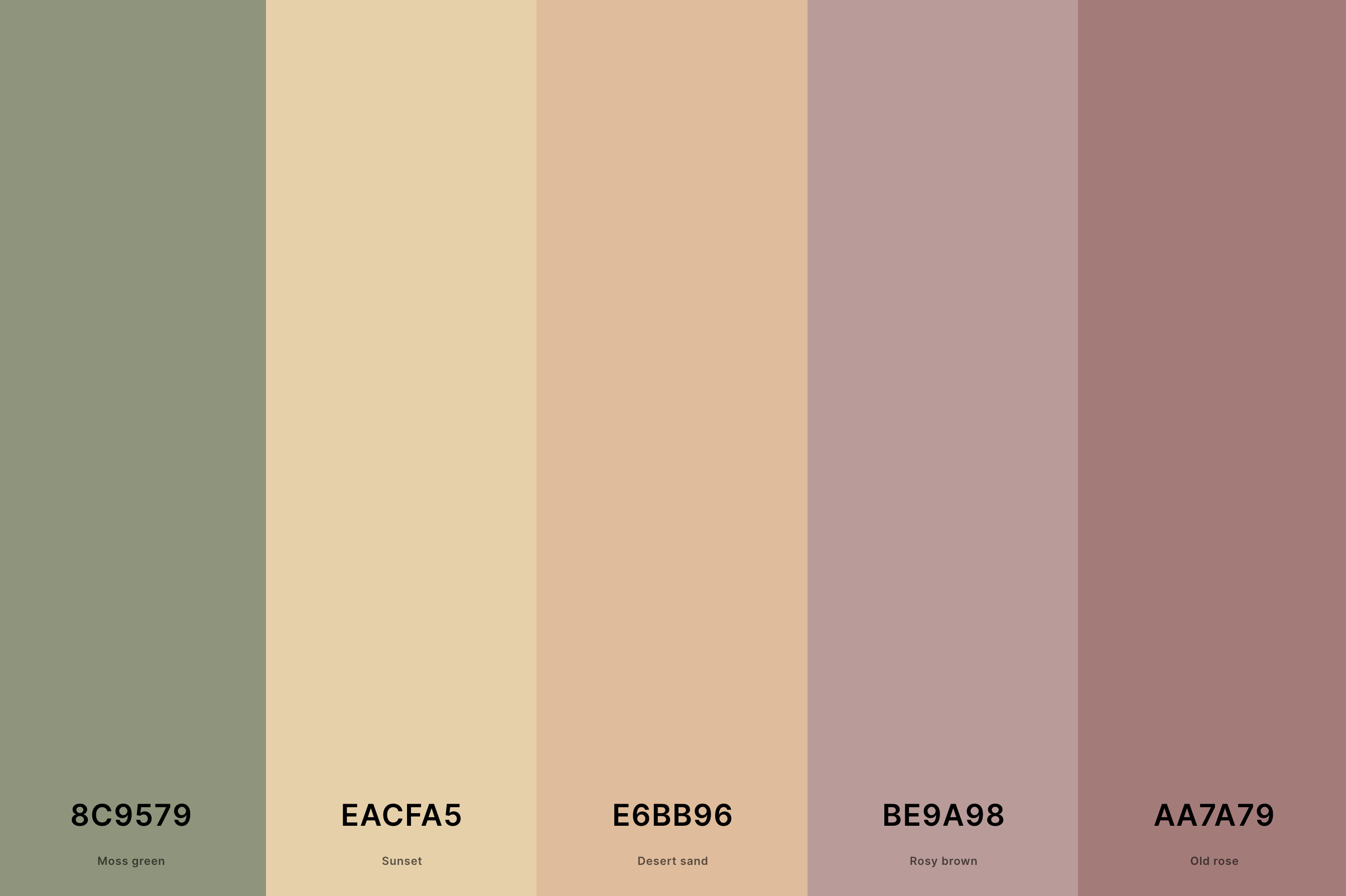
Hex Codes: #8C9579, #EACFA5, #E6BB96, #BE9A98, #AA7A79
Reflecting the dramatic and intense skies of the Southwest, this palette incorporates deep reds, burnt oranges, and golden yellows. It's inspired by the bold and vivid sunsets over Arizona's deserts and canyons.
These colors are ideal for an Arizona sunset theme, capturing the raw, untamed beauty and the striking contrasts of the region's end-of-day spectacle.
12. Pastel Fall Color Palette
Olivine + Straw + Vanilla + Melon + Old Rose
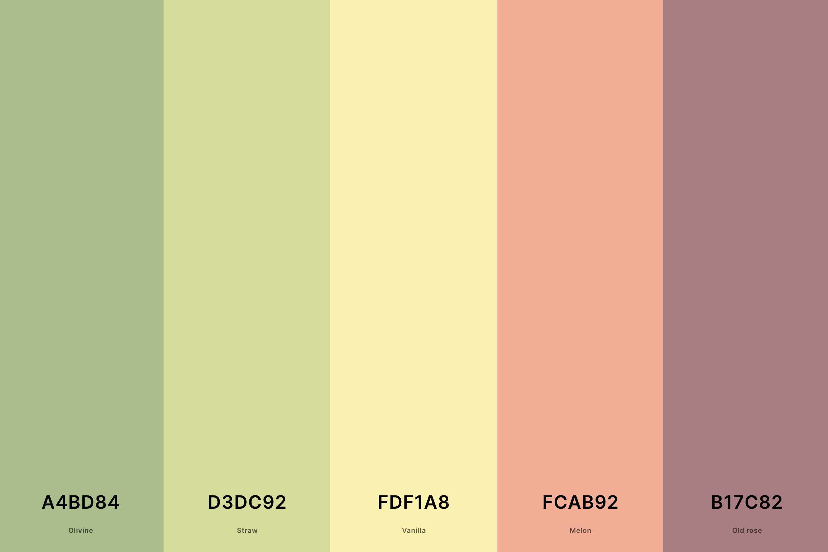
Hex Codes: #A4BD84, #D3DC92, #FDF1A8, #FCAB92, #B17C82
This palette offers a twist on the traditional sunset colors, featuring deeper and more somber tones like maroon, indigo, and dark grey.
It evokes the mood of a sunset on a cloudy or stormy day, where the sun's final rays fight through the darkening skies.
This palette is perfect for a sunset theme that aims to capture the more dramatic, intense, and moody aspects of the evening sky.
13. Pastel Orange Color Palette
Sandy Brown + Sandy Brown + Peach + Peach Yellow + Vanilla
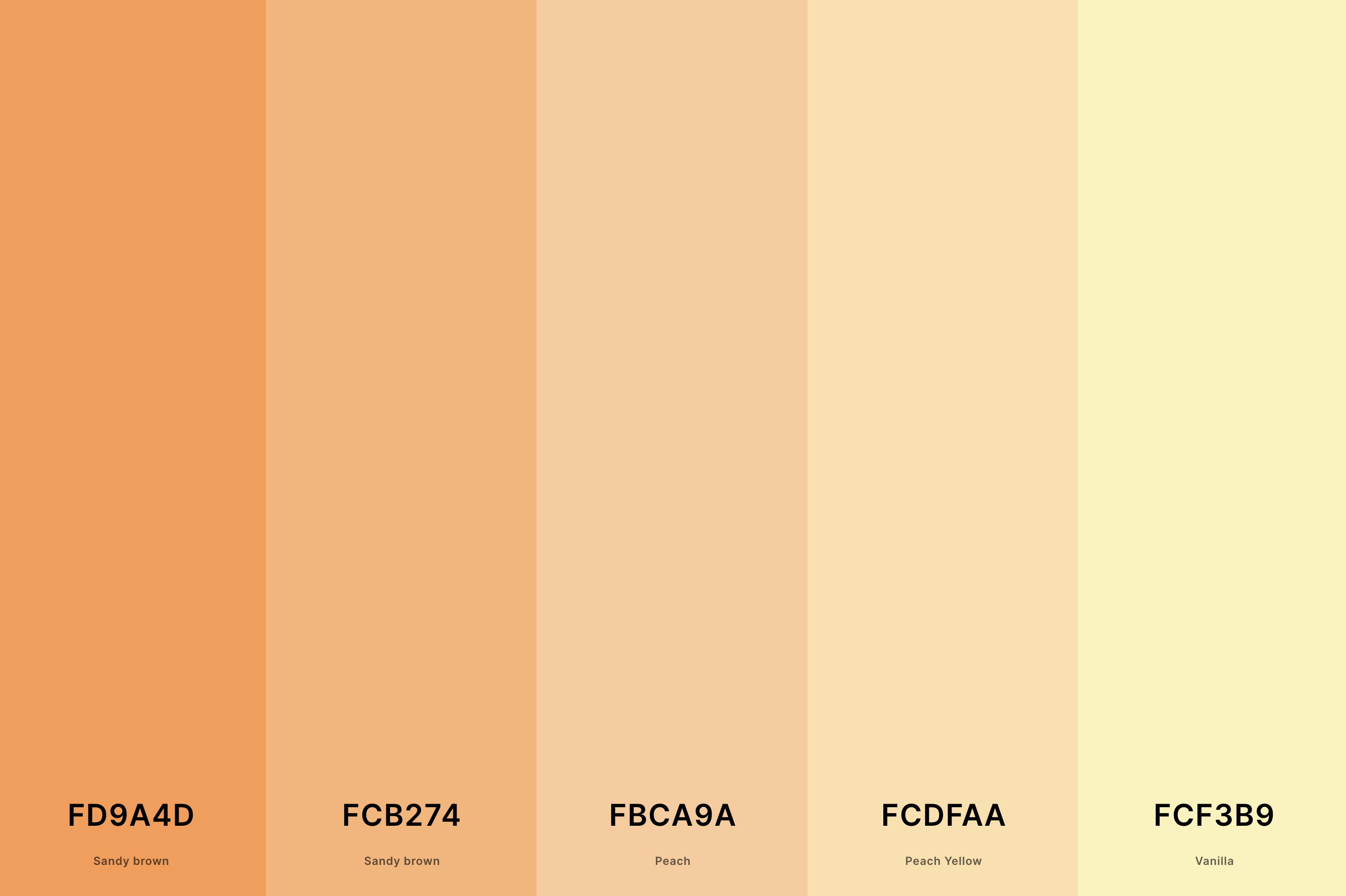
Hex Codes: #FD9A4D, #FCB274, #FBCA9A, #FCDFAA, #FCF3B9
Inspired by the rugged and majestic mountainous landscapes, this palette blends earthy greens and browns with the vibrant pinks and oranges of the setting sun.
It captures the unique interplay of light on the mountains as the sun sets, highlighting the peaks and valleys.
This palette is ideal for a sunset theme that seeks to embody the serene yet dynamic beauty of sunsets in mountainous regions.
14. Pastel Spring Color Palette
Nyanza + Tea Green + Celeste + Periwinkle + Pink Lavender
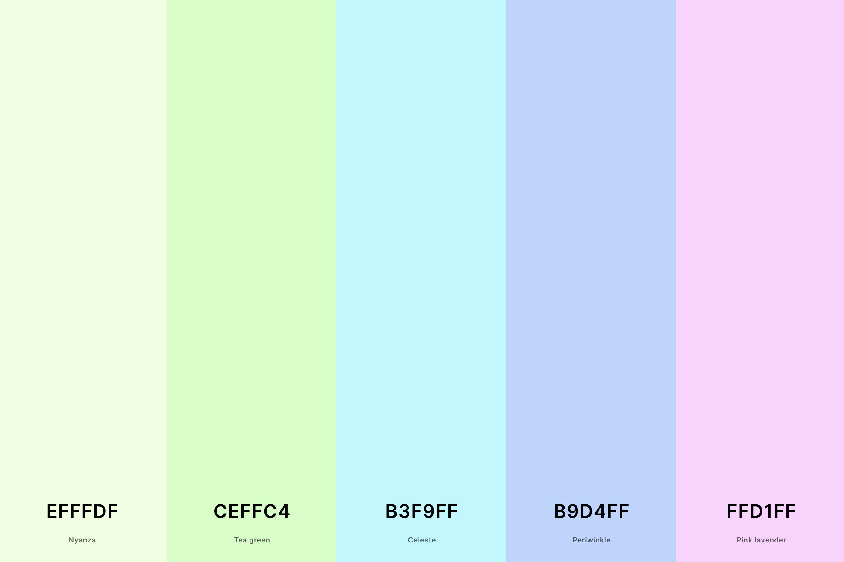
Hex Codes: #EFFFDF, #CEFFC4, #B3F9FF, #B9D4FF, #FFD1FF
Bright, bold, and lively, this palette takes the traditional sunset colors and amplifies them with neon vibrancy. Featuring electric pinks, vivid oranges, and intense purples, it's reminiscent of a highly stylized or artistic interpretation of a sunset.
This palette is perfect for a sunset theme that aims to be energetic, youthful, and eye-catching, ideal for modern, edgy designs.
15. Pastel Sunset Color Palette
Violet (Web Color) + Persian Pink + Melon + Peach + Jasmine
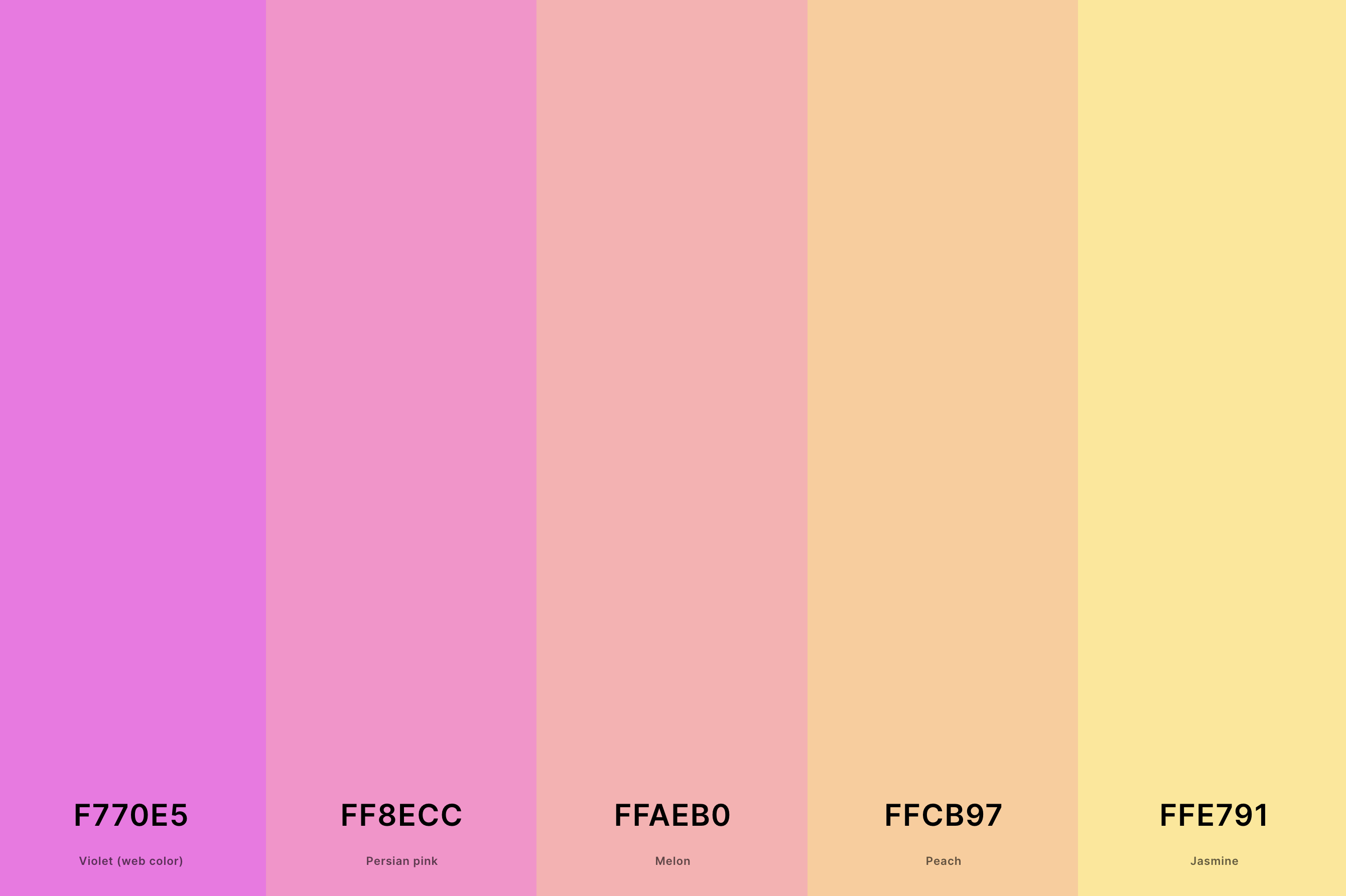
Hex Codes: #F770E5, #FF8ECC, #FFAEB0, #FFCB97, #FFE791
Dominated by various shades of pink, from soft blush to rich magenta, this palette captures the romantic and gentle aspect of the sunset.
It reflects the moments when the sky is filled with an array of pink shades, creating a calming and loving ambiance.
This palette is ideal for a sunset theme that aims to evoke feelings of romance, tranquility, and softness, perfect for settings that require a touch of delicate beauty.
16. Pastel Teal Color Palette
Caribbean Current + Teal + Light Sea Green + Verdigris + Tiffany Blue
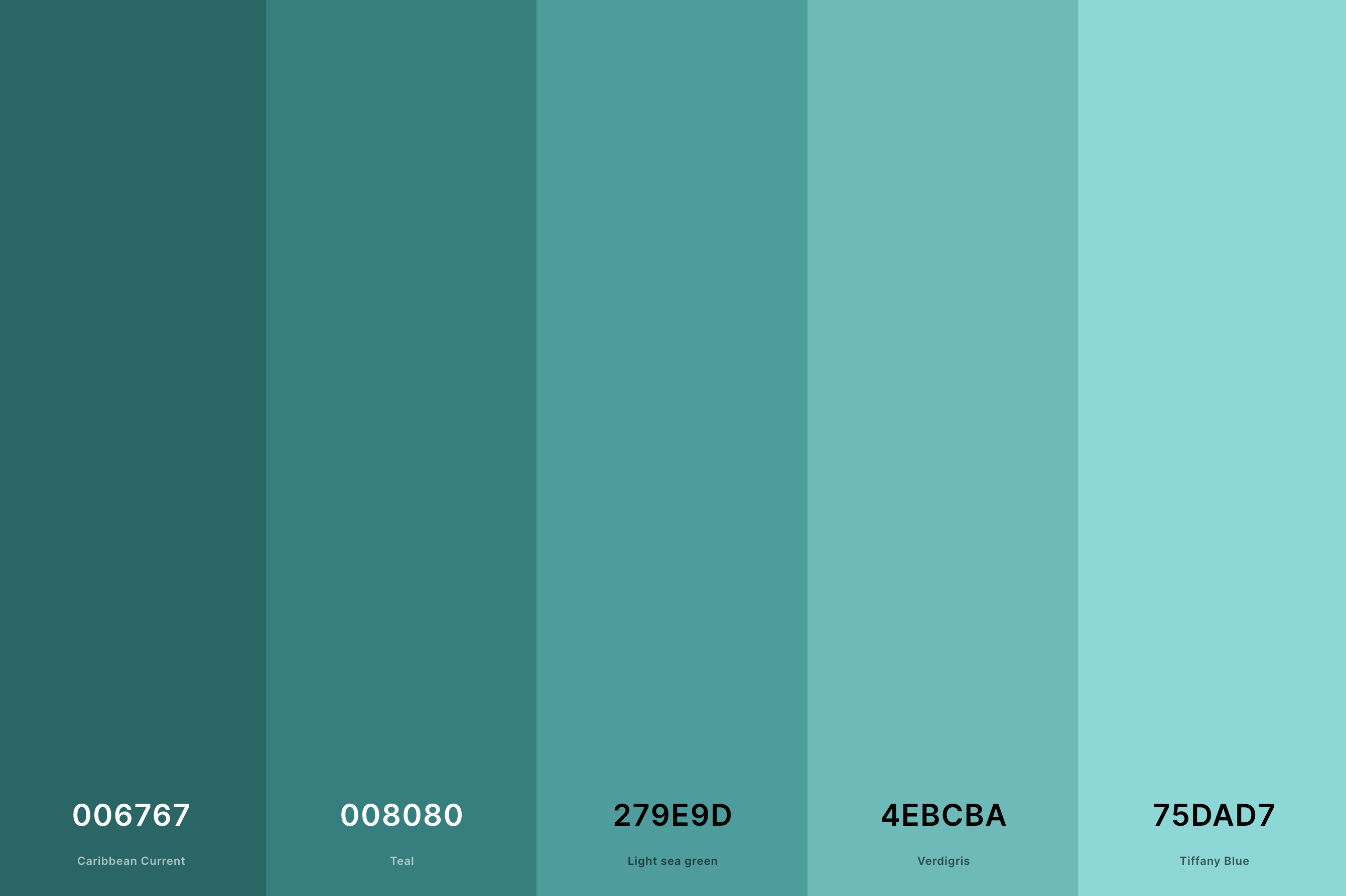
Hex Codes: #006767, #008080, #279E9D, #4EBCBA, #75DAD7
This palette is a dynamic array of reds, from bright crimson to deep burgundy, mixed with subtle oranges and purples. It captures the fiery intensity of a sunset, where the sky seems ablaze with red hues.
Perfect for a sunset theme that seeks to embody passion, power, and drama, these colors are reminiscent of the most visually striking and memorable sunsets.
17. Bright Pastel Color Palette
Mauve + Cream + Light Green + Electric Blue + Jordy Blue
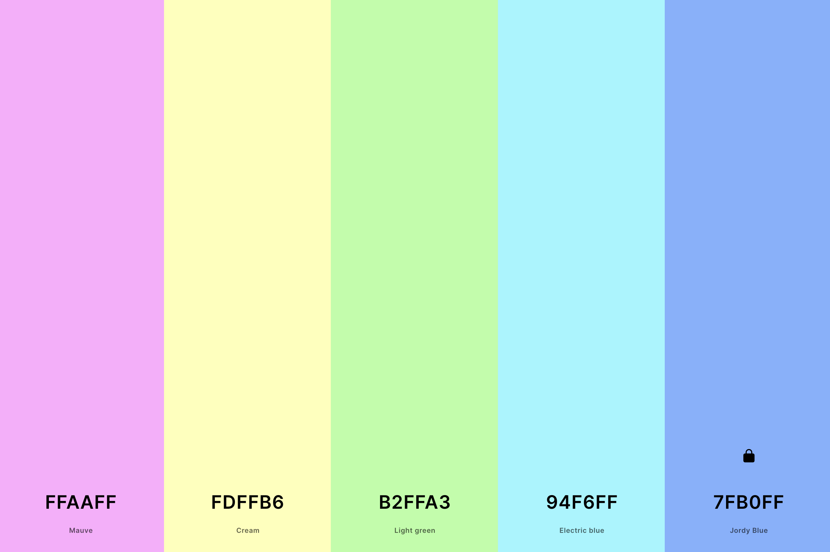
Hex Codes: #FFAAFF, #FDFFB6, #B2FFA3, #94F6FF, #7FB0FF
A nod to nostalgic aesthetics, this palette combines muted oranges, pinks, and yellows with teal and brown. It reflects the sunsets seen in vintage posters and photographs, evoking a sense of nostalgia and timelessness.
Ideal for a sunset theme that seeks a retro vibe, these colors bring a classic, yet stylish feel, appealing to a sense of cherished memories and simpler times.
18. Pastel Brown Color Palette
Lion + Tan + Desert Sand + Lion + Raw Umber
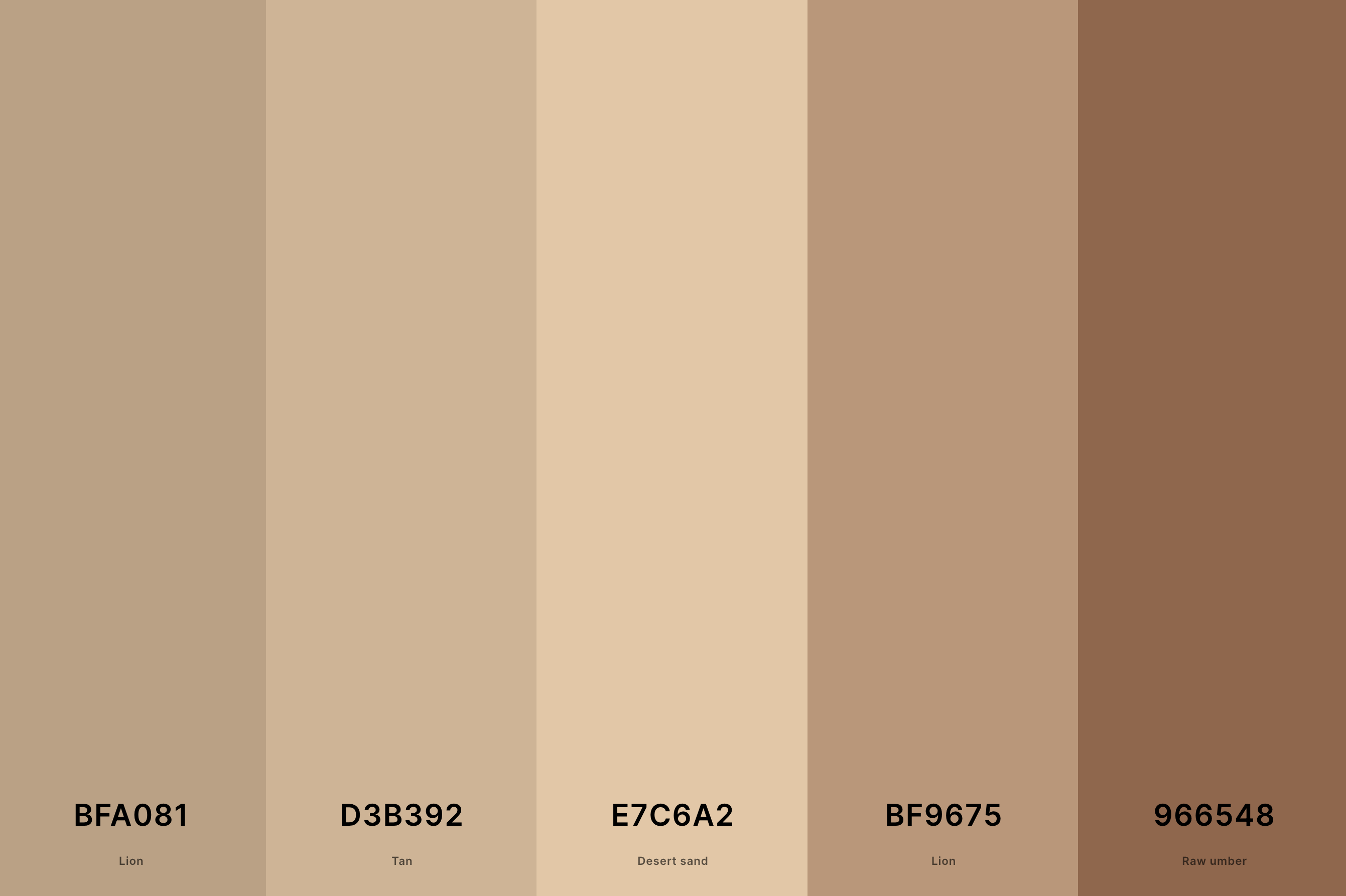
Hex Codes: #BFA081, #D3B392, #E7C6A2, #BF9675, #966548
Encompassing the full spectrum of the day, this palette starts with soft morning blues and pinks, transitions through bright daytime colors, and ends with the deep oranges and purples of sunset.
It represents the continuous cycle of the day, offering a unique take on sunset colors by including the entire daily transition. Perfect for a theme that celebrates the natural progression and beauty of time from dawn to dusk.
19. Pastel Red Color Palette
Indian Red + Light Coral + Light Coral + Melon + Tea Rose (Red)
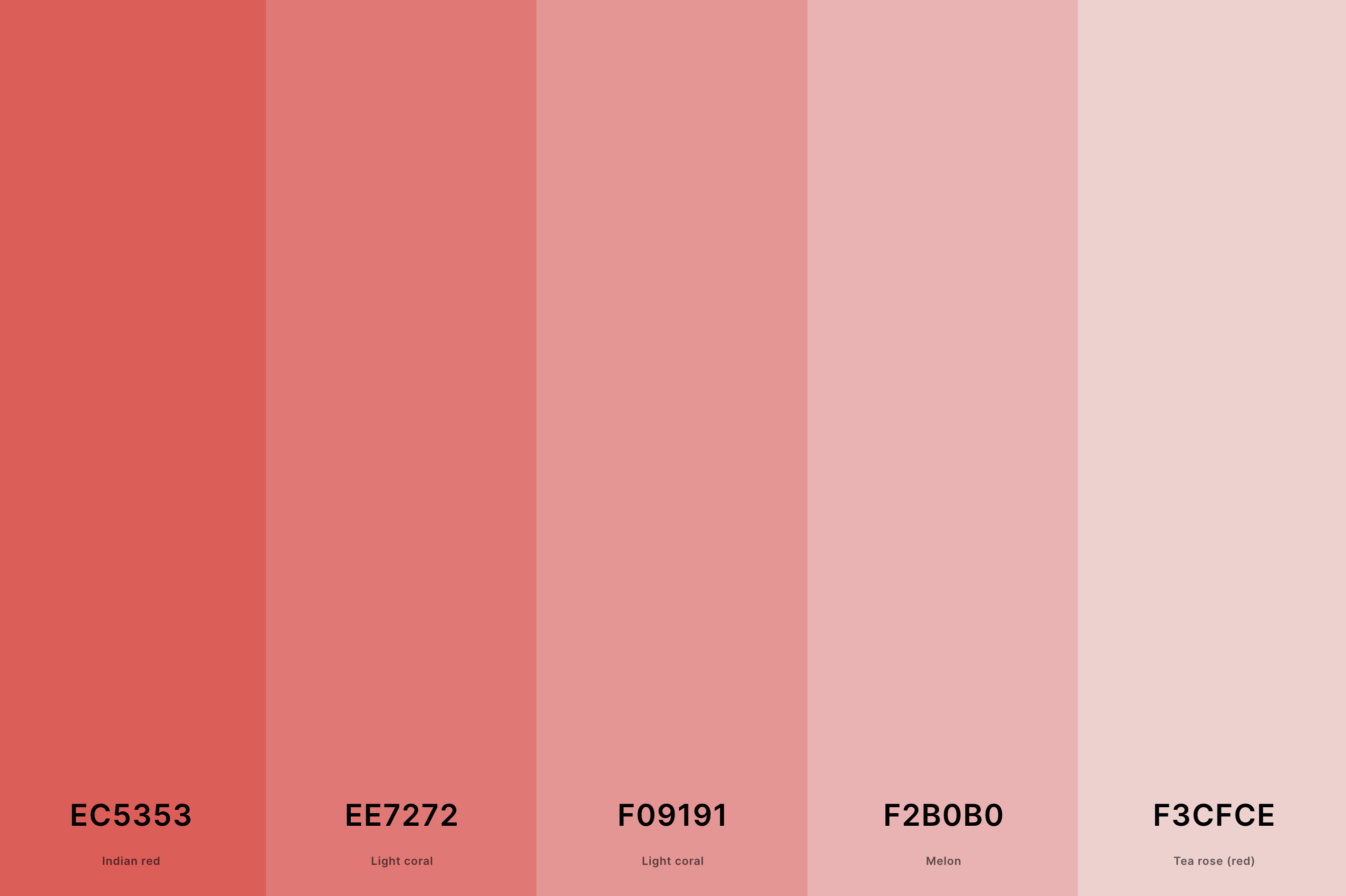
Hex Codes: #EC5353, #EE7272, #F09191, #F2B0B0, #F3CFCE
This palette is a seamless blend of sunset colors, moving fluidly from yellow to orange, then pink and finally into purple.
It mimics the gradual blending of colors in the sky during sunset, creating a smooth, gradient effect.
Ideal for a sunset theme that focuses on the fluidity and harmony of colors, this palette offers a visually soothing and cohesive color journey.
20. Soft Pastel Color Palette
Lavender Pink + Lemon Chiffon + Tea Green + Uranian Blue + Thistle
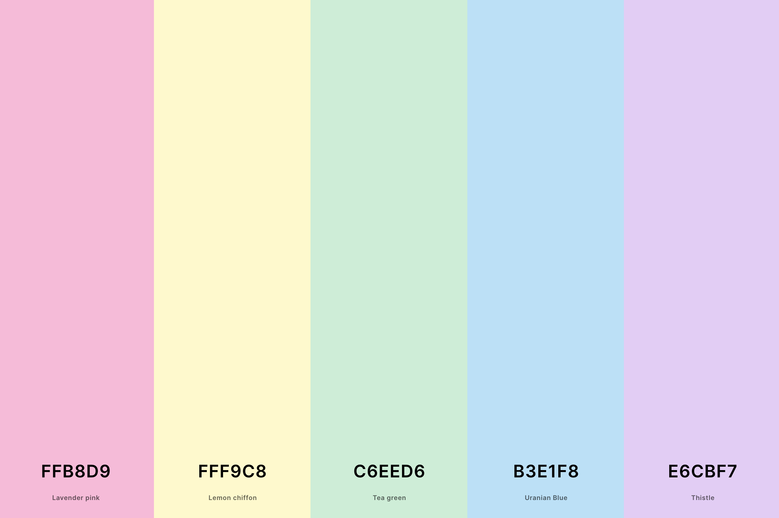
Hex Codes: #FFB8D9, #FFF9C8, #C6EED6, #B3E1F8, #E6CBF7
Incorporating luminous golds, shimmery pinks, and radiant oranges, this palette captures the sparkling essence of the sun's last rays.
It's like the glimmering reflection of the sunset on water or in the clouds, bringing a sense of magic and wonder.
Perfect for a sunset theme that aims to highlight the glittering, almost magical quality of sunsets, these colors evoke a feeling of enchantment and awe.
21. Cute Pastel Color Palette
Dutch White + Celadon + Pink Lavender + Vista Blue + Sky Blue
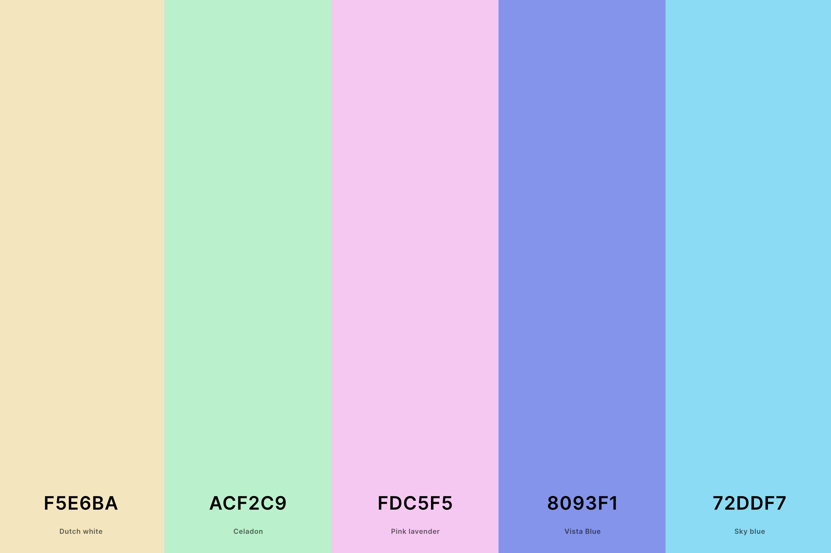
Hex Codes: #F5E6BA, #ACF2C9, #FDC5F5, #8093F1, #72DDF7
This palette showcases the full array of colors typically seen in the sky during sunset, from light sky blues to soft pinks, fiery oranges, and deep purples.
It's like a snapshot of the sky at that magical moment, capturing the diversity and beauty of the colors spread across the horizon.
Ideal for a sunset theme that seeks to embody the entire spectacle of the sunset sky, these colors offer a broad and dynamic range, reflecting the natural splendor of the evening sky.
22. Dark Pastel Color Palette
True Blue + Cool Gray + Fairy Tale + Blue (Munsell) + Cerulean
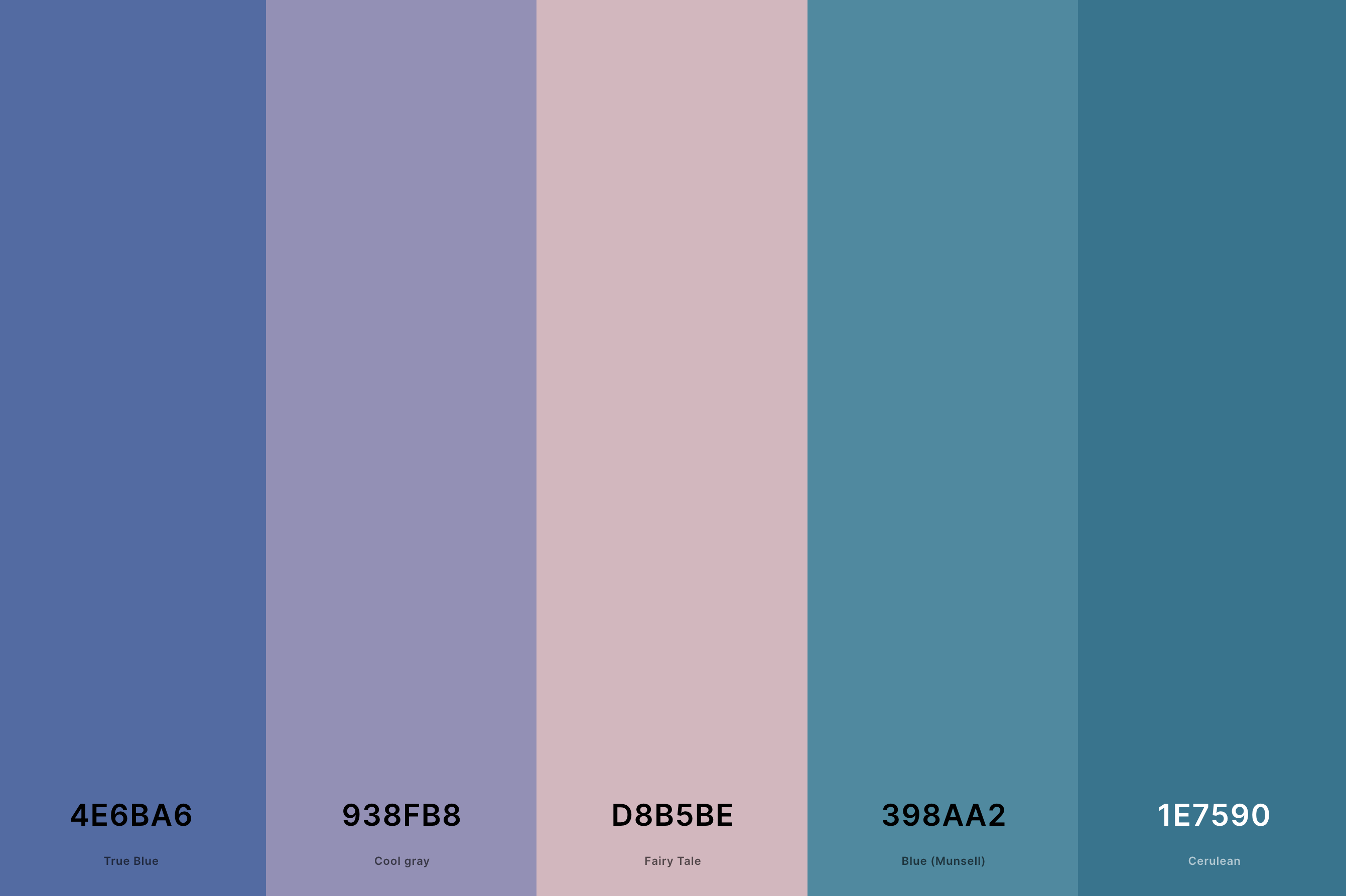
Hex Codes: #4E6BA6, #938FB8, #D8B5BE, #398AA2, #1E7590
Bursting with lively and fresh colors, this palette combines bright yellows, vibrant oranges, and cheerful pinks with hints of blue and green. It captures the essence of summer sunsets, full of energy and warmth.
Perfect for a sunset theme that aims to evoke the joyful and spirited feel of summer evenings, these colors are reminiscent of long, carefree days and the vibrant beauty of sunsets in the warmer months.
23. Pastel Earth Tone Color Palette
Lion + Dutch White + Eggshell + Cream + Sage
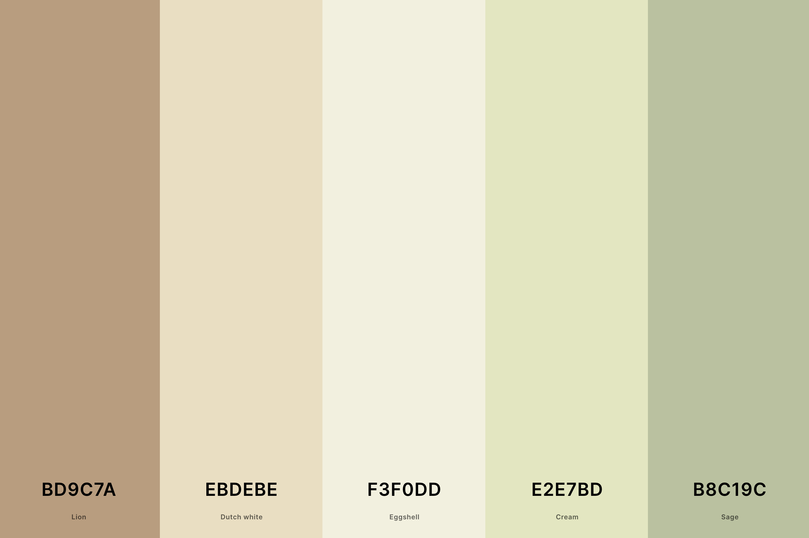
Hex Codes: #BD9C7A, #EBDEBE, #F3F0DD, #E2E7BD, #B8C19C
This palette uses a combination of muted oranges, pinks, and purples, paired with sepia tones and soft greys. It's reminiscent of old photographs and postcards, capturing the timeless elegance of sunsets from years gone by.
Ideal for a sunset theme that seeks a classic, refined feel, these colors bring a touch of history and nostalgia, offering a more subdued and elegant approach to sunset colors.
24. Pastel Lavender Color Palette
Medium Slate Blue + Tropical Indigo + Periwinkle + Periwinkle + Lavender (Web)
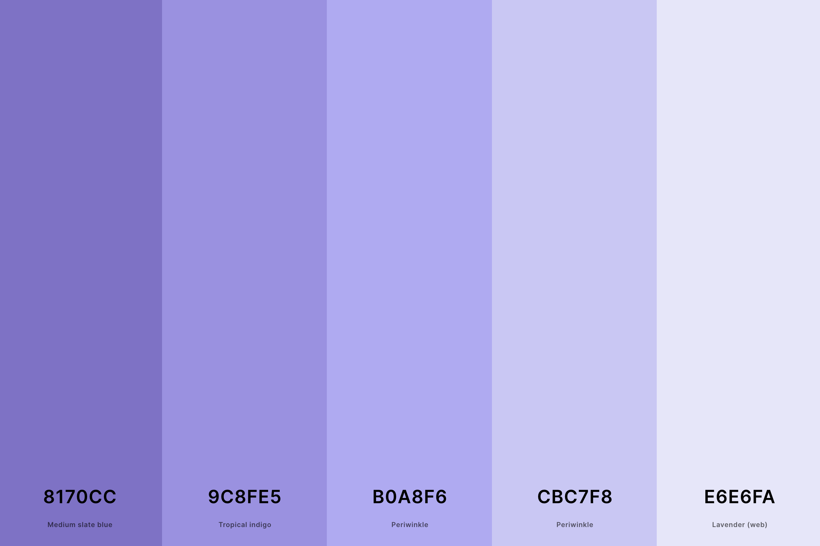
Hex Codes: #8170CC, #9C8FE5, #B0A8F6, #CBC7F8, #E6E6FA
Emphasizing warmth and comfort, this palette blends together rich oranges, cozy reds, and golden yellows. It mirrors the feeling of basking in the warm glow of the setting sun, creating a comforting and inviting atmosphere.
Perfect for a sunset theme that seeks to create a sense of warmth and coziness, these colors evoke the comforting embrace of the sun's final rays.
25. Pastel Pink And Blue Color Palette
Mimi Pink + Plum (Web) + Wisteria + Vista Blue + Non Photo Blue
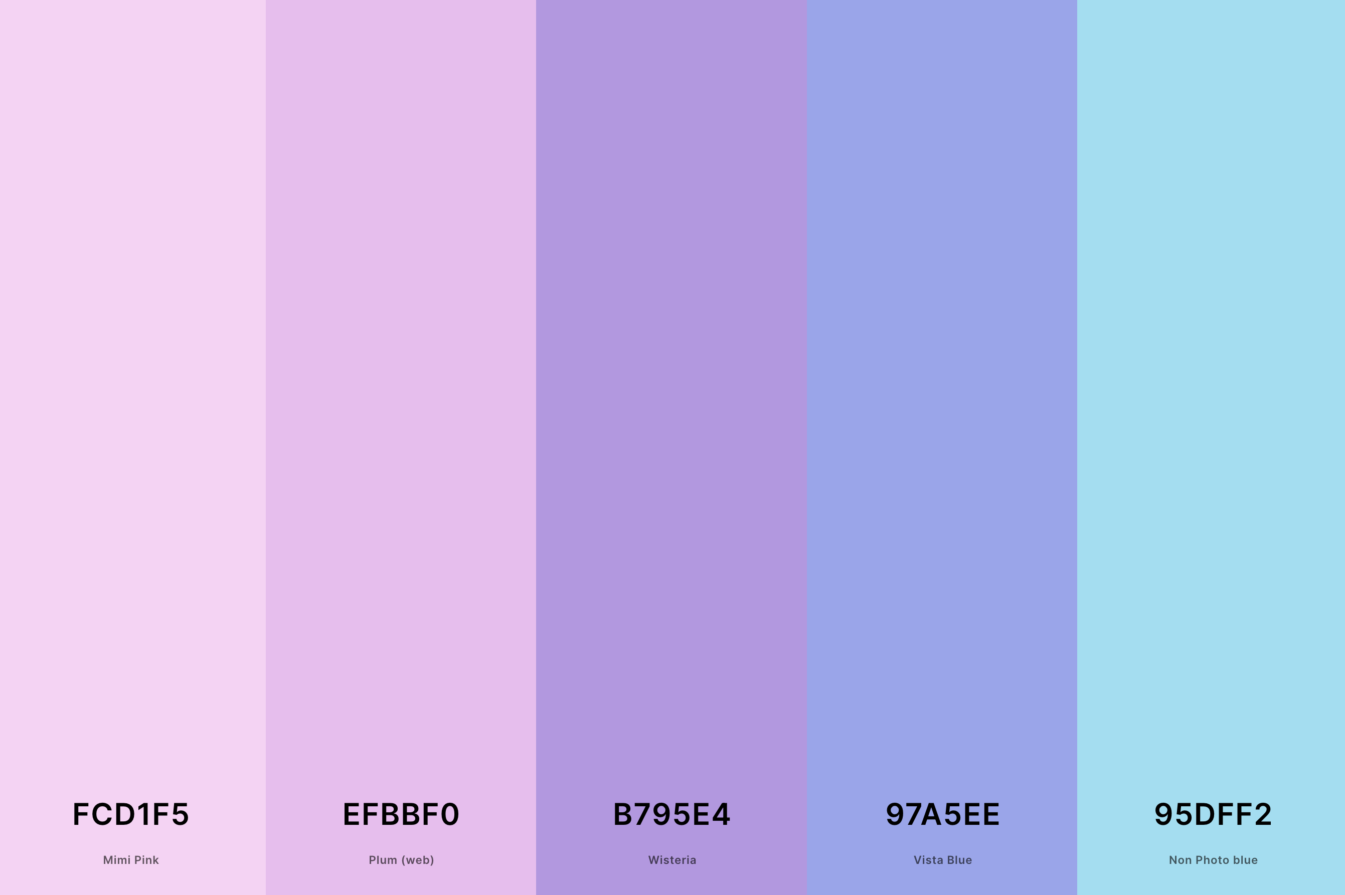
Hex Codes: #FCD1F5, #EFBBF0, #B795E4, #97A5EE, #95DFF2
Featuring a soothing mix of pastel oranges, pinks, and purples with subtle blues, this palette captures the gentler side of sunsets.
It reflects the soft, tender moments when the sky is filled with light, airy colors, creating a peaceful and calming ambiance.
Ideal for a sunset theme that aims to evoke a sense of tranquility and softness, these colors offer a delicate, dreamy take on the classic sunset.
26. Pastel Beach Color Palette
Non Photo Blue + Uranian Blue + Mimi Pink + Lavender Pink + Lemon Chiffon
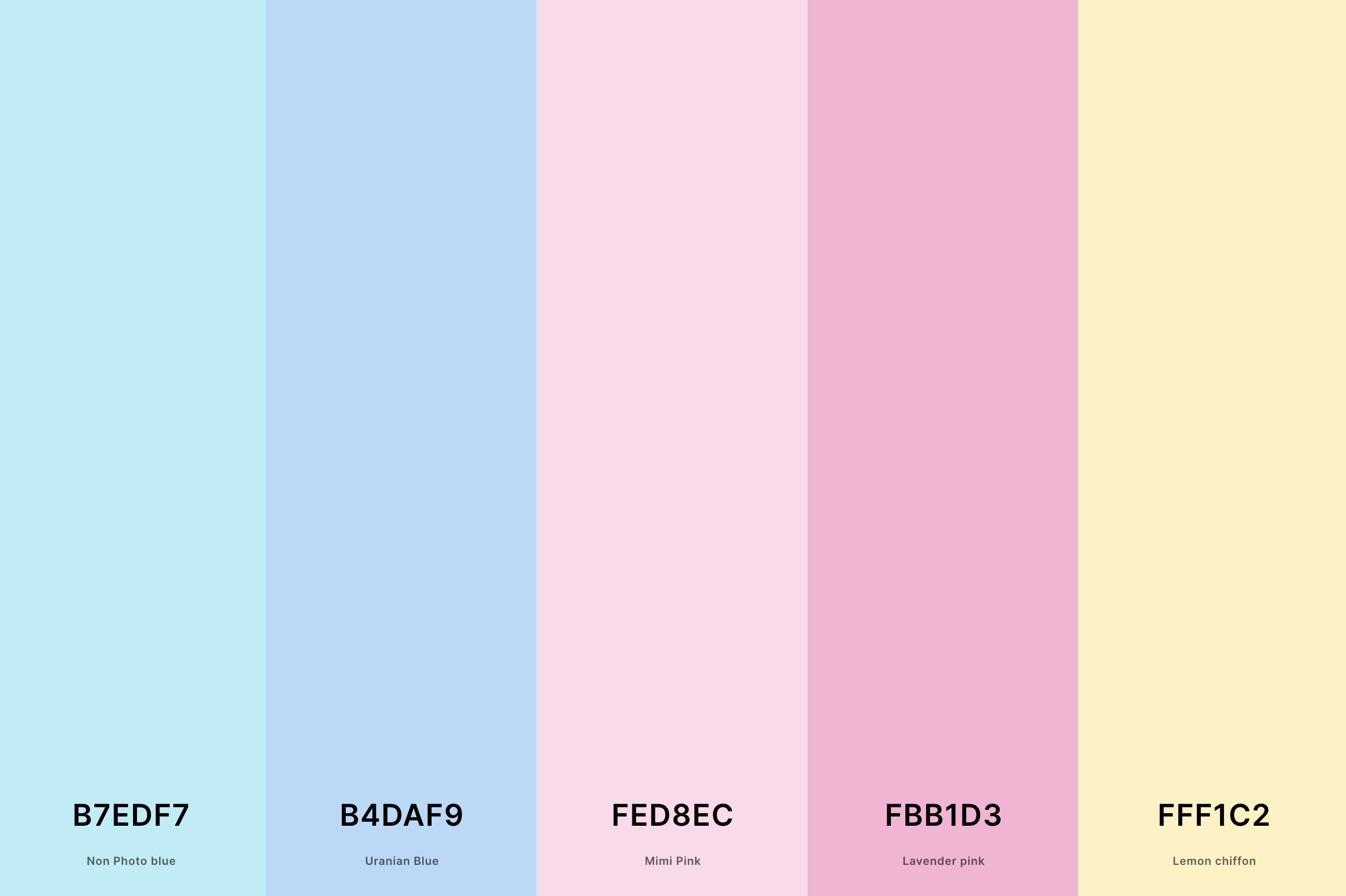
Hex Codes: #B7EDF7, #B4DAF9, #FED8EC, #FBB1D3, #FFF1C2
This palette is a vibrant homage to the 1970s, featuring bold oranges, vivid yellows, and deep browns, often paired with a distinctive teal.
It captures the essence of the era's design aesthetic, characterized by its fearless use of color and pattern.
Ideal for a sunset theme that seeks a retro, nostalgic feel, these colors are reminiscent of the dynamic and expressive nature of the 1970s, evoking a sense of freedom and creativity.
27. Pastel Wedding Color Palette
Misty Rose + Isabelline + Light Cyan + Columbia Blue + Powder Blue
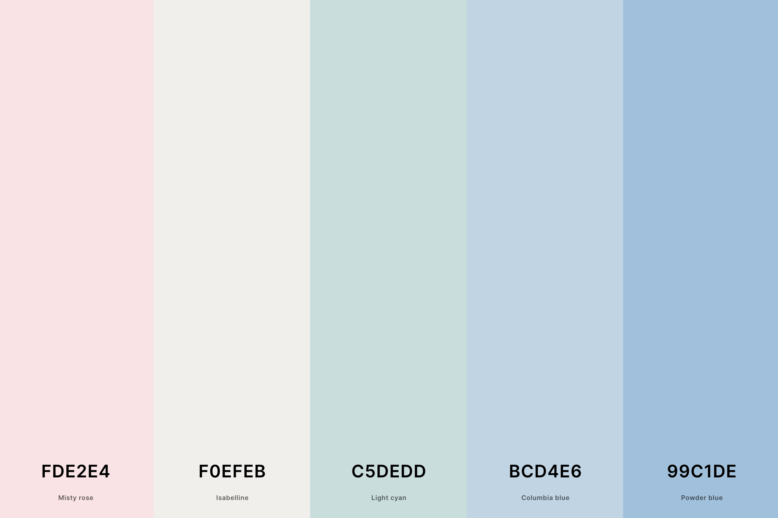
Hex Codes: #FDE2E4, #F0EFEB, #C5DEDD, #BCD4E6, #99C1DE
Embodying the spirit of the 1980s, this palette combines neon pinks and oranges with electric blues and purples. It reflects the decade's love for bright, flashy colors and its bold, adventurous style.
Perfect for a sunset theme that aims to capture the high-energy and vibrant essence of the 80s, these colors bring a sense of excitement and audacity, echoing the era's trendsetting and flamboyant approach to design and fashion.
What Are Pastel Colors?
Pastel colors are a fascinating and distinct group in the color spectrum, characterized by their high value and low to medium saturation. These colors are often described as soft, light, washed out, or muted.
They resemble the softer tones that emerge when white is added to a pure color, creating a delicate, soothing effect. This lightness gives pastels a unique charm, making them a popular choice in various design fields, including fashion, interior design, and art.
One of the most appealing aspects of pastel colors is their versatility. They have a calming effect, often associated with spring and the freshness of blooming flowers, gentle sunrises, and peaceful skies. This quality makes them ideal for creating environments that promote relaxation and comfort.
Pastels are also incredibly adaptable, blending beautifully with each other and providing a harmonious color palette that's both pleasing to the eye and easy to work with.
Moreover, pastels have a timeless elegance, transcending trends and seasons. They hold a special place in design, evoking a sense of nostalgia and innocence.
Whether used in a monochromatic scheme or paired with bolder colors for contrast, pastels have the power to convey emotion and add subtle depth and interest to any space or design. Their gentle nature allows for creative exploration, making them a fascinating subject for anyone passionate about the art of color.
How to Make a Great Pastel Color Palette?
Creating a great pastel color palette is an art that blends understanding color theory with a sense of aesthetic harmony. To design a palette that resonates with beauty and balance, follow these steps:
-
Start with a Base Color: Choose a primary color that you love. This could be a soft pink, a gentle blue, or any pastel shade that catches your eye. This color will set the mood of your palette.
-
Add Complementary Shades: Look for colors that complement your base color. For a pastel palette, these should also be light and soft. If your base is a cool color, consider warm pastels to add balance, and vice versa.
-
Consider Color Relationships: Use a color wheel as a guide. Analogous colors (colors next to each other on the wheel) often work well together in a pastel palette, offering a harmonious look.
-
Incorporate Neutrals: Pastels pair beautifully with neutral tones. Include shades like soft grey, creamy white, or light beige to give your palette a grounded, versatile feel.
-
Test Your Palette: Before finalizing, test your palette in the intended context, whether it's a digital design, a room, or a piece of art. This helps ensure the colors work well together in practice, not just in theory.
-
Adjust Saturation and Value: Play with the saturation and value of each color. Even minor adjustments can make a big difference in the overall feel of the palette.
-
Keep it Simple: A common mistake is to include too many colors. A palette with three to five colors is often more effective and visually appealing.
Remember, the key to a successful pastel palette lies in creating a sense of calm and harmony. Pastels are inherently soothing, so your palette should reflect this quality. Experiment, adjust, and most importantly, have fun with the process!
