This post may contain affiliate links. If you click one, we may earn a commission at no cost to you. Here's more details on how we make money.
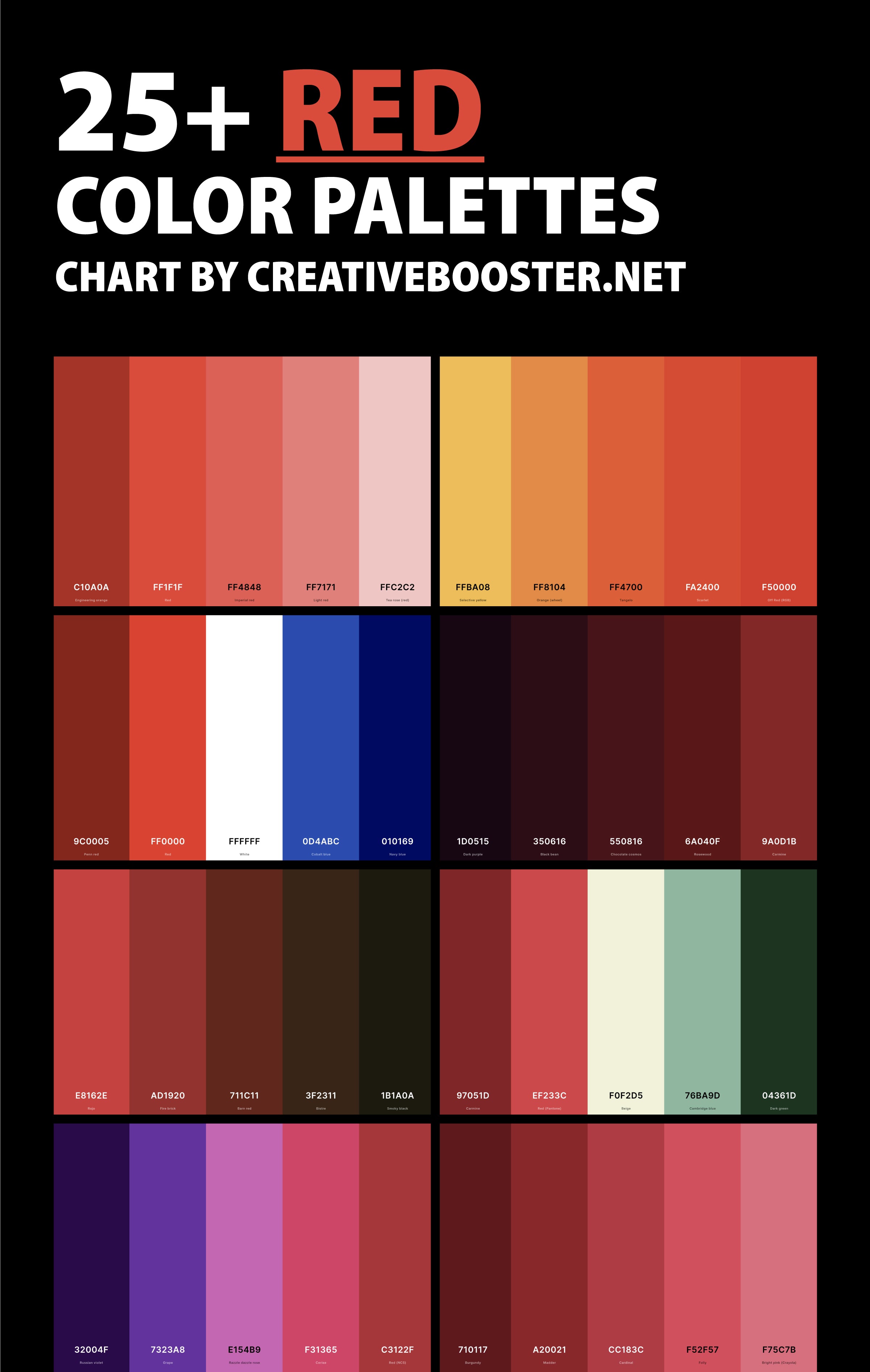
Welcome to our colorful exploration of the world of red! In this blog post, we're going to delve into the diverse and dynamic universe of red color palettes. As a color that's often associated with love, energy, and strength, red has the unique ability to evoke a range of emotions and create various atmospheres in design.
From the deep, romantic shades of wine red to the bright, cheerful tones of cherry, red's versatility is truly remarkable.
Each palette we discuss here will showcase a different facet of red, illustrating how this vibrant color can be paired with other hues to achieve a multitude of effects. Whether you're a designer seeking inspiration for your next project, a homeowner looking to spice up your decor, or simply a color enthusiast eager to learn more, these 25+ red color palettes will offer something new and exciting.
Join us as we explore how red interacts with other colors, the emotions it can convey, and the endless possibilities it presents in the world of design. Prepare to be inspired by the warmth, depth, and versatility of these stunning red color palettes! 🎨🔴🌹
1. Red And Black Color Palette
Red + Fire Engine Red + Raisin Black + Davy'S Gray + Anti-Flash White
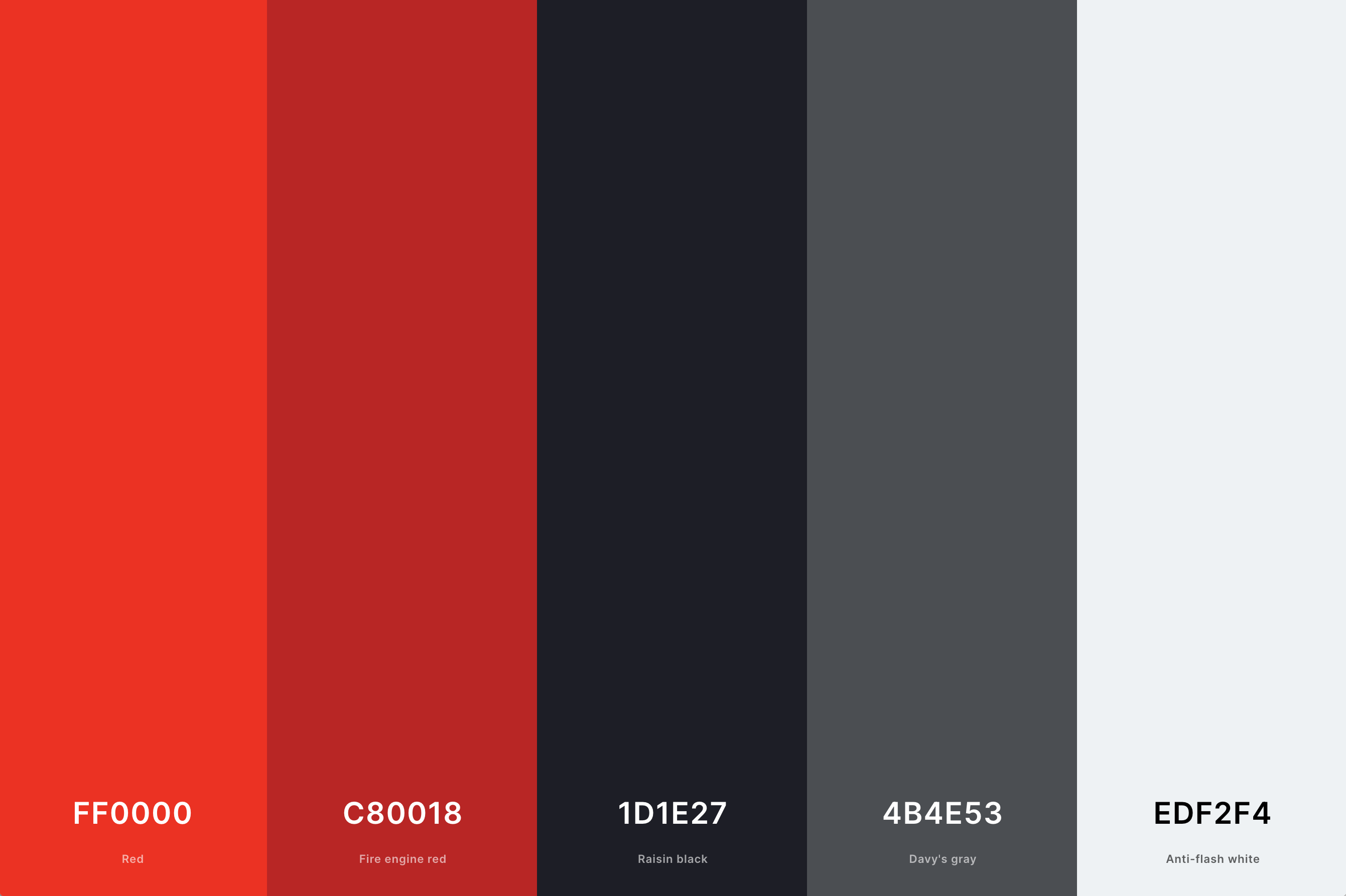
Hex Codes: #FF0000, #C80018, #1D1E27, #4B4E53, #EDF2F4
This palette combines the intensity of red with the solidity of black. The contrast here creates a dynamic visual impact, ideal for designs needing a strong, assertive presence.
Red in this combination symbolizes passion and energy, while black adds sophistication and depth. Together, they form a palette that is both bold and balanced, making it a great choice for modern, high-impact designs.
2. Red And Blue Color Palette
Engineering Orange + Red (Cmyk) + Lavender (Web) + Blue (Crayola) + Persian Blue
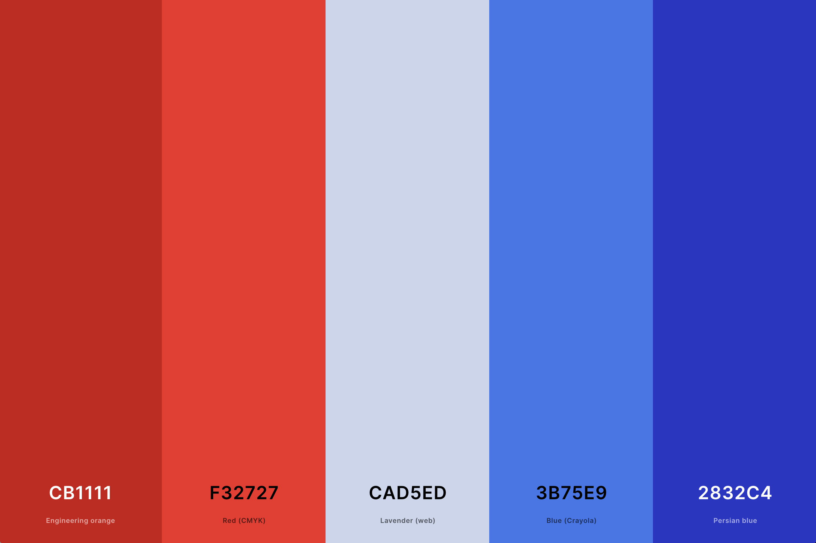
Hex Codes: #CB1111, #F32727, #CAD5ED, #3B75E9, #2832C4
This is a classic and versatile combination. Red offers warmth and vibrancy, while blue brings in a sense of calm and stability. The juxtaposition of these colors can produce a striking and harmonious balance.
This palette is often used in designs that aim to be eye-catching yet grounded, making it suitable for a variety of creative projects.
3. Dark Red Color Palette
Licorice + Blood Red + Fire Engine Red + Black Bean + Chocolate Cosmos
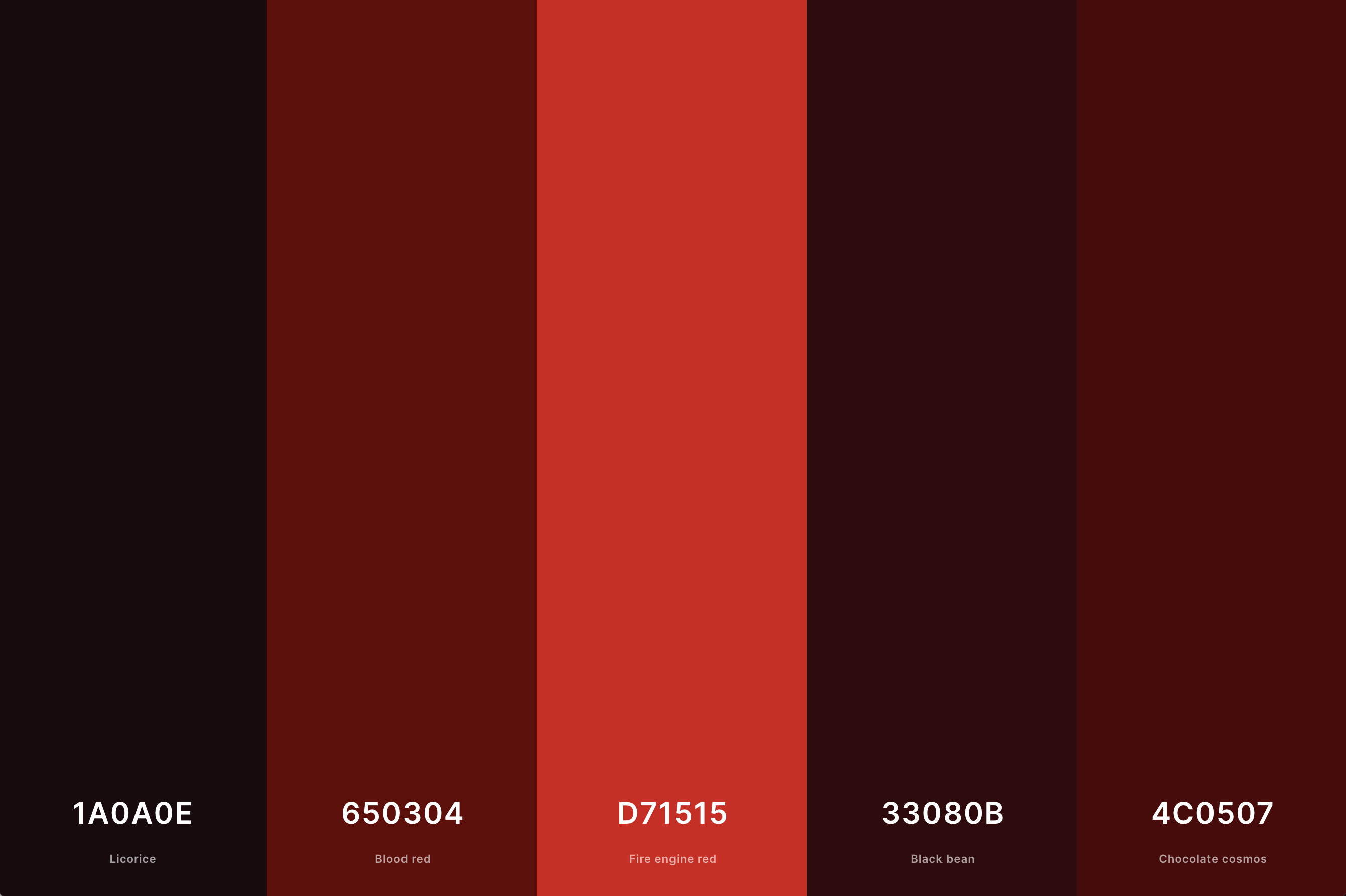
Hex Codes: #1A0A0E, #650304, #D71515, #33080B, #4C0507
Dark red shades convey a sense of elegance and depth. This palette often evokes feelings of luxury and sophistication. The deeper tones of red are less aggressive than their brighter counterparts, lending themselves to more refined and mature designs.
This palette works exceptionally well in spaces and designs that aim to create a moody, yet inviting atmosphere.
4. Red And Green Color Palette
Dark Red + Off Red (Rgb) + Peach Yellow + Forest Green + Brunswick Green
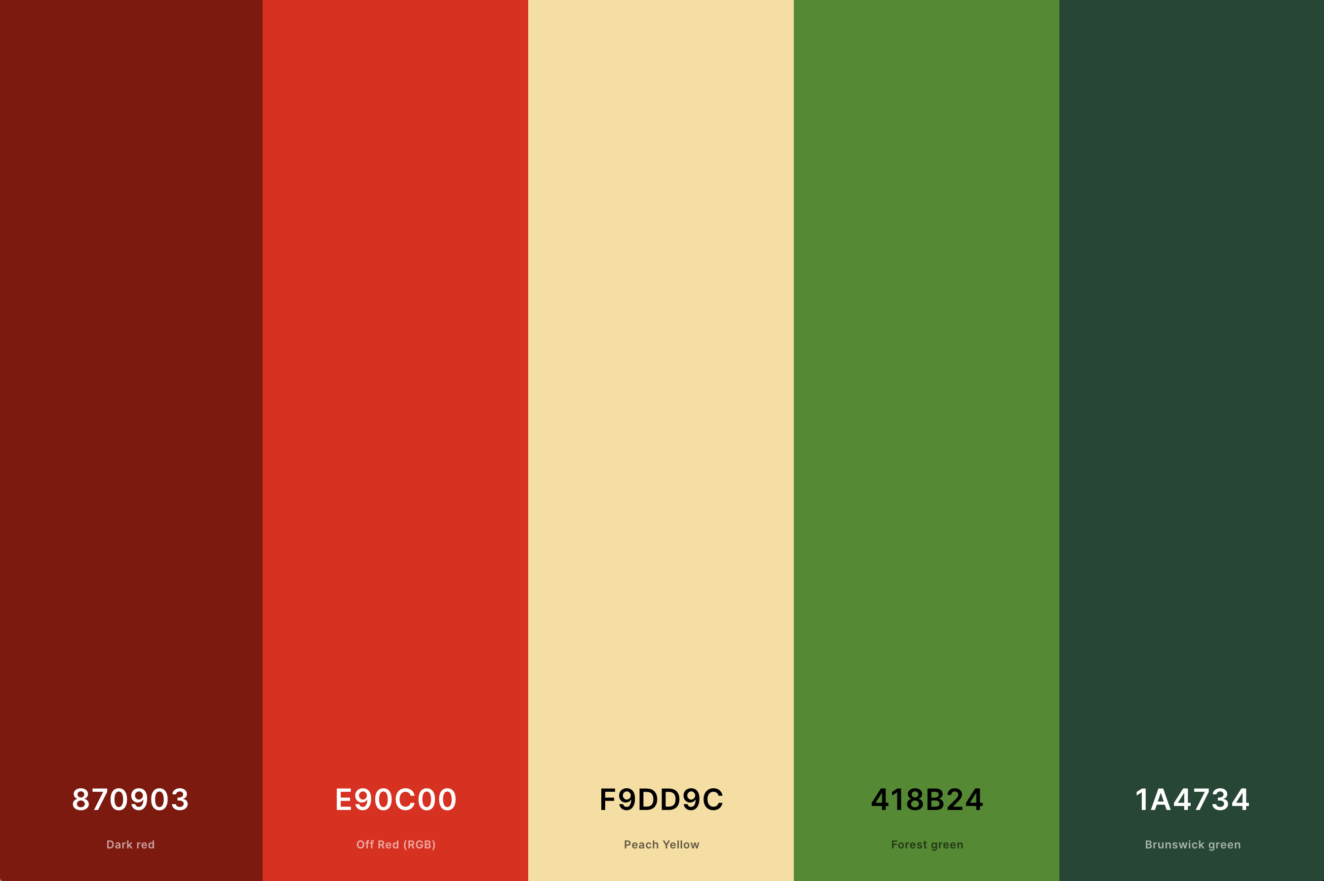
Hex Codes: #870903, #E90C00, #F9DD9C, #418B24, #1A4734
Often associated with festive themes, the red and green palette can be surprisingly versatile. Red's warmth contrasts with green's natural coolness, creating a lively interplay of colors.This palette is excellent for designs that aim to be vibrant and energetic while maintaining a connection to natural elements.
5. Red And Brown Color Palette
Rojo + Fire Brick + Barn Red + Bistre + Smoky Black
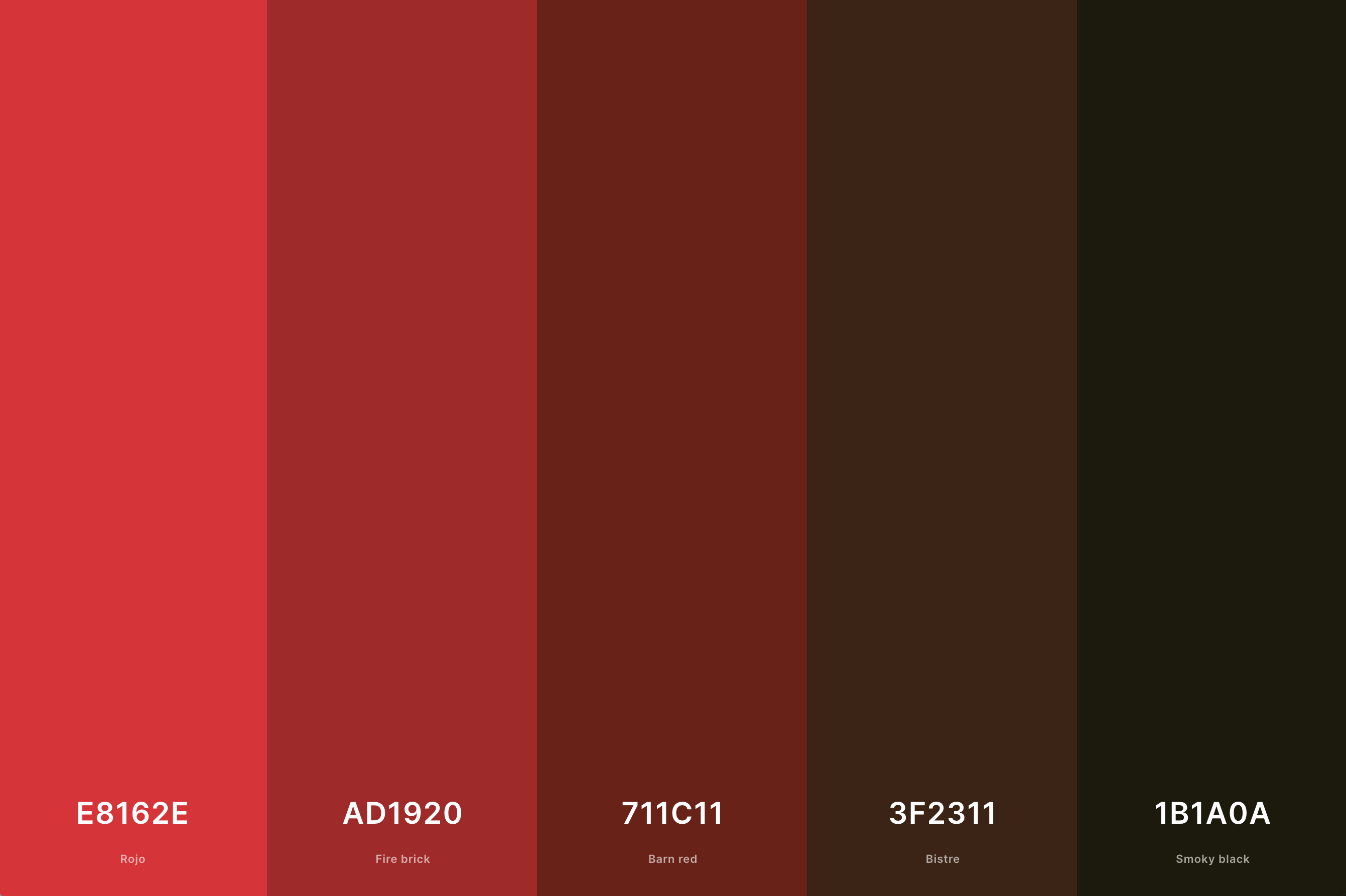
Hex Codes: #E8162E, #AD1920, #711C11, #3F2311, #1B1A0A
This earthy palette combines the warmth of red with the grounded, natural feel of brown. It creates a cozy, welcoming vibe, perfect for environments that aim to be comfortable and inviting.
This combination is often found in rustic or nature-inspired designs, where the goal is to create a sense of warmth and approachability.
6. Red And Purple Color Palette
Russian Violet + Grape + Razzle Dazzle Rose + Cerise + Red (Ncs)
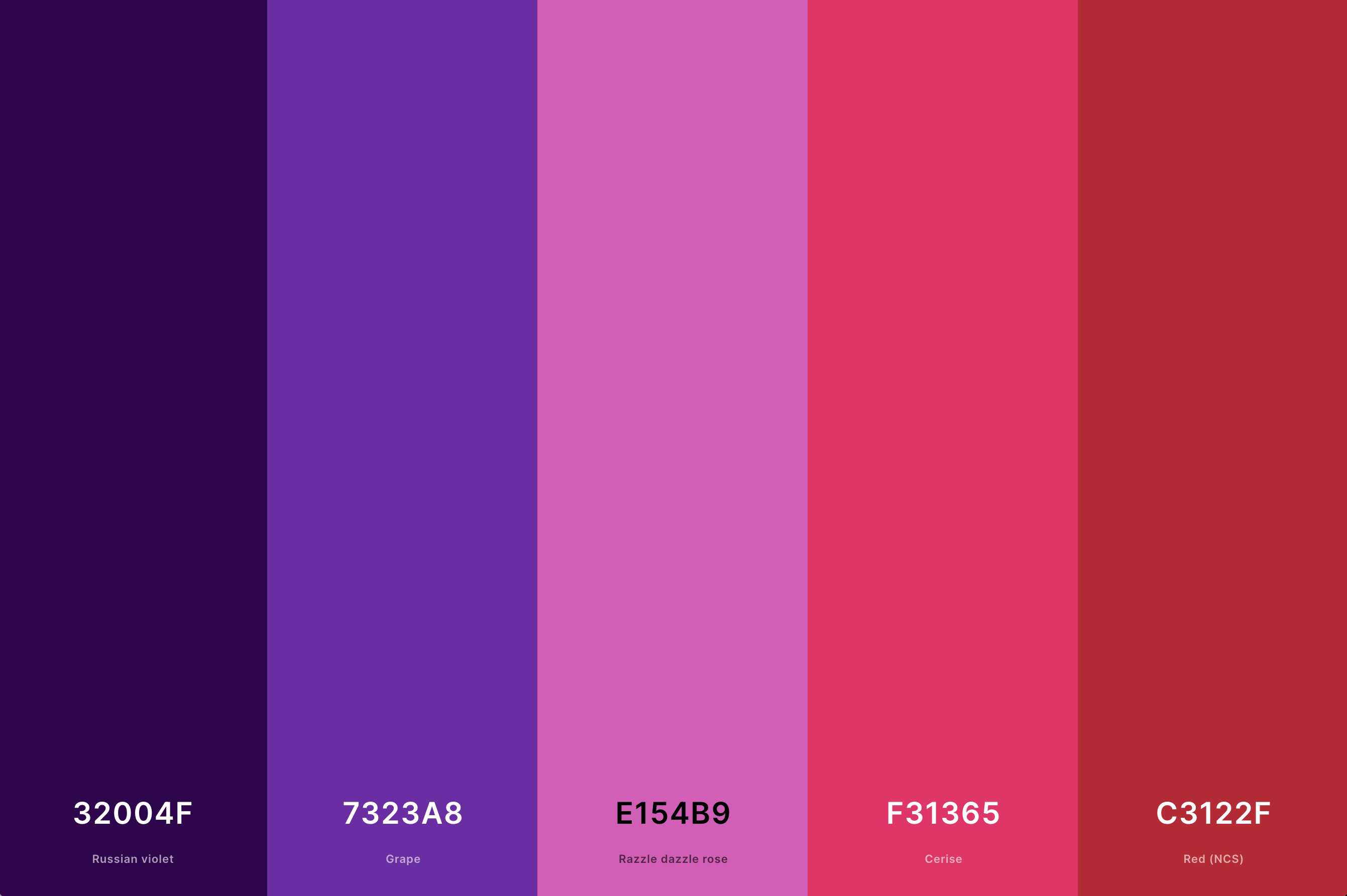
Hex Codes: #32004F, #7323A8, #E154B9, #F31365, #C3122F
This palette blends the boldness of red with the regality of purple, creating a combination that is both dynamic and elegant. The presence of red adds energy and warmth, while purple introduces a touch of luxury and sophistication.
This palette is excellent for designs that aim to convey a sense of creativity and luxury, making it a popular choice in the fashion and beauty industries.
7. Red And Gold Color Palette
Engineering Orange + Off Red (Rgb) + School Bus Yellow + Sunglow + Harvest Gold
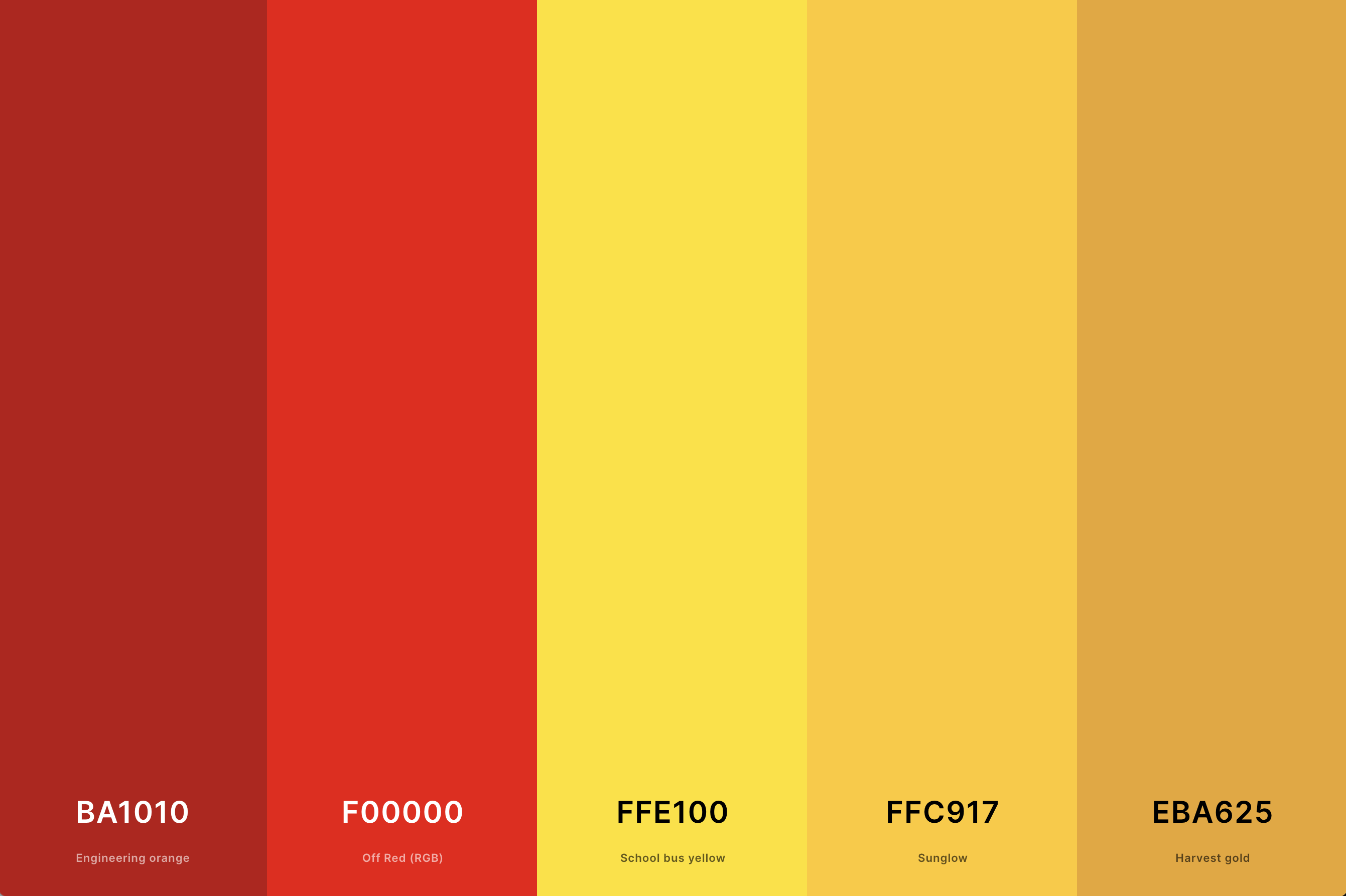
Hex Codes: #BA1010, #F00000, #FFE100, #FFC917, #EBA625
The combination of red and gold is rich and opulent. Red provides a strong, energetic base, while gold adds a layer of glamour and sophistication. This palette is often associated with luxury, celebration, and high-end elegance.
It's a popular choice for festive occasions and upscale branding, where the goal is to create an impression of grandeur and exclusivity.
8. Red And Yellow Color Palette
Chili Red + Scarlet + Safety Orange + Mikado Yellow + Mustard
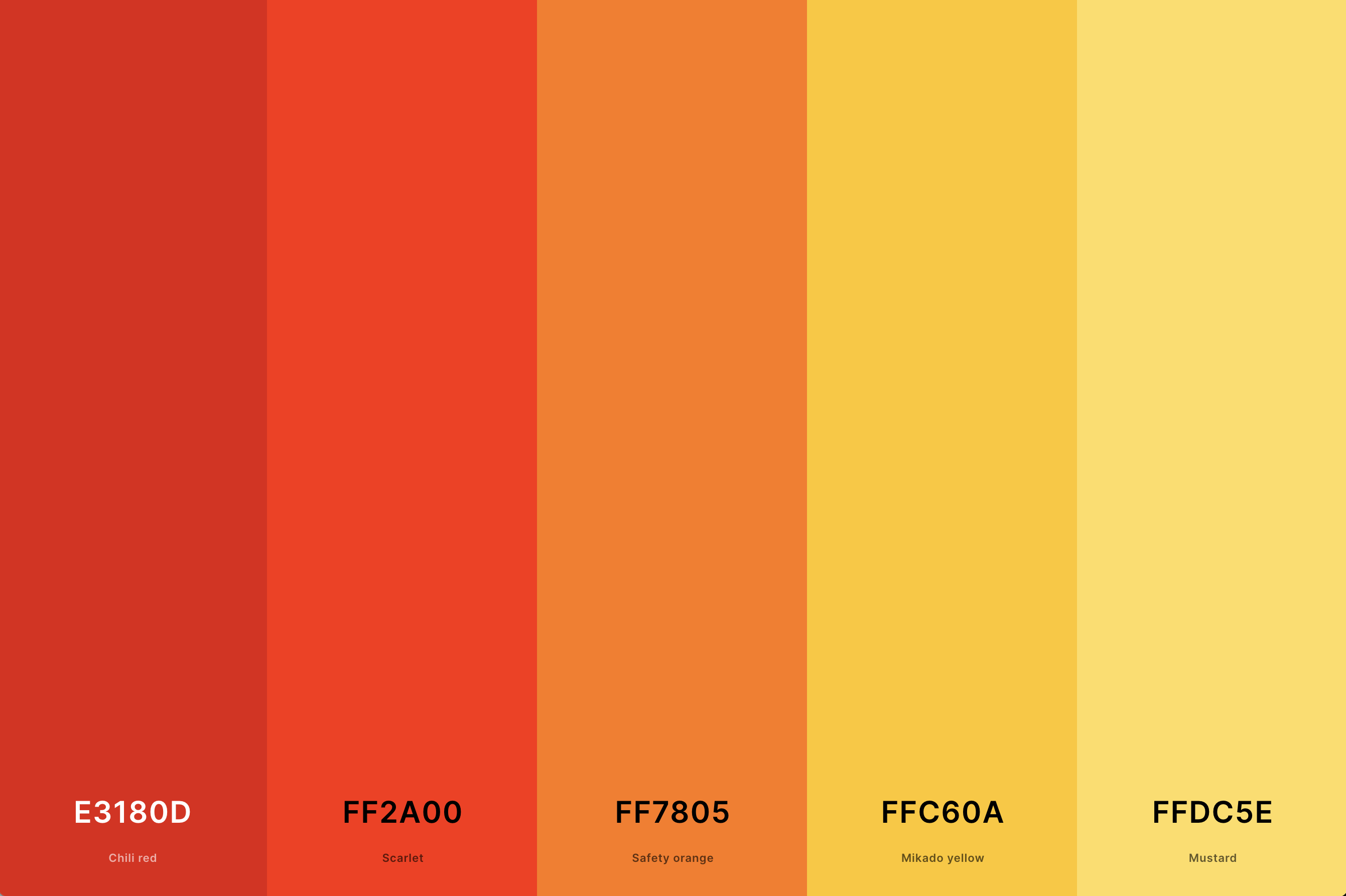
Hex Codes: #E3180D, #FF2A00, #FF7805, #FFC60A, #FFDC5E
This is a lively and vibrant combination. Red brings intensity and passion, while yellow adds cheerf
ulness and energy. Together, they create a palette that is playful and eye-catching. This combination is great for designs that aim to be friendly, approachable, and full of vitality, such as in children's products, casual dining, or creative arts.
9. Red Brick Color Palette
Penn Red + Sinopia + Desert Sand + Persian Orange + Onyx
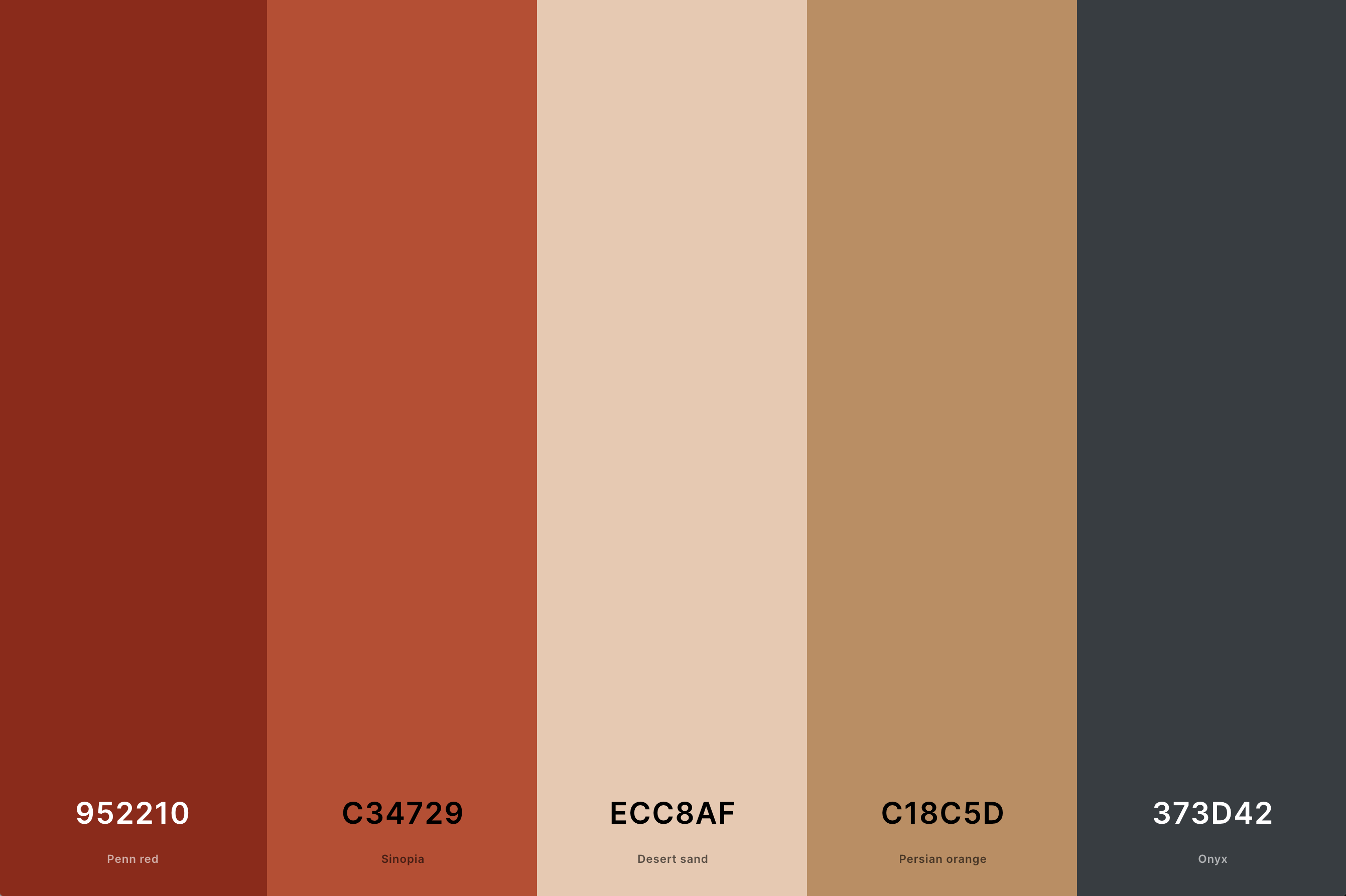
Hex Codes: #952210, #C34729, #ECC8AF, #C18C5D, #373D42
Red brick combines various shades of warm, earthy reds reminiscent of brickwork. This palette evokes a sense of stability, resilience, and timelessness. It's often used in designs that aim to reflect reliability, tradition, and a connection to the past.
This palette works well in architectural contexts and interior design, offering a comforting and familiar feel.
10. Red And Orange Color Palette
Selective Yellow + Orange (Wheel) + Tangelo + Scarlet + Off Red (Rgb)
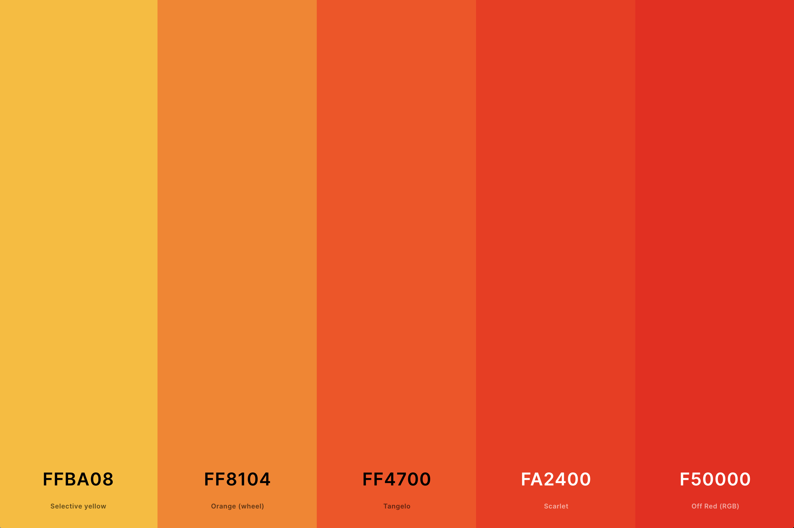
Hex Codes: #FFBA08, #FF8104, #FF4700, #FA2400, #F50000
Combining red with orange creates a palette that is full of warmth and energy. The red adds depth and intensity, while the orange brings a playful and vibrant energy.
This palette is excellent for designs that seek to be stimulating and engaging, making it a great choice for creative, energetic brands and spaces that want to convey a sense of excitement and warmth.
11. Deep Red Color Palette
Dark Purple + Black Bean + Chocolate Cosmos + Rosewood + Carmine
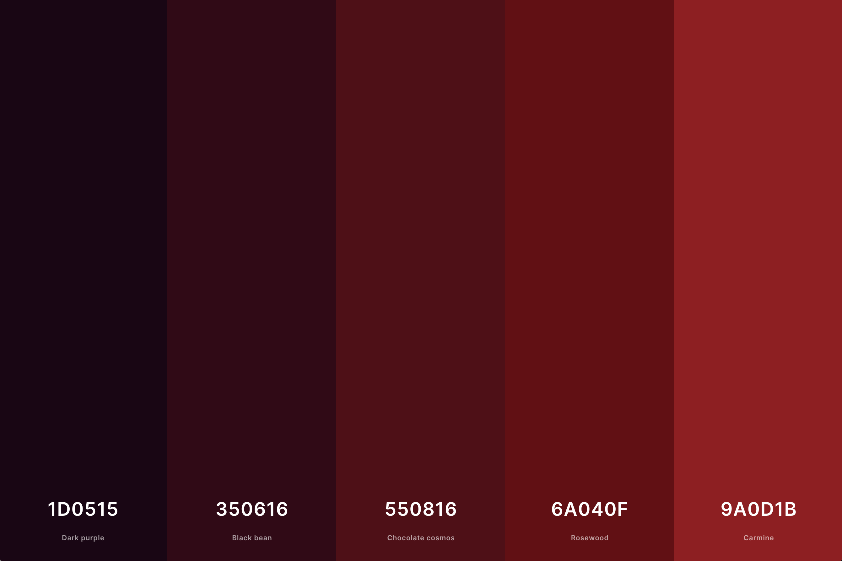
Hex Codes: #1D0515, #350616, #550816, #6A040F, #9A0D1B
Deep red shades embody richness and intensity. This palette often conveys feelings of power and sophistication. The deeper, more subdued reds are less vibrant than bright reds, offering a sense of luxury and refinement.
This palette is particularly effective in environments and designs that seek to create an atmosphere of elegance and profound depth.
12. Red And Pink Color Palette
Red (Cmyk) + Imperial Red + Bright Pink (Crayola) + Light Red + Melon
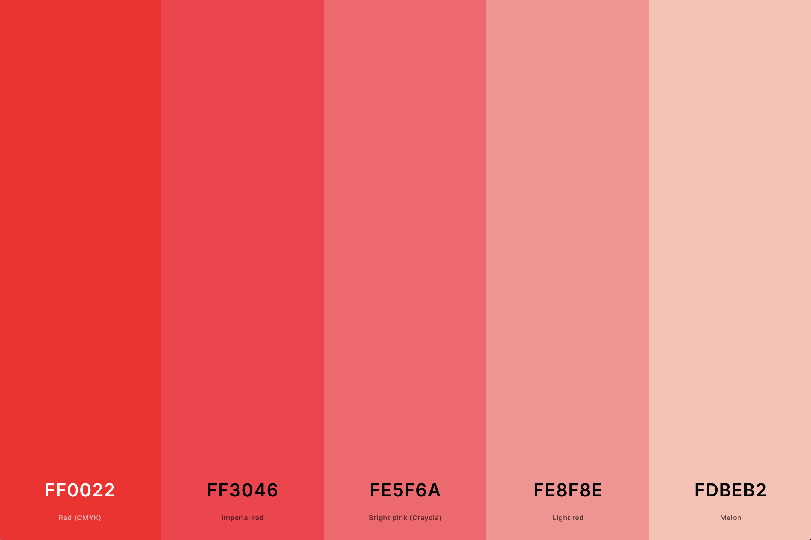
Hex Codes: #FF0022, #FF3046, #FE5F6A, #FE8F8E, #FDBEB2
Combining red with pink creates a palette that is both romantic and dynamic. The red adds a bold and energetic element, while the pink brings a softer, more gentle quality.
This palette is perfect for designs that aim to be both striking and tender, making it a favorite in fashion, beauty, and romantic-themed projects.
13. Red, White And Blue Color Palette
Penn Red + Red + White + Cobalt Blue + Navy Blue
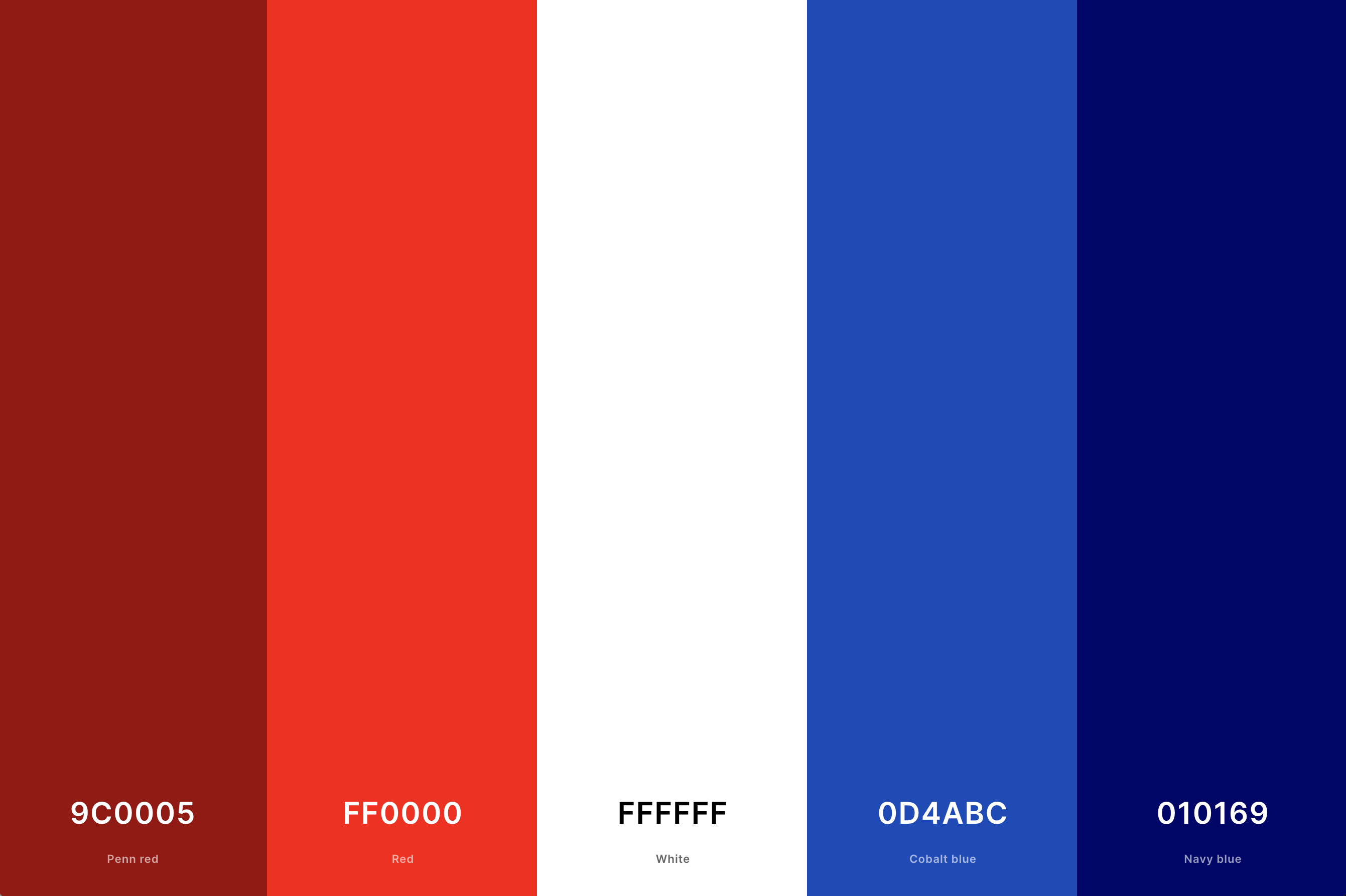
Hex Codes: #9C0005, #FF0000, #FFFFFF, #0D4ABC, #010169
This classic trio offers a balance of warmth, neutrality, and coolness. Red injects energy and passion, white provides a clean, crisp background, and blue adds a calming, stabilizing effect.
This palette is often associated with patriotism but is versatile enough for a wide range of applications, from corporate branding to casual wear.
14. Pastel Red Color Palette
Indian Red + Light Red + Light Coral + Melon + Tea Rose (Red)
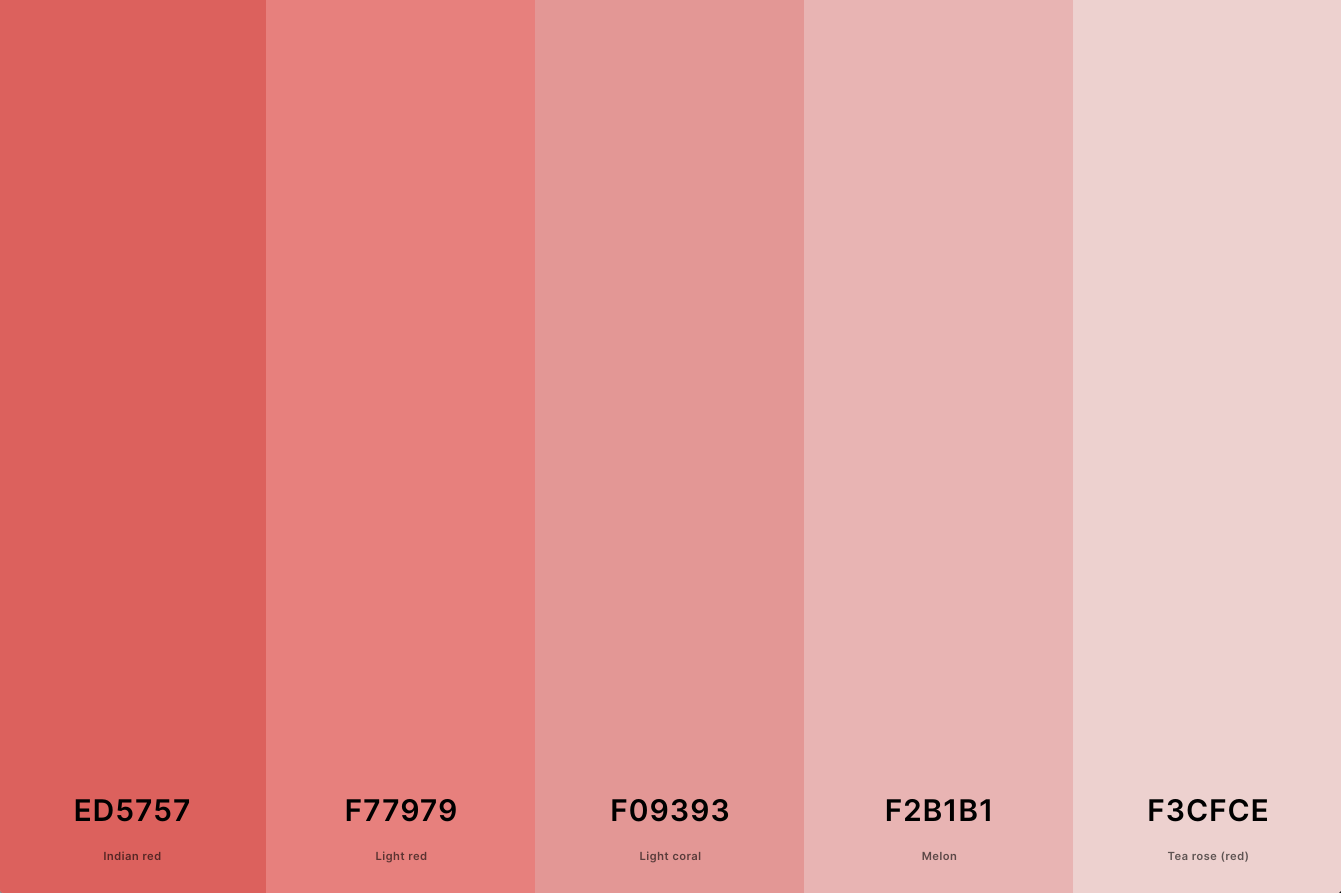
Hex Codes: #ED5757, #F77979, #F09393, #F2B1B1, #F3CFCE
Pastel red tones are soft and subdued, offering a gentler take on the typically bold red. This palette evokes a sense of calm warmth and understated elegance.
It's perfect for designs that require a touch of color without overwhelming intensity, such as in minimalist or Scandinavian-inspired aesthetics.
15. Shades Of Red Color Palette
Engineering Orange + Red + Imperial Red + Light Red + Tea Rose (Red)
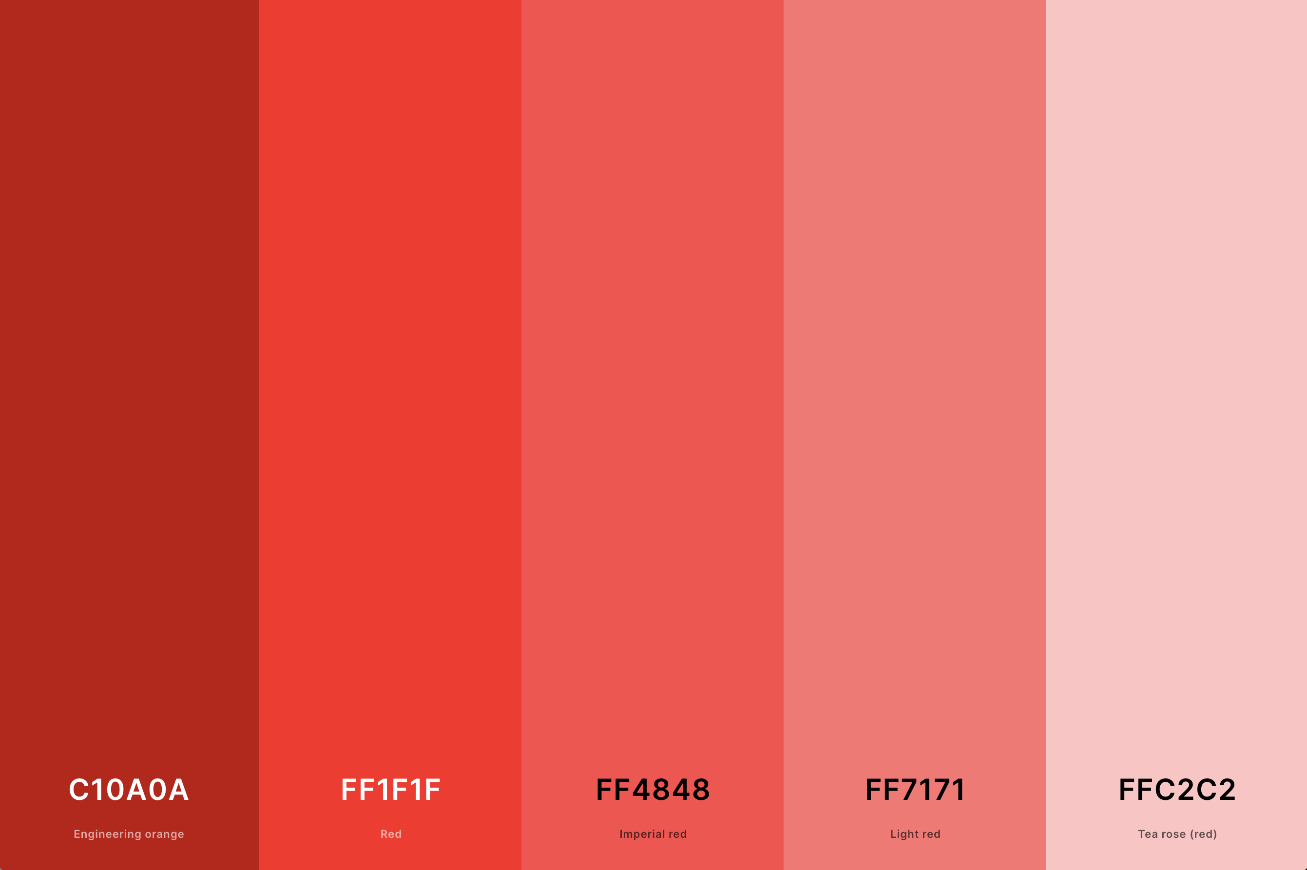
Hex Codes: #C10A0A, #FF1F1F, #FF4848, #FF7171, #FFC2C2
This palette explores the full spectrum of red, from bright and energetic to deep and moody. Each shade of red brings its own personality, ranging from passionate and invigorating to rich and sophisticated.
This variety makes the palette extremely versatile, suitable for dynamic designs that want to capture the many facets of emotion and energy that red represents.
16. Barn Red Color Palette
Falu Red + Seal Brown + Dun + Onyx + Silver
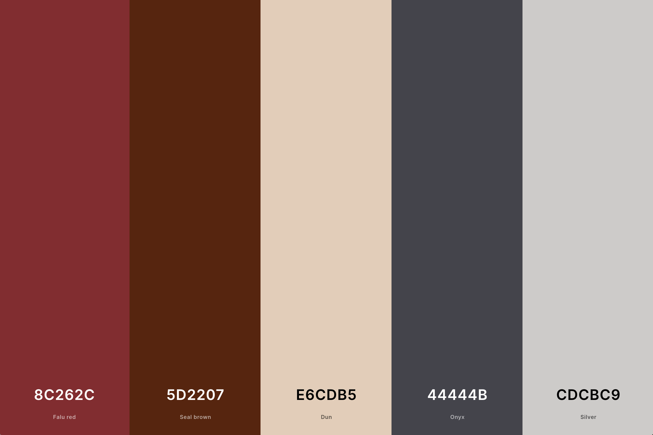
Hex Codes: #8C262C, #5D2207, #E6CDB5, #44444B, #CDCBC9
Barn red is a classic, rustic shade that evokes feelings of warmth and comfort. This palette typically includes earthy, muted reds that are reminiscent of traditional barns and rural landscapes.
It's perfect for designs aiming to convey a sense of rustic charm, nostalgia, and a connection to simpler times.
17. Red, Black And Gold Color Palette
Black + Dark Red + Lemon Chiffon + Sunglow + Harvest Gold
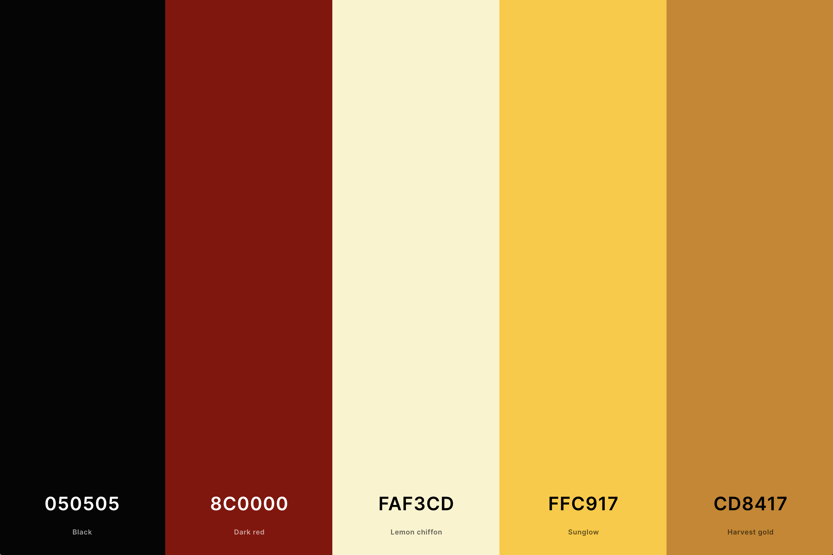
Hex Codes: #050505, #8C0000, #FAF3CD, #FFC917, #CD8417
This palette is the epitome of luxury and drama. The combination of intense red, bold black, and shimmering gold creates a visually striking and opulent effect.
It's ideal for designs that aim to exude elegance, wealth, and a sense of the extraordinary, such as in high-end fashion, luxury branding, or opulent event theming.
18. Red Panda Color Palette
Black Bean + Brown + Tangelo + Sandy Brown + Linen
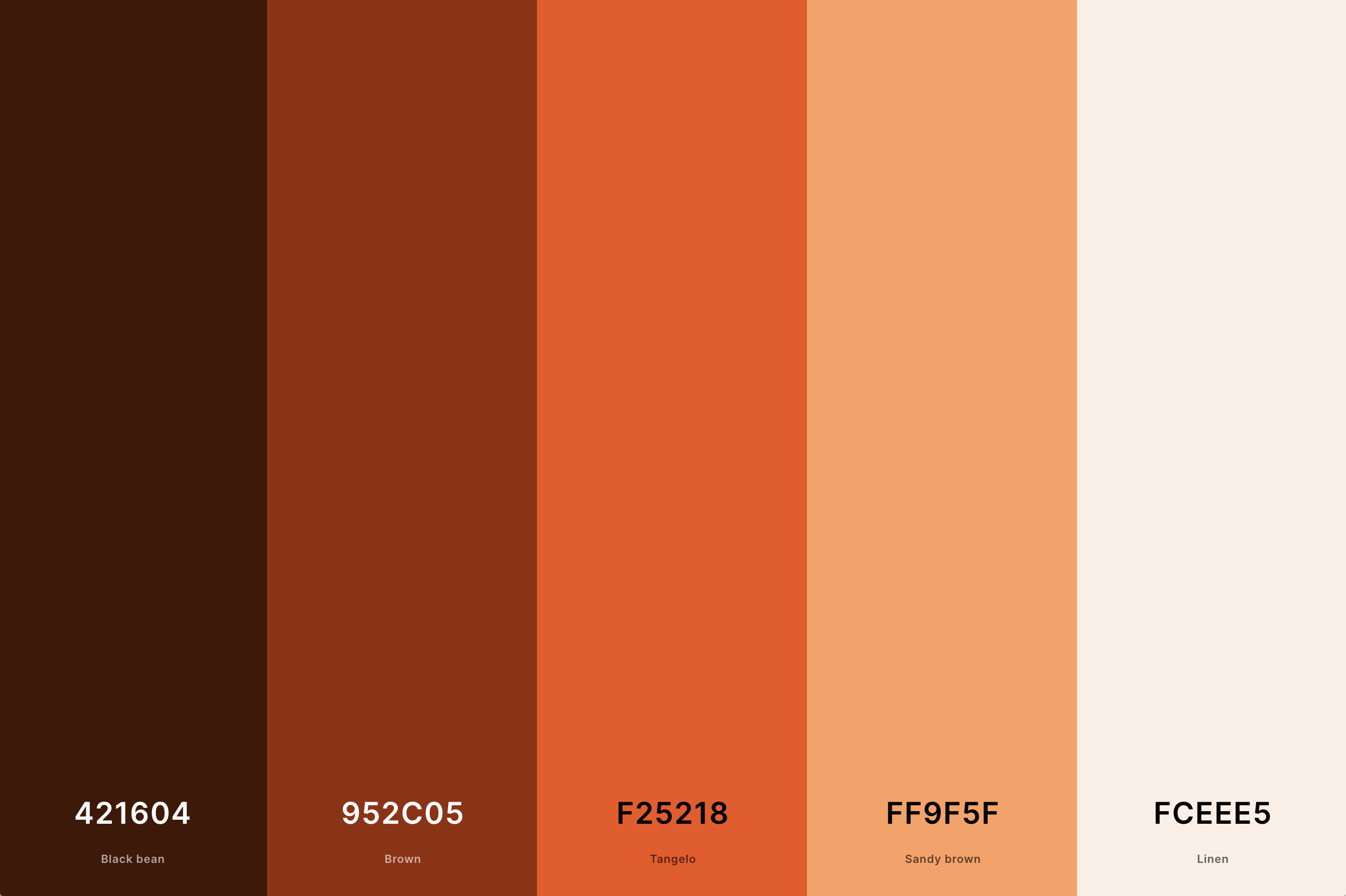
Hex Codes: #421604, #952C05, #F25218, #FF9F5F, #FCEEE5
Inspired by the colors of the red panda, this palette combines various shades of warm reds, rich browns, and soft whites. It evokes a sense of natural beauty and warmth.
This palette is great for designs that aim to reflect nature, wildlife, or want to create a cozy, approachable atmosphere.
19. Red And Gray Color Palette
Rosewood + Penn Red + Silver + Davy'S Gray + Licorice
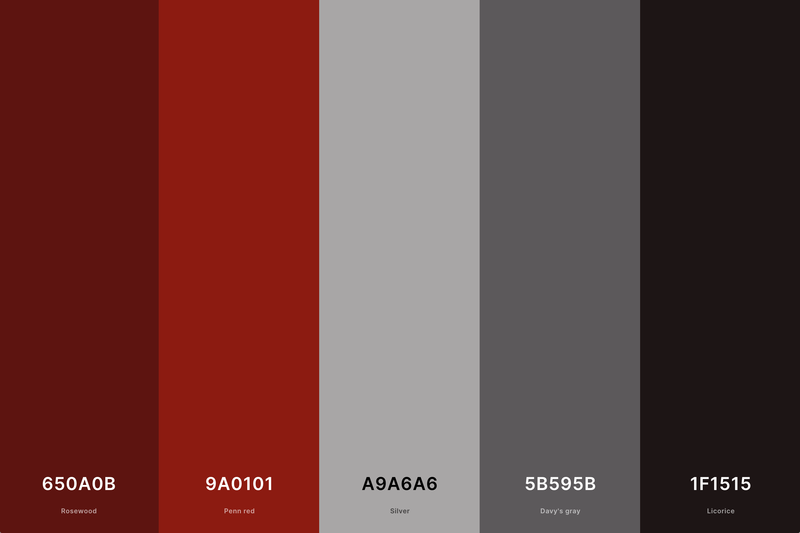
Hex Codes: #650A0B, #9A0101, #A9A6A6, #5B595B, #1F1515
This palette pairs the boldness of red with the neutrality of gray. The red brings vibrancy and energy, while the gray adds a modern, sophisticated touch.
It's a versatile combination that works well in contemporary designs, offering a balance between excitement and understated elegance.
20. Red And Beige Color Palette
Dark Red + Engineering Orange + Champagne Pink + Khaki + Coyote
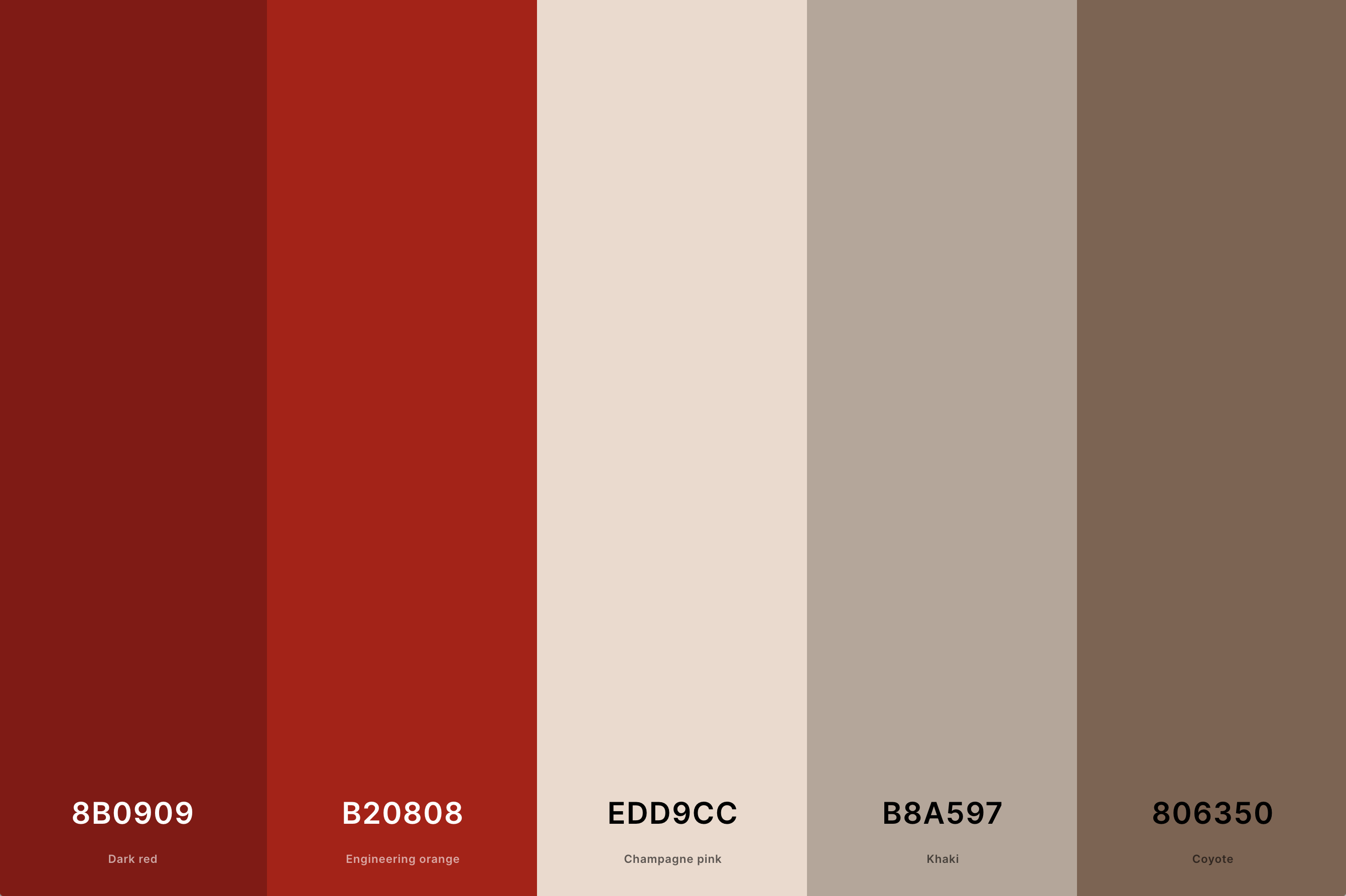
Hex Codes: #8B0909, #B20808, #EDD9CC, #B8A597, #806350
This combination of red with beige brings together the vibrancy of red and the subtlety of beige. Red adds a splash of energy and warmth, while beige provides a calming, neutral backdrop.
This palette is ideal for creating a space that is both lively and relaxing, making it a great choice for home interiors, fashion, and branding that seeks a balance of excitement and understatement.
21. Red, Green And Blue Color Palette
Rojo + Orange Peel + Light Green + Vivid Sky Blue + Dodger Blue
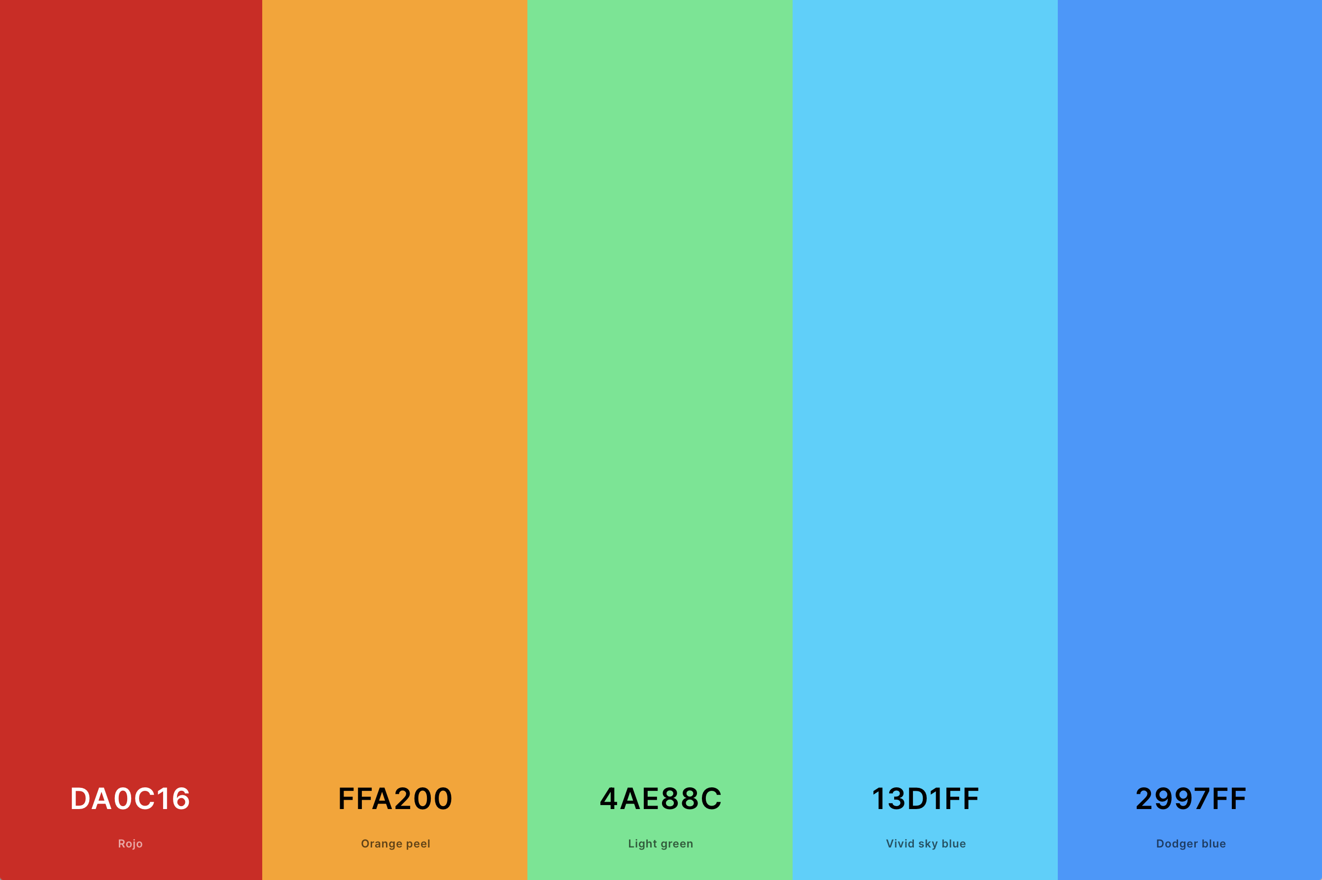
Hex Codes: #DA0C16, #FFA200, #4AE88C, #13D1FF, #2997FF
This triadic palette is vibrant and balanced, with each color bringing a unique aspect. Red adds warmth and energy, green introduces a natural, refreshing feel, and blue provides a sense of calm and stability.
This dynamic combination is perfect for designs that aim to be colorful, energetic, and harmonious, suitable for playful and creative applications.
22. Wine Red Color Palette
Auburn + Burgundy + Wine + Quinacridone Magenta + Raspberry Rose
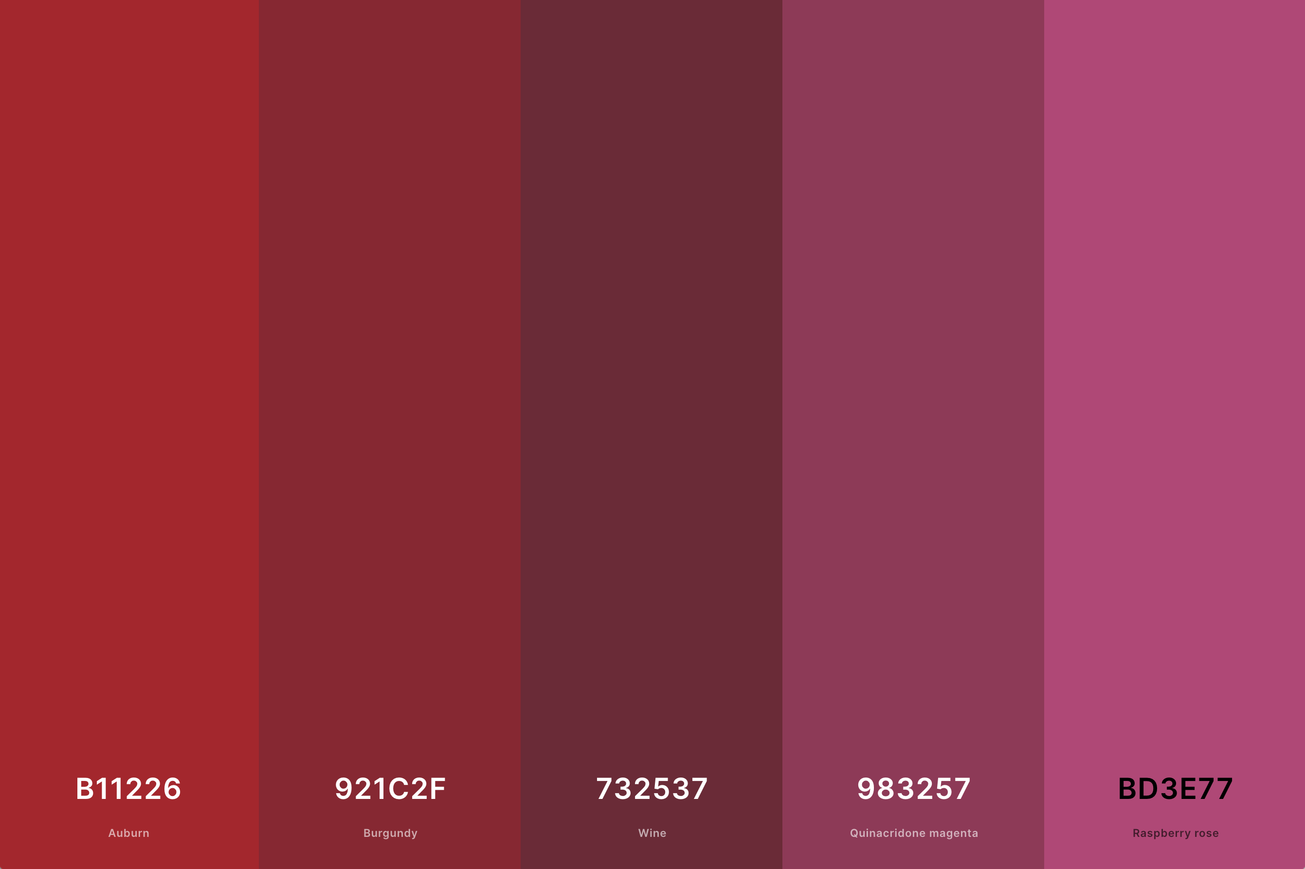
Hex Codes: #B11226, #921C2F, #732537, #983257, #BD3E77
Wine red is a rich, deep shade that evokes luxury and sophistication. This palette typically includes a range of reds reminiscent of various types of wine, from bold burgundies to softer merlots.
It’s perfect for designs that aim to convey elegance, refinement, and a touch of mystery, such as in fine dining, premium branding, or luxury interiors.
23. Aesthetic Color Palette Red
Burgundy + Madder + Cardinal + Folly + Bright Pink (Crayola)
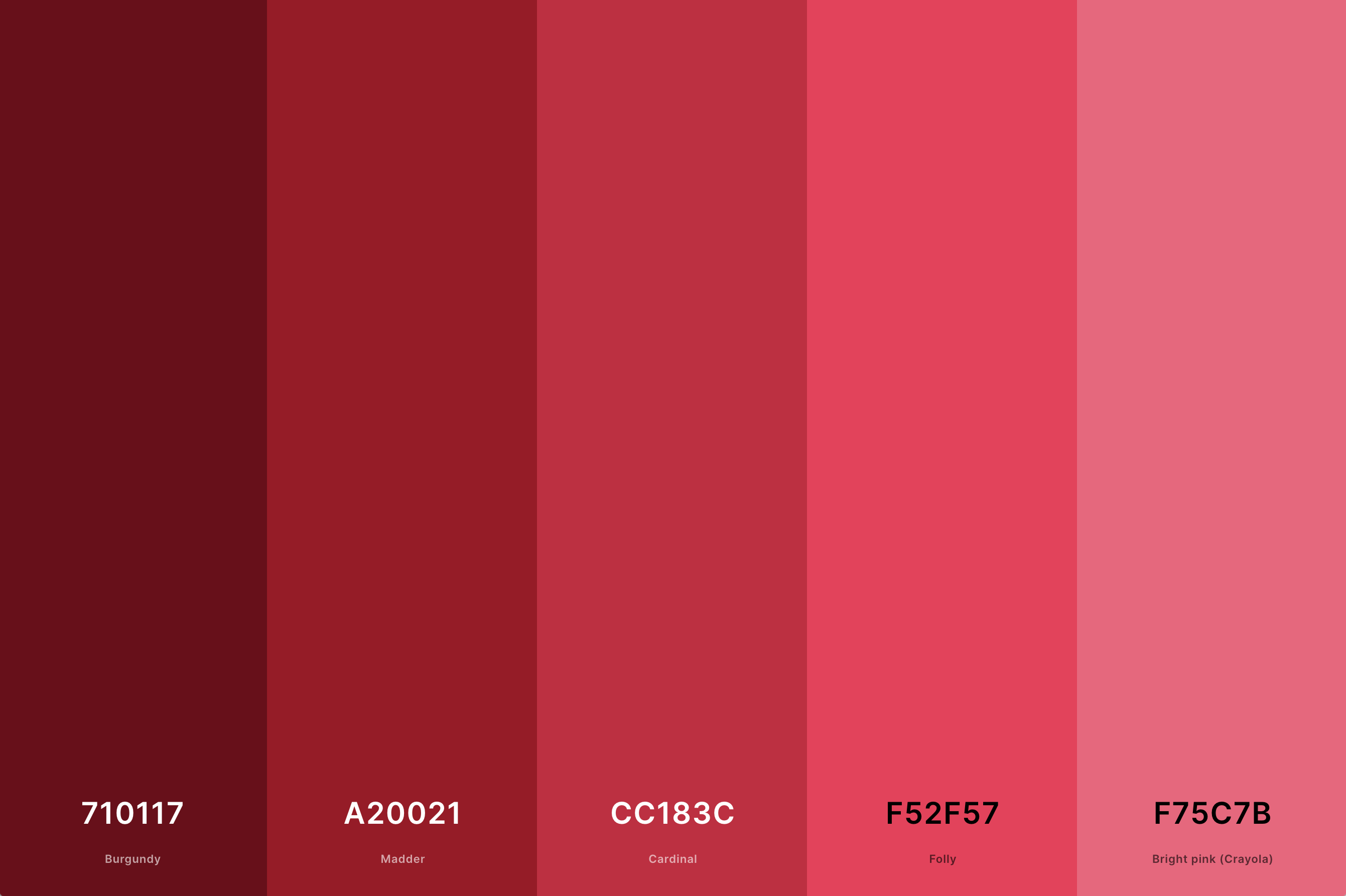
Hex Codes: #710117, #A20021, #CC183C, #F52F57, #F75C7B
This palette focuses on red's more artistic and visually pleasing aspects, combining shades that are both striking and harmonious. It can range from bright, attention-grabbing reds to deeper, more introspective shades.
This versatile palette is excellent for designs that aim to be visually impactful, stylish, and emotionally resonant.
24. Bright Red Color Palette
Rojo + Red (Cmyk) + Folly + Bright Pink (Crayola) + Mimi Pink
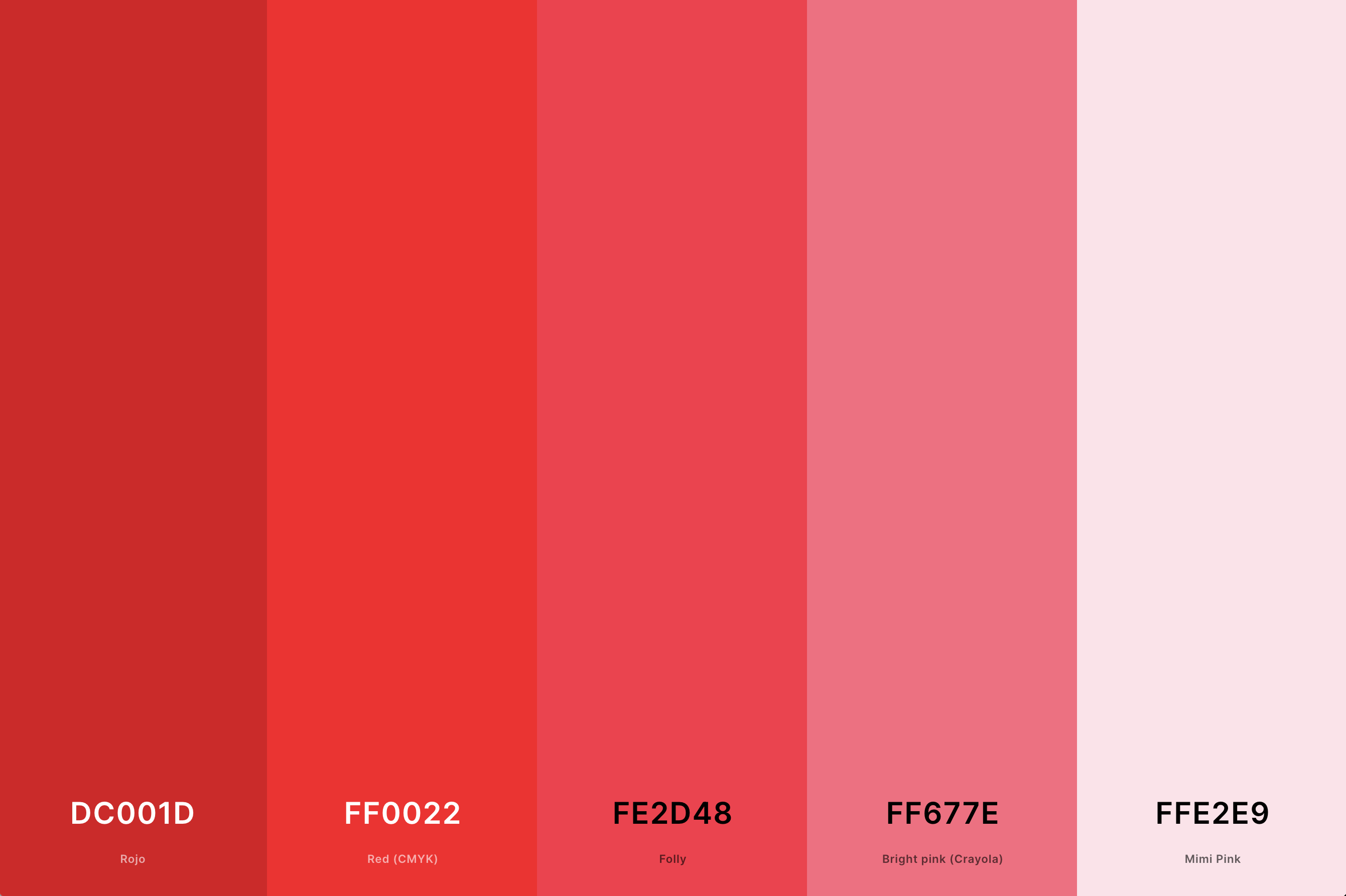
Hex Codes: #DC001D, #FF0022, #FE2D48, #FF677E, #FFE2E9
A palette of bright reds is energetic, bold, and eye-catching. It’s all about capturing attention and conveying a sense of excitement and passion.This palette is perfect for designs that aim to stand out and make a statement, such as in advertising, fashion, and any area where energy and vitality are the main themes.
25. Red And Teal Color Palette
Black Bean + Barn Red + Engineering Orange + Robin Egg Blue + Teal
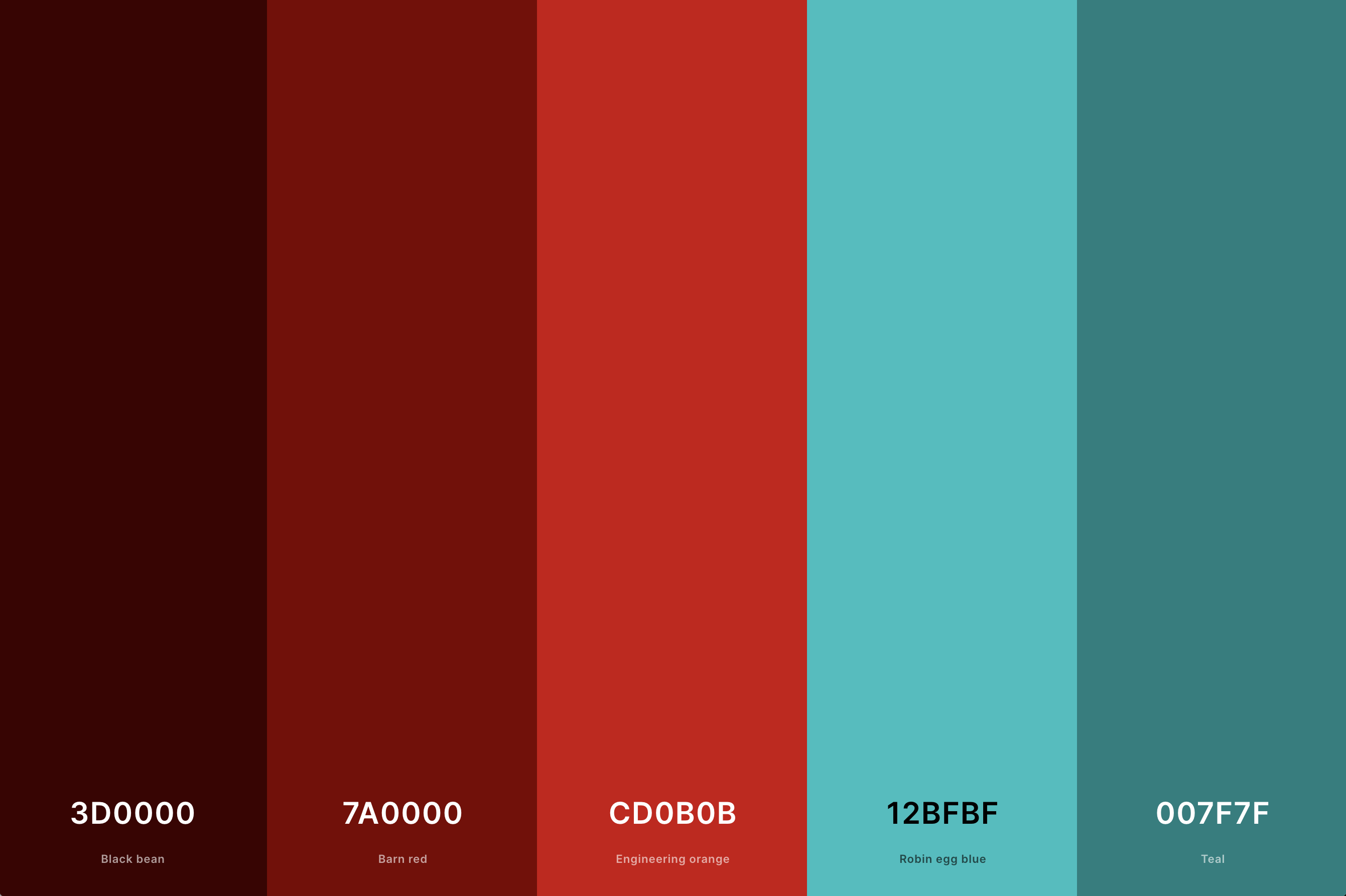
Hex Codes: #3D0000, #7A0000, #CD0B0B, #12BFBF, #007F7F
This palette pairs the warmth of red with the cool freshness of teal. Red brings a sense of energy and passion, while teal adds a calming and rejuvenating effect. he contrast between warm and cool tones makes this palette particularly striking and versatile, suitable for designs that aim to be vibrant and lively, yet balanced and soothing.
26. Christmas Red Color Palette
Carmine + Red (Pantone) + Beige + Cambridge Blue + Dark Green
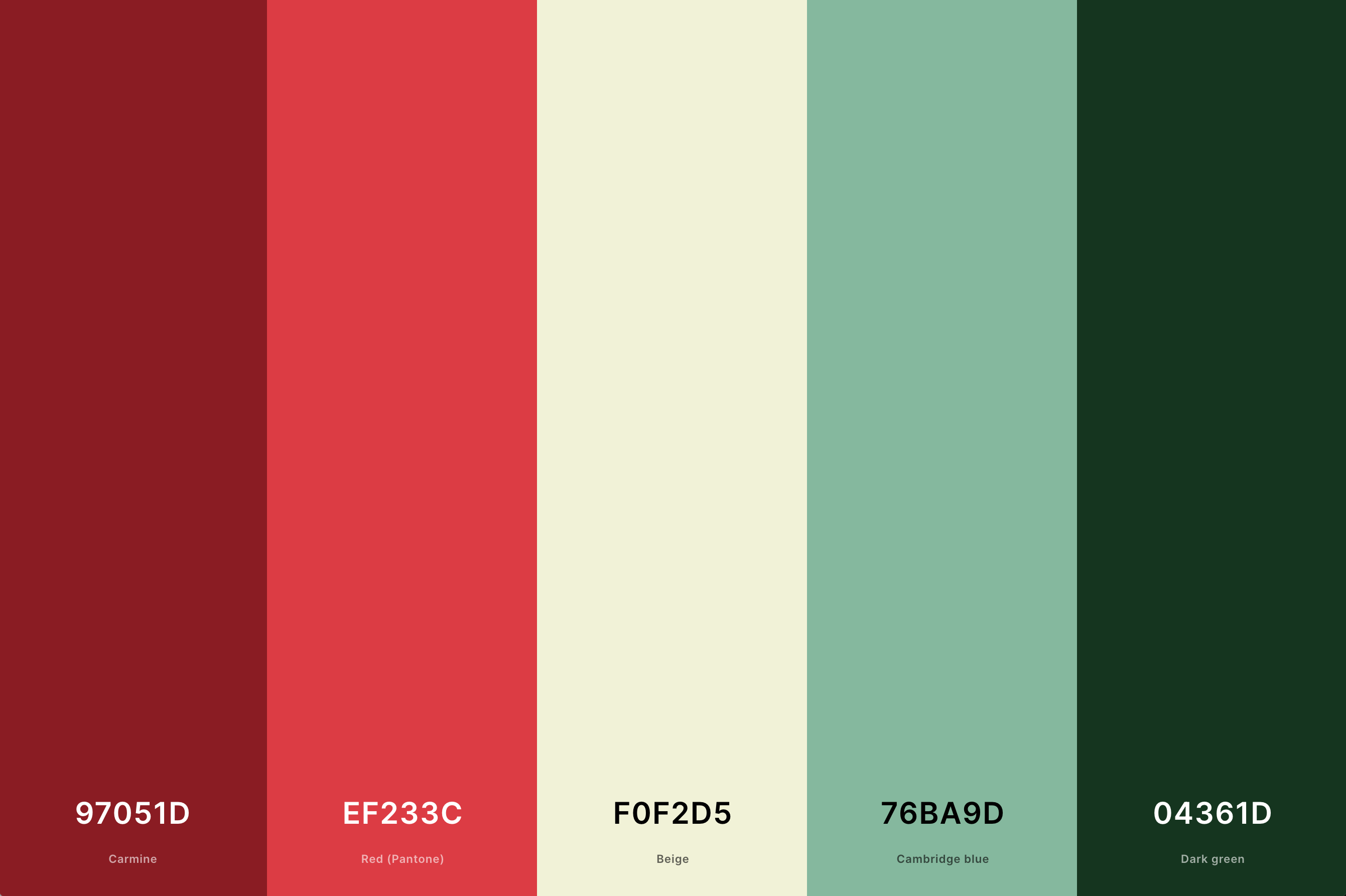
Hex Codes: #97051D, #EF233C, #F0F2D5, #76BA9D, #04361D
This festive palette is centered around the traditional Christmas red, often combined with greens, whites, and golds. The classic red is warm and inviting, evoking feelings of joy and celebration.
It's ideal for seasonal designs, holiday-themed projects, and any setting that aims to create a cozy, festive atmosphere.
27. Muted Red Color Palette
Chocolate Cosmos + Wine + Cordovan + Redwood + Light Coral
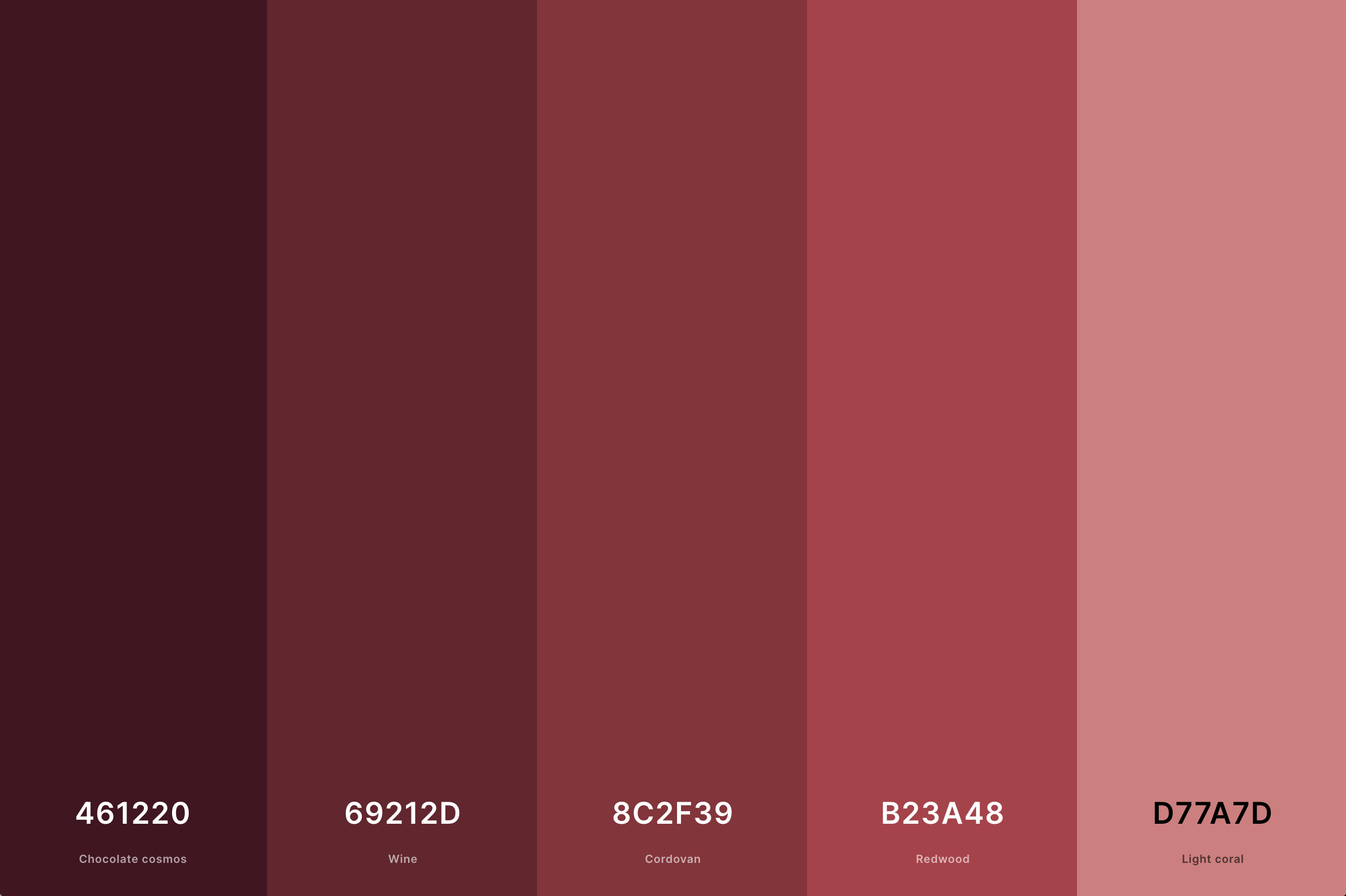
Hex Codes: #461220, #69212D, #8C2F39, #B23A48, #D77A7D
Muted reds are softer and more understated than their brighter counterparts. This palette often conveys a sense of sophistication and subtlety.
The muted tones are versatile and can create a sense of calm warmth, perfect for designs that aim for elegance without overwhelming intensity, such as in minimalist branding or contemporary interiors.
What is the Complimentary Color of Red?
The complimentary color of red, in the world of color theory, is green. This relationship is rooted in the color wheel, where these two colors are positioned directly opposite each other. The magic of this pairing lies in their contrast and balance. Red is a color full of warmth and intensity, often associated with passion and energy. Green, on the other hand, brings a sense of calmness, freshness, and natural tranquility. When these two colors are placed together, they create a visual harmony that is both striking and pleasing to the eye.
In design and art, using red and green together can make each color appear more vivid and pronounced. This combination can be used to great effect in various applications, from graphic design to interior decorating. For instance, in a room setting, red accents in a predominantly green space can add a vibrant pop of energy, while green elements in a red-dominated room can provide a refreshing counterbalance.
It's fascinating how these complementary colors, despite their differences, can enhance each other so beautifully, creating a dynamic and visually stimulating experience. This is the wonder of color theory in action, where opposites not only attract but also bring out the best in each other. 🎨🔴🌿
What Colors Go With Red?
Red is a truly versatile color, capable of harmonizing with a wide array of colors to create diverse and engaging palettes. When paired thoughtfully, red can either take center stage or complement other hues beautifully.
One classic combination is red and white. This pairing is clean and crisp, offering a striking contrast that is both eye-catching and elegant. Red and black is another popular duo, exuding sophistication and a bold, modern vibe. For a more subtle and earthy look, red pairs wonderfully with shades of brown, creating a warm and inviting atmosphere.
In the realm of cooler tones, red and navy blue make for a rich and classic combination, perfect for creating a sense of depth and professionalism. For a more playful and vibrant palette, red can be paired with bright yellows or oranges, evoking a sense of energy and enthusiasm.
For those looking to create a more balanced and harmonious feel, pairing red with its complementary color, green, can be highly effective. This combination is often used in festive decorations but can be refined for use in more sophisticated designs.
Ultimately, the key to successfully pairing colors with red lies in understanding the mood and effect you want to achieve. Whether you're aiming for boldness, elegance, warmth, or vibrancy, red can adapt and complement a wide range of colors to bring your vision to life. 🌈🔴🎨
