This post may contain affiliate links. If you click one, we may earn a commission at no cost to you. Here's more details on how we make money.
Welcome to our vibrant exploration of the world of pink! In this blog post, we're diving into "25+ Best Pink Color Palettes," a must-read for designers, artists, and color enthusiasts.
Pink, a color full of shades that's both versatile and full of expression, can evoke a range of emotions and atmospheres, from the delicate whisper of a pale rose to the unapologetic shout of neon magenta.
Whether you're looking to infuse a touch of romance into a wedding theme, add a burst of energy to a fashion line, or create a calming oasis in an interior space, the right shade of pink can make all the difference.
Each palette in our collection is carefully curated to inspire and ignite your creativity. We will guide you through the dynamic combinations and shades, explaining why each palette works and how it can be utilized effectively in your projects.
Remember, pink blends perfectly with many many colors. Let's unlock the potential of pink in all its glory!
1. Pink And Green Color Palette
Dark Spring Green + Asparagus + Mimi Pink + Amaranth Pink + Rose Pompadour
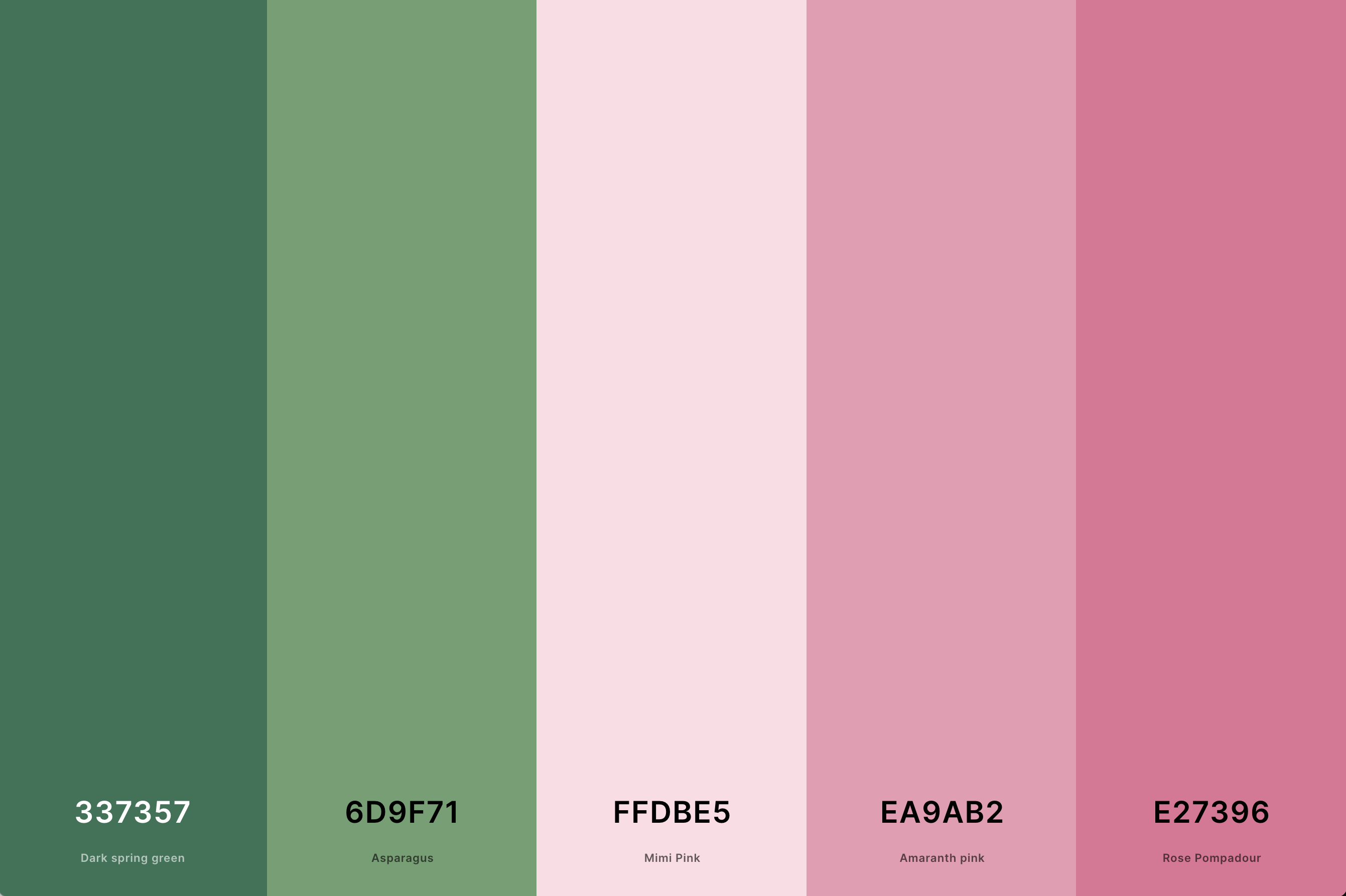
Hex Codes: #337357, #6D9F71, #FFDBE5, #EA9AB2, #E27396
This palette artfully combines the warmth of pink with the freshness of green. It's a harmonious blend that balances the femininity of pink with the natural, grounding elements of green.
This color combination is excellent for designs that aim to be both soothing and uplifting, perfect for spaces that need a touch of both energy and tranquility.
2. Hot Pink Color Palette
Hot Magenta + Steel Pink + Persian Rose + Rose Pink + Lavender Pink
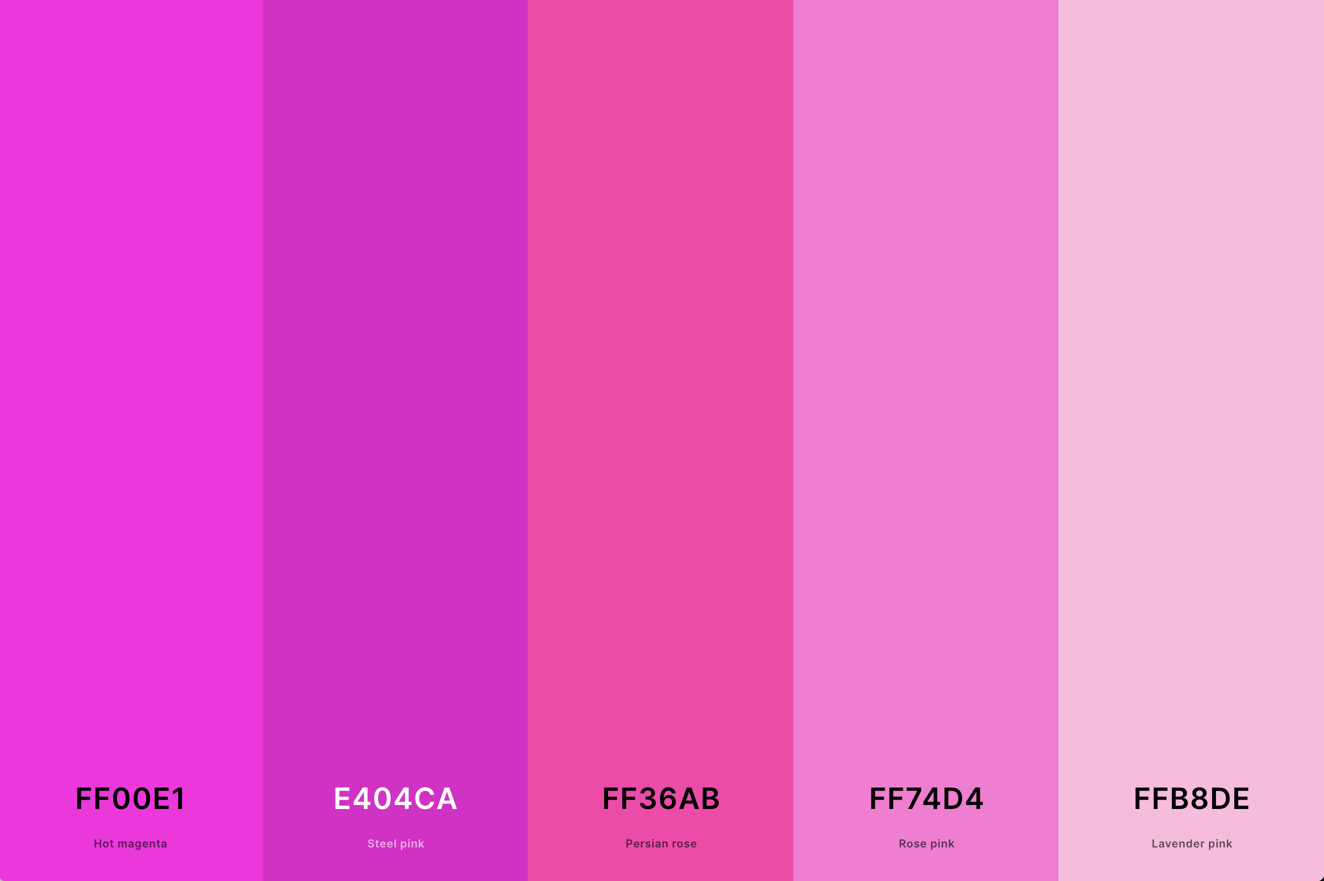
Hex Codes: #FF00E1, #E404CA, #FF36AB, #FF74D4, #FFB8DE
Embodying vibrancy and boldness, the hot pink palette is all about making a statement. This palette usually includes various shades of hot pink, sometimes paired with other vivid colors or tempered with softer pinks.
Ideal for designs that intend to be eye-catching and dynamic, this palette is a favorite in fashion and contemporary art.
Loving pink? Check out our blog post about 100+ best pink iPhone wallpapers! It also has hot pink wallpaper.
3. Light Pink Color Palette
Amaranth Pink + Orchid Pink + Mimi Pink + Misty Rose + Snow
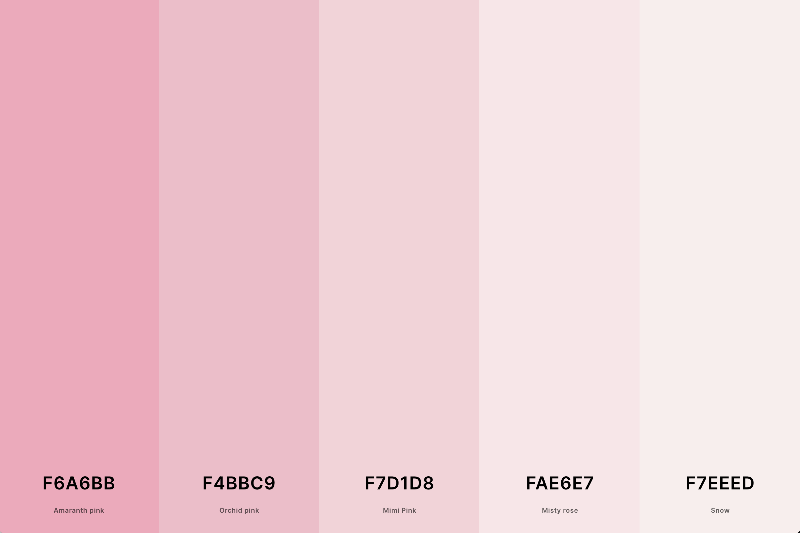
Hex Codes: #F6A6BB, #F4BBC9, #F7D1D8, #FAE6E7, #F7EEED
Soft, delicate, and understated, the light pink palette exudes a sense of calm and gentleness. Often combined with similarly light hues, it creates a feeling of serenity and simplicity.
This palette is perfect for minimalist designs or spaces that aim to evoke a sense of peace and clarity.
4. Pastel Pink Color Palette
Lavender Blush + Mimi Pink + Pink + Cherry Blossom Pink + Amaranth Pink
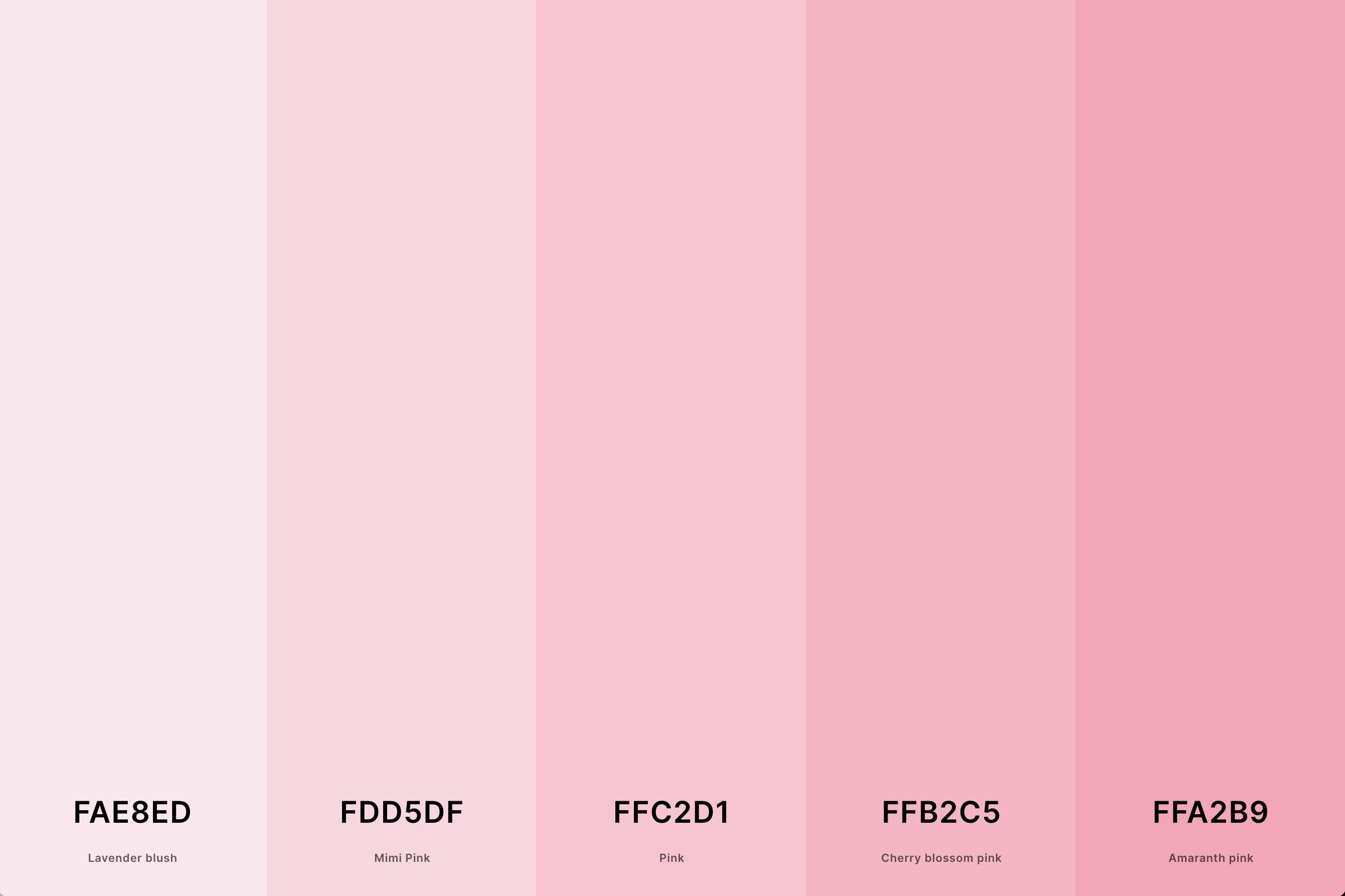
Hex Codes: #FAE8ED, #FDD5DF, #FFC2D1, #FFB2C5, #FFA2B9
Pastel pink palettes are synonymous with softness and sweetness. These palettes often combine various pastel colors, creating a dreamy and romantic vibe.
They work wonderfully in settings that aim for a nostalgic, gentle, and inviting atmosphere, like nurseries or quaint cafes.
5. Pink And Brown Color Palette
Tickle Me Pink + Lavender Pink + Mimi Pink + Beaver + Bole
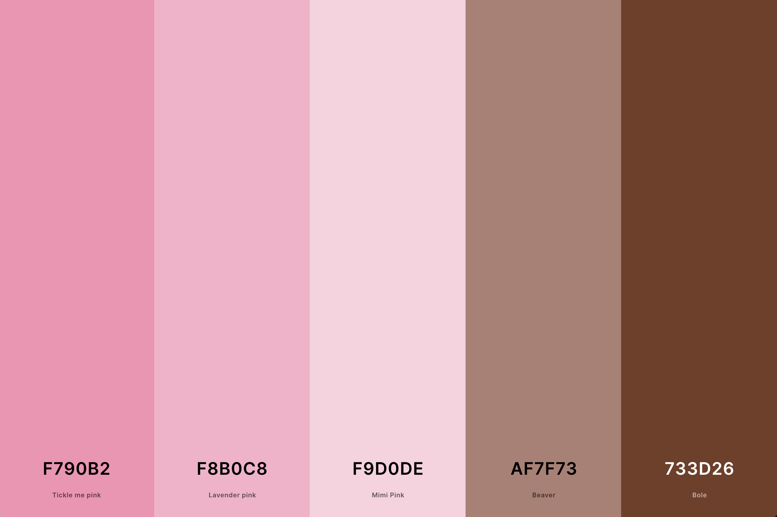
Hex Codes: #F790B2, #F8B0C8, #F9D0DE, #AF7F73, #733D26
This palette brings together the softness of pink with the earthiness of brown. It’s a balanced mix that evokes a sense of warmth and comfort.
The contrast between the delicate nature of pink and the robustness of brown makes this palette versatile and well-suited for cozy, welcoming spaces.
6. Pink And Purple Color Palette
Medium Slate Blue + Lavender (Floral) + Mauve + Carnation Pink + Baker-Miller Pink
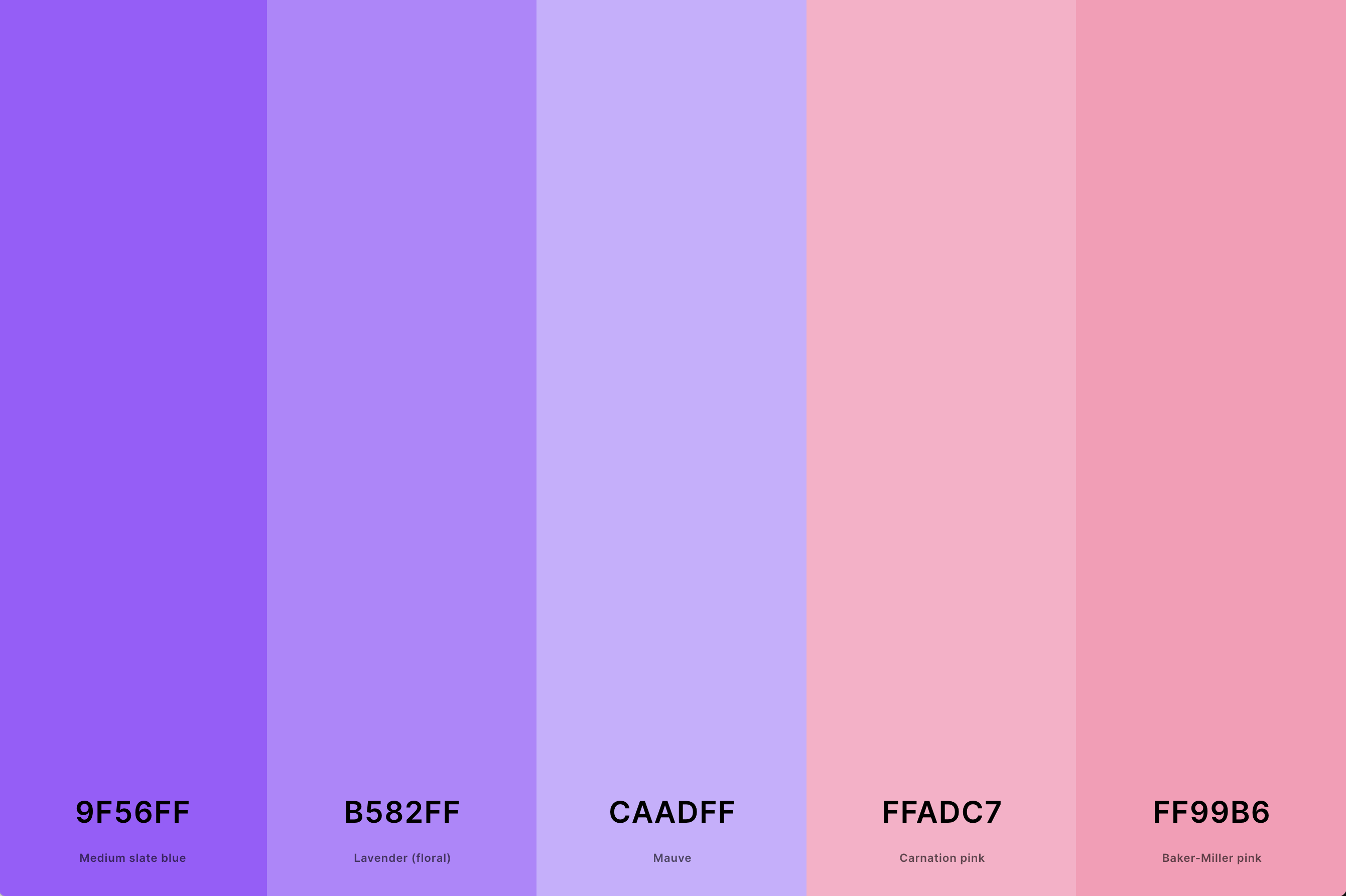
Hex Codes: #9F56FF, #B582FF, #CAADFF, #FFADC7, #FF99B6
This palette merges the playful and sweet aspects of pink with the depth and sophistication of purple. It's a versatile combination that can range from gentle and whimsical to bold and luxurious, depending on the shades chosen.
This palette is excellent for creating an enchanting and imaginative ambiance, perfect for creative spaces or elegant events.
7. Pink And Blue Color Palette
Violet (Web Color) + Plum (Web) + Blue (Crayola) + Vista Blue + Sky Blue
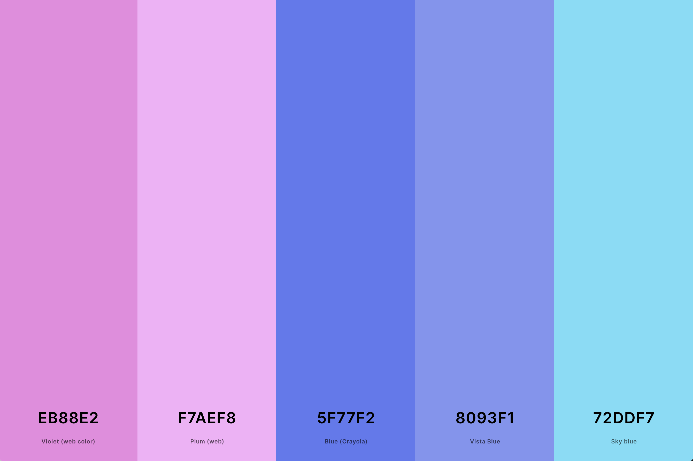
Hex Codes: #EB88E2, #F7AEF8, #5F77F2, #8093F1, #72DDF7
Combining pink and blue results in a palette that is both charming and balanced. The warmth of pink contrasts beautifully with the coolness of blue, creating a visually appealing and harmonious blend.
This palette is ideal for designs that aim to be calming yet vibrant, and it's often used in spaces that cater to relaxation and creativity.
8. Pink And Orange Color Palette
Cyclamen + Cherry Blossom Pink + Fairy Tale + Hunyadi Yellow + Atomic Tangerine
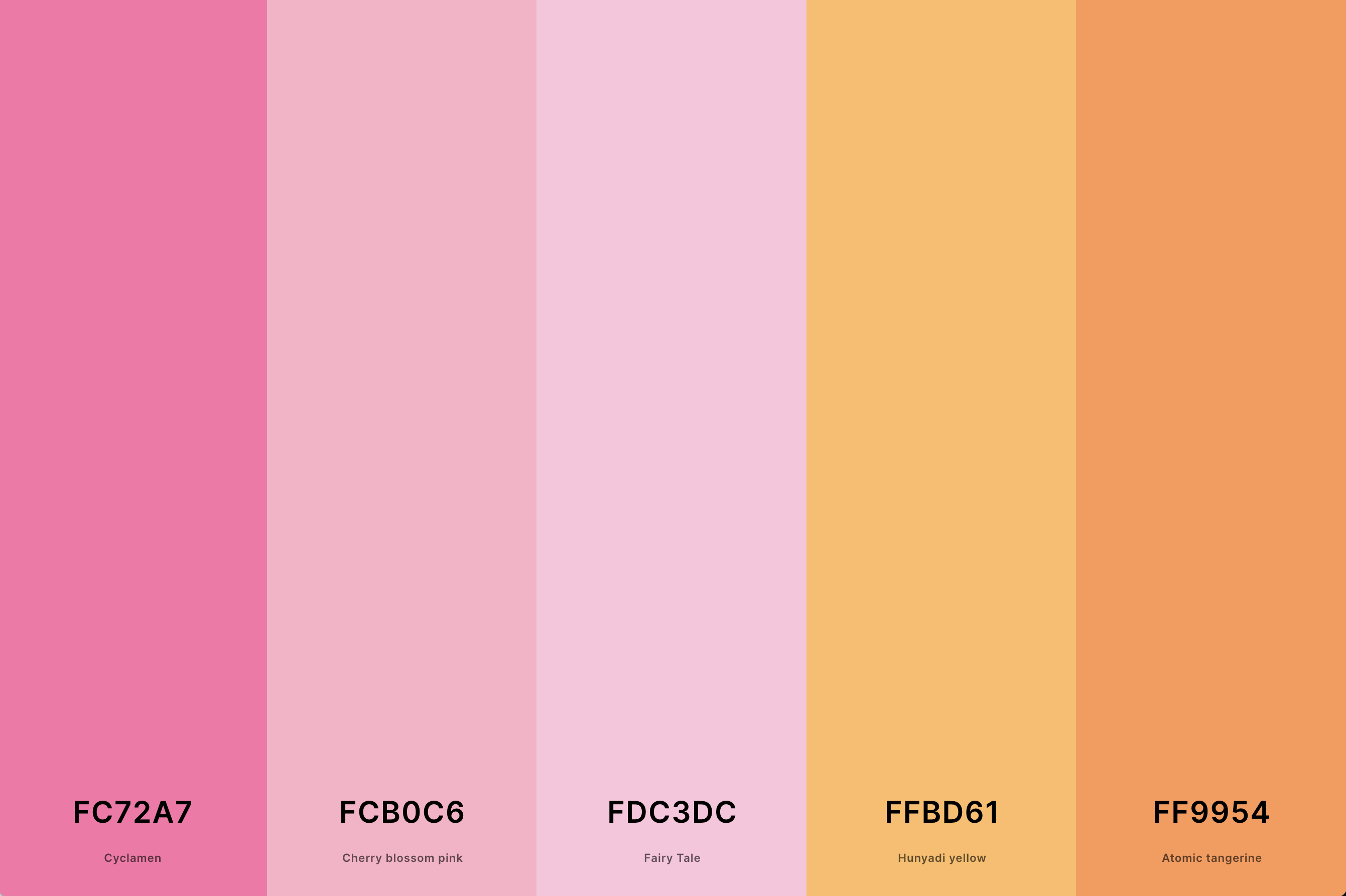
Hex Codes: #FC72A7, #FCB0C6, #FDC3DC, #FFBD61, #FF9954
This is a lively and energetic palette that exudes warmth and joy. Pink and orange together create a tropical, sunny vibe, making it perfect for vibrant, playful designs.
This palette is often used in environments that aim to stimulate positivity and excitement, like fitness centers or youthful fashion.
9. Blush Pink Color Palette
Rosy Brown + Amaranth Pink + Fairy Tale + Mimi Pink + Pale Purple
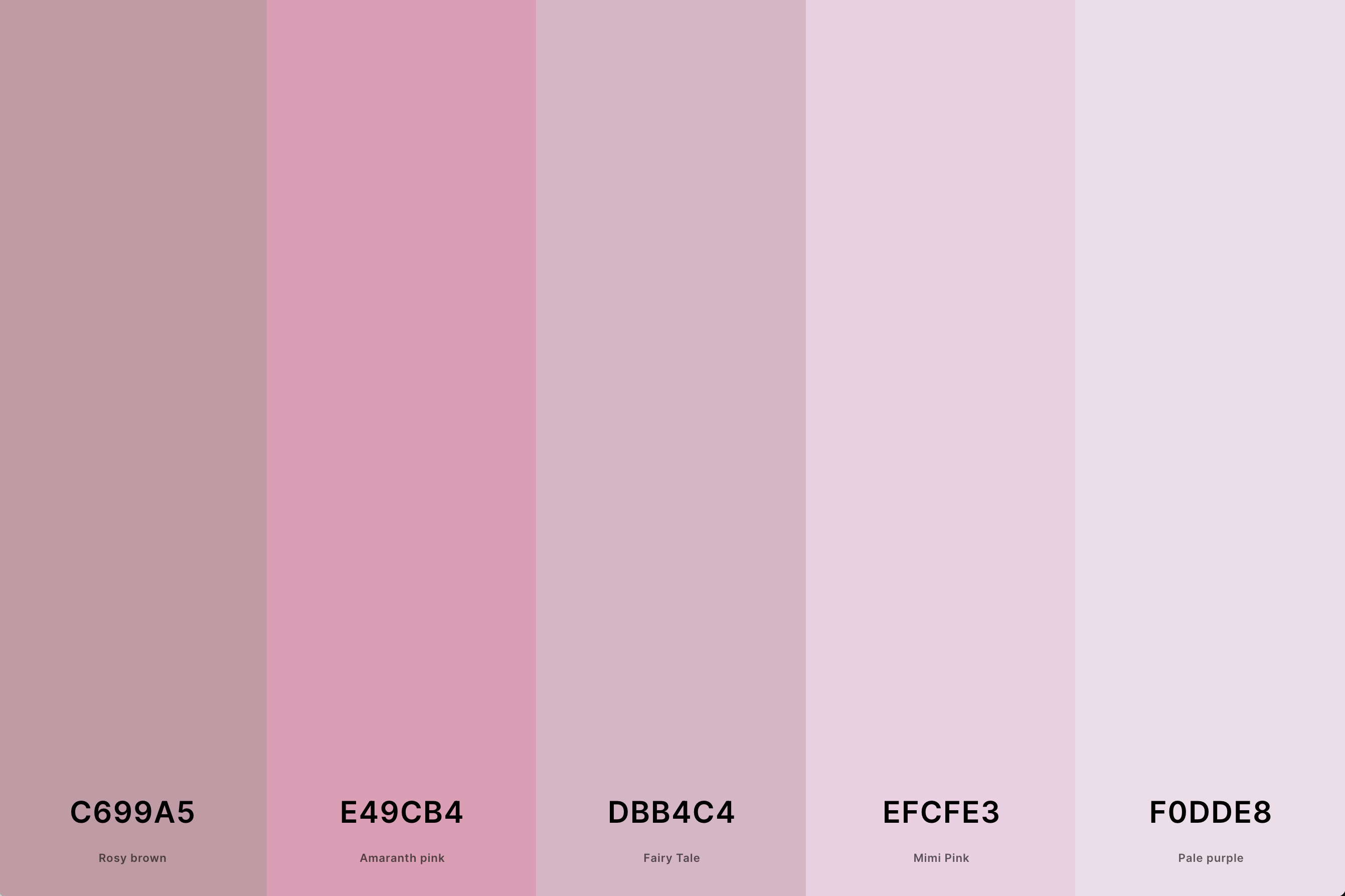
Hex Codes: #C699A5, #E49CB4, #DBB4C4, #EFCFE3, #F0DDE8
Blush pink is all about subtle elegance and sophistication. This palette often includes varying shades of muted pinks, creating a chic and understated look.
It's a popular choice in weddings and interior design, where it adds a touch of softness and refinement without overwhelming the senses.
10. Aesthetic Pink Color Palette
Pale Purple + Mimi Pink + Orchid Pink + Tickle Me Pink + Cyclamen
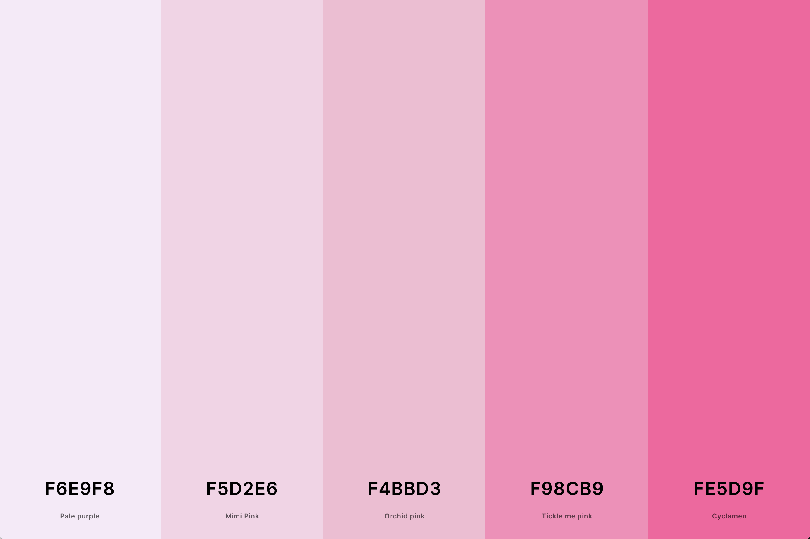
Hex Codes: #F6E9F8, #F5D2E6, #F4BBD3, #F98CB9, #FE5D9F
This palette focuses on creating a visually pleasing and trendy look, often combining various shades of pink with complementary colors to create a cohesive and stylish effect.
This palette is frequently used in modern graphic design, fashion, and interior decor, where it can create a contemporary and fashionable atmosphere.
11. Pink And Red Color Palette
Rose Red + Bright Pink (Crayola) + Bright Pink (Crayola) + Salmon Pink + Cherry Blossom Pink
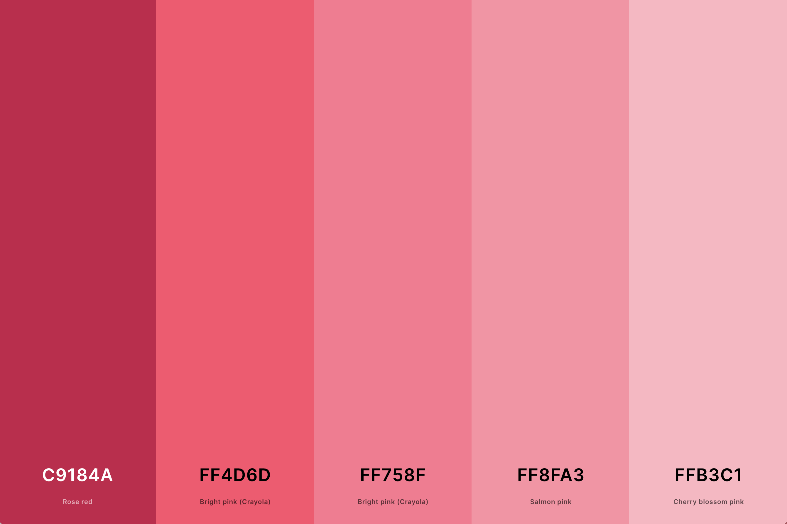
Hex Codes: #C9184A, #FF4D6D, #FF758F, #FF8FA3, #FFB3C1
This palette combines the intensity of red with the sweetness of pink, creating a passionate and dynamic mix. It's a bold choice, often used in designs that want to convey feelings of love, energy, and excitement.
This palette is especially popular around romantic themes and can be used effectively in fashion and advertising to grab attention.
12. Pink And Yellow Color Palette
Cream + Jasmine + Sunglow + Atomic Tangerine + Tickle Me Pink
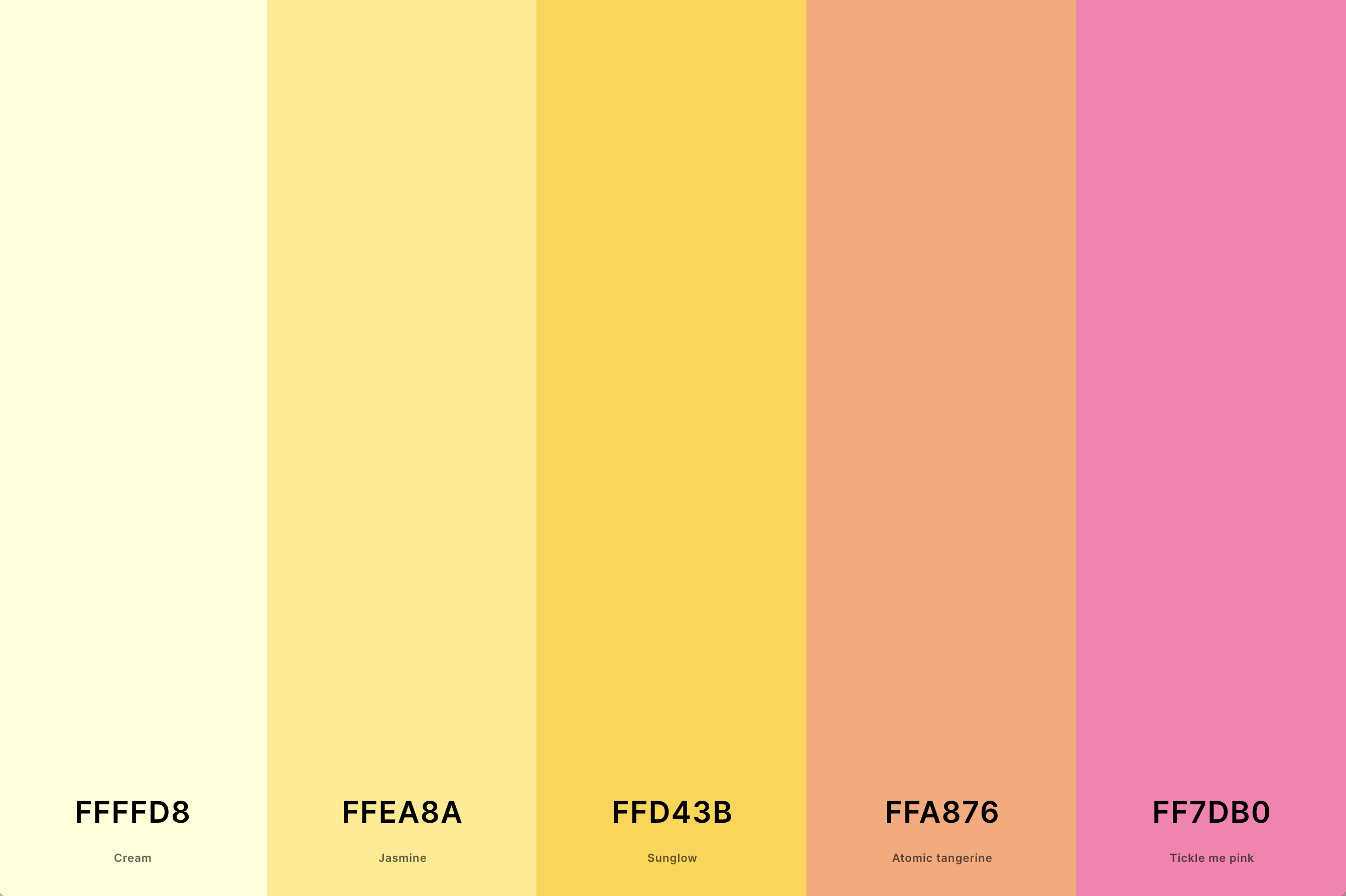
Hex Codes: #FFFFD8, #FFEA8A, #FFD43B, #FFA876, #FF7DB0
Here, the cheerfulness of yellow meets the gentle charm of pink, resulting in a palette full of optimism and joy. It's a sunny, uplifting combination that works well in spaces and designs intended to evoke happiness and warmth.
This palette is particularly effective in spring and summer-themed designs, children's spaces, and casual, fun environments.
13. Bright Pink Color Palette
Magenta Dye + Deep Pink + Hot Magenta + Violet (Web Color) + Mimi Pink
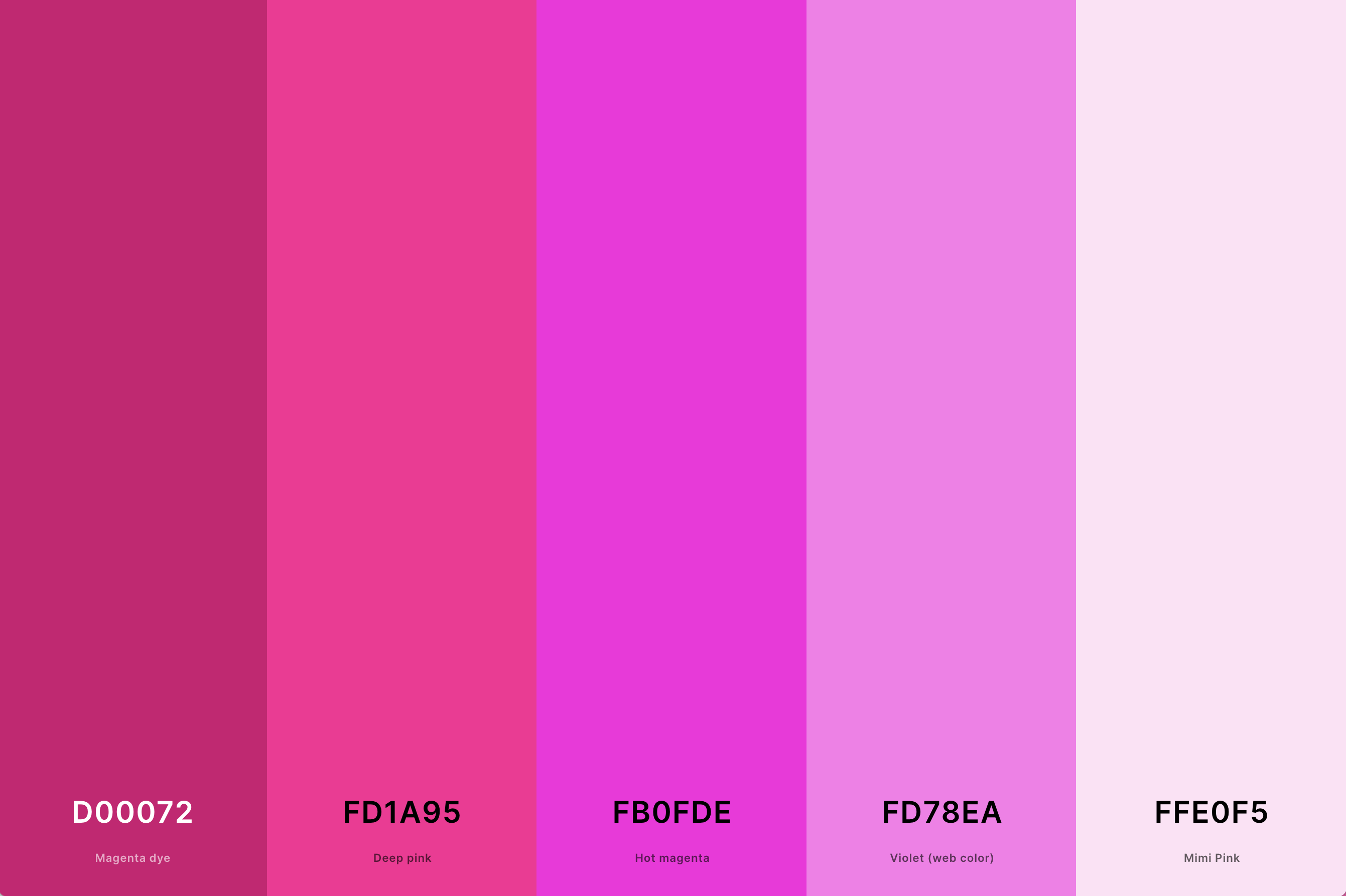
Hex Codes: #D00072, #FD1A95, #FB0FDE, #FD78EA, #FFE0F5
Characterized by its vivacity, the bright pink palette is lively and engaging. It typically includes a range of vivid pink shades, often accented with other equally bright colors.
This palette is excellent for making a bold statement and is commonly used in contexts that aim to be energetic, youthful, and attention-grabbing.
14. Dusty Pink Color Palette
Mountbatten Pink + Puce + Salmon Pink + Cherry Blossom Pink + Tea Rose (Red)
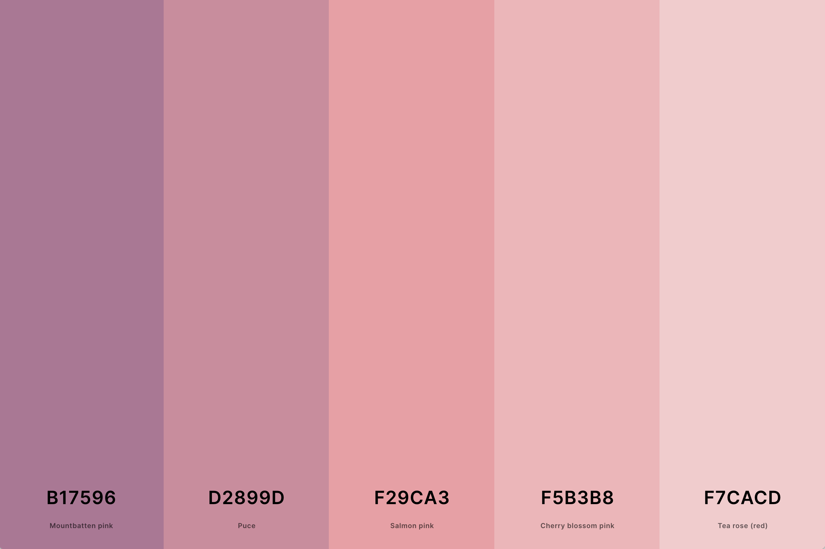
Hex Codes: #B17596, #D2899D, #F29CA3, #F5B3B8, #F7CACD
Dusty pink is a muted, sophisticated version of pink, exuding a vintage charm. This palette often includes softer, subdued shades of pink, which can create a sense of elegance and timelessness.
It's particularly well-suited for interior design, fashion, and branding that aim for a refined, understated look.
15. Pink And Black Color Palette
Eerie Black + Amaranth Purple + French Rose + Cyclamen + Rose Pompadour
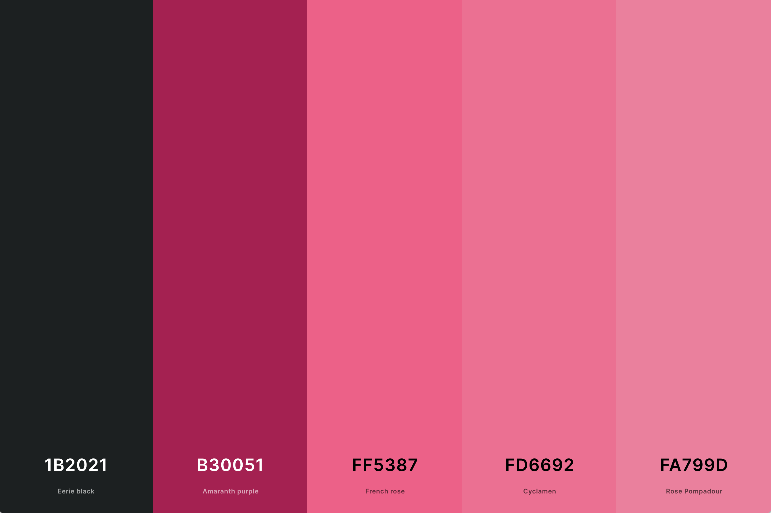
Hex Codes: #1B2021, #B30051, #FF5387, #FD6692, #FA799D
Combining pink with black creates a palette that is both striking and elegant. The contrast between the softness of pink and the boldness of black can produce a visually stunning effect.
This palette is often used in modern design and fashion, where it can convey a sense of sophistication, strength, and contemporary style.
16. Pink And Gold Color Palette
Rose Pompadour + Orchid Pink + Buff + Hunyadi Yellow + Dark Goldenrod
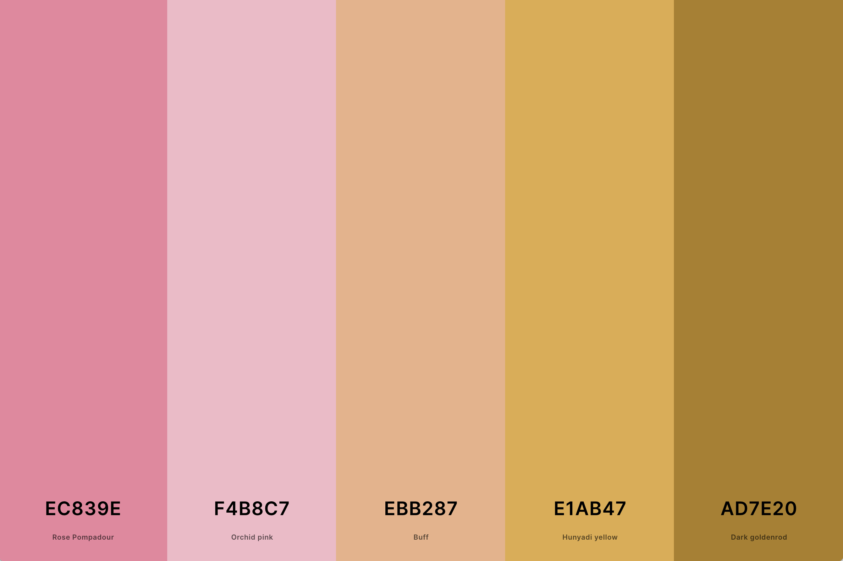
Hex Codes: #EC839E, #F4B8C7, #EBB287, #E1AB47, #AD7E20
This luxurious palette blends the softness of pink with the opulence of gold, creating a rich and elegant combination. Gold adds a touch of glamour and sophistication to the gentleness of pink, making it a popular choice for celebratory and high-end designs.
This palette is often seen in weddings, elegant parties, and upscale branding, where it adds a sense of luxury and refinement.
17. Neon Pink Color Palette
Hot Magenta + Rose Pink + Lavender Pink + Tropical Indigo + Majorelle Blue
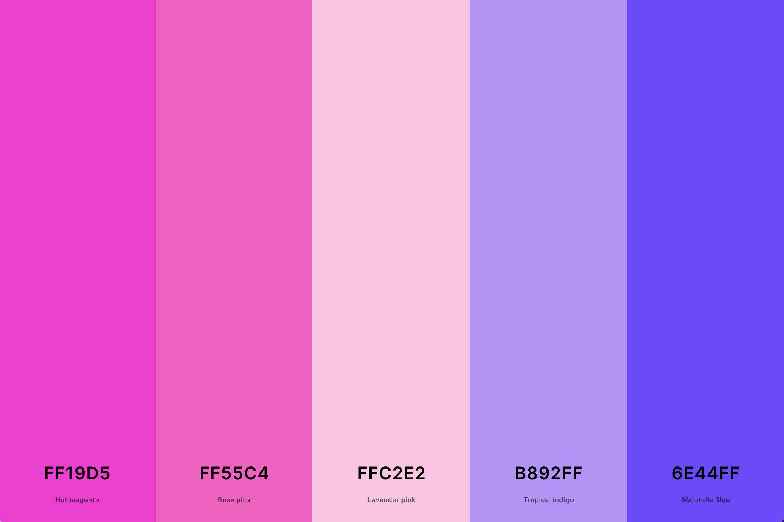
Hex Codes: #FF19D5, #FF55C4, #FFC2E2, #B892FF, #6E44FF
Neon pink is all about vibrancy and energy. This palette usually features highly saturated, bright shades of pink, often combined with other neon colors for a dynamic and electric look.
It's perfect for designs that aim to be modern, youthful, and eye-catching, such as in contemporary art, fashion, and entertainment.
18. Soft Pink Color Palette
Misty Rose + Pink + Cherry Blossom Pink + Amaranth Pink + Baker-Miller Pink
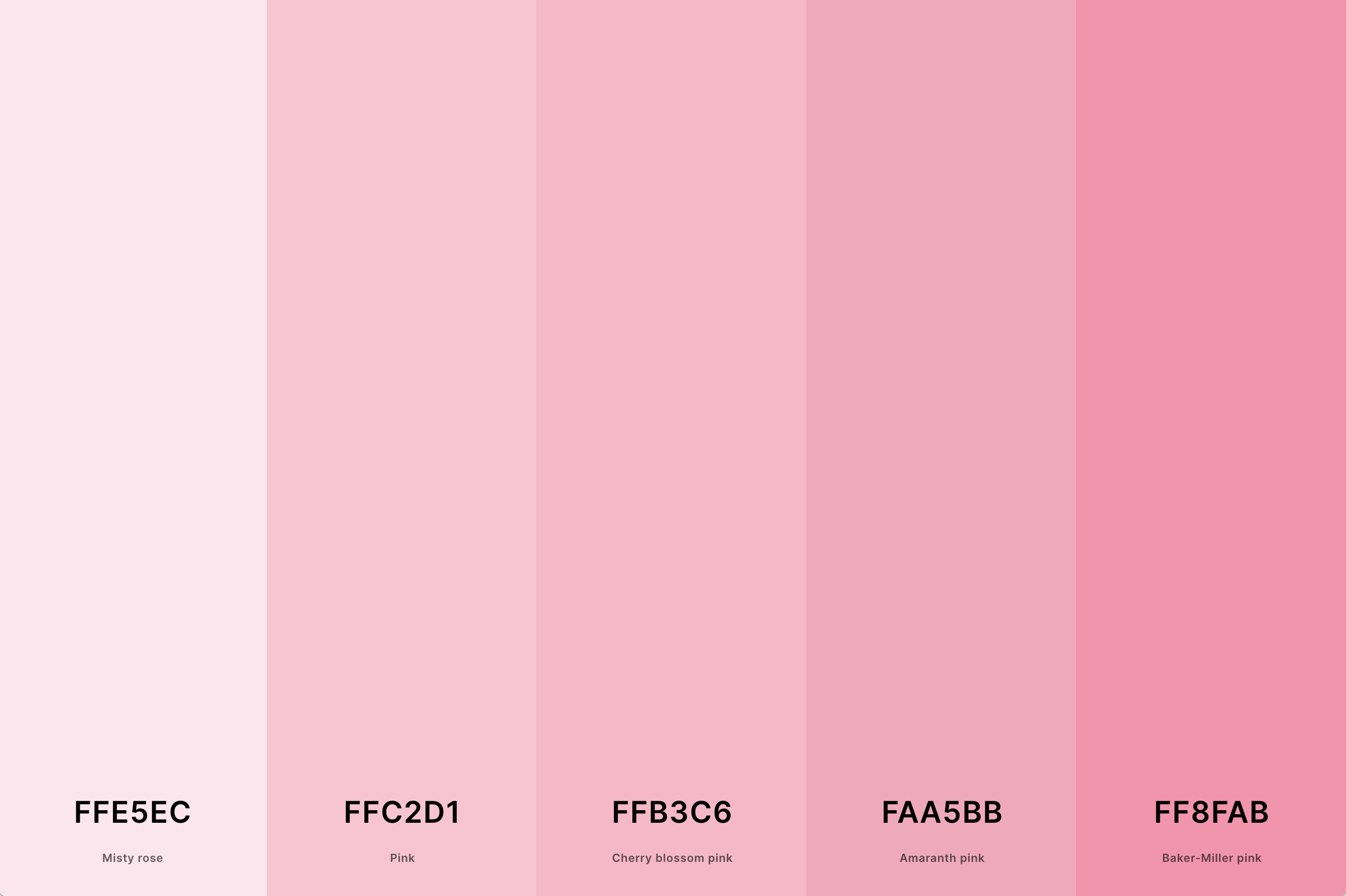
Hex Codes: #FFE5EC, #FFC2D1, #FFB3C6, #FAA5BB, #FF8FAB
Embodying delicacy and subtlety, the soft pink palette is serene and comforting. It typically includes pale, muted pink tones, creating a soothing and gentle visual experience.
Ideal for designs and spaces that seek to foster a calming and nurturing atmosphere, like spas, nurseries, or wellness centers.
19. Dark Pink Color Palette
Black + Dark Purple + Byzantium + Brilliant Rose + Carnation Pink
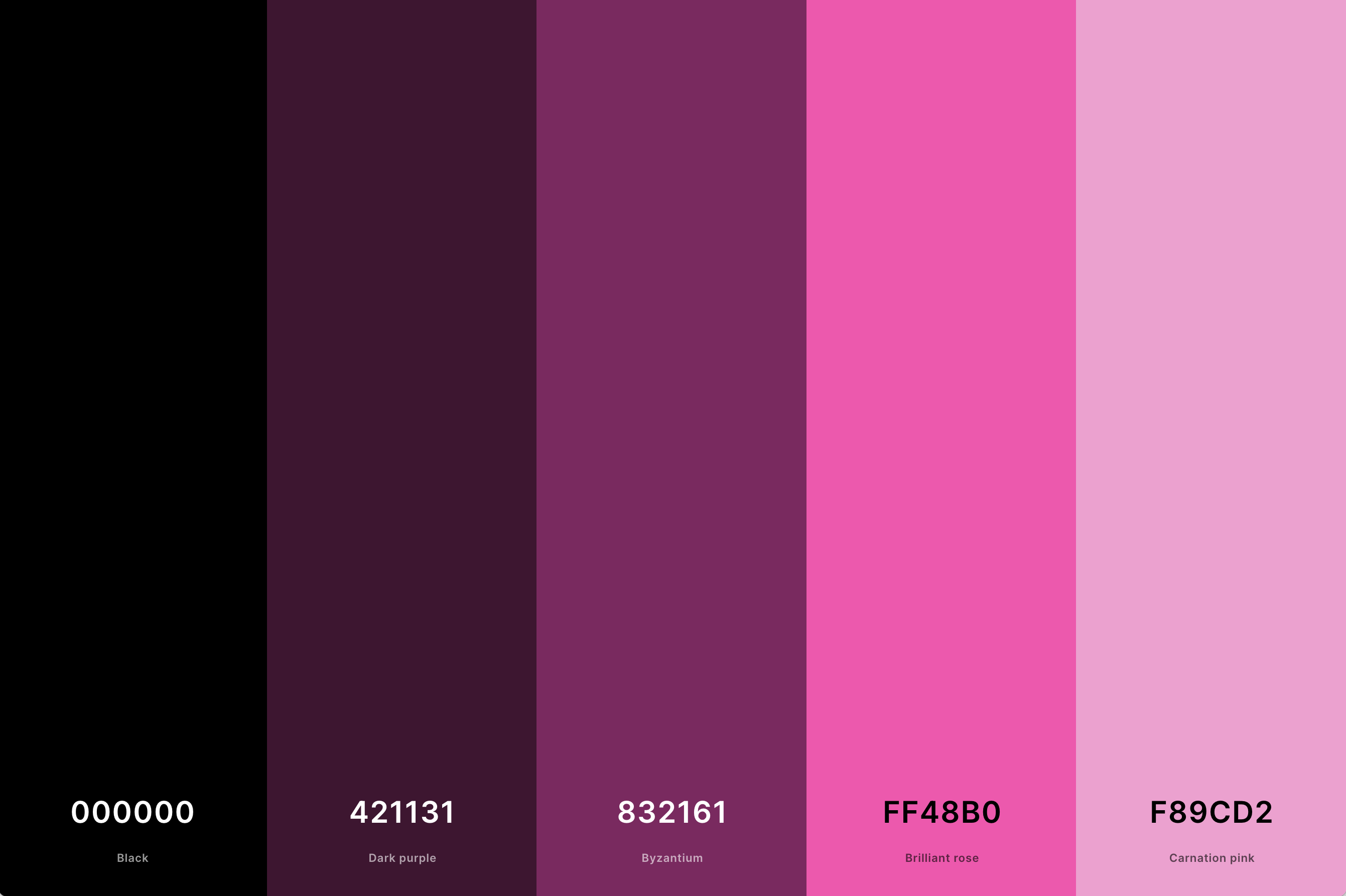
Hex Codes: #000000, #421131, #832161, #FF48B0, #F89CD2
This palette explores the deeper shades of pink, offering a more mature and sophisticated take on the color. It often includes rich, saturated pinks, creating a sense of depth and seriousness.
The dark pink palette is versatile, suitable for elegant interiors, fashion, and graphic design where a stronger, more assertive pink is desired.
20. Neutral Pink Color Palette
Melon + Melon + Salmon Pink + Light Coral + Light Coral
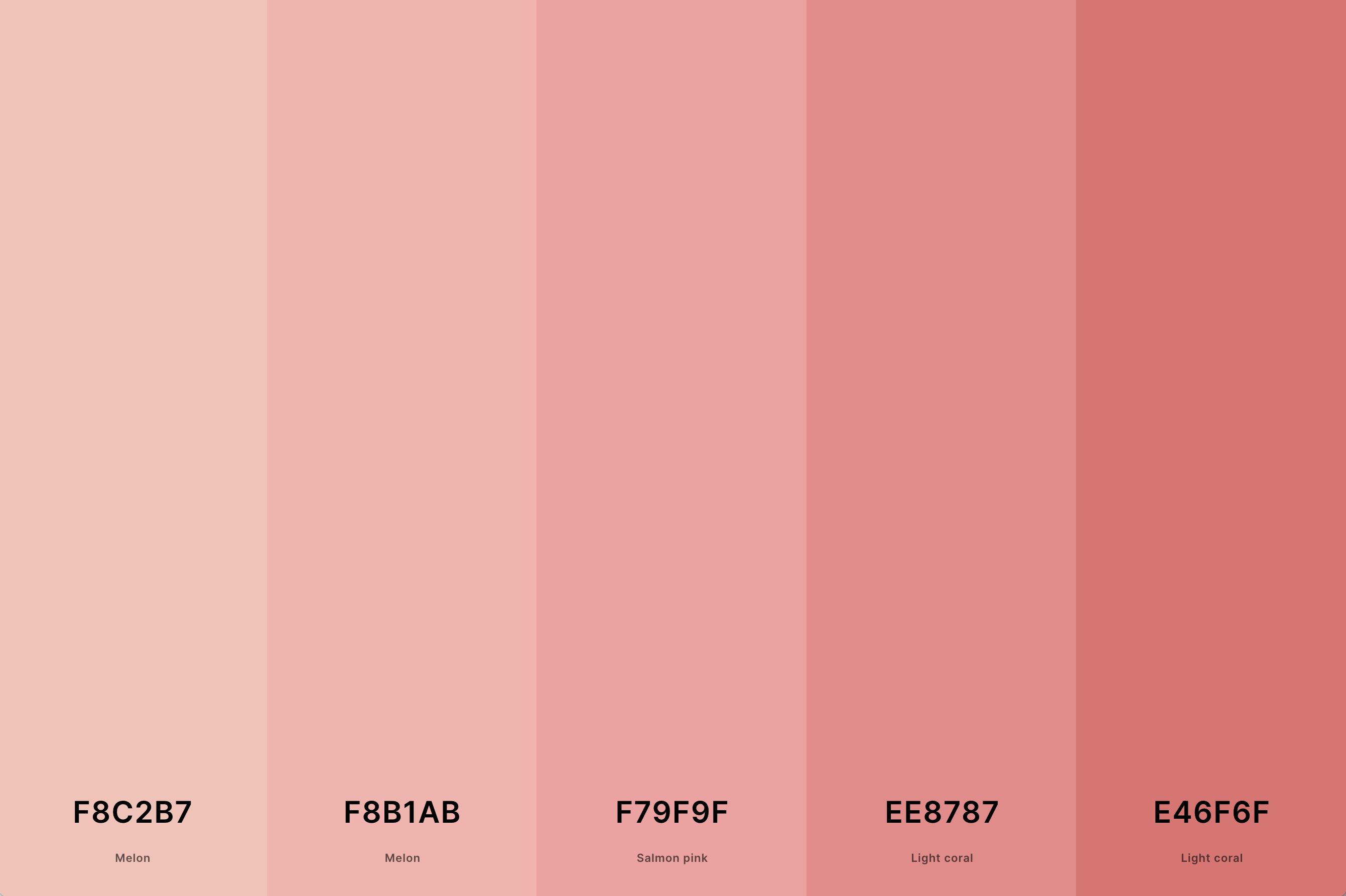
Hex Codes: #F8C2B7, #F8B1AB, #F79F9F, #EE8787, #E46F6F
Combining pink with neutral tones such as beige, gray, or cream, this palette is understated and versatile. The neutrality softens the pink, making it suitable for a wide range of applications, from contemporary interior design to subtle branding and packaging.
This palette is ideal for creating a space or design that is both warm and sophisticated.
21. Pale Pink Color Palette
Orchid Pink + Fairy Tale + Misty Rose + Lavender Blush + Snow
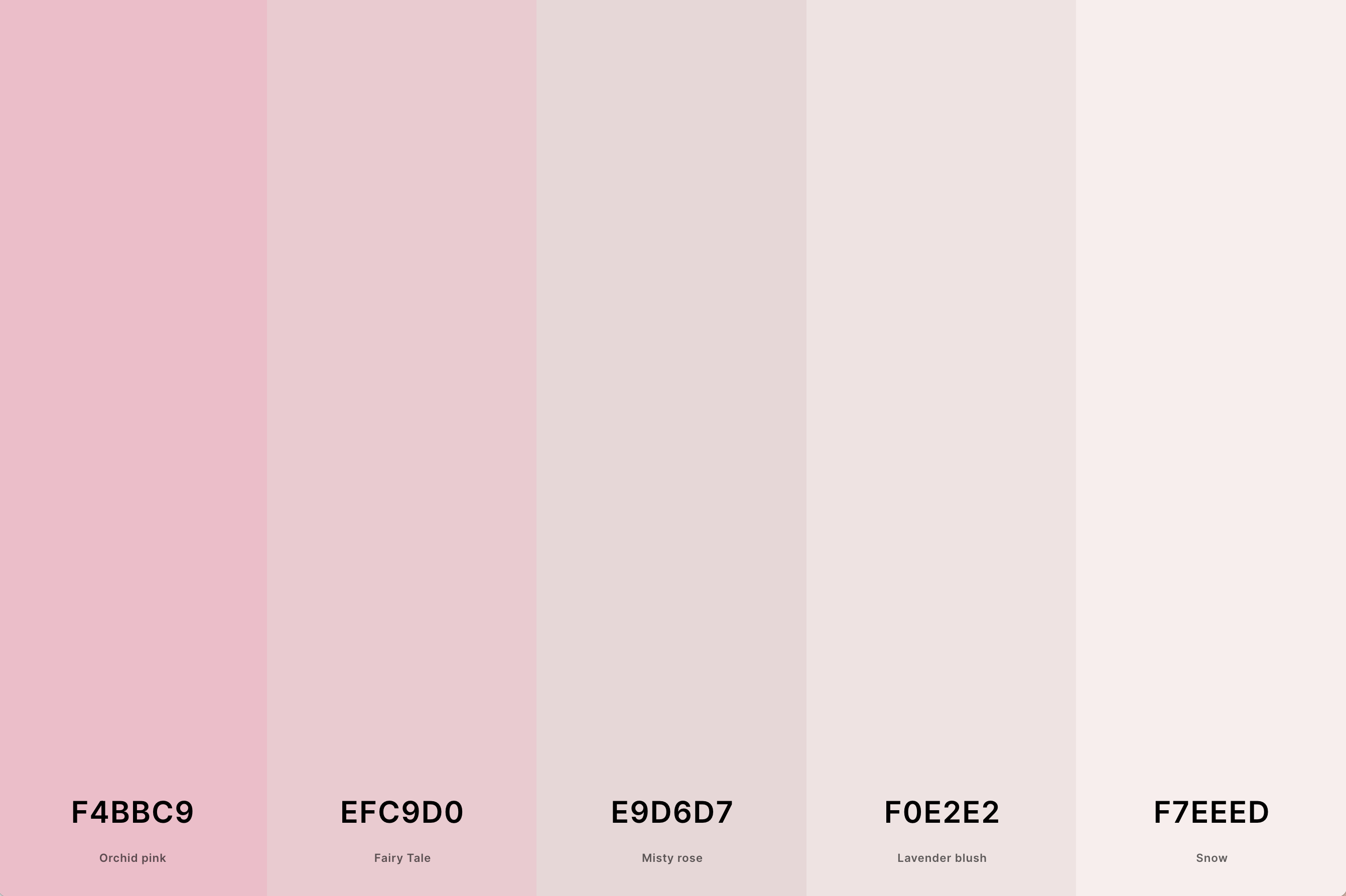
Hex Codes: #F4BBC9, #EFC9D0, #E9D6D7, #F0E2E2, #F7EEED
This palette features light, soft shades of pink that evoke a sense of innocence and tenderness. Pale pink is often paired with other equally subtle hues, creating a delicate and airy feel.
It's an excellent choice for designs that aim to be understated yet charming, making it popular in wedding themes, baby products, and minimalist interiors.
22. Pink And White Color Palette
Cyclamen + Persian Pink + Orchid Pink + Mimi Pink + Pale Purple
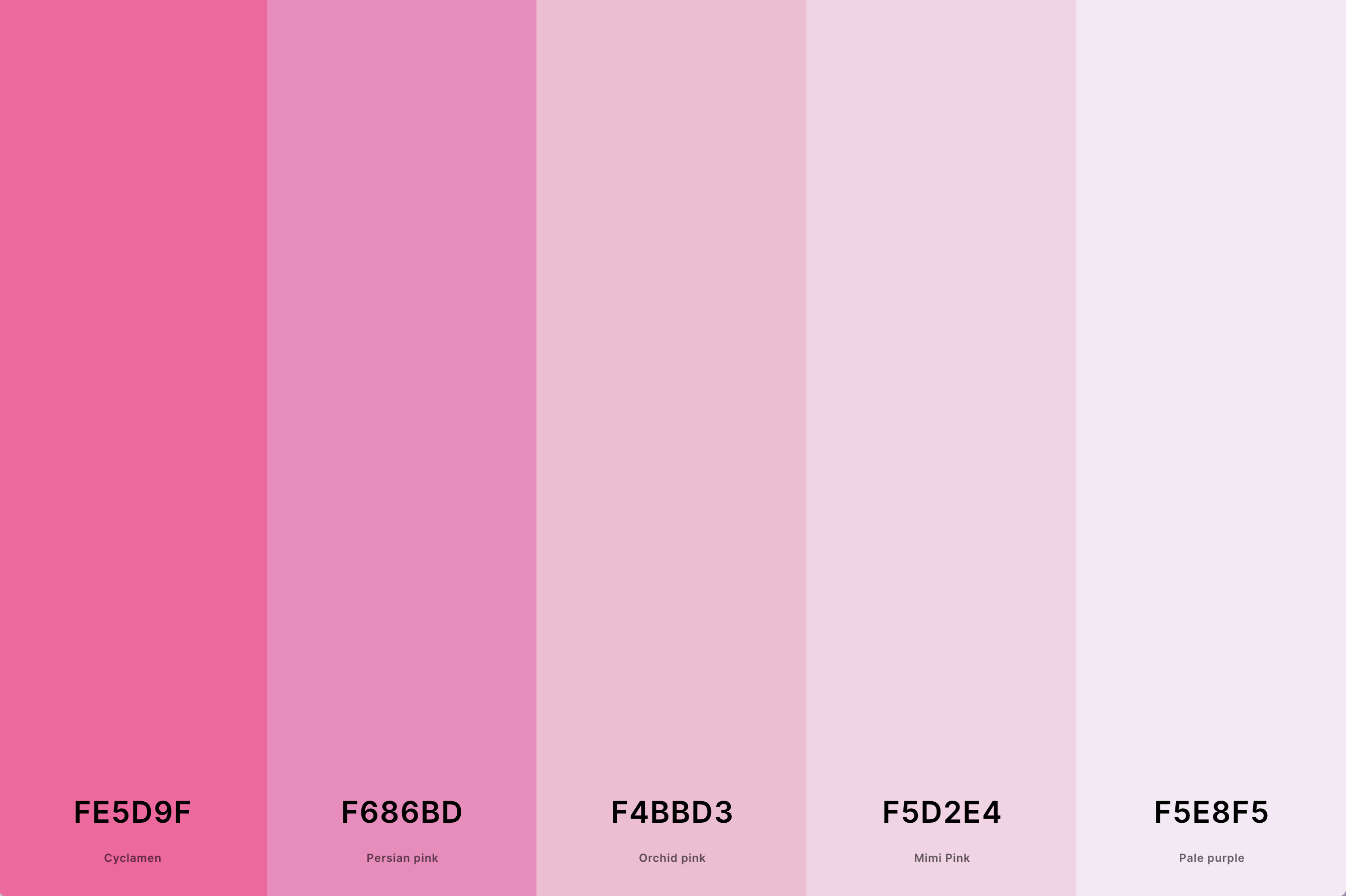
Hex Codes: #FE5D9F, #F686BD, #F4BBD3, #F5D2E4, #F5E8F5
The combination of pink and white creates a clean, fresh, and inviting palette. White adds a sense of purity and simplicity to the warmth of pink, making it a classic choice for designs seeking a gentle, yet crisp aesthetic.
This palette is widely used in healthcare, beauty products, and serene interior spaces.
23. Shades Pink Color Palette
Deep Pink + Persian Rose + Persian Pink + Lavender Pink + Misty Rose
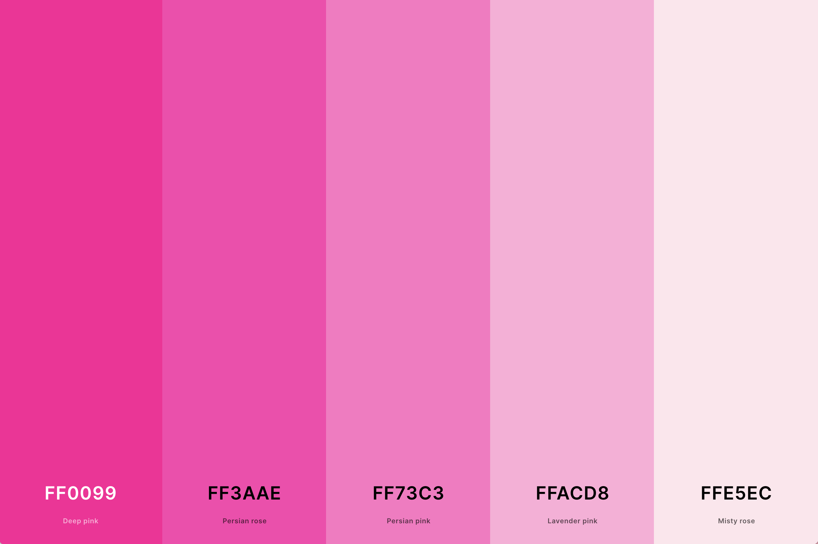
Hex Codes: #FF0099, #FF3AAE, #FF73C3, #FFACD8, #FFE5EC
This palette explores the full spectrum of pink, from the lightest blush to the deepest magenta. The variety within a single color family offers versatility and depth, allowing for a cohesive yet dynamic design.
This monochromatic approach is particularly effective in fashion and interior design, where it can create a rich, layered look.
24. Teal And Pink Color Palette
Mexican Pink + Brilliant Rose + Hot Pink + Teal + Verdigris
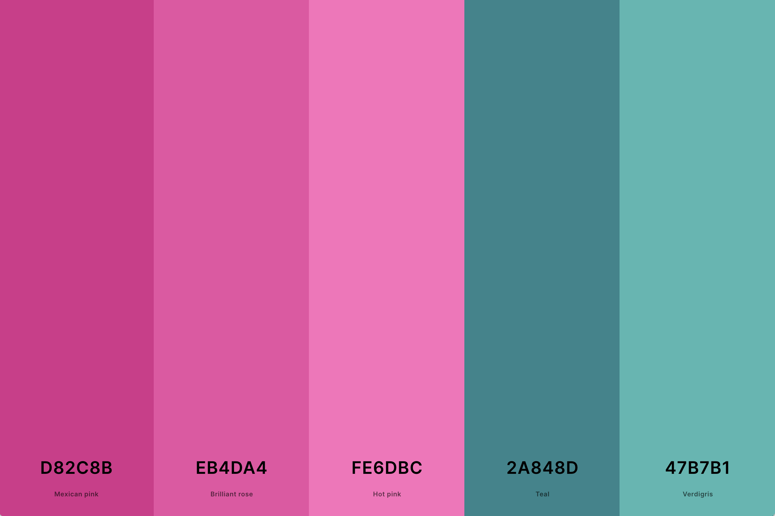
Hex Codes: #D82C8B, #EB4DA4, #FE6DBC, #2A848D, #47B7B1
Teal brings a cool, refreshing contrast to the warmth of pink. This modern and trendy palette combines the tranquil qualities of teal with the playful nature of pink.
It's a popular choice in graphic design, fashion, and contemporary decor, offering a vibrant yet balanced aesthetic.
25. Pink Wedding Color Palette
Amaranth Pink + Fairy Tale + Wisteria + Jordy Blue + Uranian Blue
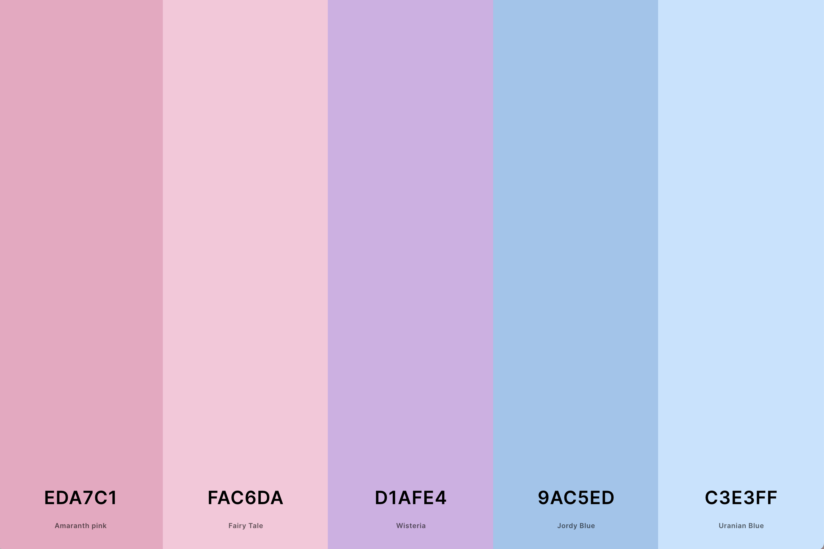
Hex Codes: #EDA7C1, #FAC6DA, #D1AFE4, #9AC5ED, #C3E3FF
A pink wedding palette is the epitome of romance and elegance. It can range from soft and delicate pastels to more vibrant hues, depending on the theme. This palette creates a dreamy, romantic atmosphere, perfect for a wedding day.
It's versatile and can be paired with metallics, greens, or other pastels for a personalized touch.
26. Pink And Grey Color Palette
Dim Gray + Taupe Gray + Lavender Pink + Brilliant Rose + Red Violet
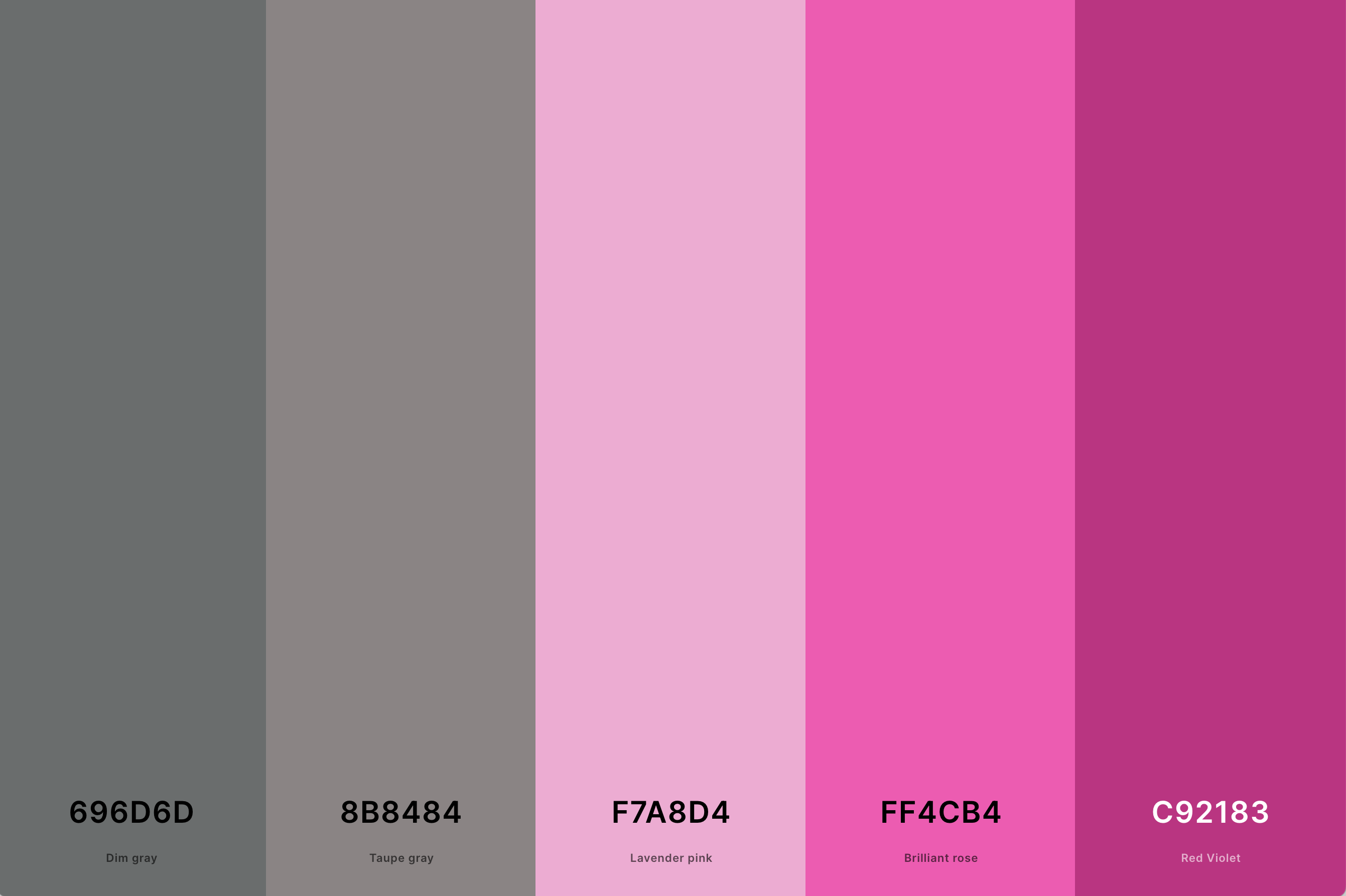
Hex Codes: #696D6D, #8B8484, #F7A8D4, #FF4CB4, #C92183
This palette combines the softness of pink with the sleek, modern feel of grey. Grey adds a sophisticated, contemporary edge to the warmth of pink, creating a balanced and refined look.
This combination is popular in interior design for creating spaces that are both cozy and stylish, and in branding where a touch of elegance and modernity is desired.
27. Rose Pink Color Palette
Lavender Pink + Carnation Pink + Baker-Miller Pink + Tickle Me Pink + Rose Pompadour
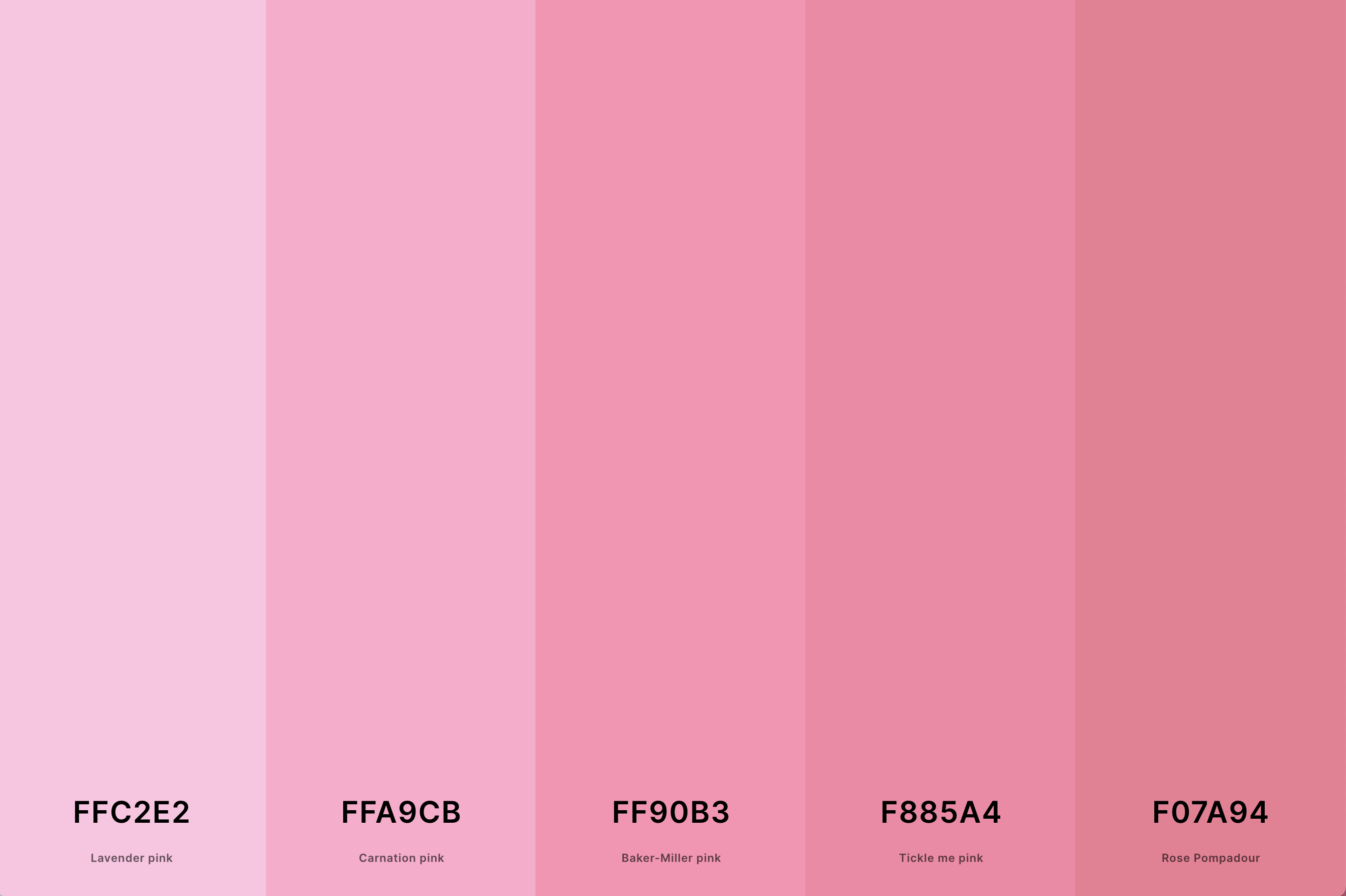
Hex Codes: #FFC2E2, #FFA9CB, #FF90B3, #F885A4, #F07A94
Rose pink is a classic and timeless hue that brings a natural, floral elegance to any palette. This palette often includes various shades of rose, ranging from soft, almost pastel tones to deeper, more vibrant variations.
It's a versatile choice that exudes romance and sophistication, making it perfect for fashion, floral designs, and elegant branding.
What is the Complimentary Color to Pink?
The complimentary color to pink in color theory is a shade of green. This might come as a surprise since pink often evokes images of soft, delicate themes, while green is more associated with nature and vitality. However, it's precisely this contrast that makes the combination so compelling and visually appealing.
Let's delve a bit deeper into why this works. Pink is essentially a lighter shade of red, and according to the color wheel, the complementary color to red is green. When we apply this principle to pink, a softer, lighter green emerges as its perfect counterpart. This particular shade of green balances the warmth of pink with its own cool, soothing presence. The result is a harmonious and eye-catching contrast that can energize or soften a design, depending on the shades and tones used.
In design, using pink and its complementary green can create a dynamic and balanced look. Think of a blush pink paired with a muted sage green - it’s perfect for a natural, understated elegance. Or, imagine a vibrant hot pink with a bright emerald green for a bold, energetic vibe. This combination can be applied in various fields, from fashion and interior design to graphic design and art, demonstrating the versatility and impact of understanding complementary colors.
What Colors Go With Pink?
When it comes to pairing colors with pink, the possibilities are as vast as they are exciting. Pink is a surprisingly versatile hue that can play well with a multitude of colors, creating a range of atmospheres from bold and energetic to soft and serene.
Firstly, let's consider the classic combinations. Pink and white create a clean, innocent, and fresh look, perfect for airy and light spaces or minimalist designs. Pink and grey offer a more mature, sophisticated vibe, blending the softness of pink with the contemporary edge of grey.
For something bolder and more dynamic, pair pink with green. As we know, green is the complementary color to pink, and this pairing can bring a lively contrast to any design. Bright pinks with dark greens create a vibrant, eye-catching look, while softer pinks with muted greens are perfect for a more understated elegance.
Don't shy away from unconventional pairings either. Pink and orange can evoke a fun, playful, and energetic feel, ideal for designs that aim to stand out. Similarly, pink and blue can result in a harmonious blend of warm and cool tones, suitable for both youthful and mature designs.
Lastly, consider monochromatic schemes with different shades of pink. This approach creates a cohesive, sophisticated, and chic look, proving that sometimes staying within one color family can be just as striking as mixing multiple colors.
In essence, whether you're designing a fashion line, decorating a room, or crafting a brand identity, understanding the compatibility of pink with other colors can open up a world of creative possibilities.
