This post may contain affiliate links. If you click one, we may earn a commission at no cost to you. Here's more details on how we make money.
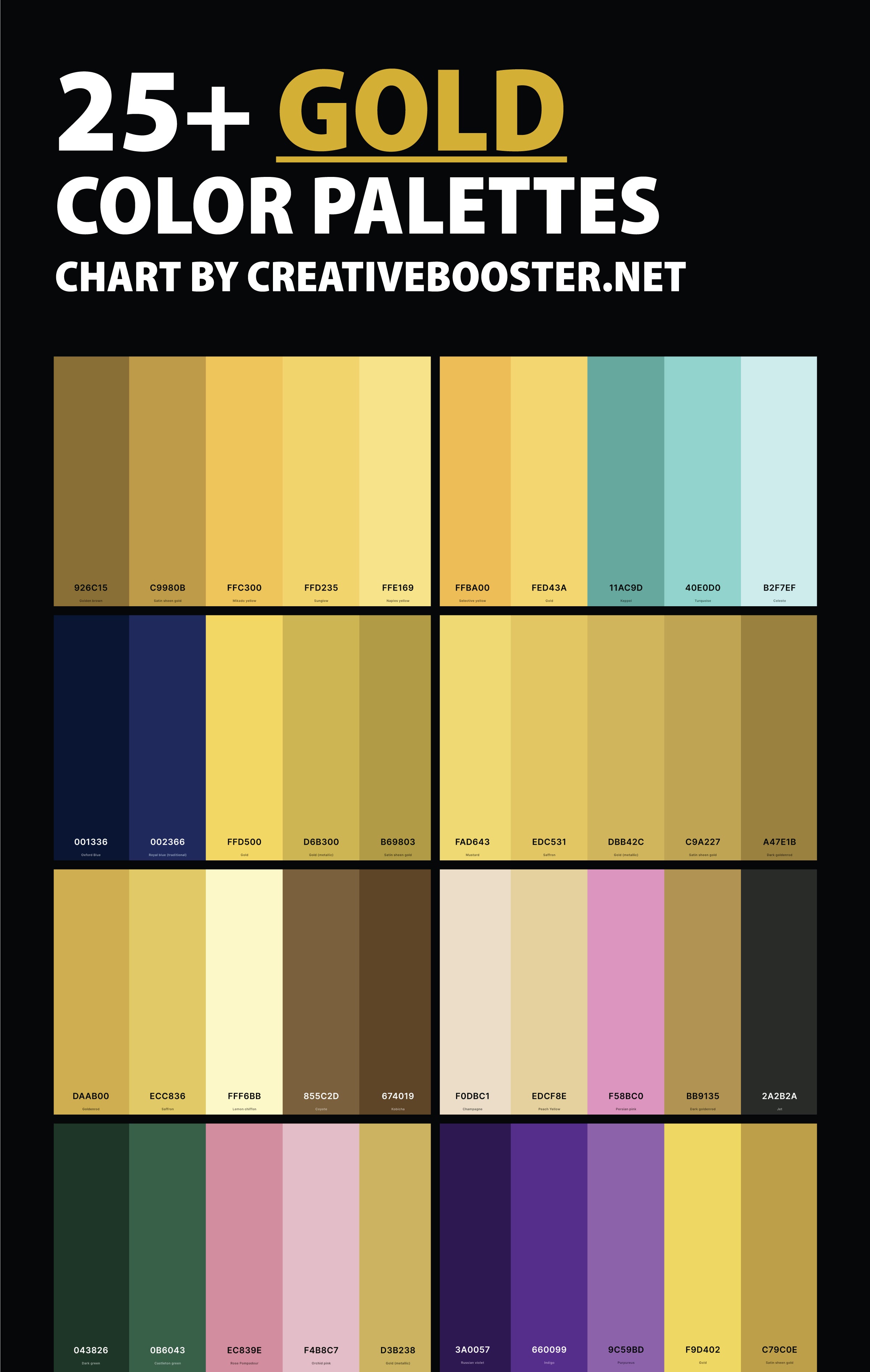
Gold, a symbol of luxury and warmth, has the unique ability to transform any space or design into something extraordinary. In this post, we'll explore over 25 stunning gold color palettes, each offering its own unique blend of elegance and style.
From the timeless charm of classic gold to the trendy allure of rose gold, each palette is carefully curated to inspire your next project. We'll also delve into how these gold combinations can harmoniously work with other colors, enhancing their beauty and impact. As you will see, gold goes well with many colors.
Understanding the full range of shades of gold is crucial for selecting the right palette. Our detailed look at the 100+ shades of gold provides a solid foundation for appreciating the depth and variety of gold.
Join us as we uncover the versatility and beauty of these gold palettes, and discover how they can add a touch of luxury and sophistication to your designs.
1. Gold Color Palette
Golden Brown + Satin Sheen Gold + Mikado Yellow + Sunglow + Naples Yellow
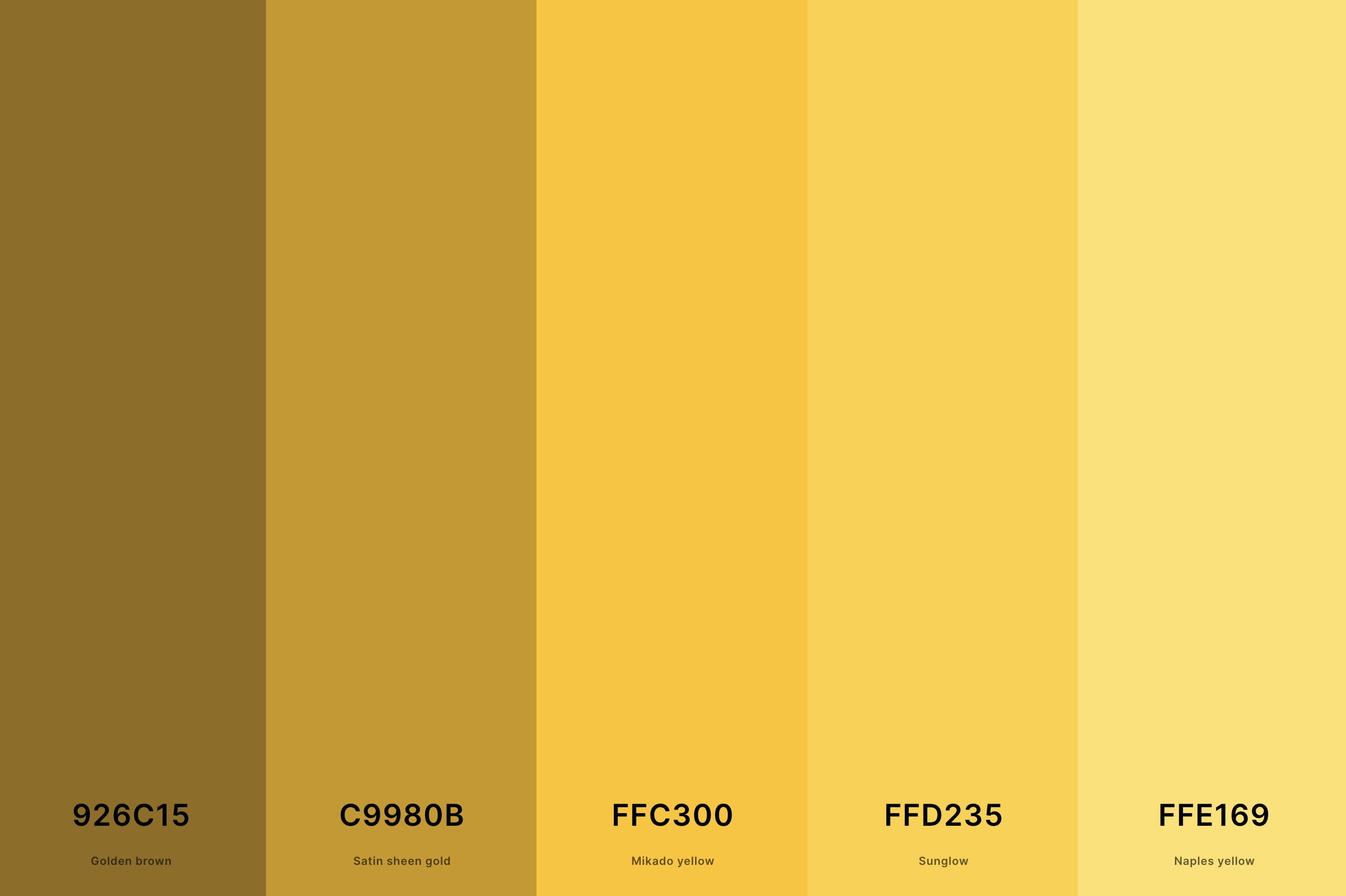
Hex Codes: #926C15, #C9980B, #FFC300, #FFD235, #FFE169
This palette combines various shades of gold, ranging from bright, shimmering yellows to deeper, almost bronze tones. This spectrum creates an opulent and luxurious feel, perfect for adding warmth and richness to any design.
The varying shades allow for dynamic and versatile applications, from elegant branding to sumptuous interior decor. The deep luster of these golds pairs beautifully with a range of colors, enhancing their visual appeal.
2. Rose Gold Color Palette
Brown Sugar + Rosy Brown + Melon + Pale Dogwood + Champagne Pink
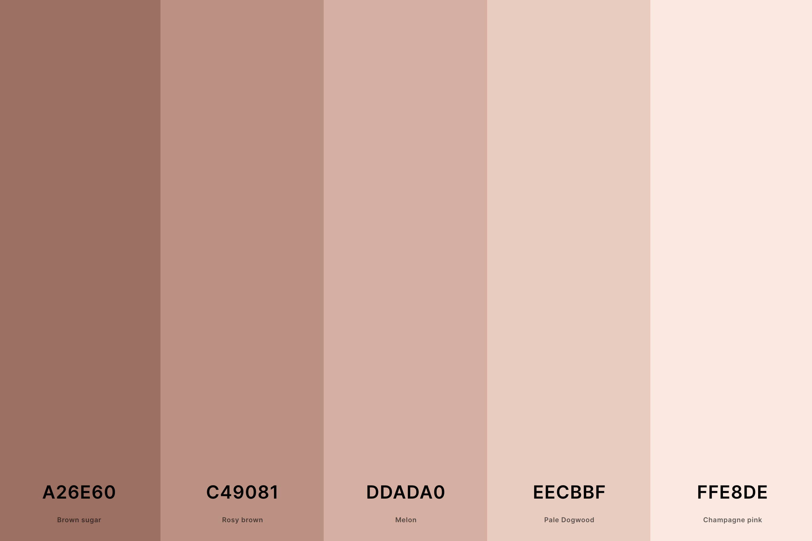
Hex Codes: #A26E60, #C49081, #DDADA0, #EECBBF, #FFE8DE
This palette is a harmonious blend of pink and gold tones, offering a unique twist on the classic gold. The inclusion of soft pinks softens the intensity of gold, resulting in a delicate, romantic, and contemporary aesthetic.
This palette is ideal for modern designs seeking a touch of femininity and elegance. It's particularly popular in fashion and lifestyle products, providing a subtle yet luxurious touch.
3. Blue And Gold Color Palette
Rich Black + Oxford Blue + Yale Blue + Satin Sheen Gold + Saffron
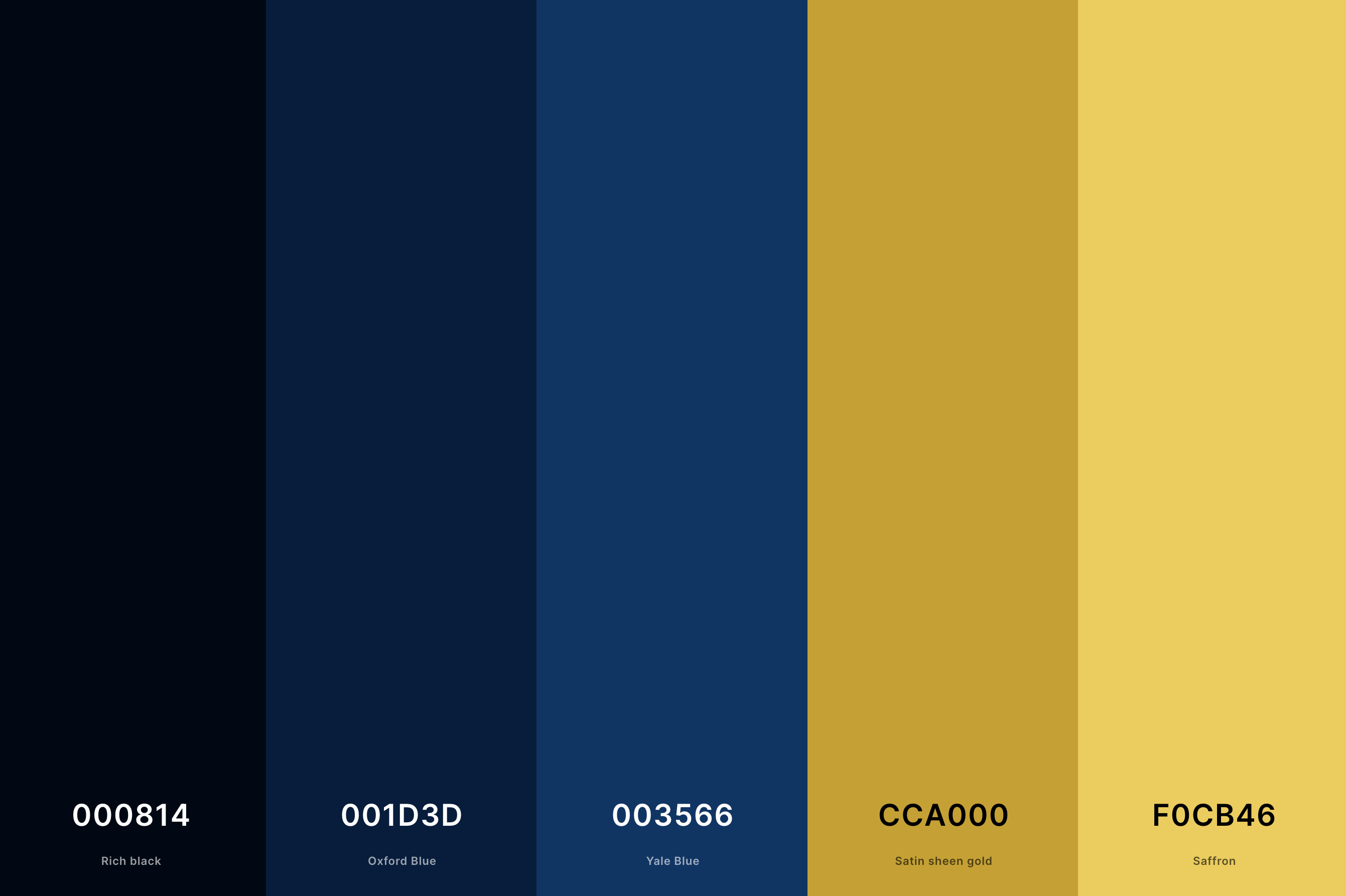
Hex Codes: #000814, #001D3D, #003566, #CCA000, #F0CB46
The contrast between the cool, serene blues and the warm, inviting golds creates a striking and sophisticated combination. This palette is often used to convey a sense of luxury and exclusivity, making it a popular choice for high-end brands and elegant events.
The coolness of the blue balances the warmth of the gold, providing a balanced and visually appealing experience.
4. Black And Gold Color Palette
Navajo White + Gold (Metallic) + Dark Goldenrod + Golden Brown + Black
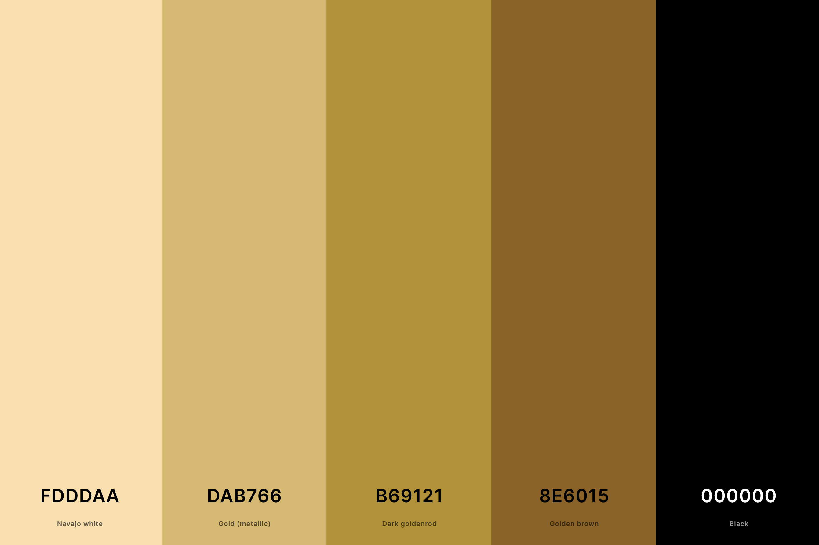
Hex Codes: #FDDDAA, #DAB766, #B69121, #8E6015, #000000
This is a classic and timeless palette that exudes sophistication and luxury. The stark contrast between the deep, bold black and the shimmering gold creates a dramatic and impactful visual.
This palette is often associated with elegance and premium quality, making it a go-to choice for luxury branding, formal event themes, and upscale interior design.
5. Green And Gold Color Palette
Naples Yellow + Satin Sheen Gold + Pistachio + Forest Green + Pakistan Green
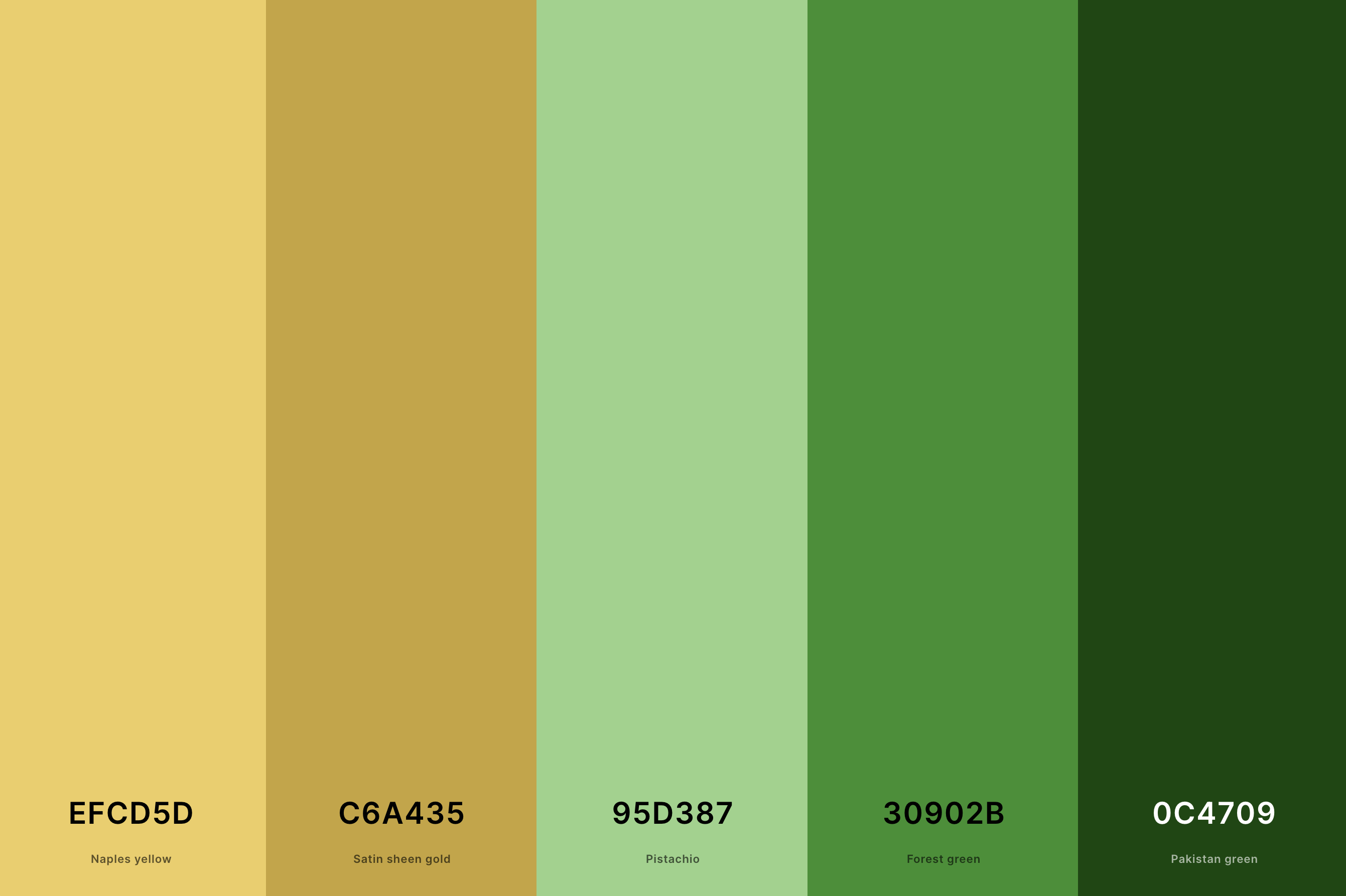
Hex Codes: #EFCD5D, #C6A435, #95D387, #30902B, #0C4709
This palette merges the natural, calming qualities of green with the richness of gold. It's often associated with growth, prosperity, and well-being, making it an excellent choice for health and wellness brands.
The gold elevates the green, lending a touch of luxury and sophistication. This palette is versatile, suitable for everything from eco-friendly products to elegant event decor.
6. Purple And Gold Color Palette
Russian Violet + Indigo + Purpureus + Gold + Satin Sheen Gold
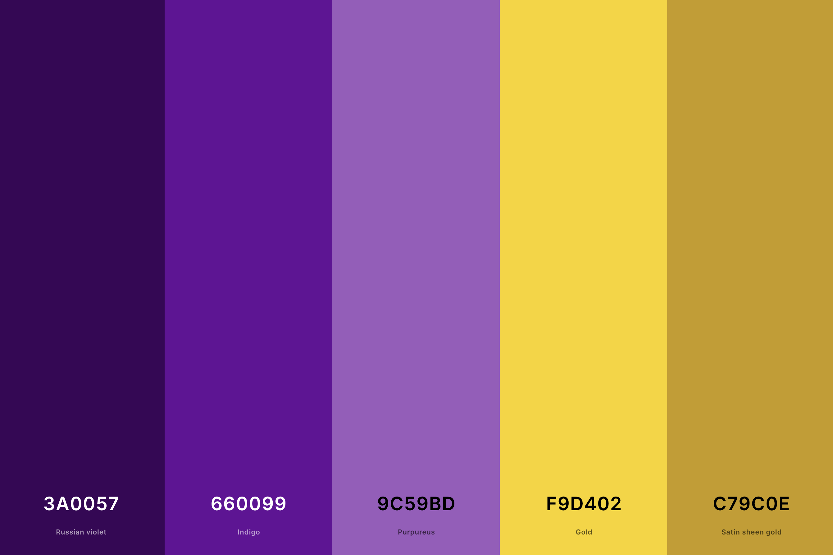
Hex Codes: #3A0057, #660099, #9C59BD, #F9D402, #C79C0E
This palette elegantly combines the royal and mysterious essence of purple with the opulence of gold. Purple's depth and sophistication are enhanced by the luxurious shimmer of gold, creating a palette that symbolizes wealth, luxury, and nobility.
Ideal for majestic and high-end designs, this combination is frequently seen in premium branding and lavish events, where it brings a touch of regal elegance.
7. Red And Gold Color Palette
Turkey Red + Fire Engine Red + Jonquil + Gold (Metallic) + Dark Goldenrod
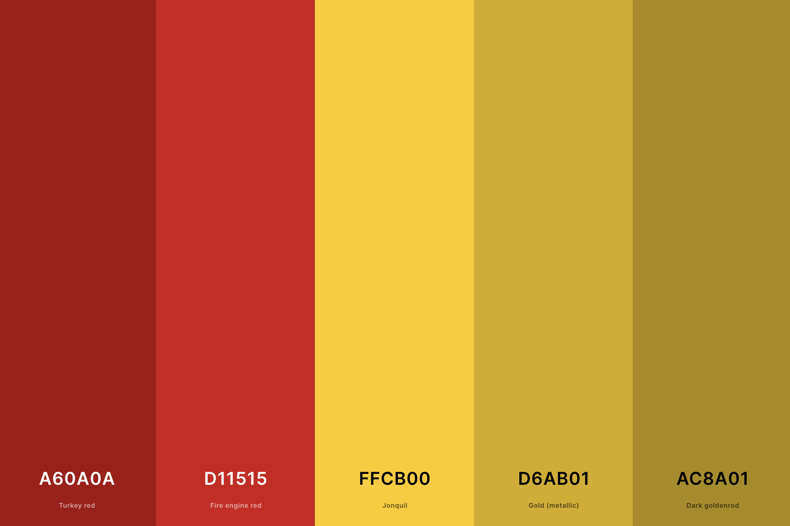
Hex Codes: #A60A0A, #D11515, #FFCB00, #D6AB01, #AC8A01
This vibrant palette merges the intensity and passion of red with the rich luxury of gold. The result is a dynamic and eye-catching combination, full of energy and opulence.
It's a popular choice for festive occasions and luxury brands, where it conveys excitement, power, and prestige. This palette can create striking visuals, perfect for impactful marketing and sumptuous event decor.
8. Pink And Gold Color Palette
Carnation Pink + Lavender Pink + Fairy Tale + Saffron + Satin Sheen Gold
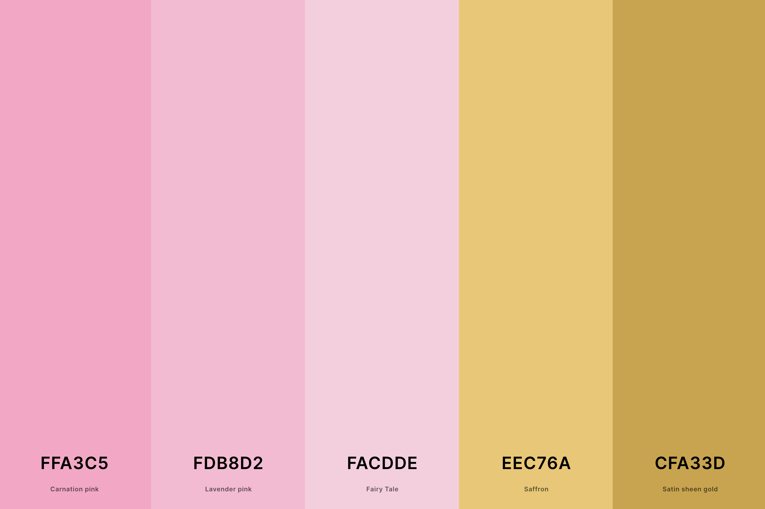
Hex Codes: #FFA3C5, #FDB8D2, #FACDDE, #EEC76A, #CFA33D
This palette combines the soft, delicate charm of pink with the lustrous warmth of gold. It creates a gentle, yet luxurious feel, ideal for romantic and feminine designs.
The gold adds a touch of sophistication to the playful and sweet pink, making it a popular choice for weddings, beauty brands, and upscale children's products. It offers a refined yet approachable aesthetic.
9. Champagne Gold Color Palette
Champagne + Peach Yellow + Persian Pink + Dark Goldenrod + Jet
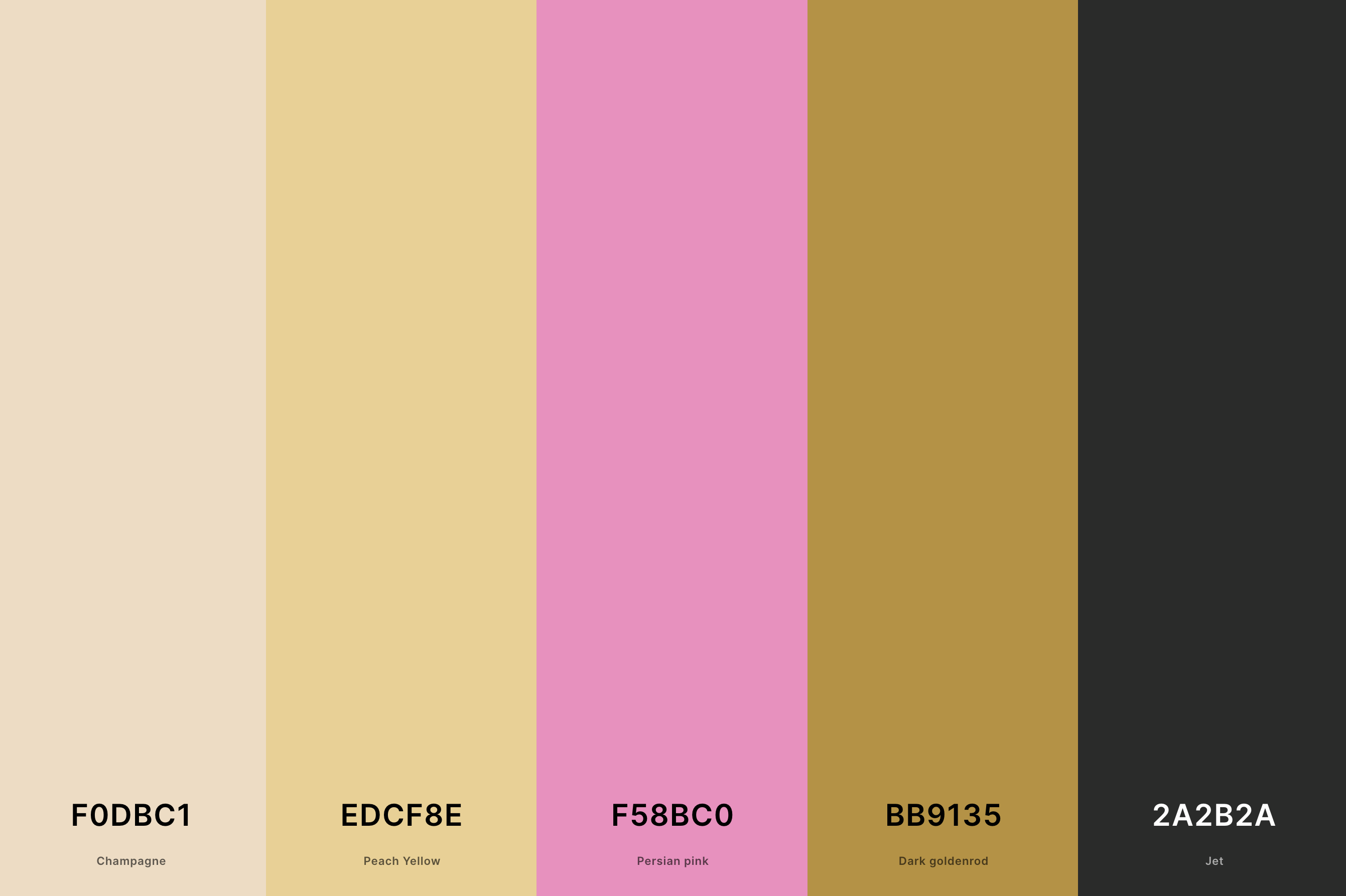
Hex Codes: #F0DBC1, #EDCF8E, #F58BC0, #BB9135, #2A2B2A
This sophisticated palette features muted gold tones reminiscent of the effervescence and elegance of champagne. The subtlety of this palette makes it versatile and timeless, perfect for creating an ambiance of understated luxury.
It's particularly well-suited for elegant branding, upscale events, and sophisticated interior design, where it adds a touch of refined glamour without overwhelming.
10. Golden Hour Color Palette
Persimmon + Tangerine + Princeton Orange + Earth Yellow + Navajo White
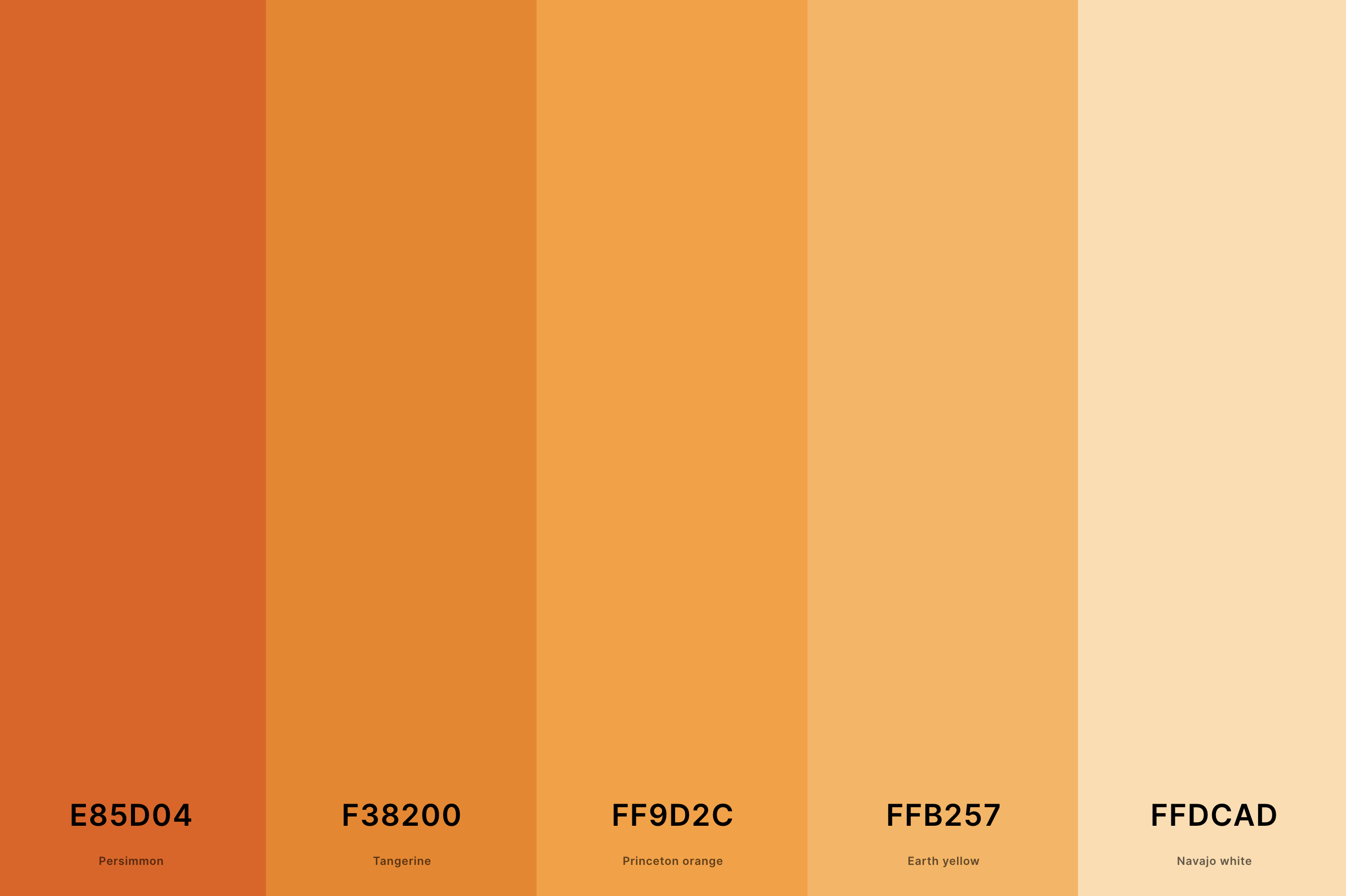
Hex Codes: #E85D04, #F38200, #FF9D2C, #FFB257, #FFDCAD
Inspired by the warm, glowing light of the golden hour, this palette captures the transient beauty of sunrise and sunset. It blends soft, warm golds with hints of orange and pink, creating a dreamy, ethereal feel.
This palette evokes feelings of tranquility and awe, making it ideal for projects that aim to inspire or soothe. Its natural and comforting tones are perfect for wellness brands, atmospheric photography, and evocative visual storytelling.
11. Metallic Gold Color Palette
Mustard + Saffron + Gold (Metallic) + Satin Sheen Gold + Dark Goldenrod
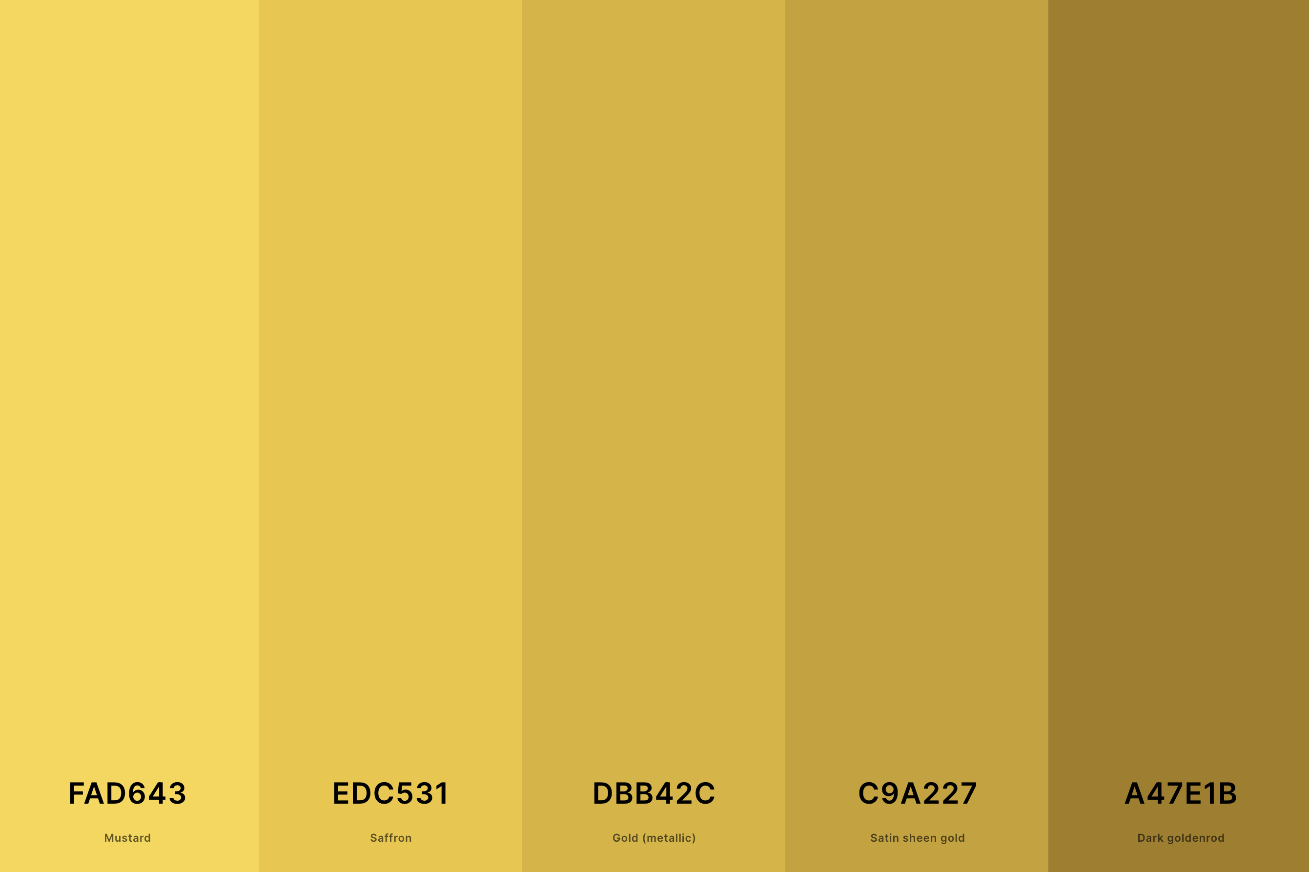
Hex Codes: #FAD643, #EDC531, #DBB42C, #C9A227, #A47E1B
This palette showcases the brilliance and shine of metallic gold, featuring a range of luminous gold shades from light, almost silvery golds to deep, rich bronzes.
The metallic sheen adds a modern twist to the classic luxury of gold, creating a futuristic yet opulent feel.
This palette is ideal for cutting-edge technology brands, high-fashion designs, and any project aiming to convey a sense of innovation and luxury.
12. Dark Green And Gold Color Palette
Dark Green + Cal Poly Green + Vanilla + Gold + Goldenrod
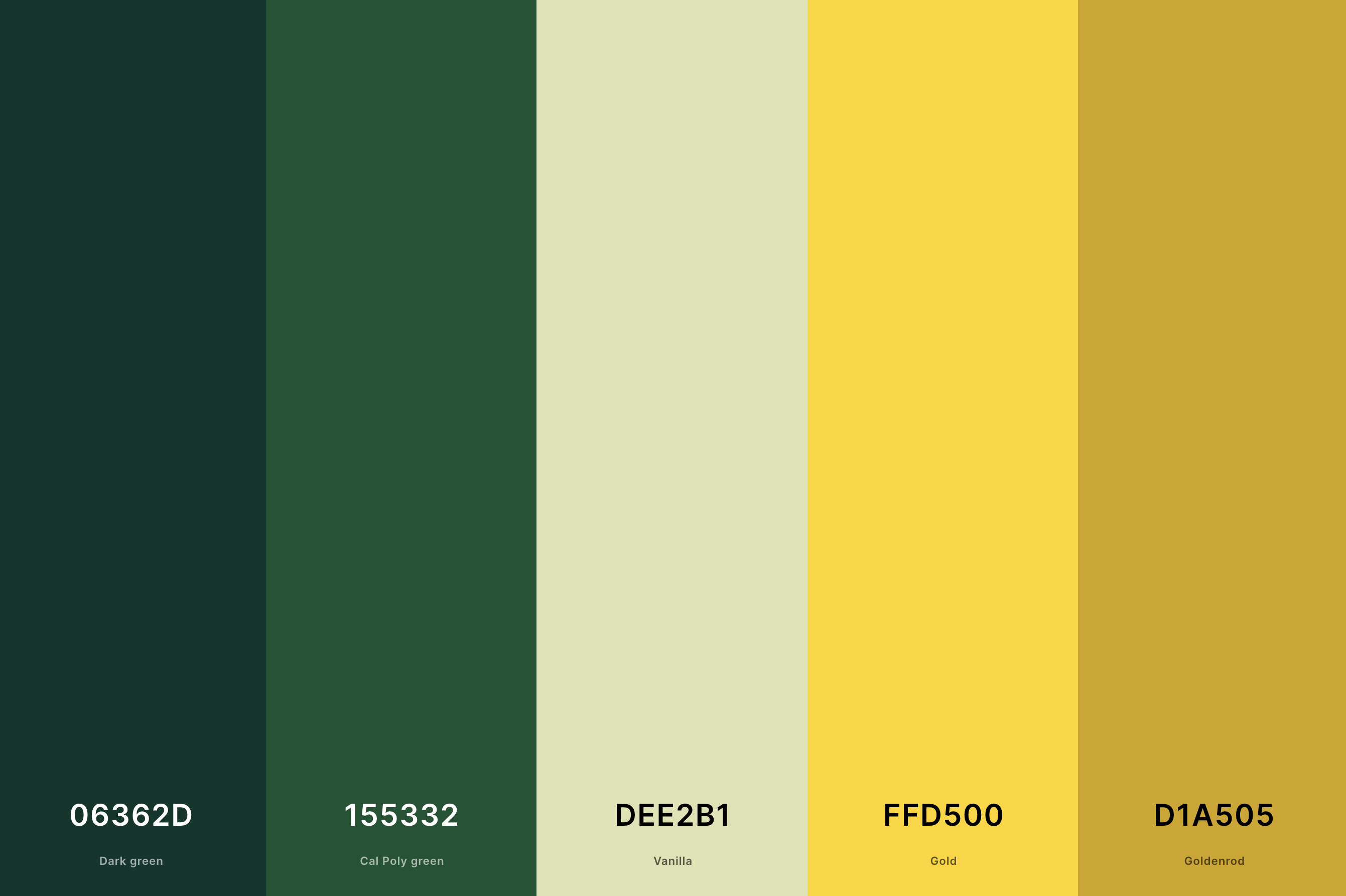
Hex Codes: #06362D, #155332, #DEE2B1, #FFD500, #D1A505
Combining the deep, lush tones of dark green with the glimmer of gold creates a palette that is both grounding and luxurious. This palette evokes the richness of nature's depths, enhanced by a touch of elegance from the gold.
It's particularly suited for eco-luxury brands, sophisticated outdoor events, and interior designs that aim to bring an organic yet lavish feel.
13. Metallic Rose Gold Color Palette
Tea Rose (Red) + Antique White + Coral Pink + Melon + Pale Dogwood
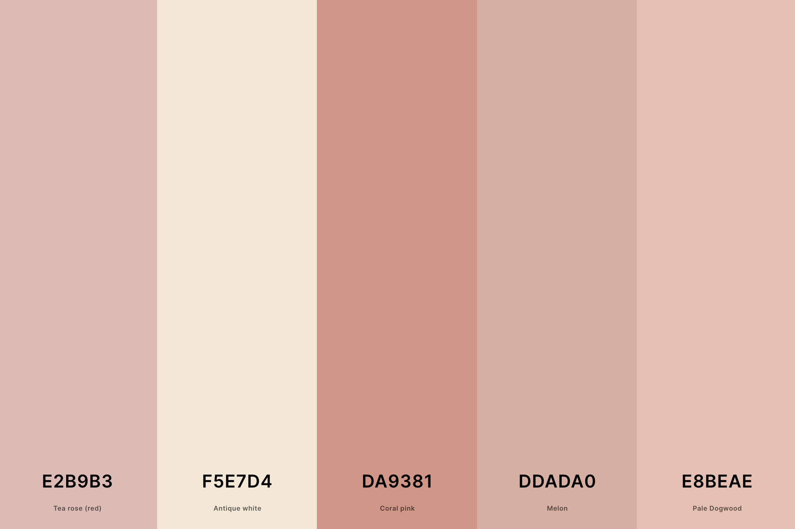
Hex Codes: #E2B9B3, #F5E7D4, #DA9381, #DDADA0, #E8BEAE
This palette takes the charm of rose gold and infuses it with a metallic luster, offering shades that range from soft, blush pinks to deeper, more intense rose tones with a metallic gleam.
The result is a contemporary, chic, and versatile palette, perfect for trendy fashion, modern jewelry designs, and stylish branding that seeks to blend femininity with a sleek, modern edge.
14. Navy Blue And Gold Color Palette
Navy Blue + Federal Blue + Amber + Gold + Goldenrod
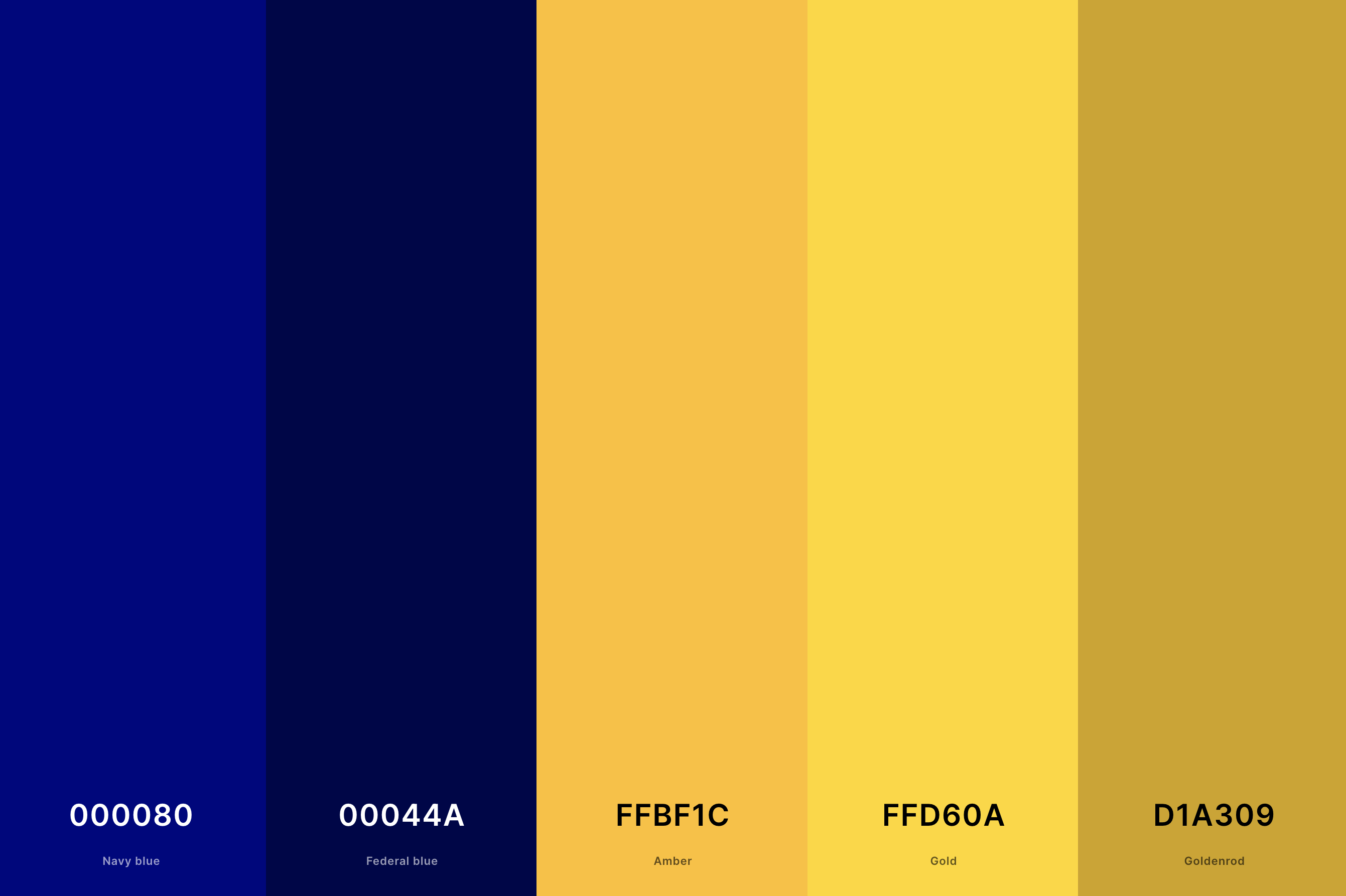
Hex Codes: #000080, #00044A, #FFBF1C, #FFD60A, #D1A309
The deep, serene tones of navy blue paired with the lustrous warmth of gold create a palette that is both elegant and powerful. This combination is often associated with nautical themes and can convey a sense of sophistication and authority.
It's a popular choice for corporate branding, upscale nautical events, and interior designs that aim to create a stately and refined atmosphere.
15. Rose Gold And Burgundy Color Palette
Burgundy + Cardinal + Light Red + Light Coral + Tea Rose (Red)
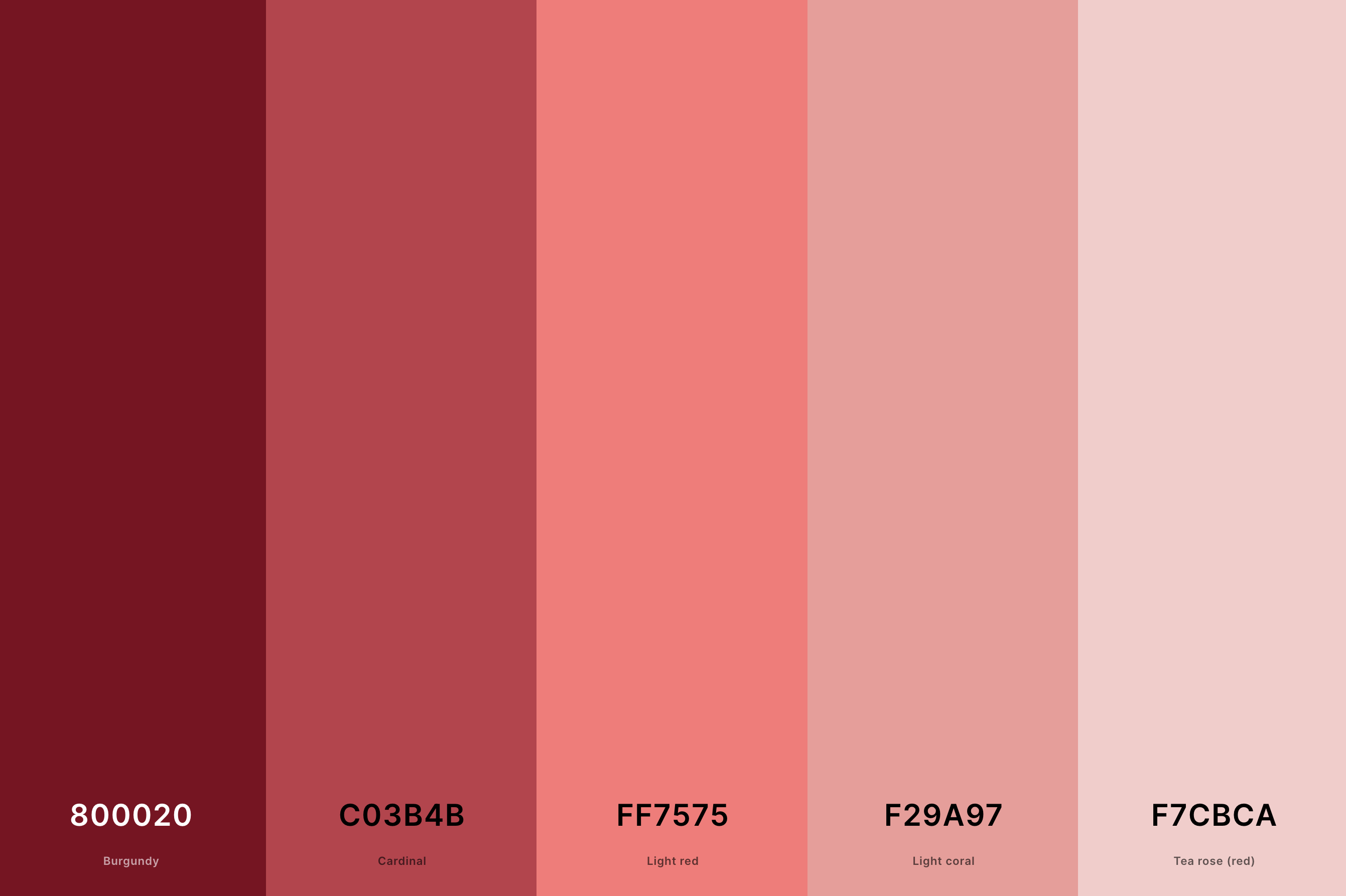
Hex Codes: #800020, #C03B4B, #FF7575, #F29A97, #F7CBCA
This palette combines the romance and softness of rose gold with the rich, velvety tones of burgundy. The contrast between the gentle luminosity of rose gold and the deep, passionate burgundy creates a luxurious and emotive aesthetic.
Ideal for elegant celebrations, high-end fashion, and intimate interior settings, this palette exudes warmth, romance, and sophistication.
16. Royal Blue And Gold Color Palette
Oxford Blue + Royal Blue (Traditional) + Gold + Gold (Metallic) + Satin Sheen Gold
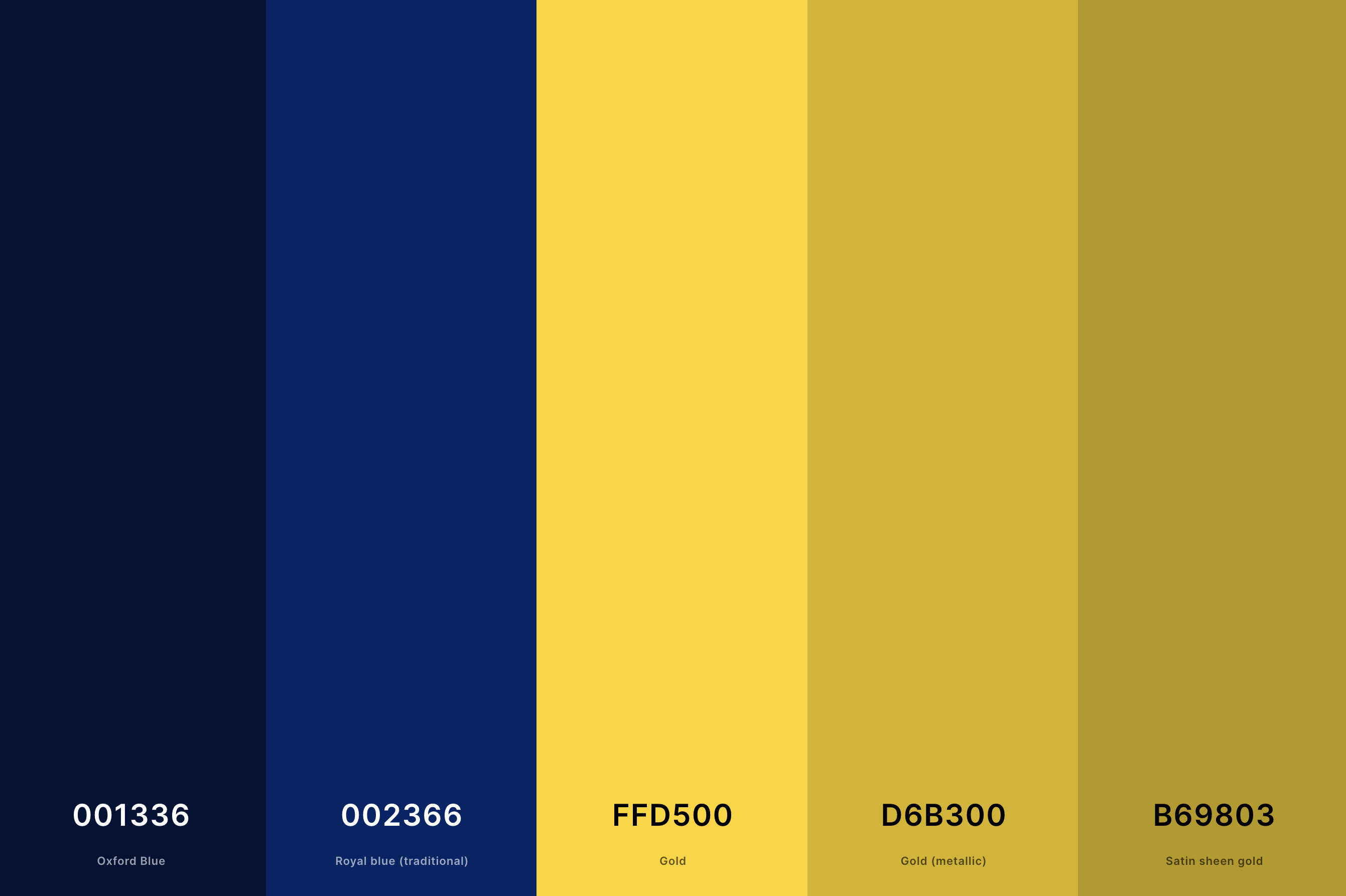
Hex Codes: #001336, #002366, #FFD500, #D6B300, #B69803
This palette combines the dignified, commanding presence of royal blue with the luxurious allure of gold. The royal blue's depth and intensity perfectly complement the bright, opulent gold, creating a visually striking and elegant combination.
This palette is ideal for high-end corporate branding, regal event themes, and interior designs that aim for a majestic and sophisticated atmosphere.
17. Teal And Gold Color Palette
Teal + Persian Green + Turquoise + School Bus Yellow + Gold (Metallic)
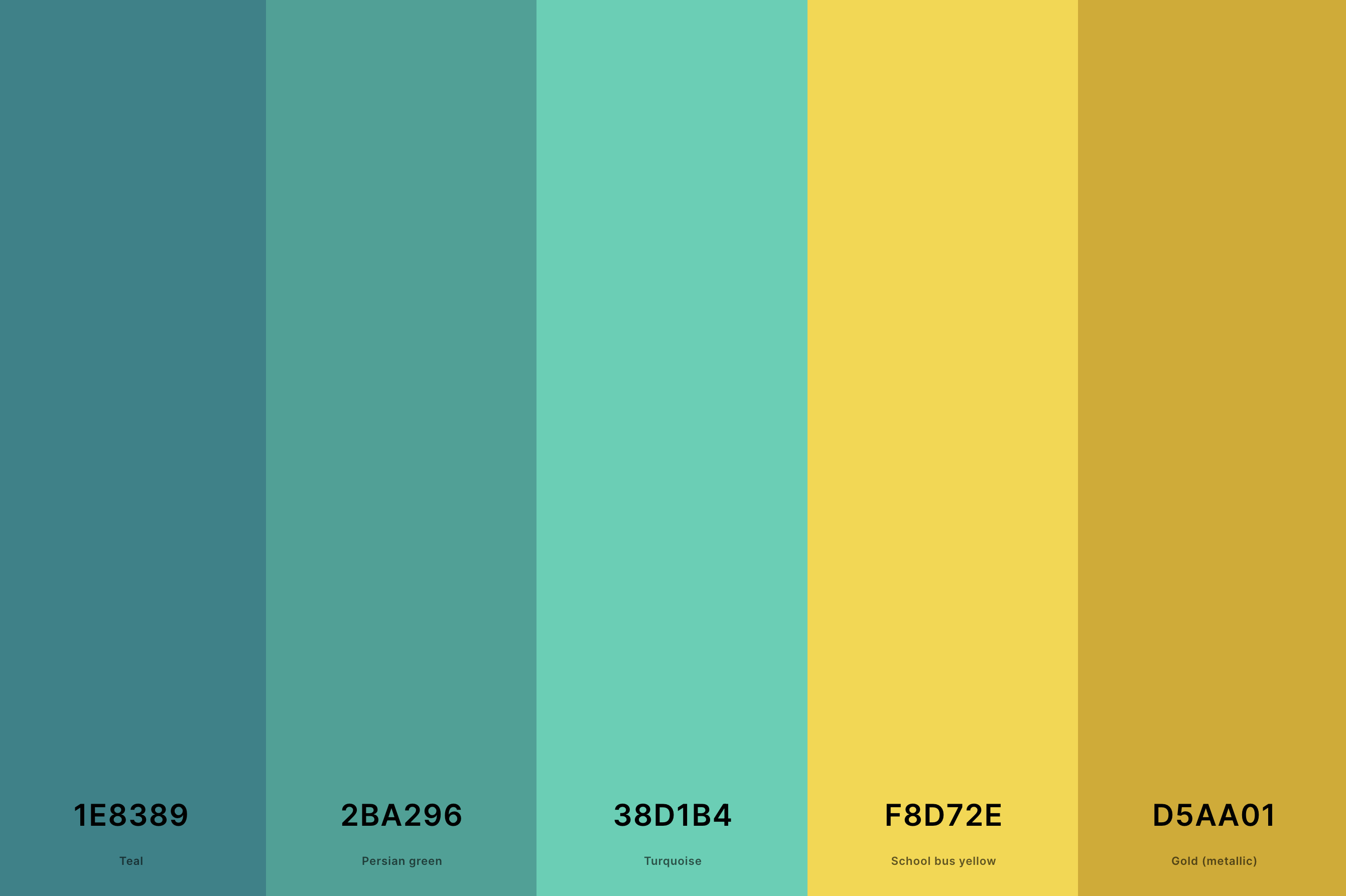
Hex Codes: #1E8389, #2BA296, #38D1B4, #F8D72E, #D5AA01
The refreshing, tranquil teal blends seamlessly with the warm, inviting gold, creating a palette that is both soothing and luxurious.
This unique combination offers a modern twist on classic elegance, making it perfect for contemporary designs seeking a balance between calmness and opulence.
It's a great choice for spa and wellness brands, upscale beach-themed events, and interior designs that favor a chic, serene ambiance.
18. Brown And Gold Color Palette
Goldenrod + Saffron + Lemon Chiffon + Coyote + Kobicha

Hex Codes: #DAAB00, #ECC836, #FFF6BB, #855C2D, #674019
Merging the earthy, comforting tones of brown with the shimmering elegance of gold creates a palette that feels both grounded and luxurious.
This combination evokes a sense of stability, warmth, and richness, making it well-suited for luxury goods, gourmet food branding, and interior designs that emphasize comfort and opulence.
19. Emerald Green And Gold Color Palette
Caribbean Current + Sea Green + Peach Yellow + Saffron + Satin Sheen Gold
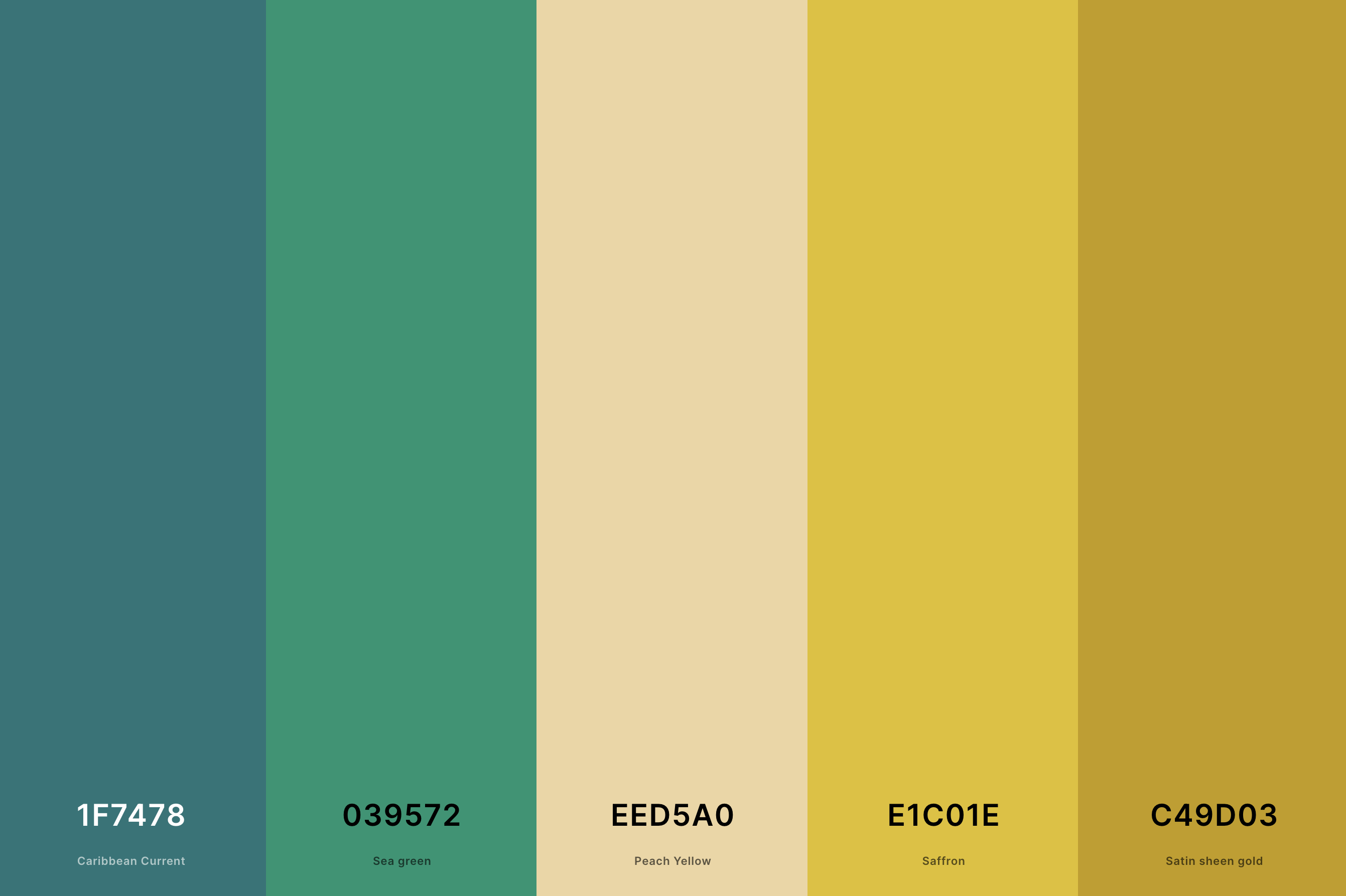
Hex Codes: #1F7478, #039572, #EED5A0, #E1C01E, #C49D03
This palette showcases the vibrant, lush tones of emerald green alongside the radiant warmth of gold. The vivid, jewel-like green complements the gold's richness, resulting in a palette that is regal and vibrant.
This combination is ideal for luxury brands, elegant events, and interior designs that aim to create an atmosphere of sophistication and vitality.
20. Red, Black And Gold Color Palette
Rich Black + Barn Red + Engineering Orange + Gold + Goldenrod
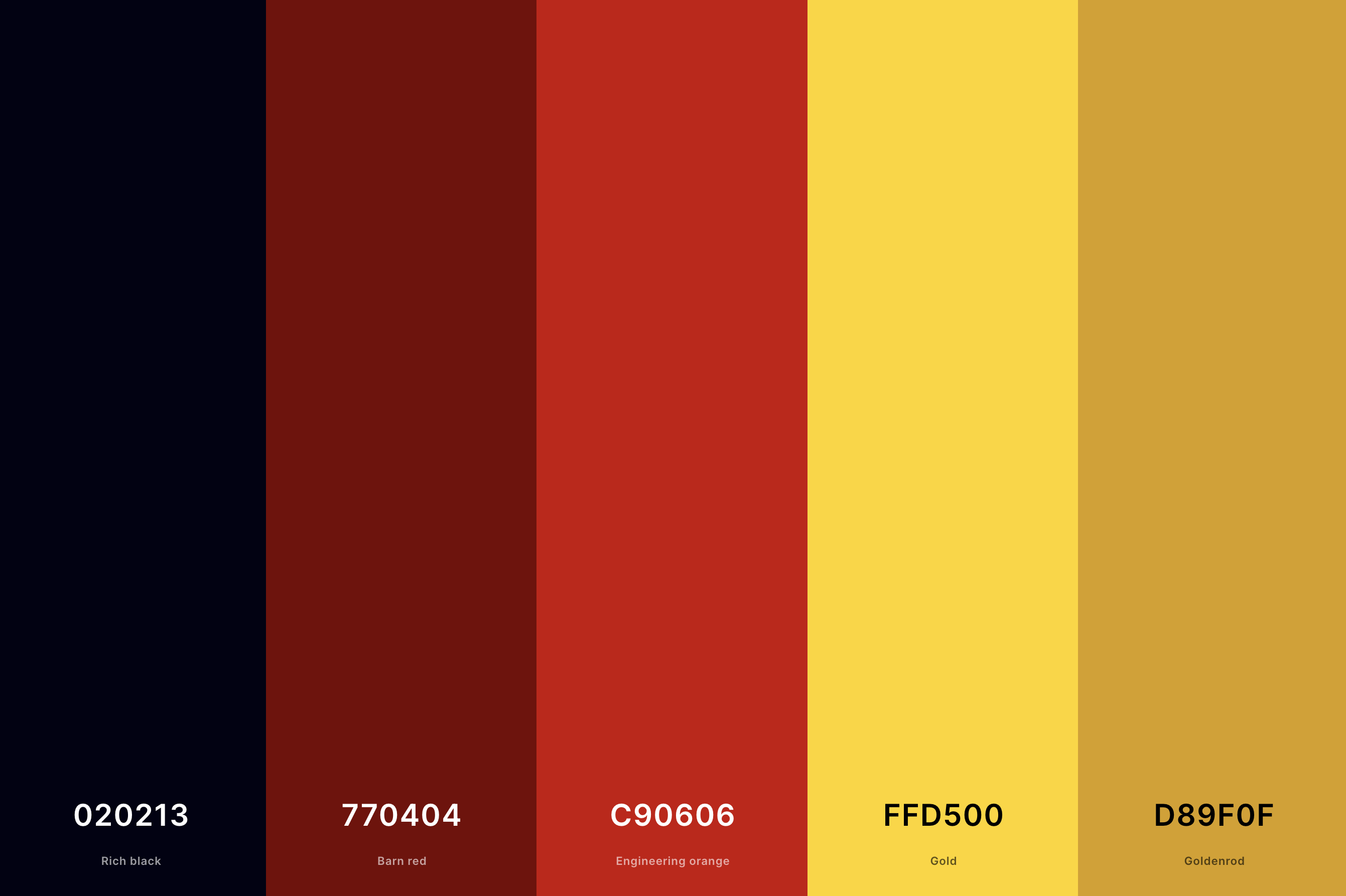
Hex Codes: #020213, #770404, #C90606, #FFD500, #D89F0F
This dynamic trio combines the boldness of red, the sophistication of black, and the opulence of gold. The palette is striking and powerful, evoking feelings of passion, elegance, and luxury.
It's a popular choice for high-fashion branding, dramatic event themes, and interior designs that aim to make a bold statement.
21. Royal Purple And Gold Color Palette
Zomp + Xanthous + Mauve + Royal Purple + Tekhelet
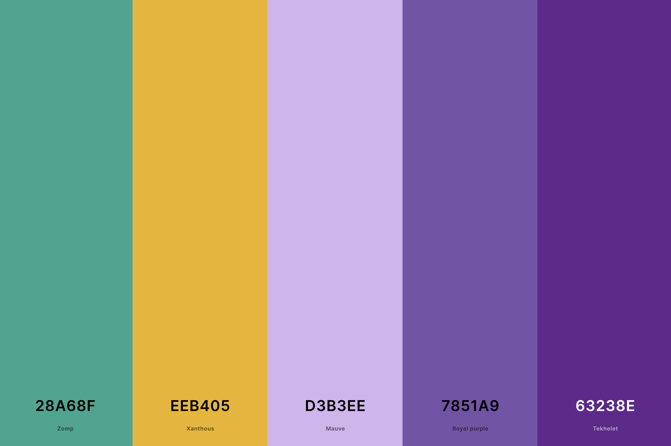
Hex Codes: #28A68F, #EEB405, #D3B3EE, #7851A9, #63238E
This palette is a regal blend of deep, luxurious purple with shimmering gold. The rich purple evokes a sense of nobility and mystery, while the gold adds a touch of opulence and grandeur.
This combination is ideal for conveying a sense of luxury and sophistication, making it perfect for high-end branding, elegant events, and lavish interior designs that aim to impress and captivate.
22. Turquoise And Gold Color Palette
Selective Yellow + Gold + Keppel + Turquoise + Celeste
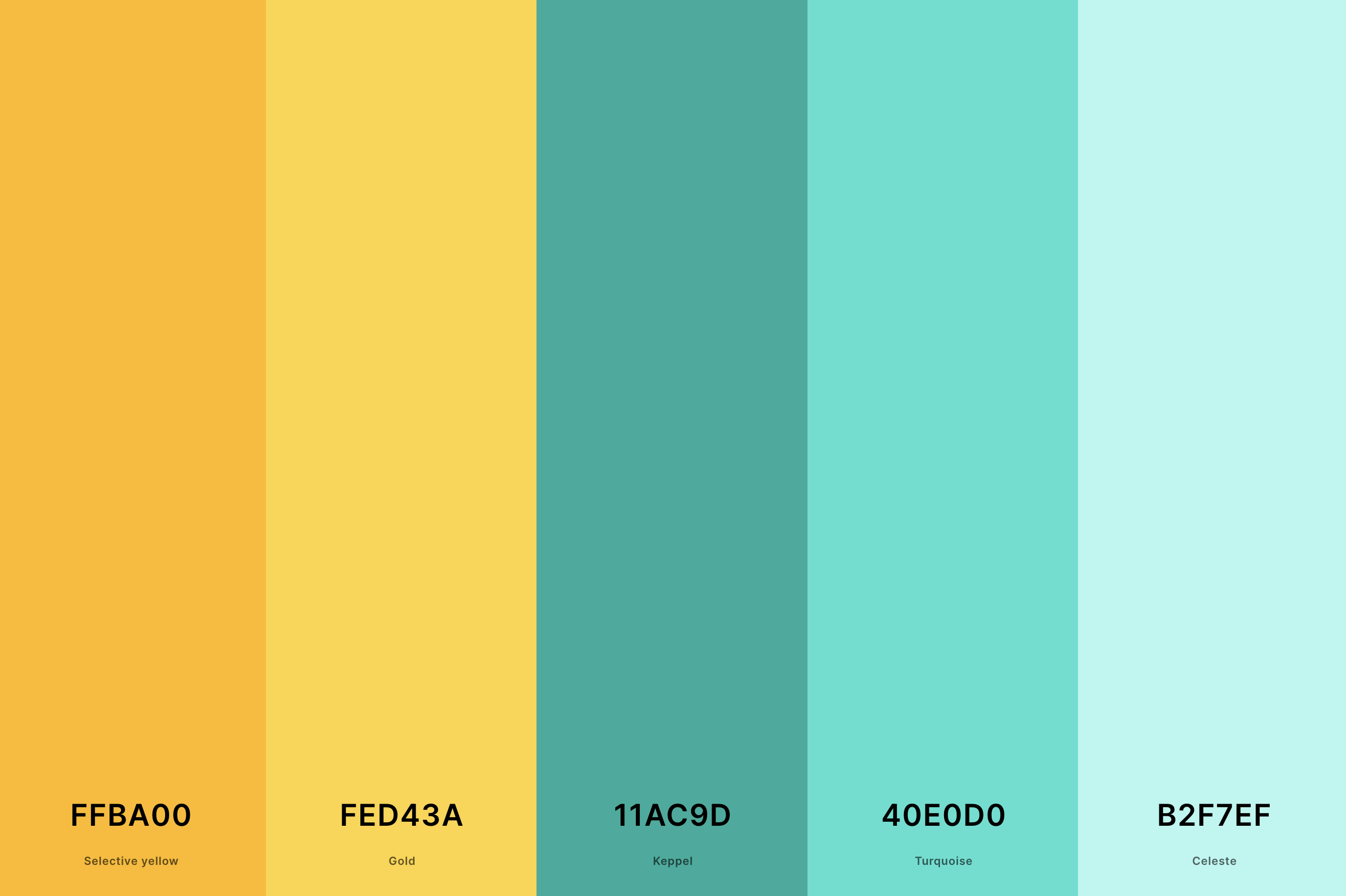
Hex Codes: #FFBA00, #FED43A, #11AC9D, #40E0D0, #B2F7EF
The vibrant, refreshing turquoise paired with the warm, lustrous gold creates a palette that is both energizing and luxurious. T
his combination is reminiscent of exotic beaches and opulent treasures, perfect for creating a feel of tropical elegance.
It's a great choice for resort branding, summer-themed events, and interiors that seek to combine a sense of adventure with luxury.
23. White And Gold Color Palette
Gold (Metallic) + Jonquil + Bone + Anti-Flash White + Timberwolf
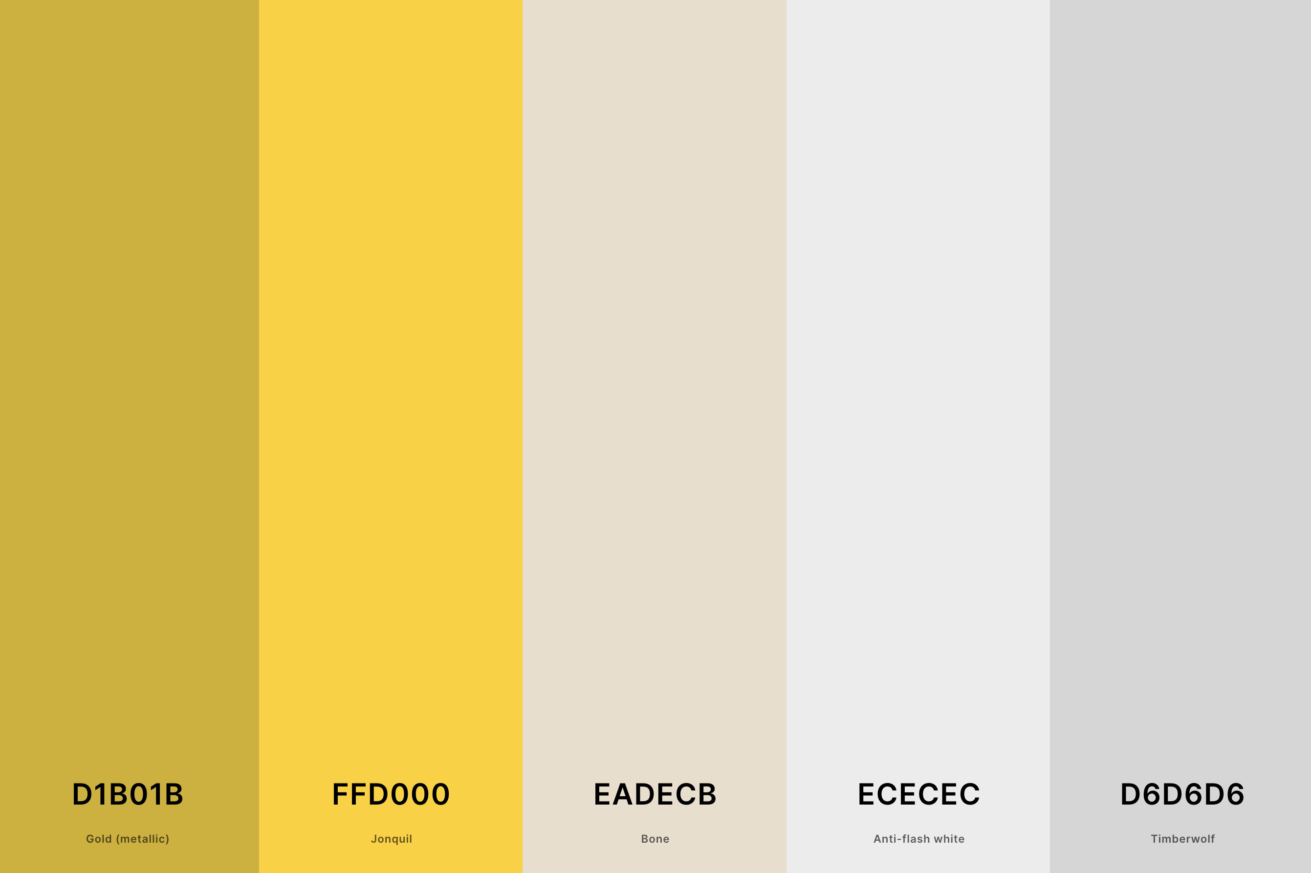
Hex Codes: #D1B01B, #FFD000, #EADECB, #ECECEC, #D6D6D6
This palette combines the purity and simplicity of white with the richness of gold. The result is a timeless and elegant combination that exudes sophistication and understated luxury.
Ideal for minimalist designs that require a touch of glamour, this palette is perfect for upscale weddings, chic branding, and interior designs that favor a clean, luxurious look.
24. Rose Gold And Champagne Color Palette
Lion + Tan + Champagne + Pale Dogwood + Tea Rose (Red)
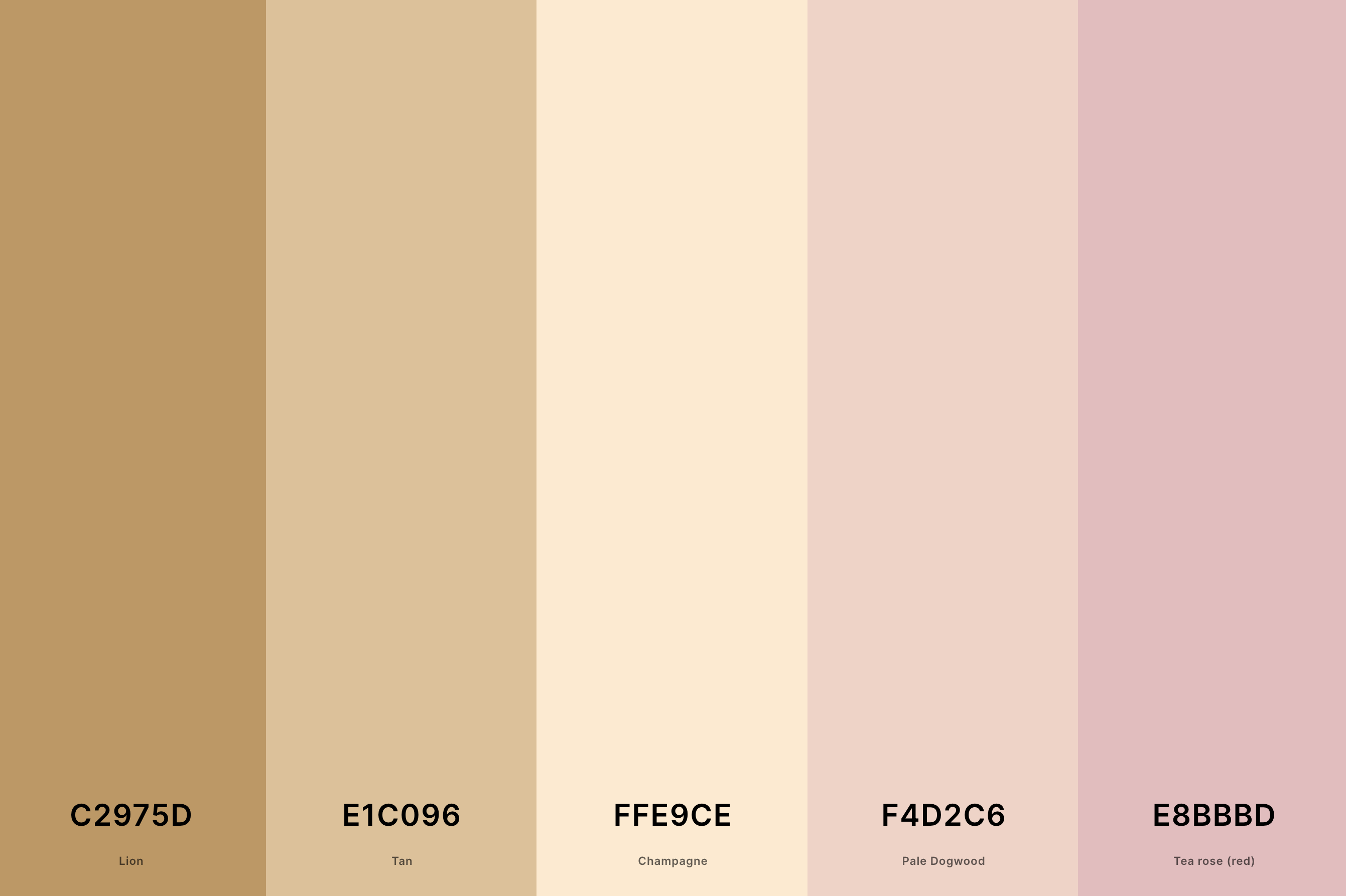
Hex Codes: #C2975D, #E1C096, #FFE9CE, #F4D2C6, #E8BBBD
This palette blends the delicate, feminine shades of rose gold with the subtle, refined tones of champagne. It exudes a sense of soft luxury and contemporary elegance, perfect for romantic and sophisticated designs.
This palette is particularly suited for wedding themes, luxury beauty brands, and interior designs that aim for a chic, modern aesthetic.
25. Rose Gold Wedding Color Palette
Brown Sugar + Pale Dogwood + Desert Sand + Pearl + Tan
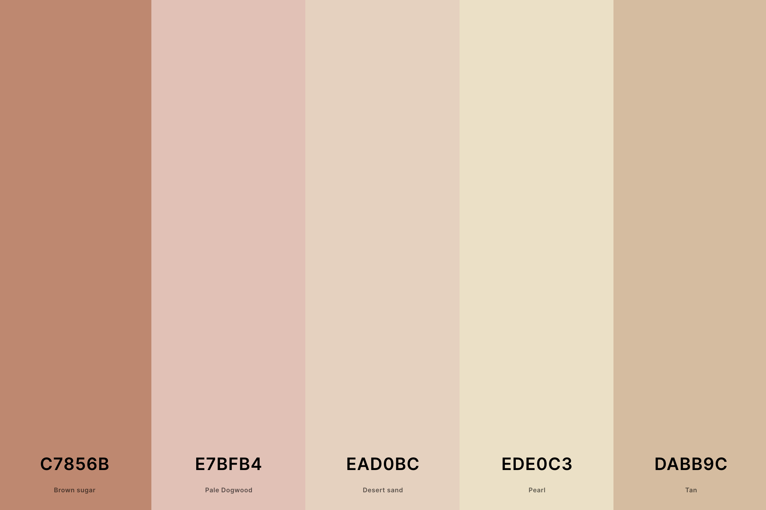
Hex Codes: #C7856B, #E7BFB4, #EAD0BC, #EDE0C3, #DABB9C
Tailored specifically for weddings, this palette features varying shades of rose gold, from soft blushes to deeper, more vibrant tones.
The palette encapsulates romance, tenderness, and luxury, making it an ideal choice for a wedding that aims to be both modern and timeless.
It's perfect for creating a warm, glowing ambiance that's both inviting and stylish.
26. Green, Pink And Gold Color Palette
Dark Green + Castleton Green + Rose Pompadour + Orchid Pink + Gold (Metallic)
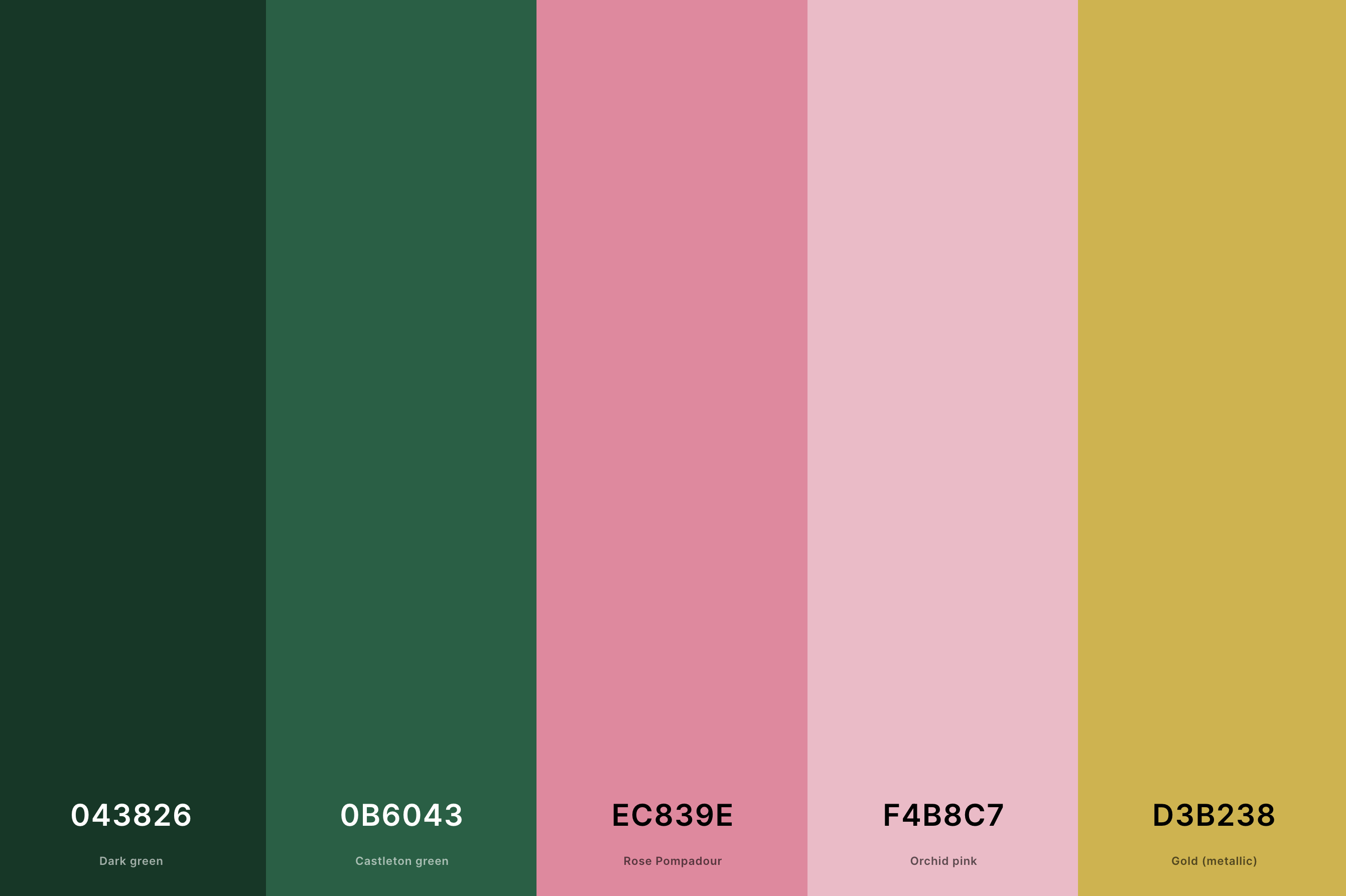
Hex Codes: #043826, #0B6043, #EC839E, #F4B8C7, #D3B238
This delightful palette combines the freshness of green, the softness of pink, and the luxury of gold. The green offers a natural, calming effect, the pink adds a touch of playful femininity, and the gold infuses the palette with elegance and opulence.
This blend is perfect for designs seeking a harmonious balance between nature-inspired elements and luxurious sophistication.
It's especially suitable for spring-themed events, lifestyle branding, and interior designs that aim to be vibrant, yet refined.
27. Yellow And Gold Color Palette
Jonquil + Gold (Metallic) + Naples Yellow + Jasmine + Vanilla
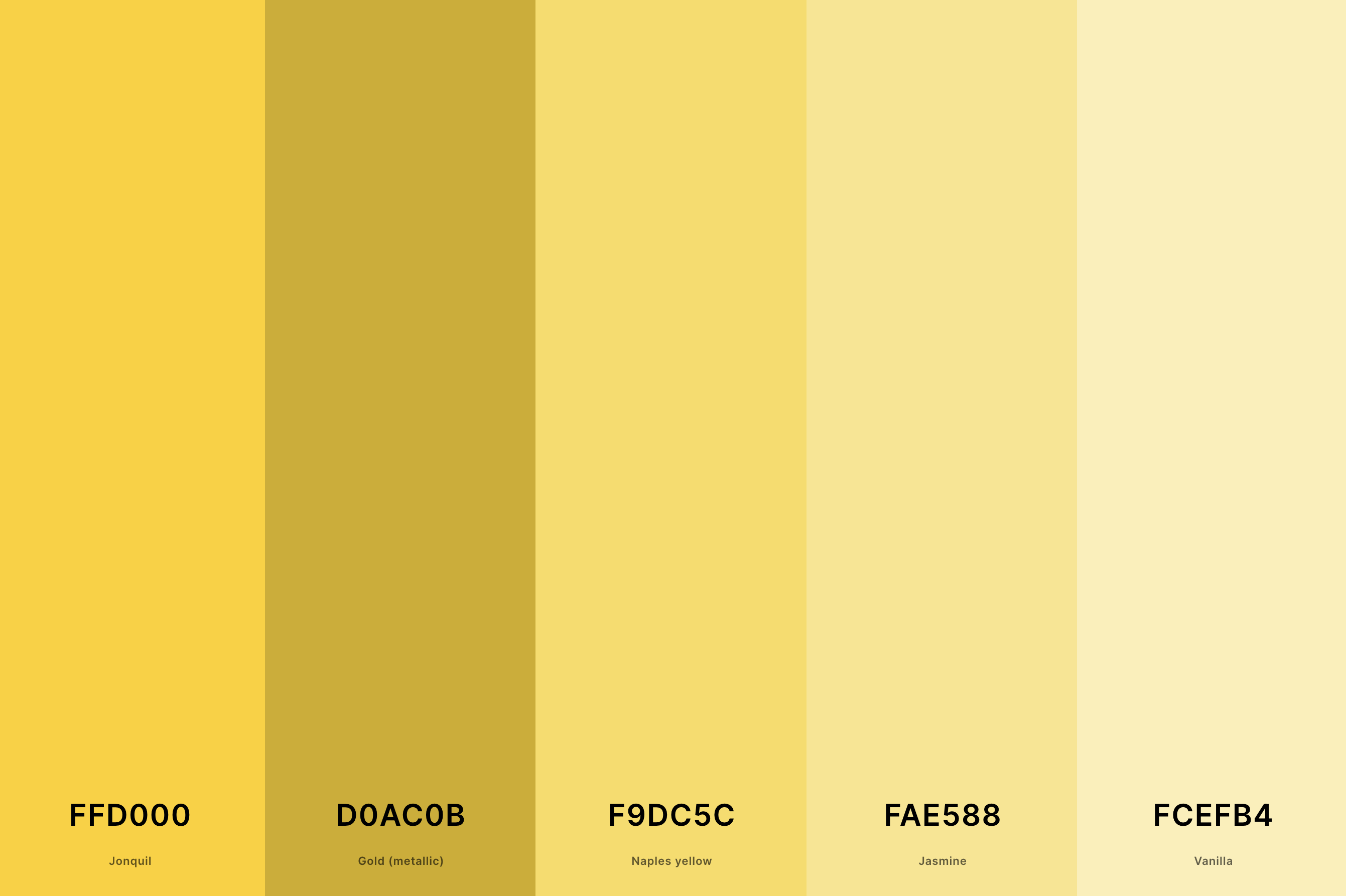
Hex Codes: #FFD000, #D0AC0B, #F9DC5C, #FAE588, #FCEFB4
This sunny palette pairs various shades of yellow with the richness of gold, creating a spectrum that ranges from pale, lemony hues to deep, amber tones.
The combination evokes feelings of joy, optimism, and warmth, making it ideal for designs that aim to be uplifting and inviting.
The gold adds a layer of luxury and refinement, making this palette suitable for cheerful yet sophisticated branding, vibrant event themes, and interiors that seek to create a bright, welcoming atmosphere.
What is the Complimentary Color to Gold?
The complimentary color to gold is a point of fascinating exploration in the world of color theory. Gold, often perceived as a luxurious and warm color, finds its complement in shades of deep, cool blue.
This striking contrast is more than just a visual delight; it's a dance of warmth and coolness, richness and sobriety.
Imagine gold's lush, shimmering tones. Now, picture them against the backdrop of a rich navy or a deep azure. This combination doesn't just work; it sings.
The cool blue provides a calming balance to gold's warmth, making the gold appear even more radiant and lively. This is why you often see this pairing in various forms of art and design, from elegant jewelry to sophisticated home decor.
The beauty of this complementary pairing lies in its versatility. It suits a wide array of applications, from graphic design and branding to fashion and interior design. In branding, for instance, this pairing communicates a sense of luxury and trustworthiness. In interiors, it adds a touch of sophistication and elegance.
So, the next time you're looking to create a design that resonates with luxury and balance, consider the dynamic duo of gold and its complementary cool blue.
It's a combination that harmoniously balances extravagance with elegance, making your design not just seen, but felt.
What Colors Go With Gold?
Gold is a versatile and luxurious color that can elevate any palette it joins. Its warm, shimmering essence pairs beautifully with a variety of colors, each combination offering a unique atmosphere. Here’s a list of colors that harmonize wonderfully with gold:
- Navy Blue: Offers a classic, sophisticated contrast; perfect for elegant and timeless designs.
- Emerald Green: Creates a rich, opulent look, reminiscent of regality and abundance.
- Black: For a sleek, modern feel, black with gold is a go-to, providing a stark, yet luxurious contrast.
- White: Brings a clean, airy quality, making gold pop while keeping the palette light and elegant.
- Burgundy: This deep wine color with gold gives a feeling of warmth and depth, ideal for cozy, inviting spaces.
- Teal: A less traditional pair, teal and gold combine for a vibrant, yet sophisticated palette.
- Coral: A playful and lively match, coral and gold are perfect for a fresh, contemporary vibe.
- Purple: Rich purples with gold offer a royal, majestic look, full of drama and luxury.
Each of these combinations can set a different tone. For instance, navy blue and gold might be used in a corporate setting to convey professionalism and luxury, while coral and gold could be perfect for a trendy, upbeat retail brand.
The key is to consider the mood and message you want to convey with your color palette.
Gold’s adaptability means it can play a supporting role or be the star of the show, depending on the colors it's paired with. This makes it an invaluable asset in any designer's toolkit.
